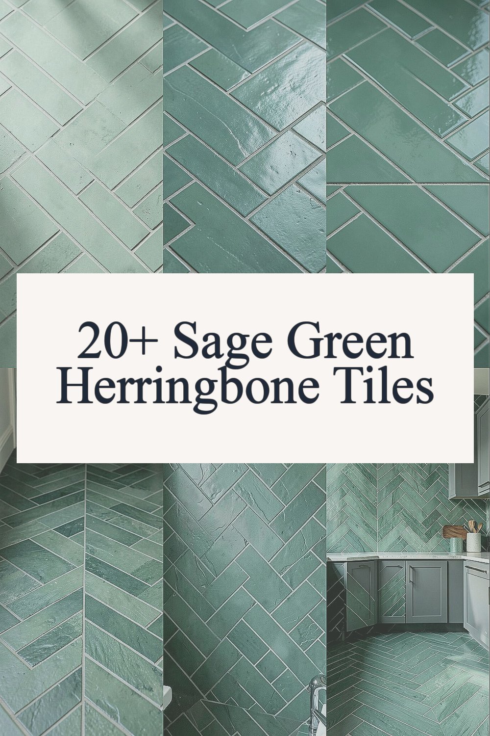
The room starts to feel quieter when the right tile pattern catches the light. Sage green herringbone does that with effortless charm.
1. Soft Sage That Makes Rooms Feel Calmer
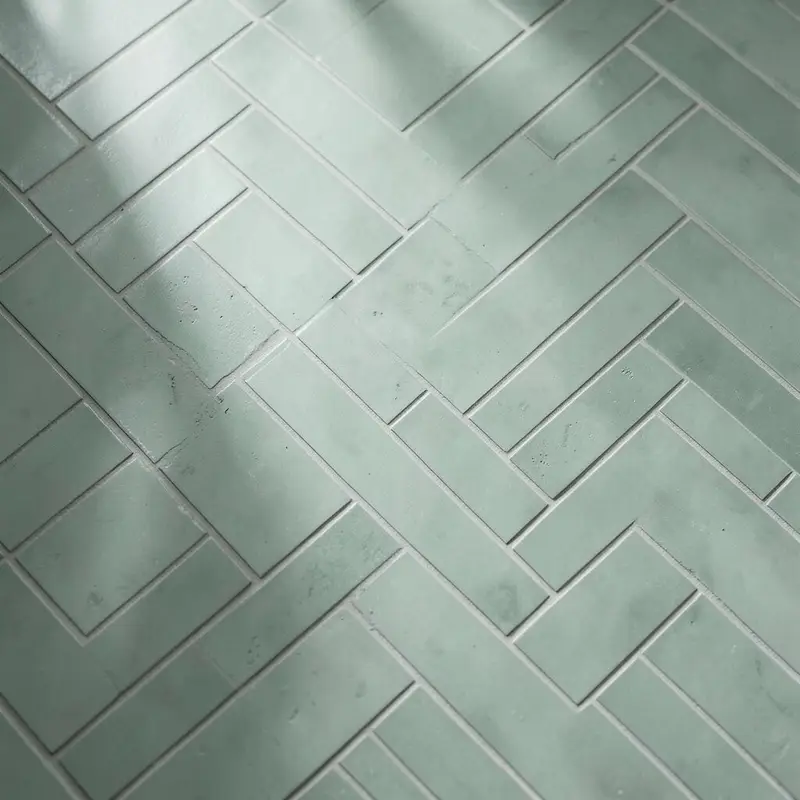
Imagine walking into a space where the walls look dressed, not loud. The sage green tones sit between gray and green, so the room feels soothing instead of harsh.
You get a moody vibe without making it dark and gloomy. Herringbone lines add gentle movement, guiding the eye along floors and walls. For a practical win, pair the tiles with warm whites and brushed metal so the color reads cozy all day long.
2. Classic Herringbone, But With a Modern Attitude

Herringbone never feels stuck in the past when the glaze has a soft, muted look. The pattern makes even a plain room feel styled because the angles create natural depth.
When the tiles sit in long runs, the layout can make spaces feel longer or wider depending on how you place them. For an easy personalization move, align the pattern with the longest wall or with a main focal feature like a fireplace. This style also works well with current trends like matte finishes and earthy palettes.
3. Moody Depth From Glossy or Satin Sheen

Some sage herringbone tiles shine like a quiet lake at dusk. Others have a satin finish that absorbs light and makes the room feel intimate.
That sheen choice changes the mood fast, so it’s worth thinking about lighting. If your room has fewer windows, satin or lightly glossy tiles can keep the space from feeling flat. For practical care, check the tile’s surface rating and choose a finish that can handle daily cleaning without losing its look.
If you want extra impact, place the tiles where light hits them most, like near a vanity or behind a soaking tub. A darker grout can deepen the shadow lines and make the herringbone pop. Go lighter if you want a softer, airy moody vibe.
4. Better Flow for Hallways and Entryways

Herringbone naturally creates a sense of direction, which helps hallways feel less like a tunnel. When you use sage green, the whole entry area feels welcoming while still staying calm.
The pattern’s diagonal texture can also hide small scuffs better than very plain surfaces. For a practical tip, keep the tile laid consistently from the entry into the adjacent space so the room feels connected. Consider a matching wall tile in a smaller shade range if you want the look to continue up the walls.
5. Bathroom Spa Feel Without Overdoing It
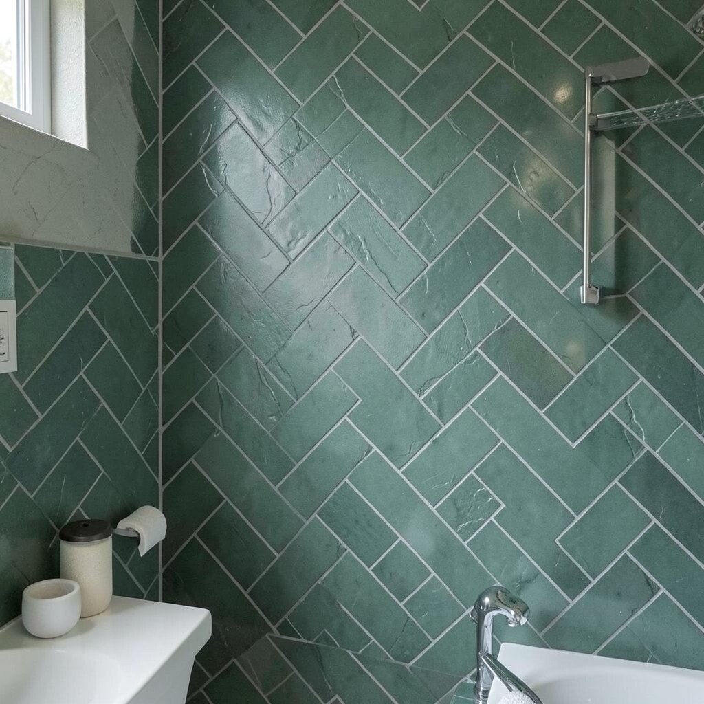
Sage green herringbone on bathroom floors looks like a spa, but it doesn’t need fancy extras to feel special. The color feels fresh and soothing, while the pattern adds warmth through texture.
To make it functional, choose tiles that are rated for wet areas and that offer good traction. You’ll love how the pattern makes the floor feel designed even when you keep the rest simple. A practical pairing is a light wood vanity and a matte black faucet for contrast that still feels gentle.
If you want to personalize, match grout color to your hardware finish. Dark grout lines can look dramatic, while light grout makes the sage feel airy. It’s also a great time to add a patterned runner that echoes the tile’s direction.
6. Kitchen Calm That Still Feels Stylish

In a kitchen, sage green herringbone can make everyday cooking feel less stressful. The pattern brings a little rhythm behind the stove or along the backsplash where splashes happen often.
Choosing a durable tile matters here, because kitchens take more wear. Look for tiles with strong stain resistance and a sealed surface if the material calls for it. For a personalization idea, repeat the herringbone pattern on a small accent strip to frame a hood or range area.
7. Tile That Hides Imperfections Beautifully
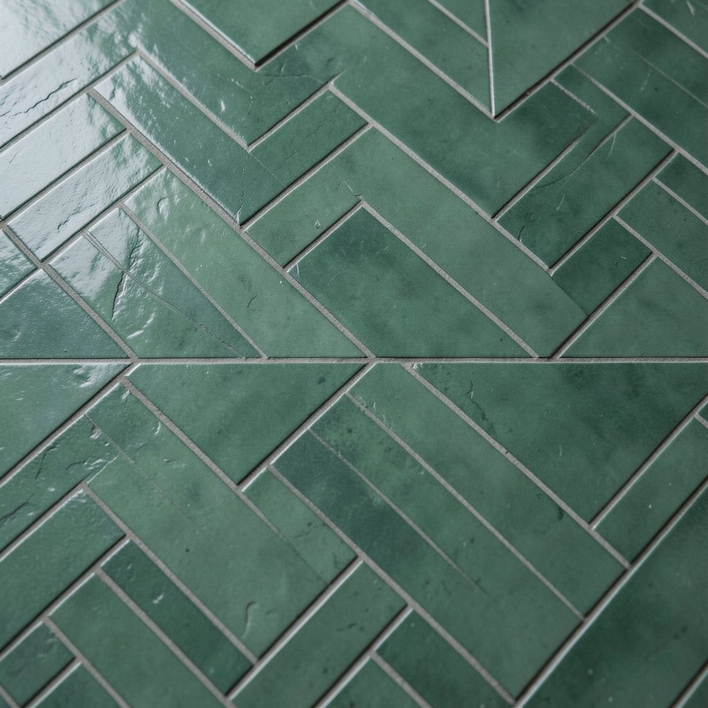
Because herringbone tiles create lots of lines, they visually soften minor unevenness in lighting and subfloor transitions. That doesn’t mean skipping proper installation, but it does help the finished look stay balanced.
Sage green also works like a forgiving background, especially when your home has natural wear and lived-in charm. A practical tip is to choose a tile with slight variation, because uniform surfaces can show dirt faster in certain lighting. For cleaning, use gentle pH-safe products and avoid harsh scrubs that can dull the finish over time.
If you’re worried about cost, focus on high-impact areas first, like a backsplash or a small bathroom floor section. You can keep the rest in neutral finishes and still get the mood you want.
8. Grout Color Creates the Whole Personality
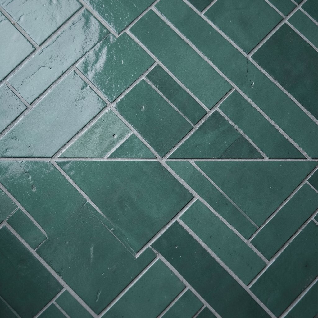
The same tile looks totally different depending on grout shade. A deep charcoal grout makes the herringbone shadows feel dramatic and moody, while a creamy grout makes the pattern feel softer and cleaner.
For best results, test grout colors on a small sample board and view it at different times of day. This small step prevents surprises and helps the tile match your cabinets, countertops, and wall paint. Personalize by echoing grout color in small details like window trim, curtain rods, or a cabinet pull finish.
9. Warm Accents That Make Sage Feel Rich
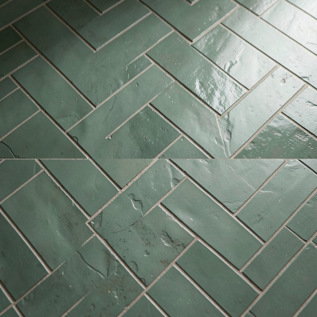
Sage green pairs beautifully with warm materials like honey oak, walnut, or creamy plaster walls. The result feels grounded and a little cinematic, especially in rooms with warm lighting bulbs.
To get an actionable look, add one warm element at a time, such as a wood tray, rattan baskets, or a linen curtain. The herringbone’s texture plays well with softer fabrics because it adds visual interest without being too busy. If you want to follow current trends, lean into natural textures and matte hardware for a cozy, modern mood.
Consider the cost of extras too, because small accessories can change the look without big spending. A few warm décor pieces can make the tile feel more expensive than it is.
10. Statement Entry Floors With Easy Practicality

An entry floor is one of the best places to use bold tiles because it sets the tone fast. Sage green herringbone makes the first impression feel calm and stylish, not overstated.
Because entryways face more dirt and mud, pick a tile that handles everyday cleaning. Choose a grout plan that won’t stain easily, and seal it if the tile needs sealing. For personalization, you can add a simple border using the same herringbone shade family so the floor feels finished and intentional.
11. Cozy Living Room Texture Underfoot
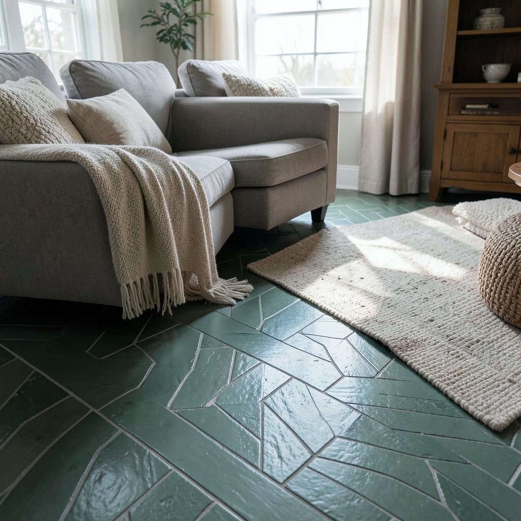
Using sage herringbone tile in a living space can be surprisingly cozy, especially when it’s paired with rugs. The diagonal pattern adds texture that looks soft even from across the room.
Consider practical setup like installing underlayment for comfort and using a large area rug to soften sound. The moody vibe comes from muted color and shadowy angles, and it feels extra warm when walls are painted in deep neutral tones. For personalization, choose a rug with subtle texture and keep furniture legs in warm metal tones.
When thinking about cost, remember that floor tile is an investment, so measure carefully and order extra to handle cuts and future repairs. Planning ahead can prevent budget surprises.
12. Shower Surrounds That Feel Like a Hidden Retreat
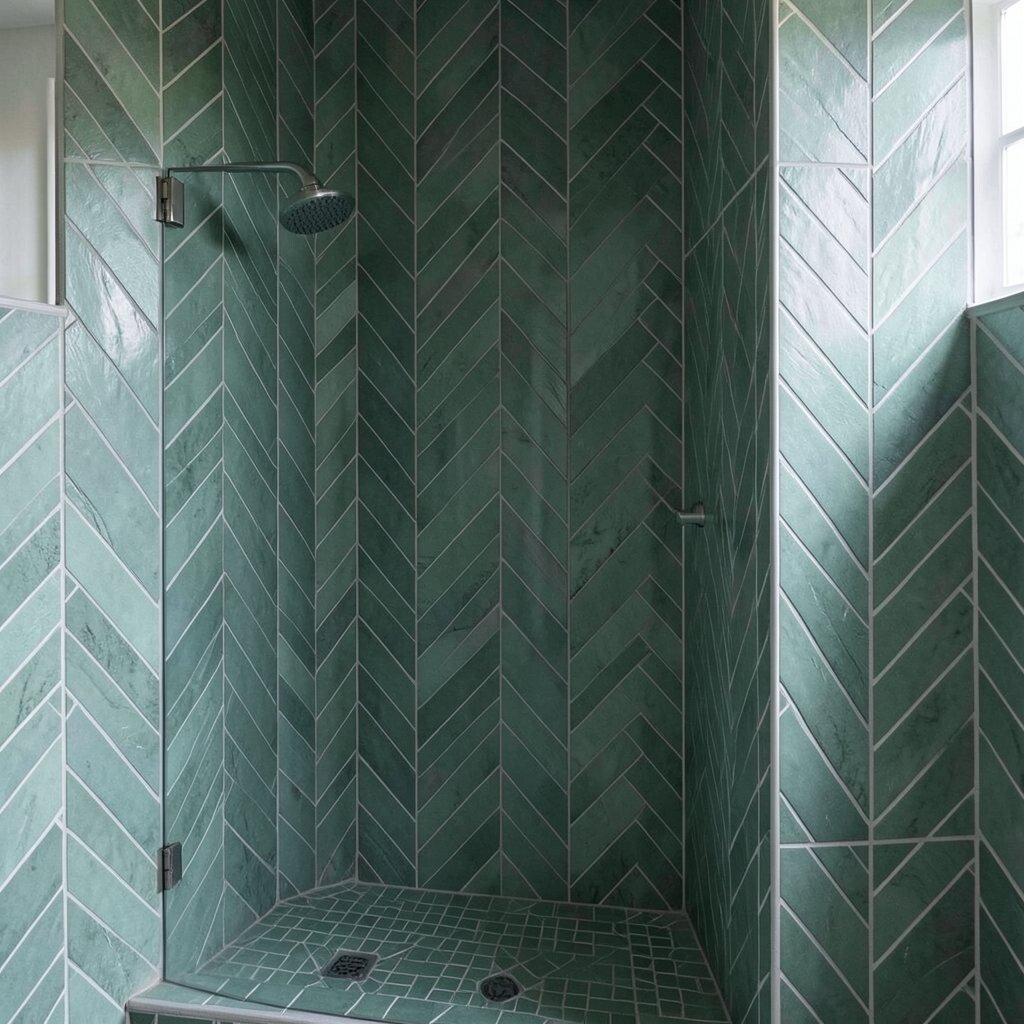
A sage herringbone shower surround can turn a regular bathroom into a calm retreat. The pattern creates a gentle, wave-like effect that feels relaxing when you stand under warm water.
To keep it practical, verify waterproofing requirements and choose appropriate backer systems. Use a tile setting method that supports wet-area safety and keeps grout protected. Personalize the vibe by adding a niche inside the shower and matching the tile direction to it for a tidy look.
13. Backsplashes With Depth Behind the Stove
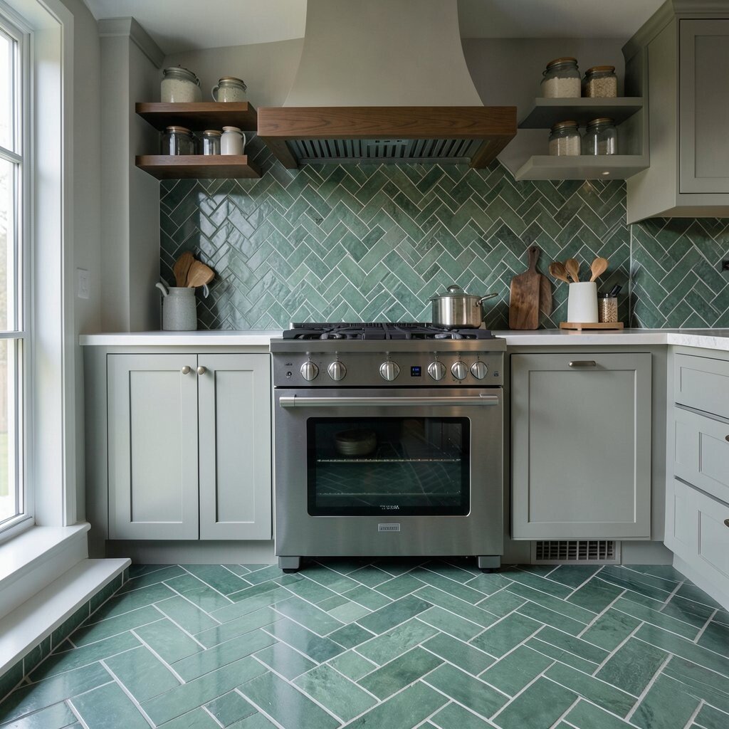
Behind the stove, tiles take on the job of looking good while dealing with real life. Sage green herringbone brings depth and quiet personality that feels better than plain squares.
The angled lines make the backsplash feel more dynamic, especially when steam and light hit it during cooking. For practical tips, use heat-safe installation methods and keep edges sealed where needed. Personalization can be as simple as choosing a slightly darker grout for sharper contrast with your counters.
If you’re working with a budget, consider using tile just behind the stove and sink instead of covering the full wall. That keeps the mood while controlling cost.
14. Fireplace Surrounds With Soft Drama
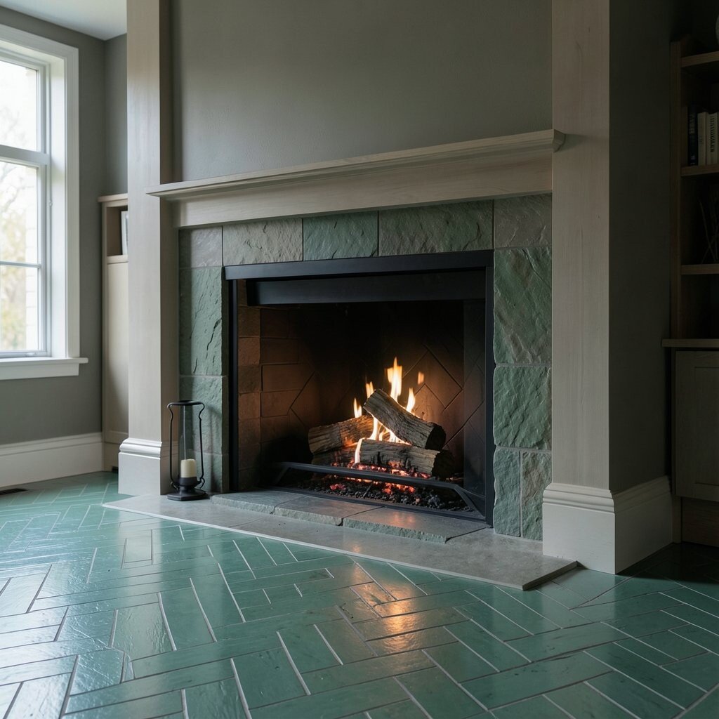
A fireplace is a natural place for herringbone because it gives the surface movement without needing extra décor. Sage green tiles bring a moody, calm atmosphere that still feels elegant when the fire is on.
For practical planning, check how the tile will handle heat exposure and choose a suitable installation. Keep grout color in sync with the rest of your room so the fireplace doesn’t feel disconnected. Personalize by placing a few matching accessories, like a ceramic vase or a woven basket, in the same warm tones that pair with sage.
15. Utility Rooms That Don’t Look Like Utility Rooms
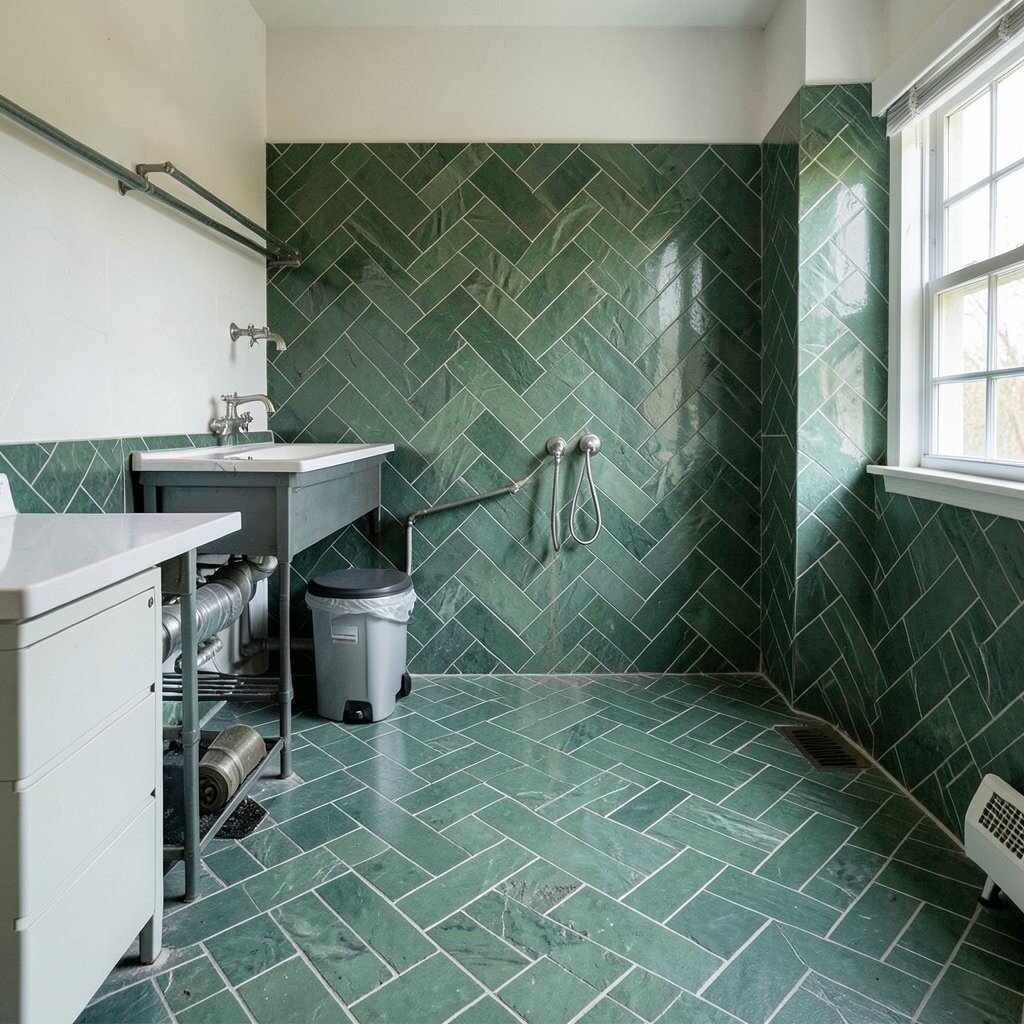
Laundry rooms can look tired, but sage herringbone tiles can make them feel intentional. The pattern adds a styled finish that makes routine tasks feel less gloomy.
Choose tiles that resist moisture and are easy to clean, since laundry rooms see water, detergent, and frequent wiping. If you want to save money, use the tile where it counts most, like the backsplash behind folding space or on the floor in the walking zone. Pair it with durable paint and simple storage so the whole room stays organized and calm.
16. Subtle Luxury With Larger-Scale Herringbone
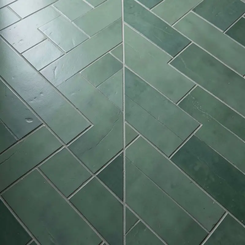
Larger herringbone pieces can read more luxurious, especially when the tone is muted and smooth. Sage green in a bigger format has a calmer look and fewer grout lines, which can feel more upscale.
Even with larger tiles, you still get the pattern’s visual interest, so the room feels designed rather than busy. For personalization, adjust the layout so the herringbone aligns with cabinet doors or a central line on the wall. If you’re balancing cost, larger tiles can reduce the amount of labor time, but you’ll want to confirm availability and matching trim pieces.
17. Small Rooms That Feel Bigger and Deeper
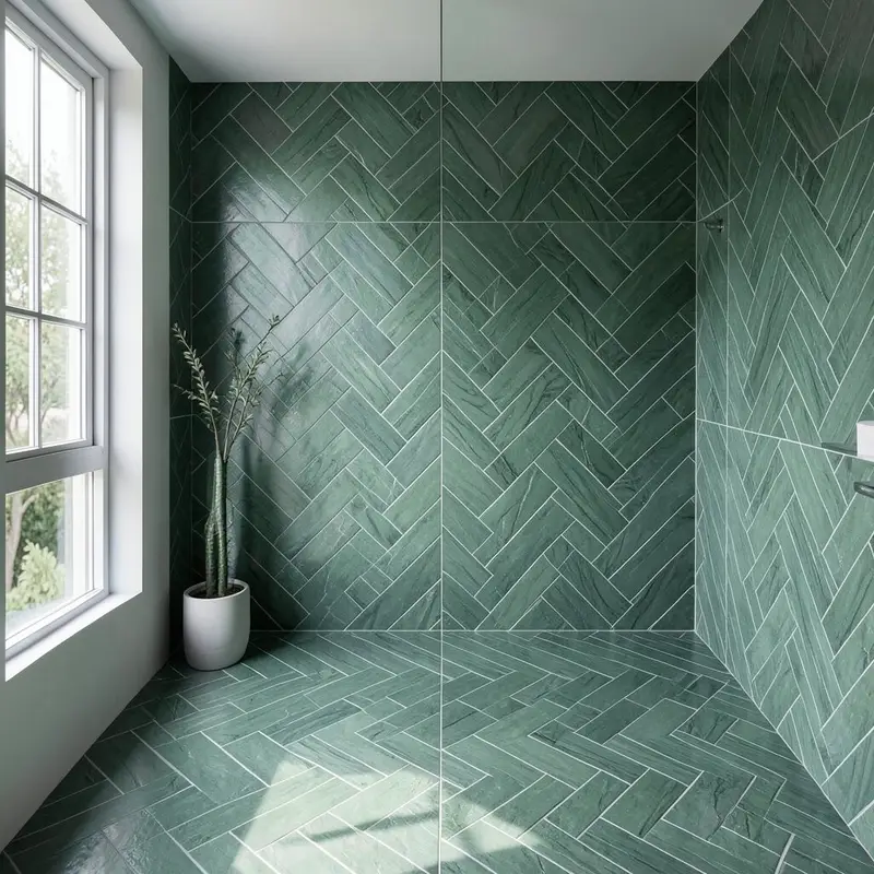
When you use sage green herringbone in a small room, the diagonal lines can create depth. That depth helps the space feel larger, especially when paired with light walls and warm lighting.
For best results, keep the rest of the palette simple and let the tile do the talking. Choose grout that supports the color scheme, because the contrast level affects how the room “breathes.” Personalize with mirrors in warm metal frames to bounce light across the textured pattern.
18. Outdoor-Feeling Patina With Indoor Comfort
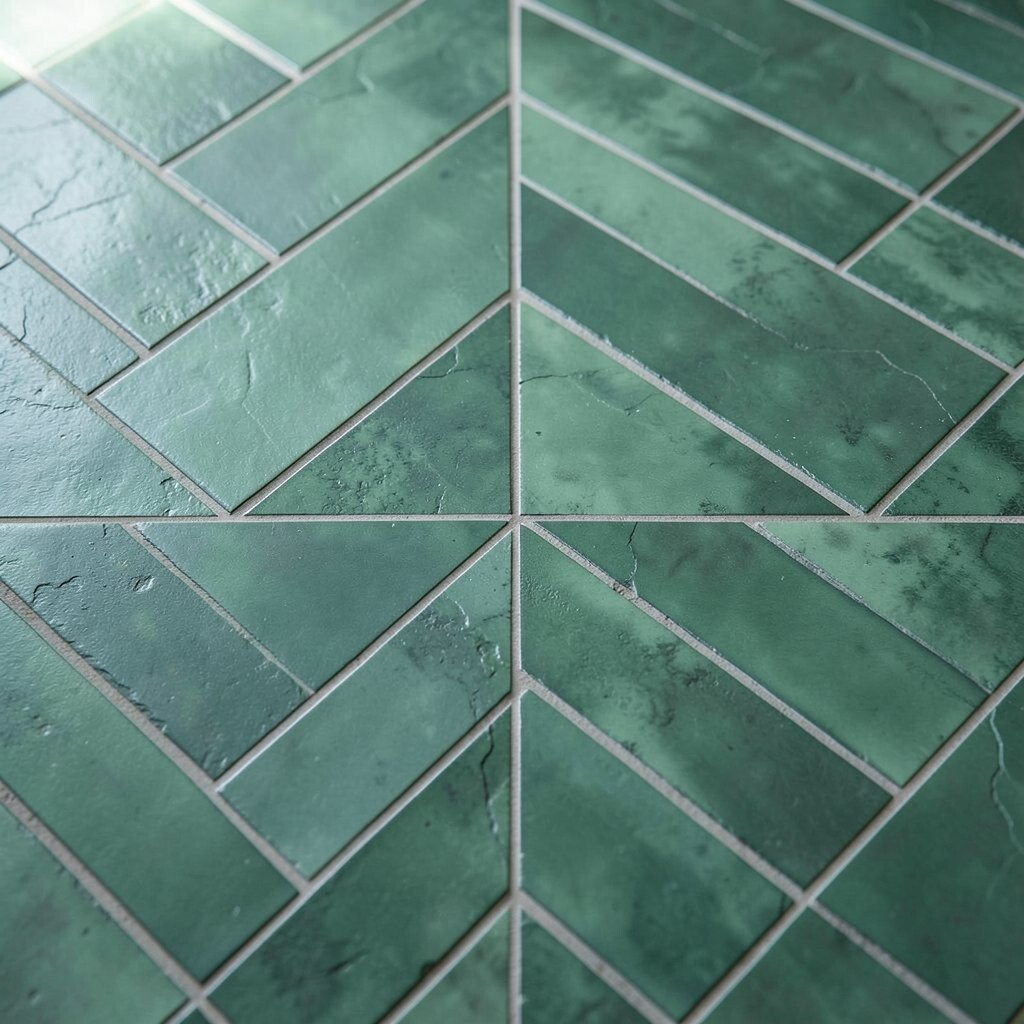
Sage green tiles can bring an outdoor calm into your indoor rooms. The herringbone texture adds a natural, handcrafted vibe that feels good in modern homes and cottage spaces alike.
If you like that earthy mood, pair the tiles with indoor plants, textured linen, and natural stone countertops. Practical tip: make sure your selection fits the room’s humidity and cleaning needs, since “outdoor vibe” should still mean “easy care.” To budget smartly, use the sage herringbone in one hero zone and keep adjacent areas in a neutral tile that’s lower cost.
You can also personalize by choosing accessories in clay, olive, or soft gold tones that echo the tile’s palette.
19. Pair Sage With Earthy Neutrals for a Cohesive Mood

Sage green herringbone looks best when it has supportive neighbors, like taupe walls or warm beige floors. Earthy neutrals let the tile’s mood show up without making the room feel chaotic.
For practical cohesion, match undertones across surfaces so nothing looks too cool or too warm. Think about how your countertops, cabinet fronts, and even your light bulbs lean in temperature. Personalize with textiles that add softness, such as olive throws or oatmeal curtains, and keep hardware in brushed finishes for a current, understated look.
20. Create a Border to Make the Design Feel Intentional

A border can make herringbone tile feel like a custom design instead of a simple installation. Sage green works wonderfully for borders because it adds color while still staying muted and moody.
To keep it practical, use the border where it frames a visual focal point, like around a vanity or along a hallway edge. Consider a slightly different tile size or trim profile to define the border clearly. Personalization is easy here, too, since you can vary the border width to match your room proportions and budget constraints.
If you’re concerned about cost, borders are often a more budget-friendly way to add style than tiling every inch. You’ll get the high-impact look with less material and fewer cuts across large areas.
21. Designing Your Own Mood With Layout Choices

The layout is where you can truly make the tile your own, even if you pick the same sage herringbone as someone else. Staggering rows, centering the pattern, or aligning it with architectural lines can all change how the room feels.
Try placing herringbone where you want the eye to move, like across a hearth, around a mirror, or leading toward a window. For practical tips, plan for grout spacing and edge finishes so corners look clean and intentional. Personalization can also include choosing accent pieces, like a narrow listello strip in a matching tone, to add a subtle highlight that feels modern and calm.
As for current trends, people are leaning toward quiet contrast, matte textures, and nature-inspired palettes, and sage herringbone fits right in. Keep an eye on total project cost by calculating material, thinset, grout, trim, and labor, then prioritizing the most visible surfaces first.