Kitchen color can change the whole mood of a home. The right shade can make the space feel calm, lively, warm, or bold.
1. Soft White
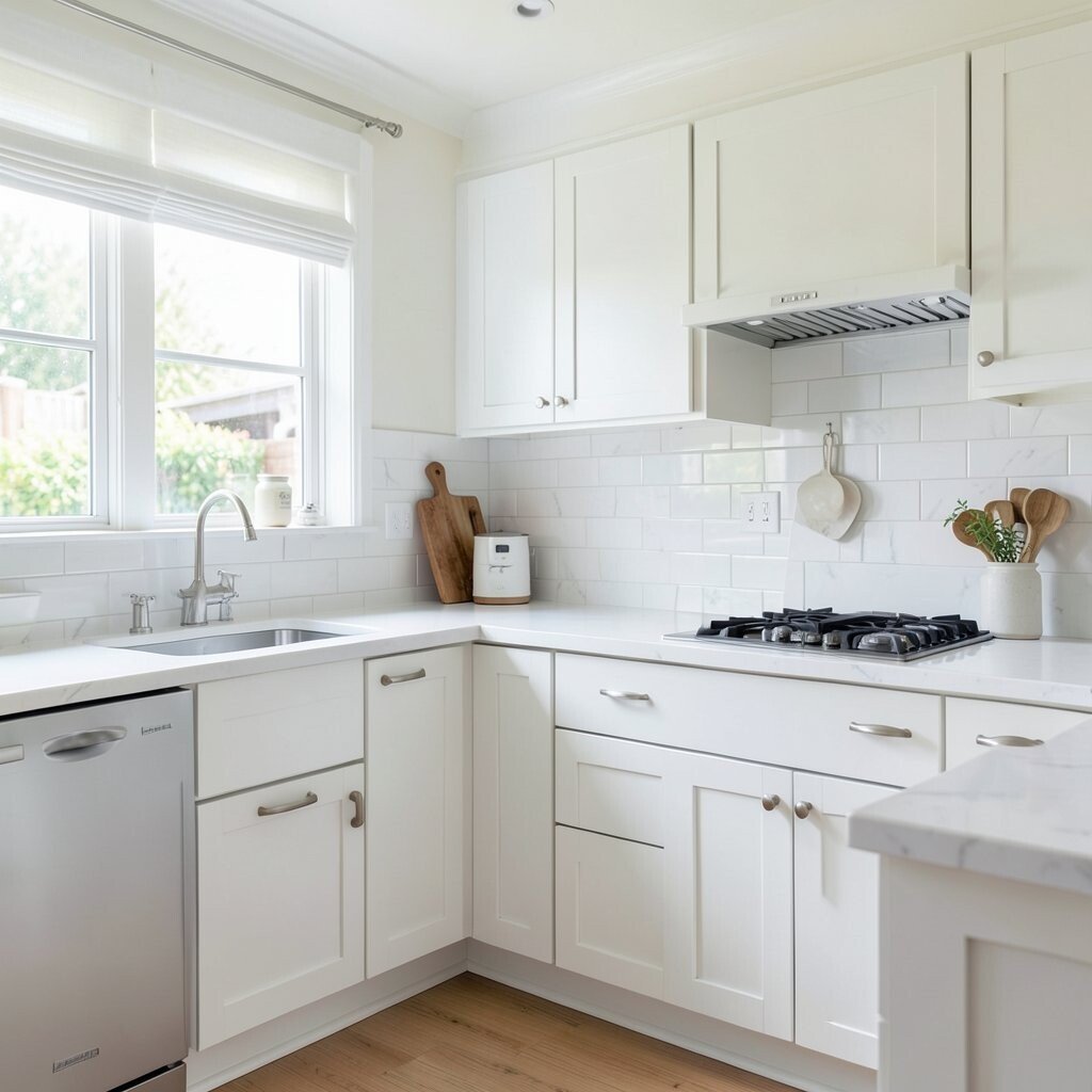
Soft white gives a kitchen a clean and bright look that feels fresh the moment you walk in. It reflects light well, so even a small room can seem bigger and calmer.
This color works nicely with wood, black accents, brass pulls, or simple tile, which makes it easy to style in many homes. It is also a smart choice if you want a look that stays appealing for years without needing a big redo, and paint in this family is often one of the most budget-friendly updates.
2. Warm Beige
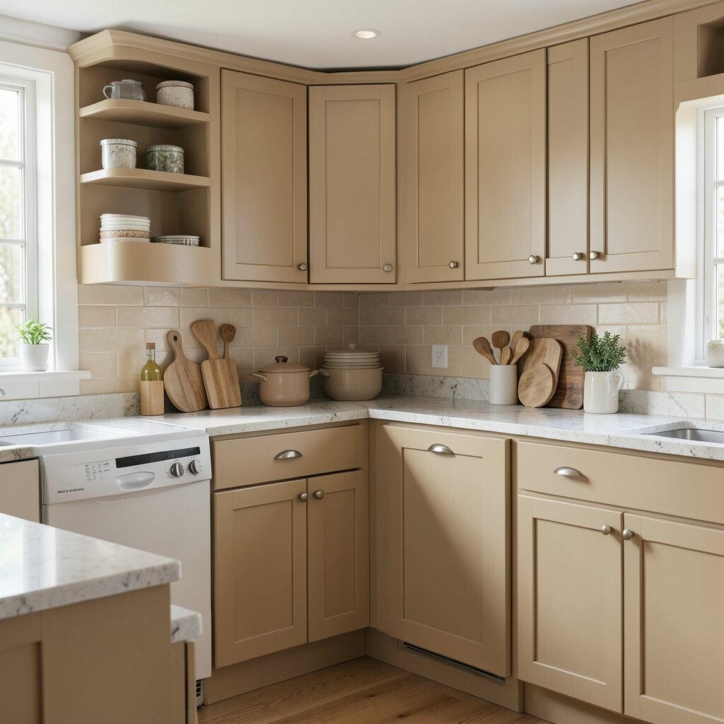
Warm beige brings a gentle, cozy feel that makes a kitchen feel lived in and welcoming. It has a soft sandy look that pairs well with both classic and modern cabinets.
Many people like beige because it hides small marks better than pure white and still keeps the room light. If you want a personal touch, try matching it with woven stools, cream dishes, or natural wood shelves, and you can keep the cost low by painting only the walls or one cabinet area.
Beige is also making a quiet comeback in homes that want a softer, earthier style. It gives a peaceful backdrop for busy mornings and family meals.
3. Pale Gray
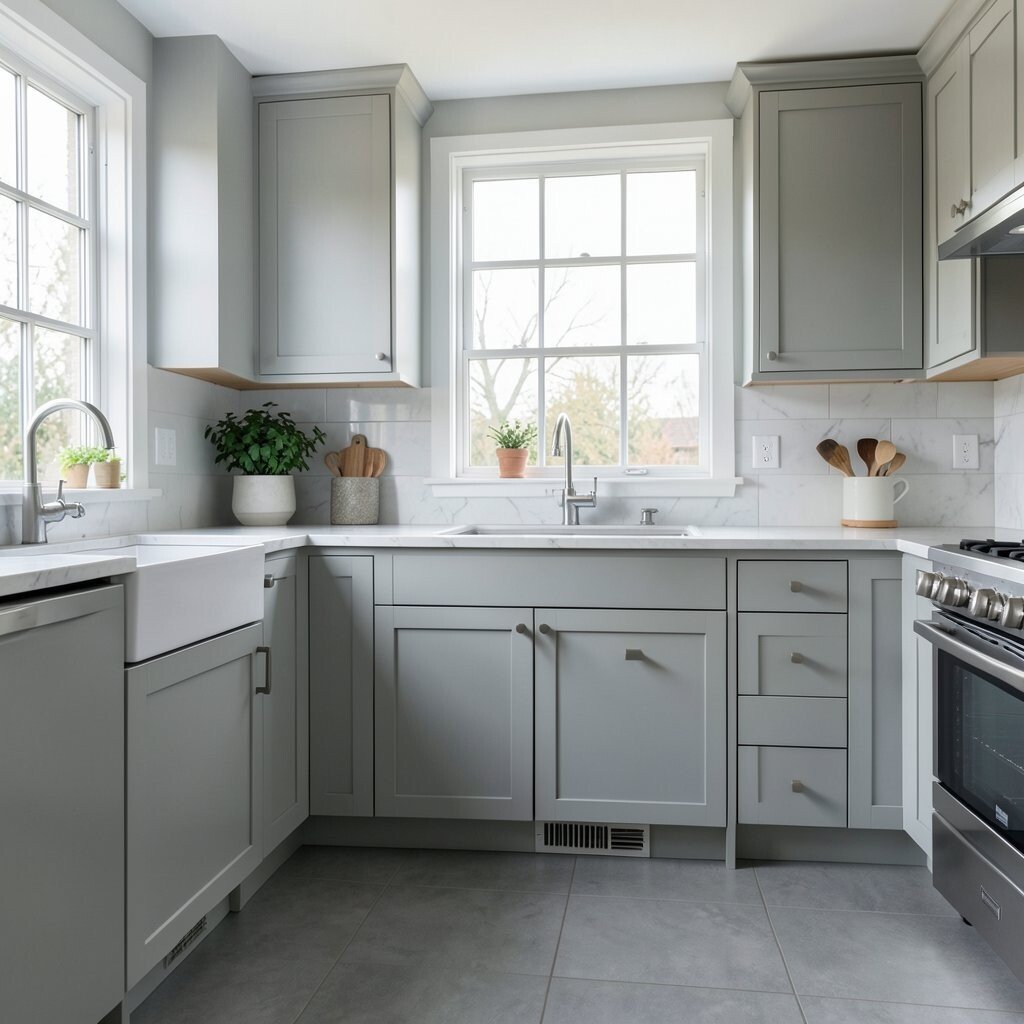
Pale gray adds a cool, tidy look that feels neat without being harsh. It can make stainless steel shine and helps a kitchen feel more polished.
This shade is a good pick if you want something that feels modern but not too strong. It works well with white counters, darker floors, and simple open shelves, and it can be a low-cost way to give old cabinets a new life with just a few cans of paint.
You can make pale gray feel softer with warm lighting or more playful with colorful dishes. In today’s homes, it is often used with matte finishes for a smooth and calm look.
4. Sage Green
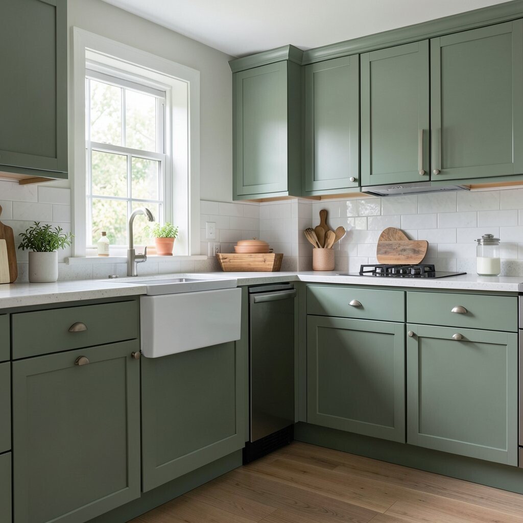
Sage green brings a gentle garden feel that can make a kitchen seem restful and alive at the same time. Its soft color can look beautiful in daylight and feel calming at night.
This shade is unique because it sits between green and gray, so it feels fresh without shouting for attention. Pair it with cream counters, rattan details, or brushed gold hardware, and if you are keeping an eye on spending, even a small sage painted island can change the whole room.
5. Olive Green
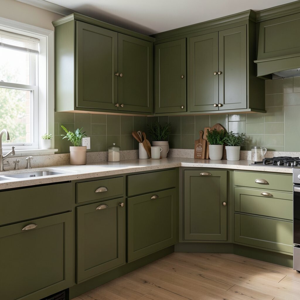
Olive green gives a kitchen a rich and earthy mood that feels grounded and strong. It has more depth than lighter greens, so it adds character right away.
This color is a favorite for people who want warmth with a little drama, and it looks lovely with walnut wood or black fixtures. A good way to personalize it is with handmade pottery or plants, while still keeping costs sensible by using olive on just one wall or cabinet bank.
Olive also fits the current move toward natural, cozy kitchens that feel connected to the outdoors. It can make the room feel special without needing lots of extra decor.
6. Navy Blue

Navy blue makes a kitchen feel bold, neat, and a little fancy. It creates a strong visual line that works well on cabinets, islands, or even a pantry wall.
The deep color helps white trim and light counters stand out, which gives the room a crisp look. If you want a personal style, add leather pulls, shiny metal, or pale stools, and remember that navy paint can be a fairly affordable way to make plain cabinets feel custom.
This shade is still popular because it balances classic style with a modern edge. It works well for busy homes that want a kitchen with real presence.
7. Powder Blue
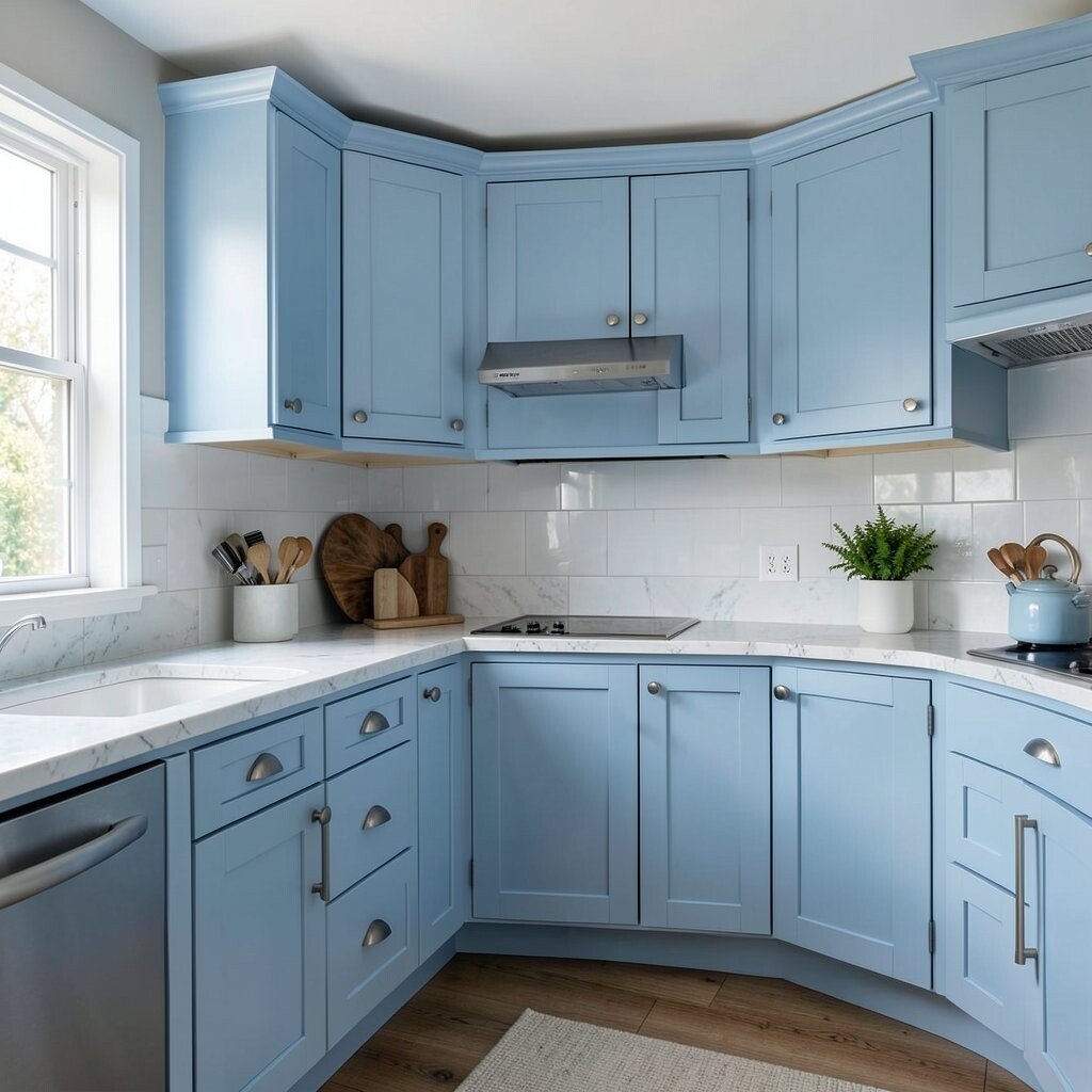
Powder blue brings a soft, airy mood that feels sweet and cheerful. It can make a kitchen look bright and open, almost like a clear morning sky.
This color is especially nice if you want a lighter feel than navy but still want more personality than white. It pairs well with white beadboard, silver hardware, and light wood, and you can keep expenses modest by using it on a backsplash wall or lower cabinets.
Powder blue also gives you room to add your own style with vintage plates or sunny artwork. It is a pretty choice for anyone who wants a kitchen that feels easy and friendly.
8. Mint Green
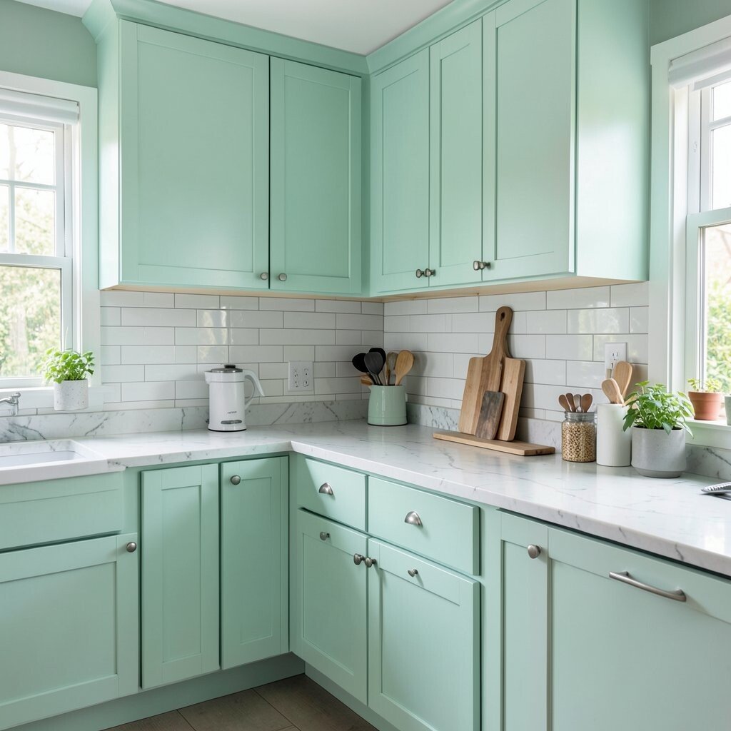
Mint green adds a crisp and cheerful touch that can make a kitchen feel playful. It has a fresh look that works well in sunny rooms and small spaces.
This shade stands out because it feels both retro and modern at once, which gives it a fun edge. Try mixing it with white counters, chrome pieces, or pale wood, and if you are watching the budget, a mint accent wall can give you a big style boost without a full remodel.
It is also a good choice for people who want something light but not plain. The color can soften a space and make everyday cooking feel a little more joyful.
9. Forest Green

Forest green gives a kitchen a deep, elegant look that feels rich and rooted. It can make the room seem cozy and strong, especially with warm lighting.
This shade works well in both old homes and newer ones because it feels timeless and bold at the same time. You can make it your own with copper pans, dark wood, or cream tile, and the cost stays reasonable if you use it on just one feature wall or a set of base cabinets.
Forest green is often chosen in homes that want a moody, layered look. It also hides wear well, which is a nice bonus in a busy kitchen.
10. Mustard Yellow
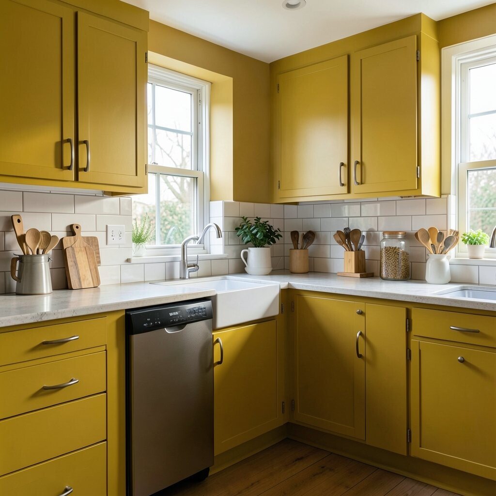
Mustard yellow brings warmth and energy that can wake up a kitchen fast. It feels sunny without looking too bright, which makes it easier to live with every day.
This color is a strong choice for people who want a room with personality and a little retro charm. It looks great with white tile, dark wood, or black accents, and if you want to keep spending low, even a painted breakfast nook can make a big difference.
Mustard yellow is also on trend in homes that love rich, earthy colors. It can make simple dishes, stools, and art feel more lively right away.
11. Soft Peach
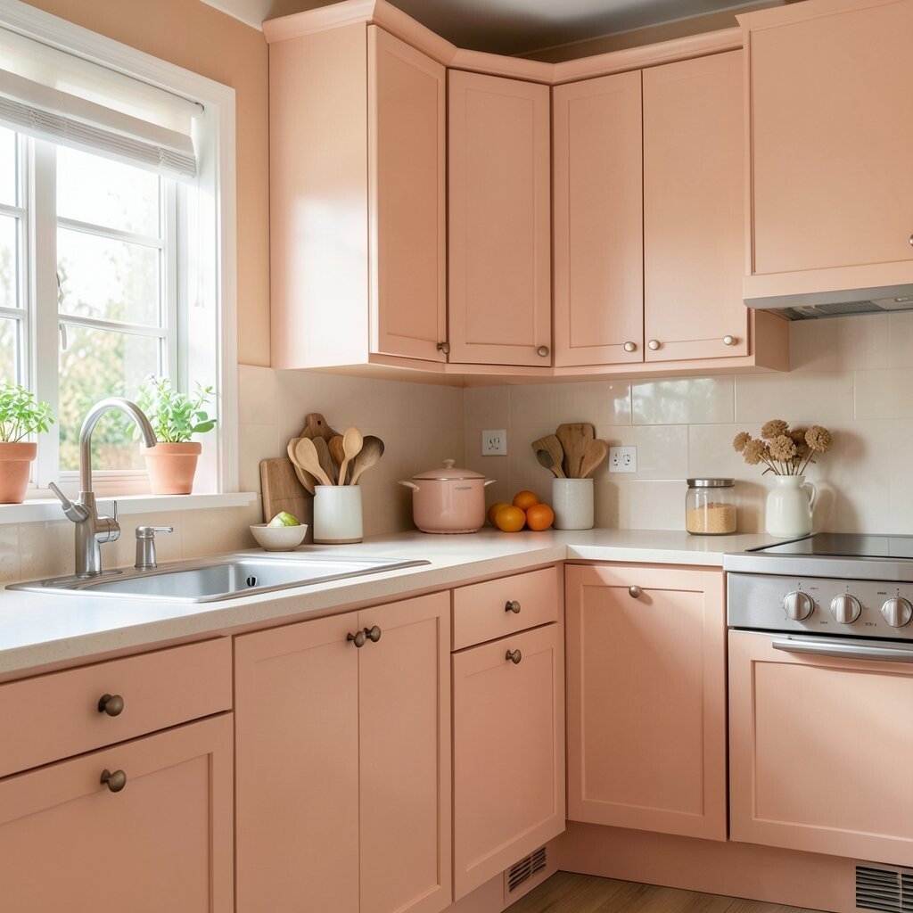
Soft peach gives a kitchen a warm glow that feels gentle and inviting. It can make the room seem friendly and bright without being loud.
This shade works well if you want a softer take on color that still brings charm. Pair it with cream cabinets, pale oak, or gold details, and personalize the look with warm-toned linens or fruit bowls, while keeping costs in check by painting only an accent wall or a small section of cabinets.
Soft peach is a pleasant choice for homes that want a cozy, happy mood. It also looks lovely in natural light, which makes the whole kitchen feel open.
12. Terracotta

Terracotta gives a kitchen a baked-clay look that feels warm, earthy, and full of character. It can make the room feel like a calm gathering place.
This color is unique because it brings in the feeling of sun, soil, and handmade pottery all at once. It pairs nicely with cream, sage, black, or natural wood, and the cost can stay practical if you use terracotta on a tile backsplash or a single painted island.
Many people like terracotta right now because it fits the move toward earthy home style. It adds depth without feeling too dark or heavy.
13. Charcoal Gray
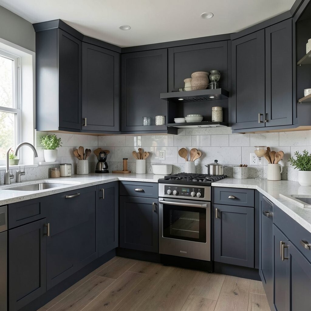
Charcoal gray gives a kitchen a strong and modern look that feels sleek and grounded. It can make lighter items pop and give the room a sharper outline.
This shade is useful if you want something dramatic that still feels easy to match with other colors. It looks good with marble, white walls, or warm wood, and it can be a smart spending choice because a little charcoal on cabinets or an island can feel high end without a full renovation.
You can soften it with soft textiles or brighten it with shiny fixtures. It is a favorite for people who want style that feels serious but still comfortable.
14. Black
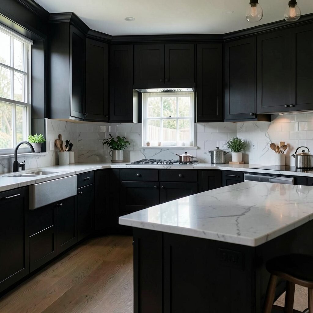
Black brings instant drama and a very polished feel to a kitchen. It can make the room look sleek, modern, and bold in a way few other colors can.
This color is unique because it works like a frame, helping other parts of the kitchen stand out more clearly. Use it on lower cabinets, hardware, or a single wall if you want a strong look, and remember that dark paint may show dust more, so simple cleaning is part of the plan, while the cost can stay manageable if you use it with care instead of covering every surface.
Black is a current favorite in stylish homes that want contrast and depth. It feels especially nice when paired with wood, brass, or bright white counters.
15. Teal
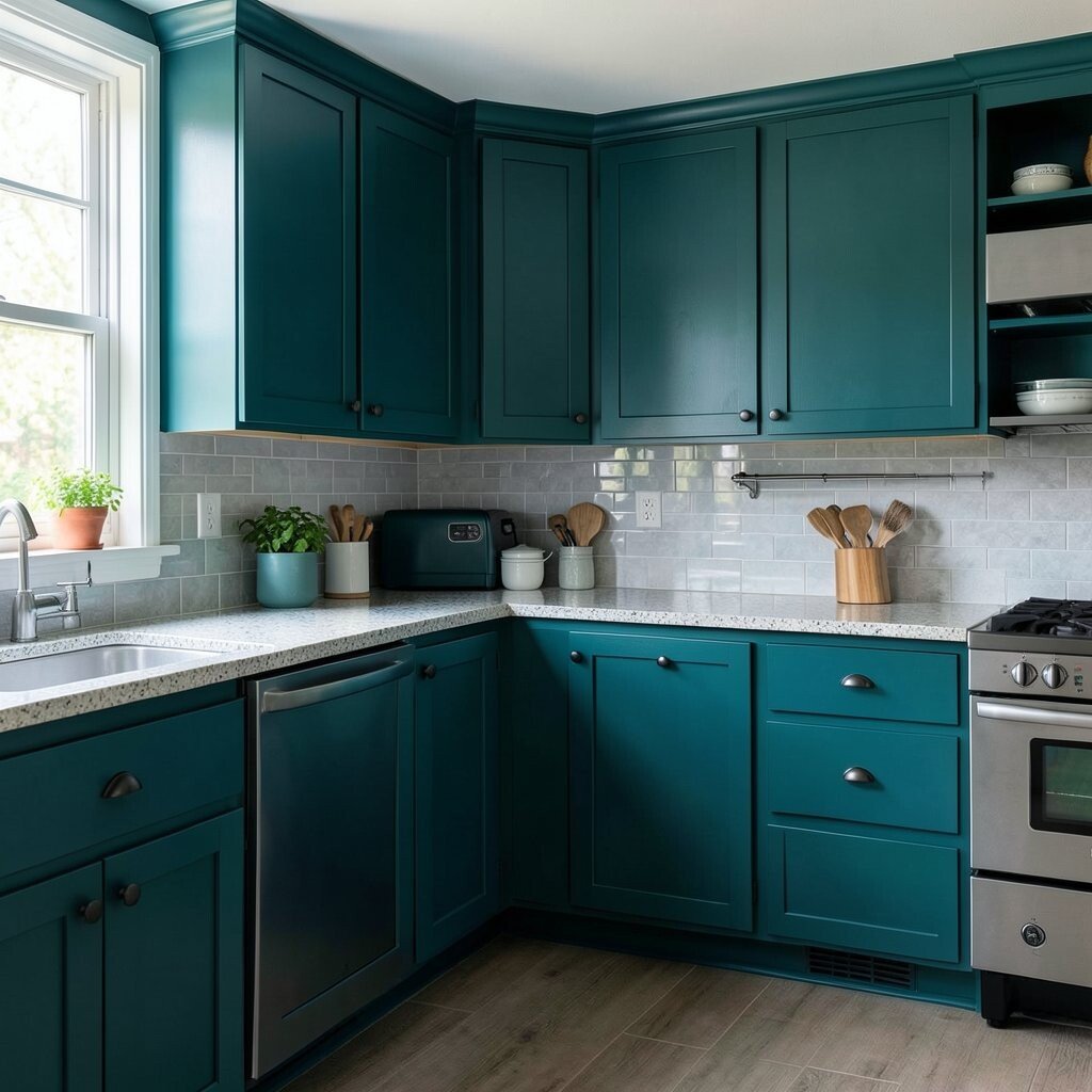
Teal gives a kitchen a rich mix of blue and green that feels lively and deep. It can make the space feel colorful without becoming too sweet or too plain.
This shade is great for anyone who wants a room with personality and a little surprise. It pairs well with white shelves, warm metal, or patterned tile, and you can personalize it with art, rugs, or dishes that repeat one of the tones in the paint, while keeping the update affordable by using teal on a single standout feature.
Teal also fits well with today’s love of jewel tones. It brings energy to the room and can make everyday tasks feel a little more fun.
16. Plum
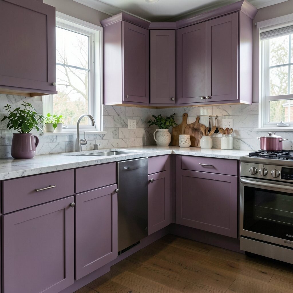
Plum adds a deep, rich color that feels cozy and a bit dreamy. It can make a kitchen seem special and inviting, especially in the evening.
This color stands out because it has a soft red base that gives it warmth, yet it still feels dark and elegant. Try it with cream cabinets, gold details, or dark wood, and if you want to save money, use plum on bar stools, a pantry door, or one accent wall instead of the whole room.
Plum is a lovely choice for people who want something less common than blue or green. It gives the kitchen a dressed-up feel without needing a lot of extras.
17. Coral
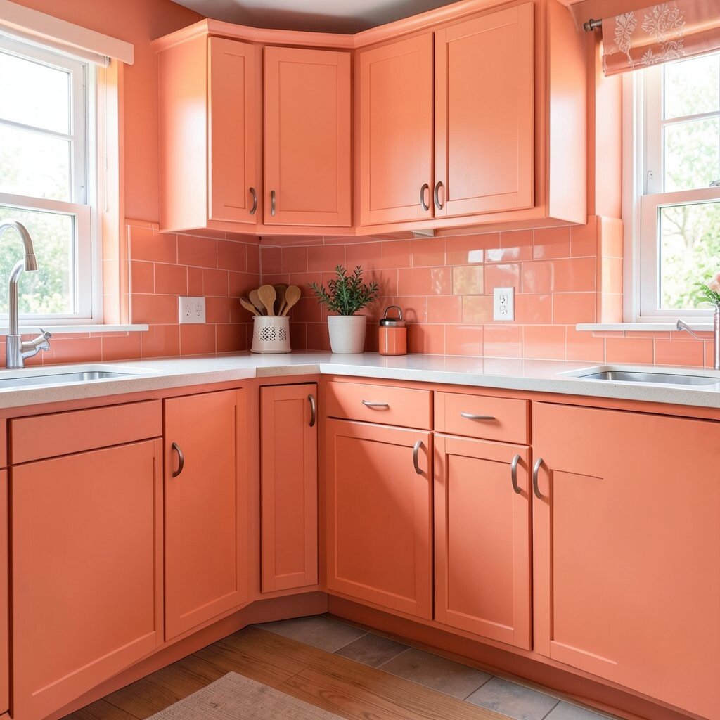
Coral brings a happy, lively glow that can make a kitchen feel bright and welcoming. It sits between pink and orange, so it feels warm and cheerful at the same time.
This shade is a good fit if you want a kitchen with a sunny mood and a bit of flair. It pairs nicely with white trim, pale wood, and simple metal finishes, and you can keep the look budget-friendly by using coral for chairs, open shelves, or just the inside of glass cabinets.
Coral is also a fun way to make a small kitchen feel more alive. It can lift the mood of the whole home with very little effort.
18. Dusty Rose
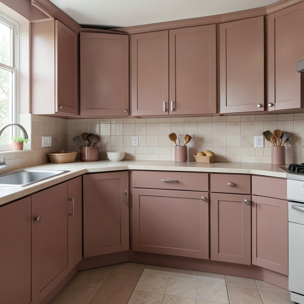
Dusty rose gives a kitchen a soft, romantic feel that is gentle instead of sweet. It brings warmth and color in a calm, easy way.
This shade is unique because it feels both old-fashioned and modern, which makes it work in many homes. Pair it with cream, taupe, brass, or pale wood, and if you want to add your own touch, bring in linen curtains or pretty jars, while keeping the price down by painting just a small section or an island.
Dusty rose is a quiet trend in homes that want softer color choices. It can make a kitchen feel special without stealing attention from the rest of the house.
19. Deep Red
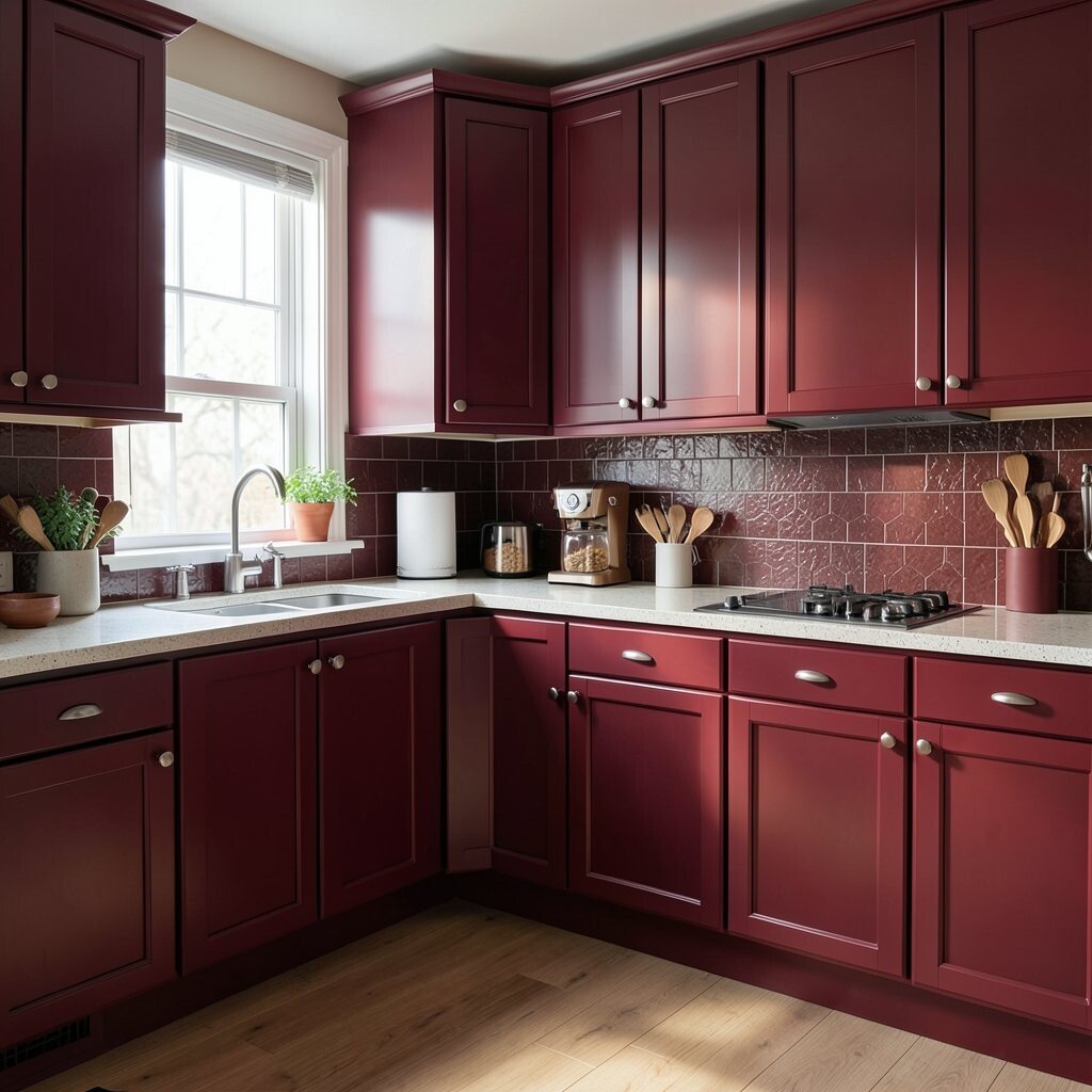
Deep red gives a kitchen a rich, warm, and lively feel that can make the space seem full of life. It has a classic charm that feels strong and welcoming at the same time.
This color works beautifully with dark wood, cream tile, or black accents, and it can give plain cabinets a more custom look. If you want to keep it practical, use deep red on a pantry wall, a small island, or lower cabinets, since that can lower cost while still creating a bold effect, and it is a great choice for homeowners who want a kitchen that feels memorable and full of heart.
Deep red also suits the current love for rich, cozy interiors. It gives a room warmth that feels perfect for cooking, chatting, and gathering.