Something a little over-the-top can make your everyday visuals feel unforgettable. Kitsch style turns “too much” into a personal signature.
If you’ve been craving color, charm, and a wink to the viewer, you’re in the right mood. Let these ideas give you a playful direction without taking away your comfort.
1. Jelly-Color Collage Layers
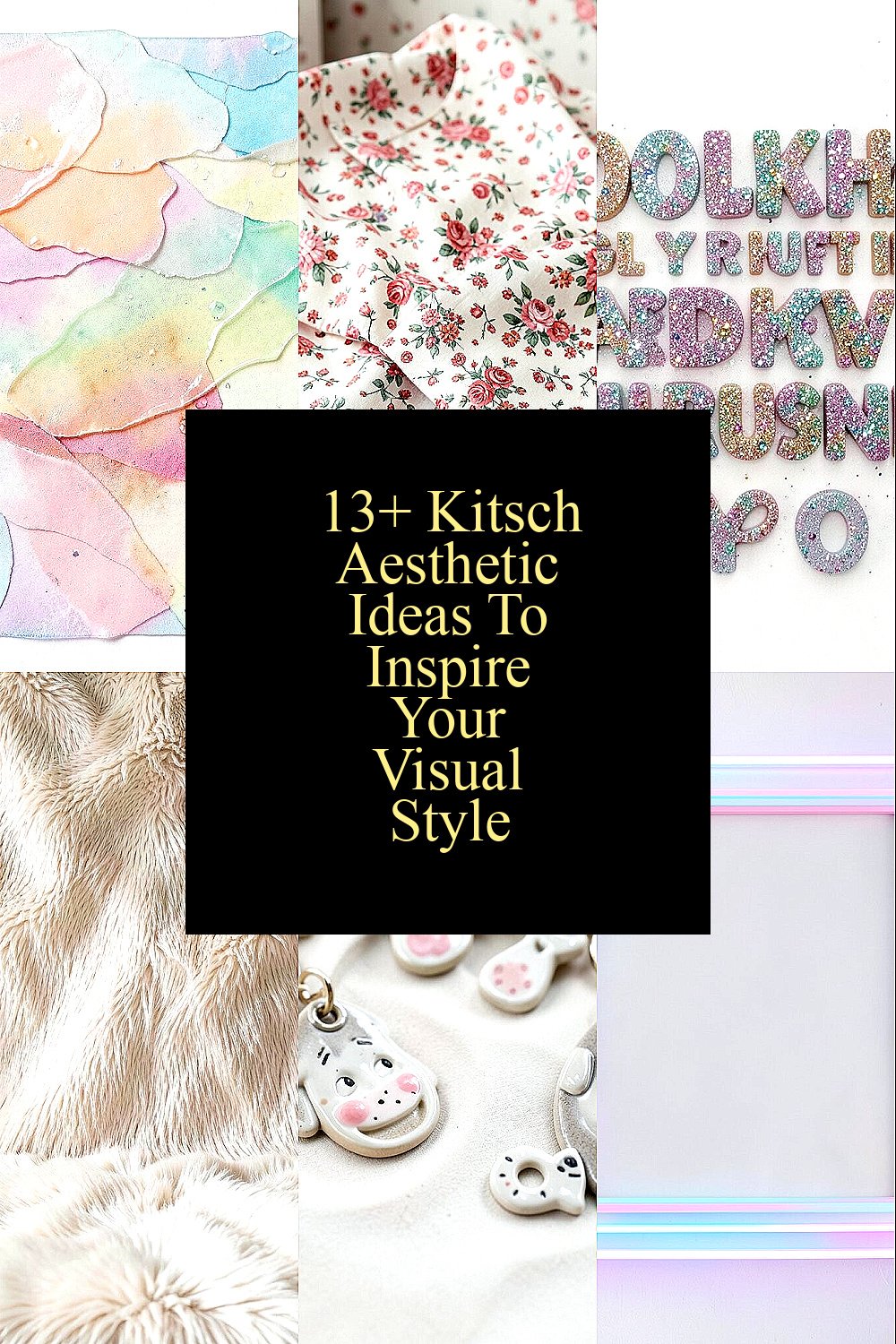
Start with a messy, candy-like collage that feels juicy and bright. Layer cut paper shapes, translucent acetate, and printed stickers until the page looks alive.
Go for big color blocks, shiny highlights, and little “mistakes” that make it feel human. The benefit is instant personality, because your work won’t look like anyone else’s clean template.
To keep it practical, scan your textures or use phone photos of wrappers, packaging, and painted walls. Trim everything with care, then let a few pieces overlap beyond the edges for a bold, kitschy finish.
2. Grandma-Print Pattern Mixing
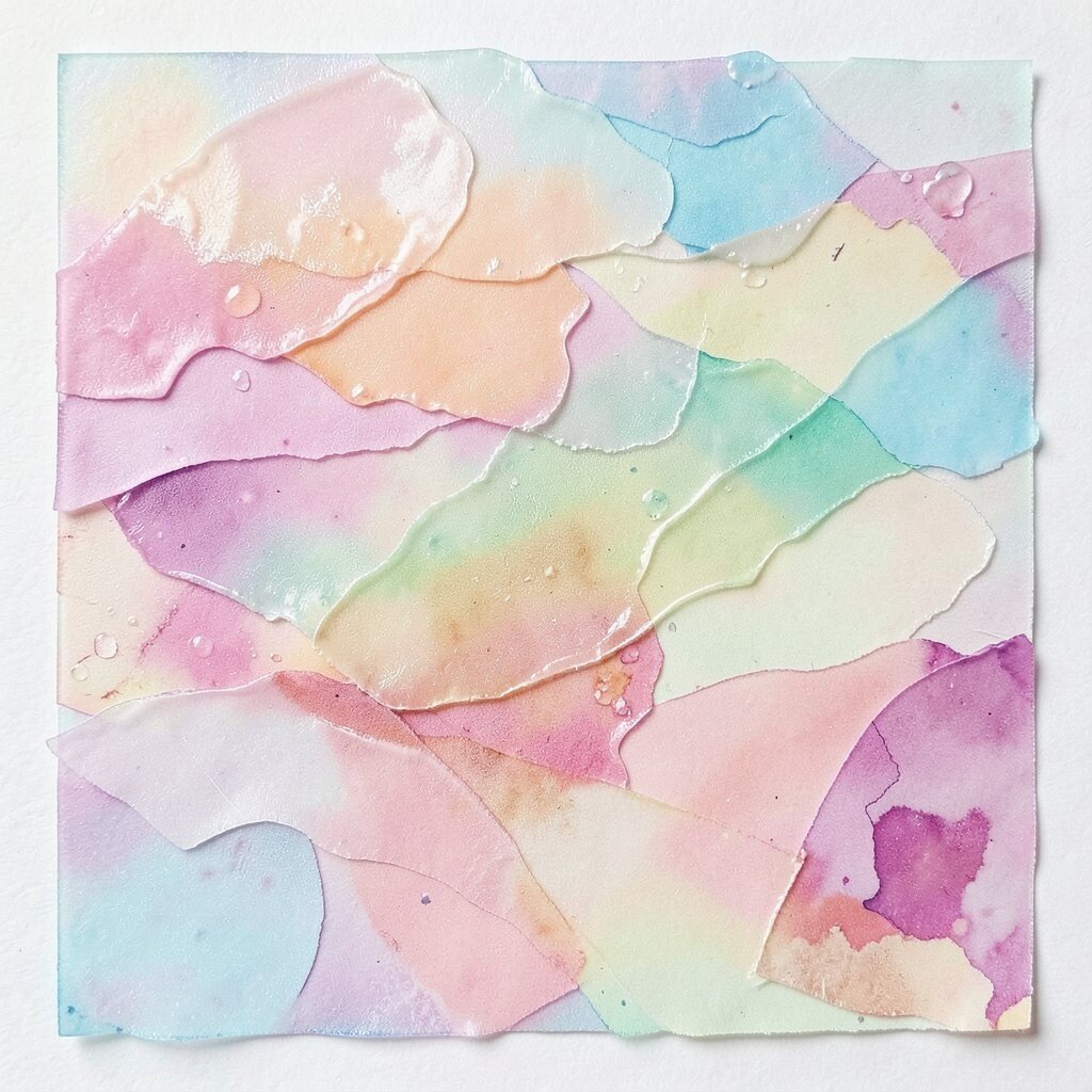
Mix classic patterns like florals, stripes, and tiny polka dots in the same outfit or layout. Think of curtains, tablecloths, and vintage fabric scraps, but make it feel modern.
Pair one loud print with two quieter ones so your eyes can breathe. This style is unique because it looks nostalgic, yet you get to steer the color story to match your vibe.
For personalization, use a single anchor color in every pattern, like teal or butter yellow. If you’re cost-conscious, thrift fabric, buy cheap remnant bundles, or print small repeat patterns on regular paper.
3. Glittery Typing and Loud Fonts
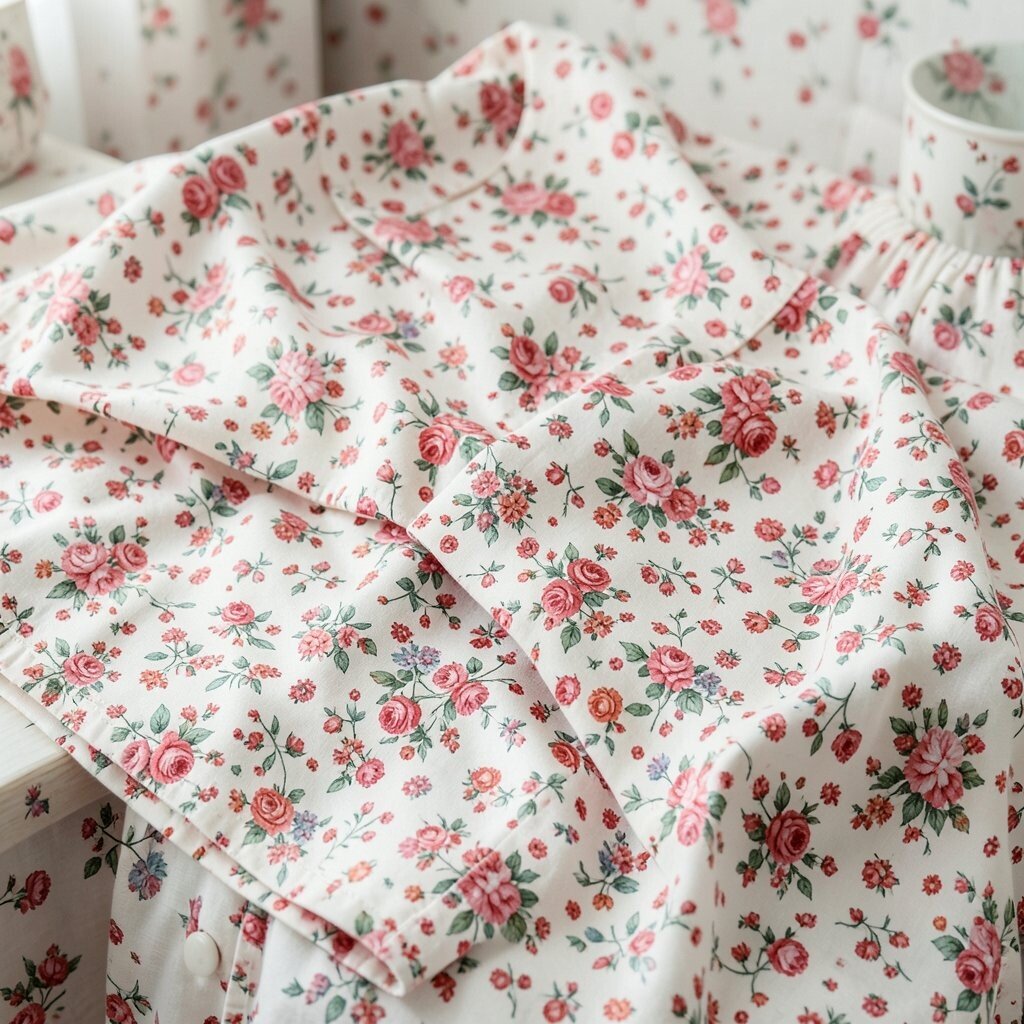
Use bold, playful typography like it’s speaking at a party. Add a glittery or bubbly effect to titles, captions, and posters, even if it’s just in one small area.
Try mixing different text moods, such as rounded letters for fun and condensed letters for attitude. The benefit is clarity with character, because readable type plus shine feels welcoming and energetic.
To keep it actionable, build a simple style set: two font families, one highlight color, and one repeating shape like stars. You can recreate the look with free font apps and photo editors, so it stays budget friendly.
When you want to match current trends, lean into short, punchy phrases and include hand-drawn scribbles next to the text. It still feels kitsch, but it also feels current.
4. Faux-Fur Texture Backdrops
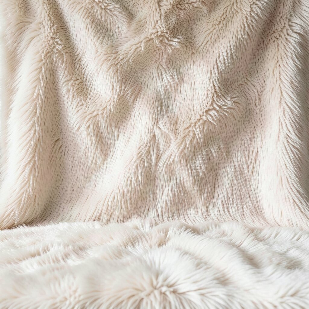
Place a faux-fur scarf, fuzzy blanket, or shaggy throw behind your photos for instant cozy drama. The texture makes even plain objects look like they belong in a glamorous scene.
Use it as a background for product shots, portraits, and flat-lay still lifes. You’ll get a clear benefit: your images instantly look richer and more tactile.
If you want practical setup tips, keep the background simple and only move one item at a time. Soft lighting helps, so try window light or a warm lamp to avoid harsh shadows.
For personalization, pick one “signature” fuzzy color, such as cream, rose, or deep teal, and reuse it across shoots. Cost stays low if you thrift gently used blankets or borrow textures from home.
5. Ceramic Charm Keychains and Props
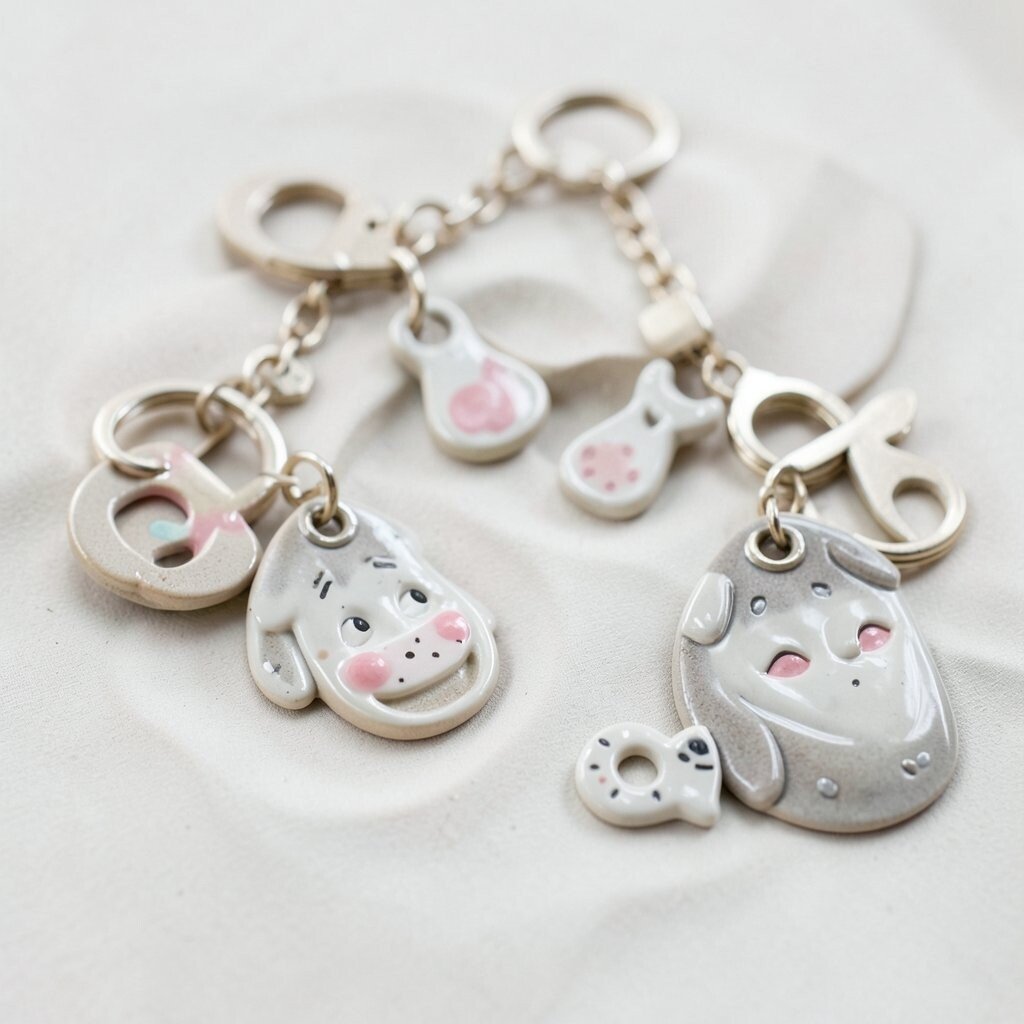
Carry tiny ceramic charms like mini animals, hearts, or whimsical faces, and let them appear in your photos. Attach them to bags, keys, or even a string across a desk.
These little props create a strong visual hook because they feel personal and slightly unexpected. The benefit is storytelling, since viewers can sense that you have real memories tied to the objects.
Keep it practical by choosing charms that are lightweight and easy to swap. If you like personalization, arrange charms in a “constellation” pattern on a key ring or pin them near your frame.
6. Neon Pastel Borders and Frame Tricks
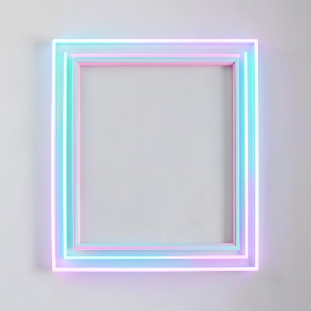
Add a thin neon border to posters, social graphics, and even phone wallpapers. Then soften it with a pastel glow so it feels fun, not harsh.
This approach is unique because it blends electric energy with dreamy sweetness. It also helps your layouts look finished, which is a real benefit when you’re posting quickly.
To make it doable, use a photo editor to add a stroke outline, then adjust brightness until it looks candy-coated. Cost considerations are easy here since most apps include border tools, and free versions usually cover the basics.
For personalization, choose one neon color that matches your wardrobe or a favorite lipstick shade. It becomes a consistent signature that keeps your style recognizable across seasons.
7. Retro Kitchen Product Still Life
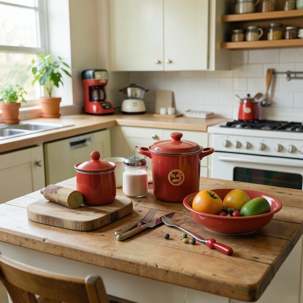
Arrange objects from your kitchen like you’re styling a vintage commercial. Think jars, cereal boxes, mismatched mugs, and shiny spoons on a bright countertop.
Choose one dominant color for the scene, then let the rest be playful and mismatched. The benefit is that your photos feel joyful and real, not staged in a cold way.
For practical tips, use a small tray or cutting board so everything stays organized. Add one kitschy element like a novelty salt shaker or a patterned napkin to tilt it toward charming chaos.
To match current trends, incorporate “honest lifestyle” styling, like showing real labels or leaving a little mess. That lived-in look is trending, and it supports the kitsch vibe beautifully.
8. Sticker Bomb Layouts on Everything
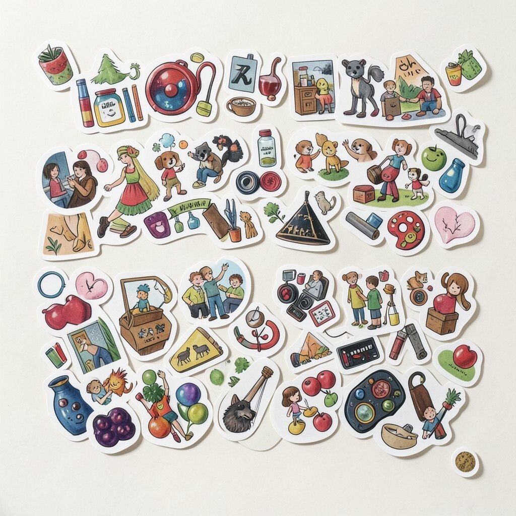
Cover a notebook, laptop, or photo binder with a sticker “storm” that includes cute logos, band icons, and random little characters. Don’t worry if it looks messy at first; kitsch is about joyful accumulation.
Use a few repeating shapes, like hearts or stars, so the chaos feels cohesive. The benefit is that your items become instant mood boards you can carry everywhere.
For personalization, include souvenirs from places you’ve visited and add one inside joke sticker that only you understand. If cost matters, trade stickers with friends, print your own simple icons, or use packaging labels as collage pieces.
Keep it actionable by planning your composition before you start. Start with the big stickers, then fill gaps with smaller ones until you hit a balanced, energetic density.
9. Cherub, Angel, and Soft Iconography
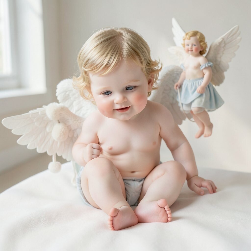
Add gentle iconography like cherubs, angels, religious-inspired halos, or soft clouds to your visuals. Even if you’re not into the religious meaning, the shapes are wonderfully kitschy and expressive.
Look for halo motifs on posters, prints, or jewelry, then place them around your photos like playful guardians. This style feels unique because it mixes tenderness with a bold, kitschy theatricality.
To make it practical, use digital overlays or print small halo images and tape them behind your subject. Consider cost by using free icon packs, vintage printables, or scanning cheap thrift finds.
Personalize the vibe by picking one emotion, like dreamy calm or mischievous sweetness, and matching the color palette to it. Pastel halos and warm skin tones can feel extra flattering in portraits.
10. Maximalist Color Curves in Art and Layouts
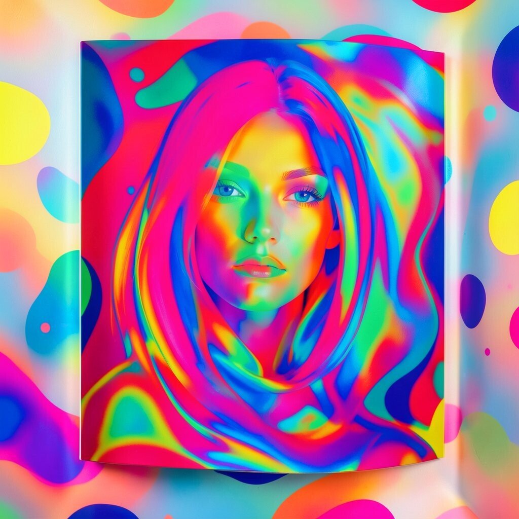
Create sweeping color curves that flow across a page, poster, or background. Think of candy swirls, sunset ribbons, and playful waves drawn with a steady hand.
Use bold colors but keep them in families so everything looks intentional. The benefit is that curves guide the eye, so your visuals feel energetic while still readable.
Practical tip: start with one thick curve that crosses the center, then add smaller curves around it. If you’re working with digital tools, try brush settings that mimic marker ink for a lively texture.
For personalization, echo your favorite accessories or nail colors inside the curves. Cost stays manageable because simple brushes and your existing color photos can do most of the work.
11. Dramatic Red Lip Pop and Paint Splashes
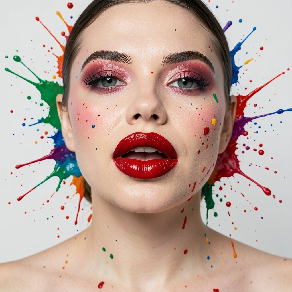
Use a single bold red element to punch up your whole visual story. It can be lipstick, a red balloon, a painted nail, or even a small red paint splash.
Then sprinkle a couple of smaller splatters in nearby colors like pink, coral, or cherry orange. This kitschy contrast is unique because it gives you a strong focal point without needing a complicated layout.
For practicality, keep the red item physically close to your subject so it looks naturally connected. Use matte textures for the main red and glossy accents for splashes to add depth.
If you want personalization, choose a red that matches your personality, from deep wine to bright tomato. Budget-wise, red paint, nail polish, or inexpensive craft markers are usually enough to build the effect.
Current trends also support bold focal colors, especially in “clean subject, messy background” styling. That balance makes kitsch feel stylish rather than cluttered.
12. Vintage Lamps and Warm Glow Photography
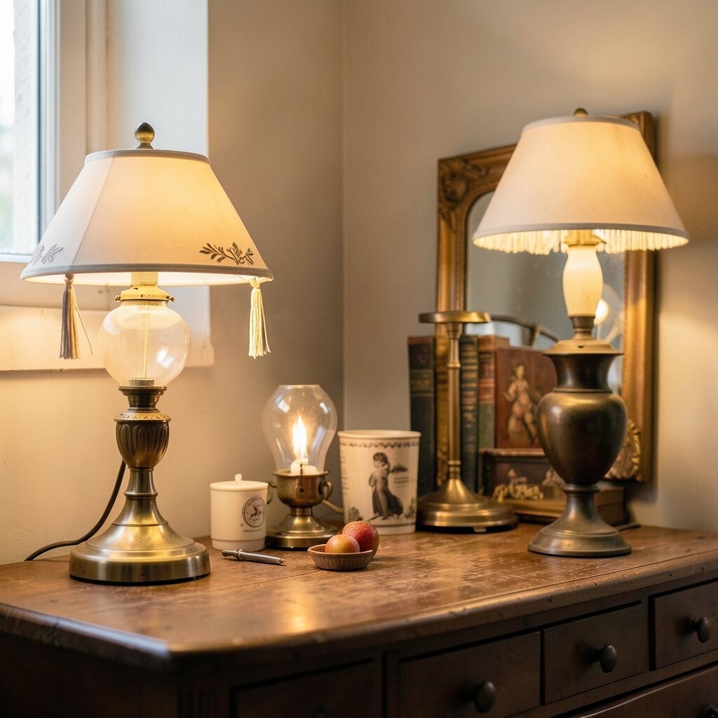
Photograph your scenes under a warm lamp so shadows feel soft and flattering. Use a vintage shade, a string light, or even a warm LED bulb to create that cozy glow.
The visual description is simple: highlights bloom, colors look richer, and everything feels a little theatrical. The benefit is mood on demand, which makes your photos feel like a mini set even when you’re at home.
Practical tips include placing the light slightly to one side and keeping your background close to the light source. That helps the glow wrap around your subject and reduces harsh contrast.
For personalization, reuse the same bulb color across your posts so your audience recognizes the atmosphere. If cost is a concern, swap bulbs first since they’re usually cheaper than buying new fixtures.
To match current trends, pair warm glow with simple compositions so the kitsch accents stand out clearly. Warm lighting is always in style, and it supports playful visuals well.
13. Nostalgic Postcards and “Found” Ephemera
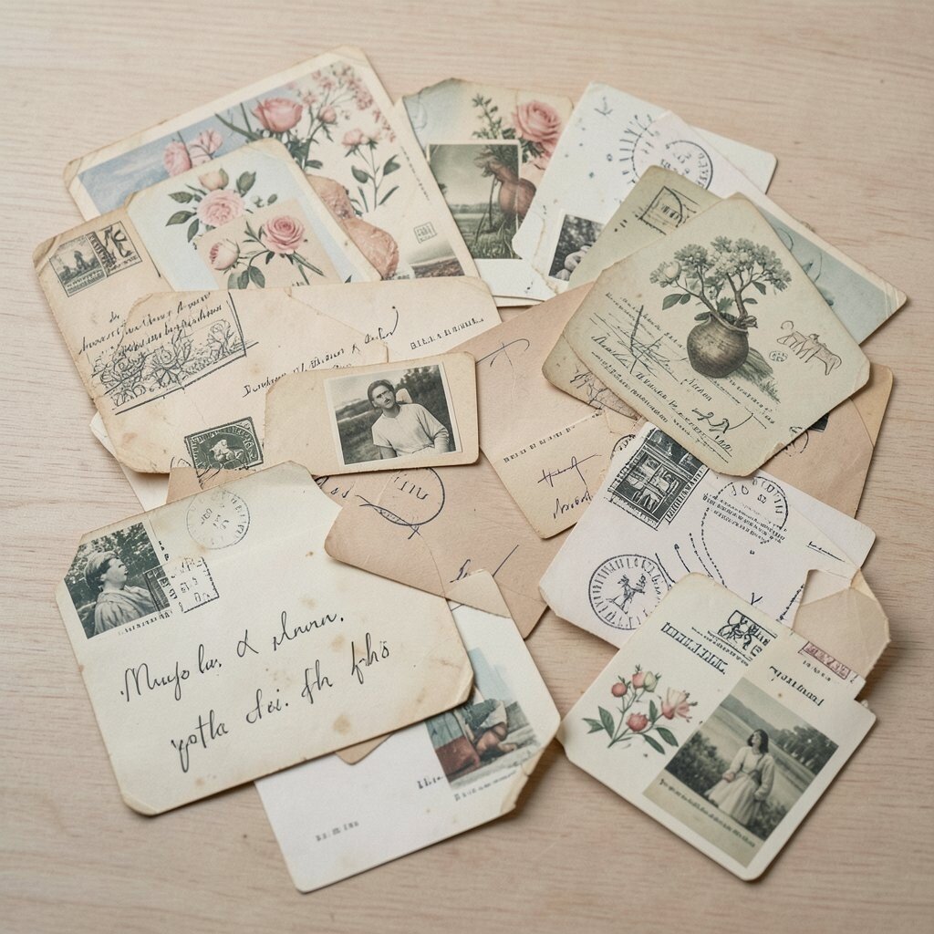
Use real or printed postcards, letters, tickets, and packaging as background texture. Tear edges, layer them behind your subject, and let some text show through like a secret message.
This works because it feels grounded in the world, not just designed on a screen. The uniqueness comes from the imperfect histories of paper, inks, and small creases.
For practical tips, collect ephemera from thrift stores, discount book sections, and old mail at home. If you want to stay budget friendly, ask friends for old postcards or print “antique-looking” text blocks for texture.
Personalize by choosing ephemera that matches your interests, like travel, animals, or old cinema themes. Then keep a consistent color tint, such as warm sepia or soft mint, to unify the collage.
Current trends favor texture and realism, and ephemera gives you that instantly. It’s kitsch with a real archive feeling, which always looks interesting.
14. Kitsch Vision Boards with One Repeat Motif
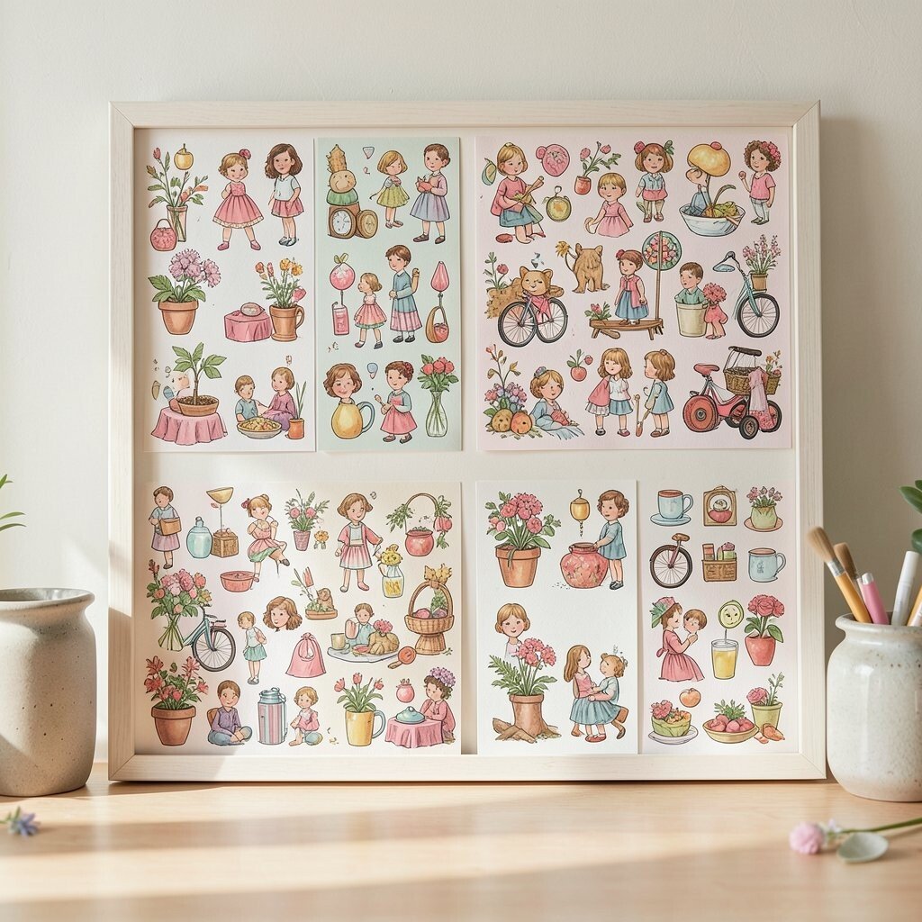
Make a vision board where everything is allowed to be cute, but one motif repeats across it. Choose something like cherries, butterflies, tiny dogs, crown shapes, or playful eyes.
Repeat it in prints, icons, nail designs, ceramics, or even recurring background colors. This style is unique because it blends maximal chaos with a clear thread you can follow.
For practical tips, pin or layer items in small clusters so your board doesn’t feel random. Then take photos of your board in the same lighting each time, so it becomes a visual brand.
Personalize by adding one “memory item” per motif cluster, such as a ticket stub or a small note. Cost considerations are easy because you can use free printable images and thrifted textures instead of expensive art supplies.
To stay current, keep your board’s main colors consistent with what you’re already wearing and using online. That way your kitsch aesthetic looks intentional, not accidental, even when it’s playful.