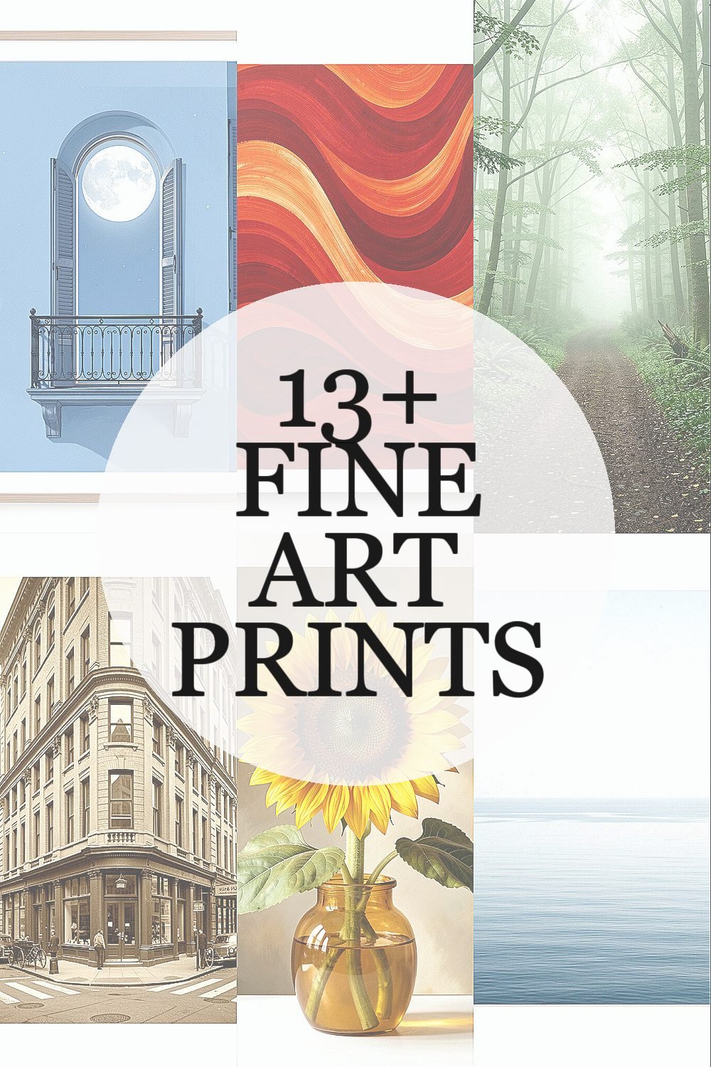
Art has a way of making a room feel finished without trying too hard. The right print can quietly change how your space looks and how you feel in it.
1. Moonlit Balcony in Soft Blue
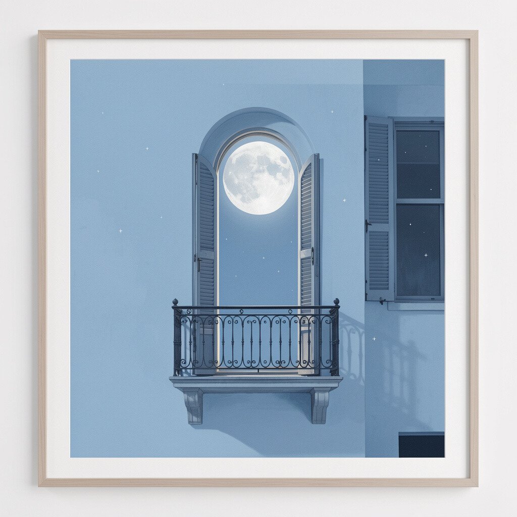
You can almost feel the cool air when you look at a scene like this. A balcony under pale light with gentle shadows creates a calm, dreamy mood.
Choose this style when you want your space to feel airy and relaxed. It works especially well in bedrooms and reading nooks where slower days fit naturally. Hang it with a matte finish or a light frame so the blues stay soft rather than harsh.
2. Bold Abstract Waves in Warm Reds
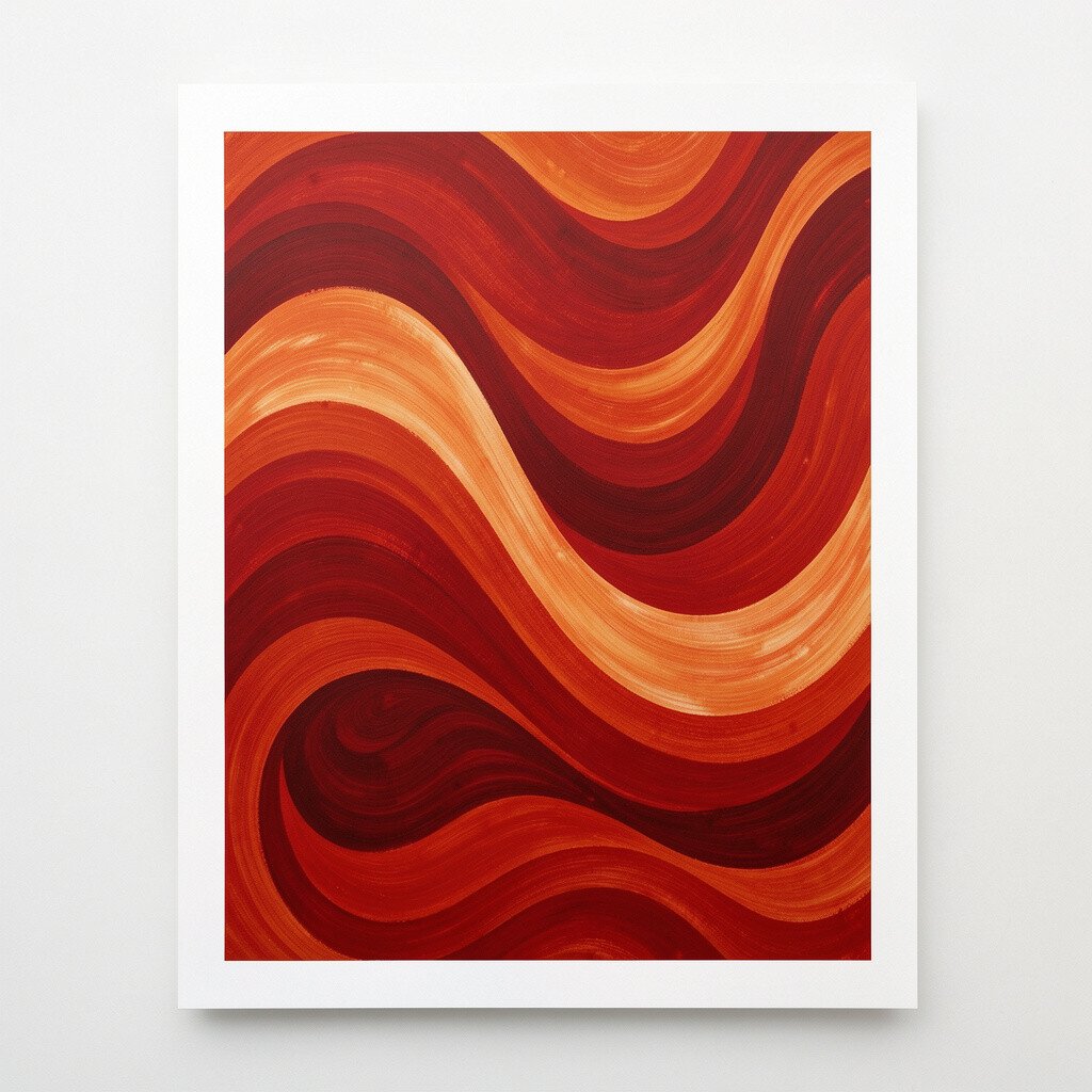
These prints bring energy fast, like a burst of color that never feels too serious. Curved forms and layered reds can make a plain wall feel alive.
Place it where you spend time in the evening, like a living room or entryway. A larger print can become a visual anchor, helping your furniture look more intentional. If you’re worried about strong color, pair it with neutral curtains, off-white walls, and simple decor.
To personalize it, pick a frame color that matches a small detail you already own, such as rust cushions or a terracotta vase. Keep the rest of the palette gentle so the artwork stays the star. From a cost point of view, abstract prints often let you choose bigger sizes without the price jumping as much as some gallery originals.
3. Quiet Forest Path in Green Mist
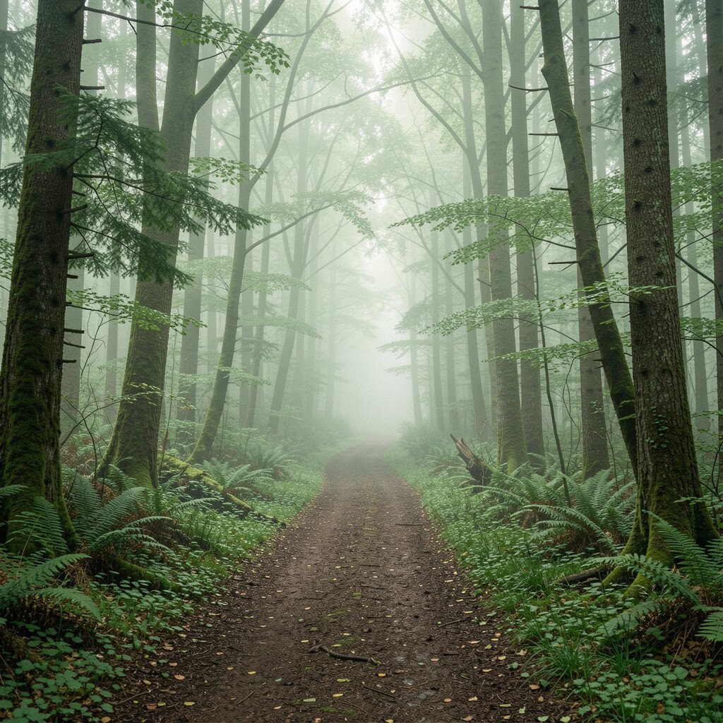
A forest path draws your eyes forward, almost like it’s inviting you to take a slow walk. Misty greens and soft depth give a cozy, grounded feel.
When you want your home to feel peaceful, nature scenes like this are a smart choice. They add color without being too loud, and they pair well with wood tones. Try placing it in a hallway so the space feels longer and more welcoming.
For a practical approach, match the frame to your flooring or furniture hardware so everything blends. You can also choose a print size that balances a narrow wall by going taller rather than wide. Many print shops offer different paper textures, and choosing a slightly textured paper can make the image feel more “real.”
4. Vintage City Corner in Sepia Tones
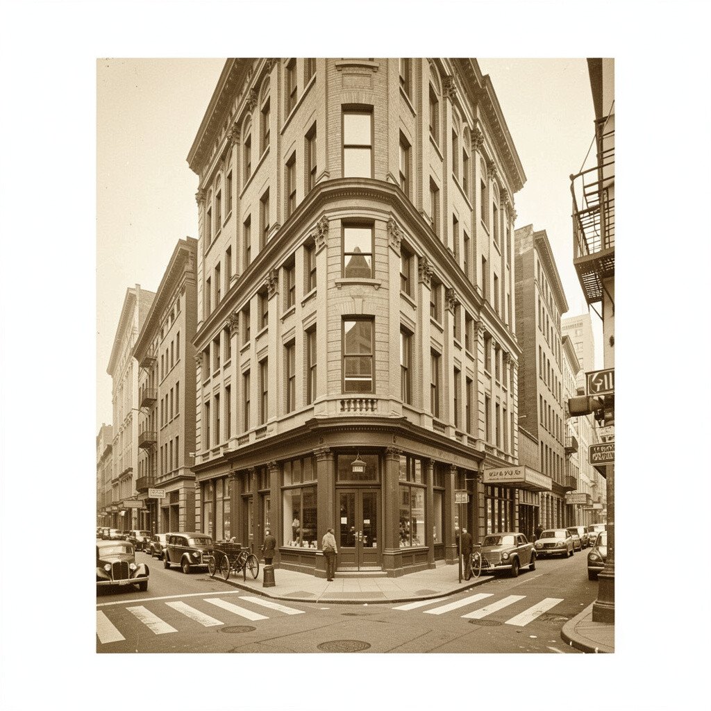
This kind of print gives a room that lived-in, story-filled charm. Sepia streets, old signage shapes, and soft shadows look great in both modern and classic homes.
It’s a wonderful pick for offices, because the warm tones feel steady and focused. Try it near bookshelves or desk lighting so the scene feels like part of your daily routine. Keep nearby colors muted so the vintage look stays warm instead of cluttered.
5. Sunflower Still Life with Golden Highlights
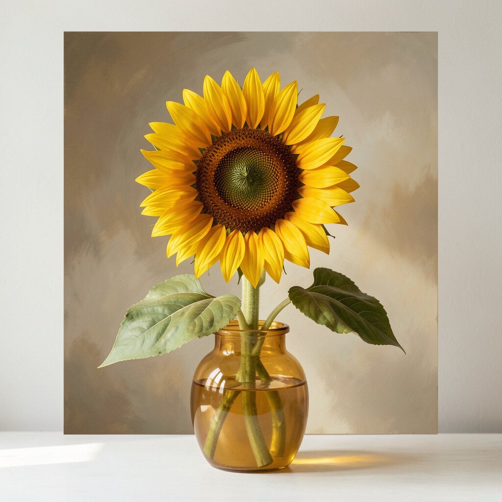
Sunflowers instantly bring a cheerful warmth, even on gray days. The bright petals and rich yellows add a friendly glow that feels like sunshine.
This print is ideal for kitchens, dining rooms, or wherever friends gather. It can make simple table settings feel more special and curated. If you like a bright look but don’t want it overwhelming, choose a version with softer background tones so the flowers pop gently.
Personalize the display by matching the frame to a kitchen metal finish, like brushed brass or matte black. For practical hanging, keep it at eye level for best everyday enjoyment. In terms of cost, still life prints often offer many size options, making it easier to pick one that fits your budget.
6. Minimal Lines of a Calm Ocean Horizon
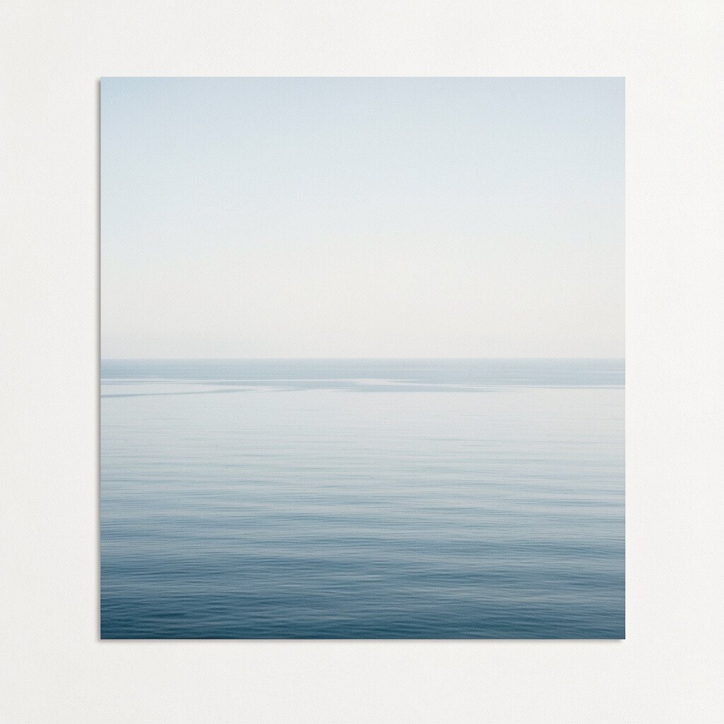
A quiet horizon with thin lines feels clean and modern. Even when the colors are subtle, the composition has a peaceful rhythm.
This kind of print works beautifully in small rooms because it doesn’t visually crowd the wall. Use it in a bathroom or bedroom to create a spa-like vibe that relaxes your eyes. For styling, pair it with simple art ledges, smooth ceramics, and airy textiles.
7. Dramatic Portrait Study in Charcoal and Light

A portrait print adds depth and personality in a way that feels almost human. The contrast between charcoal shadows and gentle highlights makes it look expressive and serious.
Choose it when you want your space to feel personal, like you’ve collected something meaningful. It can elevate a living room, especially when placed above a sofa or console. Keep the frame classic and sturdy so the artwork looks confident rather than delicate.
If you want a practical way to personalize, match the portrait’s background tone with one color from your decor, like a throw blanket or rug. Consider lighting too, such as a soft lamp that won’t glare on the glass. Many fine art prints are offered in different paper types, and selecting a thicker paper can make the portrait feel more premium without requiring a huge budget.
8. Geometric Garden Shapes with Teal Accents
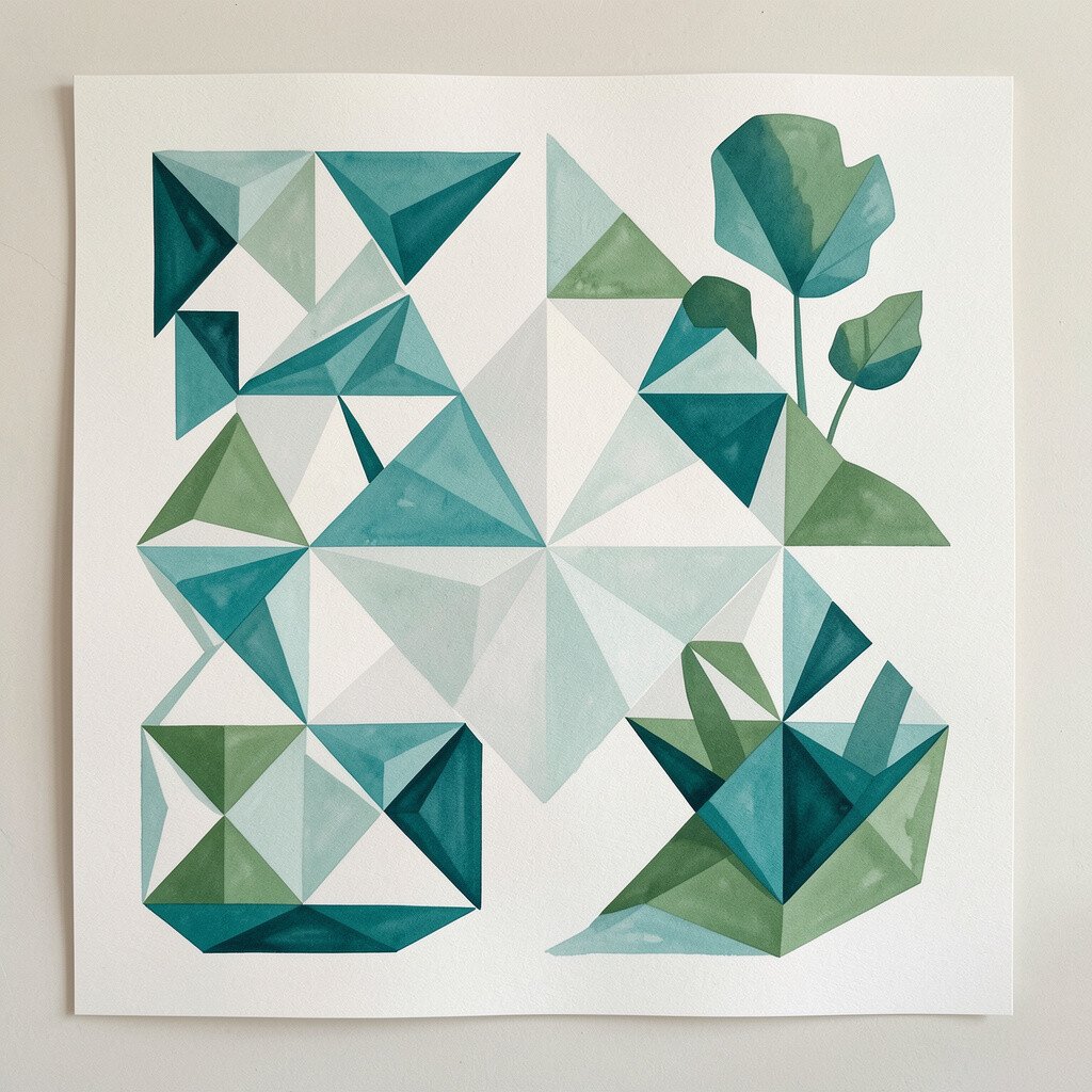
This print feels playful and tidy at the same time. Crisp shapes and repeating patterns bring structure, while teal accents add a fresh pop.
It’s a great option for entryways, where you want the first impression to feel lively. The geometry also makes it easy to coordinate with modern furniture and clean-lined shelves. Try keeping nearby colors in the same family, like cool grays, whites, and hints of teal.
9. Classic Mountain View in Layered Blues
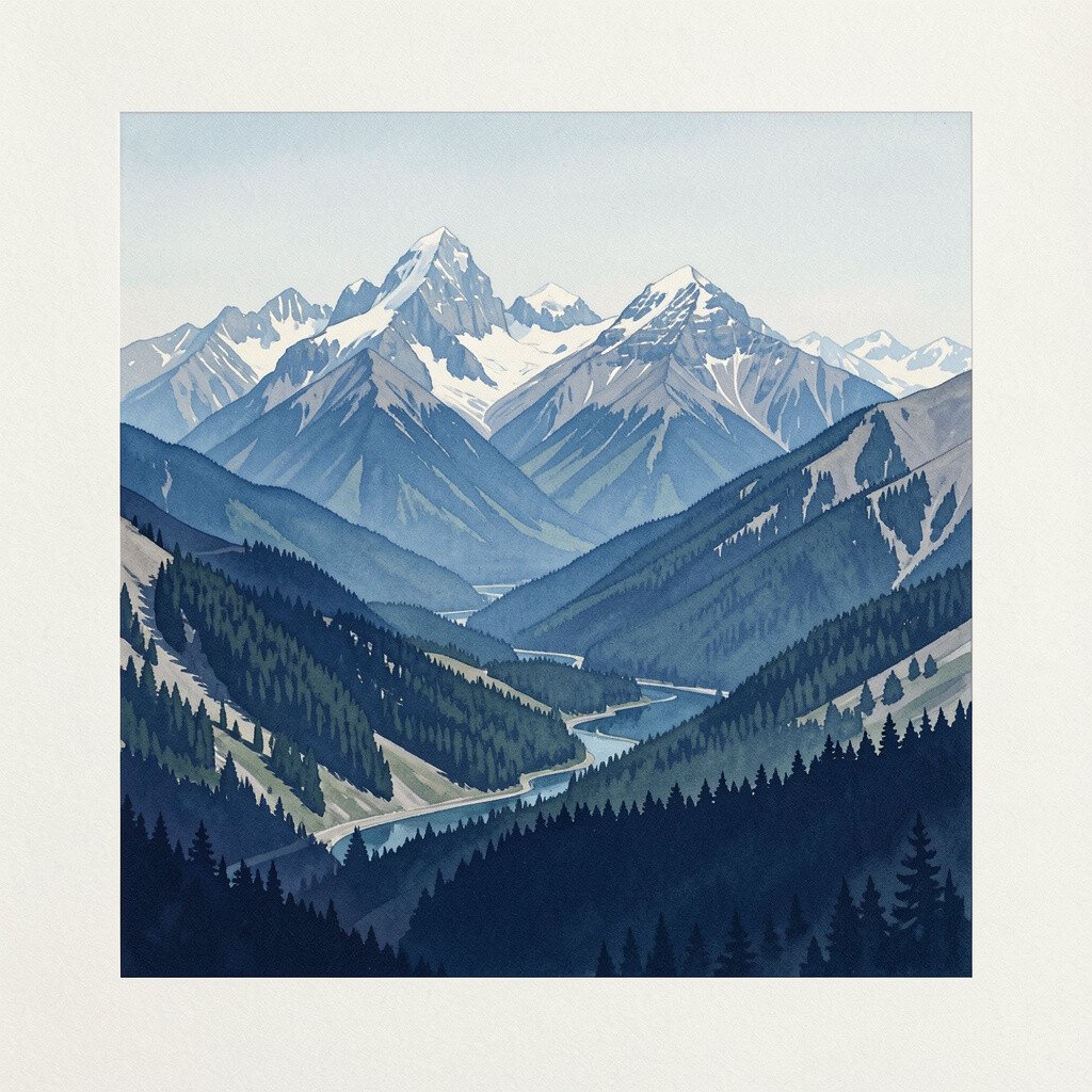
Mountain prints have a way of calming a room without being too quiet. Layered blues create depth, so even a simple wall feels like it opens outward.
This is perfect for living rooms where you want a grounding focal point. It also works nicely in bedrooms because the colors feel restful at night. If your space already has strong patterns, go for a mountain scene with fewer shapes so it doesn’t compete.
To personalize, place it near a throw or pillow color that echoes one shade from the print. For a practical layout, center it above furniture and keep the floor lamp aligned so the scene feels balanced. When thinking about cost, landscape prints often come in a range of sizes, so you can choose a smaller one if your budget is tight.
10. Abstract Botanical Study with Ink-Style Details
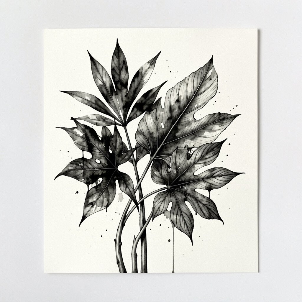
Ink-like lines and botanical forms can look delicate but full of character. A print like this adds texture to your walls without using loud colors.
It’s a smart pick for reading corners, bedrooms, and bathrooms where you want a gentle, natural touch. Pair it with light wood furniture and soft fabrics so the lines feel even more refined. If you want it to feel personal, choose a frame that matches your hardware, like silver, black, or warm brass.
For practical styling, keep other wall decor minimal so the details can be seen clearly from across the room. This also makes the artwork last longer in your style, because ink illustrations tend to stay timeless. Many sellers offer multiple botanical variations, so you can pick one that matches the mood you’re going for.
11. Colorful Market Street Scene with Soft Movement
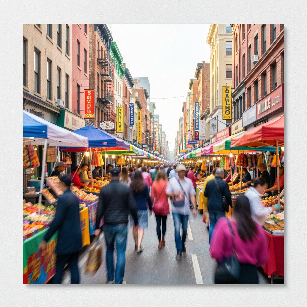
Street scenes bring motion into your home, like you’re standing in the middle of everyday life. Colorful storefront shapes and lively tones give a warm, welcoming feel.
Try this print in a dining area or hallway where you want conversation energy. It can also help break up the emptiness of long walls with lots of space. If the room already has bold decor, choose a print with softer saturation so it blends more easily.
Personalize it by coordinating with one repeating color you already use, such as a red cushion or patterned curtains. Hang it at a height where it catches light from a nearby window, because lively scenes look best when they glow a little. From a cost view, street scenes are often widely available in different sizes, making it easier to find the right price point without losing style.
12. Soft Pastel Clouds with a Gentle Gradient
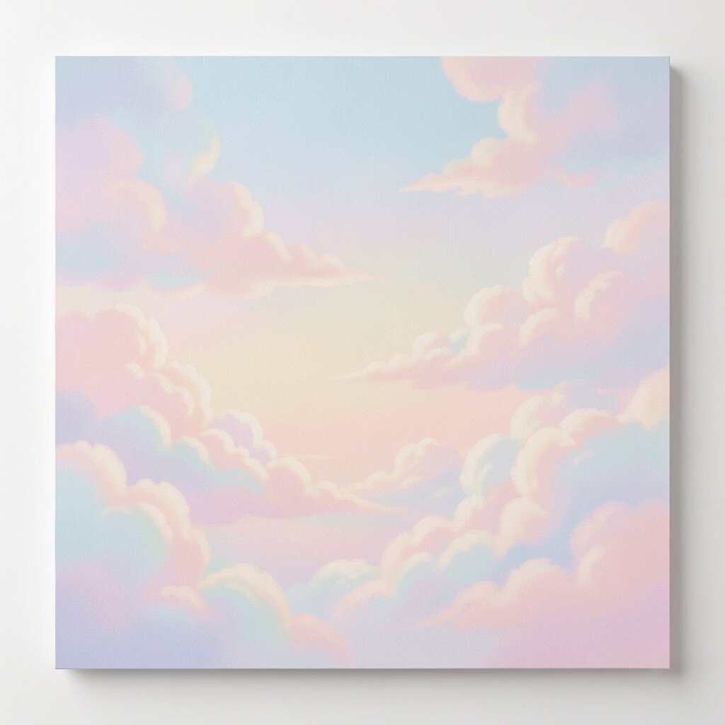
Cloud prints feel like a deep breath for the eyes. Pastels and smooth gradients add calm, and the sky tones bring an easy softness.
Use this in bedrooms, nurseries, or spaces where you unwind. It also pairs well with neutral decor and natural materials, like rattan or linen. For practical results, pick a frame that doesn’t compete, such as white, light oak, or simple black.
13. Surreal Dream Objects with Bold Contrast
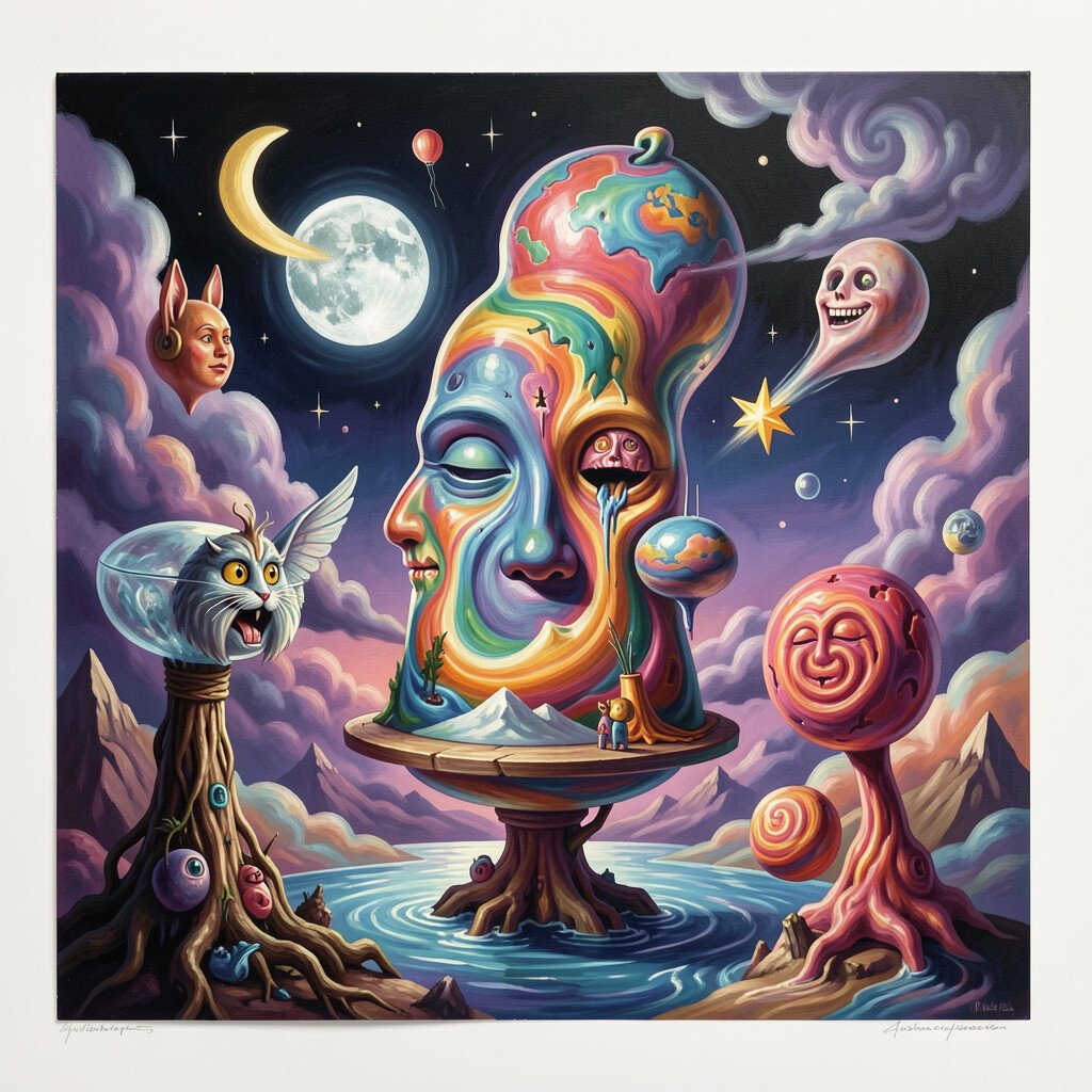
Surreal prints can feel magical, like a small secret happening on your wall. Unexpected objects and bold contrast make the artwork feel daring and unique.
This is the kind of piece that works great in creative studios or modern living rooms. It sparks curiosity, and it also gives you something fun to talk about when guests visit. If you have other statement decor, keep the palette simple so the surreal artwork remains the main focus.
To personalize, choose a print that includes at least one color found in your home, like a blue mug or a patterned rug thread. For cost, surreal art prints sometimes come in limited runs, so check what you’re getting and how many copies exist. Keeping the frame clean and minimal helps the surreal details shine without visual clutter.
For today’s trend, many people are mixing surreal art with minimal furniture and warm lighting, because the contrast feels modern. You can also layer it with small decor, like a sculptural lamp or a textured vase, to echo the dreamlike vibe. Just remember that the best effect comes when the wall has breathing room around the print.
14. Classic Still Life Fruit with Deep Rich Color
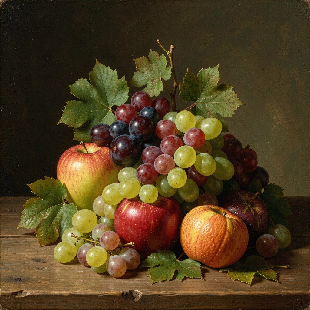
A fruit still life adds warmth, realism, and a sense of comfort. Deep reds, oranges, and shadowed greens can make a room feel cozy and lived in.
Hang it in kitchens, dining rooms, or even a breakfast nook to make everyday meals feel more special. The detail draws the eye, so even small spaces can feel inviting. Choose a frame that feels sturdy and timeless so the print looks grounded.
Personalize your display by pairing it with table decor in similar tones, like warm ceramics or a patterned placemat. For practical tips, keep the print away from direct steam and sunlight if it’s in a kitchen, since moisture and glare can dull colors over time. In terms of cost, still life prints often have lots of options, so you can select a slightly smaller size and still get a big visual impact.