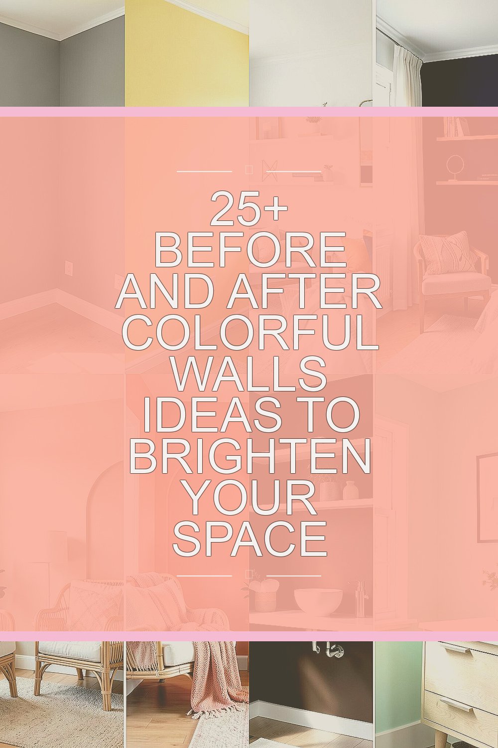
Color can change how a room feels in a flash. A plain wall can become the star of the whole home.
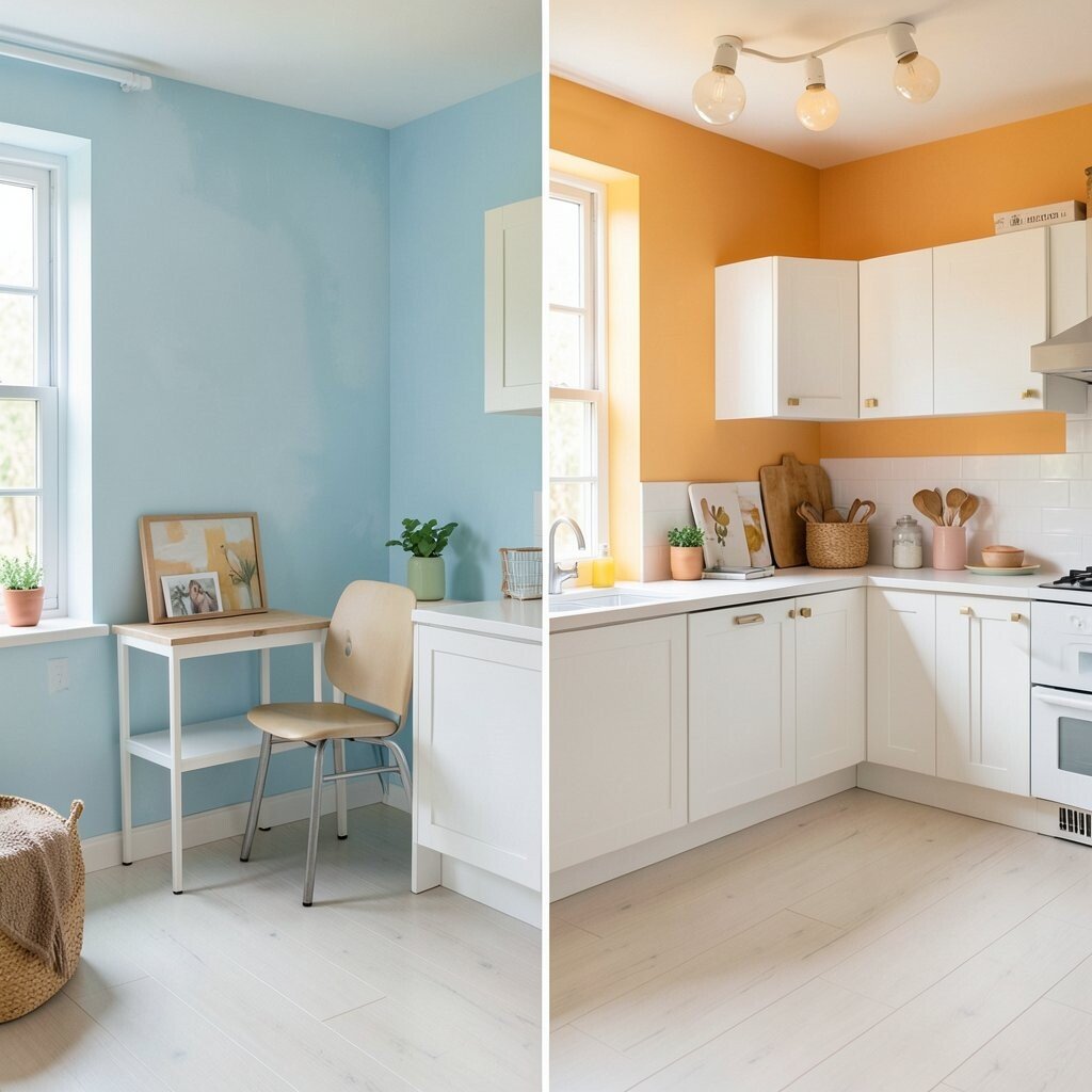
1. Soft Gray Before, Sunny Yellow After
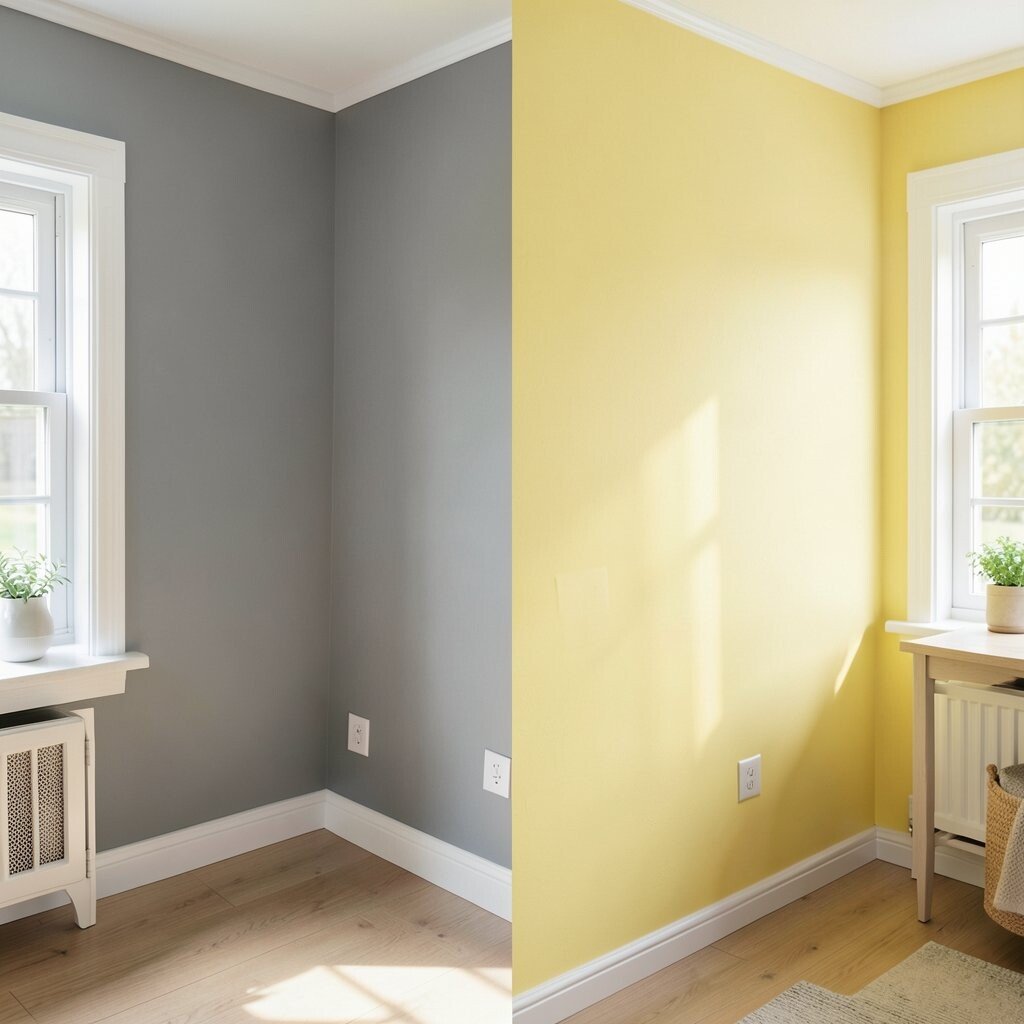
A dull gray wall can feel sleepy, especially in a room that needs more cheer. A soft yellow coat brings in light and warmth right away.
This look works well in kitchens, breakfast corners, and small entryways. It feels happy without being too loud, and it pairs nicely with white trim, light wood, or black accents. Paint is one of the most budget-friendly updates, and a single gallon can do a lot if the wall is not huge.
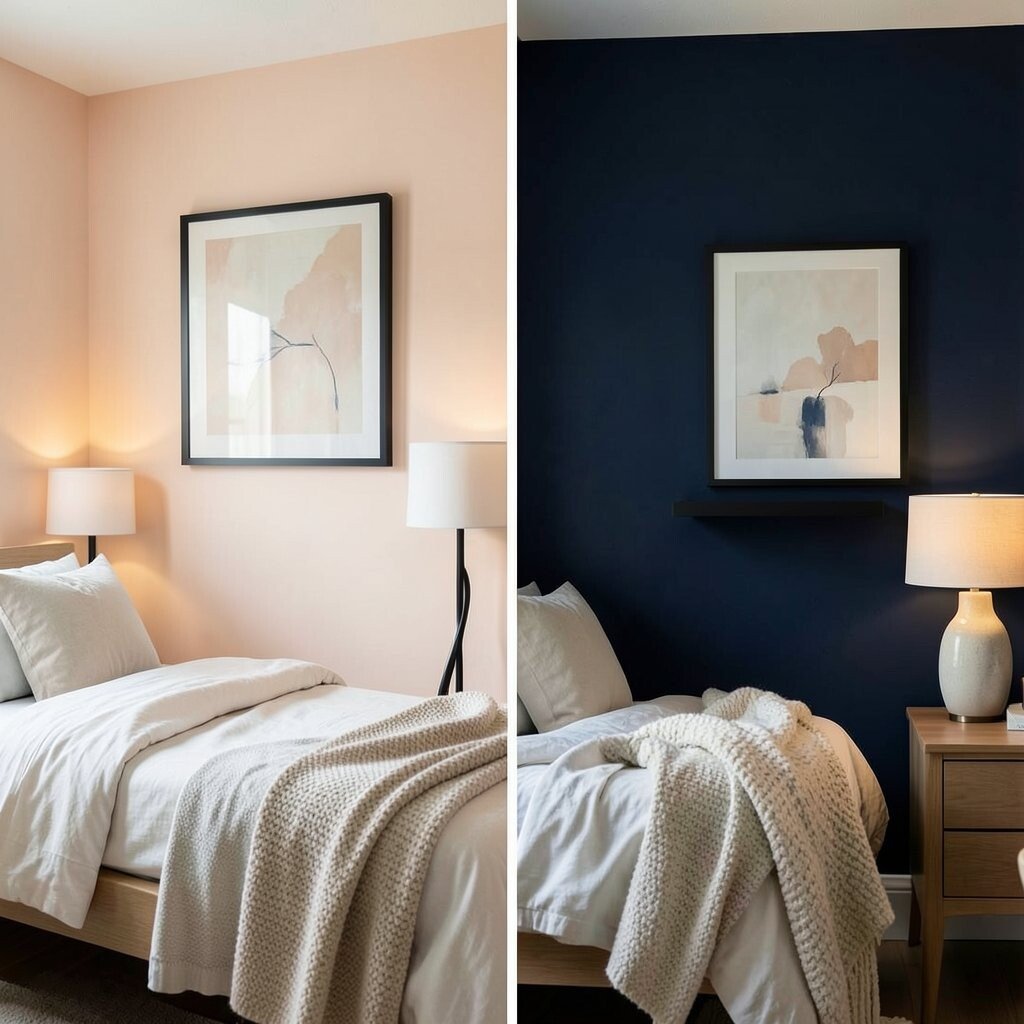
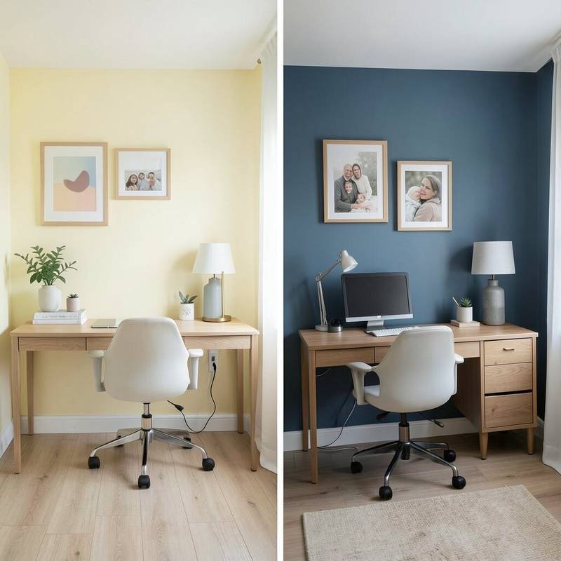
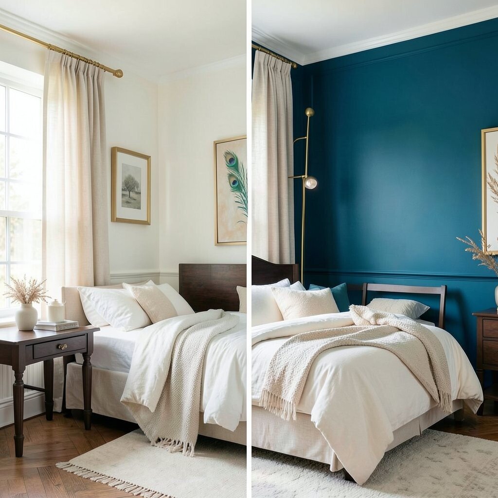
2. Plain White Before, Bold Navy After
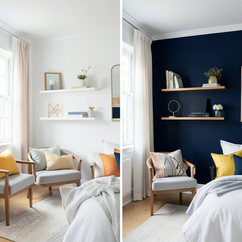
White walls are clean, but they can sometimes feel a little too plain. Deep navy adds a rich, cozy feel that looks sharp and modern.
This color makes art, shelves, and gold decor stand out in a big way. If you want a more polished look, try matte paint for a soft finish or satin for a bit of shine. Navy is a strong trend in bedrooms, offices, and dining rooms because it feels calm and stylish at the same time.
You can keep the room from feeling too dark by adding bright pillows, mirrors, or pale curtains. For a lower-cost update, paint one wall first and see how the shade looks in daylight and at night. That small test can save money and help you pick the right tone.
3. Beige Before, Coral After
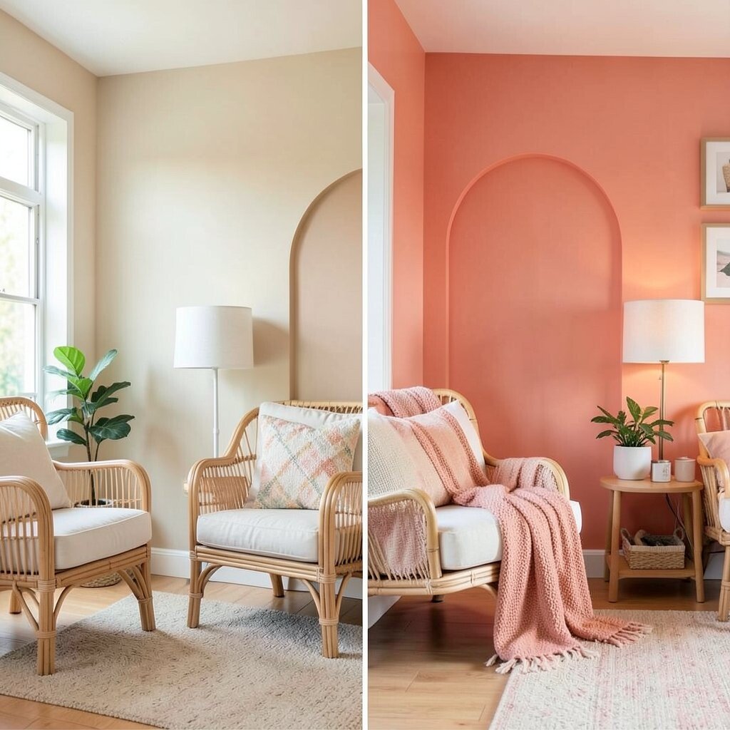
Beige walls can fade into the background, but coral gives a room a lively spark. It brings a warm glow that feels friendly and fresh.
This color is great for creative spaces, kids’ rooms, and sunny living rooms. Coral works well with rattan, white furniture, and soft green plants.
If you want a playful but still grown-up look, use coral on a single accent wall. You can also add coral through wall paint with simple shapes or painted arches for a custom feel. The best part is that this style can be done with a small paint budget and a free afternoon.
Choose a softer coral if you want a gentle mood, or pick a brighter shade for more energy. Matching throw blankets or lamps can tie the whole room together. Small details make the wall feel planned, not random.
4. Dark Brown Before, Fresh Mint After
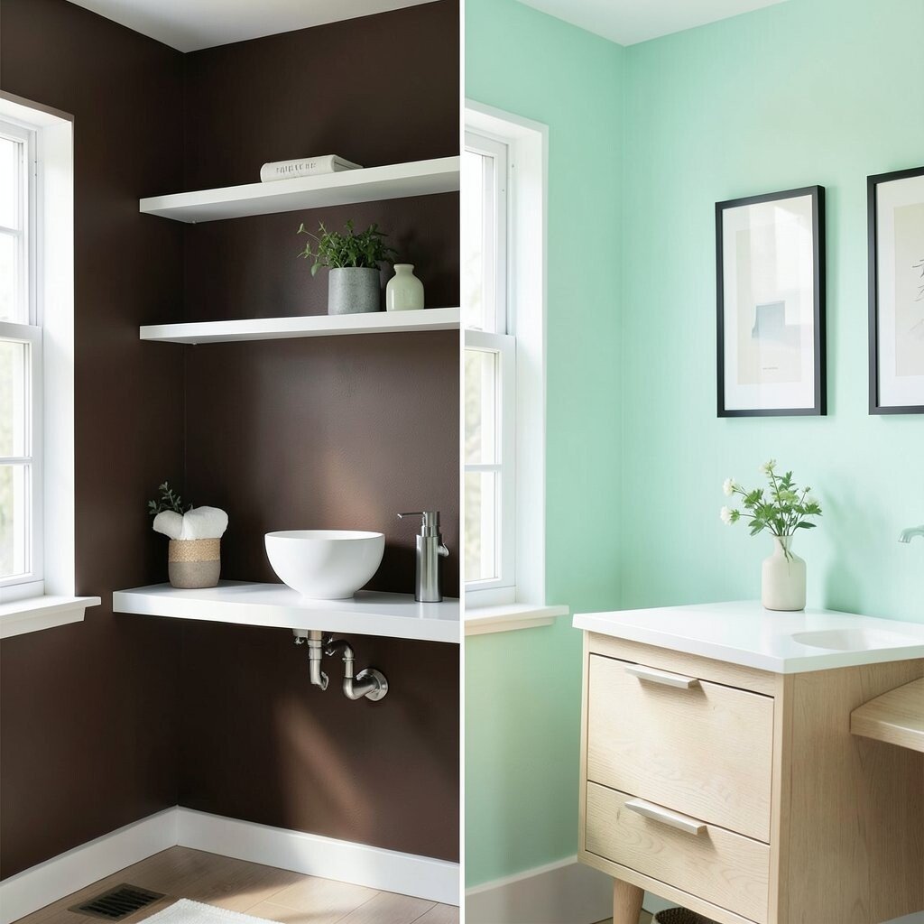
Heavy brown walls can make a room feel closed in. Mint green opens things up and gives the space a cool, breezy look.
This choice is lovely in bathrooms, craft rooms, and bedrooms that need a light touch. It feels unique because mint is not too common, yet it still looks easy to live with.
Pair it with white shelves, silver hardware, or pale oak furniture for a clean finish. If you want a modern twist, add simple wall art with thin black frames. Mint paint is usually easy on the wallet, and it can make old furniture look newer by comparison.
Try a sample patch near a window so you can see how the light changes the color. That helps you avoid a shade that feels too cold or too candy-like. A little planning makes the end result much better.
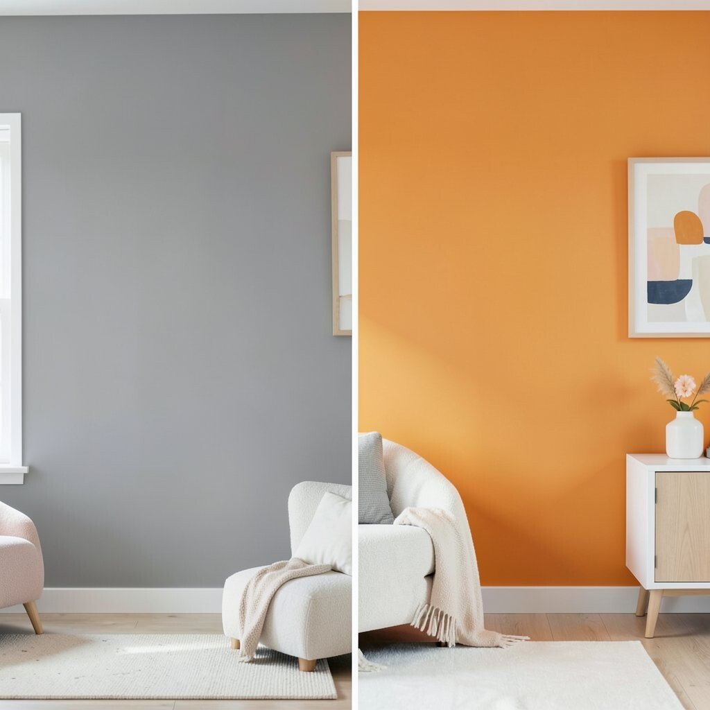
5. Flat White Before, Sunset Orange After
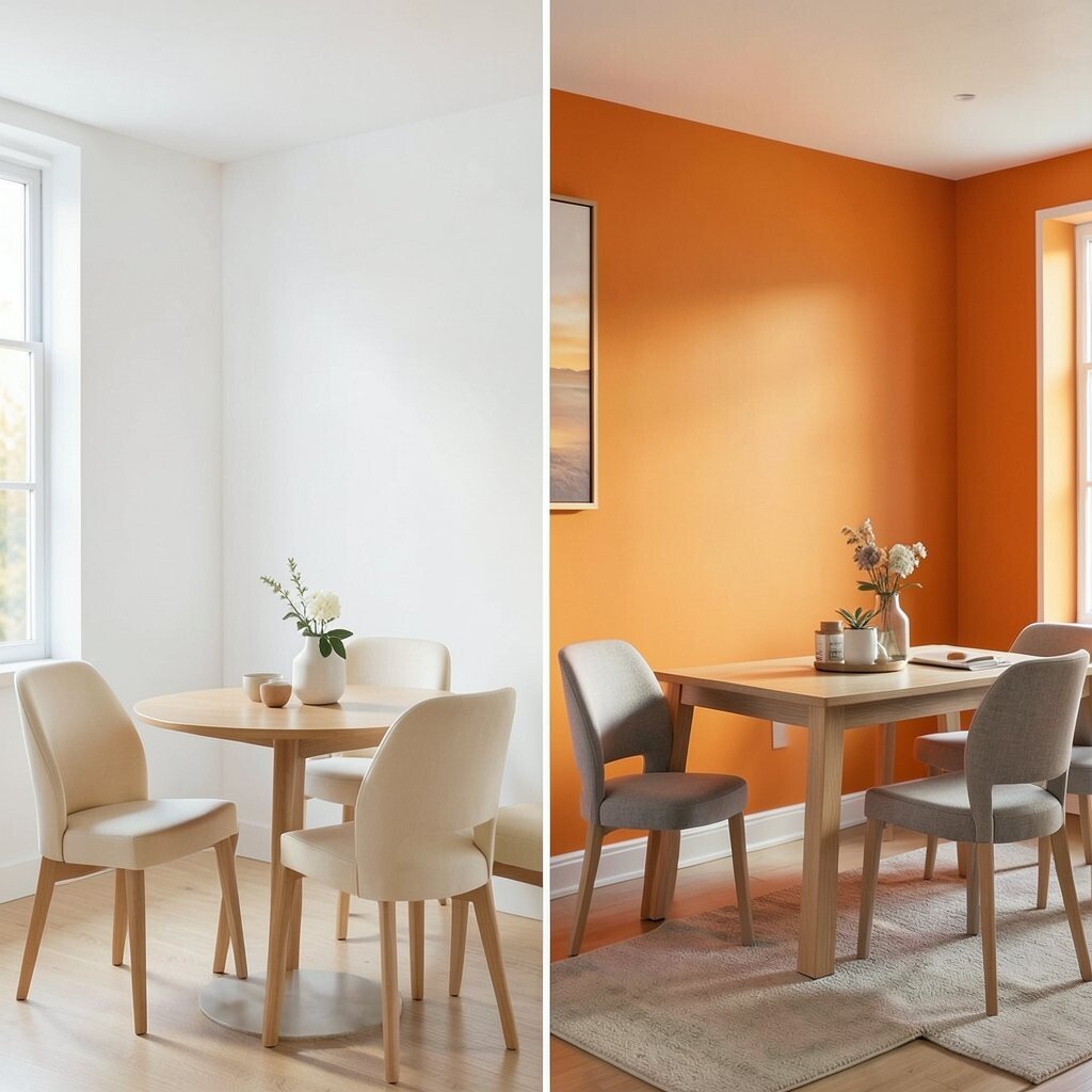
Flat white can feel safe, but it often lacks personality. Sunset orange brings a warm, glowing mood that feels full of life.
This is a strong choice for dining rooms, game rooms, and creative studios. It makes the room feel active and social, which is great when you want people to gather and stay awhile.
Because orange is bold, it works best with simple furniture and a few calm colors nearby. Try cream, tan, or soft gray to balance the look. If a full wall feels like too much, use orange in a painted stripe or half-wall design.
Paint is still the cheapest way to get this effect, but the right finish matters too. A smooth finish can look rich, while a flat finish can feel softer and less shiny. Either way, this color can turn a plain room into a warm spot fast.
6. Pale Blue Before, Emerald After
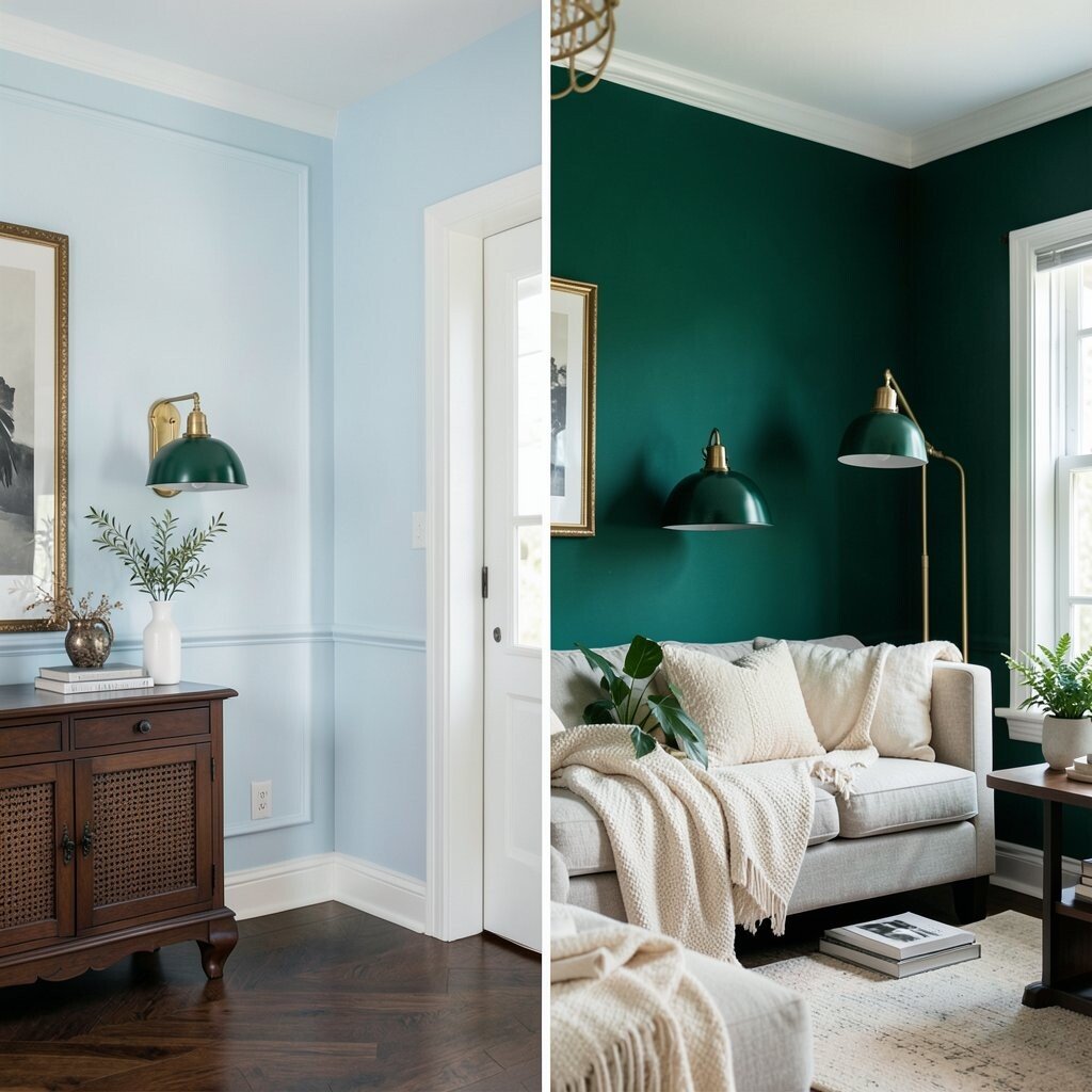
Pale blue is peaceful, but it can feel a little expected. Emerald green adds depth and makes the wall look like a jewel.
This shade fits well in living rooms, reading corners, and hallways. It has a fancy feel without needing expensive decor, which makes it a smart style pick.
Emerald looks great with brass lamps, dark wood, and cream textiles. You can also bring in plants to echo the green and make the room feel fresh. Many people like this color now because rich greens are a big trend in home design.
If you worry about going too dark, use emerald on one feature wall and keep the other walls light. That gives you drama without making the room feel small. It is a great way to get a high-end look on a modest budget.
7. Cream Before, Lavender After
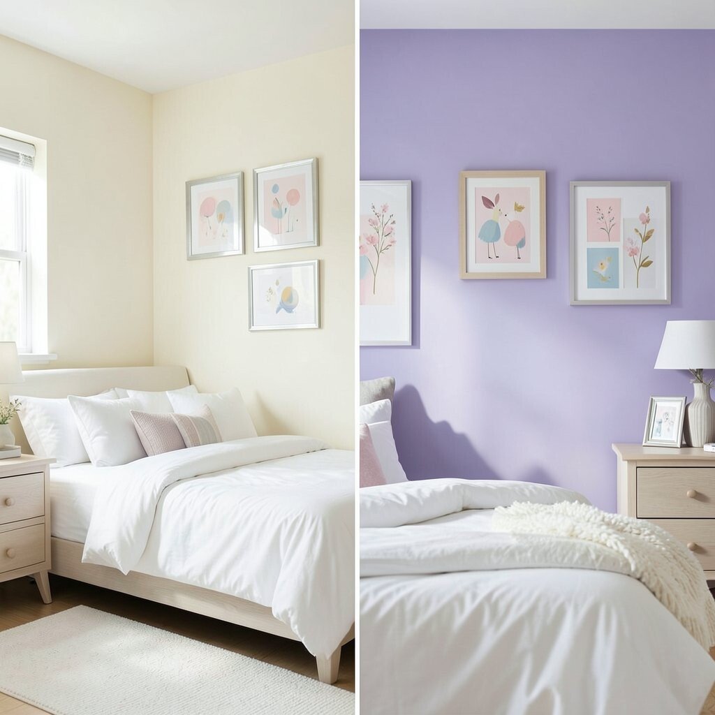
Cream walls are soft, but they can feel plain in a room that needs charm. Lavender adds a dreamy touch that feels light and special.
This color works well in bedrooms, nurseries, and quiet sitting rooms. It gives the space a gentle glow that feels soothing at the end of the day.
Lavender pairs nicely with white bedding, silver frames, and pale wood furniture. You can make it feel more grown-up by using crisp lines and simple decor. For a playful twist, add small art prints with hints of pink, blue, or gold.
Paint costs stay low, but the mood change is big. A soft lavender wall can make a room feel more personal without needing a lot of extra decor. If you want a calm but pretty space, this is a lovely pick.
8. Taupe Before, Teal After
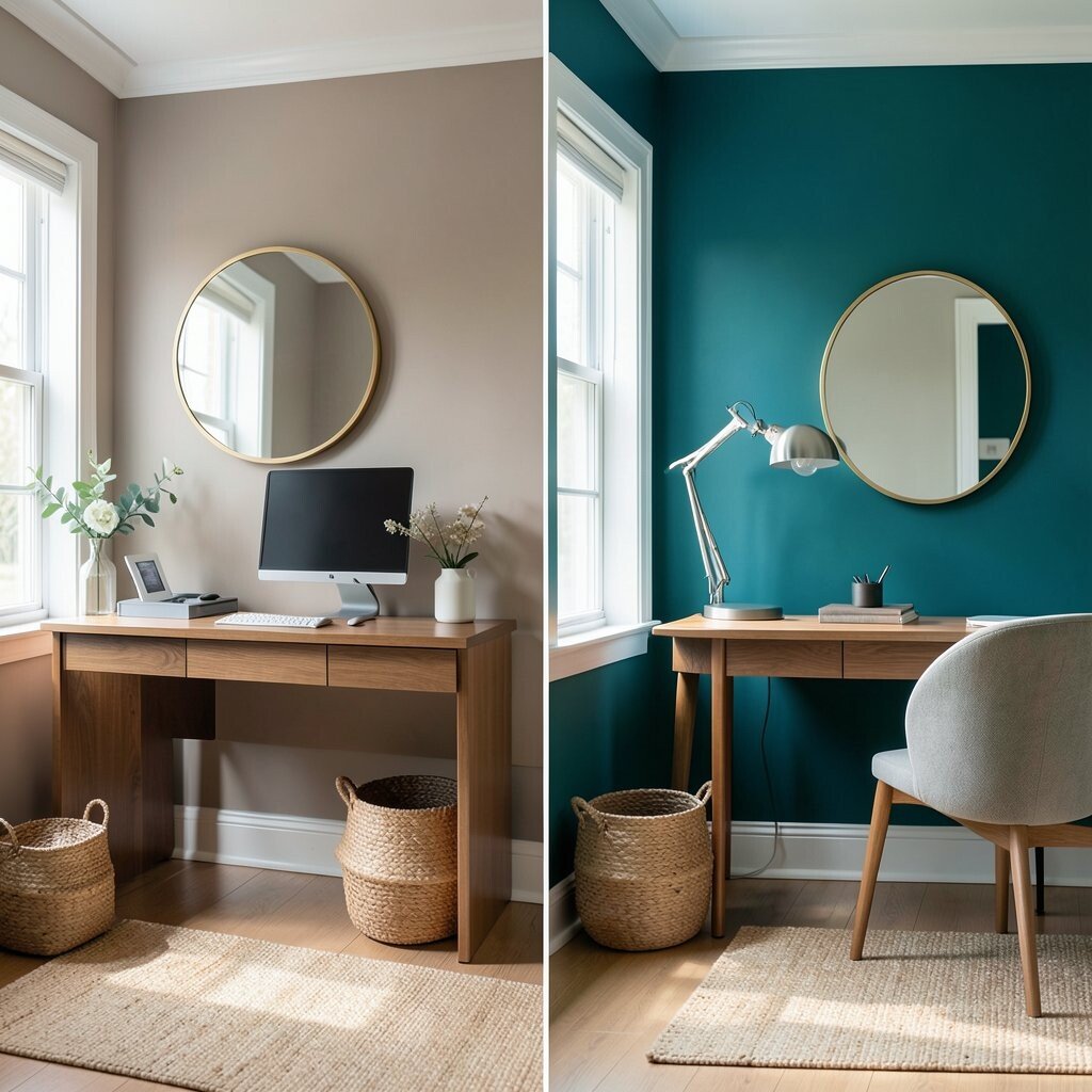
Taupe can feel safe, but it may also blend in too much. Teal gives the wall a bold splash of color with a cool, rich look.
This shade is great for home offices, dining rooms, and entry spaces. It feels both calm and lively, which makes it easy to enjoy every day.
Teal works well with white trim, warm wood, and woven baskets. If you want a current look, try adding curved mirrors or rounded furniture to soften the strong wall color. Those shapes are very popular right now and help the room feel fresh.
For a lower-cost update, use teal on the wall behind a desk or sofa instead of painting the whole room. That gives you a big visual punch with less paint and less work. It is a smart choice for renters who want a bold feel in one spot.
9. Plain Tan Before, Cherry Red After
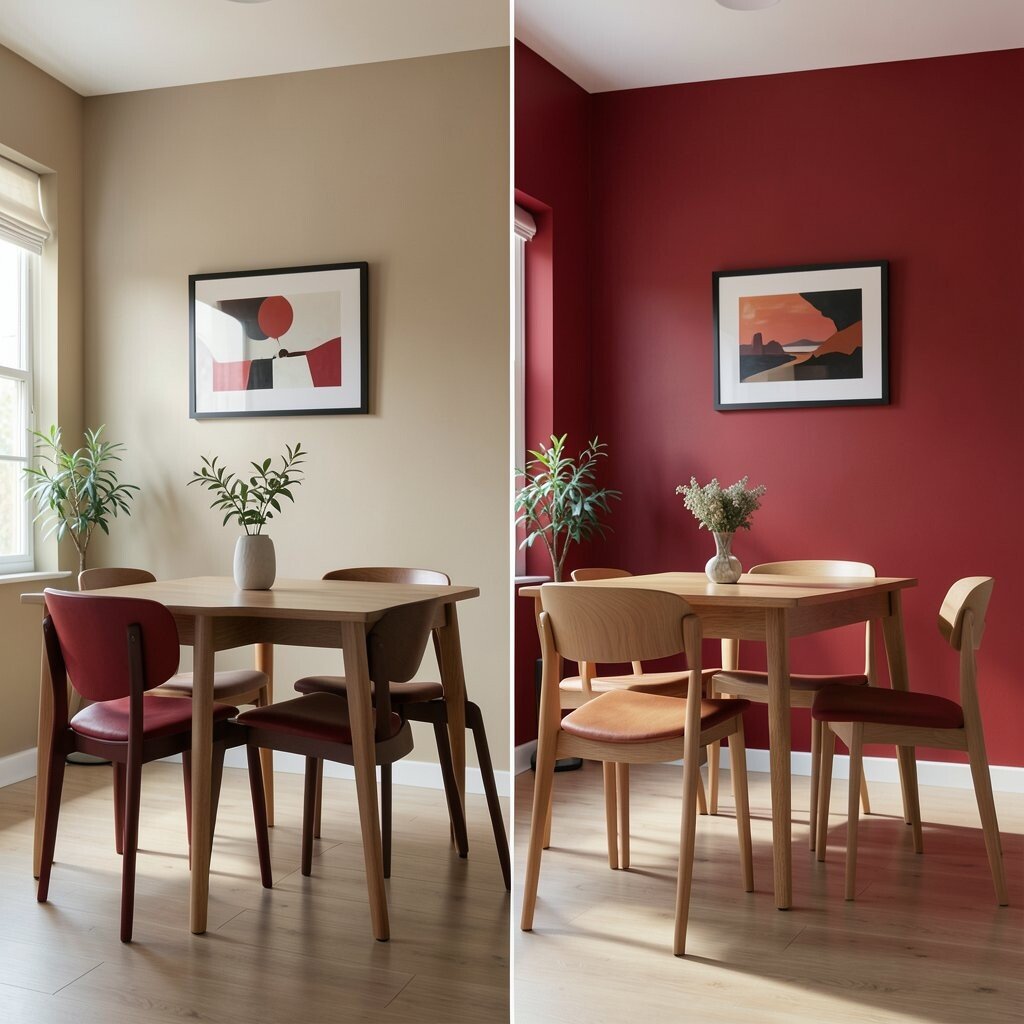
Plain tan walls can fade into the background and feel a little tired. Cherry red brings energy, warmth, and a strong sense of style.
This color can make a dining room feel exciting or turn a music room into a fun hangout spot. It is unique because it feels classic and bold at the same time.
To keep the room balanced, use red with black accents, white art, or natural wood. A smaller wall or a painted panel can give you the same drama without covering every surface. That can also help with cost if you want to use less paint.
Cherry red works best when the room has good light and simple furniture. If the shade feels too bright, choose a deeper red with a little brown in it. That gives you a richer look that still feels welcoming.
10. Dull Olive Before, Bright Peach After
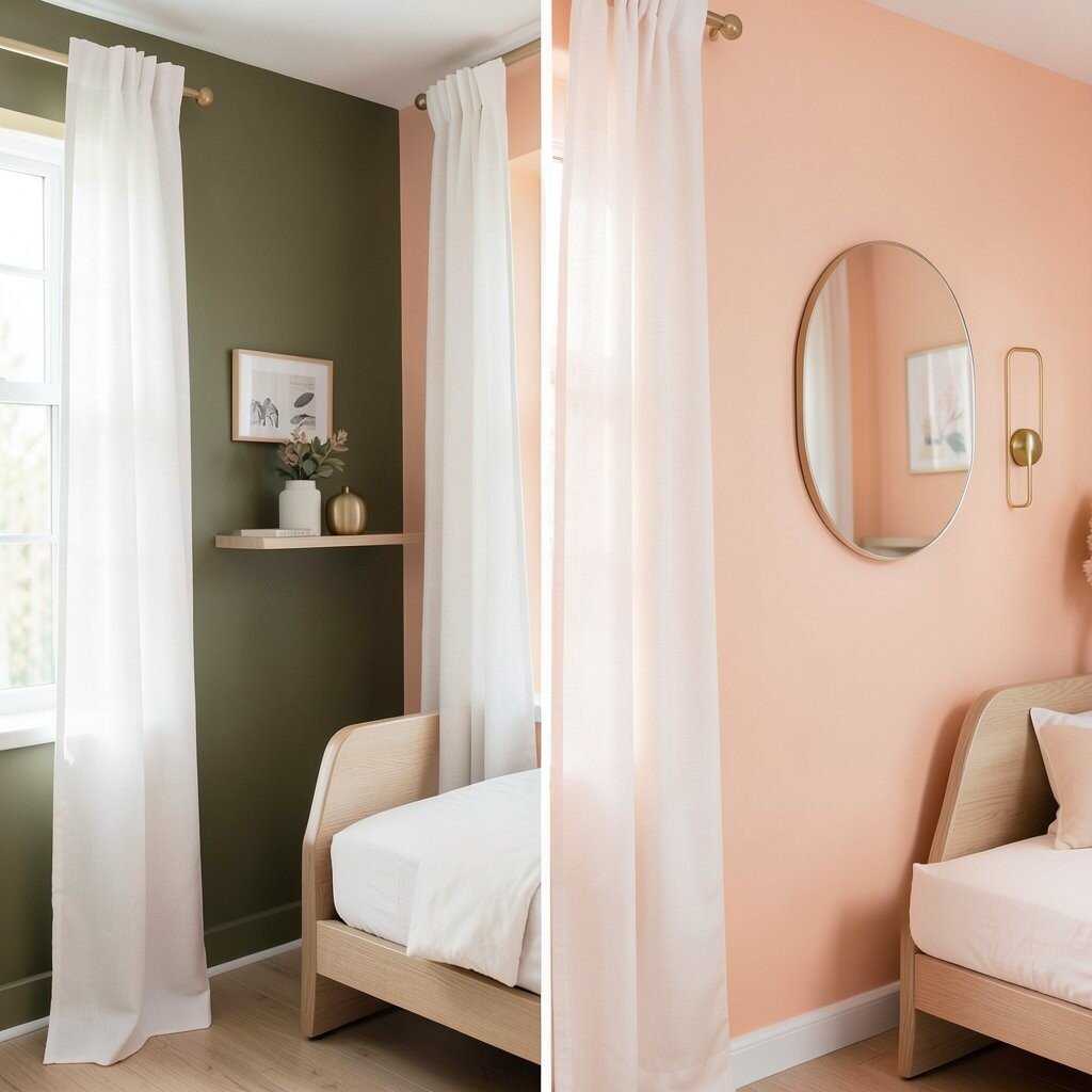
Dull olive can feel heavy and old-fashioned. Bright peach brings a soft glow that feels sunny and cheerful.
This is a sweet choice for bedrooms, craft rooms, and small sitting areas. It adds warmth without becoming too intense, which makes it easy to live with.
Peach looks lovely with white curtains, light oak, and soft gold details. If you want a trendy touch, add a simple wall shelf with curved edges or a rounded mirror. Those little updates help the color feel fresh and current.
Paint is a low-cost way to get this warm look, and peach often works well even in rooms with less natural light. You can also use peel-and-stick wall decals for a personal touch without a big price tag. That makes the room feel cheerful and custom.
11. Stark White Before, Forest Green After
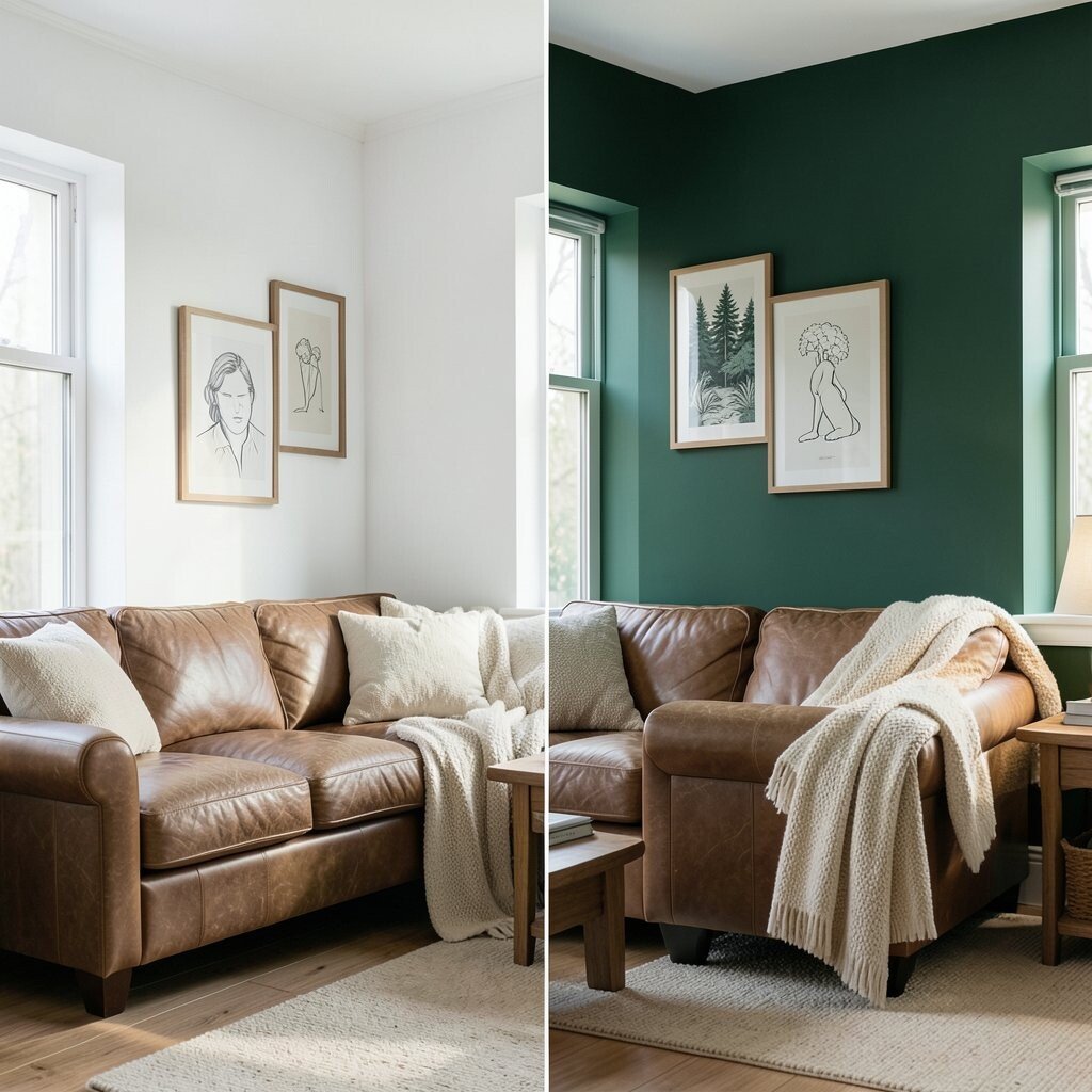
Stark white can feel cold when a room needs more soul. Forest green brings in a deep, earthy mood that feels calm and grounded.
This color is wonderful in libraries, bedrooms, and cozy dens. It gives the space a rich look that feels unique without trying too hard.
Forest green pairs beautifully with leather, warm wood, and cream textiles. You can make the wall look even better by adding framed art with nature scenes or simple line drawings. That keeps the room from feeling too dark and gives it a personal touch.
The cost can stay low if you paint only one wall and let the rest of the room stay light. That creates a strong focal point and makes the color feel special. It is a smart way to get a moody look without a big remodel.
12. Faded Blue Before, Mango After
Faded blue can look washed out after a while. Mango orange brings a bright, juicy feel that wakes up the whole room.
This shade works well in kitchens, playrooms, and creative corners. It feels bold in a happy way and can make everyday tasks feel more fun.
Because mango is lively, it looks best with clean lines and simple decor. White cabinets, pale floors, and natural textures help it shine without feeling messy. If you want a softer version, pick a mango shade with a little gold in it.
Paint is usually the cheapest part of the project, but lighting matters too. Warm bulbs can make mango feel richer, while cool bulbs can make it look sharper. Testing both can help you choose the mood you want.
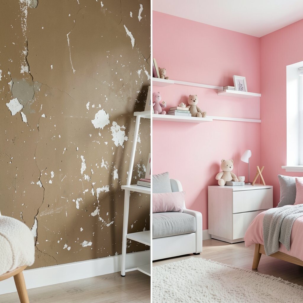
13. Muddy Gray Before, Rose After
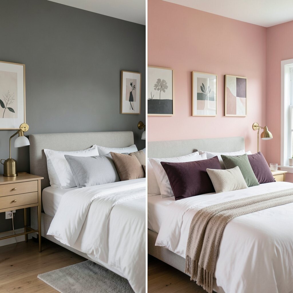
Muddy gray can make a wall feel flat and tired. Rose adds a gentle blush that feels warm, sweet, and inviting.
This color is a nice fit for bedrooms, guest rooms, and dressing areas. It gives the space a soft glow that feels pretty without being too young.
Rose works well with white bedding, brass accents, and simple artwork. You can also pair it with deeper colors like plum or forest green for a more layered look. That mix feels modern and gives the wall more personality.
If you want to save money, use rose on the wall behind the bed or vanity instead of every wall. That still gives the room a fresh new feel. Small changes like this can make a big difference without a huge bill.
14. Basic White Before, Cobalt After
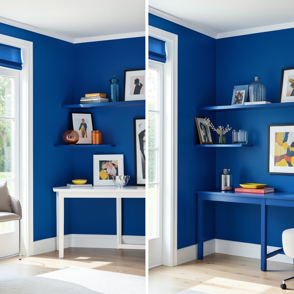
Basic white can feel too plain when the room needs a strong focal point. Cobalt blue creates a bold, crisp look that feels full of energy.
This shade is great for modern living rooms, art spaces, and cheerful offices. It stands out in a clean way and helps shelves, frames, and furniture pop.
Use cobalt with white trim to keep the look sharp and bright. A few yellow or orange accents can make the room feel lively and balanced. If you like a more polished style, add glass, chrome, or glossy decor pieces.
Cobalt can look expensive, but the wall color itself is often affordable. You can create a high-impact room with just one can of paint and a little planning. That makes it a strong choice for anyone wanting style on a budget.
15. Dark Beige Before, Lime After
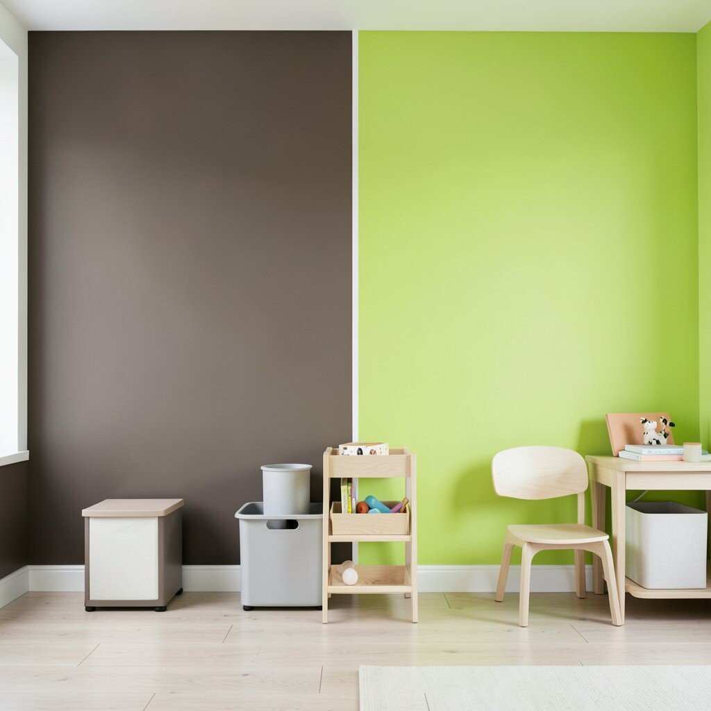
Dark beige can feel bland and heavy. Lime green brings a zesty, playful punch that wakes up the space.
This is a fun choice for kids’ rooms, craft rooms, and creative work areas. It feels lively and unusual, which makes the room memorable.
Lime looks best when it is balanced with white, pale gray, or natural wood. You can also add simple storage bins and clean-lined furniture so the wall stays the main star. Current design trends are leaning toward bold color pops, and lime fits that idea well.
If you want to keep costs low, use lime on a single wall or in painted shapes. A circle, arch, or stripe can make the room feel custom without using much paint. That is a clever way to get a fresh look with less effort.
16. Pale Peach Before, Midnight Blue After
Pale peach can feel soft but forgettable. Midnight blue brings a deep, dramatic look that feels rich and calm.
This color is perfect for bedrooms, media rooms, and dining spaces. It creates a cozy mood that makes the room feel more private and special.
Midnight blue looks beautiful with warm lamps, soft blankets, and light-colored art. If you want a modern touch, add a slim black frame or a simple floating shelf. The dark wall color can make lighter decor stand out in a very nice way.
Painting one wall can be a smart choice if you want the look without fully darkening the room. That keeps the cost lower and gives you room to test the shade. Many people like this style because it feels elegant without being fussy.
17. Flat Gray Before, Tangerine After
Flat gray can feel cold and empty in a room that needs life. Tangerine gives the wall a bright, sunny burst that feels full of motion.
This shade is excellent for kitchens, playrooms, and creative studios. It has a bold personality and can make a small area feel much more cheerful.
Tangerine pairs well with white, pale wood, and simple metal accents. If you want the room to feel less intense, use soft fabrics and calm art nearby. That balance helps the wall stand out in a good way.
Cost-wise, tangerine paint is usually no different from other colors, so the main choice is how much wall you want to cover. A half-painted wall can be a fun and budget-friendly option. It also gives you a trendy look that feels fresh and modern.
18. Pale Green Before, Plum After
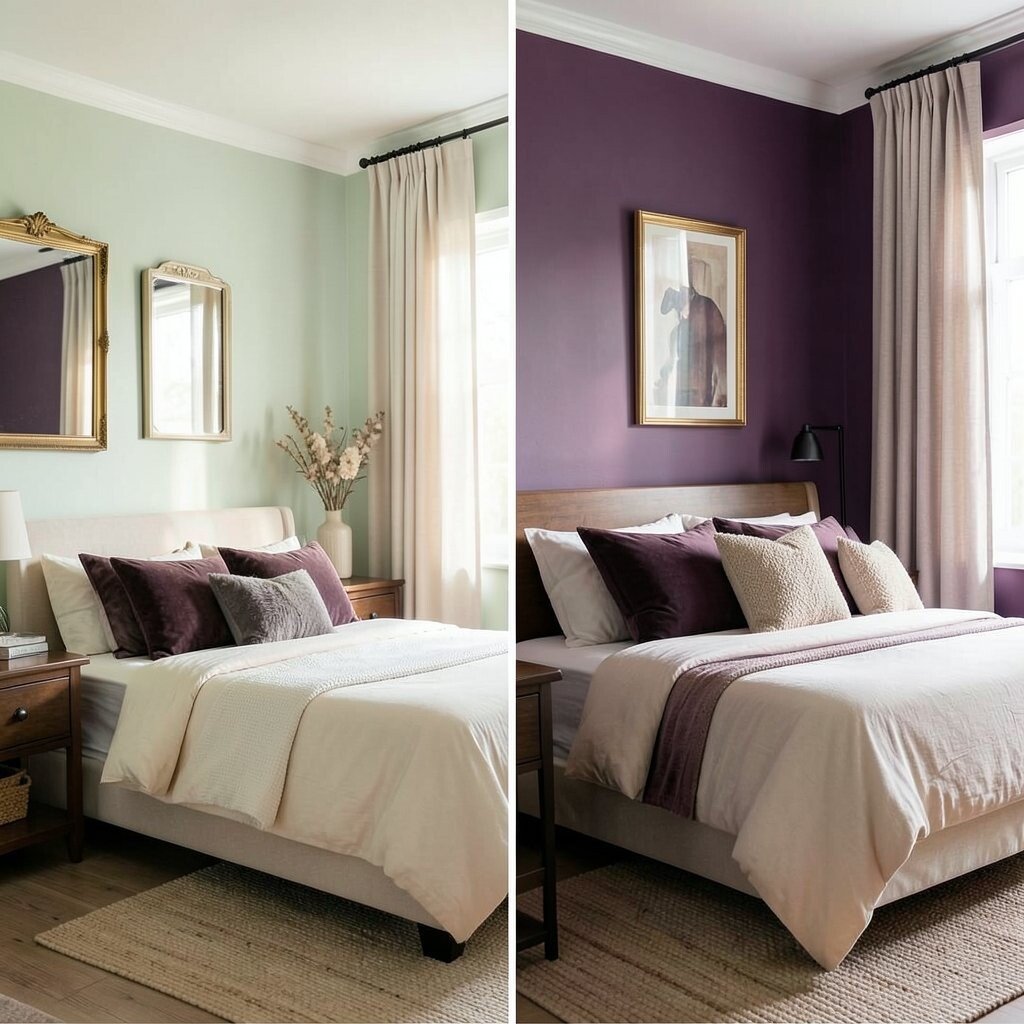
Pale green can feel sweet but not always exciting. Plum adds a deep, rich color that feels cozy and a little fancy.
This color works well in bedrooms, reading nooks, and dining rooms. It gives the space a unique mood that feels warm and thoughtful.
Plum pairs nicely with cream, gold, and dark wood. You can make it feel lighter by adding mirrors or pale curtains that bounce around the light. A few soft textures, like velvet pillows or a woven rug, make the room feel even better.
If you are watching your budget, paint just one wall behind a bed or sofa. That gives you a strong style moment without needing much material. Plum is a smart pick when you want a room that feels rich but still personal.
19. Old White Before, Aqua After

Old white walls can look tired even when they are clean. Aqua brings a fresh, watery feel that makes a room seem brighter and more open.
This color is a great fit for bathrooms, laundry rooms, and beachy living spaces. It feels crisp and cheerful, which can make daily chores feel a little lighter.
Aqua looks lovely with white tile, silver fixtures, and woven baskets. You can also add sea-glass decor or simple framed prints for a calm coastal mood. Those touches help the wall feel thoughtful instead of random.
Paint is still the easiest way to get this look, but small decor changes can help too. Try aqua towels, a rug, or a lamp if you want to test the color before painting. That can save money and help you plan the final style.
20. Faded Taupe Before, Raspberry After
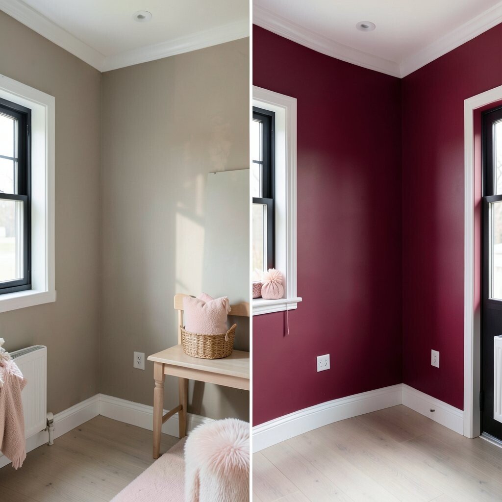
Faded taupe can feel quiet to the point of being dull. Raspberry adds a lively, juicy color that feels bold and cheerful.
This shade shines in accent walls, powder rooms, and creative spaces. It gives the room a strong personality and a fun sense of energy.
Raspberry looks great with white trim, black frames, and soft blush decor. If you want a more balanced feel, use just a section of the wall or a painted nook. That keeps the color exciting without making the whole room feel too intense.
Because the color is strong, you may not need much extra decor. That can help keep the overall cost lower while still giving the space a high-impact look. It is a great option for someone who wants a room that feels bold and playful.
21. Pale Yellow Before, Slate Blue After
Pale yellow can fade into the background when it gets too soft. Slate blue brings a cool, steady look that feels calm and stylish.
This color works well in bedrooms, offices, and hallways. It has a quiet beauty that feels easy to live with every day.
Slate blue pairs nicely with white, gray, and warm wood tones. You can make it feel more personal by adding framed family photos or art in simple colors. The wall becomes a peaceful backdrop that still has character.
For a cost-friendly update, use slate blue on the wall behind a desk or bed. That creates a clear focal point and avoids extra paint use. It is a simple way to refresh a room without a big project.
22. Busy Wallpaper Before, Fresh White-and-Color Stripe After
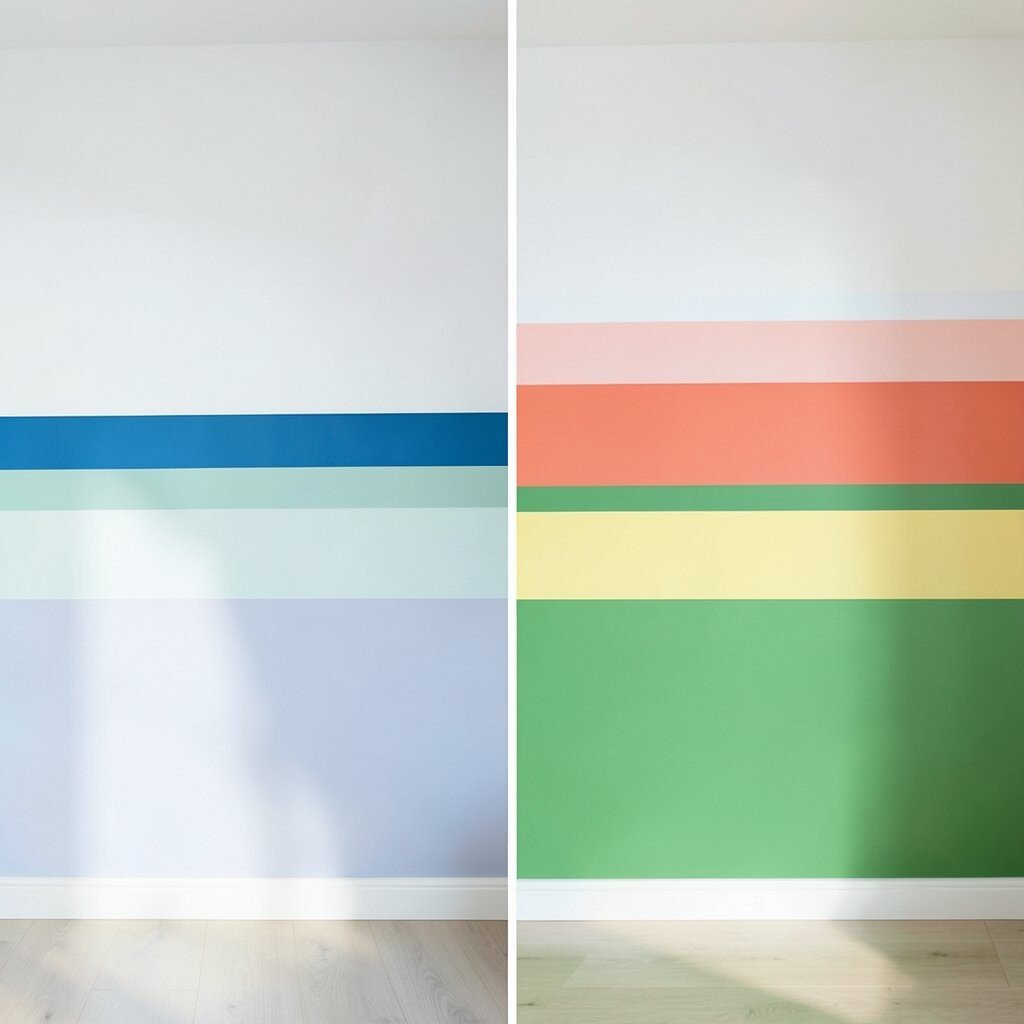
Busy wallpaper can make a room feel crowded and hard to rest in. A clean stripe design with white and one bright color gives the wall a neat, modern look.
This style is great for kids’ rooms, hallways, and small spaces that need more order. It feels unique because it is simple, yet it still brings in plenty of personality.
You can choose almost any color for the stripe, from blue to coral to green. Painter’s tape makes the job easier and keeps the lines straight. That means you can get a custom look without paying for fancy materials or professional help.
Stripes are also easy to update later if your taste changes. You can repaint the stripe in a new shade without redoing the whole wall. That flexibility makes this idea both fun and practical.
23. Tired Cream Before, Tropical Green After
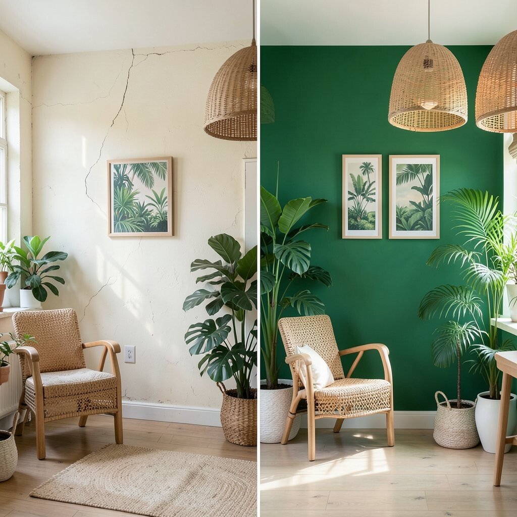
Tired cream walls can feel sleepy and old. Tropical green adds a fresh, leafy look that feels lively and full of nature.
This color is a strong choice for sunrooms, kitchens, and reading spots. It can make the room feel like a little indoor garden.
Tropical green looks great with woven furniture, bamboo shades, and lots of plants. You can also add white pottery or light wood to keep the room bright. That mix makes the wall feel rich but not heavy.
If you want to keep costs down, start with one wall and build the rest of the room slowly. Plants, baskets, and a few art prints can support the color without adding much expense. The result feels fresh, natural, and personal.
24. Cold Gray Before, Apricot After
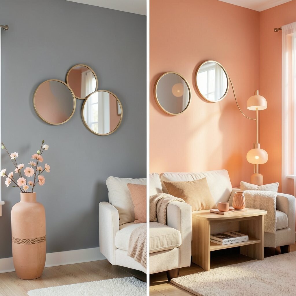
Cold gray can make a room feel stiff and unwelcoming. Apricot adds a soft, sunny warmth that feels cheerful and friendly.
This shade works well in family rooms, bedrooms, and cozy corners. It gives the wall a gentle glow that feels nice from morning to night.
Apricot pairs beautifully with cream, tan, and light wood. You can also bring in round mirrors or curved lamps to match the soft mood of the color. Those details are very on trend and help the room feel current.
Paint is a simple way to get this look, but you can also use apricot accessories if you want to test the style first. That can help you spend less while still changing the feel of the room. It is a warm choice for anyone who wants comfort with a little sparkle.
25. Plain Off-White Before, Peacock Blue After
Plain off-white can feel safe but flat. Peacock blue makes the wall look rich, bright, and full of depth.
This color is wonderful in living rooms, dining spaces, and stylish bedrooms. It has a jewel-like quality that feels special and memorable.
Peacock blue looks great with gold accents, dark wood, and creamy fabrics. If you want a softer balance, add pale art, linen curtains, or a light rug. Those pieces keep the room from feeling too dark while still letting the wall shine.
Although the color is bold, the project itself can stay affordable. One painted wall can give you the same wow factor as a full room in many cases. That makes it a smart pick for a big style change on a small budget.
26. Worn Brown Before, Candy Pink After
Worn brown can feel heavy and dated in a room that needs joy. Candy pink brings a fun, bright, and upbeat look that feels full of personality.
This shade works well in playrooms, creative studios, and small accent areas. It is playful and unique, and it can make even a plain corner feel special.
Candy pink pairs nicely with white, chrome, and soft gray for a clean finish. If you want the room to feel more balanced, add simple shelves and calm bedding or seating. A mix of sweet color and neat lines keeps the look from feeling too busy.
Because pink can be strong, you may want to start with a smaller area first. That keeps the cost low and gives you room to see how the shade feels in your light. When used well, it can turn a forgotten wall into the happiest part of the room.