Color can wake up a room fast. Mosaic shades make every tiny piece feel alive.
1. Sunflower Yellow
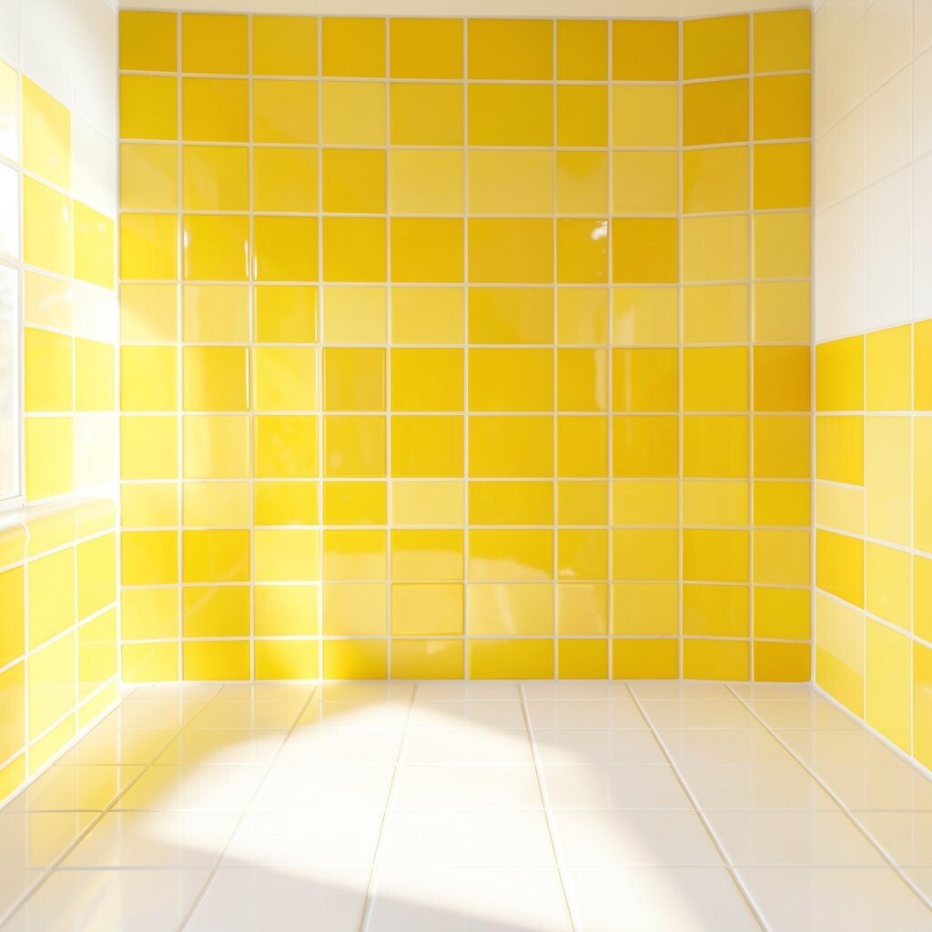
Sunflower yellow brings a happy, glowing look that feels warm right away. It shines like late morning light on glass and tile.
This color can make a space feel cheerful and open, which is great for kitchens, patios, and art corners. Try pairing it with white grout for a crisp look or with deep blue for bold contrast. If you want a budget-friendly start, use yellow glass chips in a small accent panel before committing to a whole wall.
2. Ocean Blue

Ocean blue gives mosaics a calm, cool feel that still looks rich and lively. It reminds people of water, sky, and shiny stones.
This shade works well when you want a peaceful mood in bathrooms, entryways, or garden art. Mix light and dark blues for depth, or add silver pieces for a fresh modern touch. If you like current home trends, this color fits coastal style and clean minimal rooms very well.
For a personal touch, use ocean blue around a favorite symbol like a wave, star, or fish. Small glass tiles can keep costs lower while still giving that bright, watery shine. The result feels soothing and special without looking plain.
3. Coral Pink
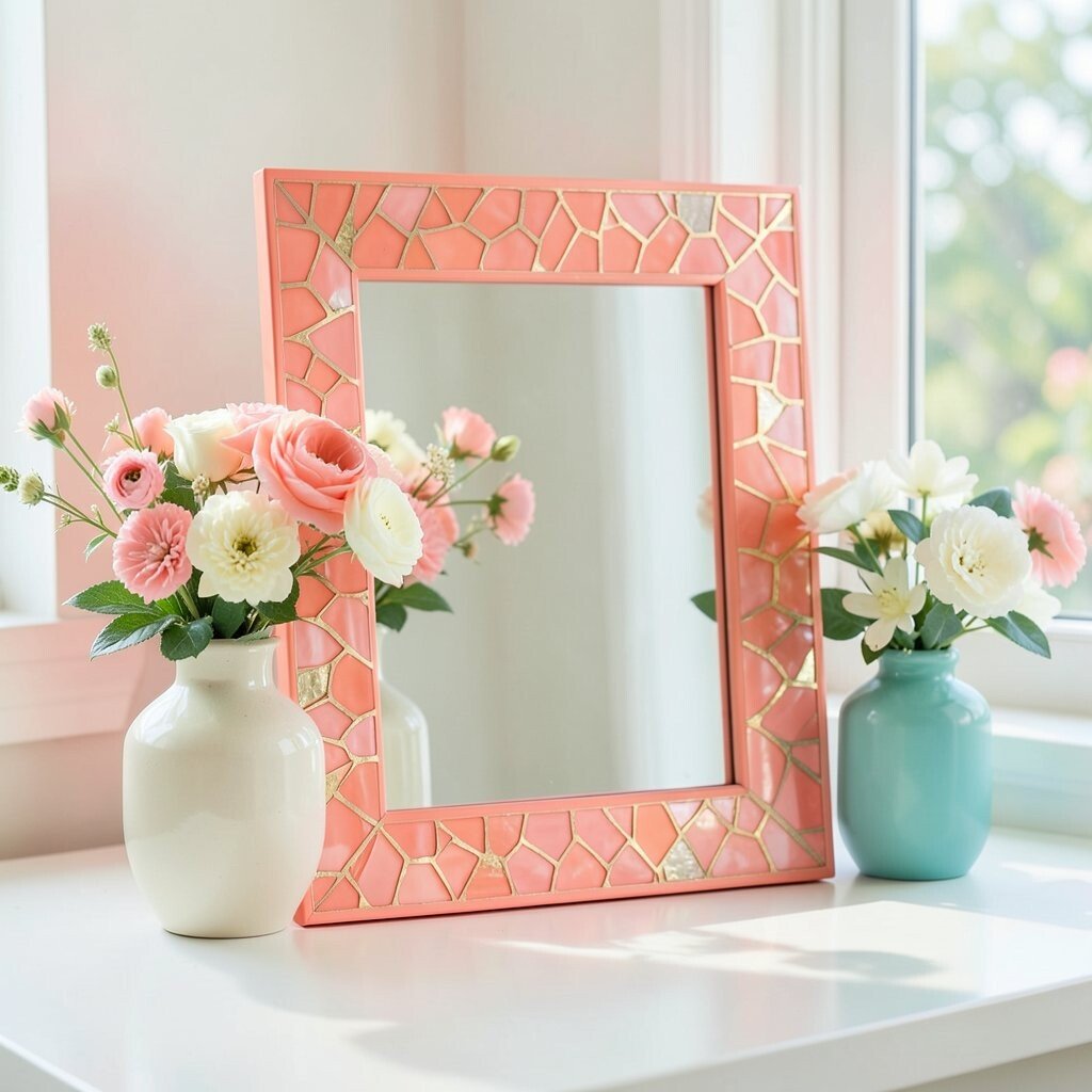
Coral pink has a soft glow that feels friendly and playful. It sits between pink and orange, so it looks lively without being too loud.
This color can brighten a mirror frame, flower pot, or tabletop with a sweet burst of charm. It pairs nicely with cream, mint, and teal, which makes color planning easy. If you want a custom look, blend coral with tiny bits of gold for a rich finish.
Coral is a smart choice when you want something trendy but still easy to live with. It often looks more expensive than it is, especially when used in small sections. Try it in a sunroom or craft project for a warm and cheerful result.
4. Emerald Green
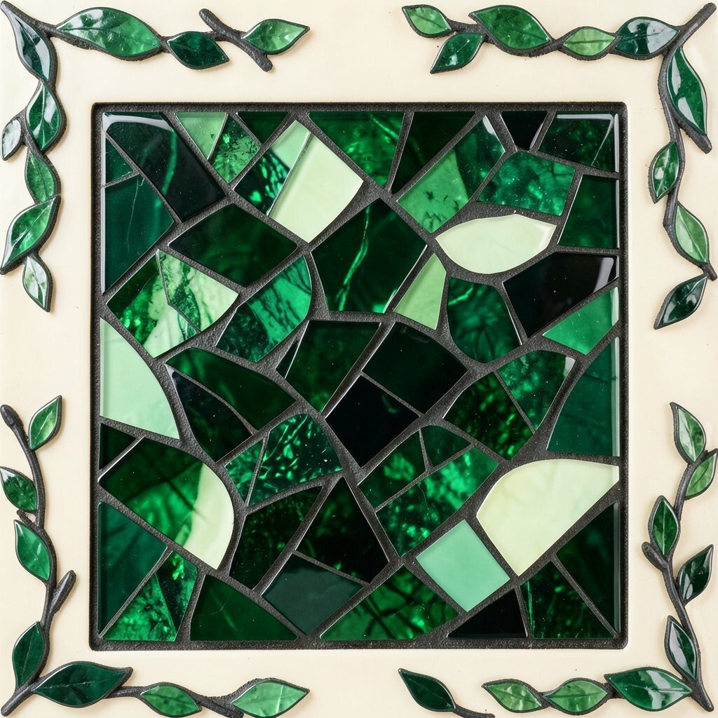
Emerald green feels deep, shiny, and full of life. It can make a mosaic look like a jewel box.
This shade is great for nature themes, leafy patterns, and garden walls. It brings a fresh feeling to spaces that need more energy and balance. Pair it with black grout for drama or with pale cream for a softer look.
Emerald also works well in small amounts if you want a rich accent without spending too much. Glass and ceramic pieces in this color can be mixed for texture and shine. For a personal twist, add tiny leaf shapes or vine lines around the main design.
5. Ruby Red
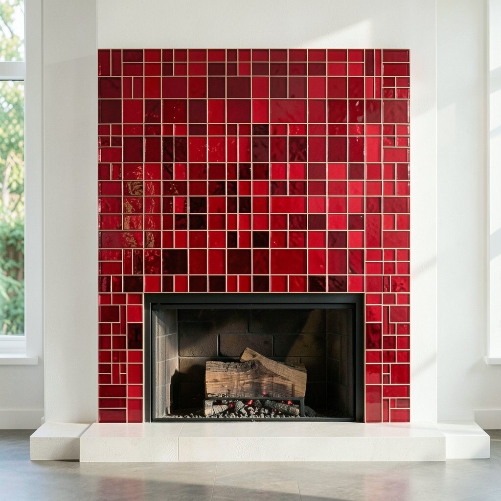
Ruby red makes a mosaic feel bold and full of heart. It catches the eye fast and gives strong energy to any design.
This color is perfect for feature pieces, like a wall art panel or fireplace surround. It pairs well with gold, white, and black, so it can fit both classic and modern styles. If you want your work to feel more dramatic, use ruby red near the center of the design.
Red tiles can cost more if you choose specialty glass, so it helps to use them as accents. A little ruby red goes a long way in making a piece feel special. Many makers love it because it adds warmth and a sense of celebration.
6. Lavender Purple
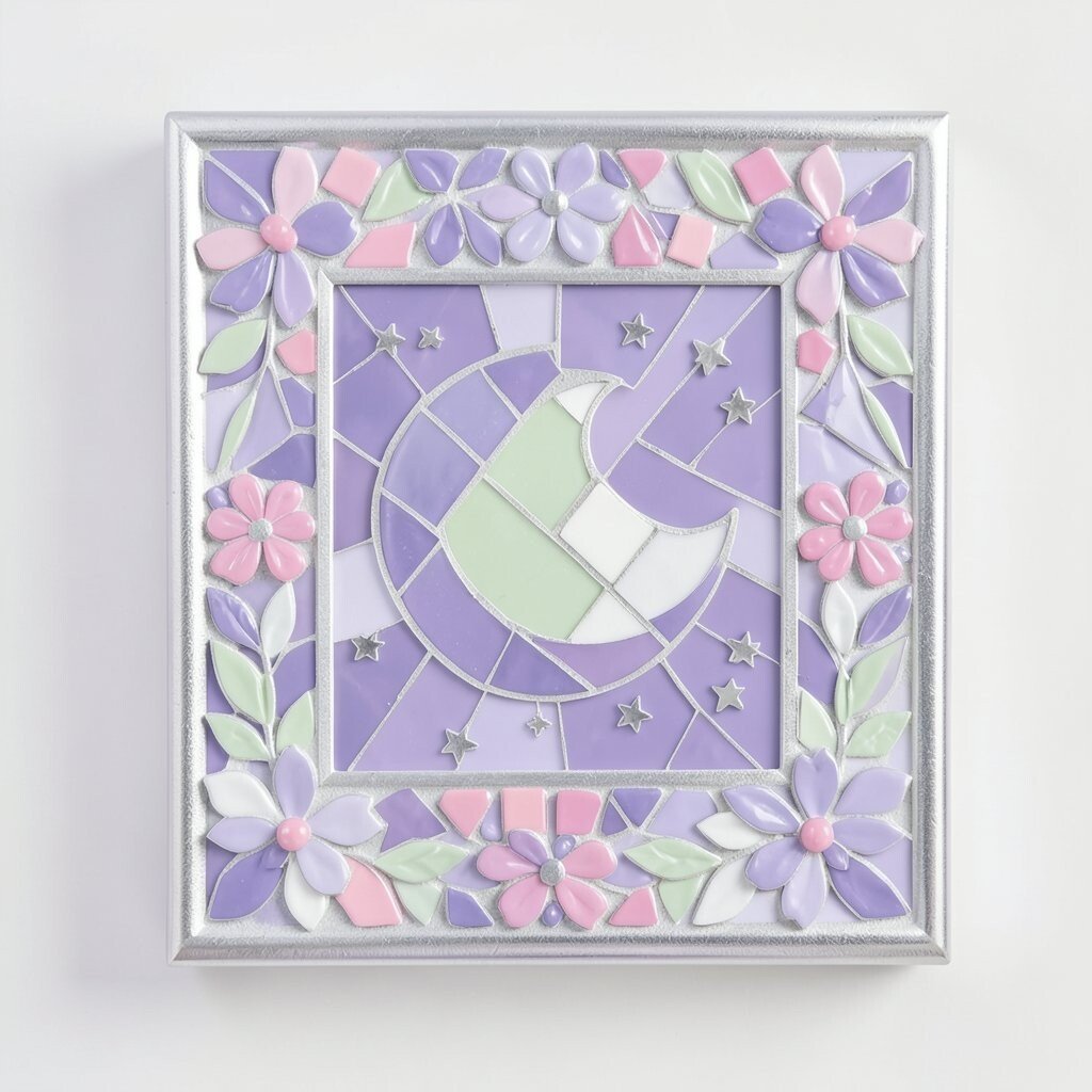
Lavender purple has a soft, dreamy look that feels calm and creative. It can make a mosaic seem light and airy.
This color works well in bedrooms, reading spaces, and decorative frames. It looks pretty with silver, white, and pale green, which keeps the design gentle. If you want a more playful style, mix lavender with tiny bright pink pieces.
Lavender is a nice choice for people who like a fresh, modern feel without harsh edges. It can also hide small color changes well, which helps when using mixed tile lots. Try it in a floral pattern or a moon-and-stars design for a personal touch.
7. Tangerine Orange
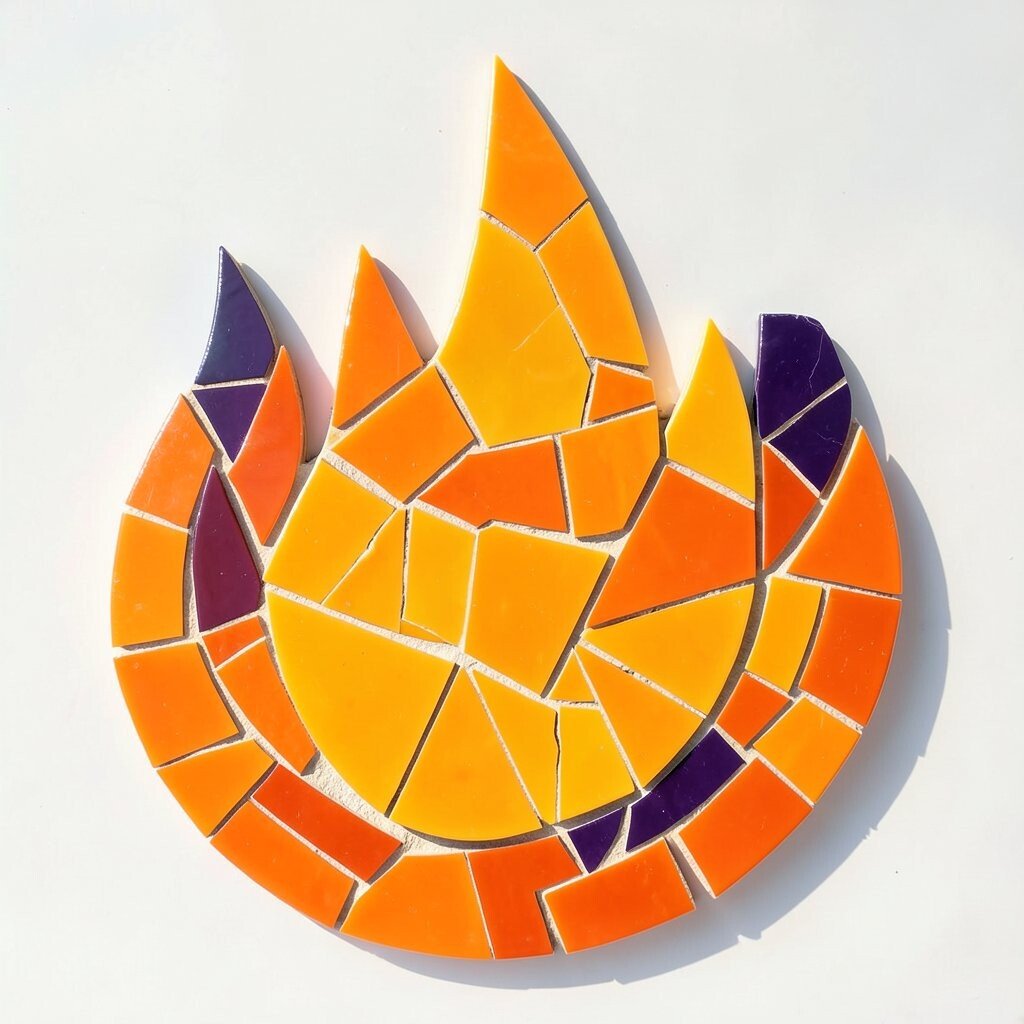
Tangerine orange brings a burst of energy that feels lively and fun. It has a sunny glow that can lift the mood of a whole project.
This color is great for playful art, kitchen backsplashes, and outdoor decor. It looks strong next to blue, teal, or deep purple, so contrast is easy to create. If you want to keep costs down, use tangerine as an accent color rather than the main field.
Orange mosaic pieces can make a design feel more active and full of movement. That is why many makers use it in flame shapes, fruit themes, or abstract swirls. It is a bold pick for anyone who wants a bright, happy statement.
8. Turquoise
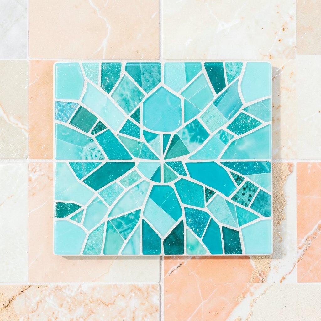
Turquoise feels fresh, bright, and full of clear water charm. It can make a mosaic look light even when the pattern is busy.
This shade is popular in beach-inspired decor and modern handmade pieces. It works well with sandy beige, white, and coral for a balanced look. If you want a trendy finish, use mixed tile sizes so the surface has more sparkle.
Turquoise is also a smart color for personal projects because it matches many styles. You can use it in borders, center shapes, or tiny highlight spots. It gives a clean, uplifting feeling that many people love right away.
9. Lime Green
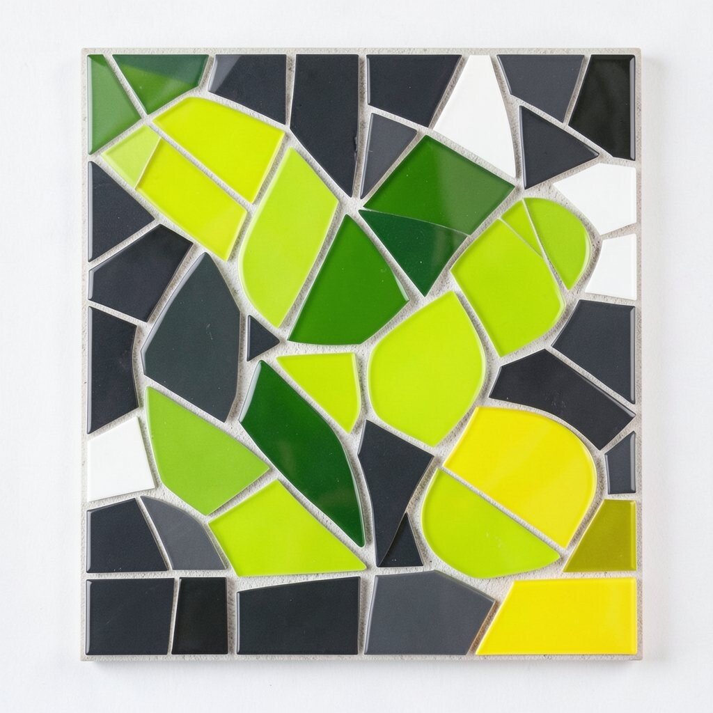
Lime green has a zesty, electric look that feels young and fresh. It stands out fast in both indoor and outdoor mosaics.
This color is useful when you want a design to feel playful and modern. It pairs well with charcoal, white, and bright yellow for a bold pop. If you are working on a small budget, a few lime pieces can still make the whole piece feel lively.
Lime green is perfect for leaves, frogs, abstract shapes, and fun kids’ projects. It gives a cheerful boost without needing a lot of extra detail. For a custom idea, mix it with matte tiles and shiny glass to add texture.
10. Cobalt Blue

Cobalt blue has a deep, rich shine that feels strong and elegant. It can make a mosaic look polished and confident.
This color works well for borders, patterns, and bold focal points. It looks beautiful with white, silver, and gold, which makes it easy to style. If you want a high-end feel without using rare materials, cobalt glass can give strong visual impact on its own.
Many people like cobalt because it suits both classic and modern homes. It also hides grout lines nicely when used in larger sections. Try it in wave patterns, geometric shapes, or a night-sky theme for a striking result.
11. Peach
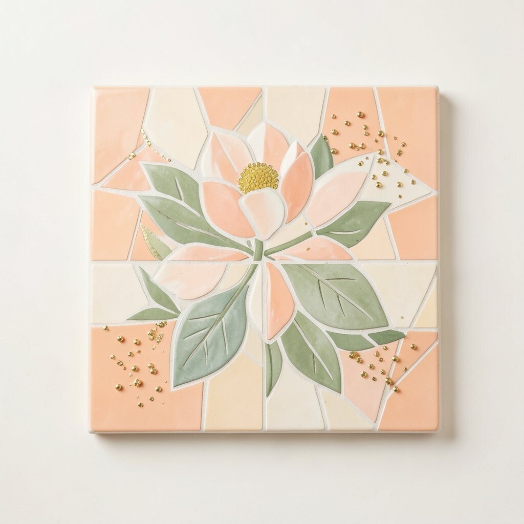
Peach gives mosaics a soft glow that feels warm and kind. It looks gentle but still has enough color to stay interesting.
This shade is lovely for nursery decor, bathroom accents, and floral art. It pairs well with cream, blush, and sage green, which creates a calm mood. If you want a low-cost option, peach ceramic tiles can often be found in simple craft packs.
Peach works well when you want a design that feels sweet rather than loud. It can soften sharp shapes and make the whole piece feel more welcoming. Add tiny gold pieces for a little sparkle and a more personal touch.
12. Teal
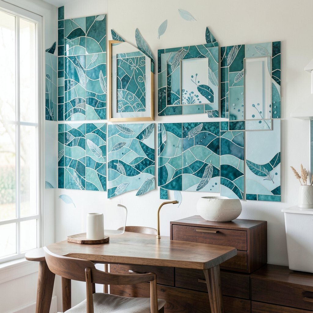
Teal blends blue and green in a way that feels rich and fresh. It has a cool look that still feels warm enough for cozy spaces.
This color is popular in modern decor because it works with many styles. It looks great with brass, white, and dark wood, making it easy to place in a home. If you want to save money, use teal as a main color with simple neutral fillers.
Teal mosaics can feel calm, stylish, and a little bit fancy all at once. They are great for tabletops, frames, and wall accents. For a custom design, add wave lines, feather shapes, or tiny dots in lighter blue.
13. Hot Pink

Hot pink brings a bright, bold punch that never hides in the background. It feels fun, fearless, and full of personality.
This color is perfect for art pieces that need a strong focal point. It looks great with black, white, and orange, which makes it easy to build lively patterns. If you want a trendy style, hot pink works well with shiny finishes and mixed textures.
Because it is so strong, a little hot pink can go a long way. That makes it useful if you want a big effect without using too many expensive tiles. Try it in hearts, flowers, or abstract bursts for a design that feels full of energy.
14. Mint Green

Mint green has a cool, soft look that feels clean and friendly. It gives mosaics a fresh mood without feeling cold.
This shade is great for bathrooms, kitchens, and spring-themed art. It pairs nicely with white, pale pink, and light gray for a gentle style. If you want a simple update, mint can make old surfaces feel newer and brighter.
Mint is also easy to personalize with small flower shapes or leaf details. It works well in both shiny glass and smooth ceramic, so you have many material choices. Many people like it because it feels current but still easy to enjoy for years.
15. Gold

Gold makes a mosaic glow like sunlight on treasure. It gives even small designs a rich and special feel.
This color is ideal for borders, highlights, and tiny accent pieces. It pairs beautifully with almost anything, especially navy, black, red, and white. If cost matters, use gold sparingly so the whole project still looks luxurious without using too much material.
Gold can turn a simple pattern into something eye-catching and elegant. It is a favorite in modern decor because it adds shine without needing a full bright palette. For a personal touch, place gold around a symbol, name, or center flower to make it stand out.
16. Sky Blue
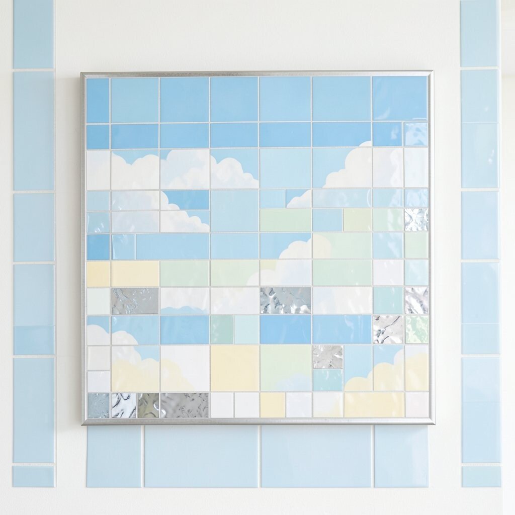
Sky blue feels open, light, and peaceful. It can make a mosaic look as airy as a clear day.
This color is useful for cloud themes, baby rooms, and calm wall art. It looks lovely with white, silver, and pale yellow, which keeps the design soft. If you want a low-stress project, sky blue is easy to match with many other shades.
It also works well in current coastal and cottage styles. You can mix glossy and matte tiles for a more interesting surface. Try using sky blue in a border or background to help brighter colors stand out.
17. Plum
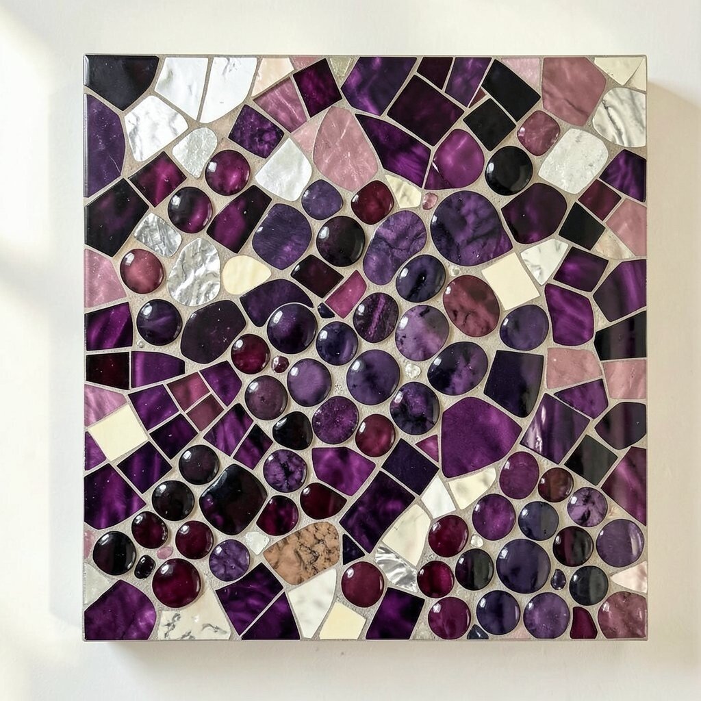
Plum has a deep purple tone that feels rich and thoughtful. It can make a mosaic look mature and full of depth.
This shade works well in elegant home decor and dramatic art pieces. It pairs nicely with silver, cream, and dusty pink for a balanced look. If you want a more affordable way to use plum, add it in small clusters instead of covering a large area.
Plum is unique because it feels bold without being as loud as red or orange. It can bring a cozy mood to a space while still looking artistic. Use it for grapes, flowers, or abstract curves to give your work a special feel.
18. Lemon Yellow
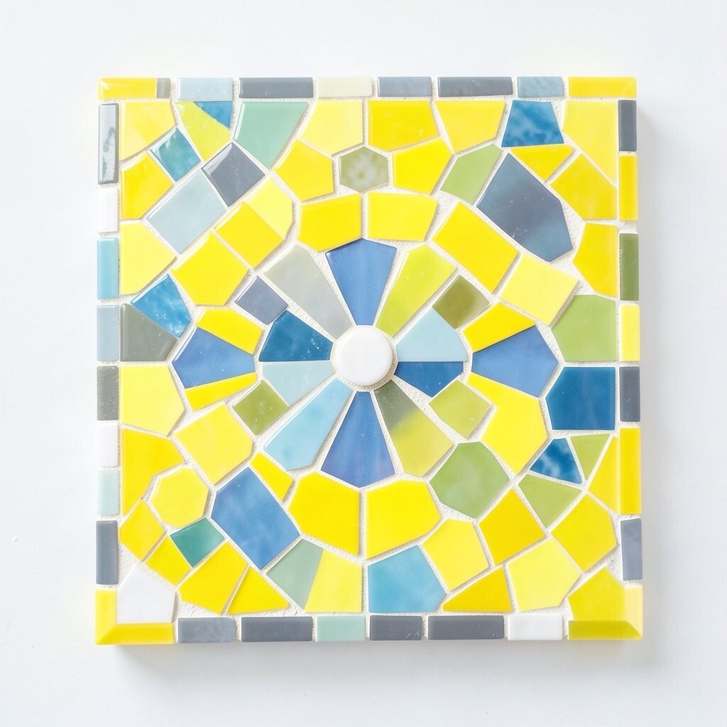
Lemon yellow has a bright, crisp shine that feels fresh and cheerful. It can light up a mosaic like a flash of morning sun.
This color is great for playful patterns, kitchen accents, and outdoor signs. It pairs well with gray, blue, and white, which helps it stand out in a clean way. If you want a budget-friendly design, lemon yellow can be used in small highlights for a big lift.
Lemon is especially nice when you want a piece to feel happy and easy to read. It works well in floral centers, sun shapes, and simple geometric designs. Many makers like it because it brings instant energy without making the project feel heavy.
19. Seafoam
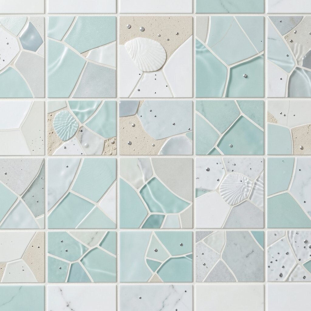
Seafoam has a soft blue-green look that feels breezy and calm. It gives mosaics a gentle shine that is easy on the eyes.
This shade fits well in spa-style rooms, beach art, and soft nature themes. It pairs with white, sand, and pale gray for a quiet, modern feel. If you want to keep costs down, seafoam can be used with plain neutral tiles and still look polished.
Seafoam is a nice choice for people who want color without too much brightness. It can make a design feel smooth and restful. Add shell shapes, water ripples, or tiny dots of silver for a more personal touch.
20. Cherry Red
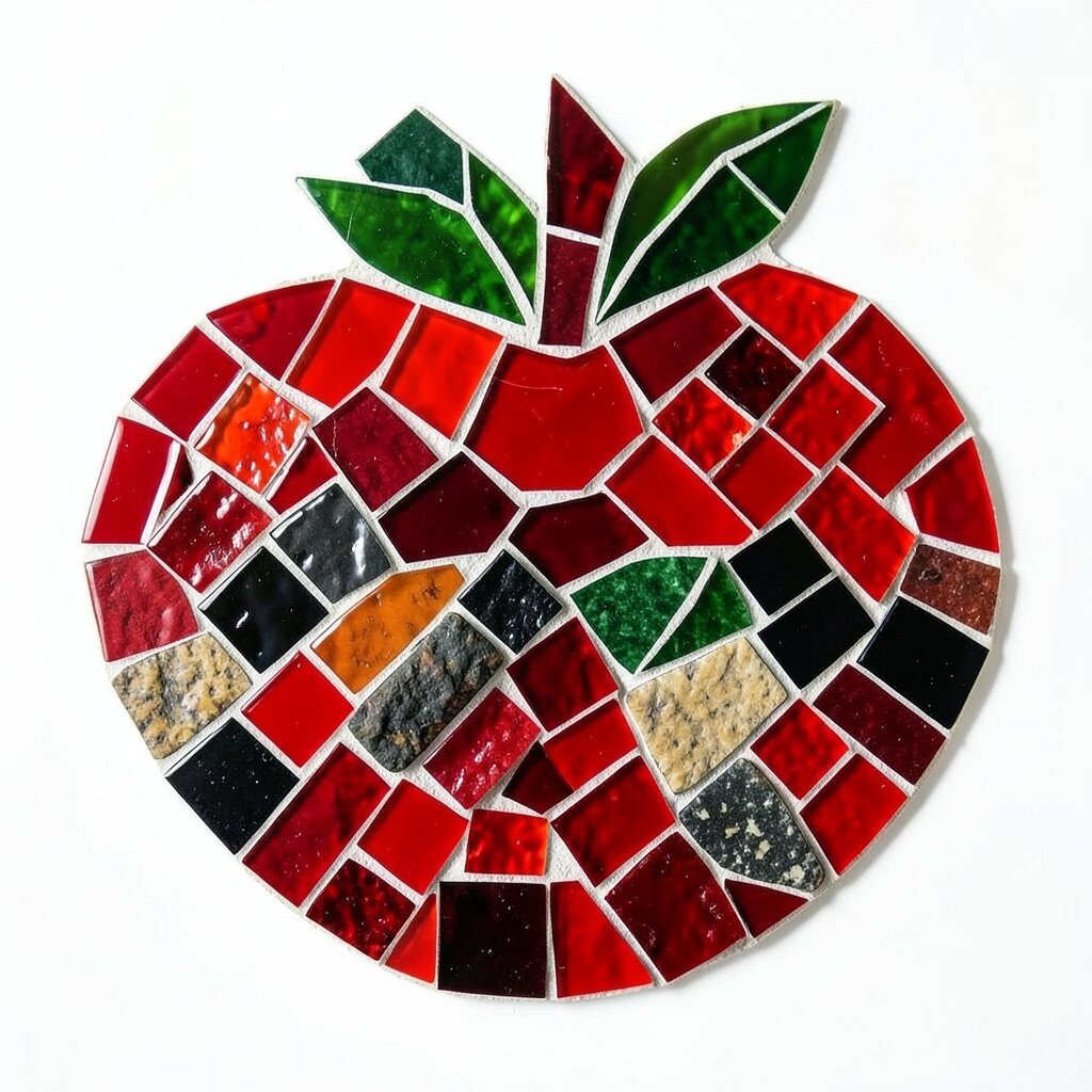
Cherry red is bright, juicy, and full of life. It adds a strong spark that can make a mosaic feel bold right away.
This color works well in fruit themes, holiday decor, and strong graphic designs. It looks sharp with white, black, and green, so it is easy to style. If you want a dramatic effect on a smaller budget, use cherry red in a few key spots instead of everywhere.
Cherry red is unique because it feels both classic and playful. It can make tiny mosaic pieces look extra vivid when light hits them. For a custom idea, try mixing glossy red with rough stone pieces to create contrast.
21. Periwinkle
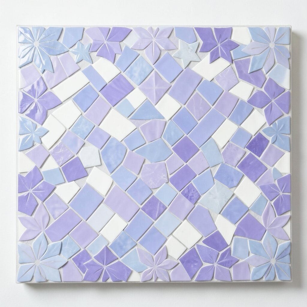
Periwinkle has a soft blue-violet look that feels dreamy and light. It adds a gentle charm that stands out without shouting.
This shade works well in whimsical art, nursery decor, and flower patterns. It pairs nicely with white, lavender, and silver for a calm, pretty palette. If you want an easy way to make a piece feel current, periwinkle fits many modern color trends.
It is also helpful when you want your mosaic to feel personal and sweet. Periwinkle can soften sharp shapes and make the whole design feel more welcoming. Use it in stars, petals, or borders to give your project a soft glow.
22. Burnt Orange
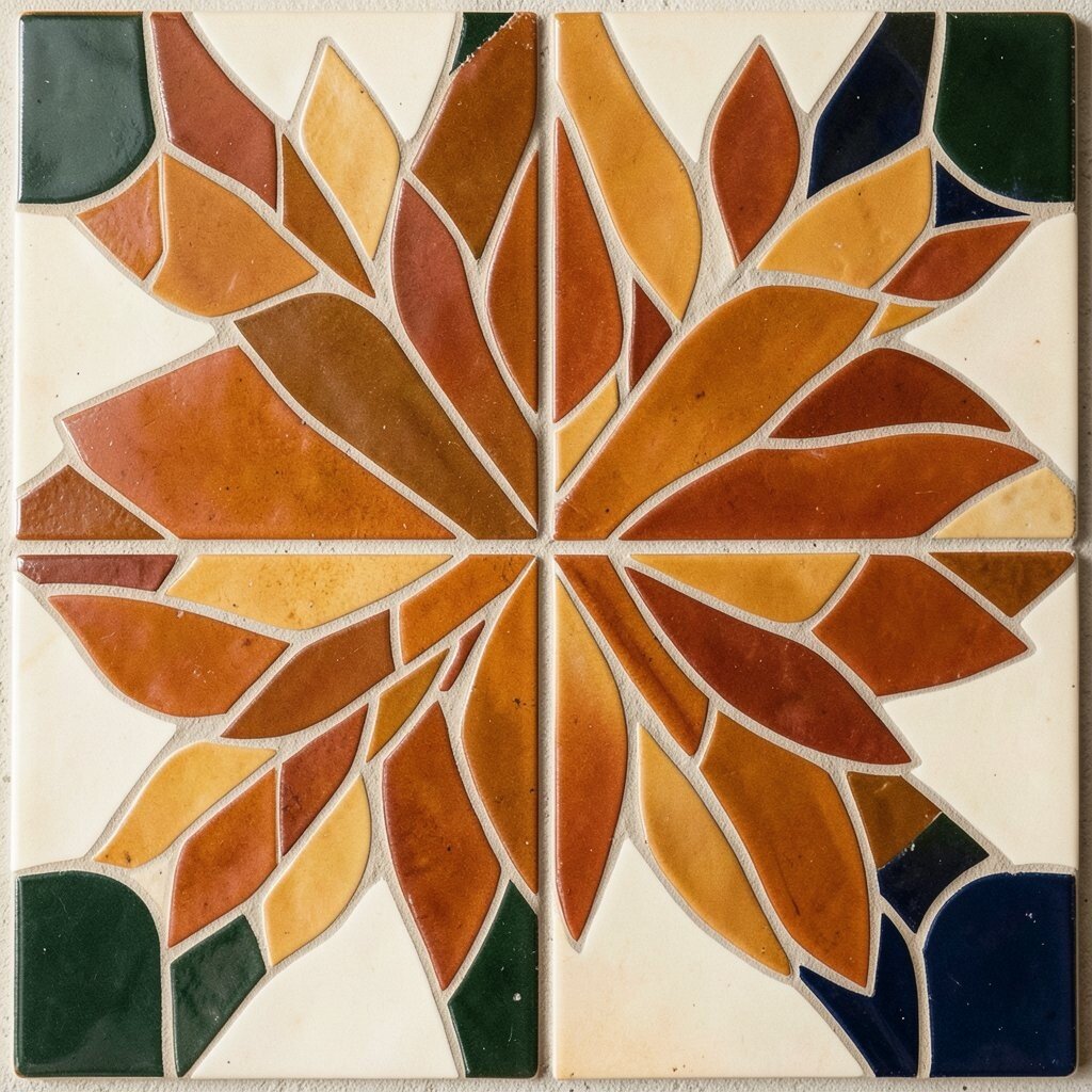
Burnt orange has a warm, earthy look that feels rich and grounded. It brings the color of autumn leaves and clay pots into a mosaic.
This color is great for rustic spaces, fall art, and nature-inspired pieces. It pairs well with cream, dark green, and navy for a balanced look. If you are watching your budget, burnt orange ceramic tiles often give a lot of style without needing fancy extras.
Burnt orange is unique because it feels both bold and cozy. It can make a design feel handmade in the best way. Try using it in leaf shapes, sunbursts, or border bands for a warm and inviting result.
23. Lilac

Lilac has a light purple glow that feels sweet and dreamy. It can make a mosaic look soft, neat, and graceful.
This shade is lovely for floral art, gift pieces, and calm decorative panels. It looks pretty with white, pale green, and silver, which helps keep the design fresh. If you want a simple custom idea, use lilac as the main color and add one bright accent for surprise.
Lilac also works well in modern home decor because it feels gentle but not dull. It can brighten a room without taking over the whole space. Many crafters like it for frames, trays, and wall art because it gives a polished finish.
24. Aqua
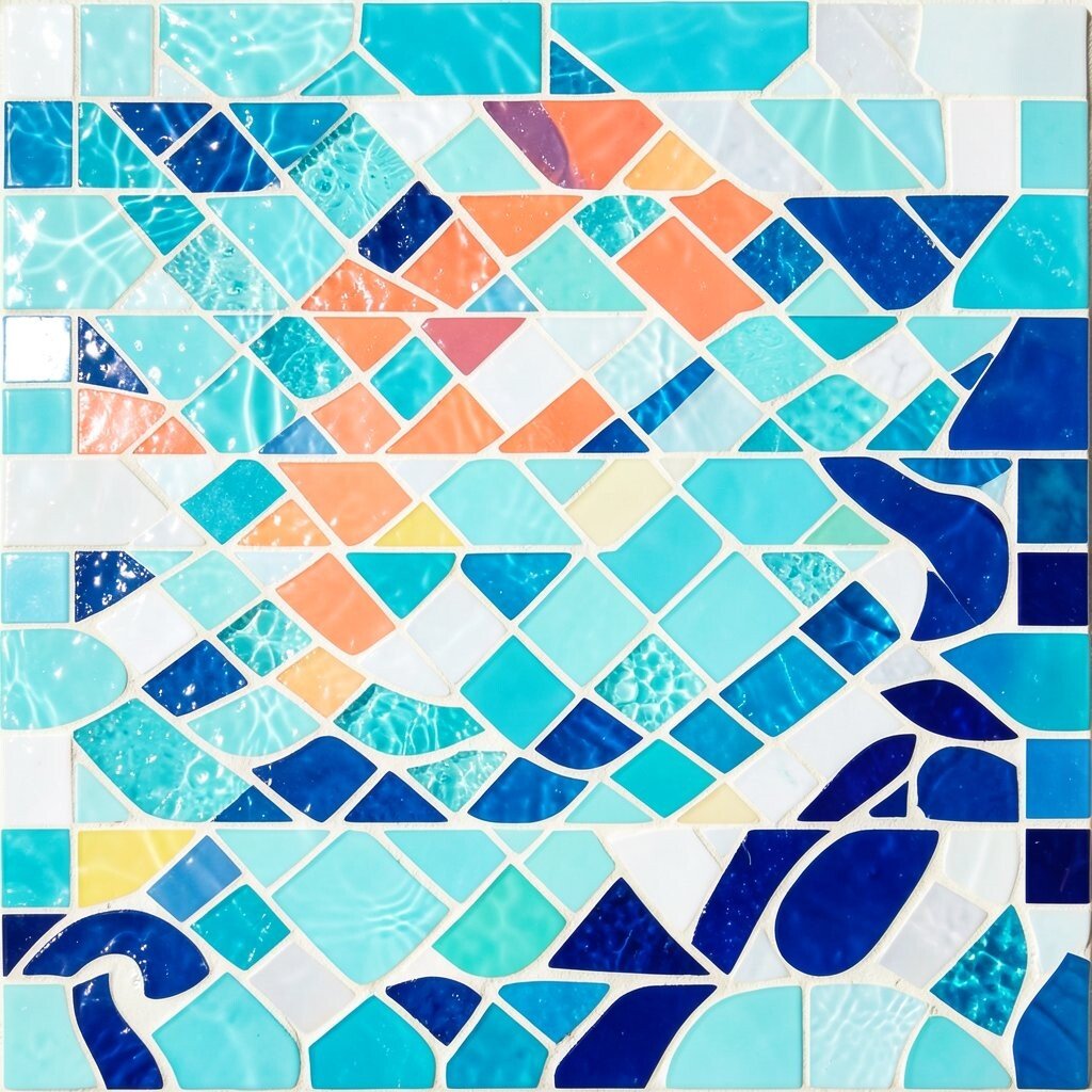
Aqua is bright, clear, and full of water-like sparkle. It gives mosaics a cool, lively feel that is hard to miss.
This color is a favorite for beach themes, poolside decor, and playful abstract art. It pairs well with white, coral, and deep blue for a fresh look. If you want to keep costs reasonable, aqua can shine even in small tile pieces.
Aqua is useful when you want a design to feel young and energetic. It adds motion and brightness without making the piece feel heavy. Try it in fish scales, waves, or swirling shapes to create a fun personal style.
25. Raspberry

Raspberry has a rich pink-red tone that feels sweet and strong at the same time. It gives mosaics a juicy, lively look.
This shade works well in floral patterns, heart designs, and bold decorative borders. It pairs nicely with cream, plum, and gold, which makes the whole piece feel warm. If you want a stylish look on a smaller budget, use raspberry as an accent color with simple background tiles.
Raspberry is unique because it feels both soft and powerful. It can make a design look romantic without becoming too delicate. Add small shiny pieces nearby to make the color pop even more.
26. Chartreuse
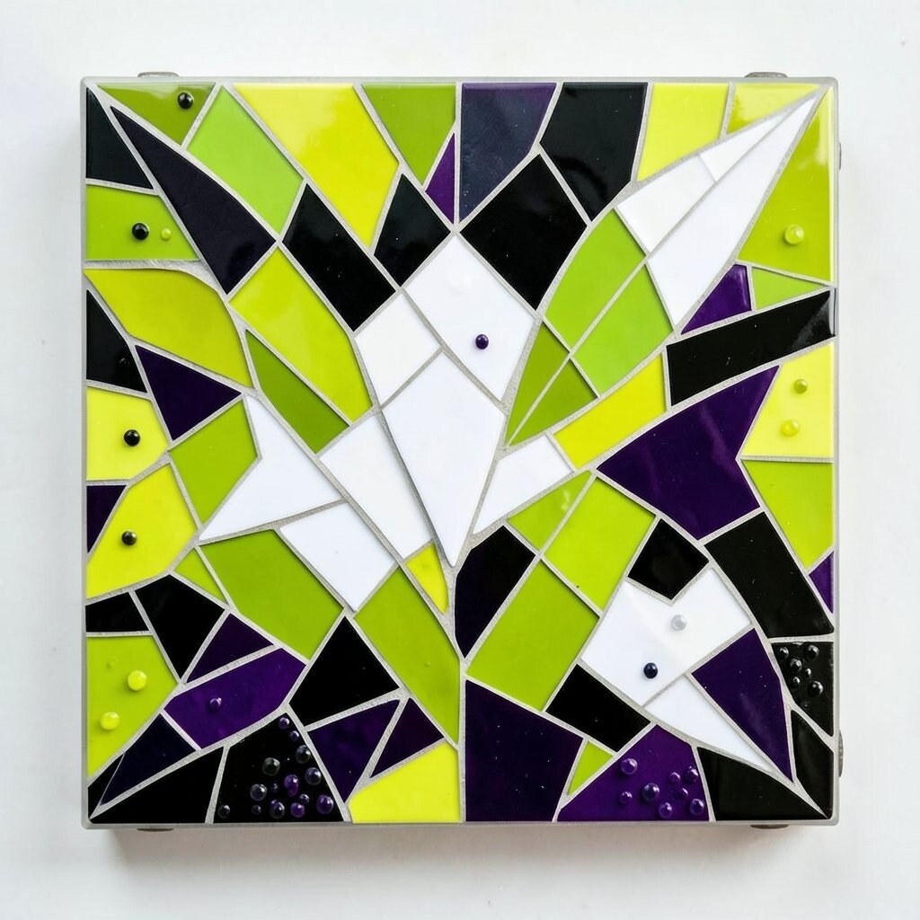
Chartreuse is a yellow-green shade that feels wild, bright, and modern. It can make a mosaic look fresh and full of surprise.
This color is perfect for bold accents, abstract art, and nature-inspired pieces with a twist. It pairs well with black, white, and deep purple for strong contrast. If you want to follow current design trends, chartreuse works well in modern graphic styles.
Because it is so unusual, chartreuse can make a project feel one of a kind. It is best used with care so the design stays balanced and pleasant. For a personal touch, try it in leaf tips, small dots, or sharp geometric lines.
27. Rose Gold
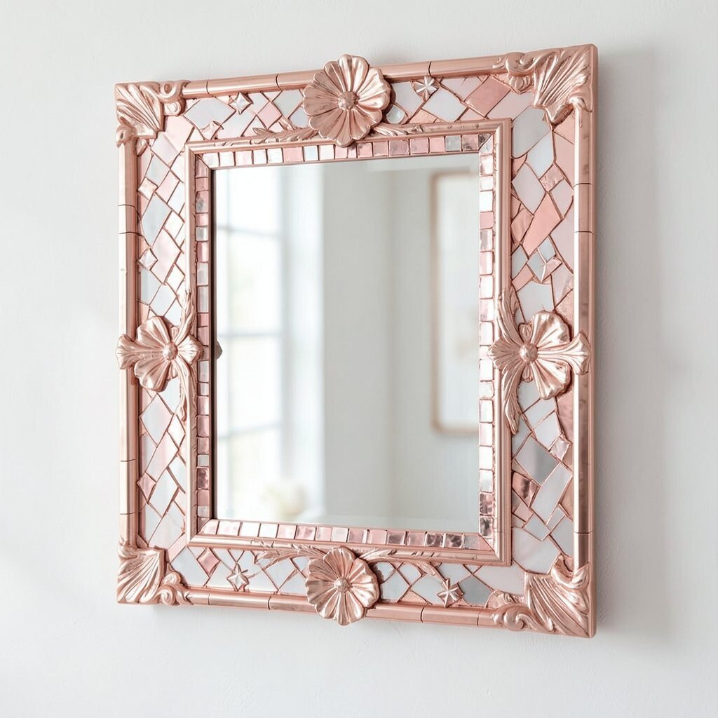
Rose gold has a soft pink-metal shine that feels both warm and fancy. It gives mosaics a gentle glow that catches light beautifully.
This color is popular in modern decor because it feels stylish and friendly at once. It looks lovely with white, blush, gray, and navy, so it fits many rooms. If you want a richer look without a huge cost, rose gold accents can do a lot of work in a small area.
Rose gold is great for frames, mirrors, jewelry boxes, and elegant wall art. It can make a handmade piece feel polished and gift-worthy. Add it to edges, stars, or floral centers for a soft, special finish.
28. Indigo
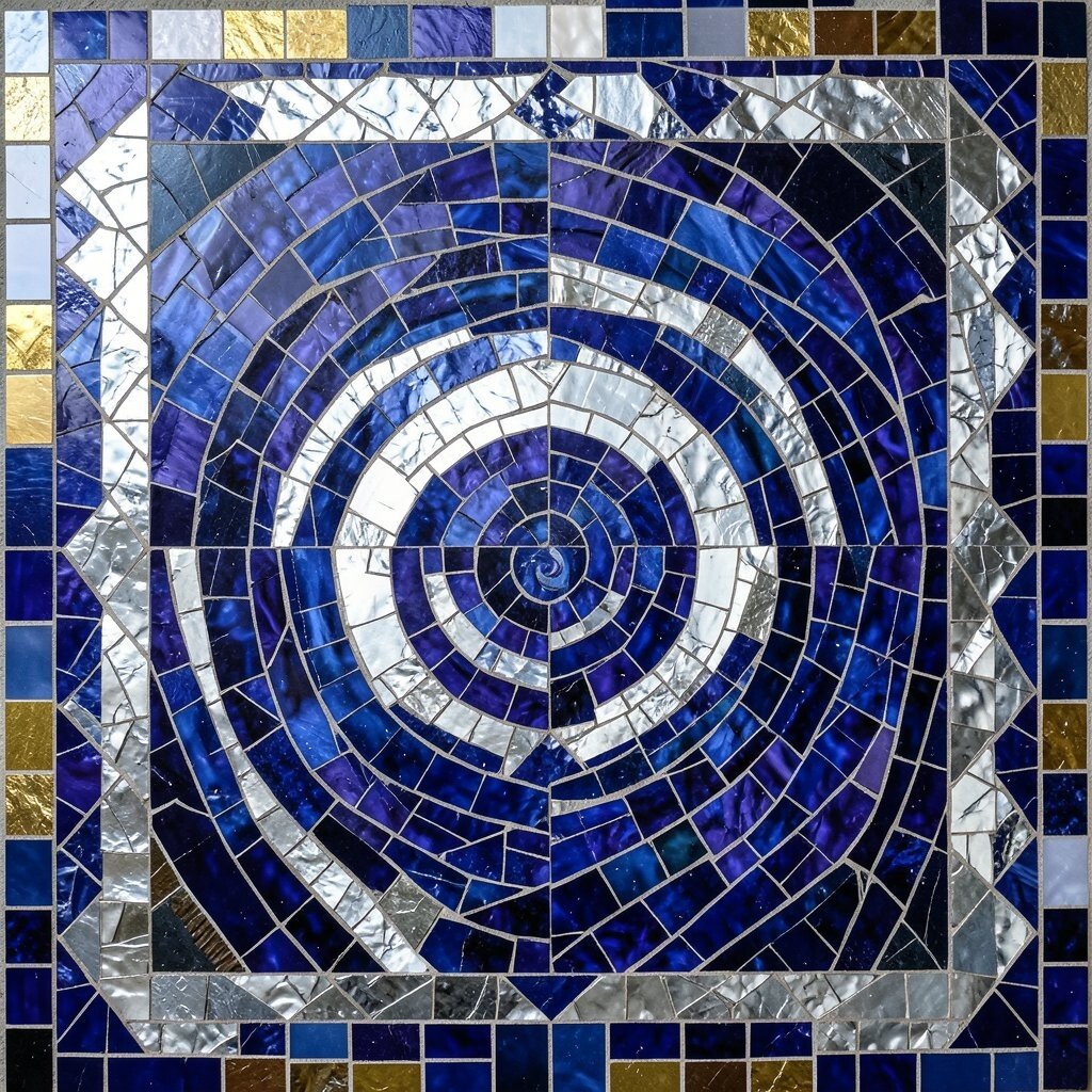
Indigo has a deep blue-purple tone that feels calm and dramatic. It gives mosaics a night-sky mood with a strong sense of depth.
This shade works well in celestial art, moody interiors, and bold geometric patterns. It pairs beautifully with silver, white, and gold for a rich contrast. If you want a design that feels high style, indigo can make simple shapes look more serious and elegant.
Indigo is also useful when you want to hide small flaws in tile size or color mix. It can make a piece feel fuller and more layered. Try it in backgrounds, borders, or swirling skies for a striking effect.
29. Apricot
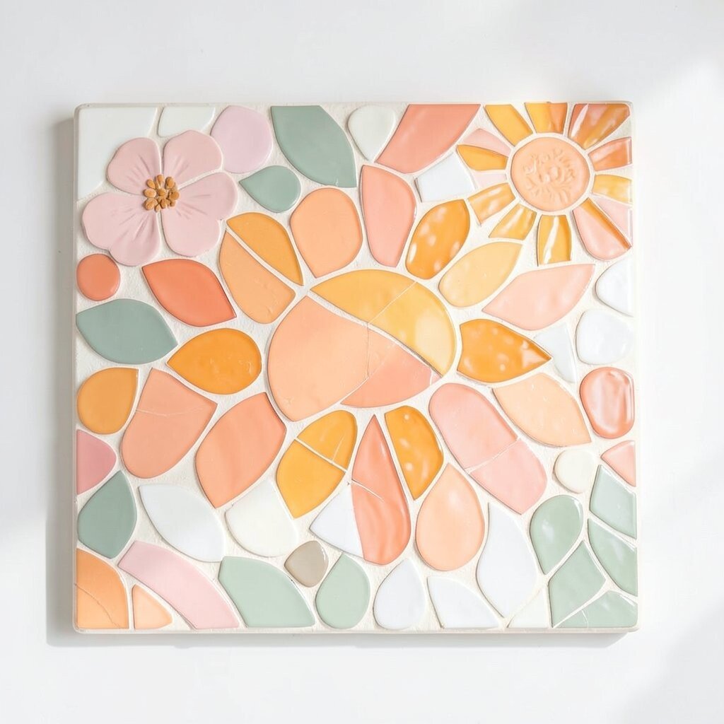
Apricot has a soft orange-peach glow that feels sunny and kind. It adds warmth without being too bright or too dark.
This color is lovely for kitchen decor, spring art, and gentle floral scenes. It pairs well with white, sage, and soft pink, which keeps the look smooth. If you want a low-cost way to add charm, apricot can brighten a design with just a few small sections.
Apricot works well for people who like a cheerful but calm style. It can make a mosaic feel friendly and easy to enjoy every day. Add it to petals, fruit shapes, or sun edges for a sweet personal touch.
30. Midnight Black

Midnight black gives mosaics a strong frame and a deep, glossy look. It makes bright colors stand out like stars in the dark.
This shade is useful for outlines, backgrounds, and modern graphic designs. It pairs with almost every color, which makes planning much easier. If you want a smart budget choice, black tiles can stretch far because they make other colors look richer.
Black is unique because it can make a piece feel both simple and powerful. It works well in trendy styles, especially when mixed with gold, white, or jewel tones. For a personal idea, use it to shape bold lines, sharp borders, or night-themed art that feels strong and stylish.