Small mantel changes can make a room feel brand new. The right colors help every object look like it belongs.
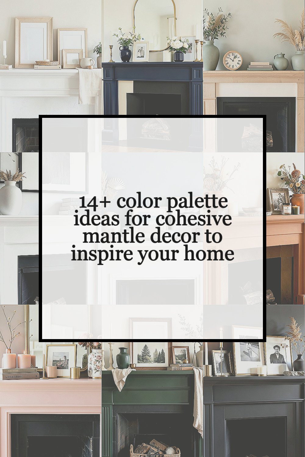
1. Soft White, Warm Beige, and Pale Oak

This gentle palette feels calm and clean, with a light look that makes a mantel seem open and airy. White candles, beige books, and pale wood frames create a soft scene that works in almost any home.
The big benefit is easy styling, since these shades blend well with almost anything you already own. It is also budget friendly because thrifted frames, simple pottery, and natural wood pieces often fit this look without much cost. Add a woven basket, a linen runner, or a small plant to keep the display from feeling flat.
2. Navy, Cream, and Brass

Navy brings depth, cream keeps things bright, and brass adds a little shine. Together, they make the mantel feel polished and classic without looking stiff.
This palette stands out in living rooms with light walls, since the dark blue gives the eye a place to rest. Brass candle holders or a gold mirror can make the whole setup feel richer, even if the rest of the pieces are simple. If you want a personal touch, use family photos in cream frames or add a navy vase with fresh stems.
Many people like this look because it feels current and timeless at the same time. You can keep costs low by using one bold navy item and filling in with affordable cream accents from home stores or secondhand shops.
3. Sage Green, Ivory, and Natural Wood

Sage green brings a soft garden feel that looks peaceful and fresh. Ivory and natural wood keep the mantel warm, so the whole display feels easy to live with.
This palette is great for homes that lean cozy or nature-inspired, and it works well with plants, dried grasses, and ceramic bowls. A simple leaf print, a wood clock, or a small stack of neutral books can make the setup feel complete. If you want more personality, mix in handmade pottery or a vase from a local maker.
The look is especially nice for people who want calm color without bright shades. It can stay affordable because many decor stores carry sage pieces, and wood accents often come in many price ranges.
For a fresh trend feel, try matte finishes instead of shiny ones, since they make the colors feel softer and more relaxed.
4. Black, White, and Gray

Black, white, and gray create a crisp mantel that feels neat and modern. The contrast makes each object pop, so even a few pieces can look strong and stylish.
This palette is useful when you want a clean look that does not fight with other colors in the room. A black frame, a white vase, and a gray stack of books can be enough to make the mantel feel finished. To keep it from feeling cold, add texture with stone, knit, or wood details.
5. Dusty Blue, Sand, and White

Dusty blue has a soft sky feel that brings calm to a mantel. Sand and white keep the palette light, which makes the whole area feel open and easy.
This mix works well in homes that need a little color but not too much. It pairs nicely with coastal pieces, shell shapes, and soft ceramic pots, yet it still feels calm in a city apartment or a classic house. You can make it more personal with a framed beach photo, a handwritten quote, or a small bowl of collected stones.
One good reason to use this palette is that it feels fresh in every season. It is also easy on the wallet because you can use painted thrift finds, simple candles, and low-cost glass pieces to build the look.
If you want a trend-forward detail, use curved shapes and rounded vases, since soft edges are very popular right now.
6. Terracotta, Cream, and Olive

Terracotta gives the mantel a warm, earthy glow that feels rich and welcoming. Cream softens the look, while olive adds a deep natural note that keeps the palette grounded.
This style is perfect for anyone who likes a cozy, sun-baked feel. Clay pots, woven trays, and dried flowers all fit well and help the mantel feel full without being crowded. You can personalize it with a handmade bowl, a favorite candle scent, or a photo in a rustic frame.
The palette feels unique because it has both warmth and calm in one place. It can be low cost too, since terracotta planters, simple cream candles, and olive-colored accents are often easy to find. For a polished finish, repeat each color at least once so the arrangement feels balanced.
7. Blush Pink, Taupe, and Gold

Blush pink makes a mantel feel soft and sweet, while taupe keeps it grown-up and calm. Gold adds a little sparkle that helps the whole display feel special.
This palette works well in rooms that need warmth and a gentle touch. Try blush candles, taupe books, and a gold mirror or picture frame to make the colors feel connected. If you want more of your own style in the mix, add a small flower print or a vase with dried roses.
The look can feel elegant without needing expensive pieces. Many stores carry affordable gold accents, and blush decor often comes in simple items like candles, ceramics, and art prints.
As a current style note, soft romantic colors are still popular, especially when paired with matte gold instead of shiny finishes.
8. Forest Green, Cream, and Walnut

Forest green gives a mantel a deep, rich feel that looks strong and calm. Cream and walnut wood bring balance, making the display feel warm instead of heavy.
This palette is a great choice if you want something classic with a little drama. A dark green vase, cream candlesticks, and a walnut frame can create a look that feels layered and thoughtful. It is easy to personalize with nature prints, old books, or a small brass object for a tiny bit of shine.
The benefit here is how well the colors work in both modern and traditional rooms. You can keep the cost down by using one statement green piece and filling in with simple neutral decor.
To make the mantel feel even more inviting, add soft textures like linen, wool, or a small woven box.
9. Charcoal, Linen, and Soft Gold

Charcoal creates a strong base that gives the mantel a sleek and moody look. Linen softens the scene, and soft gold brings just enough glow to keep it from feeling too dark.
This palette is useful when you want a grown-up style that still feels cozy. It works well with candles, stone objects, and framed art that has simple lines. A personal touch could be a favorite black-and-white photo or a small vase with dried stems.
The look feels unique because it is quiet but still has depth. It can also be practical, since charcoal books or frames are often easy to find, and linen pieces can be made from low-cost fabric or simple wraps.
For a trendy detail, mix in mixed metals very lightly, but keep the main finish soft so the mantel stays calm.
10. Lavender, Cream, and Silver

Lavender brings a light, dreamy mood that feels fresh and a little playful. Cream and silver keep the palette clean, so the mantel still feels neat and grown-up.
This is a nice choice if you want color that feels gentle instead of loud. Lavender candles, cream pottery, and a silver frame can make the mantel feel pretty and balanced. You can make it more personal with a small floral print or a vase of dried lavender stems.
The palette is especially nice in spring, but it can work all year if the tones stay soft. It can also fit many budgets because lavender accents often appear in candles, ribbon, and simple decor pieces.
If you want the look to feel modern, choose simple shapes and keep the arrangement airy rather than crowded.
11. Rust, Tan, and Off-White

Rust gives the mantel a warm, cozy feel that looks rich and lived in. Tan and off-white keep the palette soft, so the display feels welcoming instead of heavy.
This mix is great for fall style, but it can stay on display much longer because the colors feel natural. A rust vase, tan books, and an off-white ceramic piece can make the mantel feel layered and calm. Add a personal item like a favorite family photo or a handmade bowl to keep it from feeling too styled.
The look has a strong benefit: it adds warmth to rooms that feel plain or chilly. It is also easy to manage on a budget, since rust tones show up in candles, pillows, and simple pottery at many price points.
For a current touch, use dried branches or grasses, since they match the earthy feel and need little care.
12. Pale Yellow, White, and Light Wood

Pale yellow brings a sunny mood that can make a mantel feel bright and happy. White and light wood keep the palette soft, so the look stays cheerful without becoming loud.
This palette works well in rooms that need a little lift. A yellow vase, white candles, and a light wood tray can make the mantel feel fresh and friendly. You can personalize it with a small framed print, a ceramic bird, or a bowl of lemons for a playful touch.
The benefit is that it can make a space feel more open and upbeat. It is often affordable too, since pale yellow appears in many simple decor items and light wood pieces are common in budget-friendly stores.
To keep the mantel from feeling too sweet, add one item with a clean shape or a little texture.
13. Teal, White, and Driftwood

Teal adds a lively splash of color that feels cool and refreshing. White and driftwood balance it out, giving the mantel a breezy and relaxed look.
This palette is a strong choice if you want color that feels bold but still easy to live with. Teal glass, white pottery, and driftwood frames or bowls can make the mantel feel layered and interesting. It is simple to personalize with travel photos, seashells, or a favorite art print in matching tones.
The uniqueness comes from the mix of bright water-like color and soft natural texture. You can keep costs reasonable by using one teal statement item and building around it with neutral pieces you already own.
For a trendy finish, use clear glass or light-reflecting surfaces, since they help the teal feel fresh and bright.
14. Burgundy, Cream, and Dark Wood

Burgundy gives the mantel a deep, rich feel that looks elegant and cozy. Cream and dark wood keep the palette balanced, so the display feels warm and classic.
This look is lovely in cooler months, but it can stay on display if you like a more formal style. Burgundy candles, cream frames, and dark wood accents create a strong, polished scene. To make it yours, add a family heirloom, a vintage clock, or a framed piece of art that means something to you.
The palette feels special because it has a sense of depth without needing many items. It can also be cost friendly if you use one burgundy accent and pair it with neutral decor you already have.
For a modern twist, keep the arrangement simple and let the color do the work instead of filling every inch of space.
15. Soft Coral, White, and Light Gray

Soft coral brings a warm glow that feels lively but still gentle. White and light gray help the mantel stay calm and clean, which makes the coral feel fresh instead of loud.
This palette is a great pick for anyone who wants a happy, welcoming mantel. Coral flowers, white candle holders, and a light gray frame can create a bright and balanced display. You can make it personal with a favorite quote, a small painted object, or a vase of seasonal blooms.
The benefit of this palette is its cheerful energy, which can brighten a room fast. It is also easy to style on a budget because coral shows up well in small accents like candles, books, and simple art prints.
To keep it feeling current, use clean lines and a few rounded shapes, which helps the colors feel soft and modern at the same time.