Soft colors can feel calm, rich, and full of style without shouting for attention. If you love pretty spaces or outfits that feel easy on the eyes, these gentle palettes may be just what you want.
1. Misty Sage and Cream
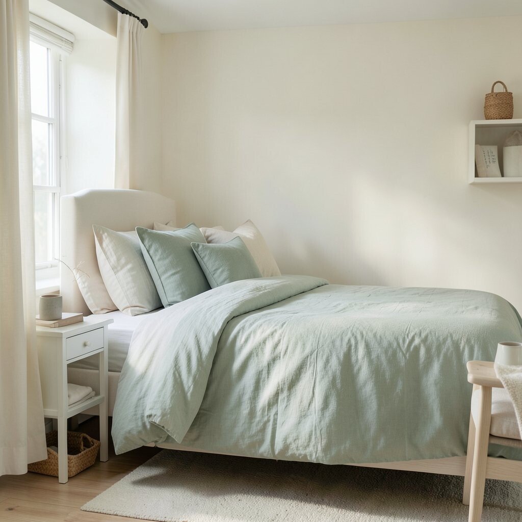
Misty sage and cream make a room feel fresh, soft, and peaceful. The green has a dusty look, so it feels natural instead of loud.
This palette works well for bedrooms, kitchens, and cozy outfits. It brings a calm mood that feels clean and easy to live with.
What makes it special is how simple it looks but still feels fancy. Try cream walls with sage pillows, or a sage dress with warm cream shoes.
This look is also easy on the budget because these colors are common in paint, fabric, and decor. If you want a gentle trend that never feels too much, this is a smart pick.
2. Dusty Rose and Warm Beige
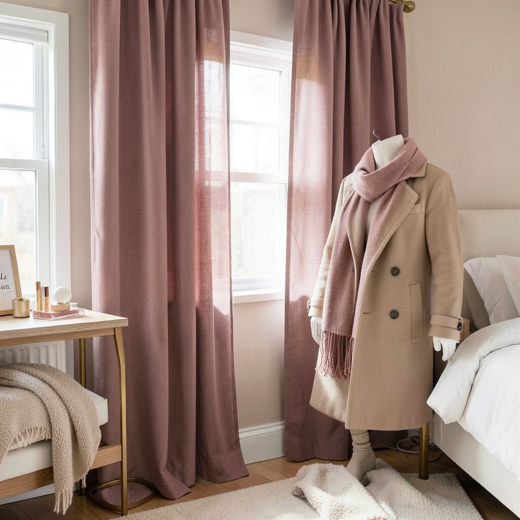
Dusty rose and warm beige feel sweet, soft, and a little romantic. The pink is muted, so it looks grown-up and calm.
This palette is great for bedrooms, makeup corners, and soft fashion looks. It can make a space feel cozy without being too girly.
Its charm comes from the balance of warmth and softness. Try dusty rose curtains with beige blankets, or a beige coat with a rose scarf.
This idea is easy to personalize with gold, wood, or white accents. It is also budget-friendly because you can find these shades in many stores and price ranges.
3. Soft Navy and Sand
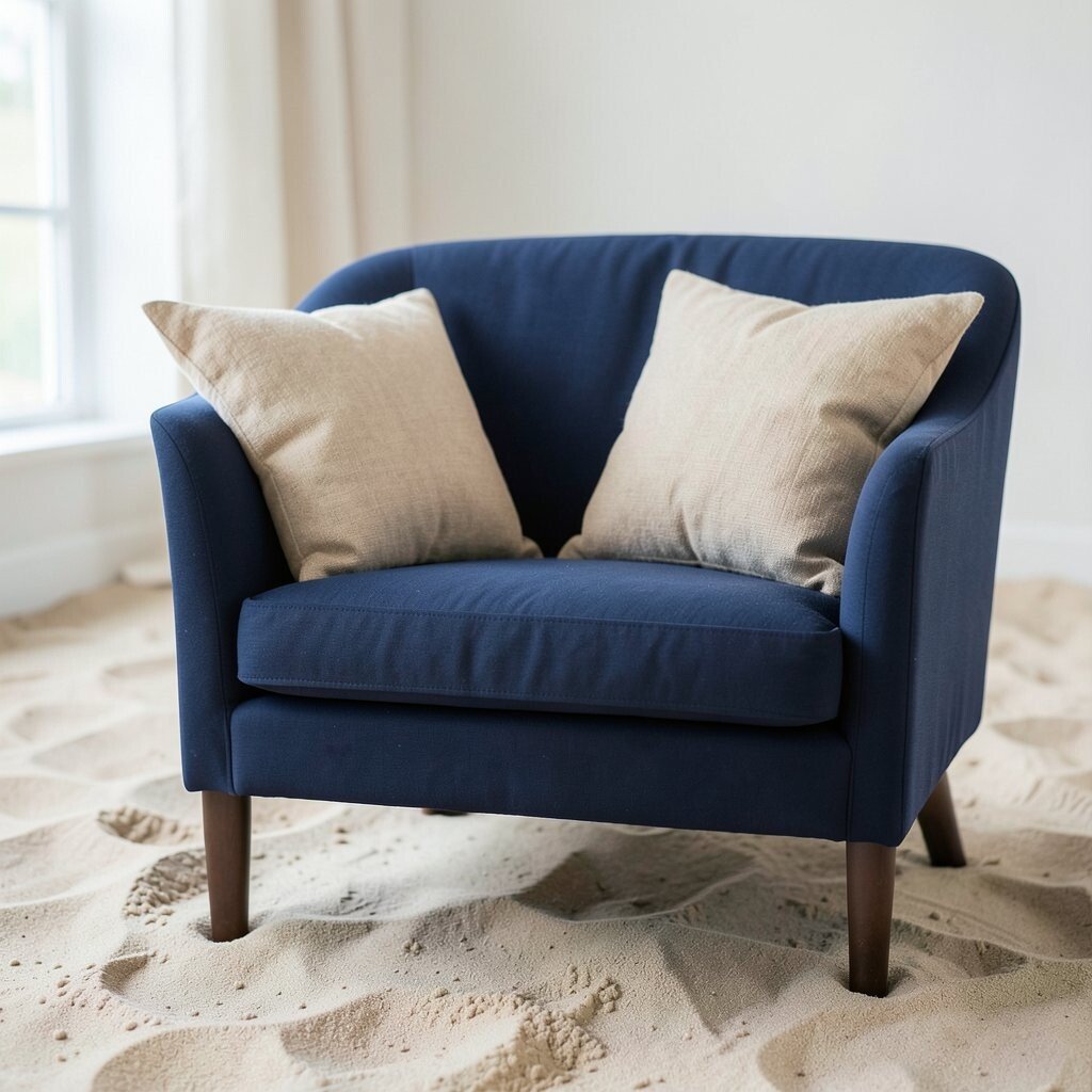
Soft navy and sand bring a beachy feel without bright colors. The navy gives depth, while sand keeps everything light and relaxed.
This palette works nicely in living rooms, offices, and casual clothes. It feels neat, classic, and a little bit nautical.
What makes it unique is the strong contrast that still feels calm. Use navy chairs with sand pillows, or a sand shirt with navy pants.
This style fits many trends because it looks timeless and clean. It can be low cost too, especially if you use simple textiles or painted pieces.
4. Smoky Lavender and Dove Gray
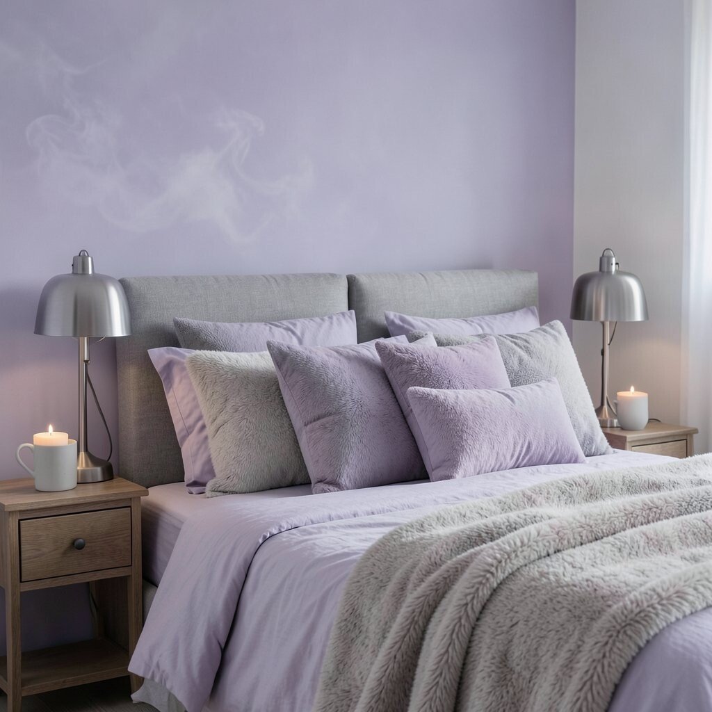
Smoky lavender and dove gray feel dreamy and soft, like a cloudy morning. The lavender is gentle, so it adds color without any loud shine.
This pair is lovely for bedrooms, reading spots, and soft fashion pieces. It gives a quiet charm that feels restful and a little magical.
The special part is how the gray keeps the lavender from feeling too sweet. Try it with silver lamps, fuzzy throws, or a gray blazer with a lavender top.
This palette is easy to adjust for your own style. It can be affordable if you use small touches like pillows, candles, or simple accessories.
5. Olive Green and Taupe
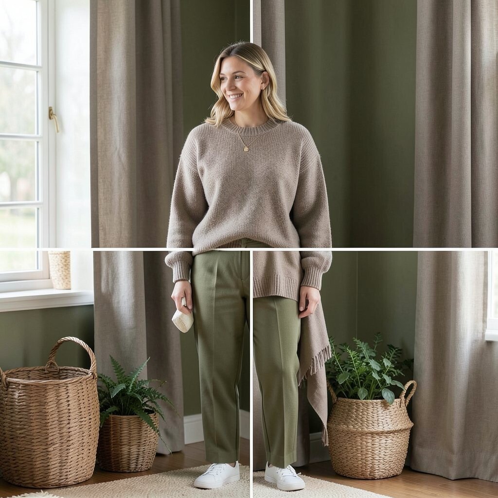
Olive green and taupe feel earthy, warm, and easy to love. The olive adds depth, while taupe makes the look soft and balanced.
This palette is great for homes with wood, woven baskets, and natural textures. It also works well in fashion when you want a calm, polished look.
Its uniqueness comes from its grounded feel. Try olive walls with taupe curtains, or a taupe sweater with olive pants.
This is a strong trend for people who like quiet, natural style. It is usually cost-friendly because both shades are common in paint, furniture, and clothing.
6. Powder Blue and Soft White
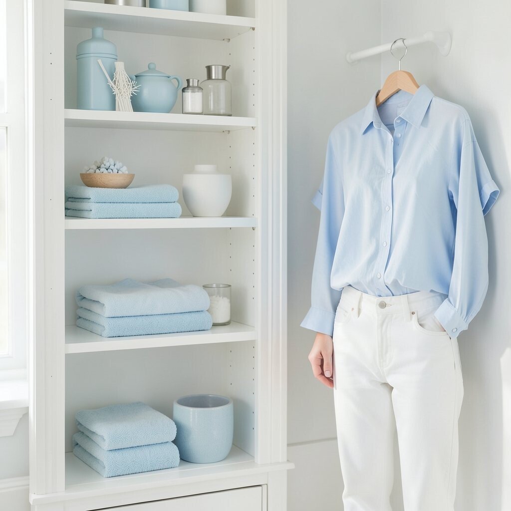
Powder blue and soft white feel light, airy, and very clean. The blue is gentle, so it gives a fresh look without feeling cold.
This palette is perfect for bathrooms, nurseries, and spring outfits. It can make small spaces feel bigger and brighter in a soft way.
What makes it special is its easy, breezy mood. Use white shelves with powder blue decor, or a blue blouse with white jeans.
This look is easy to personalize with silver, glass, or light wood. It is also a smart low-cost idea because white and pale blue items are easy to find.
7. Terracotta and Oatmeal
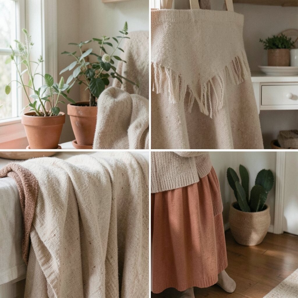
Terracotta and oatmeal bring a warm, cozy feeling that feels like home. The terracotta adds a clay-like richness, while oatmeal softens it.
This palette works well in kitchens, entryways, and comfy clothes. It feels warm without becoming too dark or too bright.
Its special charm comes from the natural, handmade look it gives. Try terracotta pots with oatmeal linens, or a terracotta skirt with an oatmeal sweater.
This style is very trendy in rustic and boho spaces. It can be done on a budget with simple pottery, fabric, or painted accents.
8. Charcoal and Soft Blush
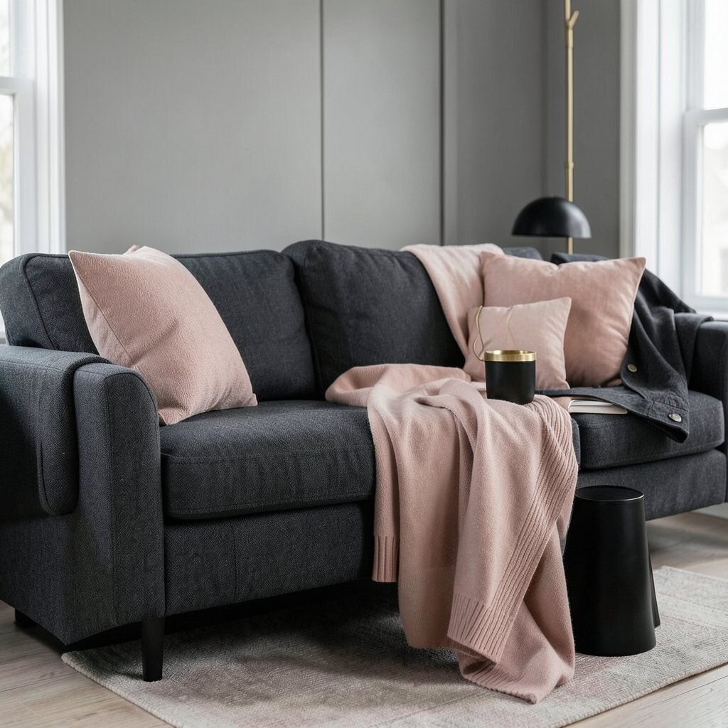
Charcoal and soft blush make a pretty mix of strong and gentle. The dark gray gives a bold base, while blush adds a kind, soft touch.
This palette is great for modern rooms, office spaces, and dressy outfits. It feels stylish without being too sharp or too bright.
What makes it unique is the way it blends cool and warm tones. Try charcoal furniture with blush pillows, or a blush dress with a charcoal jacket.
This look can feel very polished and current. It is easy to personalize with gold, black, or white, and it does not need a big budget to look good.
9. Butter Yellow and Stone
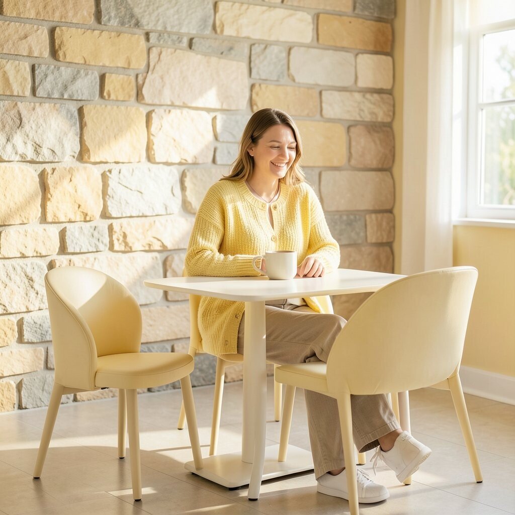
Butter yellow and stone feel sunny, soft, and easygoing. The yellow is pale and warm, so it brings cheer without neon glow.
This palette is lovely for kitchens, breakfast areas, and happy casual clothes. It makes a space feel friendly and bright in a gentle way.
The uniqueness comes from its soft glow and calm mood. Use stone walls with butter yellow chairs, or a yellow cardigan with stone-colored pants.
This palette fits current trends that love warm, soft color. It can also be low cost because pale yellow decor and stone neutrals are easy to mix and match.
10. Forest Green and Linen
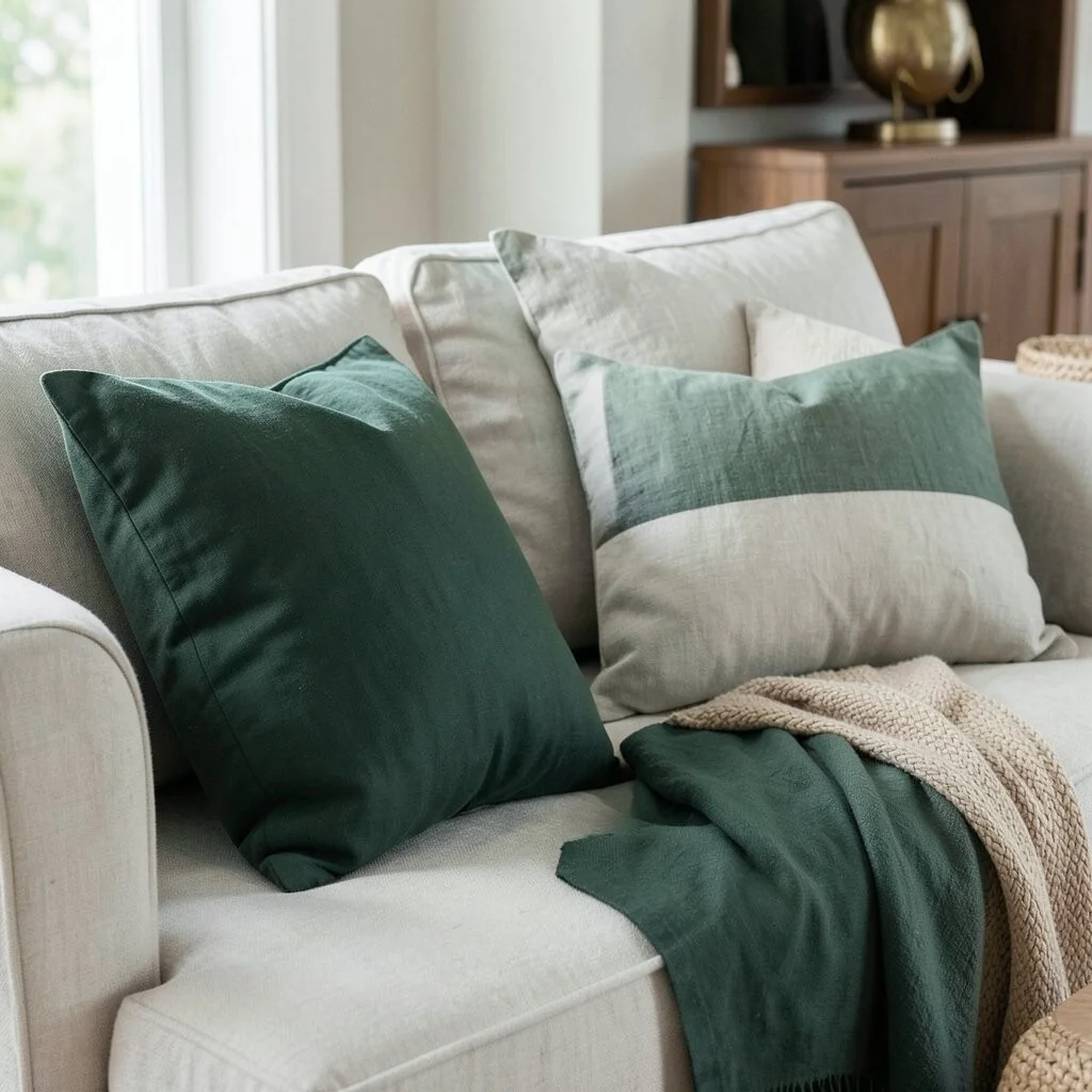
Forest green and linen feel rich, calm, and a little classic. The deep green adds life, and linen keeps the whole look light.
This palette is great for dining rooms, bookshelves, and smart everyday outfits. It feels like nature, but in a neat and polished way.
What makes it stand out is the deep color paired with a soft neutral. Try forest green cushions on a linen sofa, or a linen shirt with a forest green skirt.
This style works well with wood, brass, and woven textures. It can be affordable if you start with small items like napkins, pillows, or throws.
11. Mauve and Dusty Teal
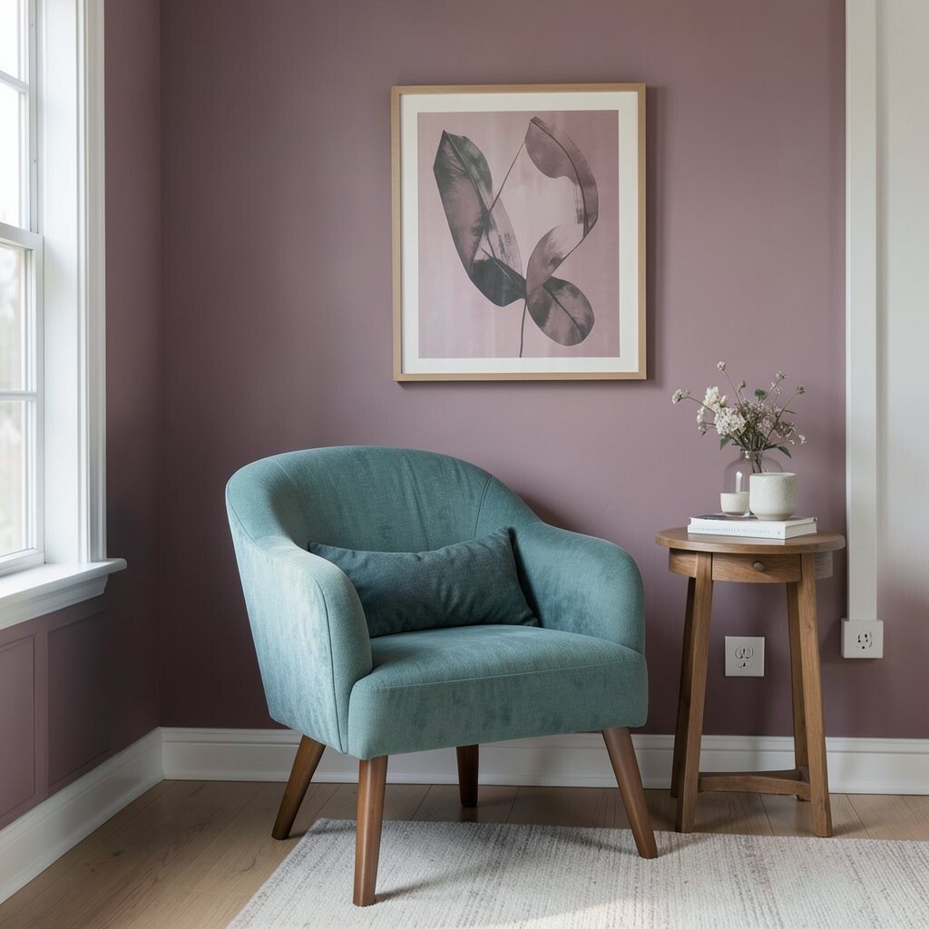
Mauve and dusty teal create a soft, artsy look that feels a little unexpected. Both colors are muted, so they work together without clashing.
This palette is nice for creative spaces, bedrooms, and fashion with personality. It feels gentle, but it still has a cool edge.
The special part is how the warm mauve and cool teal balance each other. Try a teal chair with mauve art, or a mauve top with dusty teal pants.
This palette is a good choice if you want something different from plain neutrals. It can be done on many budgets by using paint, fabric, or small decor pieces.
12. Cocoa Brown and Soft Peach
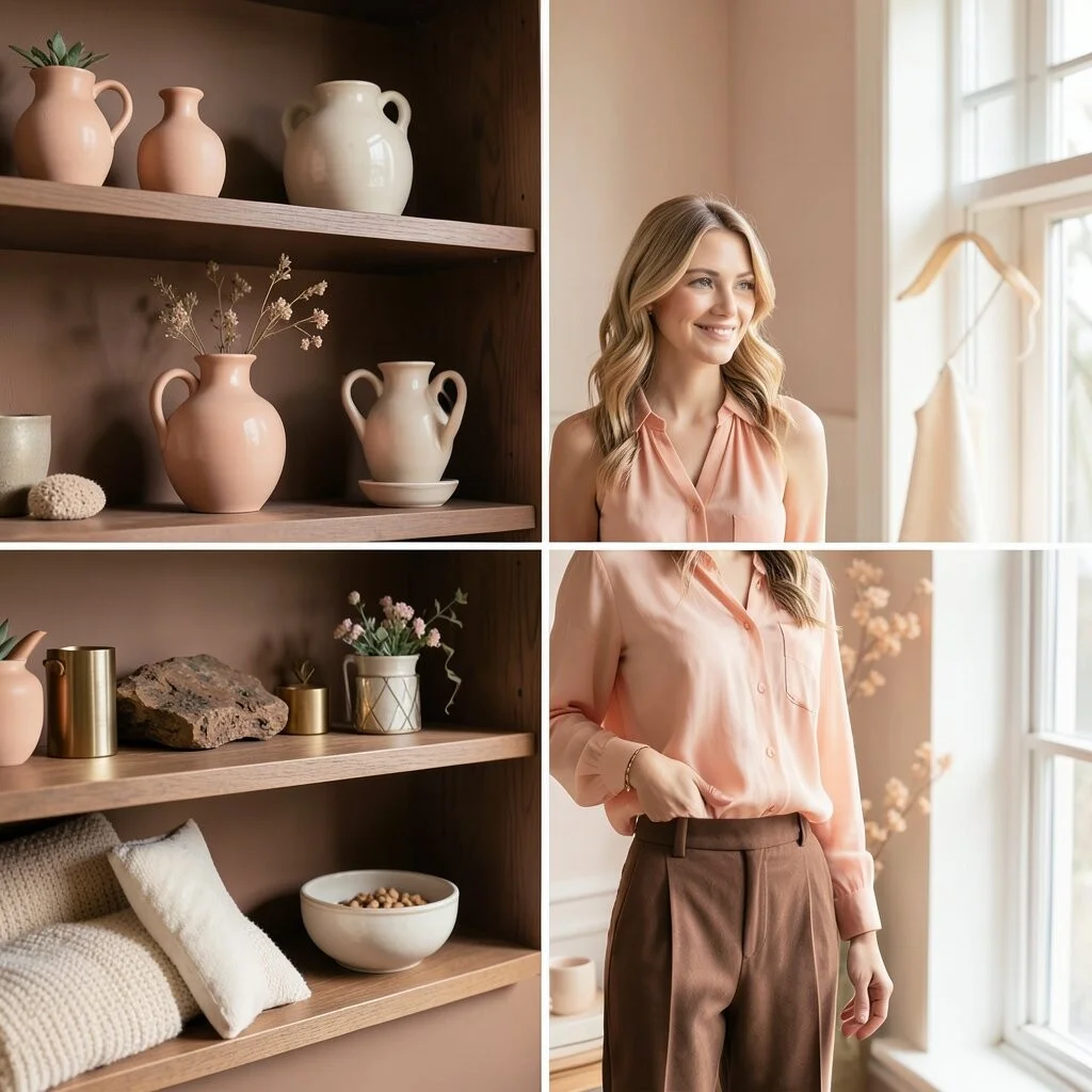
Cocoa brown and soft peach feel warm, sweet, and comforting. The brown gives depth, while peach adds a soft little glow.
This palette works well in bedrooms, cafes, and cozy fashion looks. It feels inviting and gentle, like a warm hug.
Its uniqueness comes from the mix of rich and tender tones. Try cocoa shelves with peach vases, or a peach blouse with cocoa trousers.
This look is easy to style with cream, gold, or wood accents. It is also cost-friendly because both shades are easy to find in home and clothing stores.
13. Slate Blue and Fog Gray
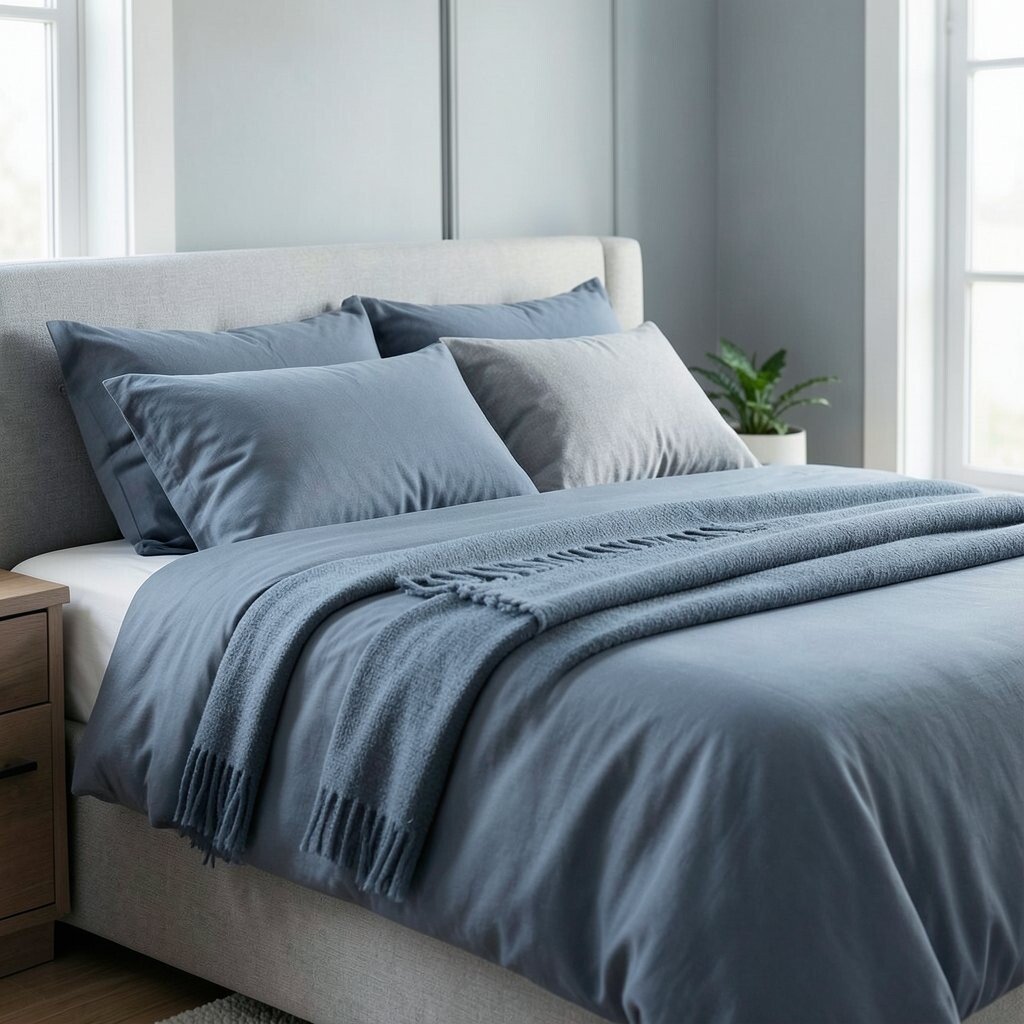
Slate blue and fog gray feel cool, calm, and very smooth. The blue has a quiet depth, and the gray keeps everything soft.
This palette is great for modern homes, work spaces, and clean outfits. It gives a neat look that feels steady and relaxed.
What makes it unique is how it looks polished without being cold. Try slate blue bedding with fog gray pillows, or a gray coat with a slate blue scarf.
This palette fits many current styles, from simple decor to smart casual clothes. It can be budget-friendly if you use paint, blankets, or simple accessories.
14. Blush Beige and Muted Gold
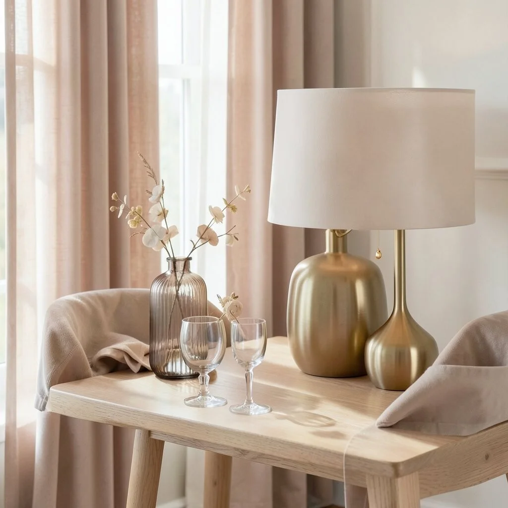
Blush beige and muted gold feel warm, soft, and a little fancy. The gold is not shiny or loud, so it adds a quiet glow.
This palette is lovely for special rooms, dressy tables, and elegant outfits. It gives a soft glow that feels rich but still gentle.
The special part is the soft shine mixed with a calm base. Try blush beige curtains with muted gold lamps, or a beige dress with gold earrings.
This look is easy to personalize with glass, velvet, or light wood. It can be done at many price points, since even small gold touches can make a big difference.
15. Deep Plum and Soft Ivory
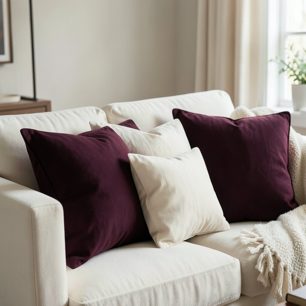
Deep plum and soft ivory feel dramatic, pretty, and calm all at once. The plum adds a rich feel, while ivory keeps it light and graceful.
This palette is great for formal rooms, cozy corners, and dressy looks. It feels special without needing bright or flashy colors.
Its uniqueness comes from the deep color paired with a soft, creamy base. Try plum pillows on an ivory couch, or an ivory blouse with a plum skirt.
This palette works well in cool seasons and in elegant trends. It can be cost-friendly if you use one bold piece and keep the rest simple.
16. Seafoam and Driftwood
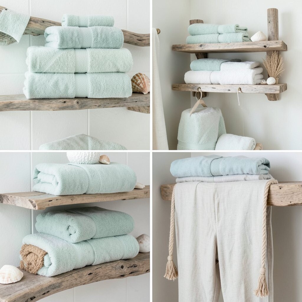
Seafoam and driftwood feel calm, fresh, and full of easy charm. Seafoam brings a soft water-like color, and driftwood adds a warm natural tone.
This palette is great for beach homes, bathrooms, and relaxed clothes. It makes a space feel light, breezy, and peaceful.
What makes it special is its soft coastal mood without loud blue or green. Try seafoam towels with driftwood shelves, or a seafoam top with driftwood-colored pants.
This style is easy to make your own with shells, rope, linen, or wood details. It can also be a low-cost choice because natural-looking pieces often work well together.