
Color can change how a room feels in a blink. The right mix can make any space look fresh and full of life.
1. Sunny White and Lemon

Sunny white walls with lemon accents bring a clean, cheerful glow to a room. The look feels light, happy, and easy to live with.
This scheme works well in kitchens, small bedrooms, and home offices because it helps the room feel open. Add lemon pillows, a vase, or a rug to keep the style bright without spending a lot. For a personal touch, use matte white paint with glossy yellow decor so the room has a nice mix of shine and softness.
2. Coral and Cream

Coral and cream make a space feel warm, soft, and friendly. The colors look lovely on walls, bedding, and curtains.
This pairing is great for people who want color without too much boldness. Cream keeps the room calm, while coral adds a playful pop that feels fresh and modern. If you want to save money, start with coral throw blankets or art prints instead of repainting the whole room.
You can make the scheme feel more personal by adding woven baskets, wood frames, or handmade pottery. This mix also fits well with current cozy-home trends that favor soft color and natural texture.
3. Sky Blue and Cloud Gray

Sky blue and cloud gray create a peaceful room that still feels bright. The look is airy and easy on the eyes.
Use sky blue on one wall or in fabric pieces like curtains and cushions. Cloud gray works well for larger pieces because it keeps the room from feeling too busy. A small room can feel bigger with this palette, and a larger room can feel calmer and more balanced.
To make it your own, add white lamps, silver frames, or a blue patterned chair. This color idea is also budget-friendly since paint samples and soft home accessories can do most of the work.
Many people like this style because it feels neat, cool, and simple to change later. It is a safe choice if you want a bright room that still feels quiet.
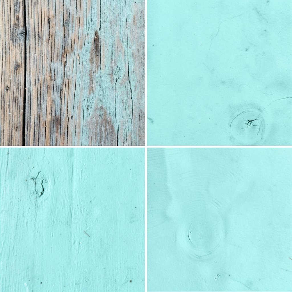
4. Mint and White

Mint and white make a space feel fresh, clean, and full of air. The colors remind people of spring and open windows.
This scheme looks lovely in bathrooms, laundry rooms, and reading corners. White keeps everything crisp, while mint adds a soft splash of color that feels gentle and new.
Try mint towels, white shelves, or a painted chair to keep costs low. If you want more personality, mix in glass jars, leafy plants, or light wood details. This look is easy to update with small pieces, so it works well for renters too.
5. Peach and Sand

Peach and sand create a warm, sunny room that feels relaxed and kind. The colors blend in a way that looks soft but not dull.
This scheme is nice for living rooms and guest rooms because it feels welcoming right away. Peach brings a gentle glow, while sand keeps the room grounded and calm. You can use peach cushions, sand-colored curtains, and a few gold touches for a polished feel.
If you want a low-cost version, try peel-and-stick art, pillow covers, or a table lamp in peach. This palette also fits well with today’s calm, earthy style trends.
Personalize the space with handmade ceramics or woven wall hangings. The result feels bright, friendly, and easy to enjoy every day.
6. Lavender and Soft Gray
Lavender and soft gray make a room feel dreamy and light. The colors look gentle and a little magical.
This pairing is great for bedrooms and quiet work areas because it helps the space feel calm. Lavender adds a sweet touch, while gray keeps the room from looking too sugary or bright.
Use lavender bedding, a gray rug, or framed prints to build the look slowly. If you are watching your budget, paint one wall lavender and keep the rest neutral. Small silver or white accents can make the whole room feel more finished.
To make it unique, add a velvet pillow or a floral lamp shade. This scheme feels soft, pretty, and easy to make your own.
7. Teal and Warm Beige

Teal and warm beige give a room rich color with a cozy feel. The mix looks bold but still easy to live with.
Teal can be used on a sofa, accent wall, or shelves, while beige keeps the room soft and balanced. This is a smart choice for people who want a bright look without using very loud colors.
You can save money by using beige paint and adding teal in smaller items like pillows and throws. A few brass details can make the room feel more stylish without a big cost. This palette works well in homes that want a modern but welcoming look.
Add plants or woven baskets to bring in more life and texture. The room will feel fresh, layered, and full of personality.
8. Butter Yellow and Pale Blue

Butter yellow and pale blue make a room feel cheerful and breezy. The colors look sweet together and bring a light, sunny mood.
This scheme is lovely in kitchens, nurseries, and breakfast areas. Butter yellow gives warmth, while pale blue adds a cool balance that keeps the space feeling fresh.
Try blue dishes, yellow art, or a striped rug to bring the colors in without much effort. If you want to keep spending low, choose one color for the main pieces and use the other as a small accent. That way, the room stays bright without looking crowded.
For a personal touch, mix in white ceramic pieces or soft check patterns. The style feels happy, easy, and full of charm.
9. Rose Pink and Ivory

Rose pink and ivory create a soft, pretty room that feels warm and kind. The colors bring a gentle glow that works in many spaces.
This look is great for bedrooms, dressing corners, or small sitting rooms. Ivory keeps the room light and calm, while rose pink adds a sweet, lively note.
Use pink cushions, ivory curtains, or a rose-toned chair to build the palette. If you need to keep costs down, start with textile pieces instead of buying new furniture. The room can still feel polished with just a few smart choices.
To make it feel less plain, add gold frames or a patterned lamp. This scheme is popular because it feels soft, stylish, and easy to love.
10. Olive and Cream
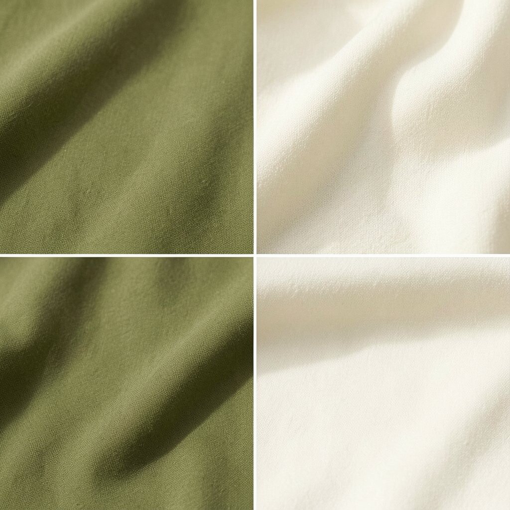
Olive and cream give a room a fresh, natural look with a little depth. The colors feel calm, but they still have enough life to brighten the space.
This pairing works well in living rooms, studies, and dining rooms. Olive brings an earthy mood, while cream keeps the space open and light.
Try olive cushions, a cream sofa, or framed botanical art to start. If you want a lower-cost update, paint one accent wall olive and keep the rest cream. A few wooden pieces can make the whole room feel more complete.
Personal touches like linen curtains or handmade bowls fit this scheme well. It is a nice choice for people who like nature-inspired style with a soft finish.
11. Aqua and White

Aqua and white make a room feel crisp, cool, and full of light. The colors bring a clean splash of energy that feels easy and fun.
This scheme is a strong pick for bathrooms, patios, and bright kitchens. White keeps the room fresh, while aqua adds a playful, watery feel that stands out in a good way.
You can use aqua towels, white shelves, or a painted stool to keep the look simple. For a budget-friendly update, swap in a few aqua accessories instead of changing the whole room. Glass decor and shiny finishes can add sparkle without much cost.
This palette feels especially nice in spaces that get lots of sunlight. Add a few plants, and the room will look lively and open.
12. Terracotta and Soft White
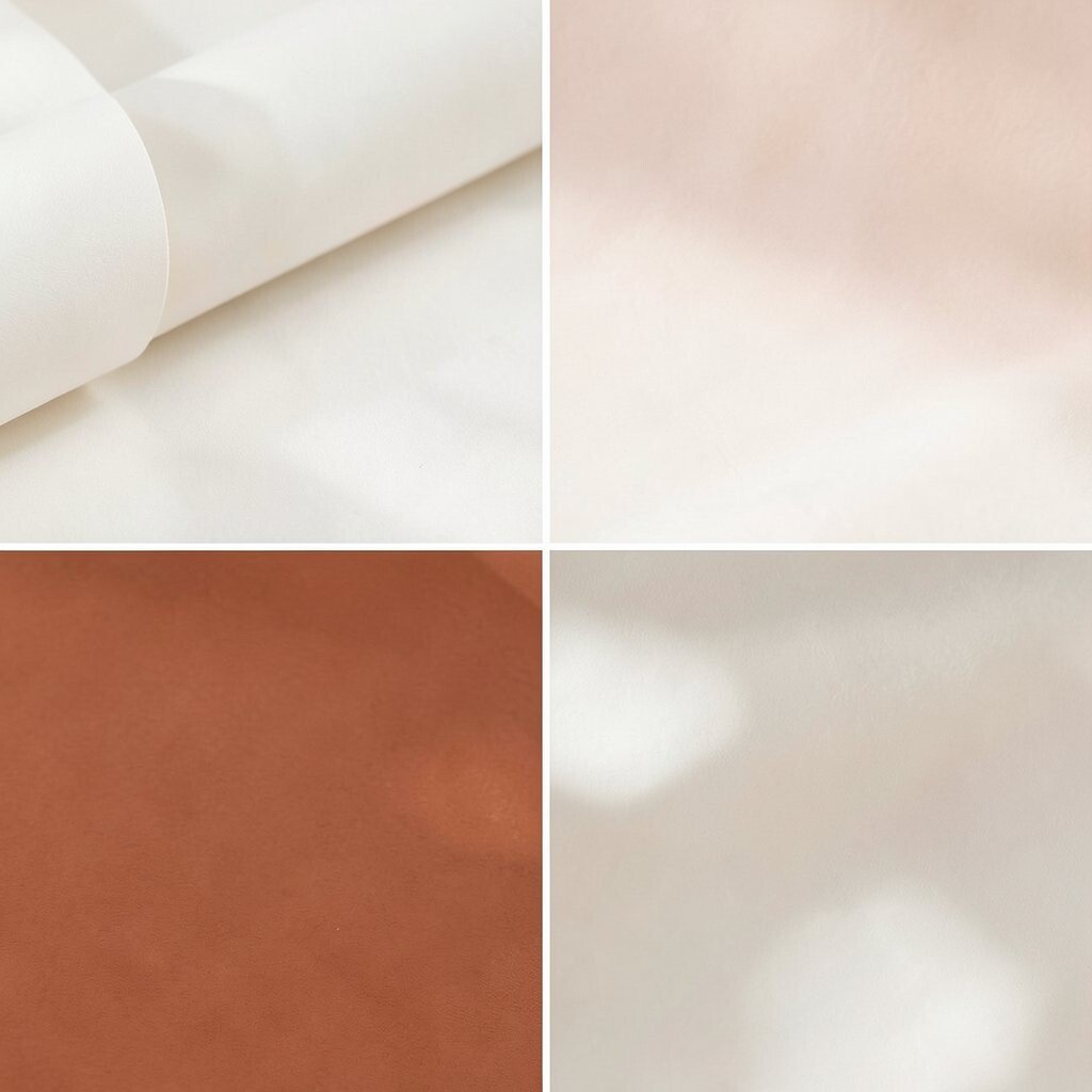
Terracotta and soft white create a warm room that feels grounded and bright at the same time. The look has a cozy glow that feels welcoming.
Terracotta brings rich color, while soft white gives the room room to breathe. This pairing is great for living rooms, entryways, and dining spaces that need a little warmth.
Try terracotta pillows, a white sofa, or clay pots to build the style. If you want to save money, use terracotta in small pieces first and see how the room feels. The palette looks stylish even with simple items.
To make it more personal, add handmade art or woven textiles. This scheme fits well with earthy home trends and still feels fresh.
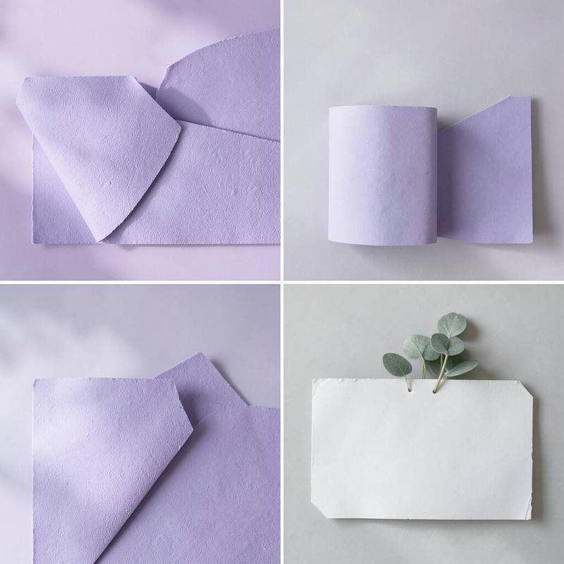
13. Lilac and Buttercream

Lilac and buttercream make a room feel soft, sweet, and bright. The colors have a gentle charm that works in many kinds of homes.
This scheme is lovely for bedrooms, craft rooms, or cozy reading spots. Buttercream keeps the room warm, while lilac adds a cool little sparkle that feels playful.
Use lilac cushions, buttercream walls, or a patterned rug to bring the colors together. If you are keeping an eye on cost, choose one main color and one or two small accents. That keeps the room balanced and easy to change later.
Personal touches like vintage books or floral artwork can make the room feel special. The mix is light, pretty, and full of quiet energy.
14. Navy and Soft Peach

Navy and soft peach make a room feel rich and bright at the same time. The dark and light colors work together in a way that feels smooth and stylish.
This pairing is great for bedrooms, offices, and living rooms. Navy gives the room structure, while soft peach adds warmth and keeps the space from feeling too serious.
Use a navy chair, peach cushions, or a striped throw to bring the look to life. If you want a lower-cost version, paint just one wall navy and keep the rest light. Gold or brass accents can make the room feel more finished without a big price tag.
Add a few plants or light wood pieces for a softer feel. This color idea is bold, cozy, and easy to make your own.
15. Green Apple and White

Green apple and white create a lively room that feels bright and fresh. The look has a crisp energy that wakes up the space.
This scheme works well in kitchens, playrooms, and home gyms. White helps the color feel clean, while green apple adds a cheerful pop that feels lively and fun.
Try green apple stools, white cabinets, or a small rug to start. If you want to keep costs low, use the bright color in just one or two items. That way, the room feels active without becoming too busy.
Personalize the space with fun prints or simple wall shelves. This palette is great for people who want a room that feels upbeat and easy to enjoy.
16. Blush and Light Oak

Blush and light oak make a room feel soft, warm, and modern. The colors look gentle together and bring a calm, bright mood.
This pairing is ideal for bedrooms, nurseries, and sitting areas. Blush adds a sweet touch, while light oak gives the room a natural, cozy base.
You can use blush bedding, oak furniture, or a soft rug to build the look. If you are trying to spend less, focus on a few key pieces and keep the rest simple. The room will still feel styled and welcoming.
To make it more unique, add a woven lamp or simple line art. This scheme is popular because it feels soft, neat, and easy to live with.
17. Cobalt and White

Cobalt and white give a room a sharp, bright look that feels lively and bold. The colors make a strong pair that stands out right away.
This scheme is great for kitchens, bathrooms, and creative spaces. White keeps the room open, while cobalt adds a punch of color that feels clean and modern.
Use cobalt bowls, white cabinets, or a blue patterned rug to bring the look together. If you want to save money, start with a few bold accessories instead of large furniture changes. The result can still feel fresh and full of energy.
Add silver hardware or glass pieces for a sleek finish. This style is a good fit for people who like a room with clear, strong color.
18. Apricot and Taupe

Apricot and taupe make a room feel warm, soft, and easy to enjoy. The colors have a cozy glow that still feels bright.
This pairing works well in bedrooms, dining rooms, and small lounges. Apricot brings a cheerful note, while taupe keeps the space calm and grown-up.
Try apricot cushions, taupe curtains, or a textured throw to build the scheme. If you want to keep spending low, use apricot in small accents and let taupe do most of the work. The room will feel balanced and gentle.
Personal details like pottery, candles, or framed photos can make the space feel lived in. This palette fits well with soft neutral trends that still want a bit of color.
19. Turquoise and Sand

Turquoise and sand bring a beach-like feeling that is bright and relaxed. The colors feel sunny, open, and easy to like.
This scheme is perfect for sunrooms, bathrooms, and casual living spaces. Turquoise adds a splash of joy, while sand keeps the room soft and grounded.
Use turquoise pillows, sand-colored furniture, or a woven rug to create the look. If you want to keep the cost down, add color through small decor pieces and keep the larger items neutral. This makes the room easy to update later.
Shell shapes, driftwood, and light fabrics can make the room feel more personal. The whole space can feel like a calm day near the water.
20. Plum and Soft Gold

Plum and soft gold make a room feel rich, bright, and a little fancy. The colors bring a deep glow that can still feel cozy.
This pairing works well in dining rooms, bedrooms, and sitting rooms. Plum adds drama, while soft gold gives the room a warm shine that helps it feel lively.
Try plum curtains, gold lamps, or a patterned pillow to start. If your budget is tight, use gold in small details and let plum be the main color in just one area. That keeps the room elegant without too much spending.
To make it your own, add velvet, glass, or framed art with warm tones. This scheme feels bold, stylish, and full of character.
21. Pale Yellow and Gray Blue

Pale yellow and gray blue create a room that feels sunny but still calm. The colors look soft together and give the space a friendly mood.
This scheme is lovely for bedrooms, hallways, and family rooms. Pale yellow adds light, while gray blue keeps the room from feeling too sweet.
Use yellow cushions, gray blue walls, or a checked blanket to bring the palette in. If you want a simple, low-cost update, choose one color for the main surface and the other for small accents. The room will feel bright without much effort.
Personalize the look with framed photos or simple wood furniture. This mix is easy to live with and works well in both new and older homes.
22. Raspberry and White

Raspberry and white make a room feel lively, crisp, and full of energy. The bright color pops against the clean background in a fun way.
This pairing is strong in kitchens, kids’ rooms, and creative corners. White keeps the space fresh, while raspberry adds a juicy burst of color that feels cheerful.
Try raspberry chairs, white walls, or a bold piece of art to start. If you want to keep costs down, use the bright shade in a few small items instead of all over the room. That gives you the look without a big price.
Add simple shelves or black accents if you want a more modern feel. This palette is playful, eye-catching, and easy to make your own.
23. Sage and Ivory
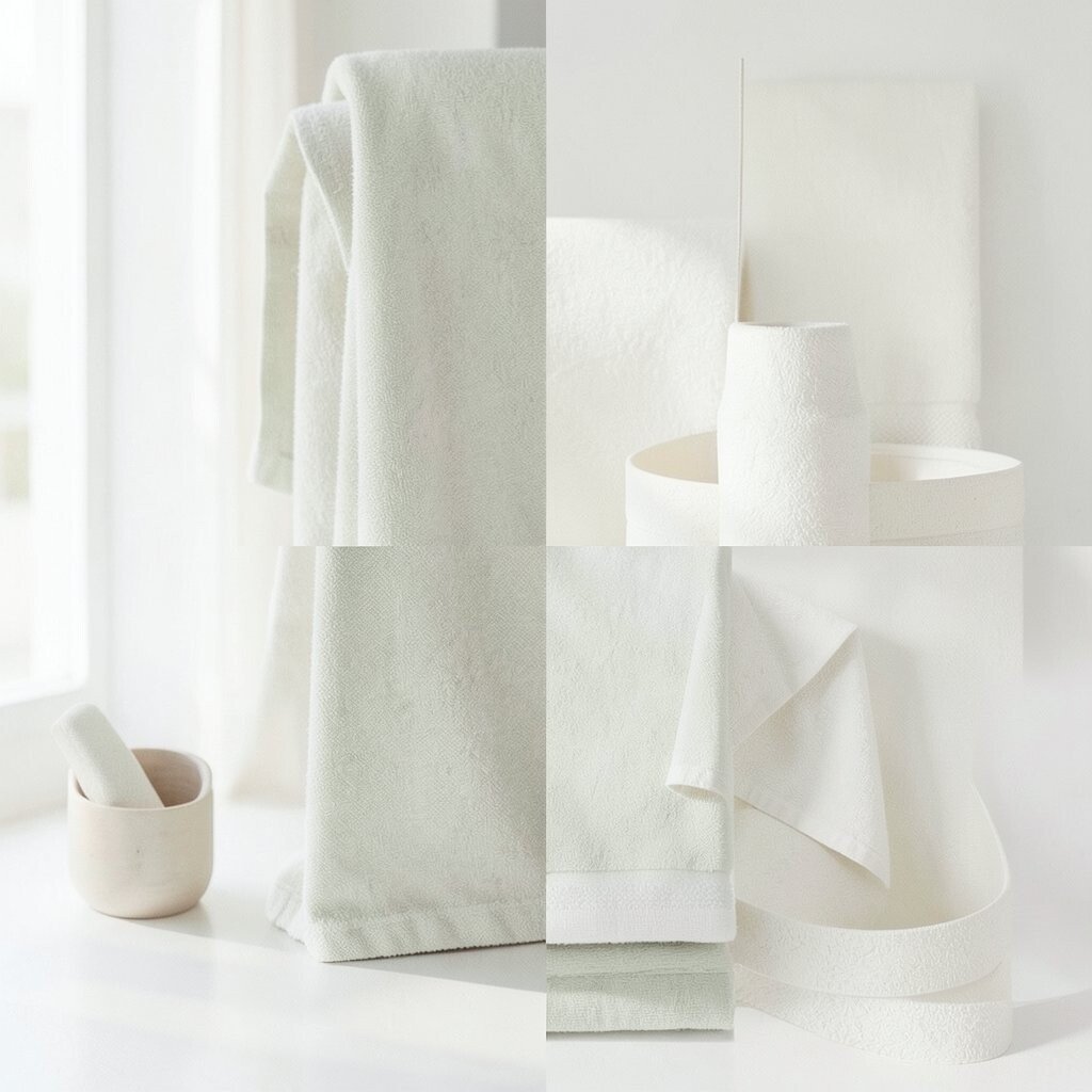
Sage and ivory make a room feel peaceful, bright, and natural. The colors have a soft look that feels calm but not plain.
This scheme is great for bedrooms, bathrooms, and reading spaces. Sage brings a gentle green note, while ivory keeps the room open and light.
Use sage bedding, ivory curtains, or a soft rug to bring the idea together. If you want to save money, paint one wall sage and use ivory in the larger pieces you already own. The result feels fresh without needing a full makeover.
Personal touches like dried flowers or linen pillows fit this style well. It is a nice choice for anyone who likes quiet color with a clean finish.
24. Tangerine and Cream

Tangerine and cream create a room that feels sunny, bold, and happy. The colors have a bright glow that can wake up a dull space.
This pairing works well in kitchens, play spaces, and lively living rooms. Cream keeps the room soft, while tangerine adds a burst of fun that feels full of life.
Try tangerine cushions, cream walls, or a bright chair to bring in the palette. If you need to stay on budget, use tangerine in just one or two decor pieces. That gives the room energy without making it too loud.
Wood, rattan, and simple white dishes can help balance the look. This style feels cheerful, modern, and easy to enjoy every day.
25. Ice Blue and Blush

Ice blue and blush make a room feel soft, light, and a little dreamy. The colors look delicate together and bring a fresh, pretty mood.
This scheme is lovely for bedrooms, guest rooms, and calm work areas. Ice blue cools the room down, while blush adds warmth and keeps it from feeling too plain.
Use blush pillows, ice blue art, or a striped throw to build the look. If you want a budget-friendly version, choose one color for the bigger items and the other for small accents. The room will still feel polished and bright.
For a personal touch, add glass decor or silver frames. This palette feels light, sweet, and easy to style.
26. Mustard and Warm White

Mustard and warm white make a room feel sunny and grounded. The colors have a rich, happy feel that brings life to the space.
This pairing works well in living rooms, entryways, and study corners. Warm white keeps the room soft, while mustard adds a bold glow that feels cheerful.
Try mustard throws, warm white walls, or a patterned cushion to start. If you want to keep costs low, add mustard in small pieces and let the rest stay simple. That keeps the room bright without feeling crowded.
Personalize the space with wood furniture or black picture frames. This scheme has a modern look that still feels cozy and easy to use.
27. Seafoam and Driftwood
Seafoam and driftwood create a calm room with a fresh, airy feel. The colors remind people of the shore and bring a soft, natural look.
This scheme is great for bathrooms, bedrooms, and quiet sitting rooms. Seafoam adds a gentle color wash, while driftwood tones keep everything warm and relaxed.
Use seafoam towels, driftwood shelves, or a woven basket to bring the palette to life. If you are watching your budget, focus on simple decor and natural textures instead of buying lots of new items. The room can still feel special and complete.
Add plants or light linen for a more personal touch. This style is easy to love because it feels fresh, peaceful, and current.
28. Black, White, and Bright Accent Colors

Black and white make a room look crisp, while bright accent colors bring the fun. The contrast feels strong and modern, yet still cheerful.
This scheme works in almost any room because it is easy to control. Use black and white for the base, then add one bright accent like red, yellow, or teal for a lively pop.
If you want to keep spending low, start with pillows, art, or a lamp in your chosen accent color. Black frames and white walls can make even a small room feel stylish and neat. The look is easy to change later if your taste shifts.
To make it more personal, choose an accent color that matches your favorite things. This palette feels bold, flexible, and perfect for a bright home.