Colors can be tricky. They can make or break your design, turning your space into a masterpiece or a mishap.
1. Neon Green
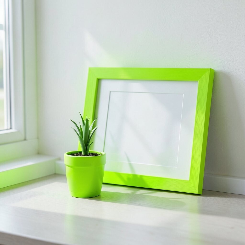
Neon green is bold and loud, making it hard for the eyes to relax. While it might seem exciting, it can quickly overpower a space.
For a unique twist, use it sparingly as an accent. A small plant pot or a picture frame can add just the right pop.
Stick to a budget by using neon green in DIY projects. It’s a cost-effective way to play with this fun shade without going overboard.
2. Dull Beige
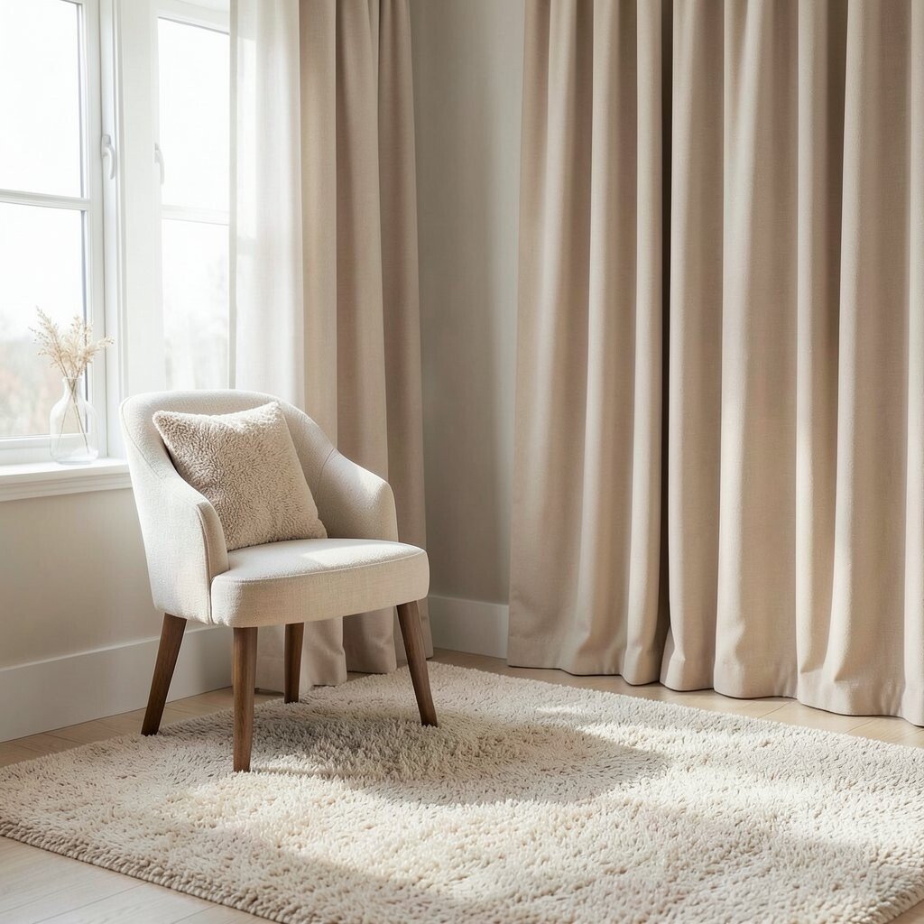
Dull beige often lacks the vibrancy needed to bring a room to life. It can make spaces feel uninspired.
Try a warm beige with a hint of pink or yellow for a cozy, welcoming feel. This subtle change can make all the difference.
When personalization is key, mix beige with different textures. Think fluffy rugs or smooth curtains for an interesting combo.
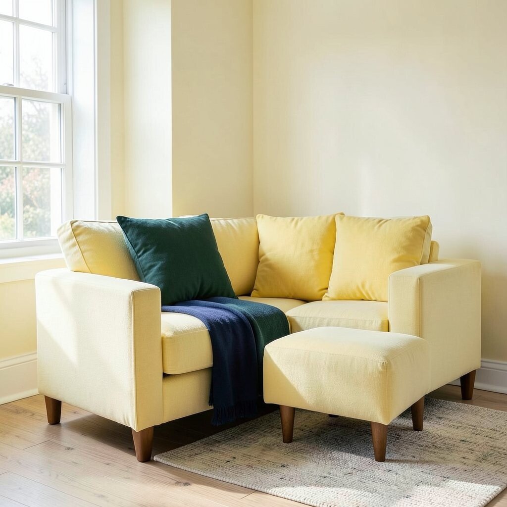
3. Bright Yellow
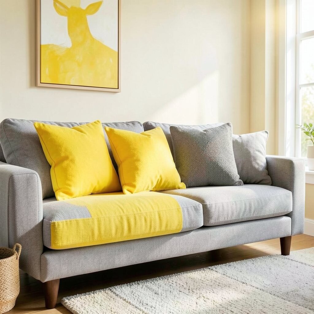
Bright yellow is cheerful but can be overwhelming. In large doses, it can be hard on the eyes.
Use it in smaller accents like cushions or artwork to bring sunshine to a room without going overboard.
Trendy choices like combining yellow with grey can create a modern look that’s both bright and balanced.
4. Dark Brown
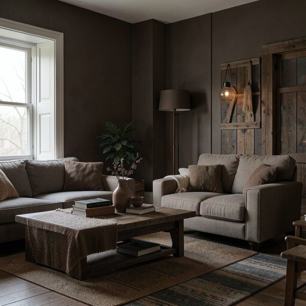
Dark brown can make a space feel heavy and dated. It’s a color that’s hard to get right.
Opt for lighter browns or tans that bring warmth without the weight. They’re perfect for creating a rustic feel.
Dark brown can be costly if overused, as it might require more lighting to brighten up the space.
5. Fluorescent Pink
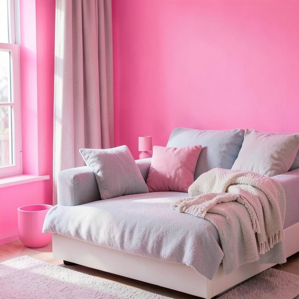
Fluorescent pink is eye-catching but can be too much in large areas. It screams for attention.
Instead, try softer shades of pink that bring charm and subtlety to a design.
Combine pink with cool neutrals for a balanced look that’s both trendy and timeless.
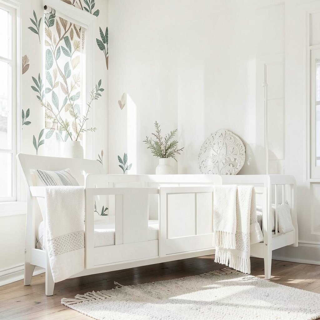
6. Stark White
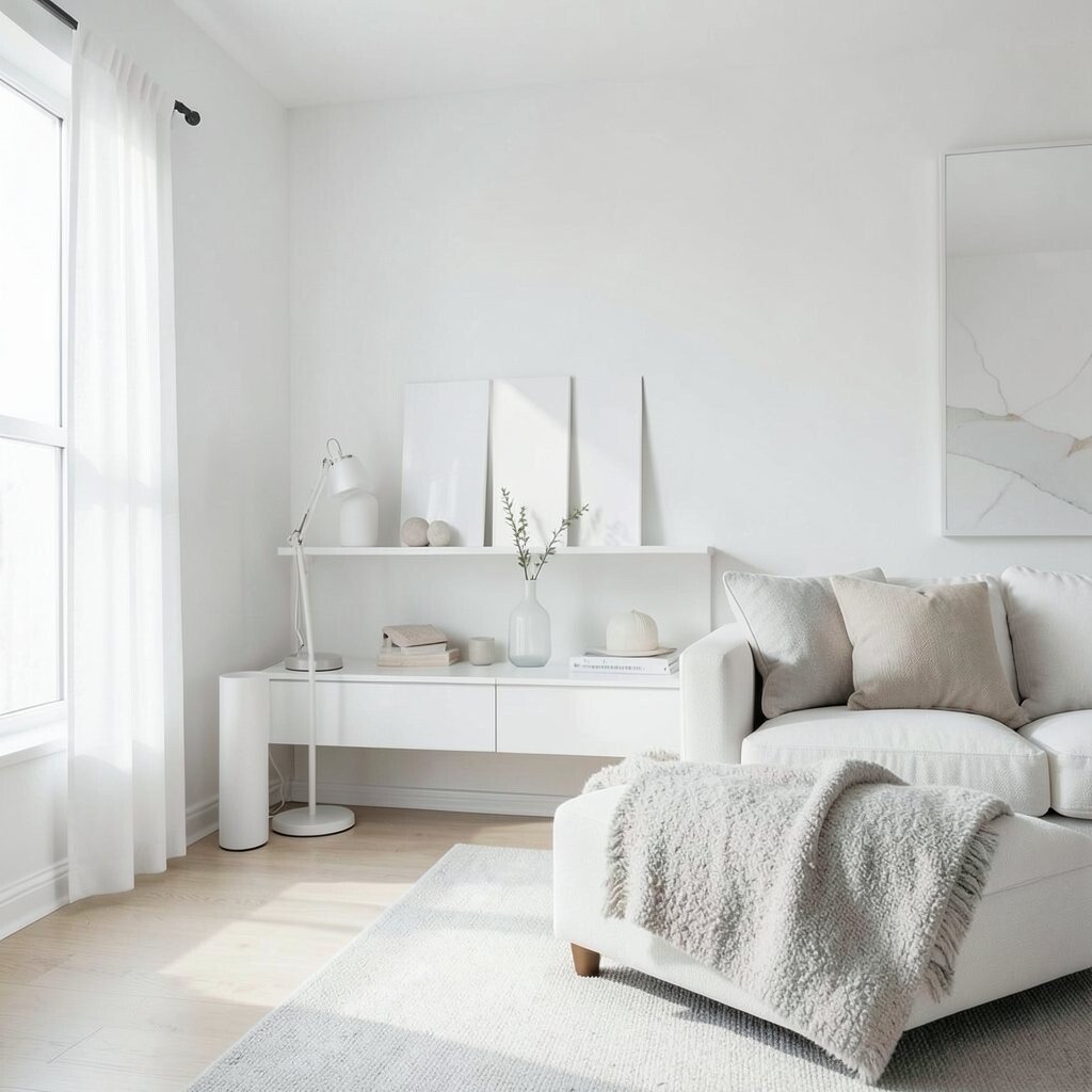
Stark white can feel cold and sterile. It lacks the warmth that a homey space needs.
Consider off-whites or shades with a hint of gray or beige for a softer, more inviting look.
White is versatile and cost-effective, making it easy to pair with almost any color scheme.
7. Harsh Red
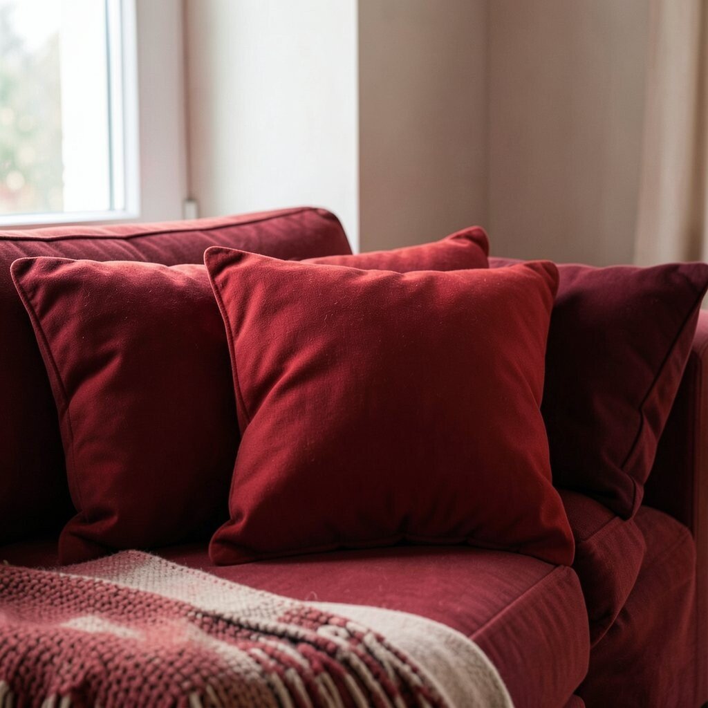
Harsh red can create tension and is often too intense for most spaces. It demands attention.
Use softer reds or burgundy tones to keep the intensity while adding depth and elegance.
Red can be budget-friendly when used in accessories like pillows or small decor items.
8. Electric Blue
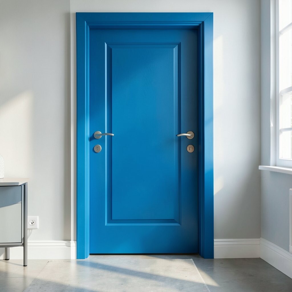
Electric blue is vibrant but can be jarring if not balanced with other colors.
Try pairing it with softer blues or neutrals to create a harmonious and stylish look.
For a unique touch, use electric blue in unexpected places like a door or a piece of furniture.
9. Muddy Gray
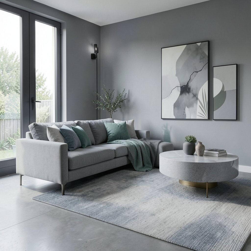
Muddy gray can make spaces look dull and lifeless. It’s a color that often lacks character.
Opt for crisp grays with blue or green undertones to add freshness and vibrancy.
Gray is a trendy choice for modern designs, making it easy to find decor items at various price points.
10. Olive Green
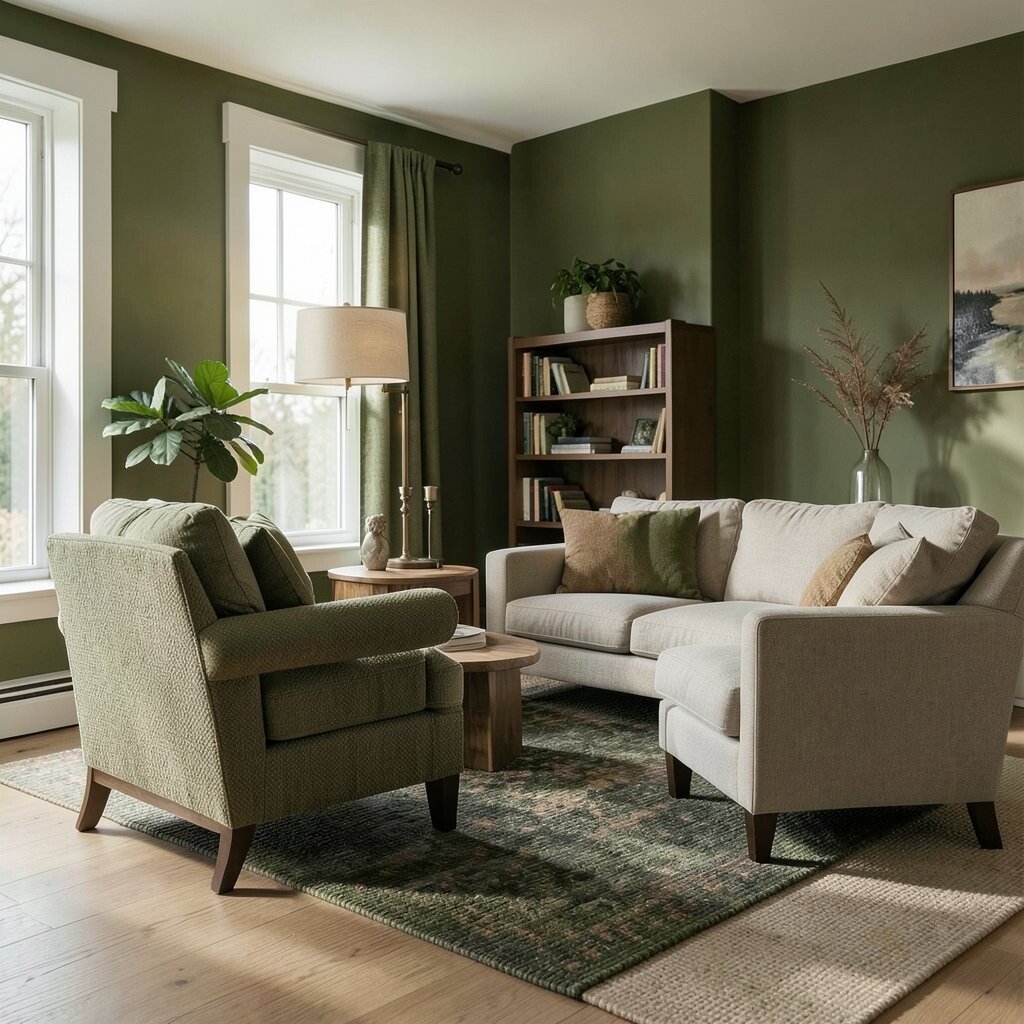
Olive green can be tricky, often giving a space an outdated feel if not used correctly.
Pair it with warm neutrals or rich earth tones for a sophisticated and natural look.
Olive green is perfect for those who love the outdoors and want to bring a touch of nature inside.
11. Pastel Purple
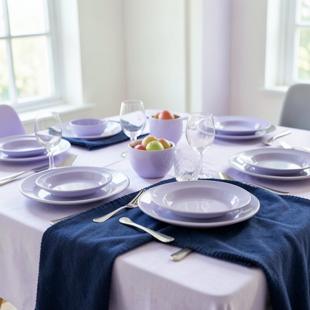
Pastel purple may appear too soft and can sometimes feel juvenile when overdone.
Consider using it in combination with bold colors like navy for a grown-up twist.
Experiment with pastel purple in affordable decor items such as tableware or throw blankets.
12. Deep Black
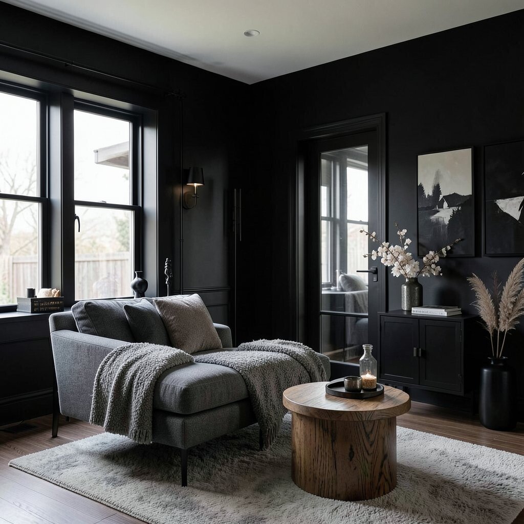
Deep black is sophisticated but can easily overwhelm a space, making it feel smaller.
Use it in small amounts or as accents to create a dramatic, yet balanced look.
Black is a classic choice that can be easily found in many home decor items, fitting various budgets.
13. Pale Peach
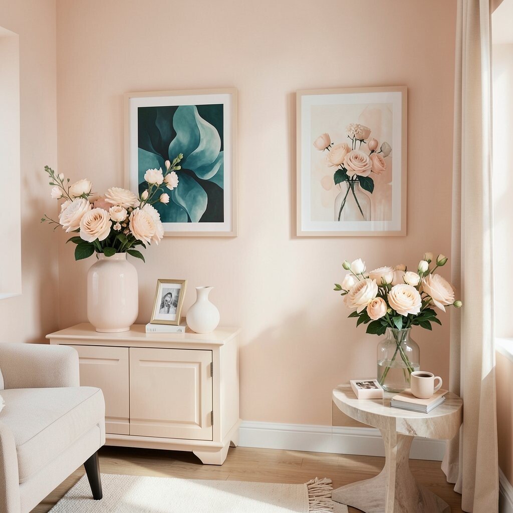
Pale peach can wash out a room, leaving it feeling bland and uninspired.
Try pairing it with bolder colors like teal or emerald for a lively and refreshing contrast.
For a unique touch, incorporate pale peach in floral arrangements or art prints.
14. Glaring Orange
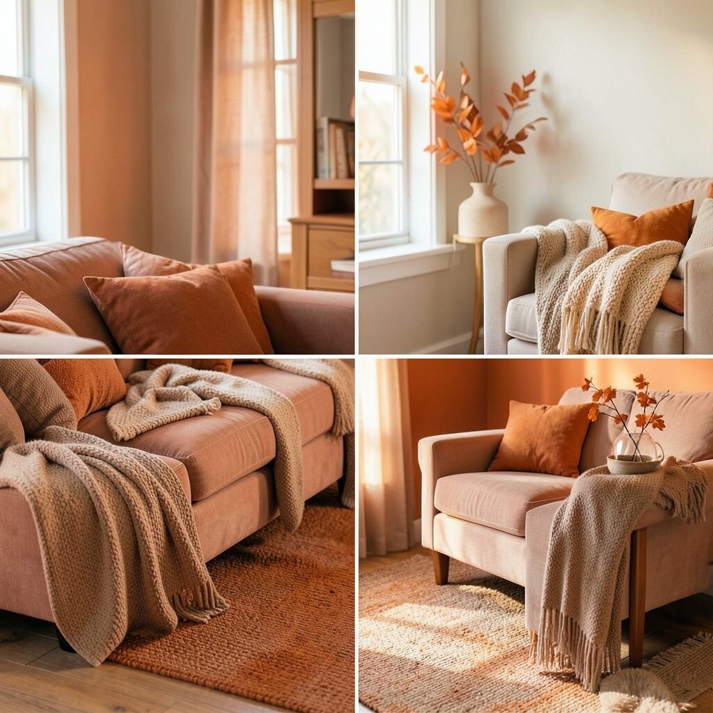
Glaring orange is energetic but can quickly become too much, making a space feel chaotic.
Consider using muted oranges or terracotta shades for warmth without the chaos.
Orange is a fun color to play around with and can be used in seasonal decor for a budget-friendly update.
15. Salmon Pink
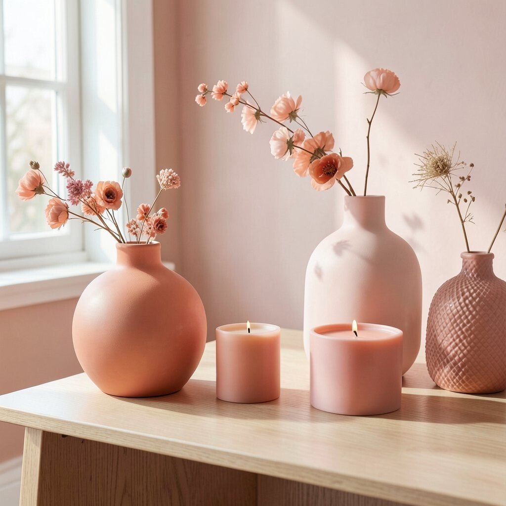
Salmon pink can be tricky, sometimes appearing too dated for modern spaces.
Opt for coral or blush shades that offer a fresher and more contemporary vibe.
Incorporate salmon pink in small decor pieces like vases or candles for a subtle pop.
16. Dusty Blue
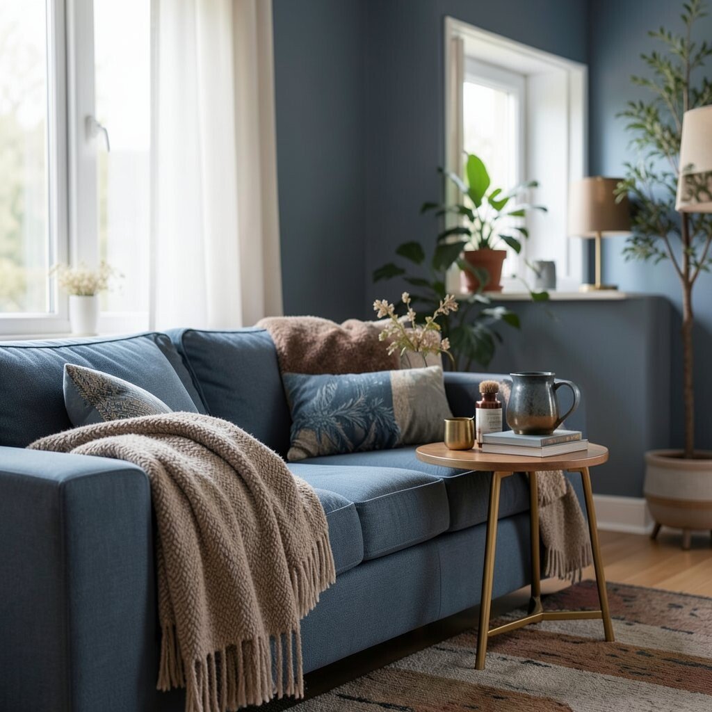
Dusty blue can feel cold and uninviting if not balanced with warmer tones.
Pair it with rich browns or golds to create a cozy and elegant atmosphere.
Blue is a versatile color that can be found in many affordable decor items, making it easy to experiment with.
17. Brick Red
Brick red can feel too heavy and dated if used excessively in a design.
Consider using it in smaller doses or as an accent color for a warm, inviting touch.
Red is a classic choice that can be easily paired with other colors for a stylish look.
18. Pale Yellow
Pale yellow can feel washed out and lack the vibrancy needed to make a statement.
Try pairing it with bolder colors like navy or emerald for a striking contrast.
Yellow is a cheerful color that can be easily incorporated into decor for an affordable update.
19. Mint Green
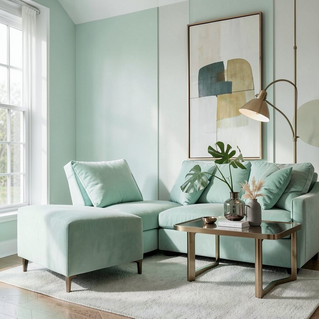
Mint green can feel too soft and sweet, sometimes appearing juvenile in mature spaces.
Combine it with bold colors or metallics for a sophisticated and modern look.
Mint green is a trendy choice that can be found in various decor items, fitting different budgets.
20. Eggshell White
Eggshell white can feel too plain and uninspiring if not paired with other colors.
Use it as a backdrop for bolder colors or patterns to create an interesting and dynamic look.
White is a versatile choice that can be easily found in many home decor items, fitting various budgets.