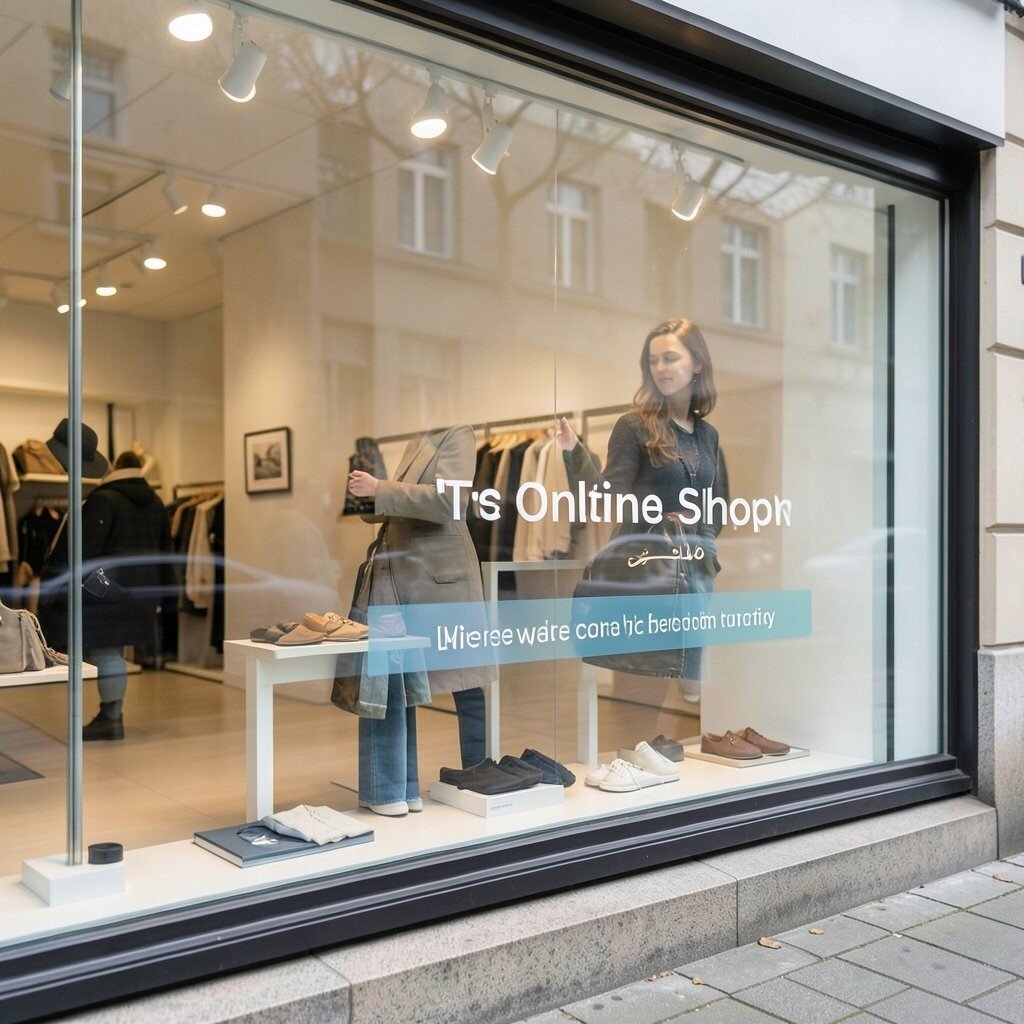
Window displays can stop a shopper in their tracks. A smart one can make your online shop feel alive.
1. Glow-Edge Product Frames
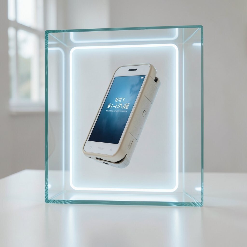
Bright edge lighting can make a product look like it is floating in a clean glass box. This style feels modern, neat, and easy to spot on a busy screen.
It works well for beauty, tech, and gift items because the light pulls the eye right to the product. Keep the background simple, use one strong hero item, and add a short line that says why it matters. If you want to keep costs low, use soft digital glow effects instead of full animation, and match the color of the light to your brand.
2. Seasonal Story Scenes
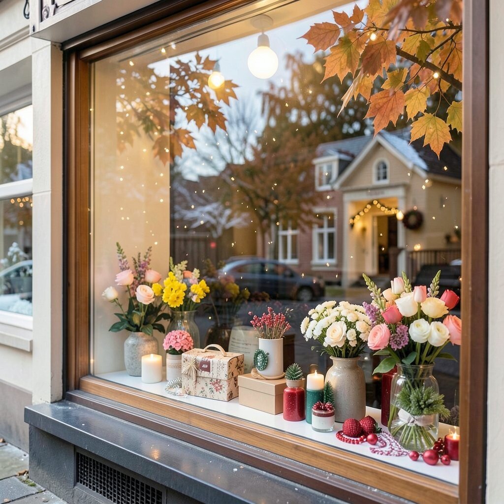
A seasonal scene gives your shop a fresh mood that changes with the calendar. Think warm leaves, snowy sparkle, spring flowers, or bright summer skies.
This kind of display helps shoppers feel the moment, which can make your products seem more useful and timely. It also gives you an easy way to refresh your site often without a full redesign. Add a few personal touches, like favorite colors or local holiday hints, and use reusable design parts so you save money over time.
Seasonal displays are popular right now because they keep pages feeling active and current. They also give returning visitors a reason to look again. A small change in props, color, or message can make a big difference.
3. Minimal White Space Showcase
Clean white space can make even a small product feel special. The empty room around it helps the eye rest and makes the item stand out.
This style is great for luxury goods, handmade pieces, and items with fine details. It feels calm, modern, and easy to shop.
Try one neat product photo, a short headline, and one clear call to action. You can personalize the look with a single brand color or a tiny accent icon. It is also a smart budget choice because it needs fewer design extras.
4. Bold Color Block Windows
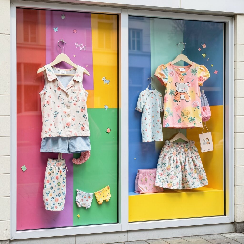
Strong color blocks can give your shop a loud, happy voice. They work like a big sign that says, “Look here.”
This idea is perfect for fashion, kids’ items, and playful brands. It adds energy fast and can make your products feel fun before a shopper even reads the text.
Use two or three colors that fit your brand, then place products where the contrast feels strongest. You can personalize the blocks with patterns, shape cutouts, or small slogans. If you want to keep costs down, reuse the same layout and just swap the colors for each campaign.
5. Interactive Hover Surprise
A hover display changes when the shopper moves the mouse over it. That small moment of surprise can make your shop feel clever and alive.
It is a good fit for online stores that want more clicks on featured items. The motion can show a second angle, a hidden message, or a quick use tip.
Keep it simple so it does not feel hard to use. Add a personal touch with a friendly label or a brand mascot. Since this style relies on web design more than physical props, it can be a smart low-cost way to add excitement.
6. Handwritten Note Window
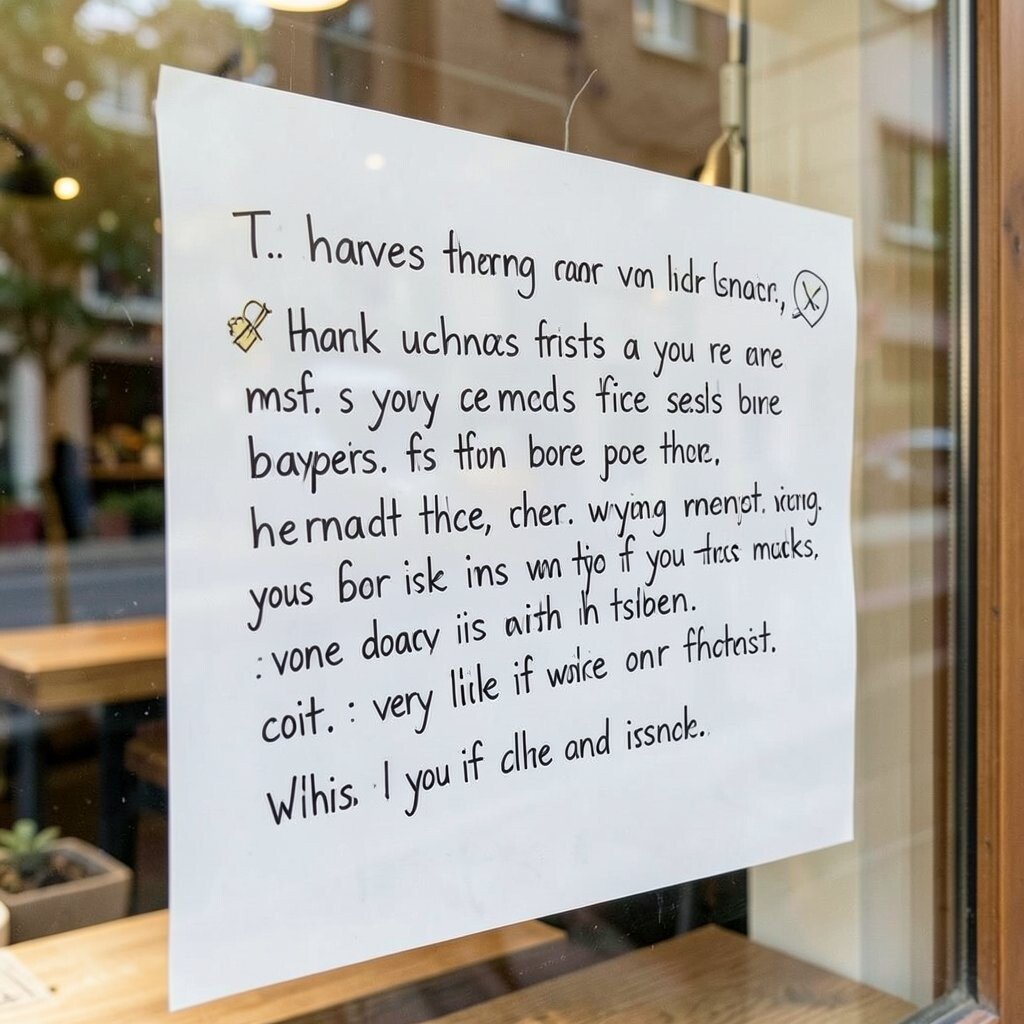
Handwritten text makes a display feel warm and human. It can look like a note from a shop owner rather than a big company.
This style helps build trust, especially for small shops and made-by-hand products. It also gives your brand a voice that feels close and honest.
Use short lines, simple doodles, and a friendly tone that sounds like real speech. You can personalize the note for your audience, like thanking repeat buyers or welcoming first-time visitors. It costs very little if you make it with digital lettering or scanned handwriting.
7. Mirror and Reflection Style
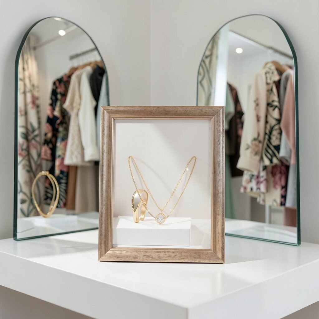
Mirrors can make a display feel bigger and brighter. They also create fun layers that keep the eye moving.
This look works well for fashion, jewelry, and beauty items because it adds shine without much clutter. It can also make a small shop page feel more polished and rich.
Try placing one main item in front of a reflective surface or use mirrored shapes in the background. Add a personal twist with a custom frame color or a brand pattern in the reflection. For cost control, digital mirror effects can give the same feel without extra setup.
8. Storybook Scene Window
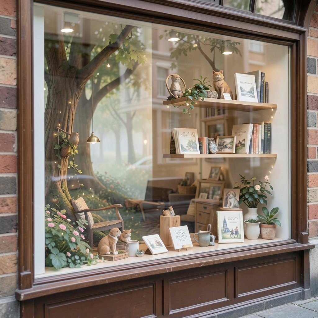
A storybook display makes your products feel like part of a little tale. It can look dreamy, soft, and a bit magical.
Shoppers often stay longer when a display feels like a scene, not just a shelf. That extra time can help them remember your brand and click deeper into the shop.
Use one clear theme, such as a forest, a city street, or a cozy room. Personalize it with tiny details that match your audience, like pets, books, or travel items. If you keep the main shapes simple, you can build the scene on a modest budget.
9. Split-Screen Before and After
Split-screen windows show two sides of one story at once. This can make a product’s value easy to understand in a few seconds.
It is useful for beauty, home, and cleaning items because people can see the change right away. The clear contrast helps shoppers feel sure about what they are buying.
Use a clean line down the middle and keep both sides easy to read. You can personalize the idea with brand colors or product photos from real customers. Since the layout is simple, it often costs less than a big animated display.
10. Floating Product Islands
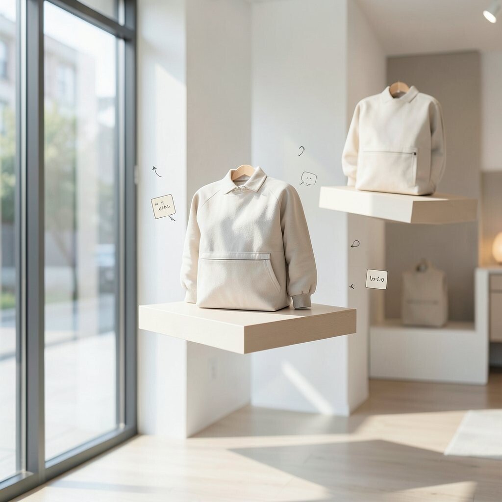
Floating product islands make items seem like they are resting in midair. The look feels light, modern, and a little playful.
This style is a strong choice for new launches because it gives the product a special spotlight. It also works well for pages that need a fresh, high-end feel.
Use soft shadows, hidden supports, or digital depth effects to create the floating look. Add a personal touch by placing small icons or notes near each product. To save money, use one strong hero item and a few simple accents instead of a full scene.
11. Nature-Inspired Green Window
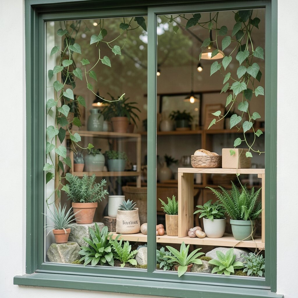
Plants, leaves, and earth tones can make a shop feel calm and friendly. The look brings a little outdoors feeling into the screen.
This display style fits wellness, home, food, and eco-friendly brands very well. It can help shoppers feel that your products are gentle, fresh, and thoughtful.
Mix soft greens with wood textures, stone looks, or simple vine shapes. You can personalize the design with local plants or a color that matches your packaging. Real or digital greenery can both work, so the cost can stay flexible.
12. Neon Edge Statement
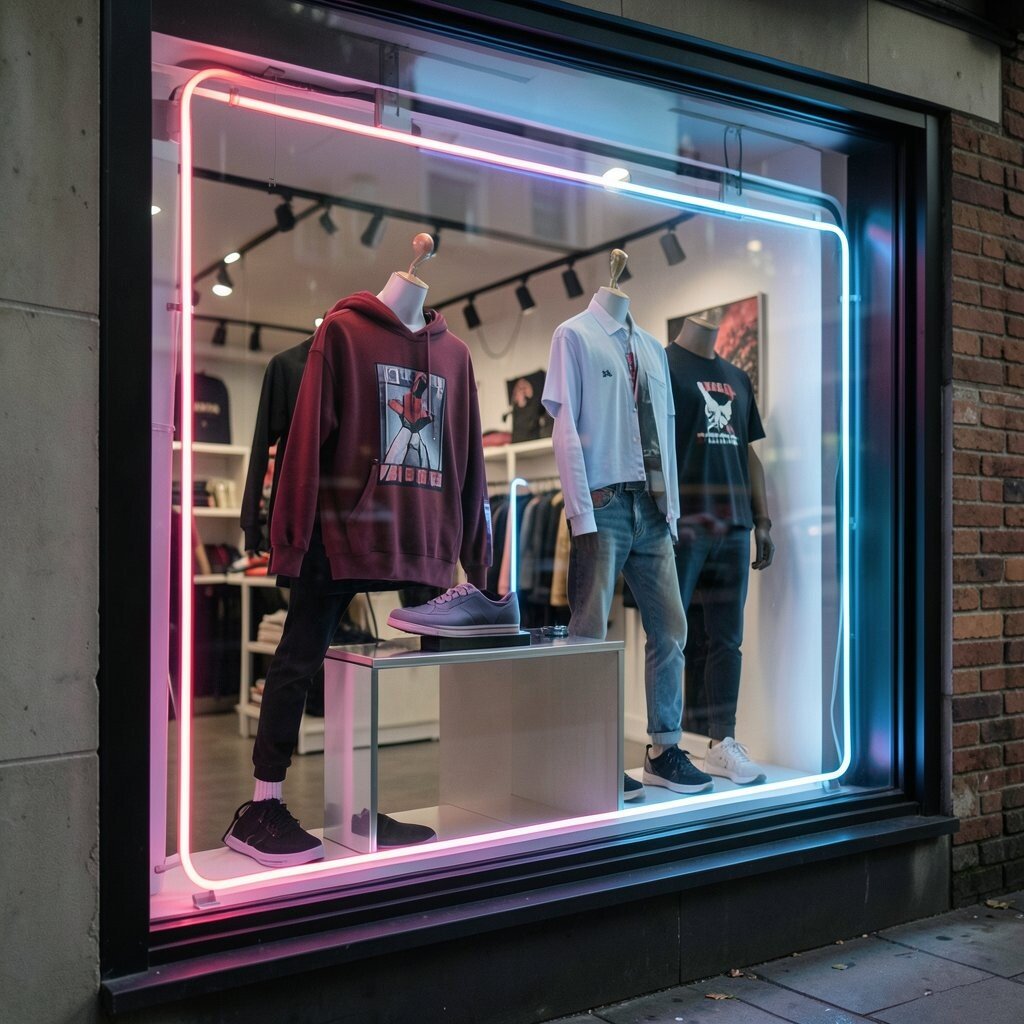
Neon-style lines can make a display feel bold and lively. They give your shop a night-city glow that stands out fast.
This is a strong trend for fashion, music merch, and youth-focused brands. It can make even a small product feel cool and current.
Keep the product area easy to read so the glow does not take over. Add a short punchy phrase and a personal brand color for a custom touch. Digital neon effects are often cheaper than real light signs and still look sharp.
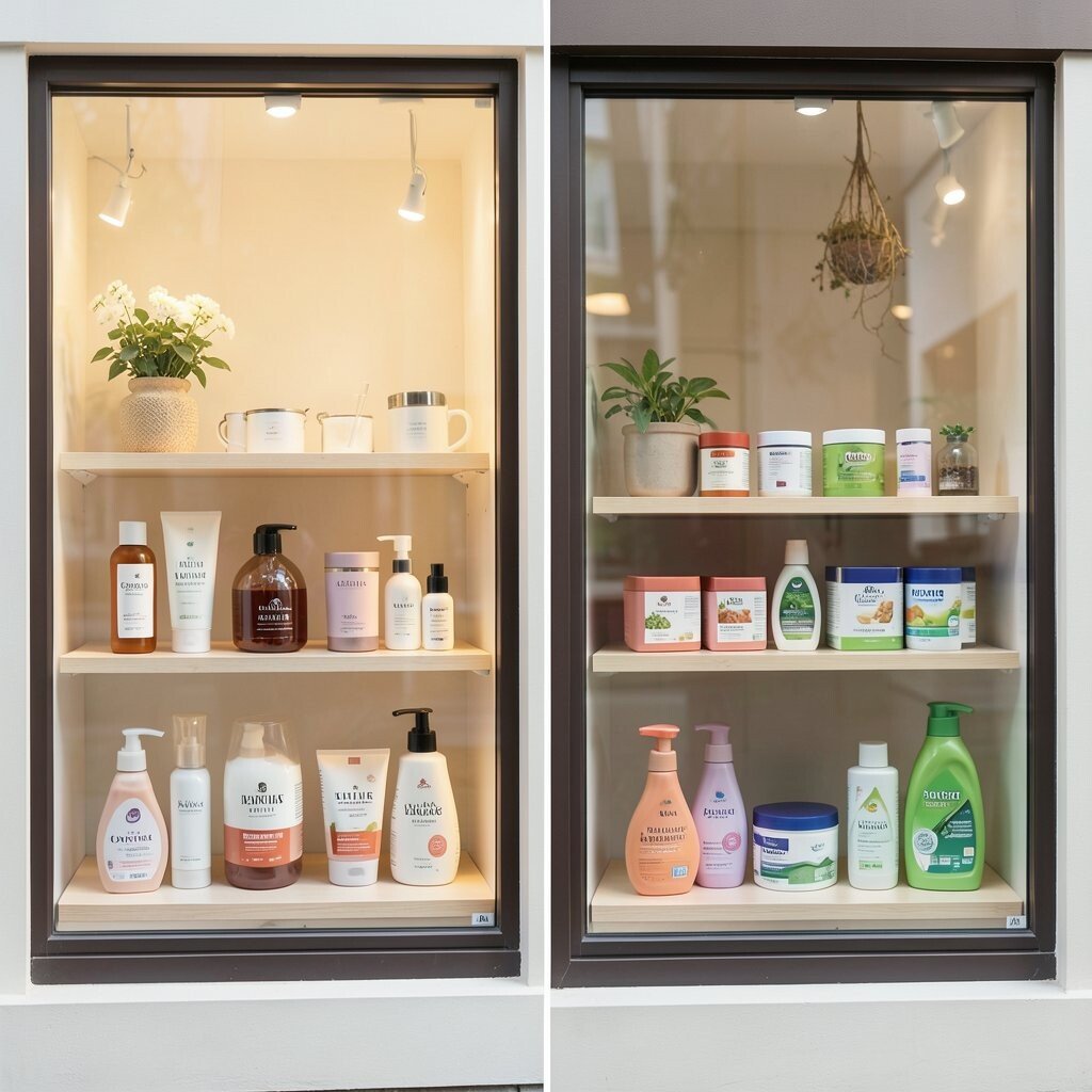
13. Curated Shelf Stack
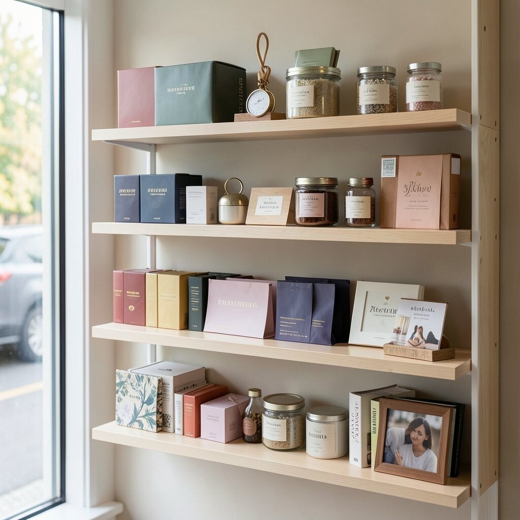
A shelf stack display arranges products in neat layers like a mini store wall. It feels organized and easy to browse.
This style is helpful when you want to show a group of related items together. It can also encourage shoppers to buy more than one thing at a time.
Group items by use, color, or mood so the display feels tidy. You can personalize each shelf with a small card, a badge, or a themed prop. If you keep the shelving simple, the cost stays low while the look stays polished.
14. Soft Pastel Dream
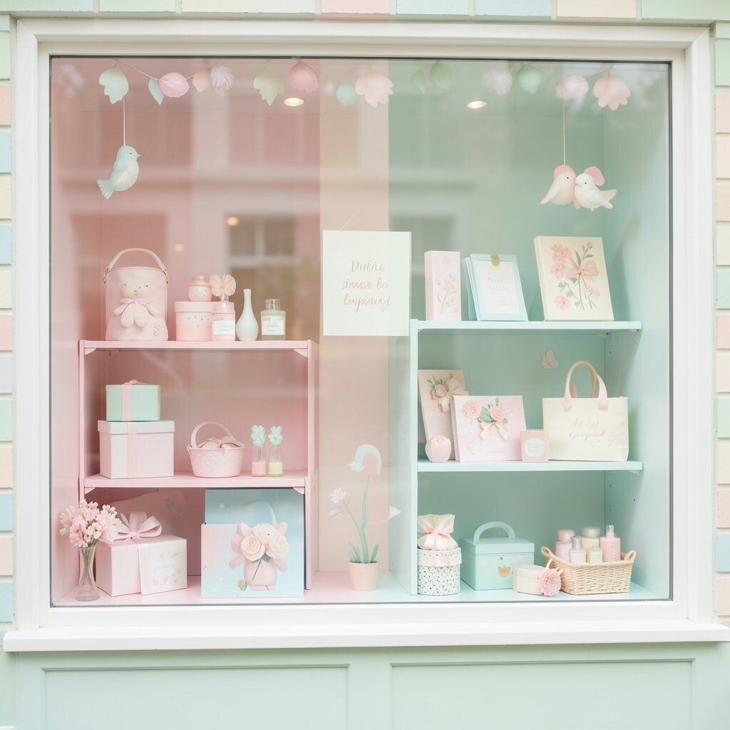
Pastel shades can make a window display feel sweet and gentle. The soft colors are easy on the eyes and easy to love.
This style works well for baby goods, stationery, gifts, and beauty items. It gives a calm feeling that can help shoppers slow down and look longer.
Use pale pink, mint, sky blue, or cream in a balanced way. Add a personal note through a custom illustration or a small quote that fits your brand voice. Pastel designs can be budget-friendly if you rely on color changes instead of many props.
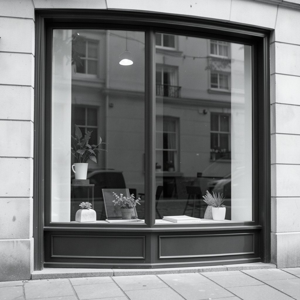
15. High-Contrast Black and White
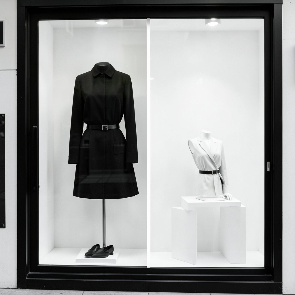
Black and white displays feel sharp and classy. The strong contrast makes every shape easy to notice.
This look is great for fashion, art, and premium goods because it feels bold without needing much decoration. It also gives your shop a timeless style that rarely feels old.
Try one black hero item against a white background or the reverse. You can personalize the display with a small pop of color or a custom typeface. Since the palette is simple, it can be a cost-smart choice for many shops.
16. Motion Banner Window
A motion banner adds gentle movement across the display. Even a slow slide or fade can make people pause.
This style is useful for sales, product launches, and limited offers. It draws attention to the message while keeping the layout neat.
Keep the motion smooth and easy to follow so it does not feel busy. Add a personal tone with a short welcome line or a friendly offer. Motion banners can be made with simple web tools, which helps keep spending under control.
17. Mix-and-Match Product Cluster
A cluster display shows several items that work well together. It feels lively and helps shoppers imagine how the products fit into real life.
This is a smart choice for sets, bundles, and cross-sell ideas. It can raise order size because shoppers see more ways to use what you sell.
Arrange the items by size, color, or use so the display still feels neat. Personalize the cluster with a theme like travel, self-care, or weekend fun. A good cluster can be built from products you already have, so it often costs less than making something brand new.
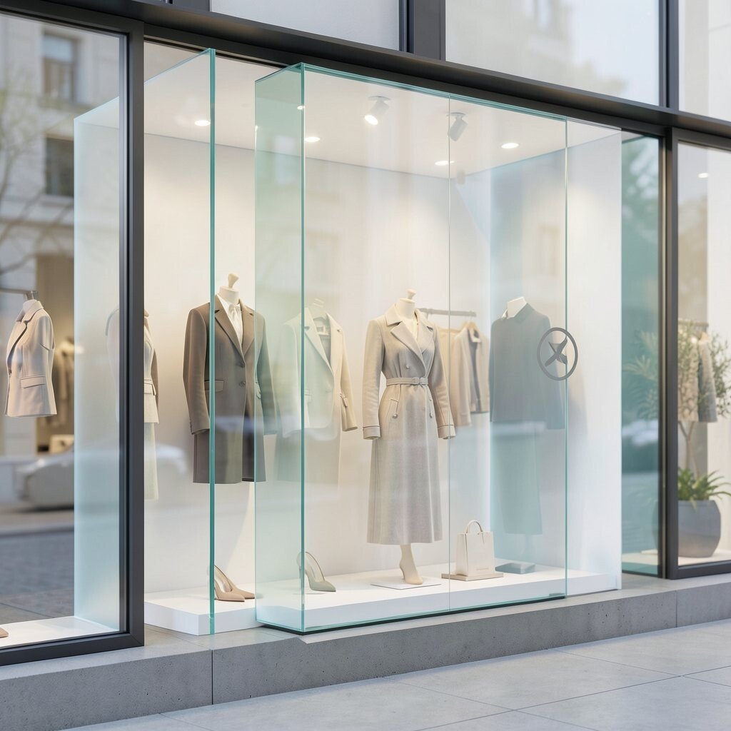
18. Glass Case Luxury Look
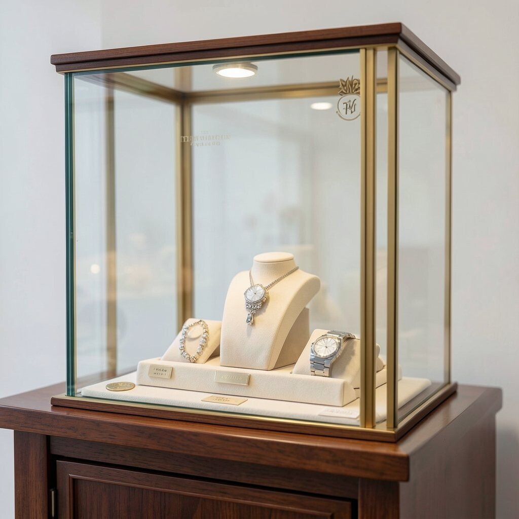
A glass case style gives products a protected, special feeling. It can make a simple item look more valuable right away.
This works well for jewelry, watches, collectibles, and premium gifts. The clear barrier creates a sense of care and trust.
Use crisp lighting and a clean background so the product stays the star. Add a personal touch with a monogram, a small seal, or a custom label. If you use digital framing instead of full custom graphics, the cost can stay reasonable.
19. Bright Sale Burst
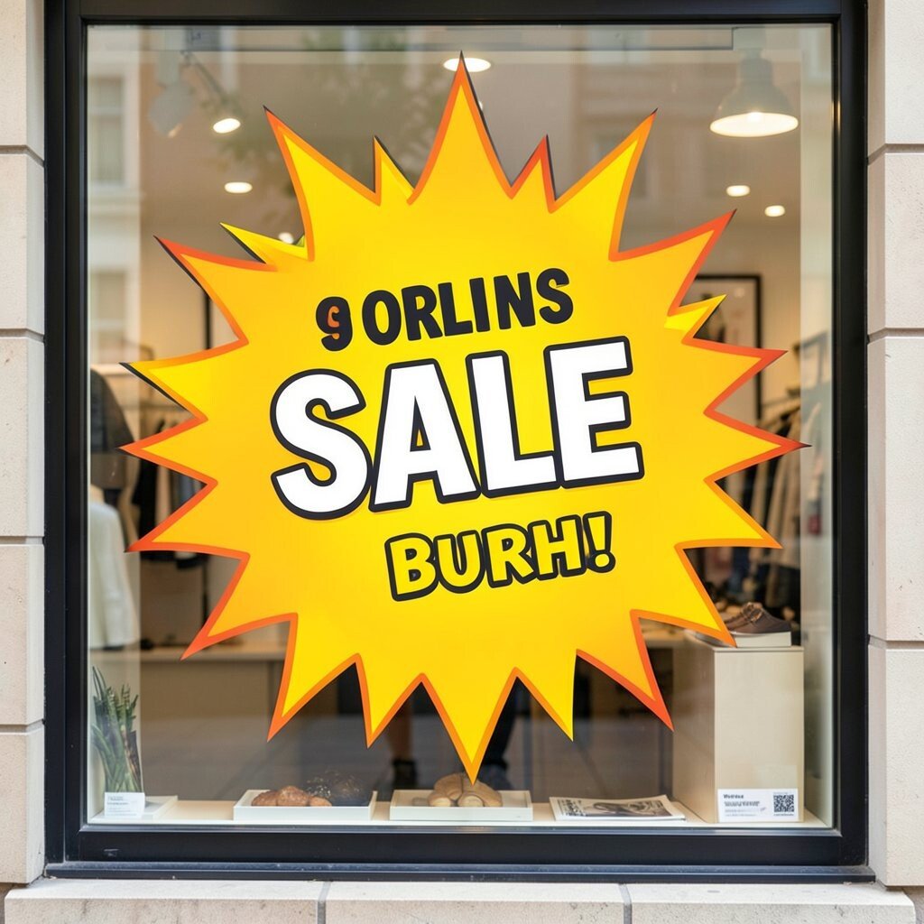
A sale burst display uses strong shapes and lively text to shout about a deal. It can get attention fast and make the offer feel urgent.
This style is useful when you need quick clicks on a special event or clearance page. It works best when the message is clear and easy to scan.
Use one main deal message and keep the rest of the design simple. You can personalize the burst with brand colors or fun words that match your shop voice. It is also a low-cost option because it depends more on layout than on fancy art.
20. Cozy Home Corner
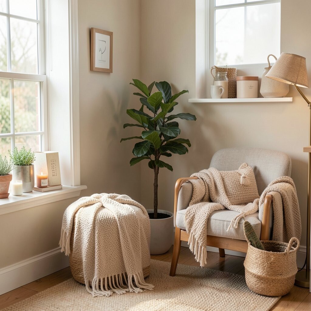
A cozy corner display feels like a little room inside the shop. Soft textures, warm colors, and gentle props can make it feel inviting.
This style is a great fit for home goods, candles, blankets, and kitchen items. It helps shoppers picture the product in their own space.
Add a chair, a lamp, a plant, or a mug to build the mood. Personalize the corner with a style that matches your audience, such as modern, rustic, or playful. You can keep costs down by using a few strong pieces instead of a full room setup.
21. Transparent Layer Play
Clear layers can make a display feel airy and smart. They let the eye see through one shape to the next.
This style is a nice fit for tech, beauty, and modern fashion brands. It gives a neat future feel without making the page look heavy.
Use glass-like panels, soft gradients, or see-through shapes around the product. Add a personal touch with a hidden icon or a subtle brand mark. Since the look can be made with digital design tricks, it may cost less than building complex visuals.
22. Handmade Craft Table
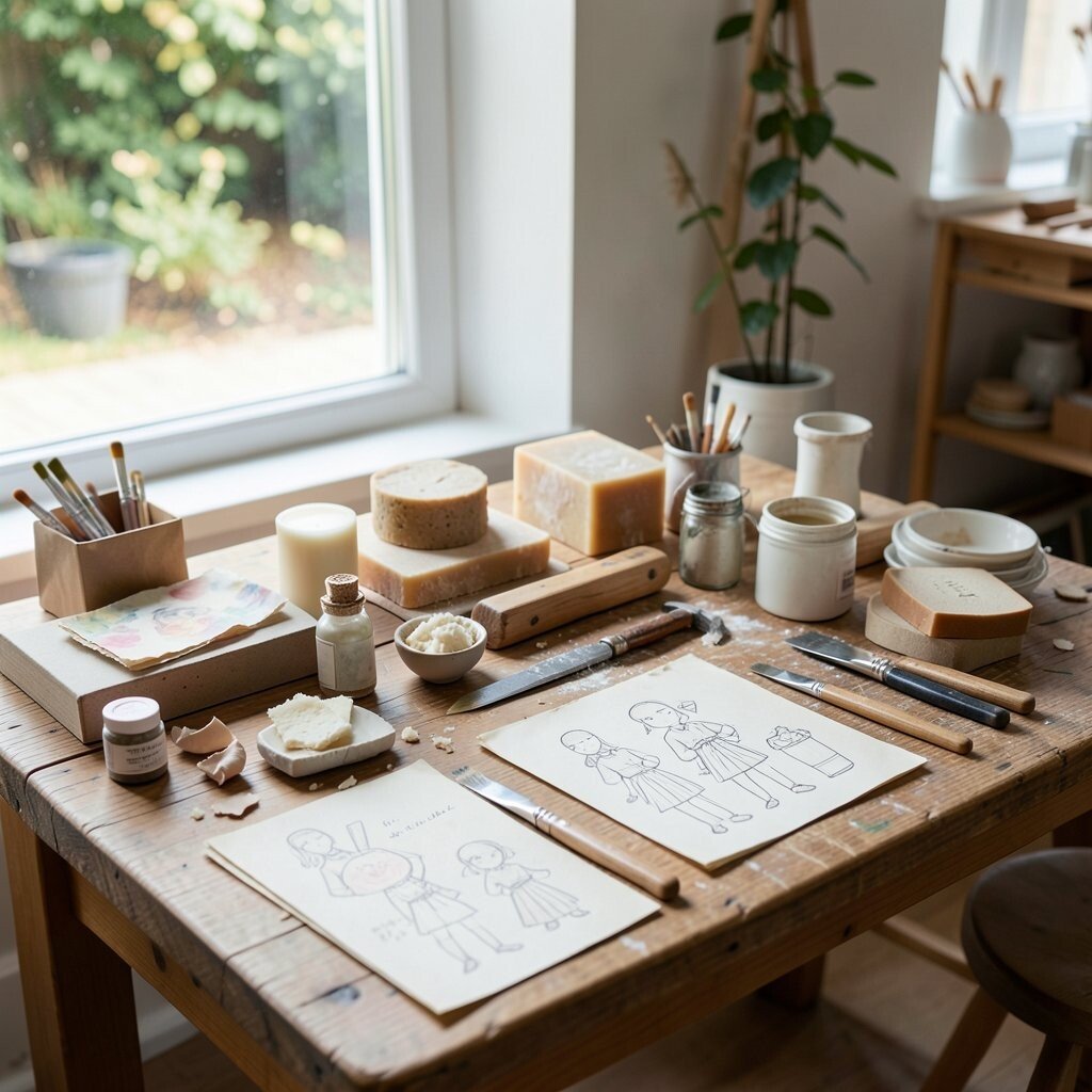
A craft table display feels real, warm, and full of care. It can look like the products were just made by hand.
This style is perfect for art, paper goods, soaps, and small gifts. It helps shoppers feel the work and effort behind each item.
Show tools, textures, scraps, or sketches to tell the making story. You can personalize the table with your own hands-on process or a note about how the item is created. The cost can stay low if you use items from your studio or shop space.
23. Smart Tech Grid
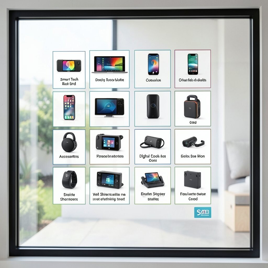
A tech grid display uses neat lines and clear blocks to show products in a tidy way. It feels clean, fast, and easy to understand.
This style is ideal for gadgets, apps, accessories, and digital tools. It can help shoppers compare items without feeling lost.
Use icons, short labels, and crisp photos to keep the grid simple. Add a personal touch with a custom color code or a small brand badge. Current design trends favor clean grids because they work well on phones and tablets, and they are often cost-efficient to build.
24. Bold Typo First
Sometimes words can be the main star of the display. Big, bold type can grab the eye before a picture even loads.
This works well for brands with a strong voice or a clear message. It can make a shop feel brave, modern, and confident.
Choose a short line that sounds like your brand and place it where it can be read fast. You can personalize the type with a custom font, hand-drawn letters, or a phrase that speaks to your buyers. It is often a low-cost choice because strong type can do a lot with very little.
25. Art Gallery Product Wall
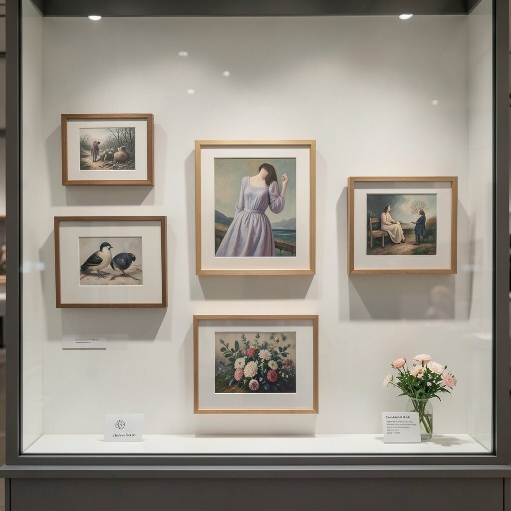
An art gallery display frames products like pieces in a museum. The result feels polished and special.
This style is great for prints, fashion, decor, and premium handmade goods. It can make shoppers slow down and look more carefully.
Use plenty of breathing room and neat alignment so each item feels important. Add a personal touch with a title card or a small story about the product. You can keep spending in check by using simple frames and a few strong images.
26. Travel Postcard Theme
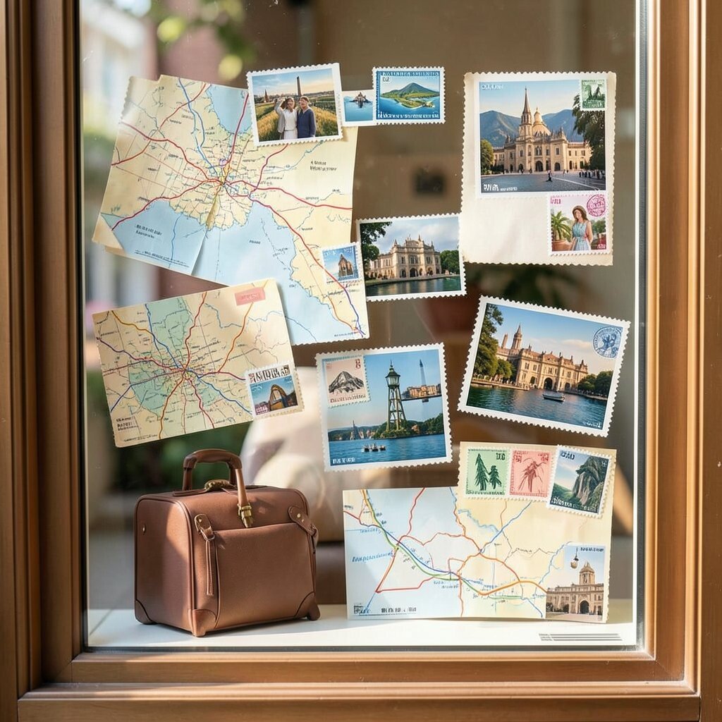
A postcard-style display brings in maps, stamps, and travel vibes. It feels cheerful and full of movement.
This look works well for luggage, gifts, journals, and lifestyle items. It can help shoppers imagine adventure and fun.
Mix soft paper textures with bright stamps or route lines to build the scene. Personalize it with places that matter to your audience, like local landmarks or dream trips. If you use flat graphics and a few printed accents, the cost stays friendly.
27. Monochrome Brand Mood
A monochrome display uses one color family for the full scene. That makes the whole window feel calm, strong, and put together.
This style is useful for brands that want a clear mood without too much noise. It can make products look more premium and more memorable.
Pick one main color and use different shades to add depth. You can personalize the mood with a texture, a pattern, or a small accent item. The simple palette helps keep design costs lower while still looking high-end.
28. Customer Favorite Spotlight
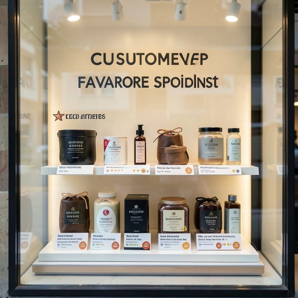
A favorite spotlight display puts best-loved products in the front row. It feels friendly because it shows what other shoppers already enjoy.
This style can build trust and help new buyers feel safe choosing a popular item. It also makes it easier to guide people toward proven sellers.
Use badges, short reviews, or star marks to show why each item stands out. Add a personal note about why your team loves it too. Since you are using items you already know sell well, the setup can be simple and cost-aware.
29. Festival of Small Details
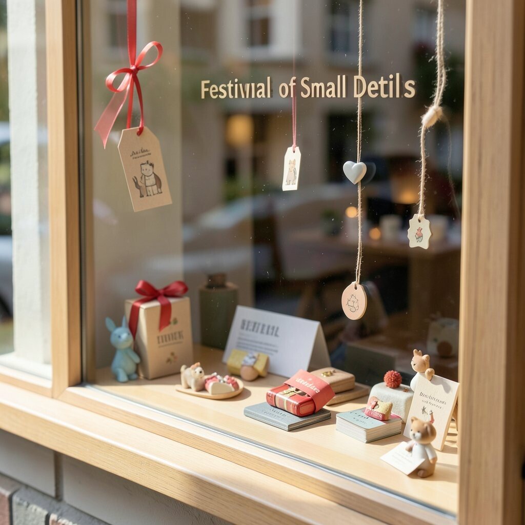
A detail-rich display uses tiny touches to keep people looking longer. A ribbon, a tag, a tiny icon, or a soft shadow can all help.
This style is perfect for brands that want a handcrafted feel with a modern finish. It makes the whole shop seem thoughtful and cared for.
Choose a few small details that match your brand story and repeat them in a gentle way. You can personalize the display with signature shapes, favorite colors, or a tiny mascot. Small details often cost less than big props, yet they can make the biggest difference in how your shop feels.