A fresh front color can change the whole mood of a house. The right shade can make a home feel warm, happy, and full of life.
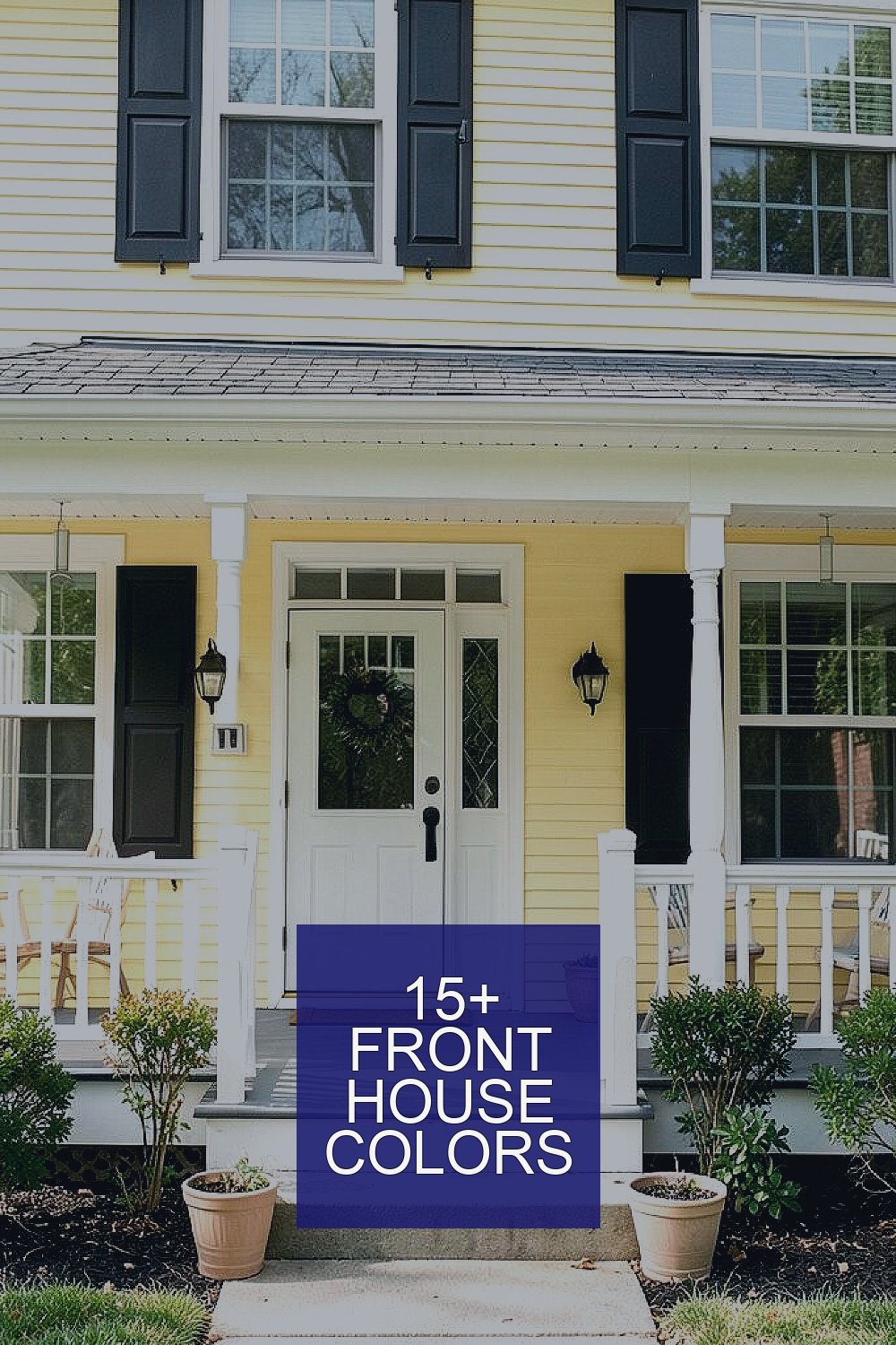
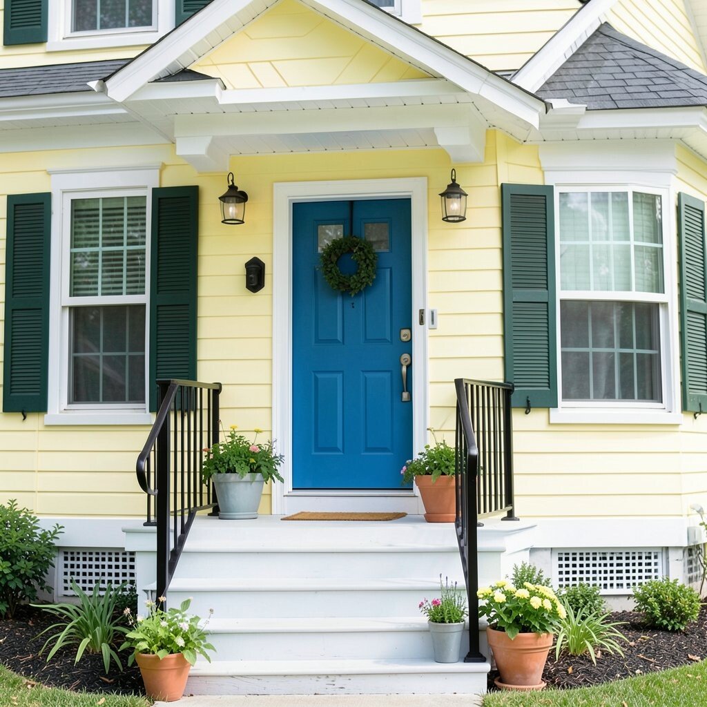
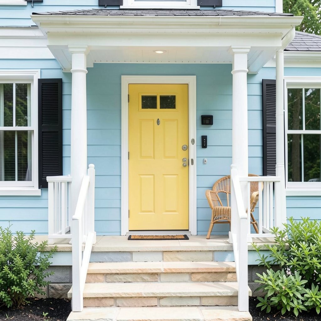
1. Sunny Butter Yellow
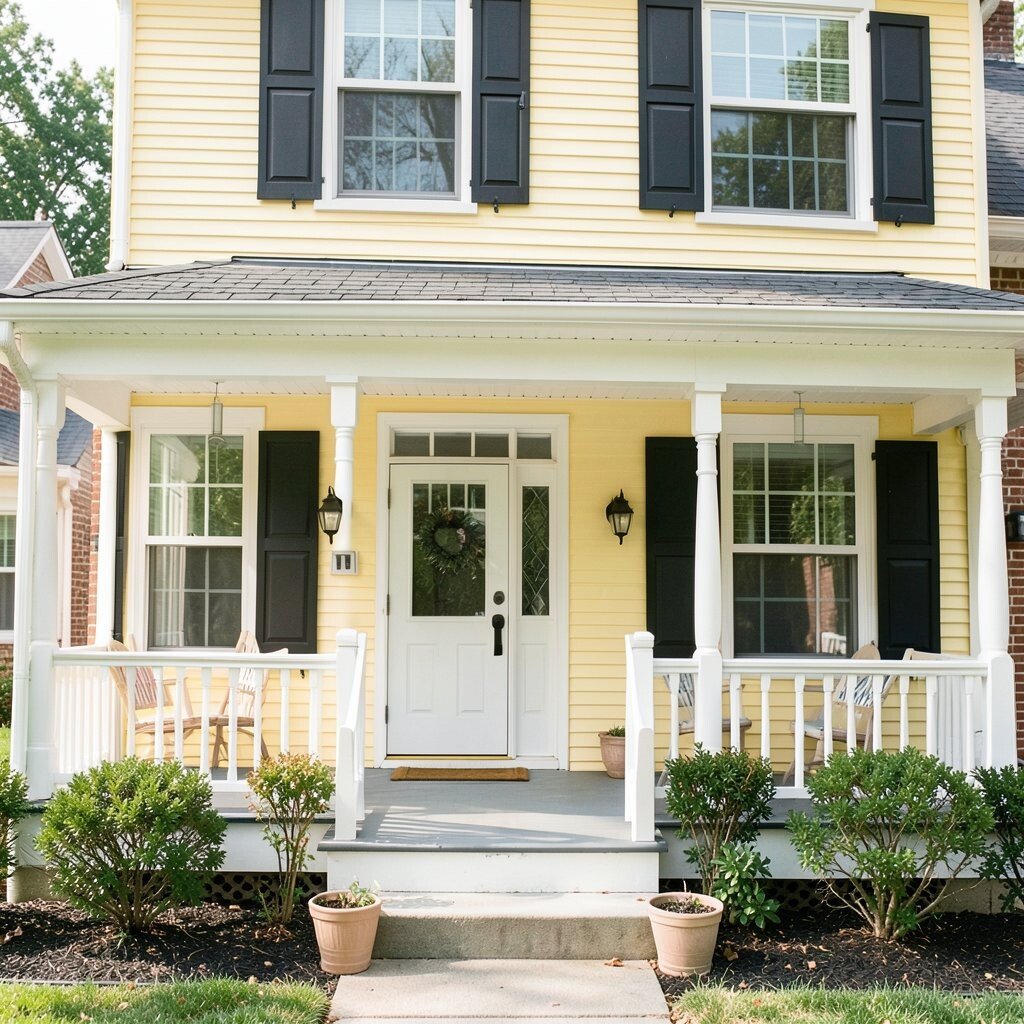
Sunny butter yellow brings a soft glow that feels cheerful without being too loud. It makes a front porch look bright and welcoming from the street.
This color works well on homes with white trim, dark shutters, or brick accents. It can hide small dust marks better than very pale shades, and it often feels friendly in both old and new neighborhoods. If you want a happy look on a modest budget, this is a smart pick because many paint lines offer butter yellow at a fair price.
2. Sky Blue
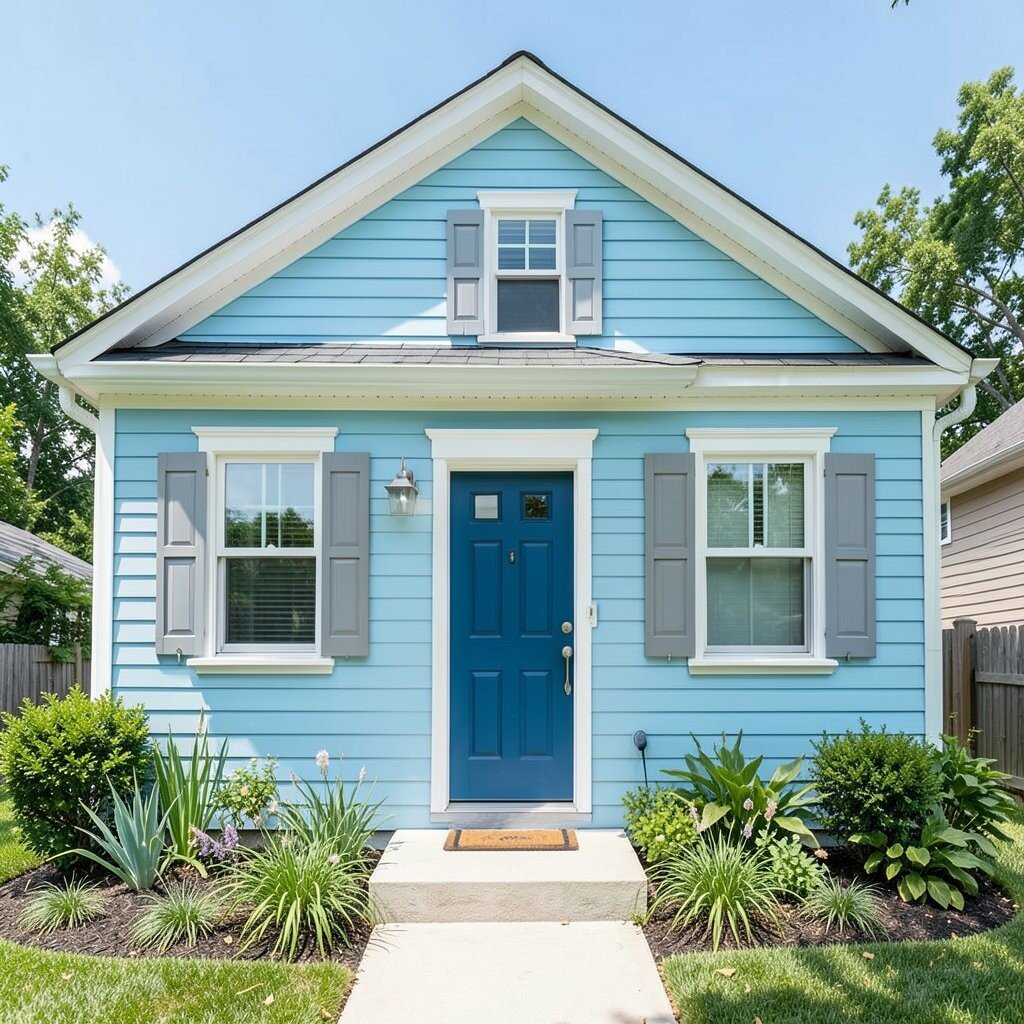
Sky blue gives a home a fresh, airy feel that looks clean in almost any season. It can make a small house seem lighter and more open.
This shade pairs nicely with crisp white trim, silver hardware, and natural wood details. It is a nice choice for people who want color without going too bold, and it can feel calm in busy streets. For a personal touch, try a deeper blue door or soft gray shutters to add balance without raising the paint cost too much.
Many homeowners like sky blue because it fits coastal styles, cottage looks, and modern homes all at once. It also works well with green plants, which can make the whole front yard feel bright and alive. If your home gets strong sun, ask for a paint finish that resists fading so the color stays cheerful longer.
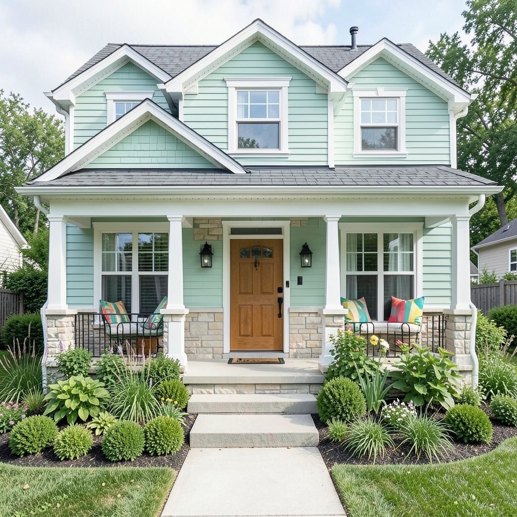
3. Mint Green
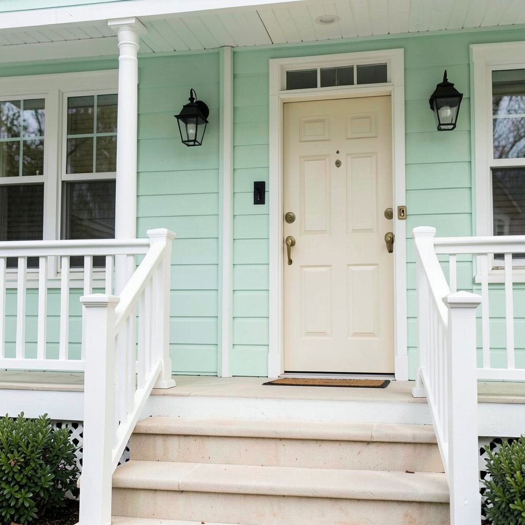
Mint green feels cool, fresh, and a little playful. It can give an older house a sweet update without making it look too trendy.
This shade is lovely with white railings, black lantern lights, and pale stone steps. It stands out in a soft way, which helps a home feel unique while still looking easy to live with. If you want a custom look, add a cream-colored door or warm brass handles to make the color feel richer.
Mint green is a good fit for people who like light colors but want something less common than beige or gray. It can also help a front porch feel more relaxing on hot days. For cost, this color often works well in one main coat and a simple trim repaint, so the whole project can stay manageable.
4. Coral Peach
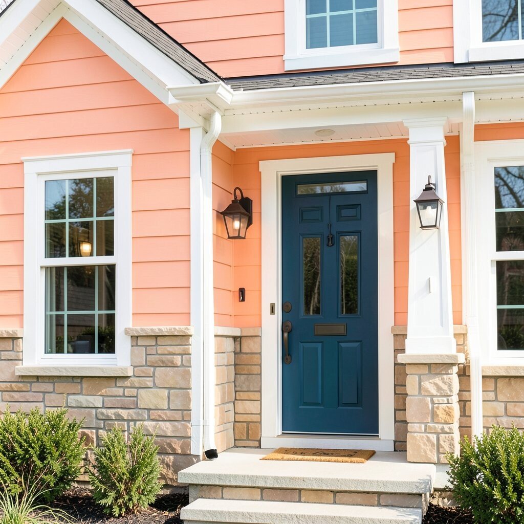
Coral peach brings a sunny, friendly energy to the front of a home. It can make the house feel cheerful before anyone even steps inside.
This color looks beautiful with white trim, tan stone, and dark bronze fixtures. It has a warm glow that feels special, and it can help a home stand out in a gentle way. If you want to personalize it, use a bold front door color like teal or navy for a fun contrast.
Coral peach is a strong choice for people who want a bright look without going full orange. It works especially well in places with lots of sun, where the color can shine instead of looking flat. Since brighter paints may cost a bit more, it helps to compare brands and choose a durable finish that lasts.
5. Classic White

Classic white keeps a home looking clean, crisp, and bright. It reflects light well and can make even a small front yard seem larger.
This shade is very flexible, so it works with nearly any roof color, trim style, or porch design. It is also one of the easiest colors to personalize with plants, doors, and outdoor decor. If you want a fresh look on a tighter budget, white can be a practical choice because many paint options are widely available.
White is popular in current home style trends because it feels simple and timeless. It can be paired with black shutters for a sharp look or with wood accents for a softer one. Keep in mind that white may need more cleaning over time, so choose a washable exterior paint if your area gets dusty or rainy.
6. Pale Sage
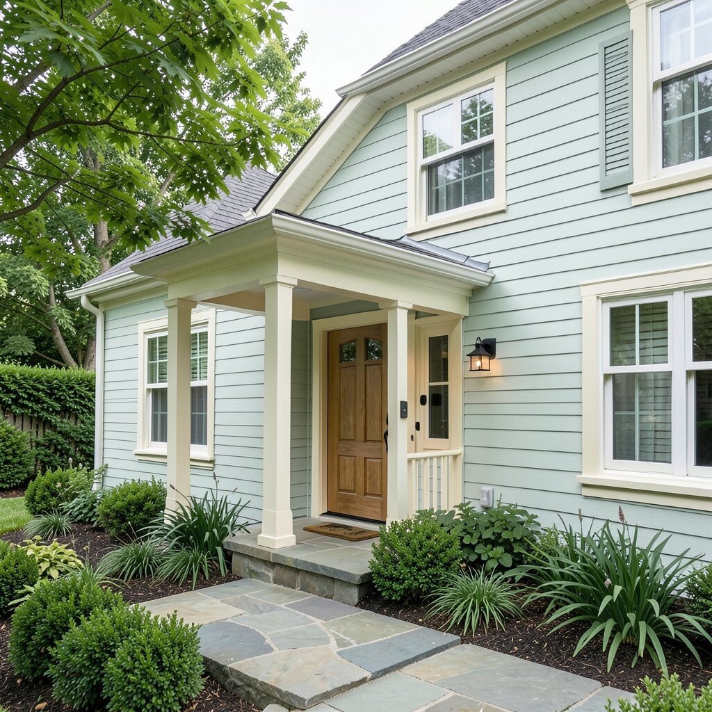
Pale sage gives a home a gentle, nature-inspired feel. It looks soft and peaceful, almost like a quiet garden wall.
This color works well with cream trim, stone walkways, and dark green plants. It can make a front house look calm and polished without feeling boring. For a personal touch, add a wood door or matte black lights to give the home a more finished look.
Pale sage is a nice choice for homes that sit near trees or flower beds because it blends with the outdoors. It can also help a house feel cooler and more restful in warm weather. If you are watching costs, this shade is often easy to match with off-the-shelf trim colors, which can save time and money.
7. Warm Beige
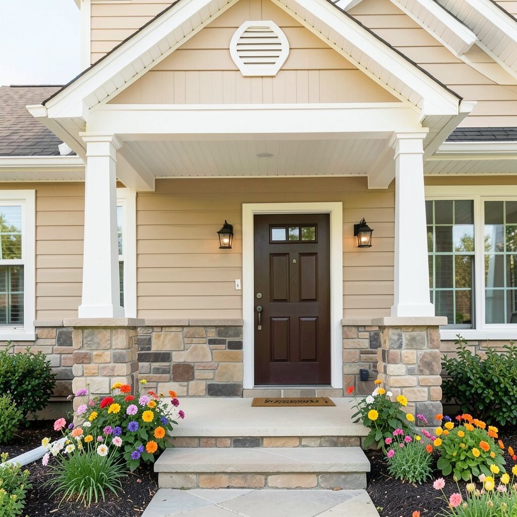
Warm beige gives a house a soft, cozy glow. It feels steady and inviting, like a friendly smile on the front of the home.
This color is easy to style with white trim, dark brown doors, and natural stone. It helps hide dirt better than very light colors, which is a useful benefit for busy homes. If you want a more personal look, try adding colorful flowers or a painted porch ceiling to bring in extra charm.
Warm beige is great for people who want a safe color choice that still looks polished. It works in many neighborhoods and rarely feels too loud or too plain when paired with the right accents. Because it is a common color family, it can also be easier to find in many price ranges.
8. Soft Lavender
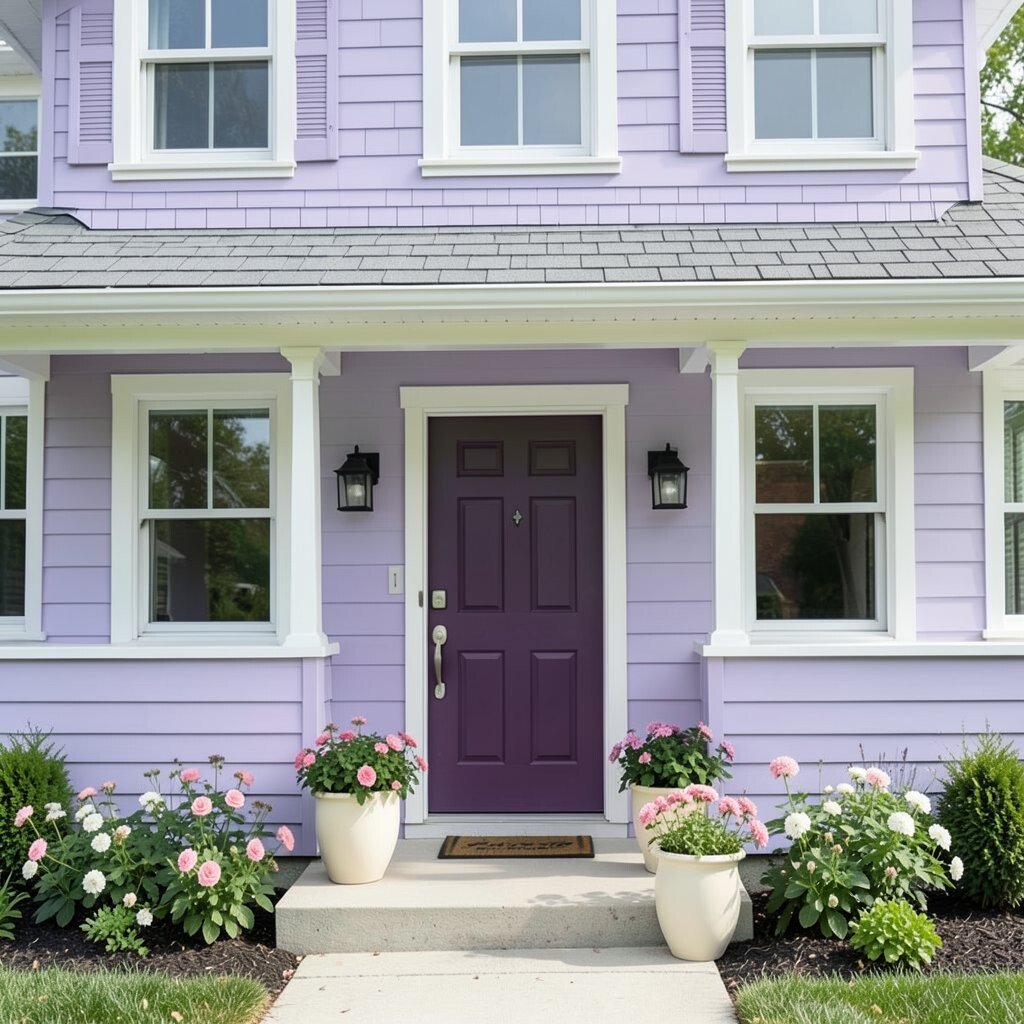
Soft lavender gives a home a dreamy and gentle look. It can feel sweet and surprising at the same time, which makes it memorable.
This shade looks lovely with white trim, gray shingles, and silver or black hardware. It can brighten a front house without making it feel too bold or too dark. For a unique touch, choose a deep plum door or light cream planters to make the color feel more playful.
Soft lavender is a great pick for cottage homes, small bungalows, and creative homeowners who want something different. It can make a front porch feel calm and pretty, especially when paired with flowers in pink or white. If you want to keep costs in check, use lavender on the main body and a simple neutral for the trim.
9. Light Teal

Light teal brings a fresh, lively look that feels both cool and bright. It can make a house stand out in a way that feels modern and fun.
This color pairs well with white trim, dark metal lights, and natural wood posts. It has a clean energy that can make the front of a home feel full of personality. If you want to make it your own, add a bright door color or simple house numbers in brushed metal.
Light teal is part of a current trend toward colors that feel cheerful but still easy to live with. It works well in sunny areas because the color stays lively and easy on the eyes. When planning your budget, remember that bold shades may need an extra coat for full coverage, so check the paint label before buying.
10. Soft Gray Blue
Soft gray blue gives a house a cool, calm look with a little more color than plain gray. It can feel fresh and graceful, especially in bright daylight.
This shade looks nice with white trim, black shutters, and stone or brick details. It helps a home feel updated without losing a classic feel, which is why many people like it for older houses. For a personal twist, add navy porch chairs or a red door to make the front feel more lively.
Soft gray blue is a smart choice if you want something bright but not too bold. It works well in both city and country settings, and it can make landscaping colors pop. Since it sits in a popular color family, you may find many affordable paint options and sample sizes to test first.
11. Buttercream Cream

Buttercream cream offers a soft, sunny look that feels warmer than plain white. It can make a home appear bright, cozy, and cared for.
This color works beautifully with dark shutters, brick steps, and wood doors. It gives a gentle glow that can make the front of a house look welcoming from far away. If you want a personal style, use colorful flower boxes or a painted bench to add charm without changing the main color.
Buttercream cream is a good match for homes that need a brighter look but not a stark one. It can also soften harsh shadows on porches and under roof lines. For cost, this shade is often easy to find in many brands, so it can be a simple and budget-friendly update.
12. Dusty Rose
Dusty rose brings a soft, warm blush that feels gentle and stylish. It can make a front house look sweet without seeming too delicate.
This color pairs well with white trim, charcoal details, and stone paths. It gives a home a unique personality and can look especially pretty next to green shrubs or climbing vines. If you want a more custom feel, choose a dark front door or antique-style lighting for extra charm.
Dusty rose is a lovely choice for homeowners who want a color that feels both old-fashioned and fresh. It fits well with cottage, vintage, and artsy home styles. Since it is not as common as beige or gray, it may cost a little more to match accessories, so plan the full look before you buy.
13. Lemon Cream
Lemon cream adds a bright, happy shine that feels light and sunny. It can make a house look awake and cheerful even on cloudy days.
This shade looks great with white trim, dark green shutters, and black railings. It gives a playful lift to the front of a home while still feeling soft enough for everyday life. For a personal touch, try a blue door or potted herbs near the steps to make the front entry feel fresh.
Lemon cream is perfect for homeowners who want brightness without a strong yellow tone. It can help a small home feel larger and more open from the street. If you are keeping an eye on cost, choose a durable exterior paint so the color stays lively and does not need early repainting.
14. Seafoam Green
Seafoam green brings a light, breezy feeling that looks clean and peaceful. It can make a front house feel like a calm spot near the water, even far from the coast.
This color works well with white trim, pale stone, and silver or black details. It is unique enough to stand out, yet soft enough to feel friendly and easy to enjoy. If you want to personalize it, add a warm wood door or colorful porch cushions to make the whole front feel more lived-in.
Seafoam green is a strong pick for homes that need a fresh update with a gentle touch. It can also pair nicely with many plants, which helps the house blend into the yard in a pretty way. Because lighter greens can vary a lot by brand, it is wise to test a few samples before spending on a full paint job.
15. Bright Terracotta
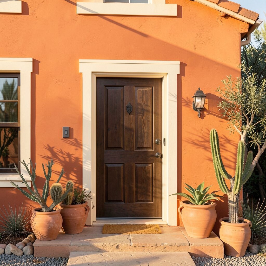
Bright terracotta gives a house a warm, earthy glow that feels bold and sunny. It can make a front wall look rich and full of energy.
This shade looks beautiful with cream trim, dark wood doors, and clay pots. It has a strong personality that can make a home feel special and inviting at the same time. For a personal style, add desert plants, warm lighting, or iron details to make the color feel even more complete.
Bright terracotta is a great choice for people who want something different from the usual light colors. It works well in warm climates and can make a plain house feel much more memorable. Since richer colors sometimes need stronger paint, compare coverage and finish so the project stays within your budget.
16. Powder Blue
Powder blue gives a home a soft, sweet brightness that feels airy and calm. It can make the front of a house look light, open, and welcoming.
This color pairs nicely with white trim, black shutters, and pale stone steps. It has a gentle charm that works well for small homes, porches, and houses with lots of natural light. If you want to make it personal, try a sunny yellow door or simple wicker furniture to add a cheerful touch.
Powder blue is a favorite for people who want a fresh look that still feels easy to live with. It fits well with current trends that favor soft color and relaxed style. To keep costs reasonable, use sample swatches first, because this shade can shift a lot from one brand to another.