Geometric details can make plain things feel alive. Small shapes can change the whole mood.
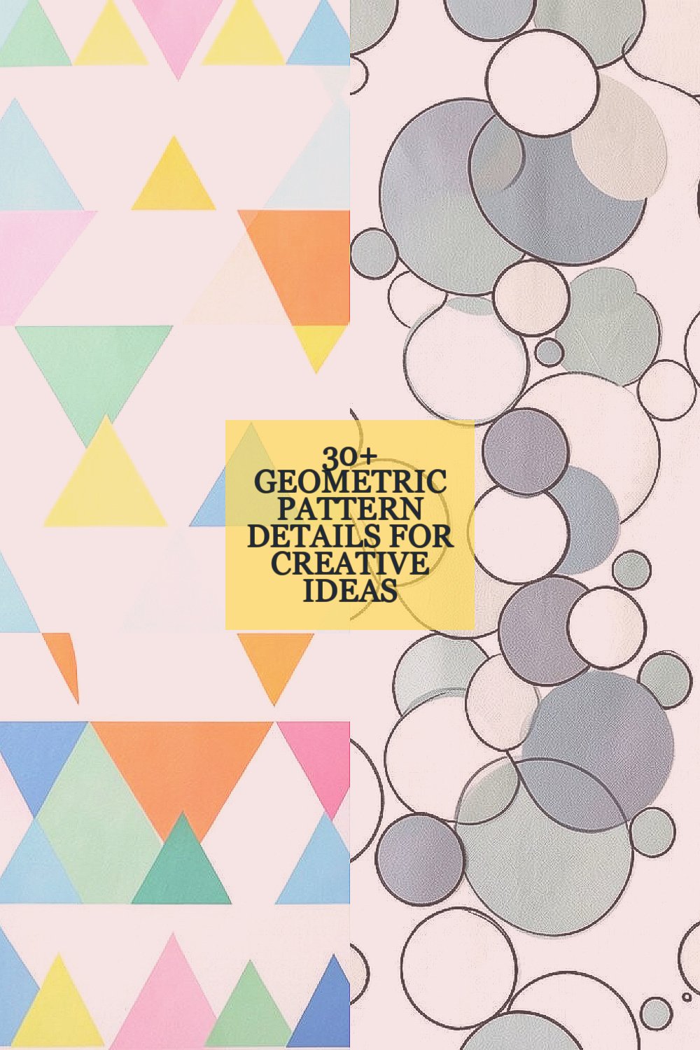
1. Tiny Triangle Borders
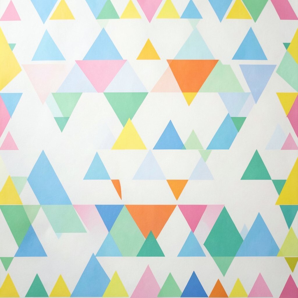
Triangle borders bring a sharp, lively edge to a design. They look neat, bold, and a little playful at the same time.
You can use them on posters, notebooks, wrapping paper, or web headers. Try soft colors for a calm feel or bright colors for a modern pop. They are low-cost to draw by hand or make with simple digital tools, which makes them great for fast projects.
2. Layered Circle Clusters
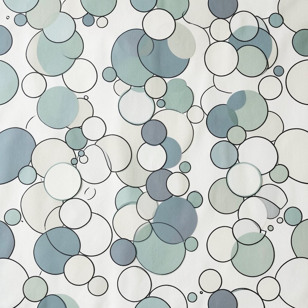
Circle clusters feel soft and friendly, yet they still look smart. When circles overlap, they create a gentle sense of movement.
This style works well for logos, wall art, and fabric prints. It can add depth without making a page feel crowded. For a custom touch, change the circle sizes or mix in dots and rings, and keep printing costs low by using only a few ink colors.
Many designers like this look because it fits current clean and modern trends. It also works well on social posts, where simple shapes stand out fast. Add a few hand-drawn lines if you want it to feel more personal.
3. Hexagon Grid Panels
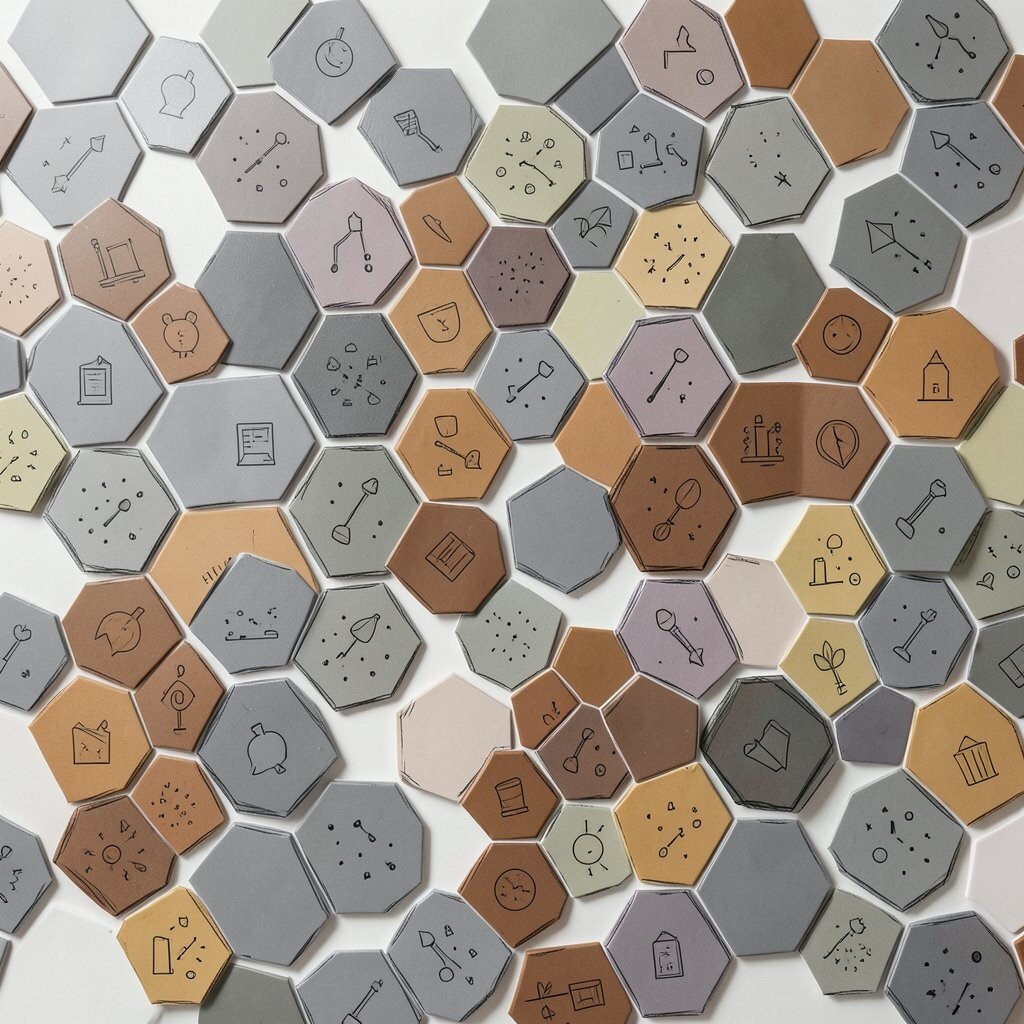
Hexagon grids give a design a smart and tidy look. They remind people of honeycombs, science, and careful planning.
Use them for packaging, app screens, or classroom charts. The shape feels special because it is less common than squares or circles. You can save money by repeating one shape many times, and you can make it your own with color fades, icons, or tiny patterns inside each cell.
These grids are popular in tech and home decor right now. They can feel sleek when done in gray, or warm when done in earth tones. If you want a more handmade look, sketch the edges unevenly on purpose.
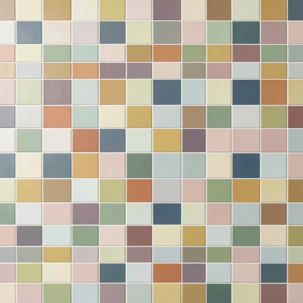
4. Checkerboard Bands
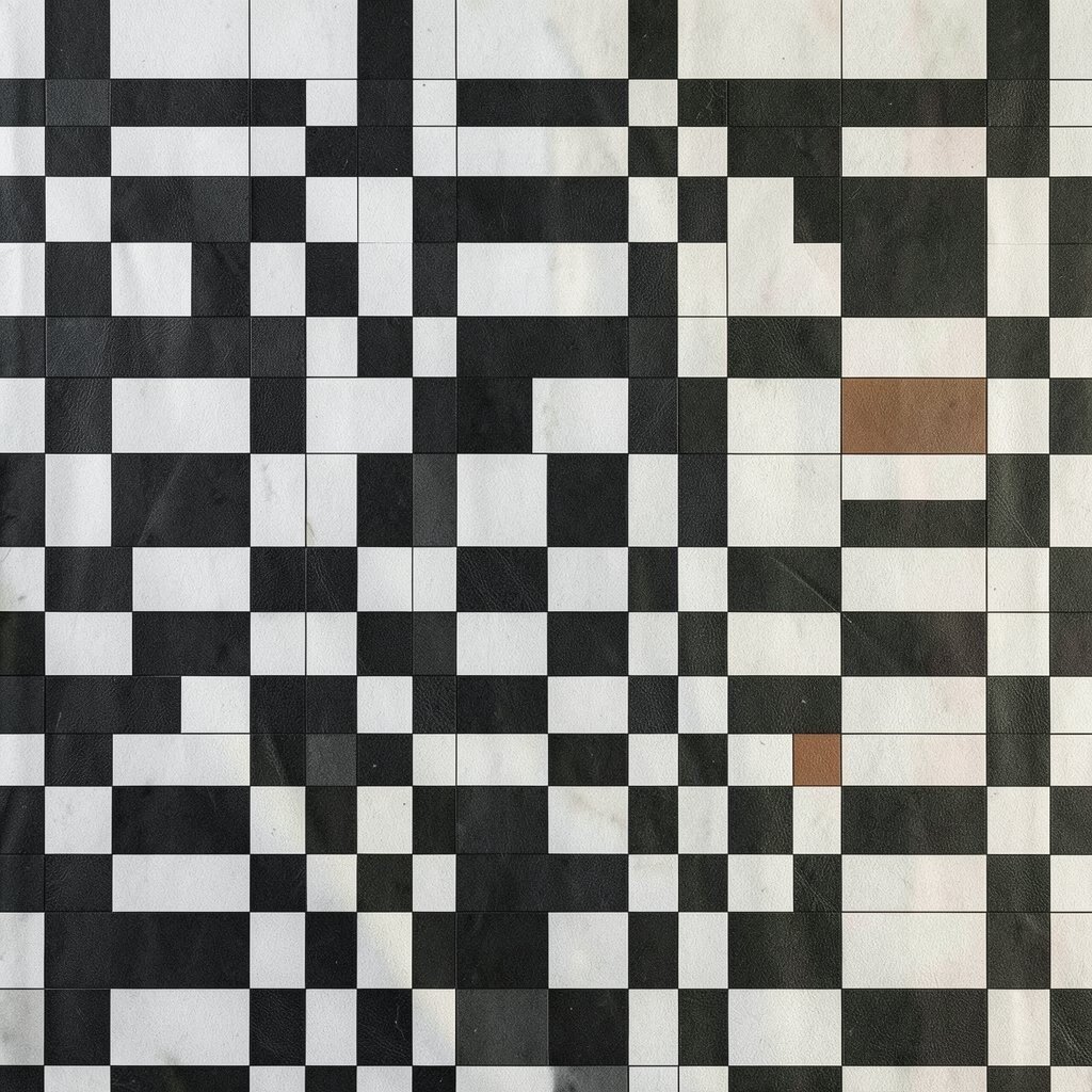
Checkerboard bands bring instant energy to any surface. The repeating squares create a bold rhythm that is easy to notice.
This pattern is great for borders, tote bags, and poster strips. It can feel sporty, retro, or even fancy, depending on the colors you choose. Black and white is classic and low-cost, while two bright shades can make it feel fresh and fun.
5. Sunburst Rays
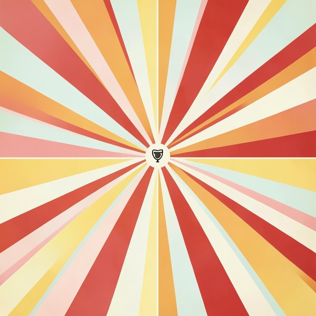
Sunburst rays make a design feel bright and full of motion. The lines spread outward like light from a lamp or sun.
Use this detail on badges, flyers, party signs, or album covers. It adds excitement without needing lots of extra art. For a personal touch, change the ray length or place a small icon in the center, and keep the look simple if you want cheaper printing.
This style is still a favorite in bold branding and vintage posters. It works best when the center is strong and the rays stay clean. Try soft pastels for a sweet mood or strong reds and yellows for a louder one.
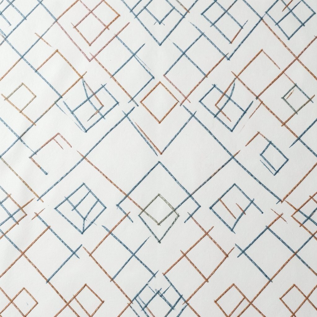
6. Diamond Stitch Lines
Diamond stitch lines feel neat, elegant, and a little fancy. They look like fabric seams or carved details on a classic frame.
You can use them on greeting cards, book covers, or decorative boxes. The repeated diamonds add order and charm without much effort. A thin line version is easy to print and budget-friendly, and you can make it special with tiny dots, metallic ink, or a color shift.
People often like this detail because it gives a handmade feel. It also works well in modern craft projects and wedding decor. If you want a softer look, round the diamond corners just a bit.
7. Spiral Dot Trails
Spiral dot trails create a sense of motion that feels fun and smart. The eye follows the path, so the design feels active.
This is a nice choice for children’s art, music flyers, and playful packaging. It can make a simple page feel much more alive. You can draw it with dots of one color for low cost, or mix dot sizes for a more personal and artistic look.
Current trend styles often use this kind of motion to keep things light and modern. It works well on social media banners because it leads the eye to the main message. Try starting with a small center and letting the dots grow outward.
8. Interlocking Squares
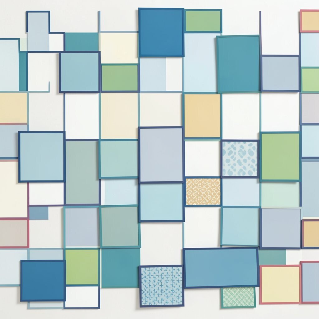
Interlocking squares give a strong, connected feel. They can suggest teamwork, unity, and smart structure.
Use them in office art, brand marks, or school posters. The repeated square links look clean and balanced. To make it yours, vary the line weight or fill some squares with patterns, and keep the cost down by using flat colors instead of heavy shading.
This style fits well with modern minimal design. It can feel calm in cool blues or more lively in mixed brights. If you want a more handmade result, let a few squares tilt slightly.
9. Wave Triangle Stripes
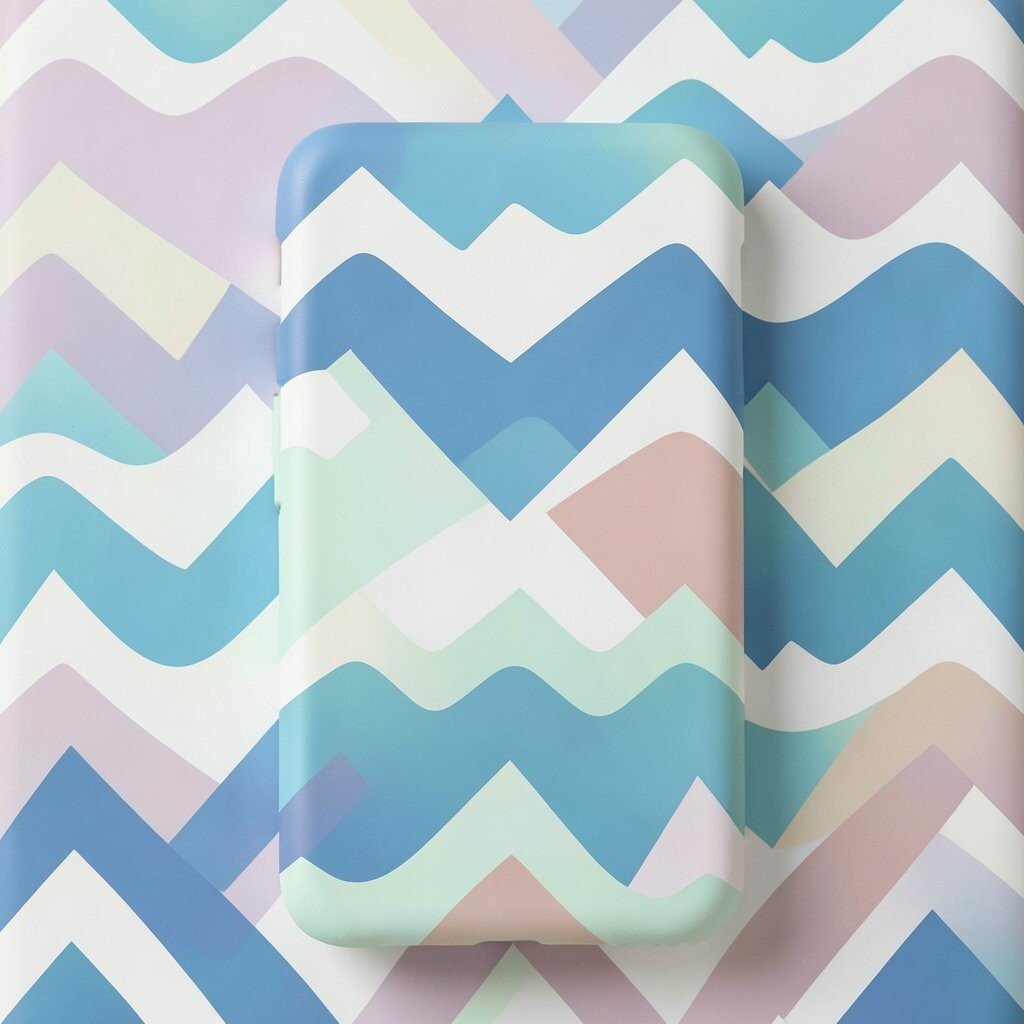
Wave triangle stripes mix sharp shapes with a flowing path. That contrast makes the design feel lively and fresh.
They work nicely on surf-themed art, festival posters, and phone cases. The repeating peaks can feel like mountains, water, or sound waves. You can personalize the look by changing the wave height or spacing, and simple two-tone printing keeps it affordable.
These stripes fit current graphic trends that blend retro and modern style. They are a good pick when you want movement without too much detail. Try them in soft gradients for a smooth look or in bold blocks for extra punch.
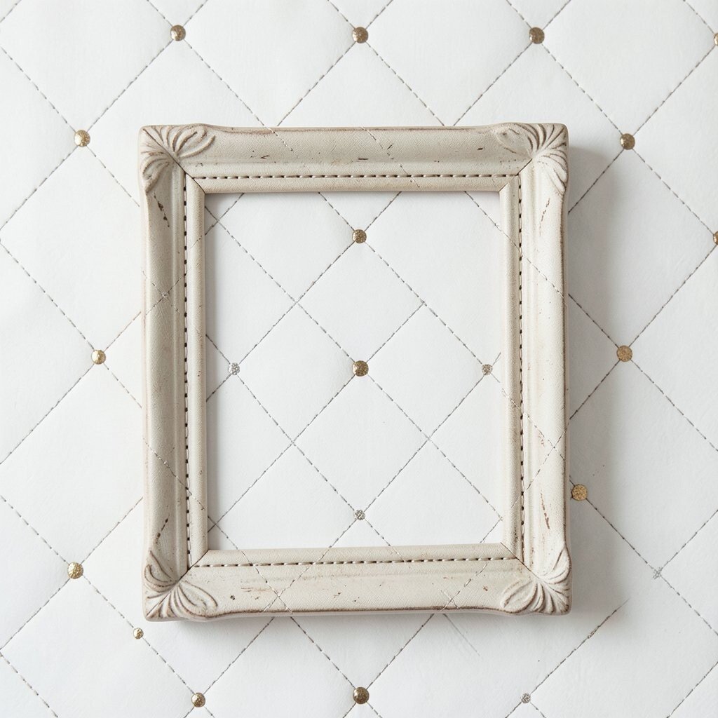
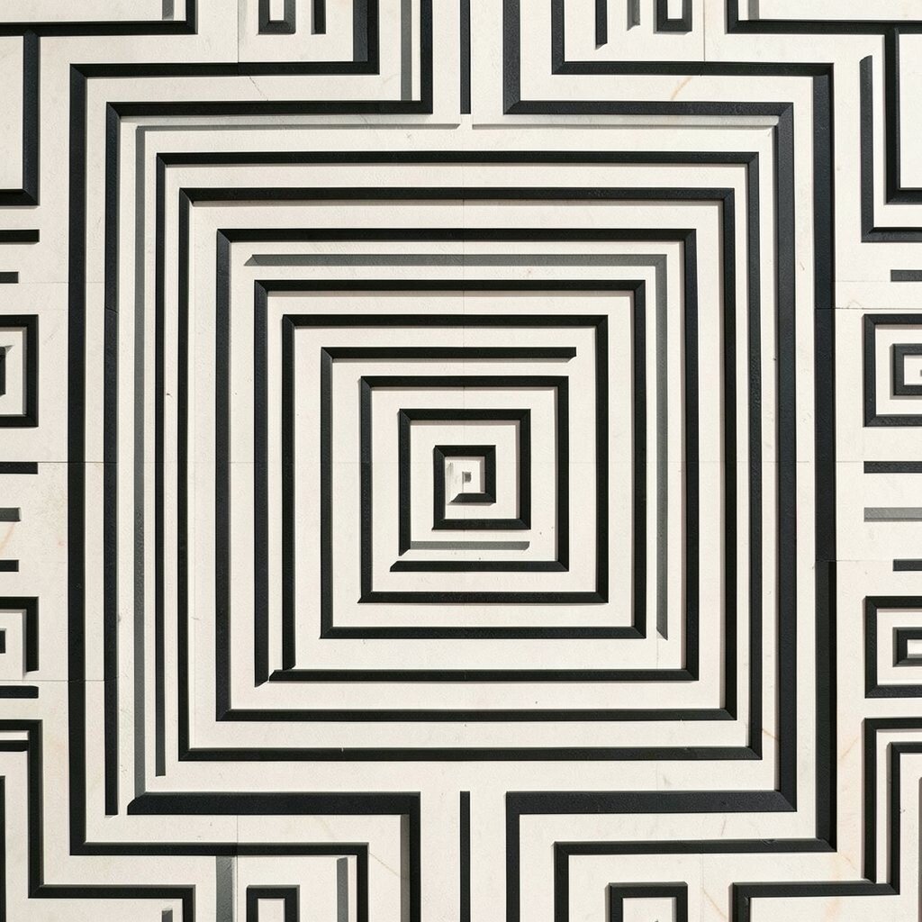
10. Nested Frame Boxes
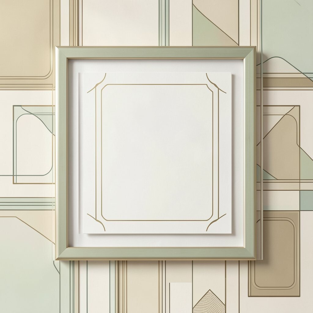
Nested frame boxes give a design a layered and polished look. Each frame pulls the eye toward the center.
This detail is great for invitations, labels, and cover art. It adds depth while staying simple and neat. You can save money by repeating the same frame shape, and you can make it unique with rounded corners, tiny icons, or thin line textures.
People like this style because it feels classy without being too busy. It also works well for layouts that need a clear focus point. If you want a warmer feel, try cream, tan, or soft green tones.
11. Dot Matrix Fields

Dot matrix fields have a clean, tech-friendly look. They can also feel soft and artistic when the dots are spaced with care.
Use them for website backgrounds, music art, or science displays. The tiny dots create texture without making the page heavy. For a personal touch, fade the dots at one edge or build a small image from them, and use one ink color if you want to keep costs low.
This style is still common in modern digital design. It works especially well when you want a quiet background that does not steal attention. Try larger dots for a bold look or tiny ones for a gentle feel.
12. Angular Zigzag Edges
Angular zigzag edges bring a playful jolt to any piece. They feel sharp, active, and full of energy.
They are useful on borders, tags, and scrapbook pages. The jagged line can make a design feel louder without adding much detail. You can change the angle size to match your mood, and the simple shape keeps design and printing costs low.
Zigzags are easy to pair with bright colors and bold type. They are also handy when you want a youthful or sporty look. A hand-drawn version can make the edge feel more relaxed and personal.
13. Circular Maze Paths
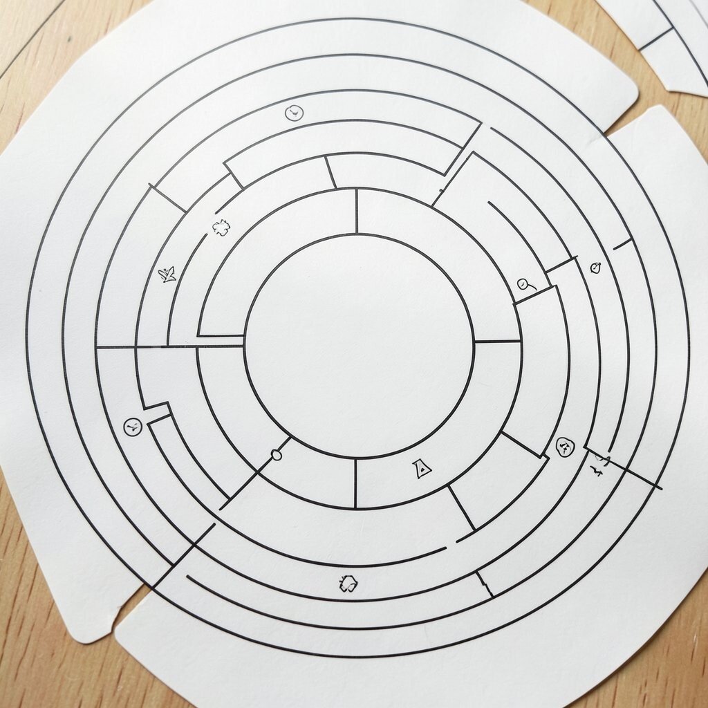
Circular maze paths are fun to look at because they invite the eye to wander. They feel clever, calm, and a little mysterious.
This detail works well for kids’ products, puzzle art, and creative logos. It gives a design depth without needing many colors. For a custom version, change the path width or add tiny symbols along the route, and keep the layout simple to avoid higher print costs.
Many people enjoy maze-like art because it feels interactive. It can also fit current trends that mix play with clean design. Use thin lines for a delicate look or thicker ones for stronger impact.
14. Offset Grid Tiles
Offset grid tiles look orderly, but the shifted rows keep them from feeling boring. That small change gives the whole pattern a fresh beat.
They are useful for wallpaper, app backgrounds, and fabric prints. The pattern feels modern and easy to repeat. You can personalize it by changing tile color in each row or adding tiny icons, and the simple structure helps keep production costs sensible.
This look fits well with current home decor trends that favor clean shapes. It can feel soft in muted tones or lively in mixed colors. If you want more charm, make each tile edge a little uneven by hand.
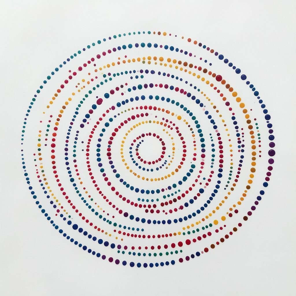
15. Radiating Ring Layers
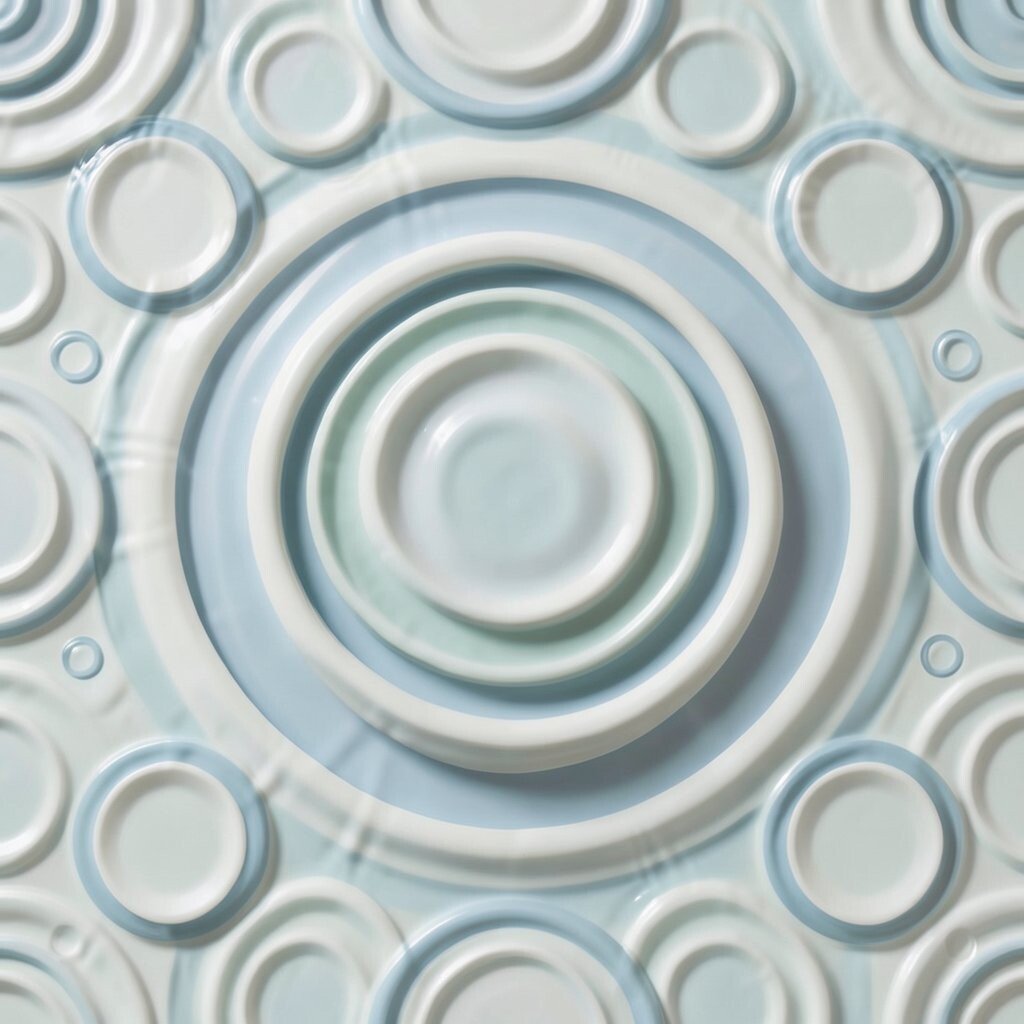
Radiating ring layers make a design feel deep and calm. The circles spread out like ripples on water.
They work well for posters, meditation cards, and album art. This pattern can create a peaceful mood while still looking strong. Try changing the ring spacing for a custom feel, and use one or two colors to keep the cost low and the effect clear.
These rings are popular in modern wellness and abstract art. They can make a small space feel wider and more open. A faded edge can add softness if you want a gentler look.
16. Broken Line Diamonds
Broken line diamonds give a design a crafty, stitched feel. The gaps make the shape feel lighter and more open.
Use them on packaging, stationery, or border art. They are easy to repeat and do not need much ink. You can make them special with tiny color changes, and the simple line work keeps them budget-friendly for both print and digital use.
This detail fits well with handmade and boho-inspired styles. It also works nicely in modern branding that wants a softer edge. Try pairing it with warm neutrals or dusty blues for a cozy mood.
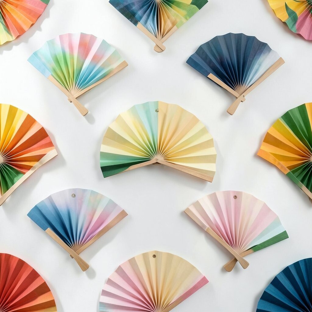
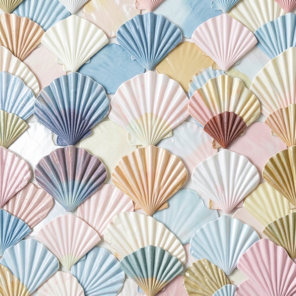
17. Overlapping Arc Fans
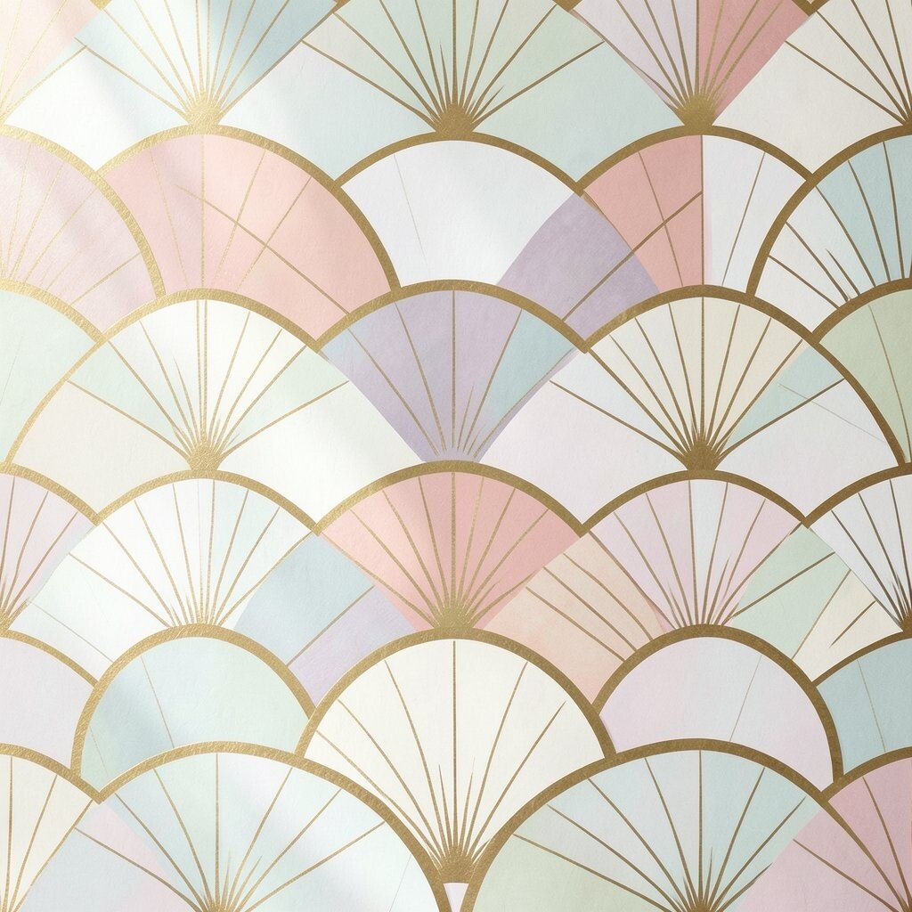
Overlapping arc fans feel graceful and bright. The curved shapes spread like open fans or shell edges.
They are a lovely choice for invitations, wall prints, and beauty branding. The arcs create movement while still feeling neat. You can personalize them with gold tones, pastel shades, or hand-drawn lines, and the repeating curve helps keep production costs manageable.
This pattern is very popular in stylish decor and elegant packaging. It can feel vintage or modern depending on the colors. Use small arcs for a delicate look or larger ones for a bold statement.
18. Pixel Square Steps
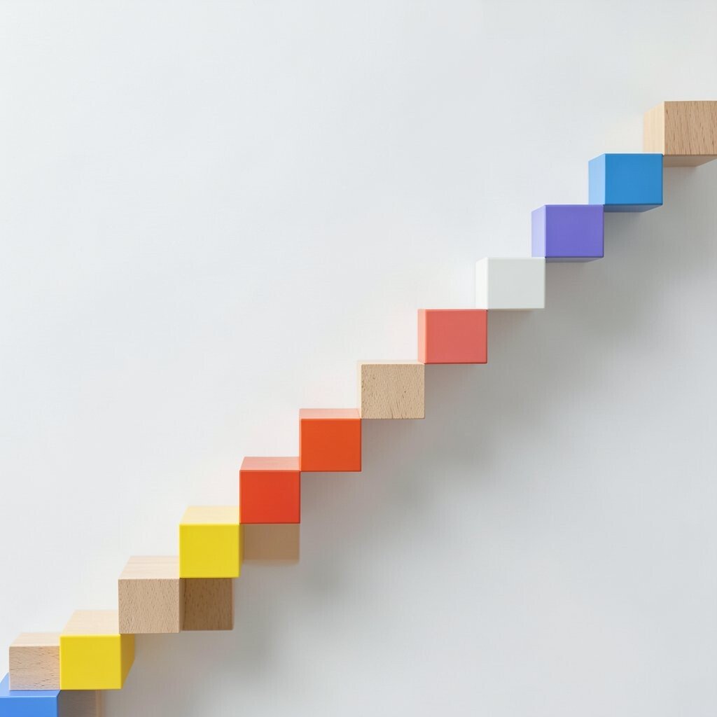
Pixel square steps bring a playful digital feel to a design. They can look like stairs, blocks, or tiny building pieces.
This style is great for game art, kids’ branding, and tech posters. It feels simple but still full of character. To make it your own, change the step direction or mix solid and empty squares, and keep the palette limited if cost matters.
Pixel looks remain trendy because they feel nostalgic and fresh at once. They work especially well on screens, but they can also shine in print. A few bright blocks can make the whole design pop.
19. Concentric Octagon Rings
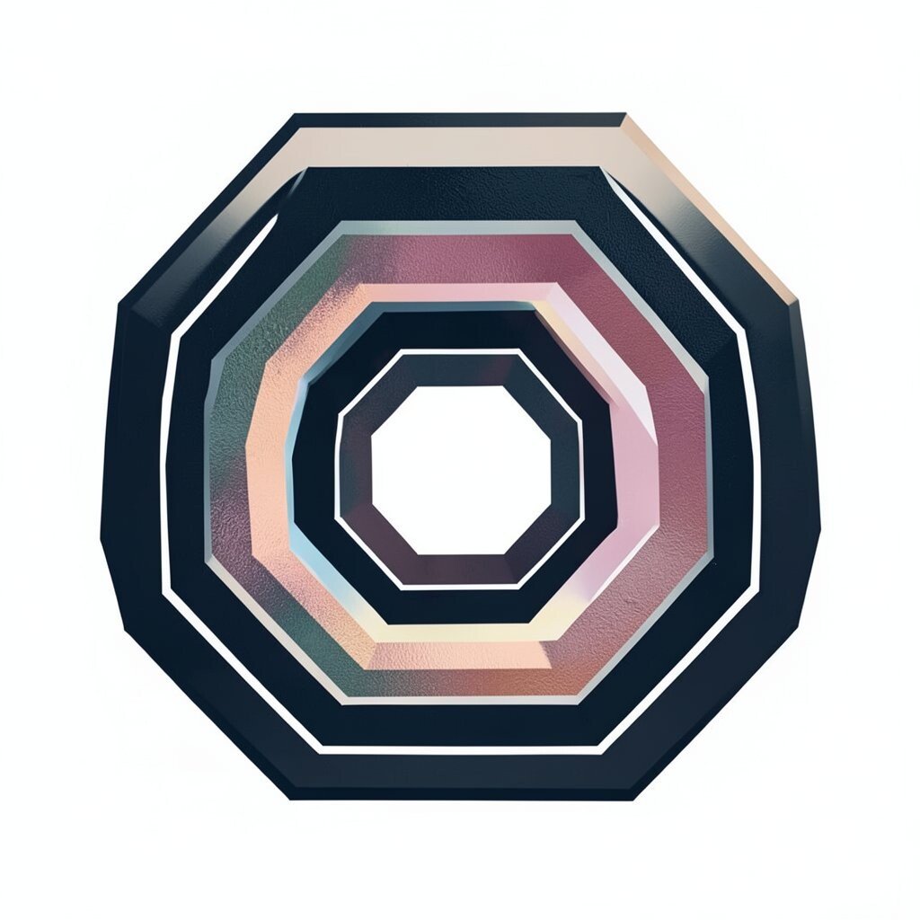
Concentric octagon rings feel bold and structured. The shape stands out because it is not as common as a circle or square.
Use them for labels, emblems, and decorative posters. The repeating rings give a strong center and a clear sense of balance. You can add texture inside each ring or use a color fade, and the simple geometry keeps costs lower than complex illustrations.
This look can feel premium in dark tones or cheerful in bright ones. It fits current design trends that like sharp but clean shapes. If you want a softer edge, pair the octagons with rounded fonts or curved accents.
20. Starburst Dot Bursts
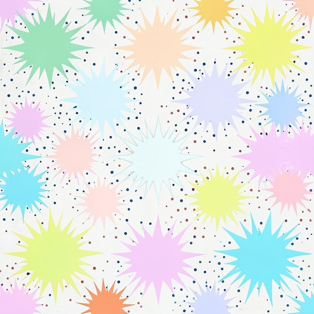
Starburst dot bursts feel exciting and full of life. They can make a page look like it is popping with ideas.
They are useful for sale tags, comic art, and event flyers. The burst shape draws attention fast, which is great when you need a message to stand out. You can make it unique by changing the dot size or spacing, and one-color versions are easy on the budget.
This pattern still shows up in bold ads and fun social graphics. It works well with strong words and short phrases. Try a soft pastel burst for a cute mood or a neon burst for a louder one.
21. Crisscross Lattice Lines
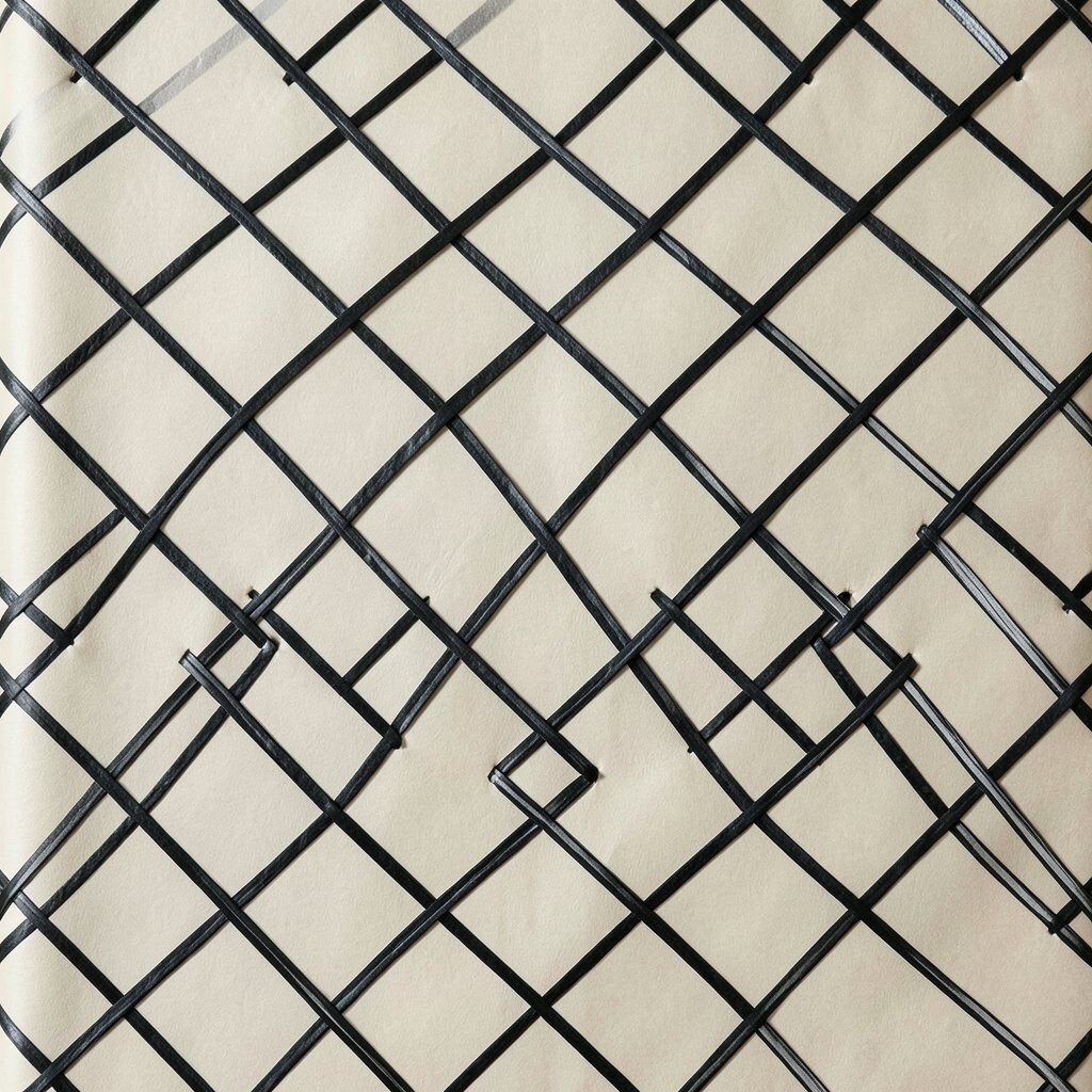
Crisscross lattice lines create a neat woven look. They feel steady, balanced, and a little bit fancy.
Use them on gift wrap, menus, or notebook covers. The pattern gives texture without making the design too busy. For a personal touch, thicken some lines or leave small gaps, and keep the line count simple if you want to save on printing.
Lattice patterns are useful in both classic and modern styles. They can feel warm in tan or cream, or sleek in black and silver. This detail works well when you want a background that supports, not steals, attention.
22. Curved Triangle Fans
Curved triangle fans mix sharp points with smooth motion. That blend makes them feel lively and elegant at the same time.
They work well for fashion tags, art prints, and decorative apps. The fan shape can guide the eye in a gentle way. You can personalize the look by adjusting the curve and angle, and repeating one shape keeps costs low for large runs.
This style fits current trends that mix retro charm with clean lines. It can feel tropical, festive, or even classy. Try soft gradients for a dreamy mood or flat colors for a crisp finish.
23. Mini Hex Dot Chains
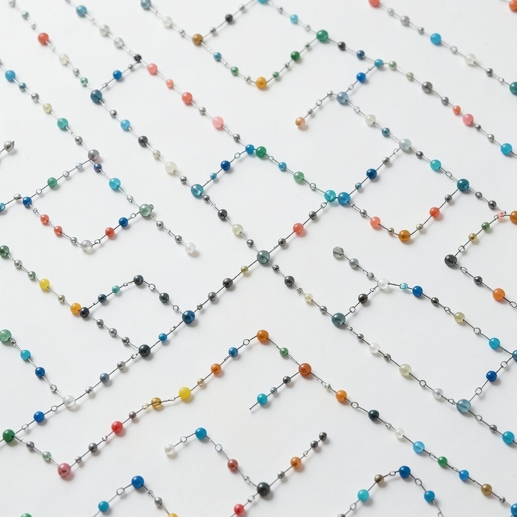
Mini hex dot chains are small but full of charm. They give a design a smart, connected feel without looking heavy.
Use them around labels, icons, or small product cards. The tiny linked shapes add detail in a quiet way. You can make them your own by shifting the chain direction or using one accent color, and the simple repeat keeps production costs friendly.
This kind of detail works well in clean branding and modern craft work. It is also a good fit for people who want something subtle. A thin version looks delicate, while a thicker one feels more playful.
24. Spiral Square Paths
Spiral square paths feel clever and a bit surprising. The square shape keeps the spiral grounded and neat.
They are useful for posters, puzzle pages, and abstract art. The pattern creates movement while still feeling organized. For a custom look, change the spiral speed or line thickness, and use a small color range to keep costs under control.
This detail stands out because it is less common than round spirals. It can fit modern digital art and bold print work. Try it as a background or as a main focal point.
25. Layered Fan Scales
Layered fan scales feel soft, fancy, and full of texture. They can look like feathers, shells, or roof tiles.
Use them on packaging, wall art, or beauty product labels. The layers add richness without needing complex drawing. You can personalize the look with pearl tones, ombré colors, or hand-painted edges, and a simple repeat can help keep costs reasonable.
This pattern is popular in decor because it feels both classic and fresh. It works well in calm blues, warm golds, or soft pinks. If you want a more modern feel, keep the shapes very clean.
26. Angular Ring Cuts
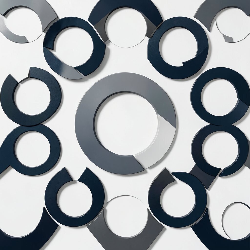
Angular ring cuts give a circle-based design a sharper twist. The cut edges make the pattern feel active and modern.
They are a strong choice for logos, labels, and poster accents. The design looks bold without needing a lot of extra decoration. You can make it personal by moving the cut points or adding a small shadow, and flat colors help keep the cost low.
These shapes fit current trends that like bold geometry and simple contrast. They are nice for brands that want a smart, fresh look. Try them in dark tones for drama or bright tones for energy.
27. Repeating Arch Windows

Repeating arch windows bring a warm, classic charm. They feel like doorways, old buildings, and storybook scenes.
Use them in stationery, decor prints, or invitation art. The arches make a pattern feel open and graceful. You can personalize them with tiny panes, line details, or soft shading, and the repeated shape keeps printing costs easy to manage.
This style works well in current home decor and wedding design. It can feel romantic in blush colors or calm in stone tones. A hand-drawn line can make the arches feel more welcoming.
28. Small Square Confetti
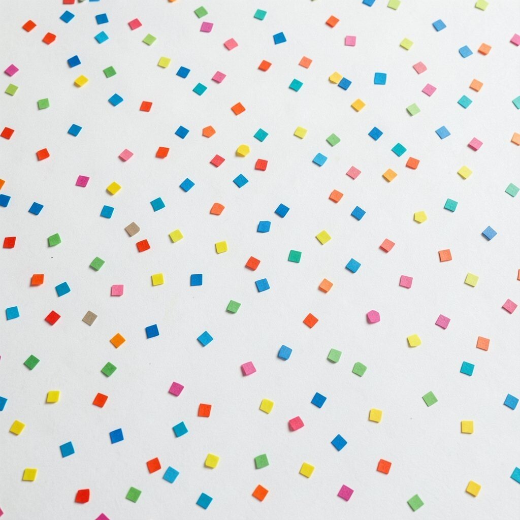
Small square confetti adds instant joy to a design. The tiny bits feel light, playful, and full of motion.
They are great for party invites, social banners, and craft paper. The scattered look can make a page feel happy without much effort. Try mixing a few colors for a custom feel, and use simple shapes so the design stays cheap to print.
This is a good pick when you want a cheerful trend-friendly style. It works well as a background or a small accent. If you want less noise, spread the pieces farther apart.
29. Interwoven Circle Chains
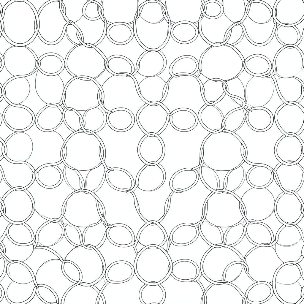
Interwoven circle chains feel linked, smooth, and friendly. The circles create a soft rhythm that is easy on the eyes.
They work well for friendship themes, wellness art, and brand marks. The linked form can suggest trust and connection. You can make it unique by changing the circle size or adding a tiny gap, and the simple repeat keeps the cost low for many uses.
This pattern fits modern design that values calm and connection. It can look neat in monochrome or more playful in color. A thin outline version feels airy, while a filled version feels stronger.
30. Sharp Fan Chevron Mix
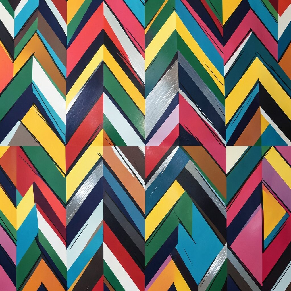
Sharp fan chevron mix gives a design both speed and style. The pointed shapes make the eye move quickly across the page.
Use it on sports graphics, fashion prints, or bold packaging. It feels powerful and clean at the same time. You can personalize it with color blocking, metallic accents, or hand-drawn edges, and repeating the same shape keeps production costs easier to handle.
This detail is very useful when you want a modern, on-trend look. It can feel loud in bright colors or refined in dark, muted tones. Try it in short strips or full backgrounds for different effects.
31. Soft Polygon Petals
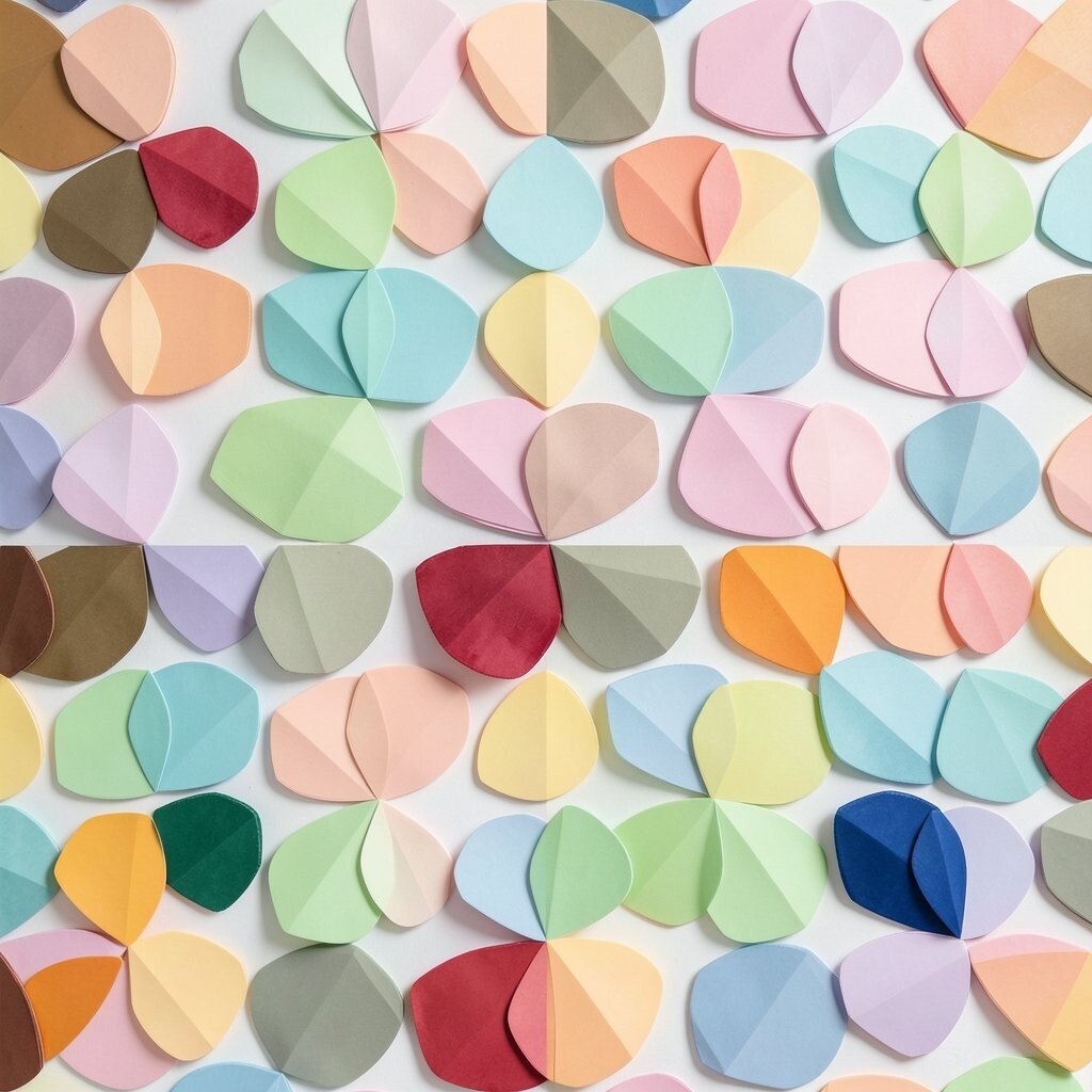
Soft polygon petals blend flower-like charm with geometric order. They look gentle, stylish, and a little unexpected.
Use them for art prints, notebooks, or home decor pieces. The petal shape adds warmth while still feeling tidy. You can make it personal with layered colors, tiny line details, or a hand-painted edge, and the repeated form helps keep the cost fair for both print and digital work.
This look matches current trends that mix nature and shape. It works well in pastel sets, earthy colors, or bright rainbow groups. If you want it to feel more modern, keep the petals crisp and the spacing even.