Art Nouveau looks soft, flowing, and full of charm. Yet a few small errors can make it feel flat or messy.
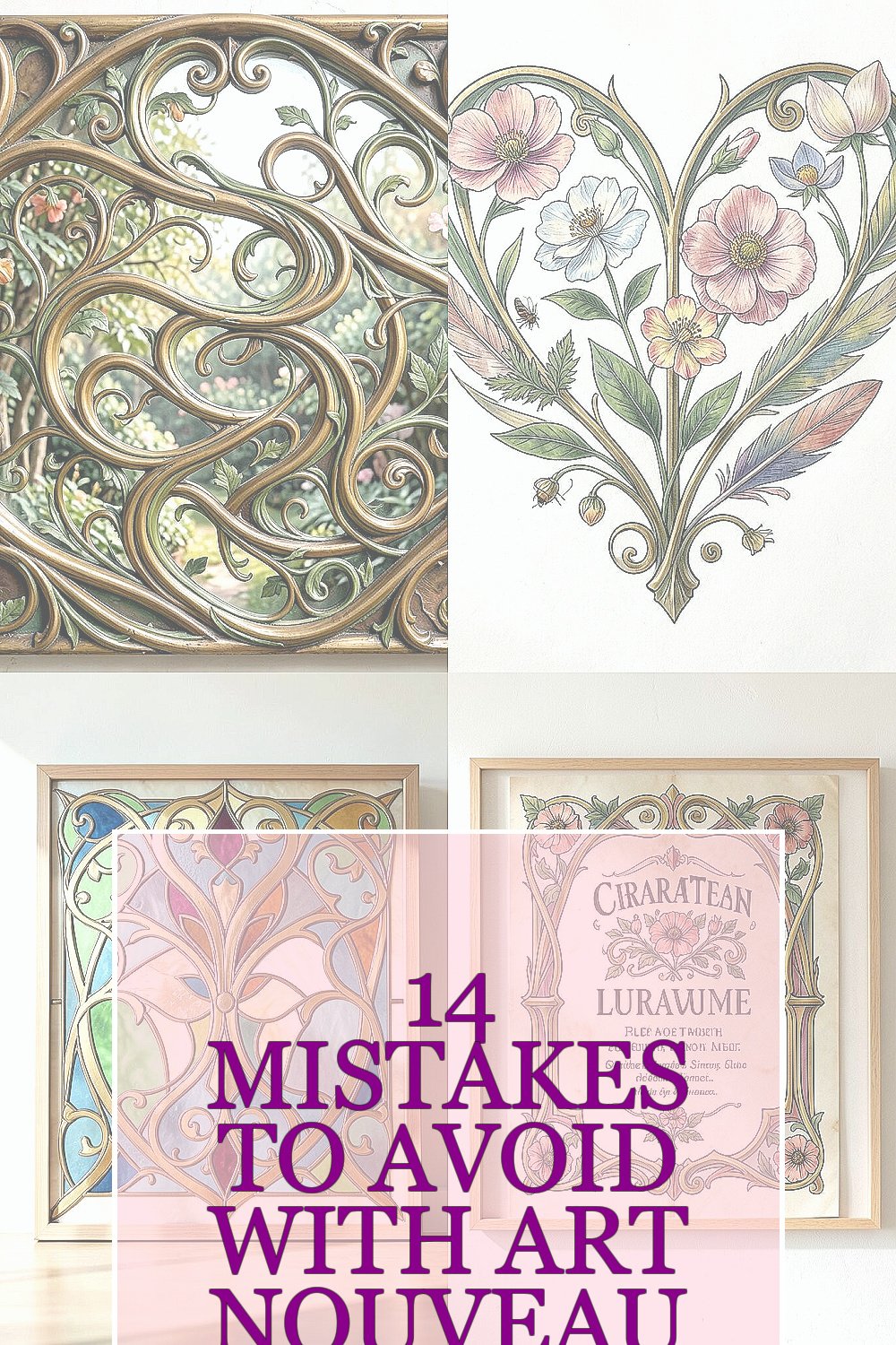
1. Using Too Many Competing Curves
Art Nouveau loves curves, but too many curves can turn a graceful design into a tangled one. The best pieces feel like vines in a garden, not a pile of noodles.
Pick one main flowing path and let the rest support it. This keeps the eye calm and makes the design feel rich instead of crowded. It also helps your work look more polished, which can save time and lower the cost of fixes later.
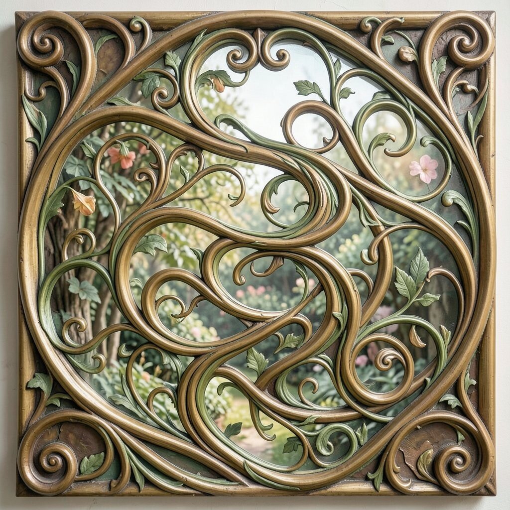
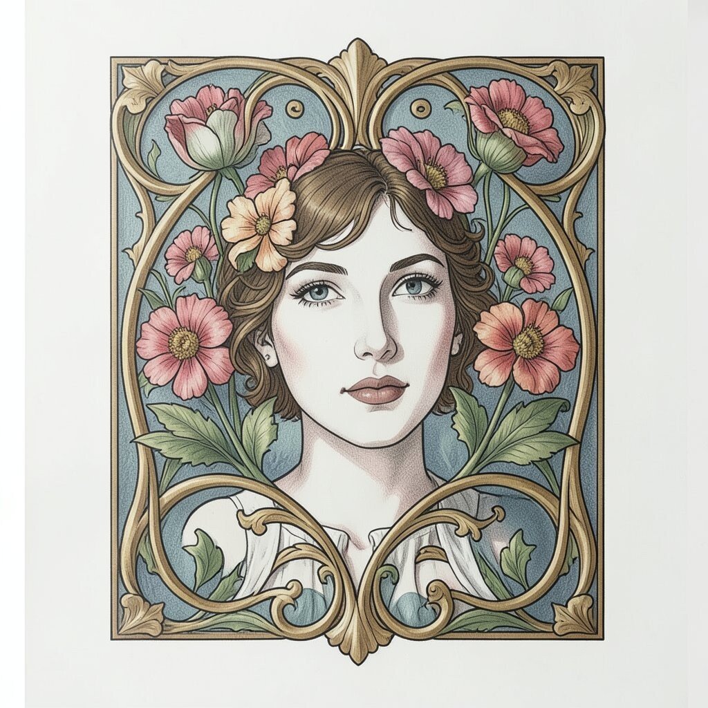
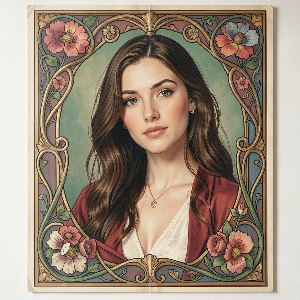
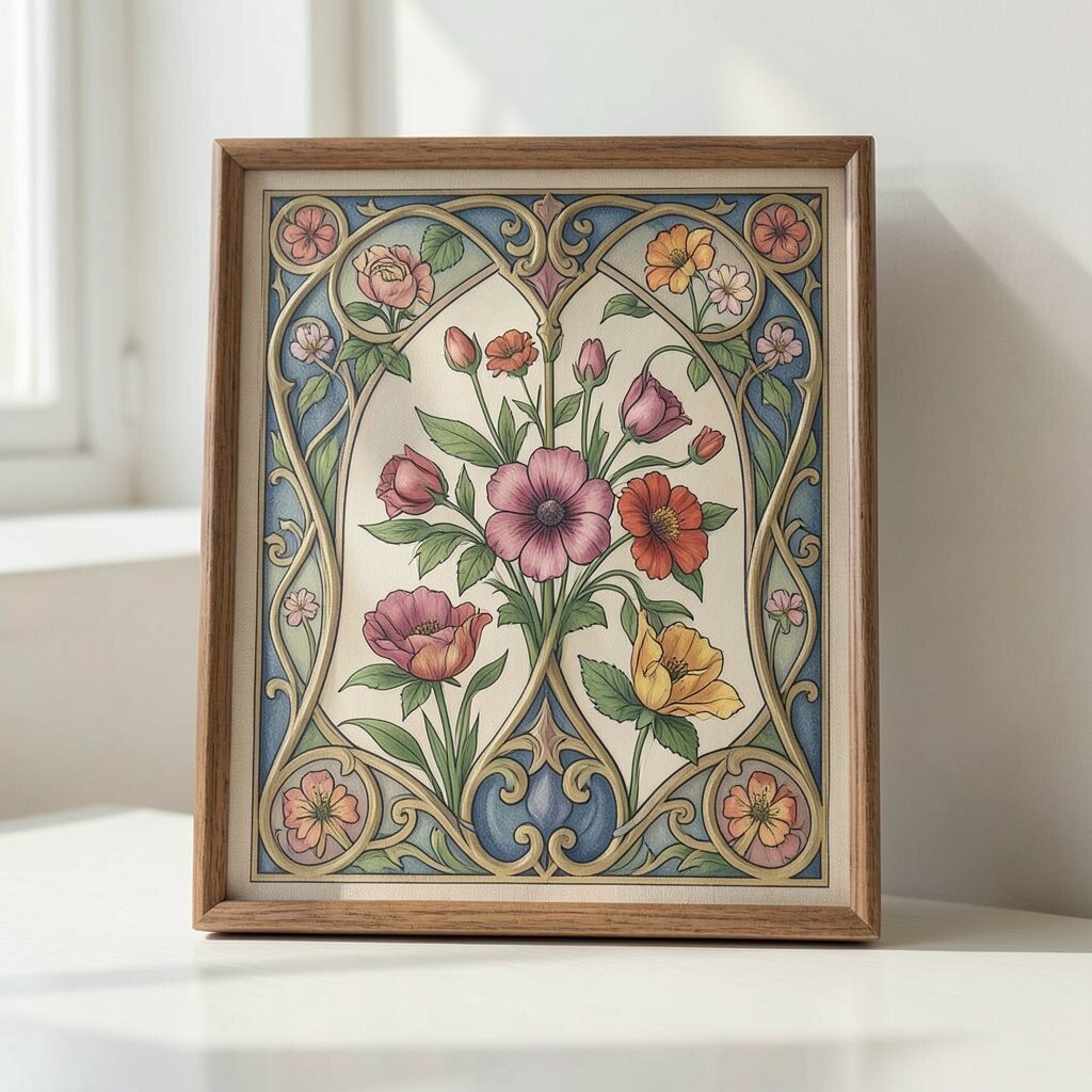
2. Ignoring Natural Motifs
Flowers, leaves, feathers, and insects are part of the heart of this style. Without them, the design can lose its warm, living feel.
Use simple plant shapes, soft petals, or wing-like forms to bring in that classic mood. You can make it personal by choosing blooms from your own garden or a favorite season. This adds uniqueness while still matching the style people love today.
Try not to force every natural shape into the same size or angle. A little variety makes the artwork feel hand-made and less stiff.
3. Choosing Harsh Colors
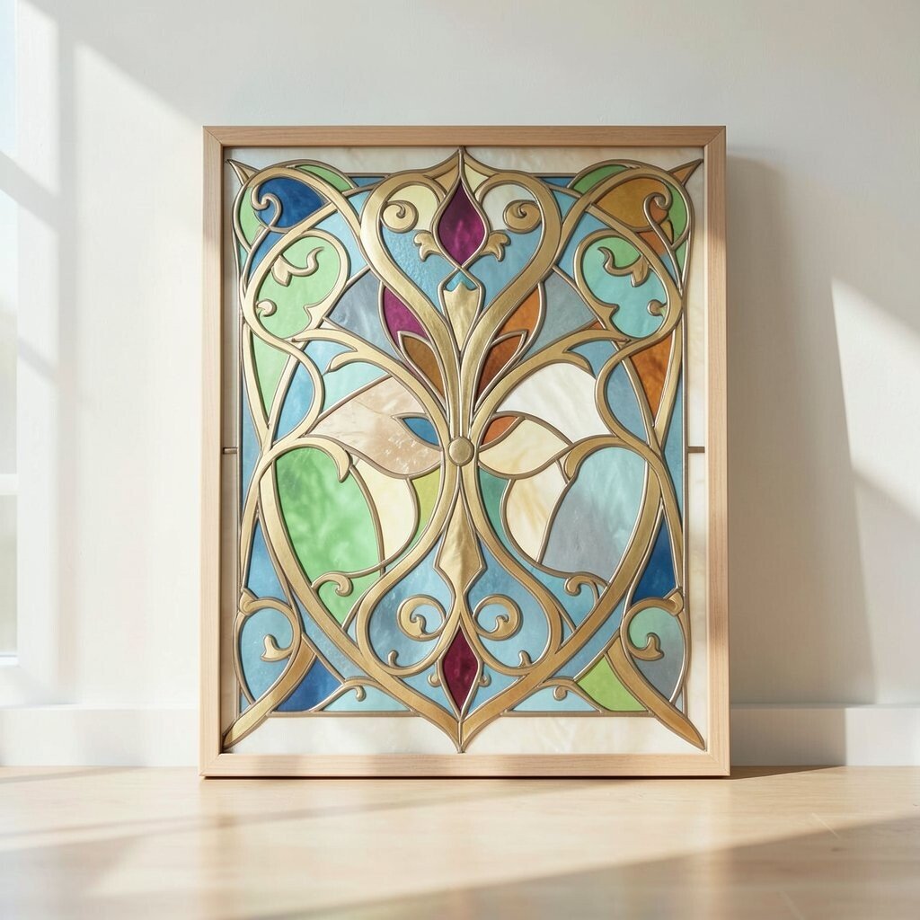
Bright neon shades can fight against the gentle spirit of Art Nouveau. Soft greens, golds, creams, dusty blues, and warm browns often work much better.
Color should feel like stained glass in sunlight, not a flashing sign. You can still make the design stand out by using one bold accent color in a small area. This is a smart way to keep costs down when printing or decorating, since fewer strong colors can be easier to manage.
Current trends often favor muted tones with a little shine, so this style can feel fresh as well as classic. A careful palette also makes the whole piece easier to live with in a room or on a product.
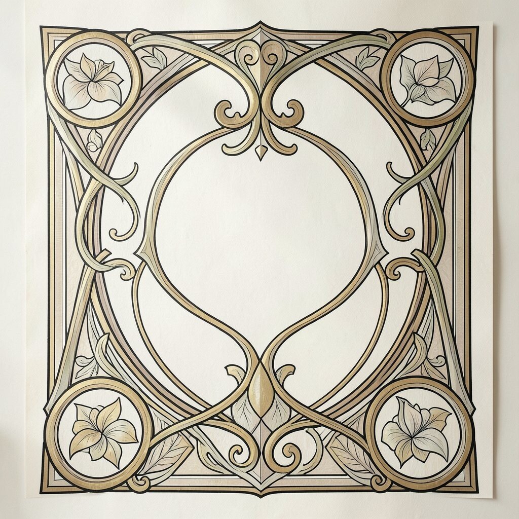
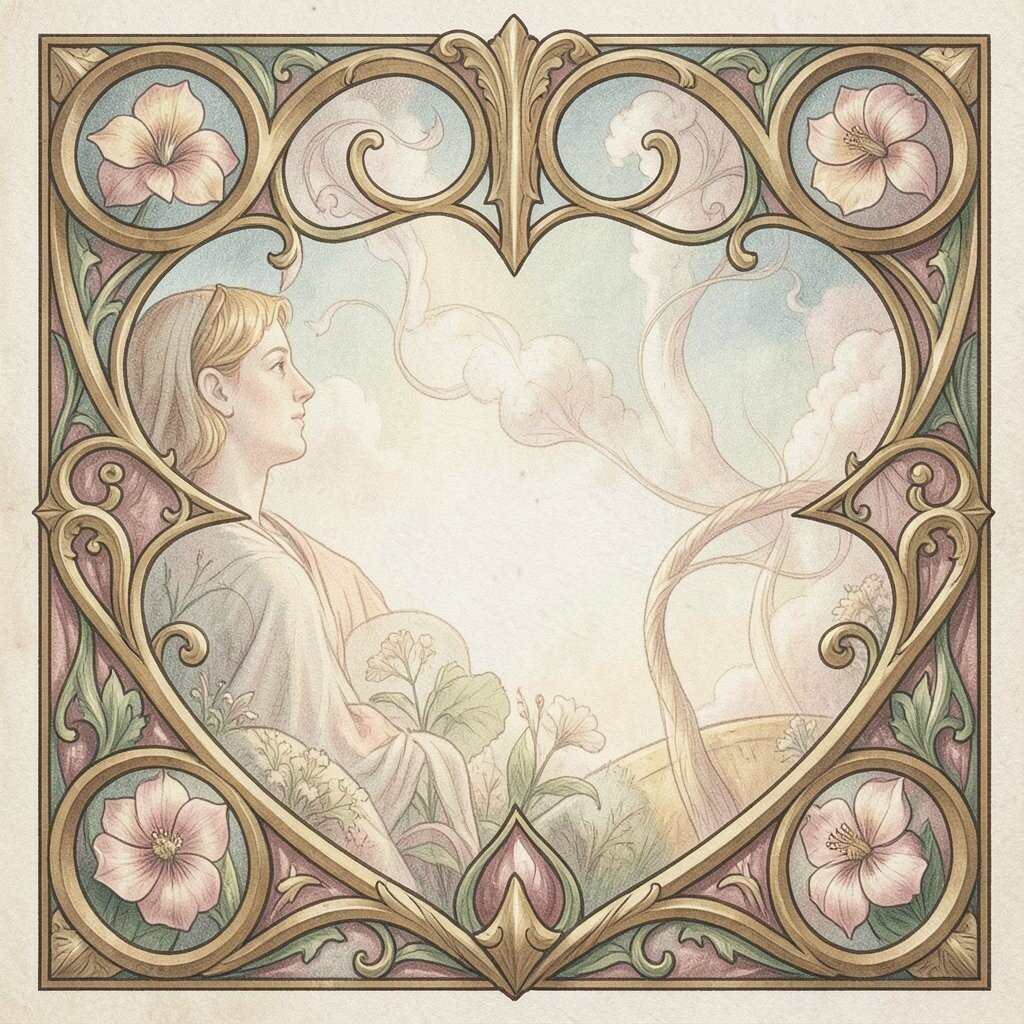
4. Forgetting the Border and Frame
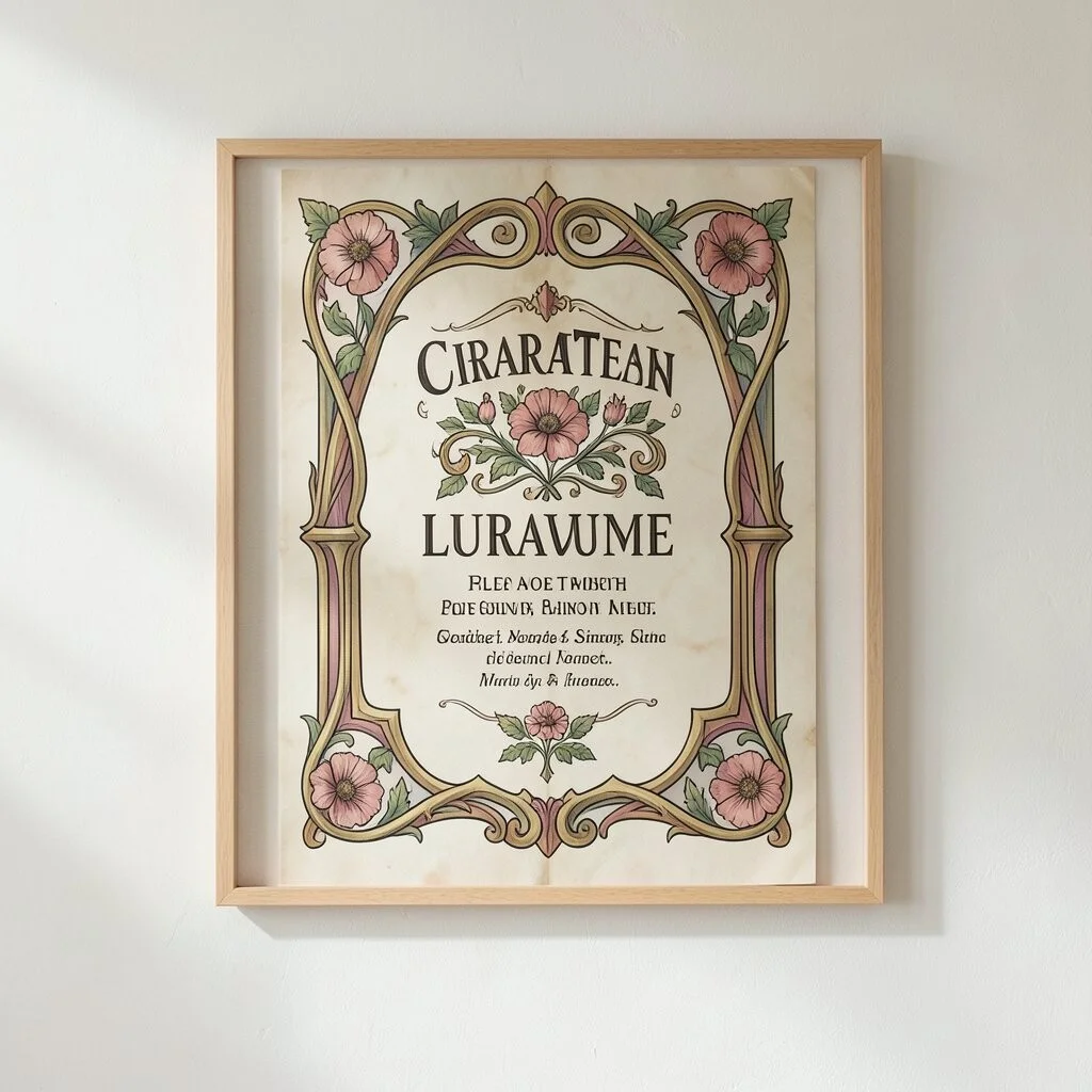
Many Art Nouveau pieces look complete because the edges are just as thoughtful as the center. A weak border can make the whole design feel unfinished.
Use flowing frames, curling corners, or floral borders to guide the eye. These shapes can make posters, labels, and wall art feel more special. They also give you a good place to add names, dates, or short messages without crowding the main image.
5. Making Everything Too Symmetrical
Perfect balance can be nice, but too much of it can make Art Nouveau feel stiff. This style often shines when it feels a little organic and alive.
Try a design where one side has more weight, but the whole piece still feels balanced. That small shift can make the image feel more unique and less like a template. It may also let you personalize the work with a favorite flower, bird, or shape on one side.
As a bonus, this kind of layout can look more modern in today’s homes and branding. It gives the artwork a handmade charm that many people want right now.
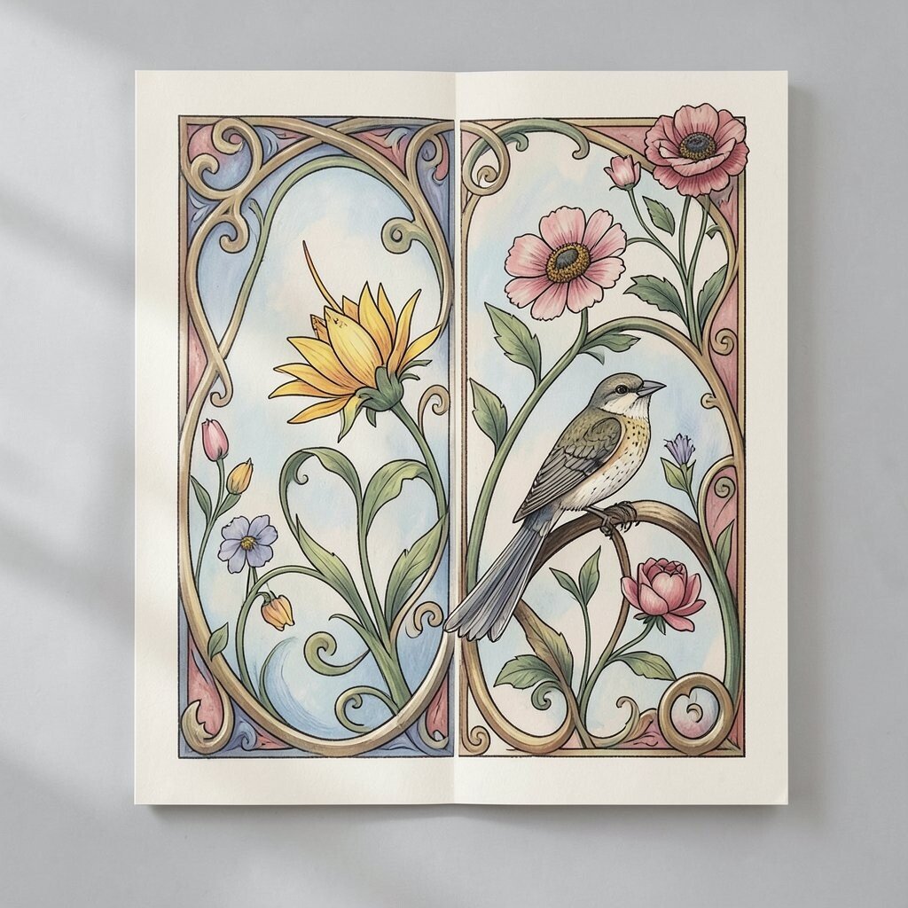
6. Using Flat Shapes With No Flow
Art Nouveau is known for movement, and flat shapes can make it feel dull. When lines stop too suddenly, the magic slips away.
Let stems bend, hair curl, and ornaments sweep across the page. Even a small ripple in a line can make a big difference. If you are working with a lower budget, simple flowing lines can still create a strong look without needing lots of extra detail.
Think about how the eye travels through the design. A smooth path gives the viewer a pleasant ride and makes the artwork easier to enjoy.
7. Overloading the Design With Tiny Details
Fine detail can be lovely, but too much of it can make the image feel busy and hard to read. Art Nouveau should feel elegant, not like a puzzle with no rest spots.
Leave some open space so the main shapes can breathe. This helps the flowers, faces, or lettering stand out more clearly. It also keeps printing and embroidery costs more reasonable, since extra tiny marks can raise production time.
Use detail where it matters most, such as around a face, a bloom, or a title. Then let the rest of the design stay calm and smooth.
8. Forgetting the Role of Line Weight
Thin and thick lines can change the whole mood of an Art Nouveau piece. If every line is the same, the work may look plain and lifeless.
Try thicker lines for the main outline and lighter lines for inner decoration. This creates depth and helps the viewer know where to look first. It also gives you room to adjust the look for different uses, from posters to product labels.
A thoughtful line plan can make even a simple design feel expensive. That is useful when you want a rich look without a high price tag.
9. Copying Historical Styles Too Literally
Old Art Nouveau posters are beautiful, but copying them too closely can make your work feel stuck in the past. The style works best when it has a fresh voice.
Use classic ideas like long hair, floral frames, and graceful curves, but mix them with your own subject or story. You might add a modern face, a new color mood, or a custom symbol that matters to you. That keeps the design unique and makes it feel right for today’s trends.
This approach also helps your work stand out in a crowded market. People often remember pieces that honor tradition without acting like a museum copy.
10. Picking the Wrong Lettering
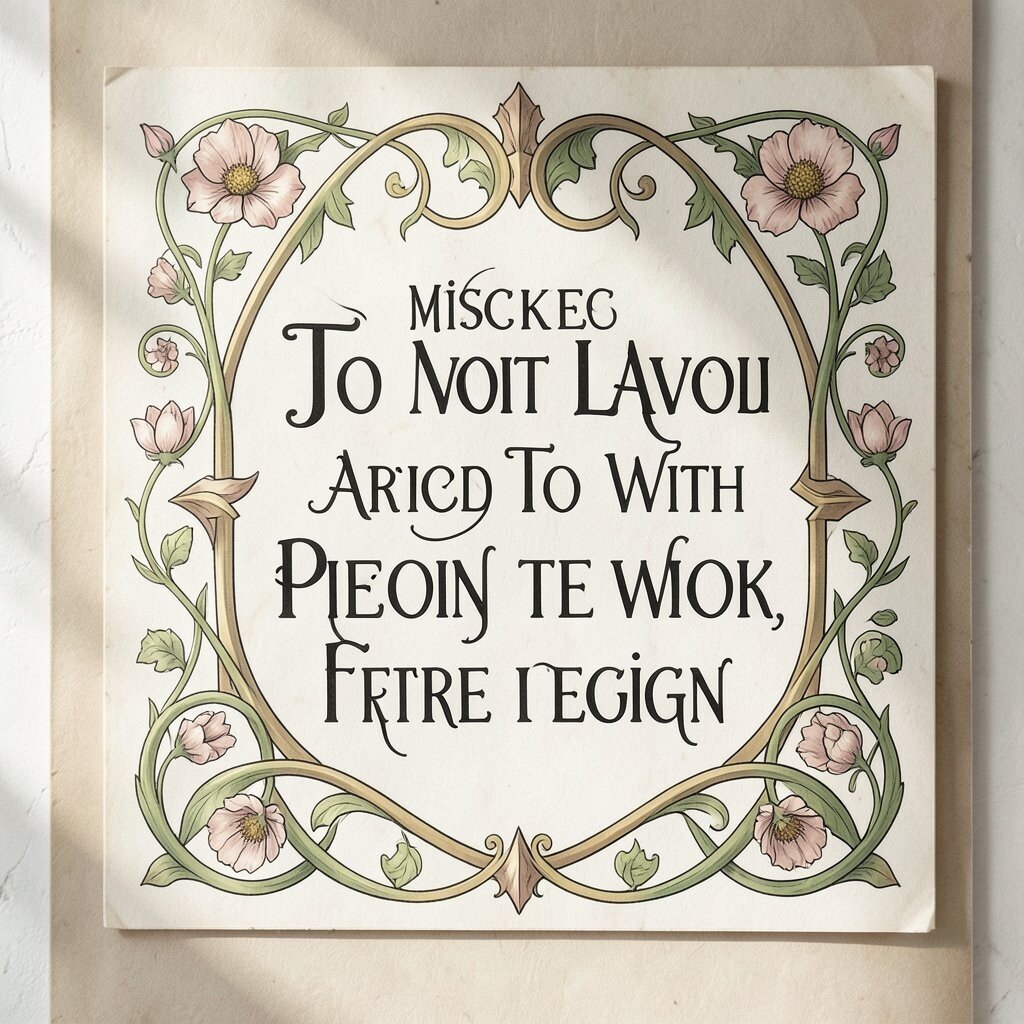
Lettering can make or break an Art Nouveau design. A plain font that feels too sharp or modern can clash with the soft artwork around it.
Choose letters with a graceful shape and smooth rhythm. They should feel like they belong beside vines, petals, and curved frames. If you are designing a sign or invitation, personal touches in the text can make the piece feel warm and special.
Good lettering also helps with readability, which matters a lot in posters and packaging. A beautiful message is best when people can read it with ease.
11. Using Too Many Bright Metallic Effects
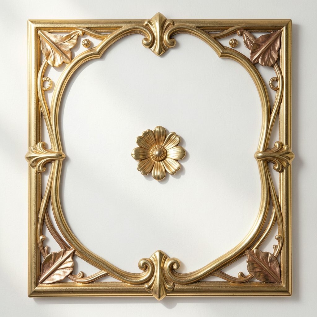
Gold and bronze can look lovely in Art Nouveau, but too much shine can make the design feel loud. The style usually works best with a soft glow, not a blinding flash.
Use metallic accents in small spots, like a border, hair pin, or flower center. That gives the piece a rich look without taking over the whole page. It can also be a smart cost choice, since small accents use less special material than full coverage.
Shiny details are especially popular in current home decor and stationery trends. A light touch can make your work feel stylish without losing its old-world charm.
12. Forgetting Texture and Surface Feel
Art Nouveau is not only about shape; it is also about how the piece feels to the eye. A design that looks too smooth or digital can miss the warm, crafted mood people expect.
Try paper grain, soft shading, or gentle pattern fills to add life. These touches can make the image feel more human and less like a flat screen image. They also give you lots of room for personal style, from rough handmade paper to silky printed finishes.
If you are working on a budget, even a simple texture overlay can improve the whole look. Small surface details often give the biggest payoff.
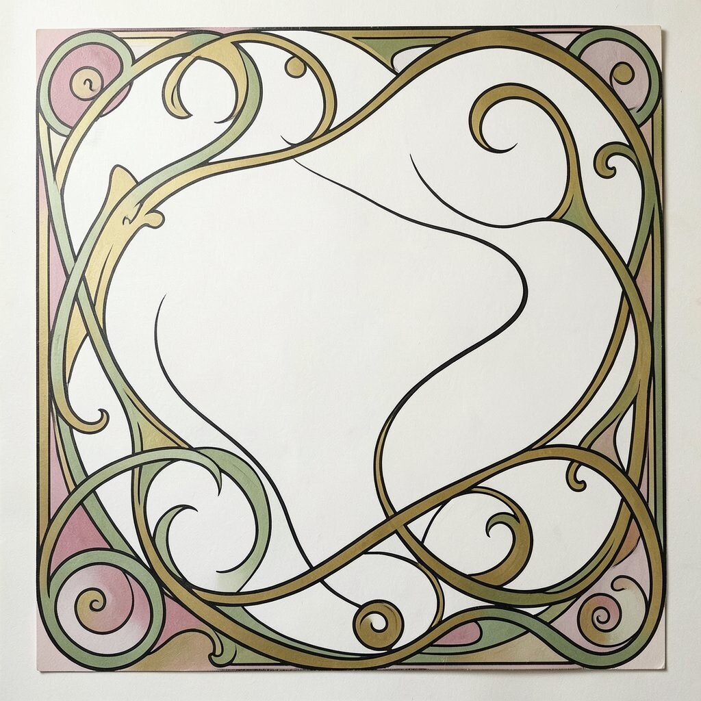
13. Making the Composition Too Empty
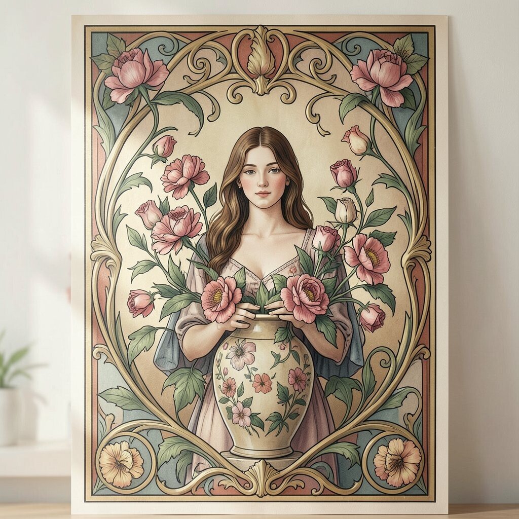
Open space is useful, but too much of it can make Art Nouveau feel weak. The style usually needs a sense of fullness and gentle abundance.
Fill the space with a few strong shapes, then let smaller forms support them. Think of a woman framed by flowers, or a vase surrounded by curling leaves. This creates a cozy, rich feel that works well in posters, room art, and product design.
You can still keep the work personal by choosing one main symbol that means something to you. That keeps the piece from feeling generic while giving it a strong focal point.
14. Ignoring Modern Use Cases
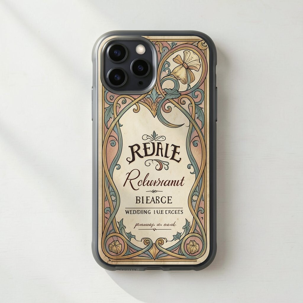
Some designers treat Art Nouveau like it only belongs in old posters and antique books. That can stop the style from reaching new buyers and new spaces.
Try it on phone cases, wedding invites, café menus, wall prints, or branding for handmade goods. The flowing shapes can make everyday items feel more special and memorable. This also opens the door to smart pricing, since a design can be reused across many products.
Current trends often favor heritage looks with a fresh twist. Art Nouveau fits that mood well when it is adapted with care and purpose.
15. Skipping Personal Voice
The biggest mistake is making a design that feels copied, safe, and forgettable. Art Nouveau has plenty of charm, but it becomes strongest when it reflects the maker behind it.
Add a favorite flower, a meaningful symbol, or a color story tied to a memory. Small choices like these make the work feel one of a kind. They also help your design stand out in a world full of similar patterns and mass-made decor.
When your own taste shows through, the style feels alive again. That is the secret to making Art Nouveau feel fresh, useful, and worth keeping.