
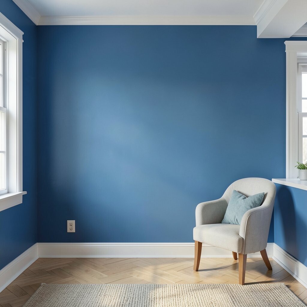
Blue walls can feel calm, bold, or cozy all at once. The wrong choice can make a room feel cold, flat, or messy.
Blue has a way of changing with light, furniture, and finish. A smart plan makes the color feel rich, fresh, and personal.
1. Picking blue before checking the room light
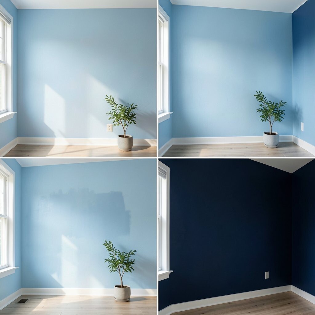
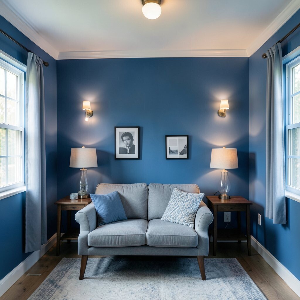
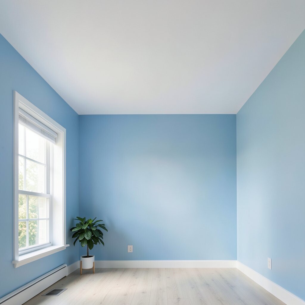
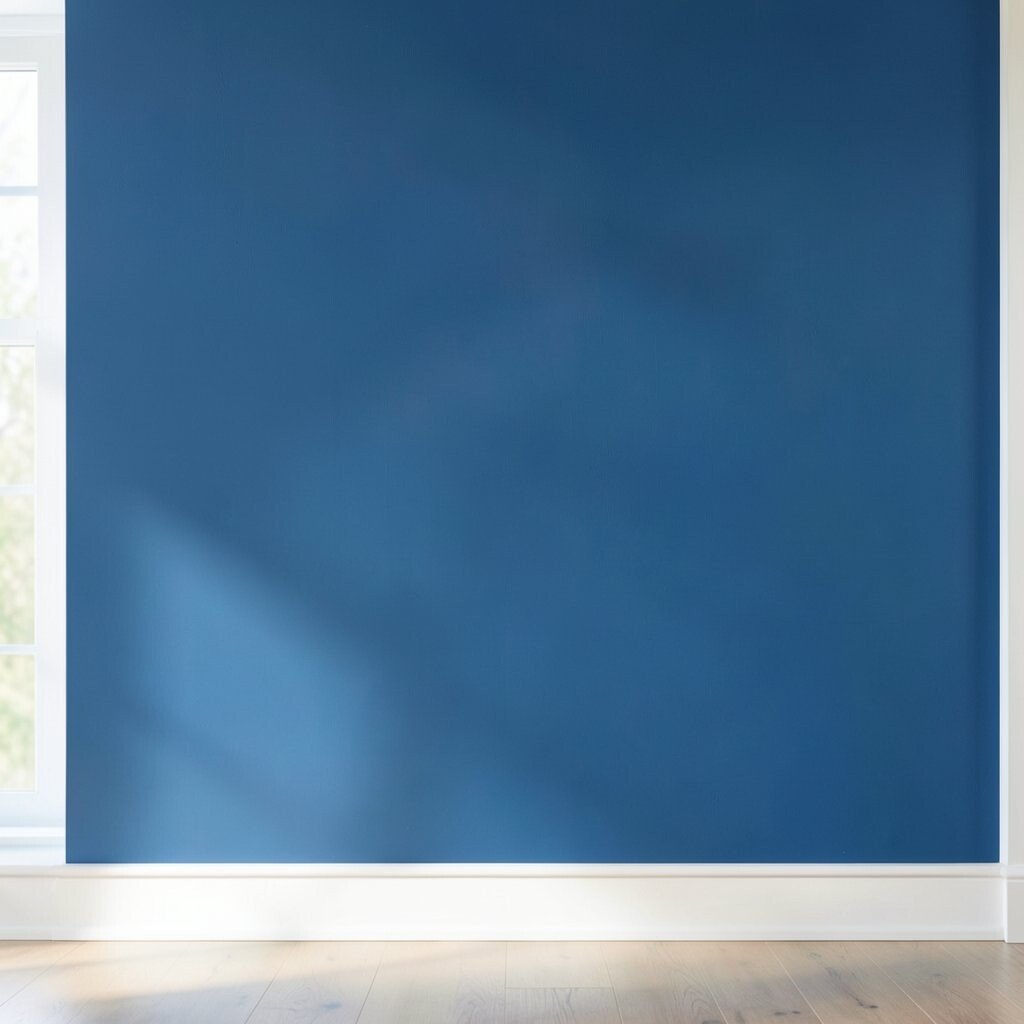
Blue paint can look bright in one room and gloomy in another. Sunlight, shade, and lamp light all change the mood fast.
Test paint on more than one wall and check it at different times of day. A soft sky blue may feel airy in the morning, while a deep navy may turn dramatic at night. This simple step can save money and help you avoid a costly repaint.
2. Using a blue that fights the room’s style

Not every blue fits every room. A beachy blue may feel out of place in a formal dining room.
Match the shade to the furniture, floor, and decor style. Crisp blues work well with modern spaces, while dusty blues suit vintage pieces and soft fabrics. If your room has warm wood or brass, try a blue with a little gray to keep it balanced.
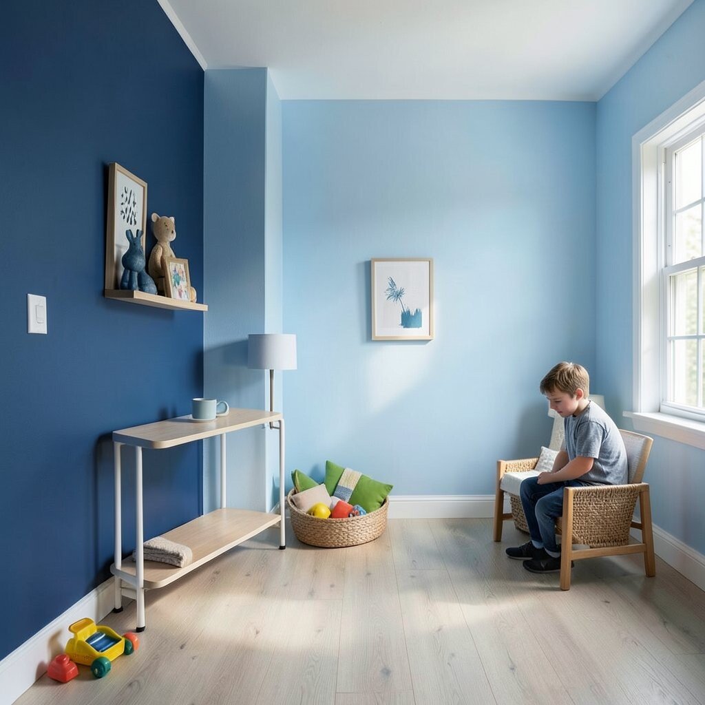
Think about the feeling you want before you buy the first sample. A playful blue can brighten a kid’s room, while a deep blue can make a bedroom feel calm and private. The best choice is the one that supports the whole room, not just the wall color.
3. Forgetting to test paint on a large sample
A tiny paint chip can fool the eye. Blue often looks much darker or greener once it covers a big wall.
Paint a large sample board or a wide patch on the wall. Move it around the room and compare it with your sofa, rug, and curtains. This helps you spot the true tone before you spend on full cans.
Large samples are useful for unique looks too. A bold cobalt may feel exciting in a small patch, but a whole wall can be intense. Testing first gives you time to decide if the color feels right for daily life.
4. Choosing the wrong finish for the room
The sheen matters almost as much as the shade. Flat blue can feel soft, while glossy blue can look sharp and shiny.
Use washable finishes in busy rooms like halls and family spaces. Matte can hide wall flaws, but satin or eggshell is often easier to clean. If you want a rich, smooth look, choose a finish that fits both style and use.
5. Ignoring the undertone in the blue
Some blues lean green, some lean gray, and some lean purple. That hidden note can change the whole mood of the room.
Hold the sample next to white paper, wood, and fabric to see the true undertone. A blue with a green base can feel fresh and coastal, while a blue with a gray base can feel calm and modern. This small detail helps the color feel more unique and less random.
Undertones also affect cost in a sneaky way. If the blue clashes with your trim or couch, you may end up replacing more items than planned. A well-chosen undertone can make old pieces look better and keep the room feeling polished.
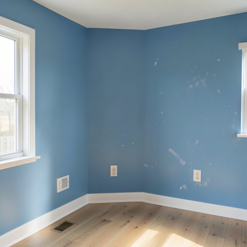
6. Painting without fixing wall flaws first

Blue can be honest. It may show dents, patches, and rough spots more than a lighter neutral would.
Fill holes, sand bumps, and clean the walls before you paint. A smooth wall makes the color look deeper and more even. This prep work is cheap compared with the cost of living with a messy finish.
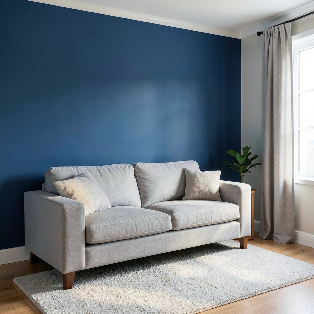
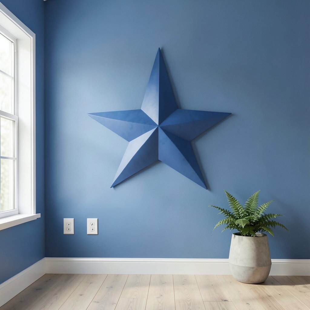
7. Using too much dark blue in a tiny room
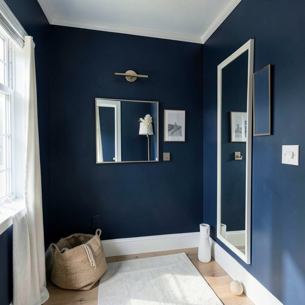
Dark blue can feel rich and moody, but it can also shrink a room. In a small space, that can make the walls feel close.
Balance deep blue with bright trim, mirrors, or light fabric. A navy accent wall can add drama without swallowing the room. If you love dark color, use it in a smart way so the space still feels open.
Current design trends often use deep blue in small powder rooms and reading corners. The trick is to pair it with clean lines and a few light objects. That contrast gives the room a stylish look without making it feel heavy.
8. Choosing a blue that is too bright for rest areas
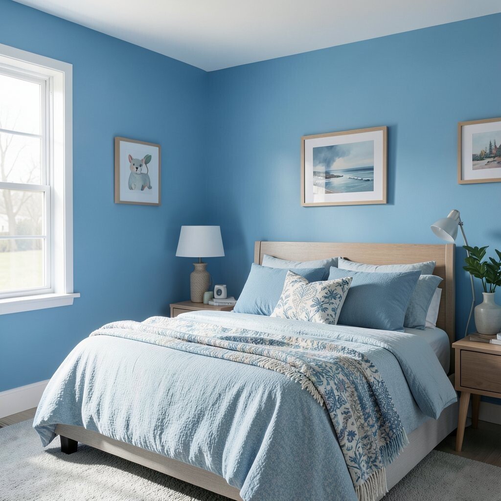
Very bright blue can feel playful and fun. In a bedroom, though, it may keep the room feeling too active.
For places meant for sleep, try a softer blue or a dusty shade. These colors feel gentle and calm, like a quiet sky. You can still make the room special with pillows, art, or a patterned throw.
If you want a bold look, save the vivid blue for a desk nook or game room. That way the color works with the room’s purpose instead of fighting it. Personal touches can still make the space feel lively without overdoing the wall color.
9. Matching blue paint to the wrong white trim
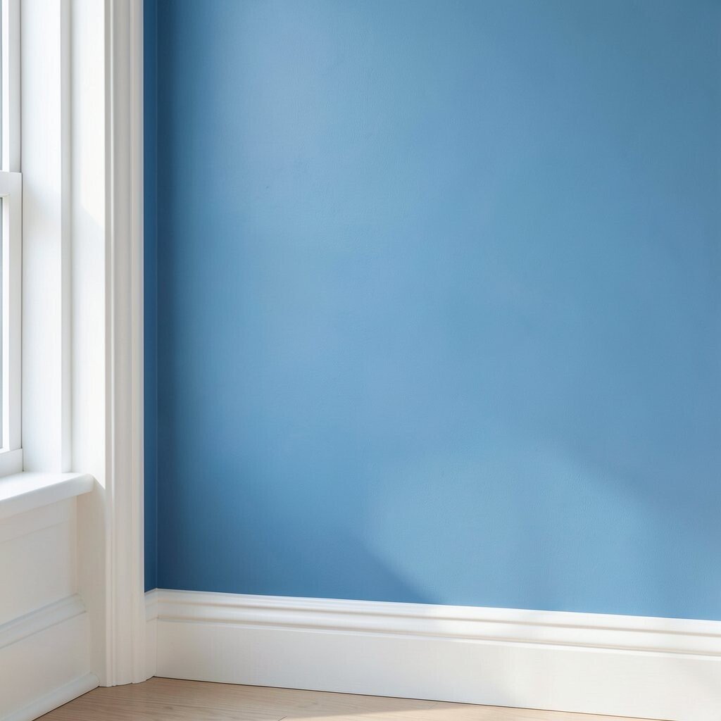
White is not just white. Some whites look creamy, while others look crisp and cool.
A warm blue with a cool white trim can feel off. A cool blue with creamy trim can look dull. Compare your trim color with the blue sample before you commit, so the pair feels clean and intentional.
This choice can change the whole room style. Bright white trim makes blue feel fresh and modern, while softer white trim makes it feel cozy and lived-in. The right pairing can make even a simple room feel special.
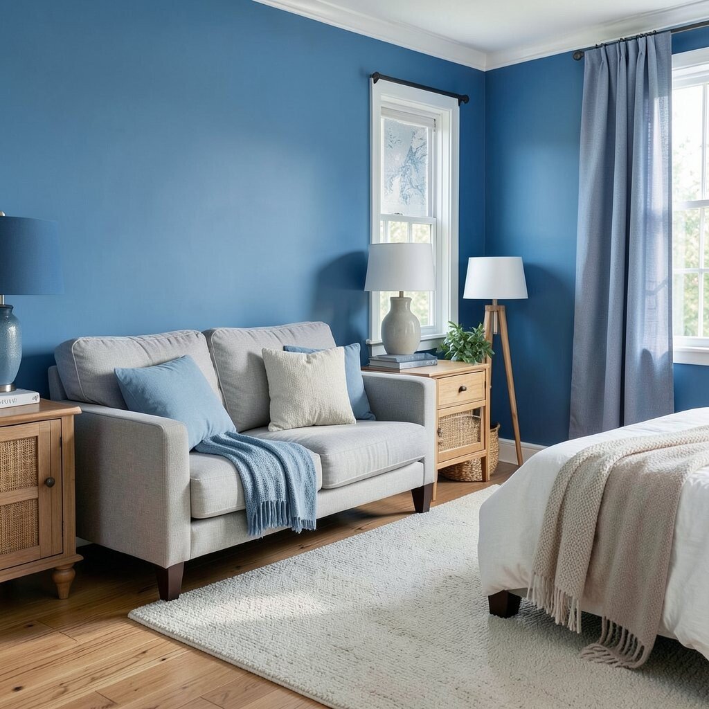
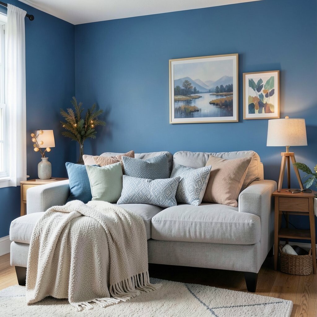
10. Skipping the effect of nearby furniture
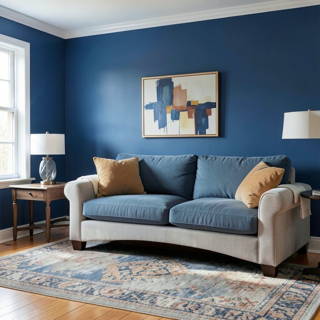
Blue walls do not stand alone. They reflect the colors of your sofa, rug, art, and wood tones.
Place the sample near your biggest pieces before buying paint. A blue that seems cool on its own may look warmer beside a tan couch or a golden floor. That small test can keep the room from feeling mismatched.
Think about the full picture, not just the wall. If your furniture is busy, a calmer blue can help the room breathe. If your furniture is plain, a richer blue can add personality and style.
11. Using blue paint to hide poor lighting
Blue cannot fix a dark room by itself. If the lighting is weak, the color may look muddy or flat.
Add lamps, brighter bulbs, or better window coverings before painting. Good light helps blue show its true beauty, from soft and misty to deep and dramatic. This can also make the room feel more welcoming at a lower cost than a full remodel.
Layered lighting is a big trend right now. People use ceiling lights, table lamps, and wall lights to make blue walls glow in a more flattering way. That mix brings out the color’s charm and makes the room easier to use every day.
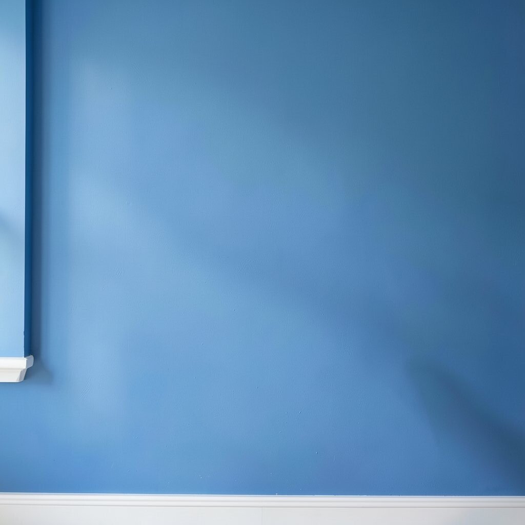
12. Forgetting that blue changes with natural light
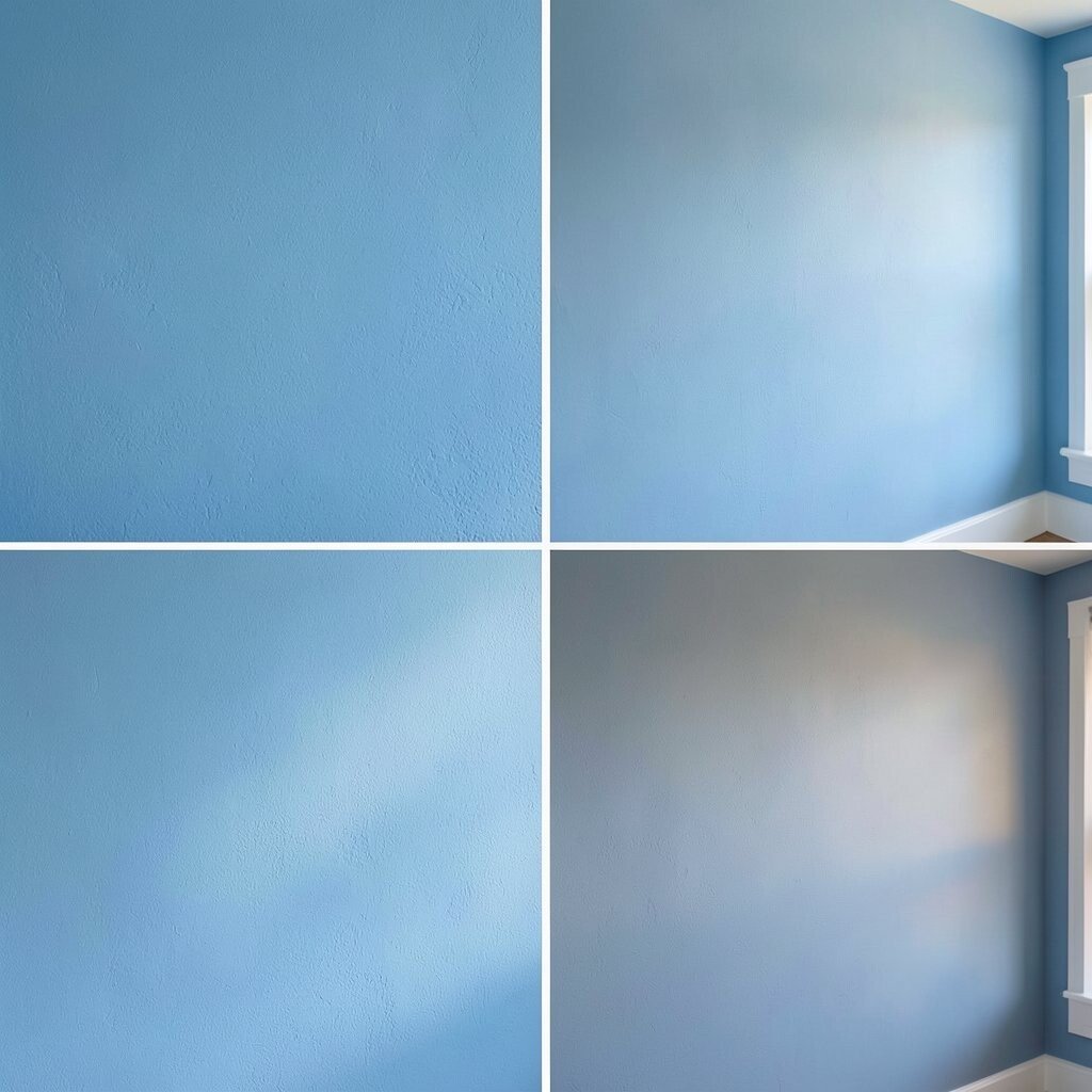
Morning light, afternoon light, and evening light can make the same blue look like three different colors. That can be a surprise if you only sample it once.
Check the paint at several times of day before you buy enough for the whole room. A calm blue may look crisp in sunlight and soft gray after sunset. This helps you choose a shade that stays attractive all day.
13. Going too trendy without thinking long term
Some blue shades feel very current. A trendy blue can look fresh now, but it may feel old fast.
If you want a lasting look, choose a blue with a classic base. Navy, denim, and dusty slate often stay stylish longer than super neon or odd teal-blue mixes. You can still use trendy decor pieces to keep the room feeling current.
Long-term style also helps with budget planning. Paint is cheaper than furniture, but repainting often still costs time and money. A timeless blue gives you more years of use and makes it easier to change accessories later.
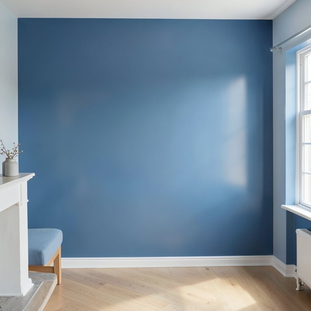
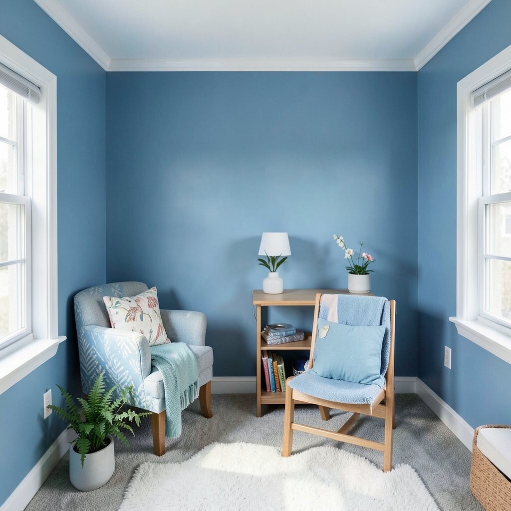
14. Painting every wall blue without balance
All-blue walls can feel bold and beautiful. They can also feel too strong if the rest of the room has no break.
Use art, shelves, trim, or light fabric to soften the look. A single blue accent wall can make the room feel special without taking over. Balance is what makes the color feel rich instead of overwhelming.
Personal style matters here. Some people love a full cocoon effect, while others want just a hint of color. Pick the amount of blue that matches how you live in the space.
15. Choosing blue without thinking about the ceiling
The ceiling can change the way blue walls feel. A white ceiling may keep the room open, while a colored ceiling can make it feel more enclosed.
If the room is low, a soft white ceiling often works best. In a tall room, a pale blue ceiling can add charm and make the space feel more complete. This can be a lovely way to make the room feel custom without spending a lot.
Ceiling color is having a moment in interior design. People are using pale blue overhead for a soft sky effect, especially in bedrooms and nurseries. It adds uniqueness while still feeling calm and easy to live with.
16. Ignoring the floor color
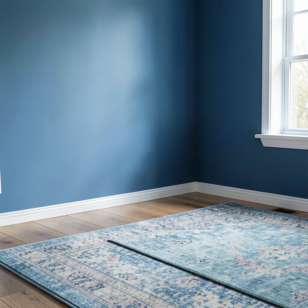
Blue walls sit next to the floor all day long. That means wood, tile, or carpet can change the whole look.
Warm floors often pair well with blue that has a gray or green hint. Cool floors may work better with a richer blue that feels balanced and clean. Checking the floor and wall together keeps the room from feeling split in two.
Rugs can help if the floor and wall do not match perfectly. A rug with a little blue in it can connect the room and make the color feel planned. That is a simple way to improve the look without replacing big items.
17. Using the wrong blue in a room with little space
Small rooms need careful color choices. A strong blue can feel tight if the room already lacks breathing room.
Try a lighter blue, a muted blue, or one accent wall instead of all four walls. These choices still give you color and personality without making the room feel boxed in. A smart shade can make a tiny room seem more charming than plain white ever could.
Small spaces are perfect for personal style. A reading nook, laundry room, or entryway can handle a little more color than you think. Blue gives these spots a cheerful look and can make them feel finished on a modest budget.
18. Forgetting to think about the room’s purpose
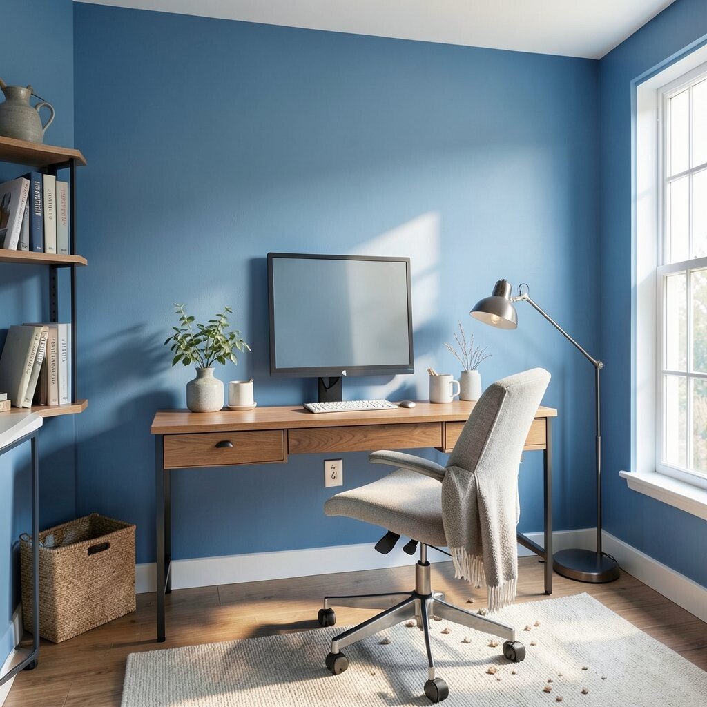
The best blue for a home office is not always the best blue for a bedroom. Each room has its own job.
Choose a color that supports the mood you want. Soft blues can help a bedroom feel restful, while cleaner blues can keep a workspace feeling alert and neat. Matching the paint to the room’s purpose makes the space easier to enjoy.
You can personalize the shade with accessories too. Add warm wood for comfort, metal for a sharper feel, or soft textiles for calm. Those choices let the blue work harder for your lifestyle.
19. Buying paint without checking coverage
Some blue paints need extra coats to look even. That can raise the cost and stretch the project longer than expected.
Read the label and ask about coverage before you buy. A rich blue may need a primer or more coats than a light blue. Planning for that ahead of time helps you avoid wasted trips and surprise expenses.
Good coverage also affects the final look. Uneven blue can show streaks, especially in bright light. A solid finish gives the wall a smooth, polished style that feels worth the effort.
20. Skipping primer on major color changes
Primer can make a big difference, especially when covering a dark wall or a spotted surface. Without it, blue may look patchy or weak.
Use primer to give the new color a clean base. This is especially helpful when moving from red, brown, or strong yellow to blue. The result is often deeper, cleaner, and more even, which saves time in the long run.
Primer can also help your paint budget. Fewer coats mean less paint used and less labor if you hire help. That makes the whole project feel smoother from start to finish.
21. Choosing blue that clashes with art and decor
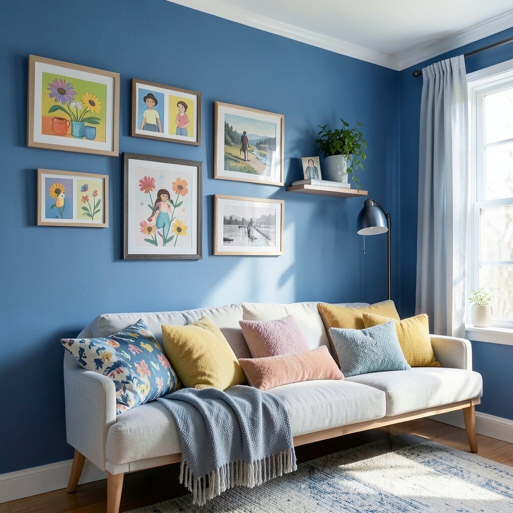
Blue walls can make art look amazing, but the wrong shade can fight with your pieces. Bright artwork may get lost against a loud blue background.
Look at the colors in your frames, prints, and shelves before you paint. A muted blue can help colorful art stand out, while a bold blue can make simple black-and-white art feel strong and clean. This creates a room that feels thoughtful and personal.
If your decor changes often, pick a blue that plays well with many colors. That gives you more freedom to swap pillows, posters, and accessories later. Flexible color choices are useful for growing families and people on a budget.
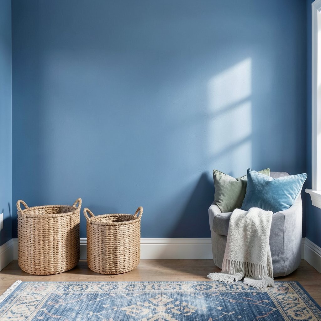
22. Using blue in a room that already feels cold
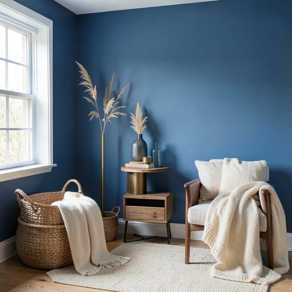
Blue can make a chilly room feel even cooler. That is not always bad, but it needs balance.
Add warm materials like wood, woven baskets, cream fabric, or brass accents. These pieces soften the blue and make the room feel more welcoming. A cozy mix helps the color feel rich instead of icy.
This balance is especially useful in modern homes with lots of gray or metal. Blue walls can look sleek and stylish there, but only if something warm joins the scene. A few soft textures can change the whole feeling of the room.
23. Overlooking how blue affects mood
Color can shape how people feel in a room. Blue often feels calm, but the wrong shade can also feel sad or sleepy.
Think about the energy you want in the room before painting. A soft blue can help with rest, while a brighter blue can bring more life to a hallway or playroom. When the mood matches the use, the room feels more natural and pleasant.
Personal taste matters a lot here. Some people feel happy in deep navy, while others prefer a pale blue that feels like open air. Choose the mood that fits your daily habits, not just what looks good in a photo.
24. Painting without planning the trim and doors
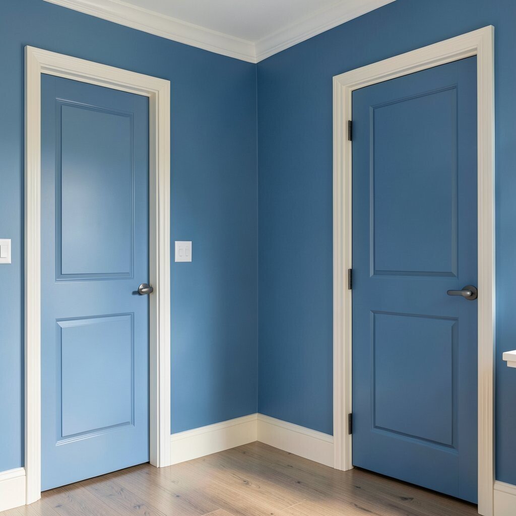
Blue walls look best when the trim and doors are part of the plan. If they are left unfinished or mismatched, the room can feel messy.
Decide early if you want bright white trim, soft cream trim, or even matching blue doors. Each choice gives a different style, from crisp and modern to smooth and cozy. This small decision can make the whole room feel more custom.
Matching doors are a current trend in some homes. They create a bold, wrapped look that feels clean and stylish. If you want something less dramatic, keep the trim light and let the walls do the talking.
25. Choosing blue that is too flat for the space
Some blues have a lovely color but no life. They can look dull if the room needs more depth.
Look for a shade with a bit of richness or movement. A blue with a soft gray, green, or violet note often feels more interesting on the wall. That extra depth can make the room feel layered and elegant.
Texture can help too. Pair flat blue walls with woven baskets, velvet pillows, or a patterned rug. These touches bring the color to life and make the room feel more finished without extra paint cost.
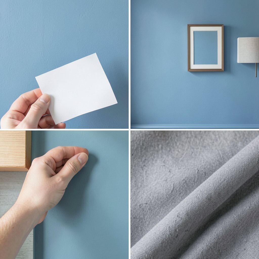
26. Not using samples near the furniture you already own
A blue may look perfect in the store and still fail at home. The reason is often the colors already in the room.
Place the sample beside your couch, bed, cabinets, or curtains. This shows you if the blue feels calm, sharp, or awkward next to the things you already use. It is one of the easiest ways to avoid regret.
This step is especially helpful if you are decorating on a budget. Keeping your current furniture means the paint has to work with what you have. A good blue can make older pieces look more stylish and fresh.
27. Using blue paint in a room with too many other strong colors
Blue is strong on its own. When it sits beside many loud colors, the room can feel busy and confused.
Choose one main star and let the rest support it. If blue is the star, keep the other colors softer or fewer in number. That creates a cleaner look and makes the blue feel more special.
Simple styling often looks more expensive too. A calm blue wall with a few well-chosen accents can feel elegant without needing a lot of decor. That is a smart way to get a polished look on a modest budget.
28. Forgetting to think about cleaning and wear
Blue walls can show smudges in busy homes. Kids, pets, and daily traffic can leave marks fast.
Pick a finish that is easy to wipe and a shade that hides small scuffs better. Mid-tone blues often hide wear more easily than very pale or very dark ones. That can save time and keep the room looking neat longer.
If the room gets heavy use, choose quality paint instead of the cheapest option. Better paint often lasts longer and needs fewer touch-ups. That may cost more at first, but it can save money later.
29. Using blue without thinking about seasonal change
Blue can feel cool in winter and fresh in summer. The same room may feel very different as the seasons shift.
Choose a shade that still feels good when the weather changes. A balanced blue can stay pretty all year, while an icy blue may feel too cold in winter. Soft blankets, warm lamps, and seasonal decor can help the room stay inviting.
This is a great place to add personal style. Change pillows, throws, and art through the year while keeping the blue walls steady. That gives the room a fresh look without repainting again and again.
30. Ignoring the power of texture with blue walls
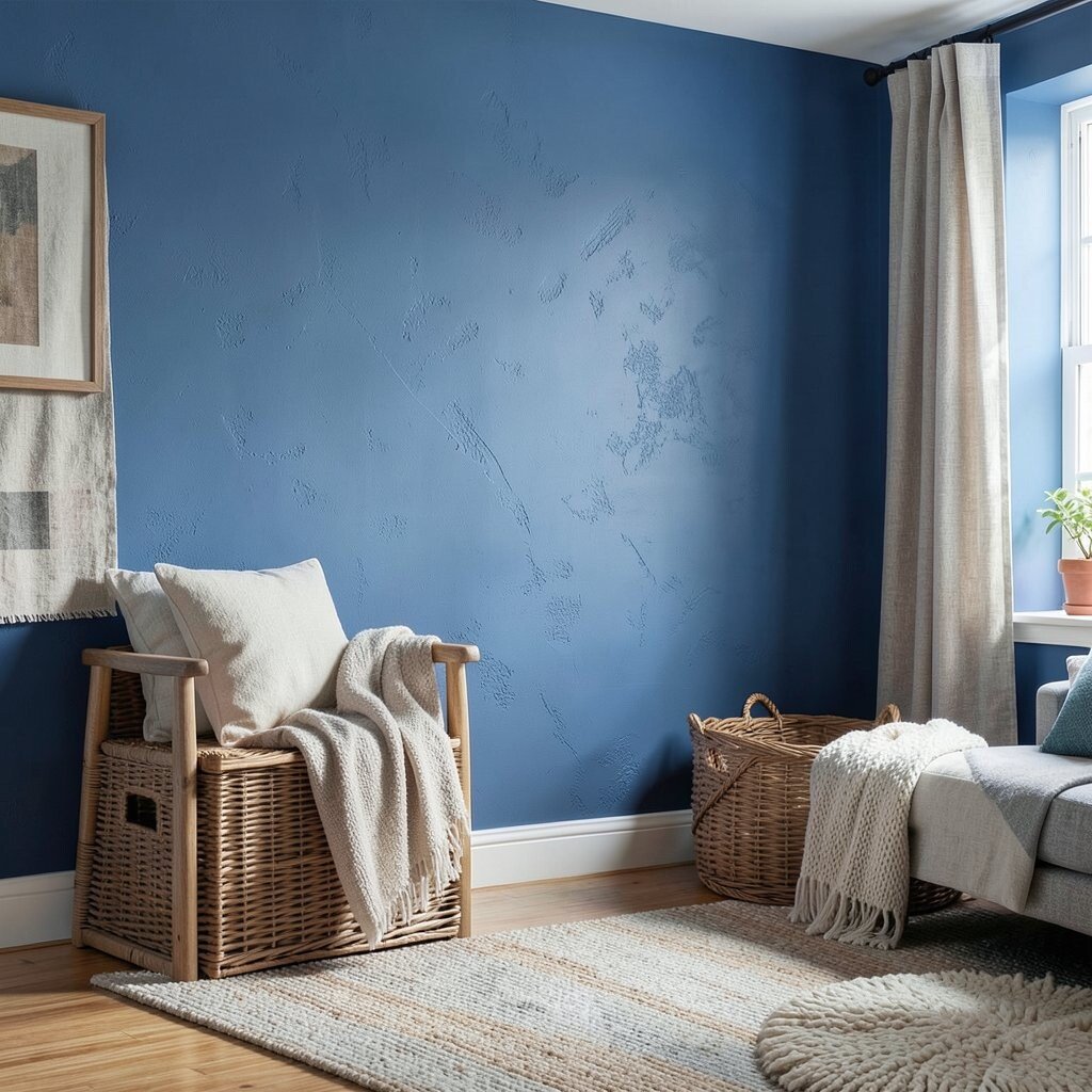
Blue walls can look flat if everything else in the room is smooth and plain. Texture gives the color more life.
Mix in linen, wood, wicker, velvet, or woven pieces to make the room feel richer. These materials catch light in different ways and help the blue feel layered. The result is a room that looks warm, stylish, and full of character.
Texture is also a good fix when the blue is very simple. A plain wall can become elegant with the right rug or curtain. That gives you a unique look without changing the paint again.
31. Rushing the final choice because the color looks good online
Blue paint online can look perfect, but screens often change the true shade. A color that seems soft and pretty on a phone may look far stronger on your wall.
Always sample the paint in your own room before making the final call. Check it with your light, floor, furniture, and trim so there are no surprises. This last step is small, but it can protect your budget and help the room feel just right.
When the choice is based on your real space, the result feels more personal and more beautiful. That is how blue walls become a smart design choice instead of a risky one.