Sharp shapes can feel fresh, calm, or bold all at once. These patterns turn simple forms into striking visual moods.
1. Hexagon Honeycomb Mesh
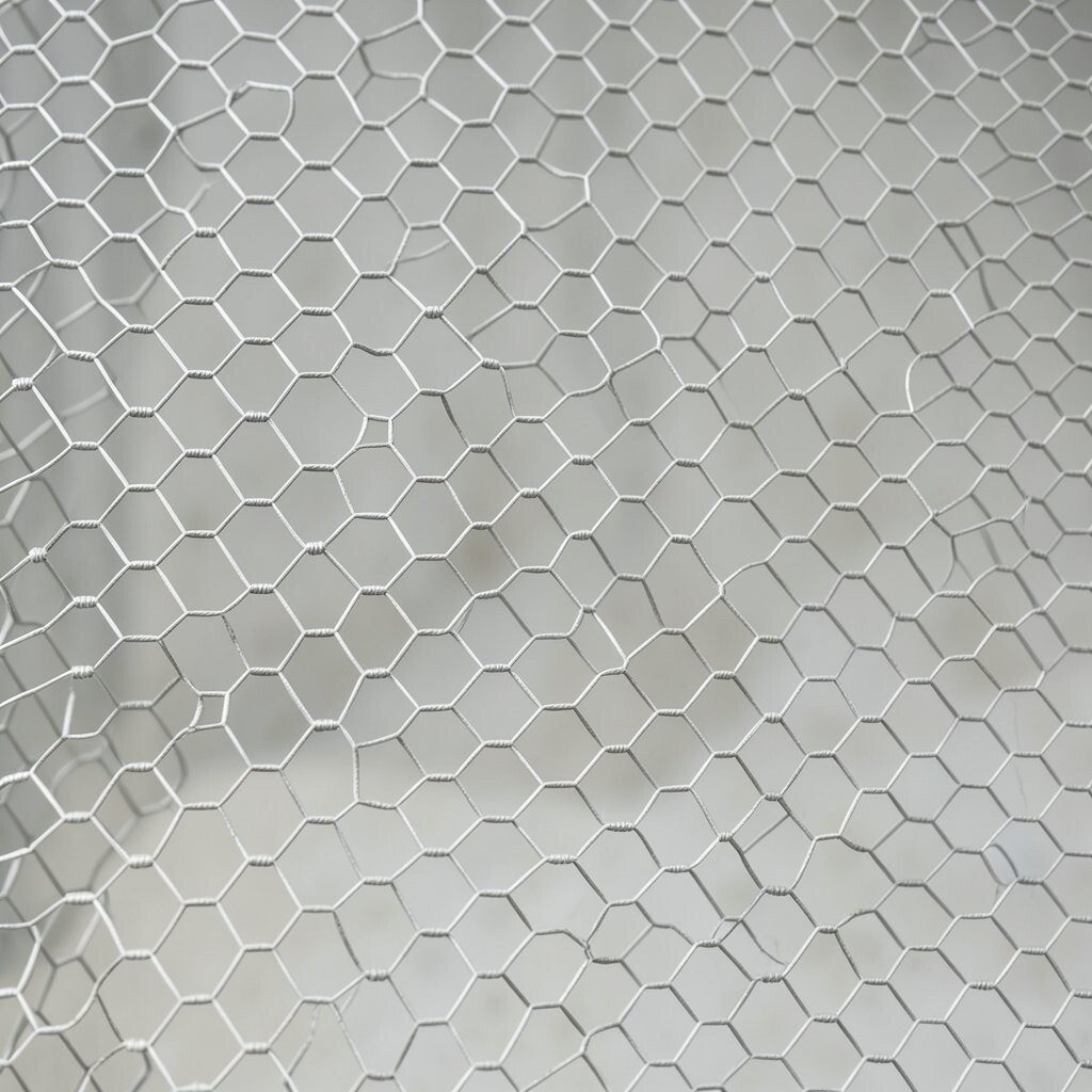
Hexagon honeycomb mesh brings a neat, linked look that feels both modern and friendly. The repeating cells create a strong visual rhythm, and that makes it useful for backgrounds, packaging, and web design where you want order without feeling plain.
This pattern stands out because it can look light and airy or dense and technical, depending on spacing and color. It is often easy on the budget too, since a simple repeat can be built fast in design software and reused in many places. Try soft grays for a clean tech feel or warm earth tones for a more natural mood, and small changes in line weight can make the whole piece feel more personal.
2. Diagonal Stripe Grid
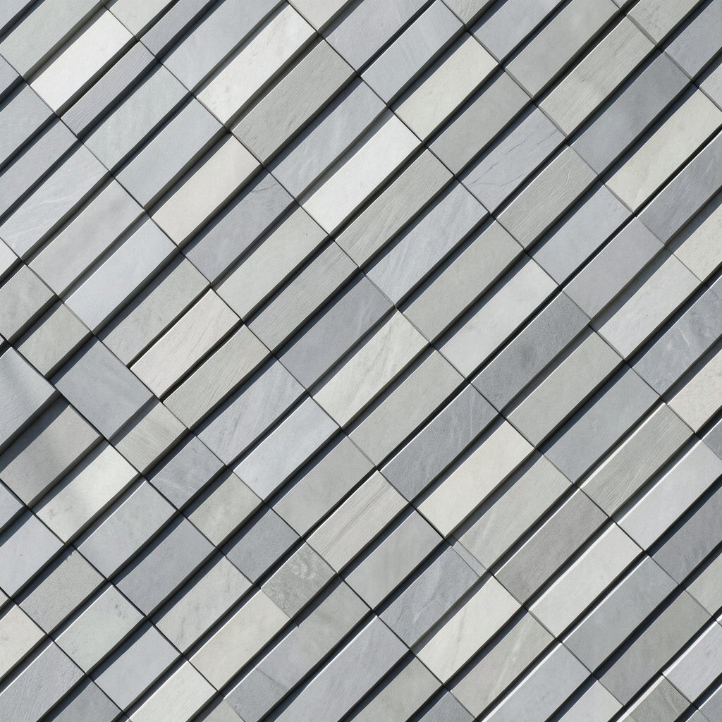
Diagonal stripe grid patterns feel active and fast, like movement frozen in place. Their crossing lines create a bold surface that works well for posters, app screens, and fabric prints.
Because the lines already do so much work, this style can stay simple while still looking polished. It is a smart choice when you want something current without spending a lot on complex art, and it can be adjusted with bright color pairs for a playful look or muted shades for a calmer one. Use wider stripes for a more open feel, or tighten the spacing if you want a richer, fuller design that matches your own style.
3. Isometric Cube Flow
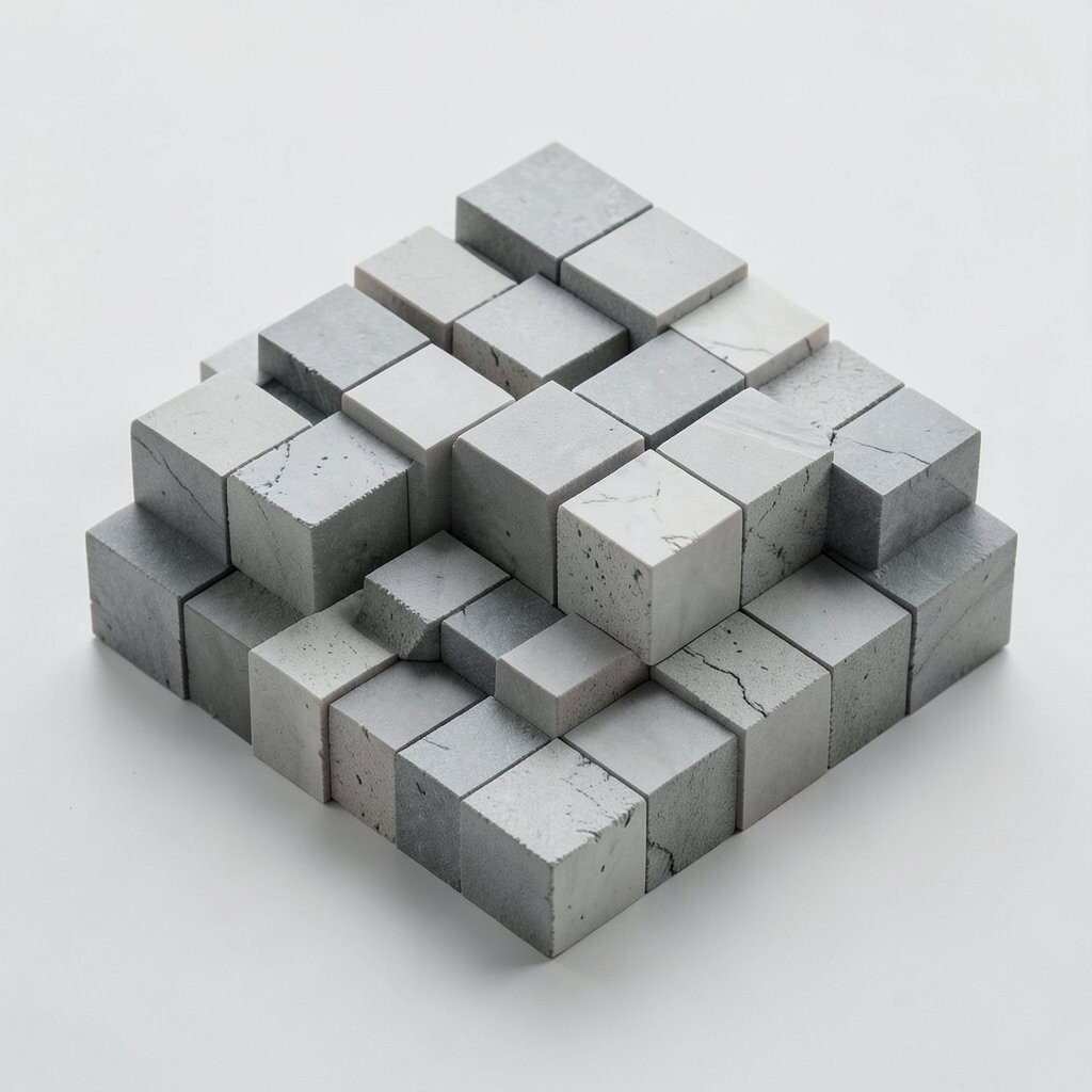
Isometric cube flow gives flat art a 3D feel without becoming too heavy. The cubes can seem stacked, floating, or marching across the page, which makes them great for tech branding, editorial graphics, and digital banners.
This pattern is unique because it suggests depth while staying clean and easy to read. It can cost very little to build when you use repeated vector pieces, and that makes it handy for brands that need a lot of visuals from one base system. A cool blue palette can make it feel futuristic, while copper, green, or purple accents can give it a custom touch that feels more personal and less generic.
4. Circular Orbit Rings
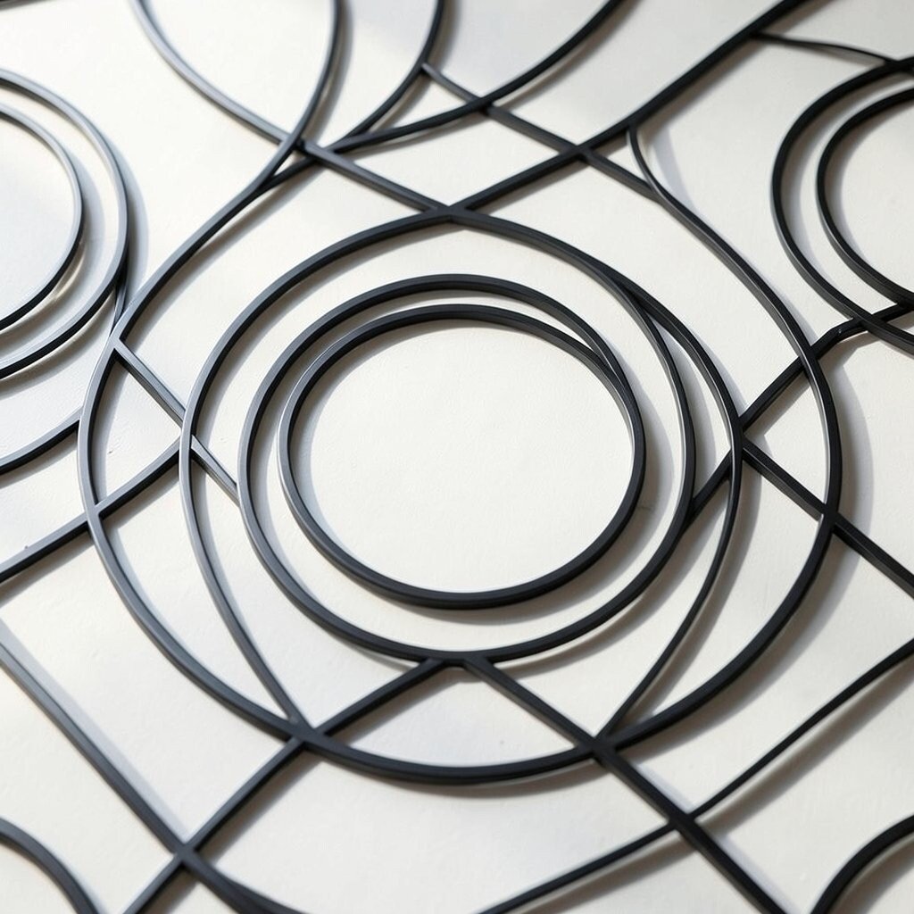
Circular orbit rings use loops and arcs to create a sense of motion around a central point. The look is smooth and balanced, and it can soften sharp layouts while still keeping a modern edge.
These rings work well when you want a pattern that feels light but not empty. They are easy to scale across a huge wall graphic or a small social post, which helps keep design costs under control for many projects. To make it your own, shift the ring thickness, overlap a few circles, or add tiny dots that echo the main form and give the pattern a more active trend-forward feel.
5. Triangle Peak Repeat
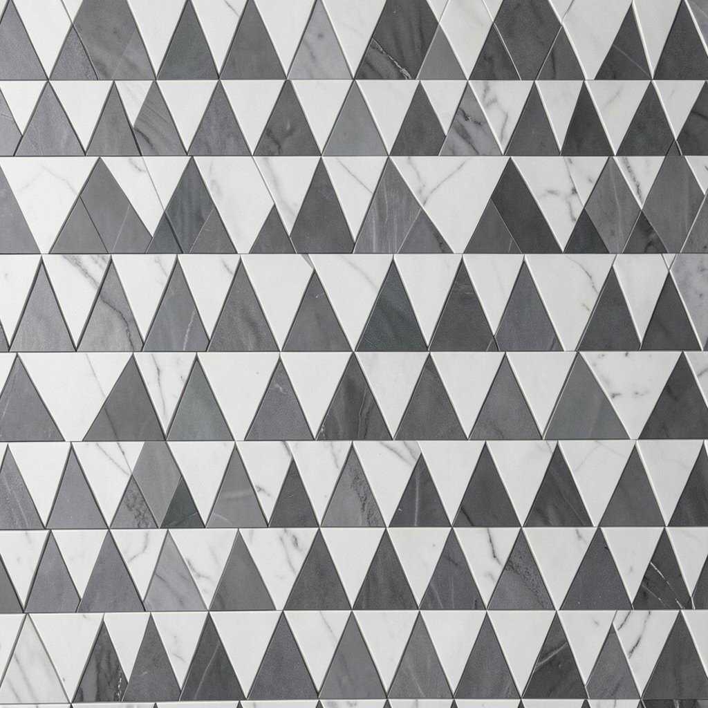
Triangle peak repeat uses pointed shapes to build a pattern with energy and direction. It can feel like mountains, arrows, or folded paper, which gives it a crisp modern voice.
The main benefit is its strong structure, since triangles naturally lead the eye across a page. That makes it useful for covers, event posters, and labels where you want the viewer to keep moving through the design. It can stay low-cost when made from one simple shape, and you can personalize it with bright gradients, soft pastels, or a single accent color to match your brand mood.
6. Mid-Century Dot Bloom
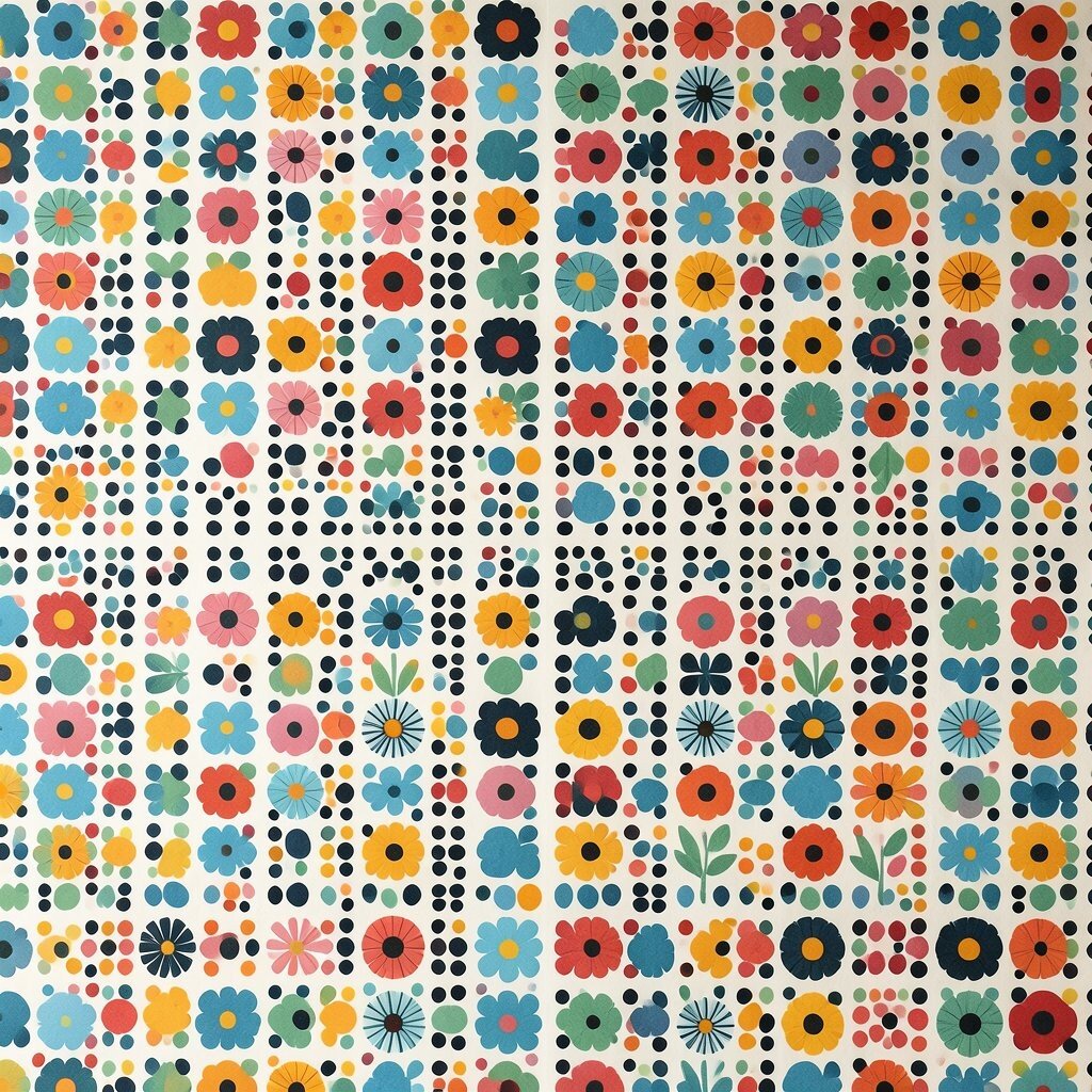
Mid-century dot bloom mixes circles, petals, and simple stems into a lively retro-modern pattern. It feels cheerful and decorative, with a gentle nod to older design styles that still look fresh today.
This pattern is unique because it blends soft charm with clean geometry, so it can suit both playful and polished spaces. It is a good pick when you want a warm look without a big budget, since the shapes are easy to repeat and recolor for different uses. Smaller dots can make it feel delicate, while larger blooms create a bolder statement that can be tailored to your own taste.
7. Angular Mosaic Shards

Angular mosaic shards look like broken glass arranged with care, and that gives them a sharp, artistic feel. The irregular edges keep the eye busy, so the pattern works well when a plain grid feels too safe.
It is a strong choice for album art, sport graphics, and modern packaging because it carries a sense of motion and texture. The style can be cost-friendly if you build it from a limited set of shapes and repeat them in clever ways, which also helps keep the design tidy. Dark backgrounds can make the shards glow, while a custom mix of bright tones can make the whole pattern feel more personal and current.
8. Soft Wave Geometry

Soft wave geometry blends smooth curves with orderly spacing, creating a look that feels calm and smart. The visual rhythm is gentle, and that makes it useful for wellness brands, lifestyle pages, and UI backgrounds.
This pattern is popular right now because it brings movement without harsh edges. It also gives good value in design work, since one wave shape can be reused in many sizes and colors without losing its charm. Try pale blue, sand, or mint for a relaxing feel, or add a single bright line to make the style more unique and aligned with your own voice.
9. Nested Square Frames
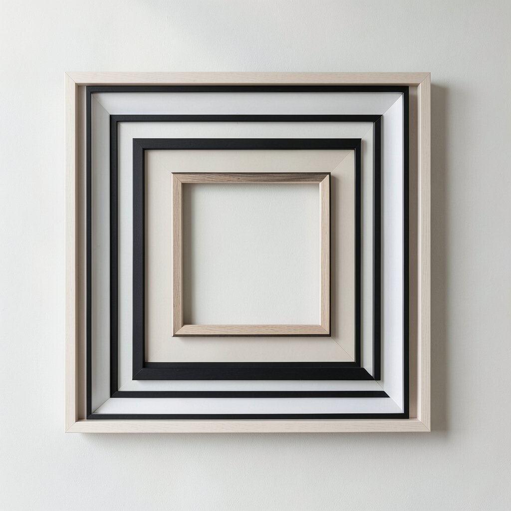
Nested square frames use one square inside another to create a tunnel-like view. The effect feels steady and clean, which makes the pattern useful for logos, covers, and digital hero sections.
Its strength comes from simple repetition, so the design can stay clear even when the layout gets busy. That makes it a good low-cost option for brands that need easy pattern systems across many sizes and products. You can space the frames evenly for a calm look, tilt them slightly for a fresh twist, or use changing line weights to make the design feel more personal and less rigid.
10. Polygon Rainfall
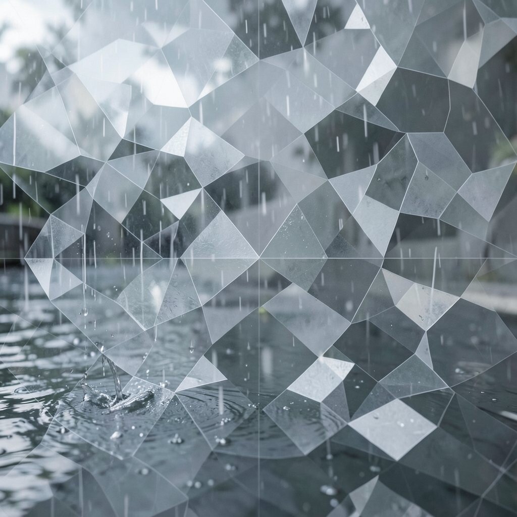
Polygon rainfall drops many small angular shapes across the surface like a modern storm. The scattered look feels lively and textured, and it can add depth without needing detailed illustration.
This pattern is useful when you want a background that supports other content instead of stealing the show. It can be made efficiently with a small set of polygons, so cost stays friendly while the final result still looks rich and current. Light-to-dark fades can give it extra mood, and custom color splashes can help it fit a brand story or a seasonal campaign.
11. Interlocking Circle Links
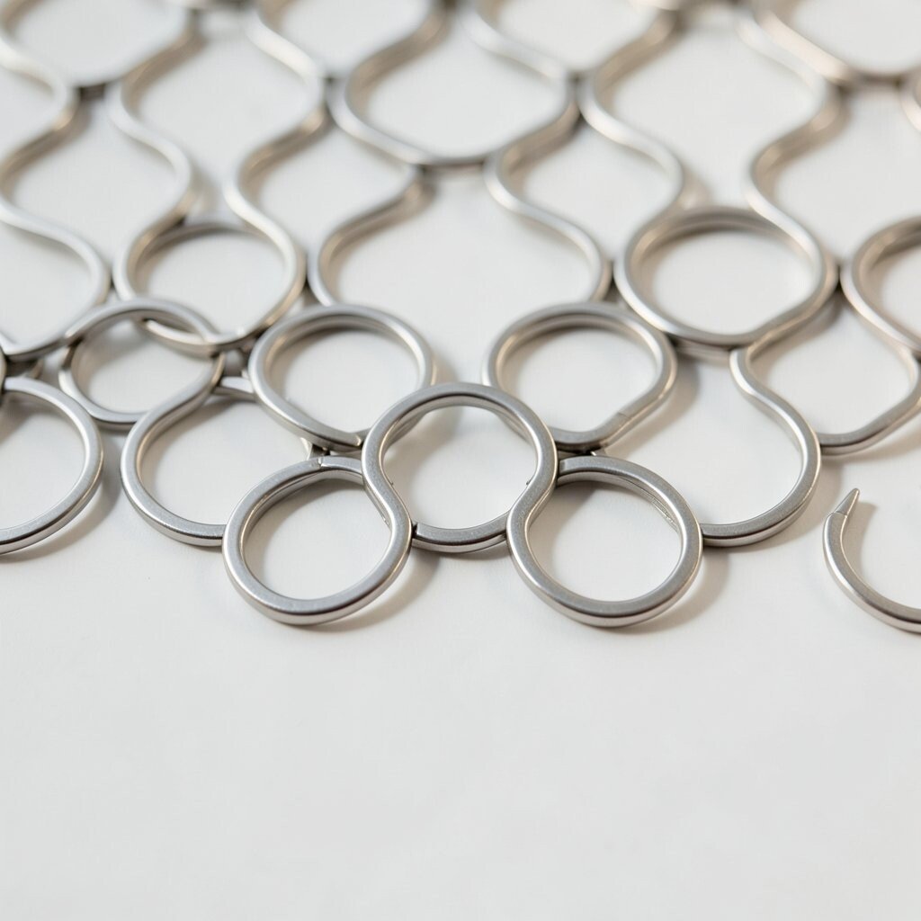
Interlocking circle links create a smooth chain effect that feels connected and balanced. The overlapping curves give the eye a soft path to follow, which can make a page feel welcoming and complete.
It is unique because it can suggest teamwork, flow, or motion without using any complex icons. That makes it a strong fit for community brands, education materials, and tech visuals that need warmth along with structure. The pattern can also stay affordable to produce, and you can make it yours with bold outlines, transparent fills, or a custom color mix that matches your message.
12. Gridline Pulse Fields
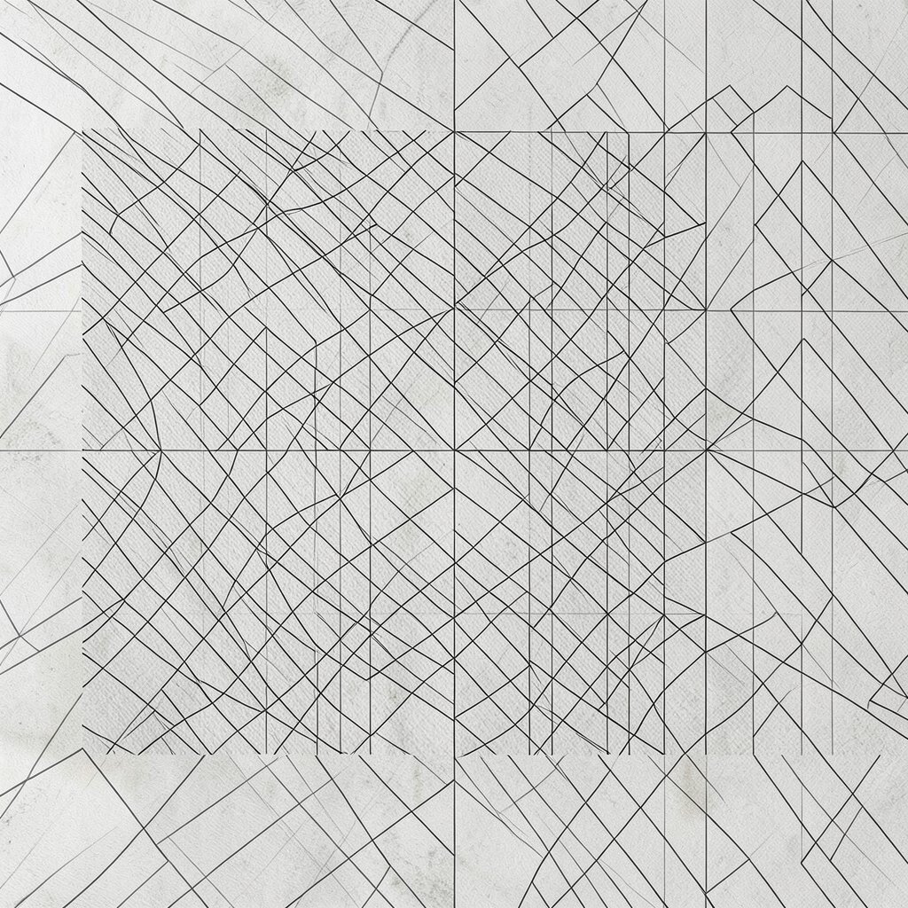
Gridline pulse fields start with a steady grid, then add pulses, bumps, or small breaks that make the surface feel alive. The result is orderly but not stiff, like a digital pulse moving under a clean skin.
This style is a good match for current interface trends because it feels technical without looking cold. It can also be built from simple repeated elements, which keeps design time and cost in check for both print and screen projects. Shift the pulse spacing to control energy, and use your own color palette to make the grid feel softer, brighter, or more brand-ready.
13. Faceted Diamond Shine

Faceted diamond shine uses many angled shapes that catch the eye like cut stone. The pattern feels bright and polished, and it works well for luxury looks, music covers, and event graphics.
Its uniqueness comes from the way light seems to move across the facets, even when the design is flat. That gives it a premium feel without always needing a high production budget, especially if you keep the shape system simple and repeat it with care. Rich jewel tones can make it dramatic, while pale metallic shades can keep it elegant and easy to pair with other visuals.
14. Curved Grid Flow
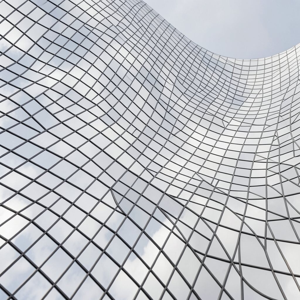
Curved grid flow takes a standard grid and bends it into soft arcs. The result feels both structured and human, which is great for brands that want to seem modern but friendly.
This pattern offers the benefit of order with a little motion, so it can guide the eye without looking harsh. It is a smart choice for websites and presentations because the curved lines can be reused in many formats, helping keep the visual system affordable and easy to update. You can make it more personal by changing the curve amount, adding subtle shadows, or pairing it with a simple icon set that matches the same mood.
15. Prism Line Echoes
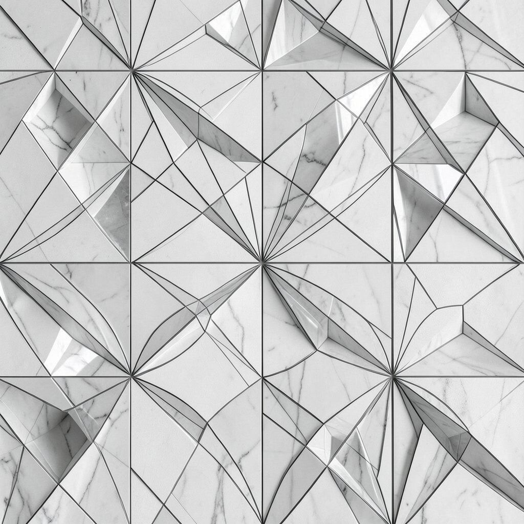
Prism line echoes use repeated outlines that seem to vibrate around a shape. The layered effect gives the pattern energy and makes even plain objects feel dramatic and fresh.
This is a strong modern look for posters, covers, and motion graphics because it suggests movement and sound. It can be built from basic lines and repeated forms, so the style stays flexible and cost-friendly for many creative jobs. Bright neon edges suit a trendy digital vibe, while softer tones create a more subtle version that still feels unique and personal.
16. Tessellated Hex Lines
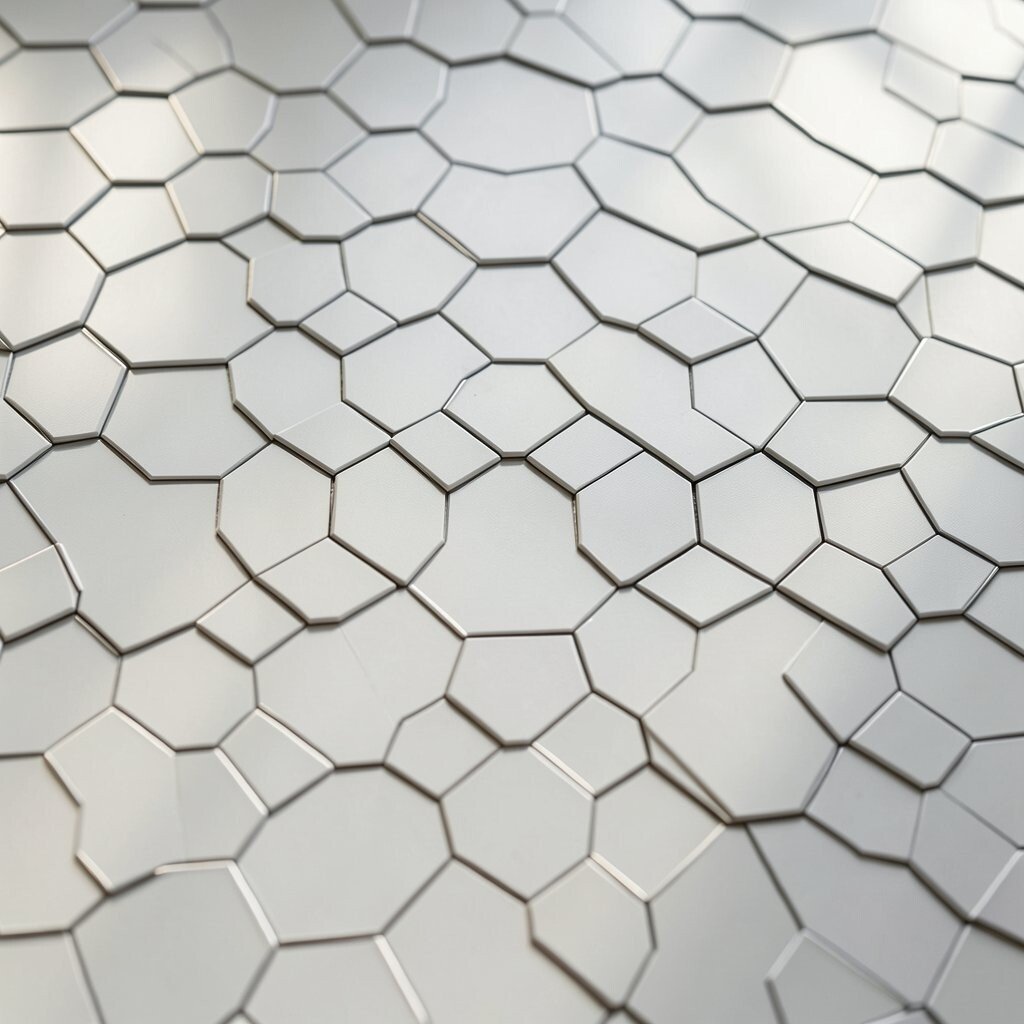
Tessellated hex lines arrange hexagons into a tight puzzle with slim borders. The pattern feels smart and tidy, and it can give a layout a strong sense of structure without becoming dull.
Its main benefit is versatility, since it can be used in backgrounds, labels, data visuals, and product wraps. The pattern is also easy to adapt at a lower cost because one base shape can be repeated and recolored many times. To make it stand out, try mixing thick and thin outlines or adding small color shifts inside a few cells so the whole design feels more custom and less mechanical.
17. Blended Geo Gradient Fields
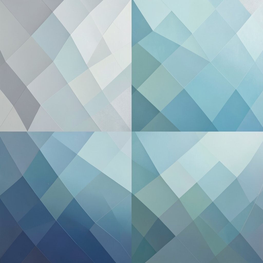
Blended geo gradient fields mix simple geometry with soft color fades, creating a look that feels smooth and modern. Squares, circles, and triangles can sit inside glowing color zones, and that mix gives the pattern a bold but friendly presence.
This style is especially useful when you want something current that can fit many uses, from web headers to packaging sleeves. It often gives strong value because the shapes stay simple while the gradients add depth, so the final result can feel rich without a large production cost. Try gentle sunrise colors for warmth or cool electric tones for a sharper feel, and adjust the shape placement so the pattern reflects your own taste and brand voice.