Neutral rooms can feel calm without feeling plain. Small color shifts can make a home look softer, warmer, and more lived in.
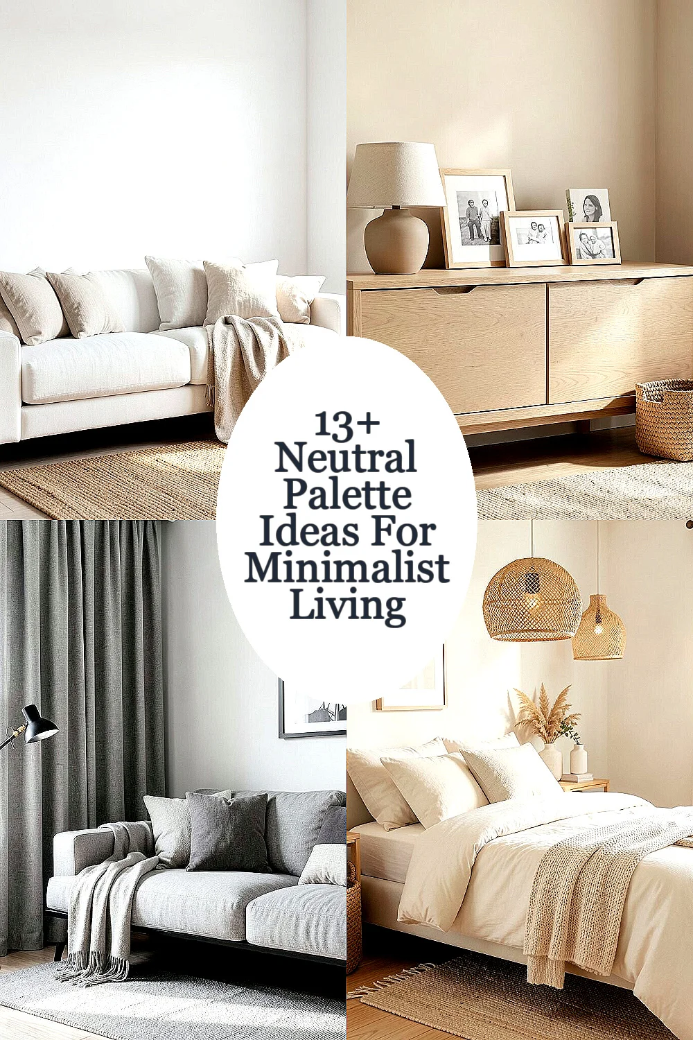
1. Soft White Walls With Sand Accents
Soft white walls create a bright, open look that feels clean and quiet. Sand accents add warmth, so the room does not feel cold or empty.
This mix works well in small rooms because it reflects light and makes the space feel bigger. Try linen pillows, a jute rug, or a pale tan throw to bring in texture without adding clutter. It is also a budget-friendly choice because white paint and natural fiber pieces can be found at many price points.
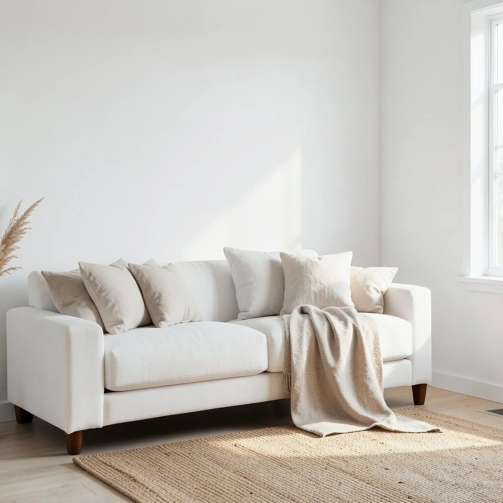
2. Warm Beige With Light Oak Furniture
Warm beige gives a room a gentle glow that feels cozy right away. Light oak furniture adds a fresh wood tone that keeps the space looking simple and modern.
This style fits current minimal trends because natural wood is still very popular. You can make it personal with framed family photos, a beige ceramic lamp, or a woven basket for storage. If you want to save money, start with one oak piece and build the rest of the room slowly.
The beauty of this palette is how easy it is to live with every day. It hides small marks better than bright white and still feels neat and calm.
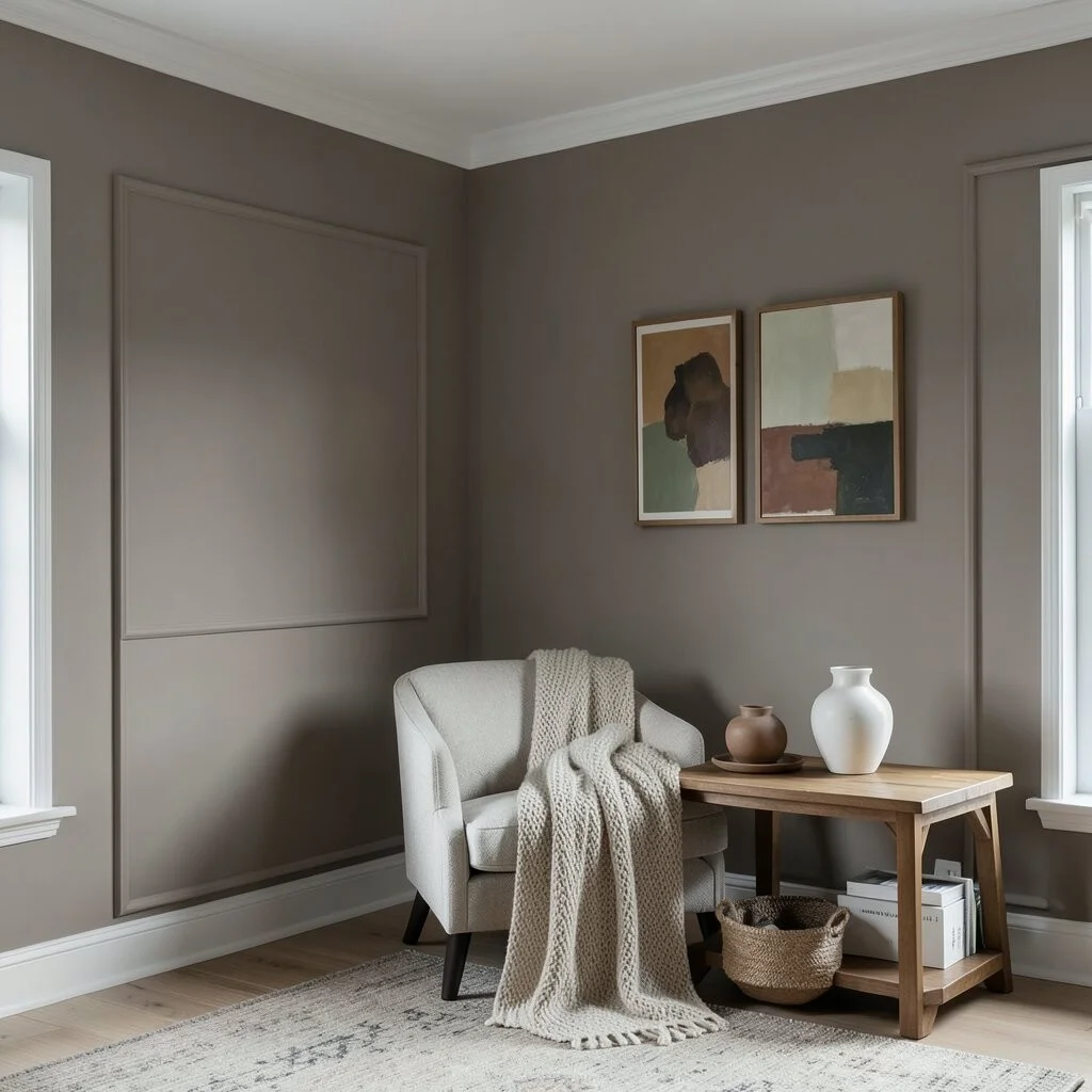
3. Greige Layers With Black Details
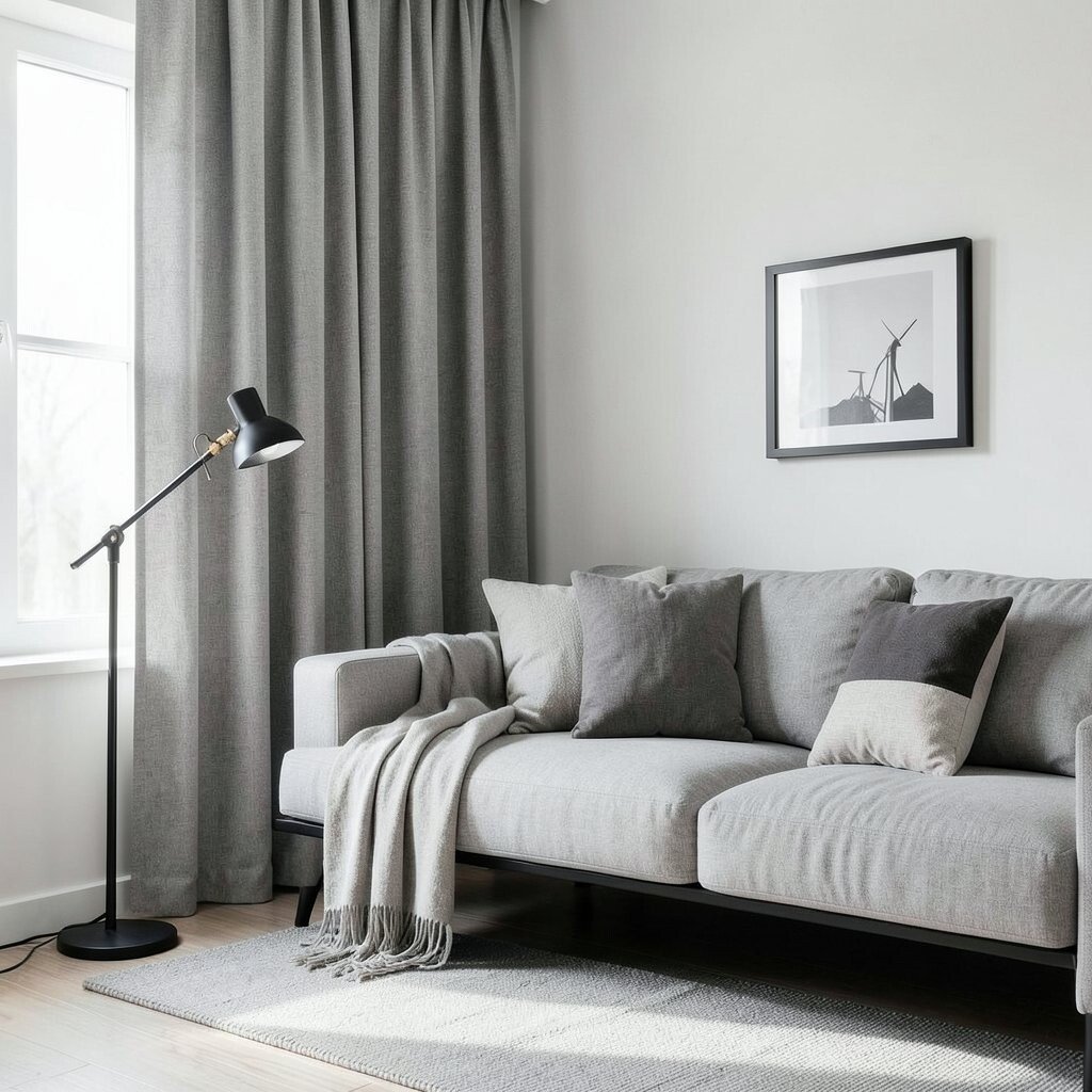
Greige is a blend of gray and beige, and it gives a balanced look that feels soft but not dull. Black details add a crisp edge that helps the room feel sharp and stylish.
This palette is great for people who want a modern look without strong color. Use black in small ways, like a lamp base, picture frame, or chair legs, so the room stays gentle. Layer in greige curtains, pillows, and a sofa to keep the space relaxed and easy on the eyes.
One nice benefit is that greige works with many other shades, so it is easy to update later. If your taste changes, you can swap the black accents for brass or wood and keep the same base.
4. Cream Tones With Woven Textures
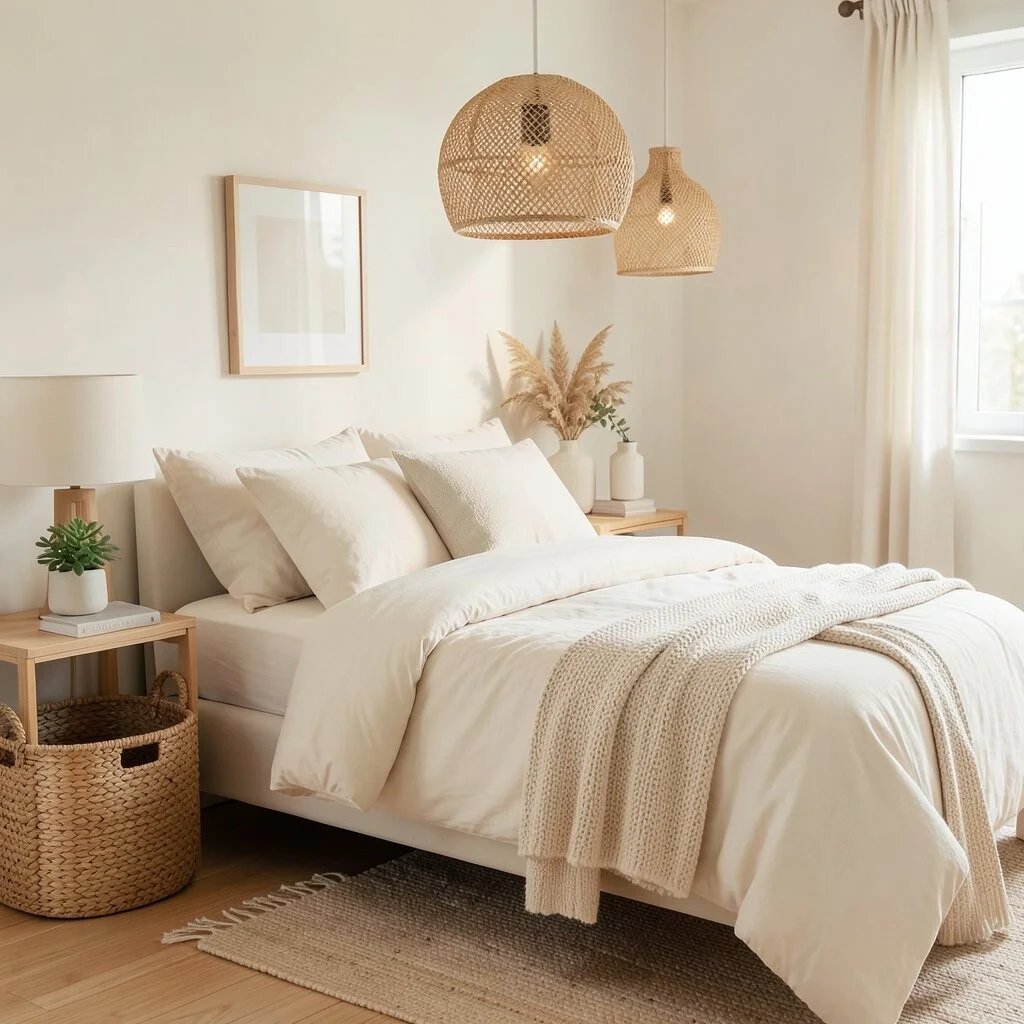
Cream tones bring a soft and cozy feel that looks elegant in a simple way. Woven textures, like rattan, cane, or basket weave, add life and make the room feel less flat.
This idea is perfect for bedrooms and reading corners because it feels peaceful. A cream duvet, a woven pendant light, and a few natural baskets can create a lovely layered look. It is also a smart choice for renters since many woven pieces are light, easy to move, and not too costly.
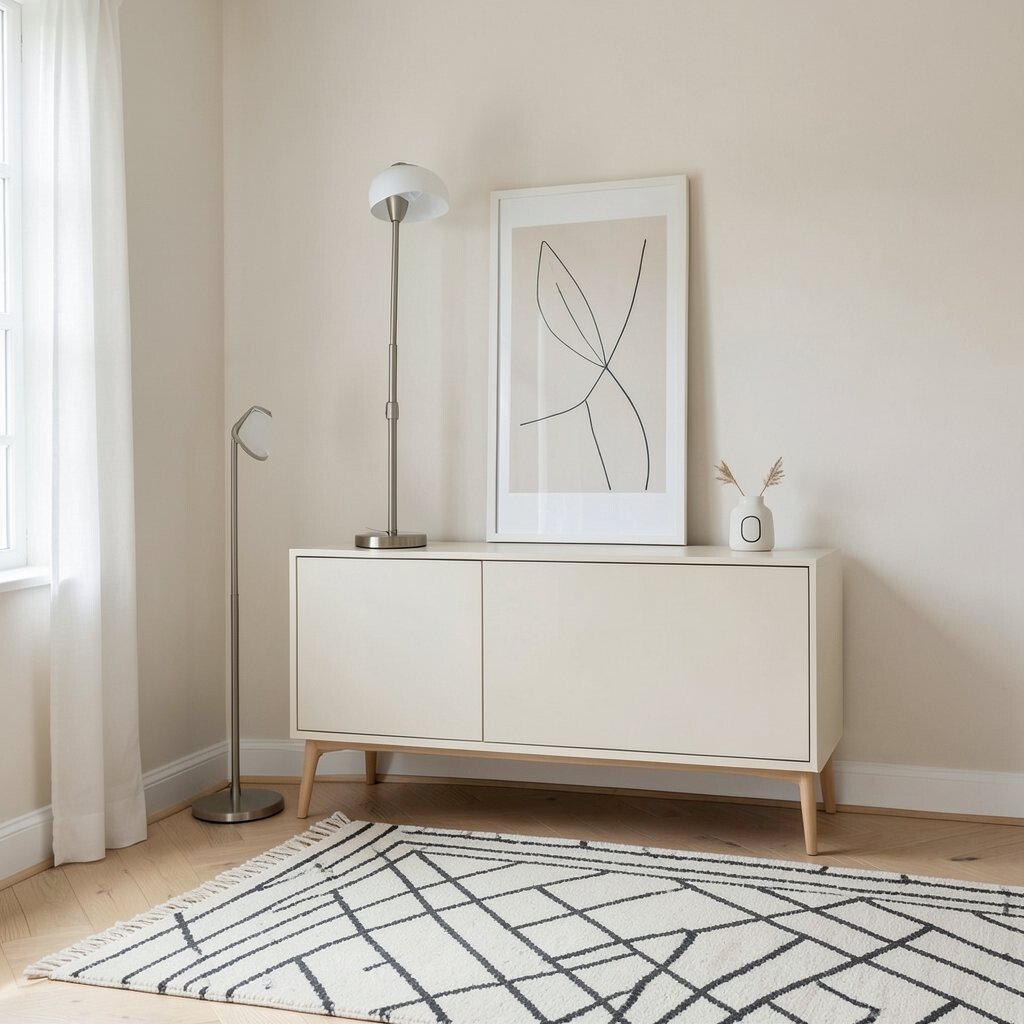
5. Stone Gray With Pale Wood
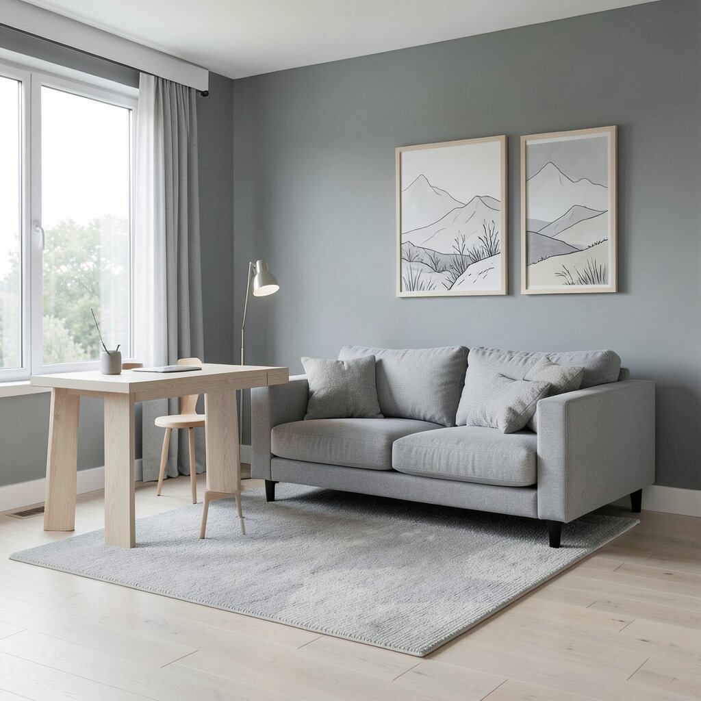
Stone gray has a cool, smooth look that feels calm and tidy. Pale wood softens it, giving the room a friendly feel instead of a stiff one.
This palette works well in living rooms and home offices because it looks neat and focused. Add a pale wood desk, a gray sofa, and a soft rug to keep the room balanced. If you want a more personal touch, use artwork with hand-drawn lines or soft landscape prints.
Many people like this look because it feels current without trying too hard. It can also be done on a smaller budget if you choose gray textiles and one or two wood pieces instead of a full furniture set.
6. Taupe Walls With Soft White Trim
Taupe walls give a room a rich, earthy feel that still stays calm. Soft white trim outlines the space and makes the walls look neat and polished.
This pairing is unique because it feels warmer than gray but more grounded than beige. You can add cozy touches like knit blankets, matte pottery, or a simple white vase to make the space feel complete. A good tip is to test the taupe in both daylight and evening light, since it can change a lot during the day.
For a personal touch, hang art with warm browns or muted greens. That small shift can make the whole room feel more like your own.
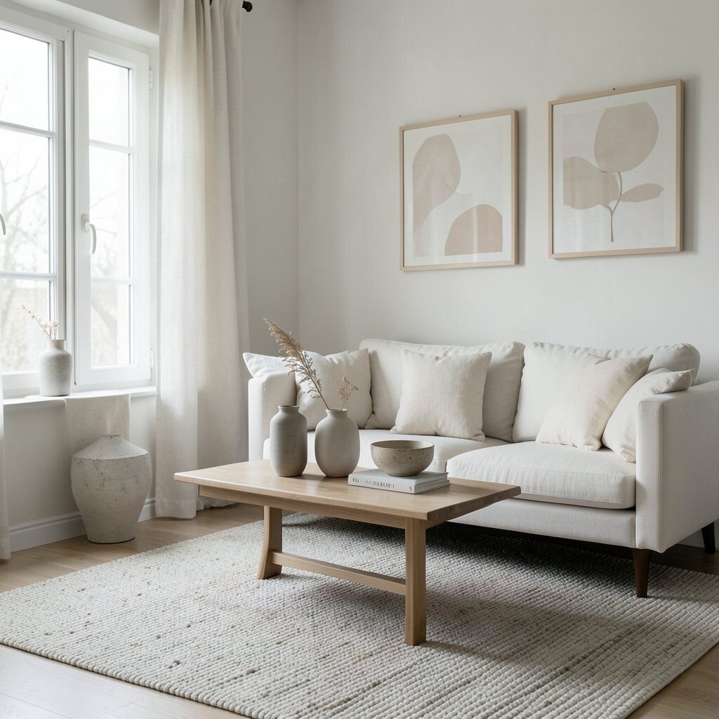
7. Chalky White With Natural Linen
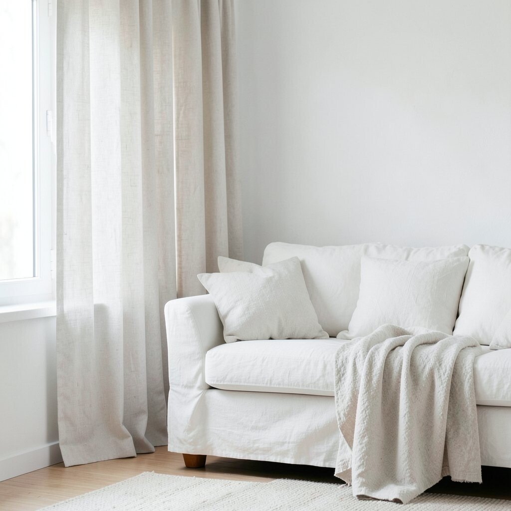
Chalky white has a soft, almost powdery look that feels gentle and clean. Natural linen brings in a relaxed texture that keeps the room from looking too perfect.
This palette is a favorite in minimalist homes because it feels airy and fresh. Use linen curtains, slipcovers, or pillow covers to add movement and softness. If you want to keep costs low, linen-blend fabrics can give a similar look for less money.
The charm of this style is in its quiet details. Slight wrinkles in the fabric and simple shapes help the room feel honest and lived in.
8. Mushroom Beige With Warm Metal Touches
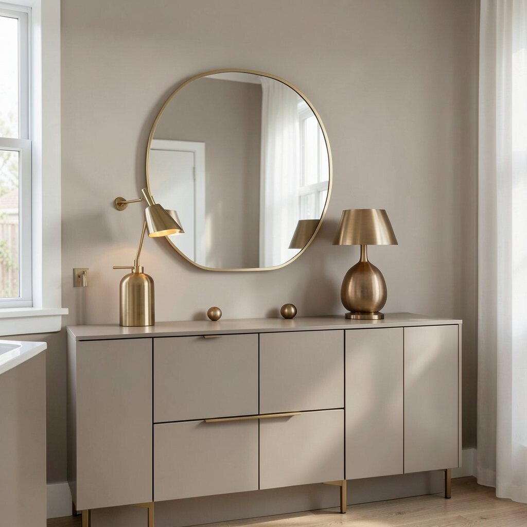
Mushroom beige is a soft brown-gray shade that feels modern and grounded. Warm metal touches, like brass or bronze, add a little shine without making the room feel busy.
This palette is great for kitchens, dining rooms, and entryways where you want a welcoming look. Try a brass mirror, a bronze lamp, or warm metal cabinet pulls to lift the space. If you are watching your budget, even one shiny accent can make the room feel more finished.
It also fits today’s trend toward calm luxury, where simple rooms still feel special. The key is to keep the metal details small so the neutral colors stay in charge.
9. Pale Gray With Soft Taupe Layers
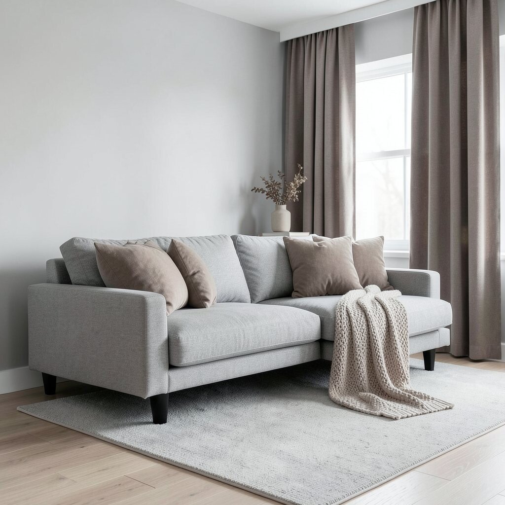
Pale gray gives a room a cool, clean base that feels neat and open. Soft taupe layers warm it up and help the space feel more human and less strict.
This mix is useful if you like a calm look but want a little more depth. Try a gray sofa with taupe pillows, or taupe curtains with a pale gray rug. You can personalize it with books, ceramics, or a favorite knit blanket in a similar soft tone.
It is also easy to refresh over time because both shades work with many styles. That makes it a smart choice for people who want a long-lasting room without having to repaint often.
10. Linen White With Soft Brown Wood
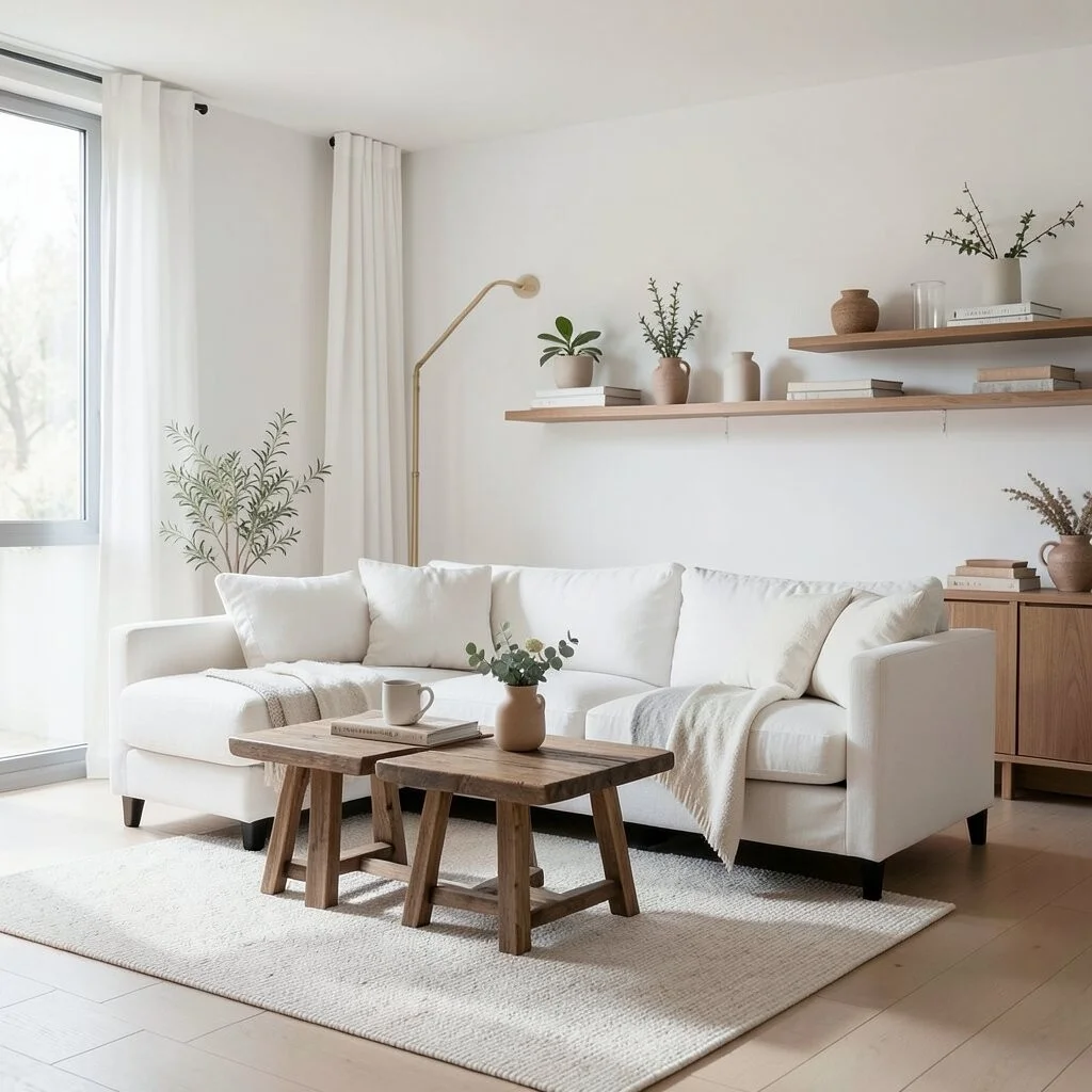
Linen white feels bright, airy, and gentle on the eyes. Soft brown wood adds a natural anchor that makes the room feel steady and warm.
This palette is lovely in open-plan homes because it helps each area feel calm and connected. Use a white sofa, brown wood tables, and simple shelves to keep the look balanced. A few handmade pieces can make it feel more personal and less like a showroom.
Cost can stay manageable if you focus on simple shapes and natural finishes. Thrift stores often have wood furniture that only needs a light cleaning or fresh hardware.
11. Dusty Stone With Off-White Decor
Dusty stone has a soft gray-beige look that feels soothing and slightly moody. Off-white decor keeps the room bright enough so it does not feel heavy.
This palette stands out because it has more depth than plain beige or white. It works well with textured rugs, matte ceramic vases, and simple art in soft shades. To make it feel personal, add one or two items with meaning, like a travel photo or a handmade bowl.
Many minimalist homes use this kind of soft contrast now because it feels calm but not flat. The look is easy to build piece by piece, which helps when you want to spread out spending.
12. Ecru With Soft Charcoal Lines
Ecru has a warm, creamy look that feels gentle and classic. Soft charcoal lines give the palette shape and keep it from drifting too far into plainness.
This idea is especially nice for bedrooms and hallways where you want quiet style. You can use charcoal in a rug pattern, a slim lamp, or a simple framed print. A great tip is to keep the lines thin and light so the room still feels open.
The mix feels unique because it has both softness and structure. That balance makes it easy to live with and easy to update later if your taste changes.
13. Pale Mushroom With Cozy Layering
Pale mushroom is a gentle neutral that sits between gray, beige, and brown. Cozy layering adds depth with blankets, cushions, rugs, and curtains in close shades.
This palette feels rich without being loud, which is perfect for a minimalist home that still wants warmth. Mix matte finishes with soft fabrics so the room feels touched and comfortable. If you enjoy seasonal changes, you can switch light layers for heavier ones in cooler months without changing the whole room.
It is also one of the easiest looks to personalize because the base is so flexible. Add a favorite reading chair, a simple plant, or a handmade pillow to give the room your own story.
14. Ivory With Quiet Green-Taupe Notes
Ivory keeps the room bright and calm, while green-taupe notes add a soft hint of nature. The result feels fresh, restful, and a little more alive than a plain neutral room.
This palette is a smart pick for people who want color, but only in a very gentle way. Use it in plants, pottery, artwork, or a painted accent shelf so the room stays subtle. It can also be a good low-cost update because small decor items are enough to shift the mood.
Right now, many minimalist spaces are leaning toward earthy neutrals with quiet hints of green. That makes this palette feel current while still staying simple and easy to enjoy every day.