Bright color can change the whole mood of a dining room. It can make a meal feel lively before the first bite.
Bold shades are not just for looks. They can help a place feel memorable, cheerful, and full of energy.
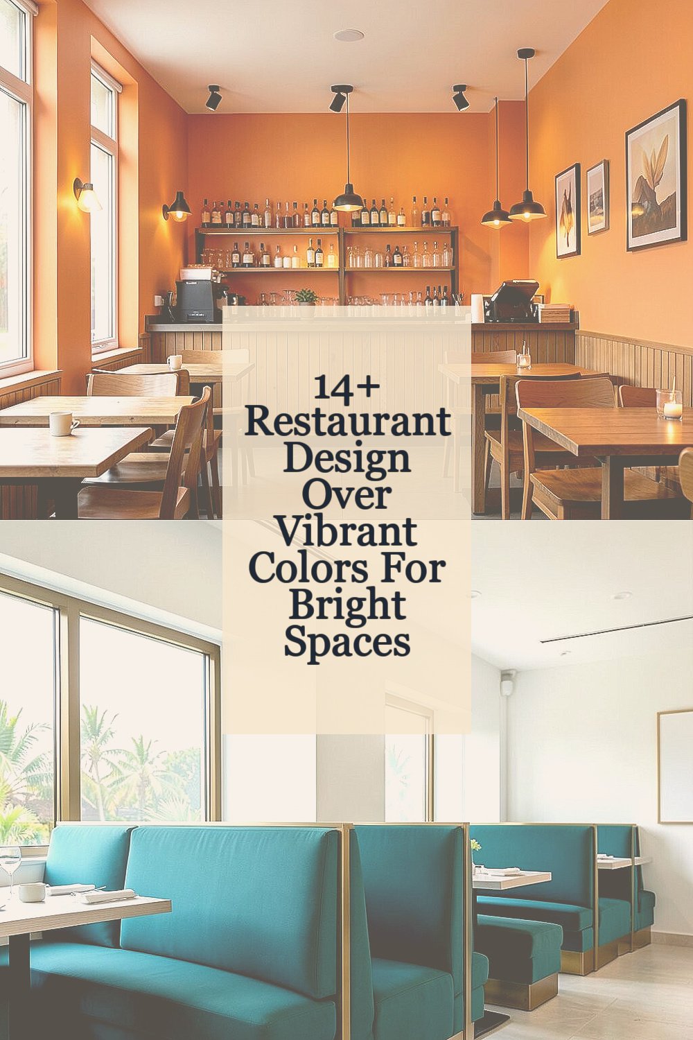
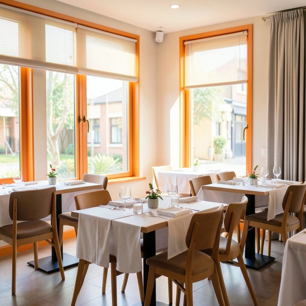
1. Sunset Orange Accent Walls
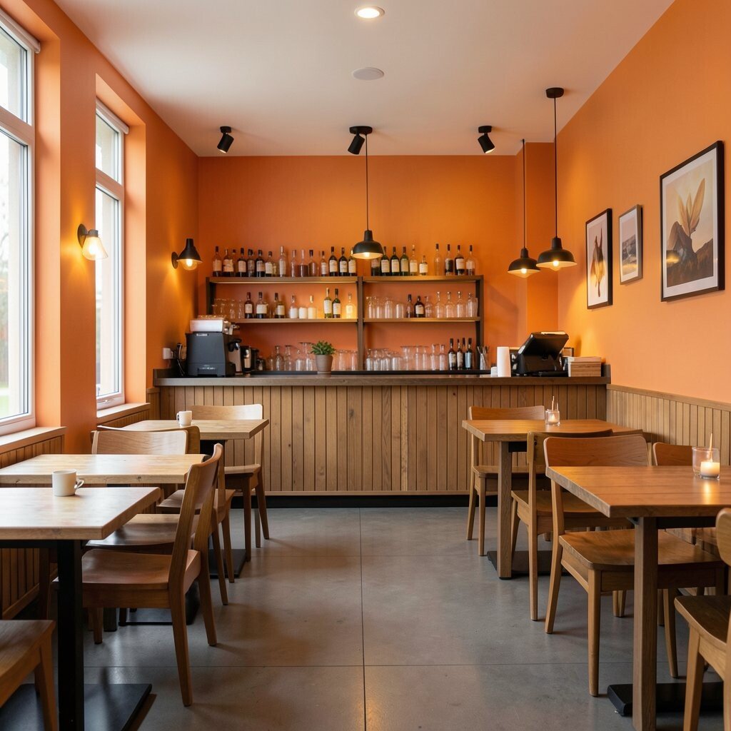
Sunset orange brings a warm glow that feels friendly right away. It can make a room feel active without being too loud.
This color works well behind a bar, near a host stand, or along one main wall. Pair it with wood tables and soft lights for a cozy look, and add simple art so the space does not feel crowded.
2. Tropical Teal Booth Seating
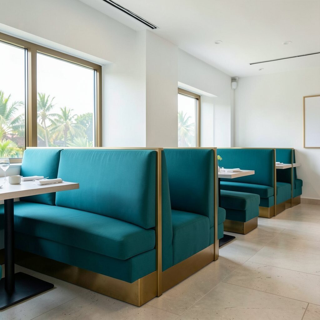
Teal booth seats add a fresh splash of color that feels cool and calm. The shade stands out in photos and gives the dining room a modern edge.
It fits well with brass trim, white walls, or light stone floors. For a custom touch, use teal only on booths and keep the rest of the room simple, which can help control cost while still looking polished.
Many owners like teal because it hides small marks better than very light colors. It also matches current trends that mix bold color with clean shapes and easy-to-clean materials.
3. Lemon Yellow Ceiling Pops
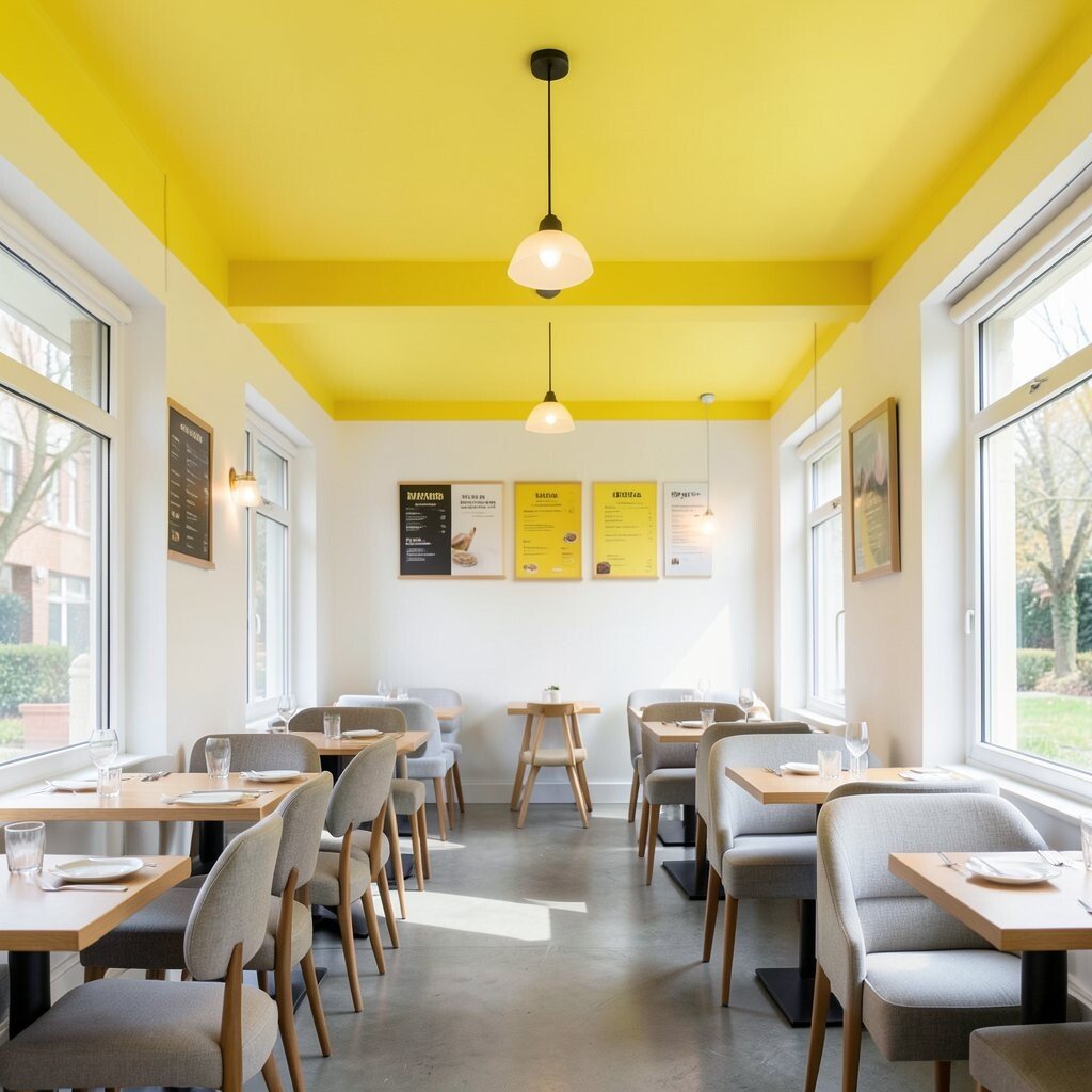
A yellow ceiling can make a space feel sunny even on a gray day. It draws the eye up and gives the room a playful spark.
This idea works best in rooms with good natural light or bright lamps. Try using yellow on the ceiling beams or trim if a full ceiling feels too strong, and keep chairs in neutral shades for balance.
The look can feel cheerful for breakfast spots, cafes, and family diners. It is also a smart way to add color without taking up wall space, which can help lower the cost of repainting large surfaces.
Small touches like matching menu boards or light fixtures can tie the design together. That makes the room feel planned, not random.
4. Coral Bar Fronts
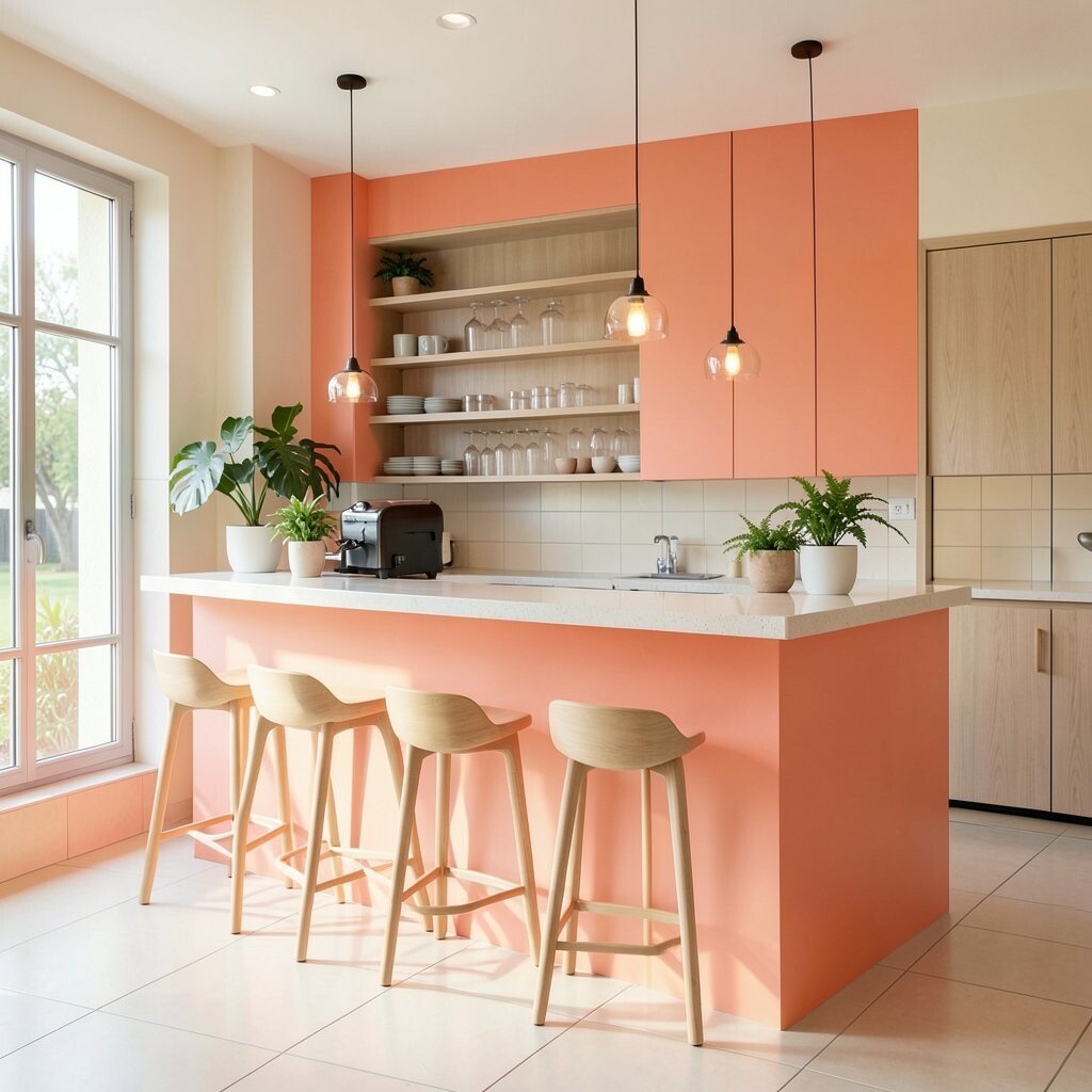
Coral gives a soft but lively look that feels warm and modern at the same time. It can make the bar area feel like the heart of the restaurant.
Use it on the front of the bar, on stools, or on a small feature wall. Add pale wood, cream tile, and a few green plants to keep the space fresh and easy on the eyes.
5. Electric Blue Tile Details
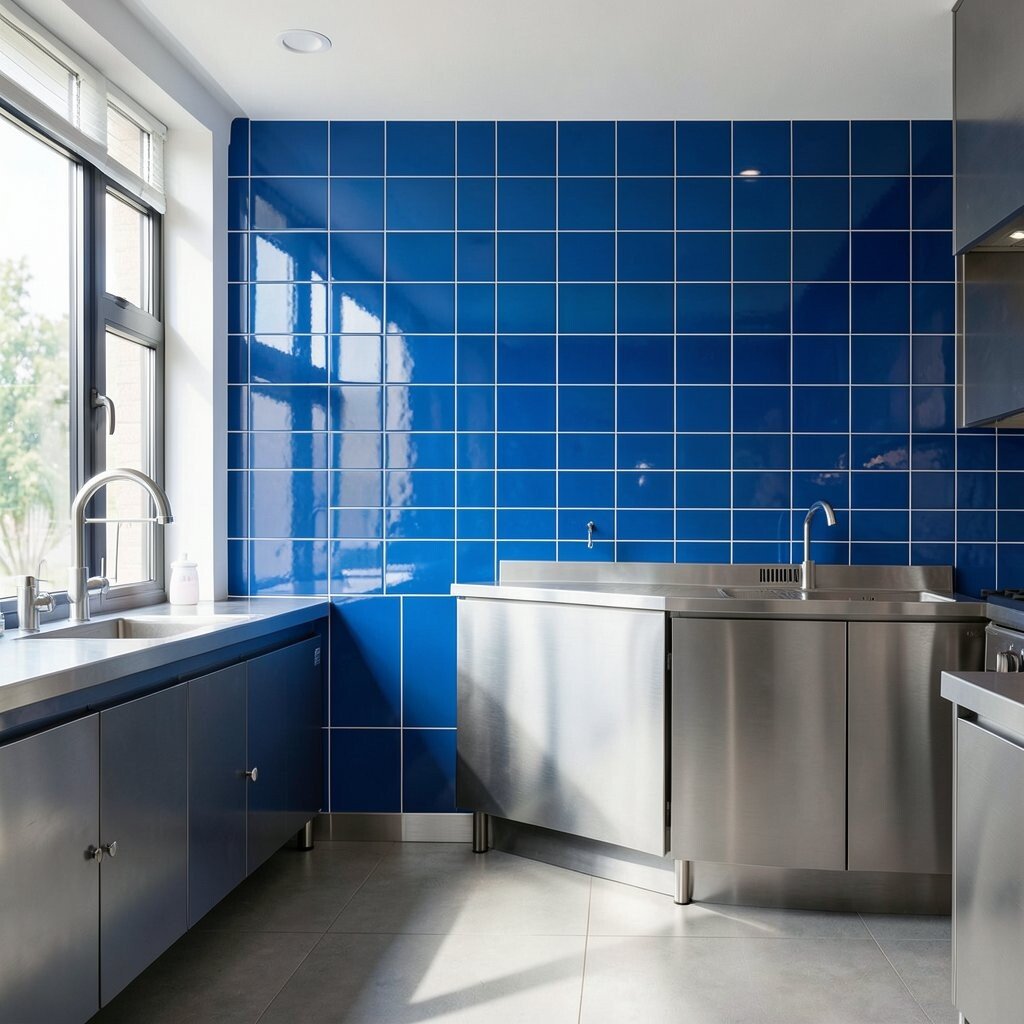
Electric blue tile can turn a plain wall into a bold focal point. The shine of tile also helps reflect light, which can make a room feel brighter.
This style works well in open kitchens, drink stations, and wash areas. For a custom feel, mix blue tile with simple grout lines and smooth metal finishes, and use the color in only one area if the budget is tight.
Blue tile is a strong choice for places that want a clean and modern feel. It also fits the trend of using one strong color as a statement instead of filling the whole room with many shades.
6. Lime Green Plant Corners
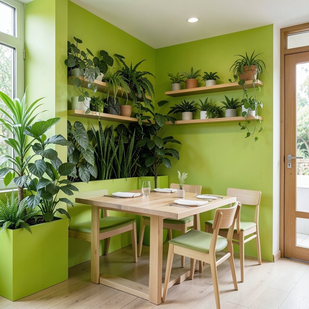
Lime green can feel fresh, lively, and a little unexpected. It looks even better when paired with real plants and natural wood.
Create a plant corner with green planters, leafy walls, or painted shelves. This can soften hard surfaces and make the dining room feel more relaxed for guests.
Using plants can also be a lower-cost way to add color because the greenery does part of the work. If you want a unique look, mix bright planters with simple seating so the eye stays on the living color.
Many modern restaurants use green to signal freshness and care. That can help support a healthy food story without saying a word.
7. Fuchsia Light Fixtures
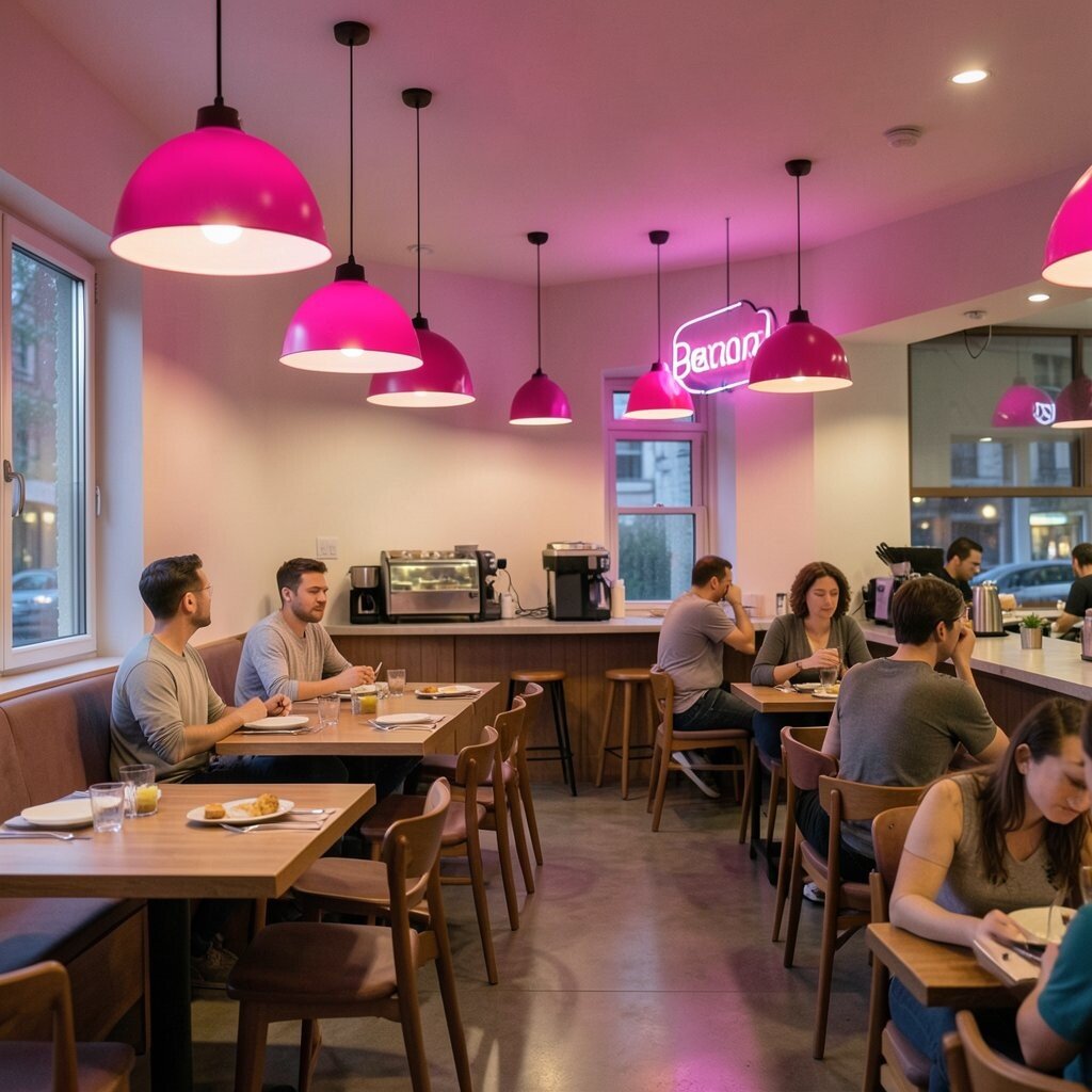
Fuchsia lights add a fun burst of color above tables and counters. They can make the room feel lively, especially at night.
Try pendant lights, lamp shades, or neon-style signs in this rich pink tone. Keep walls light or neutral so the fixtures stand out, and use dimmers to control the mood during busy and quiet hours.
Custom lighting can be a smart way to add personality without changing the whole room. It may cost less than full wall work, and it is easy to update later if your style changes.
This look works well for dessert spots, brunch cafes, and trendy bistros. It gives guests a photo-friendly moment they will want to share.
8. Red and White Patterned Floors
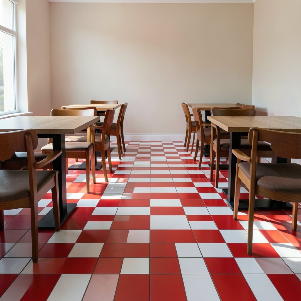
Red and white floors bring strong energy to a dining room. The pattern can make the space feel classic, bold, and full of motion.
Checkerboard tile or striped vinyl can create a neat look that is easy to notice. Balance the floor with simple tables and plain walls so the design does not feel too busy.
Floor patterns can be a smart choice because they are both decorative and practical. They may hide wear better than flat light flooring, which can help with long-term costs.
For a personal touch, choose a pattern that matches your brand colors or menu style. A playful floor can help guests remember the place long after they leave.
9. Purple Velvet Banquettes
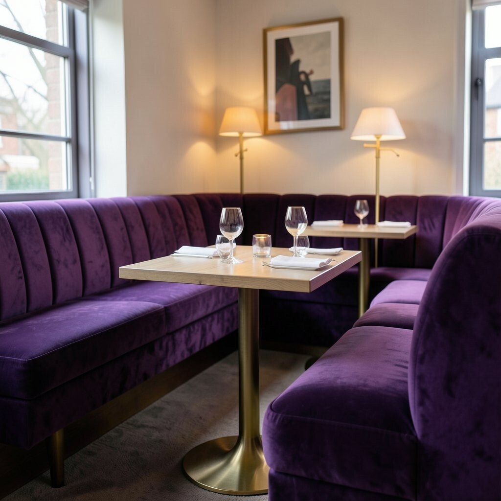
Purple velvet banquettes add a rich, soft feel that looks fancy but still welcoming. The texture makes the seating feel special and comfortable.
This choice works well in dining rooms that want a little drama. Pair it with gold table legs, warm lamps, and simple art to keep the room elegant, and use stain-resistant fabric to make upkeep easier.
Velvet can raise the cost a bit, but it often pays off in style and comfort. It also fits the current love for plush materials that make restaurants feel more like lounges.
If you want a more personal look, pick a deeper plum or a brighter violet shade. Either one can help the seating become a strong part of the brand story.
10. Multicolor Mural Walls
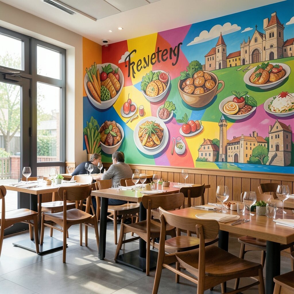
A mural can turn a blank wall into a big piece of art. Bright shapes, food scenes, or local landmarks can give the room its own voice.
Murals work best in spots guests can see right away, like near the entrance or behind the main dining area. They can also help with social media photos, which is a nice bonus for marketing.
Hiring an artist may cost more than paint alone, but the result can feel one of a kind. If the budget is smaller, use a printed mural or a simple hand-painted design with just a few bold colors.
Personal touches make murals even better, such as adding the restaurant name, a favorite dish, or a local theme. That helps the space feel made just for that place.
11. Bright Pink Countertops
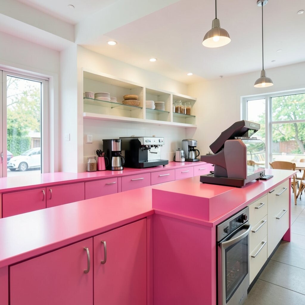
Bright pink countertops bring a cheerful pop that feels fresh and modern. They can make a service area stand out in a big way.
This color works well in cafes, dessert bars, and fast-casual spots. Combine it with white shelves and silver hardware for a clean look, and choose durable surface materials so the color stays strong over time.
Pink counters can be a smart branding tool because they are easy to remember. They also fit the trend of playful interiors that feel warm instead of cold and plain.
If a full pink counter seems too bold, try a pink service ledge or cashier stand first. That gives you a colorful focal point without a huge commitment.
12. Tangerine Window Frames
Tangerine window frames add a sunny edge around natural light. They can make the whole room feel brighter by guiding the eye to the outside view.
Use this idea in front windows, patio doors, or even interior glass panels. Match the frames with simple blinds, light curtains, or pale walls so the orange tone can shine.
This design can be more affordable than changing many large surfaces because it uses a smaller area. It also gives the restaurant a clear signature look that people notice from the street.
For a custom feel, repeat the same shade on chair legs, signs, or napkin holders. Small repeats help the color feel planned and stylish.
13. Aqua Open Shelving
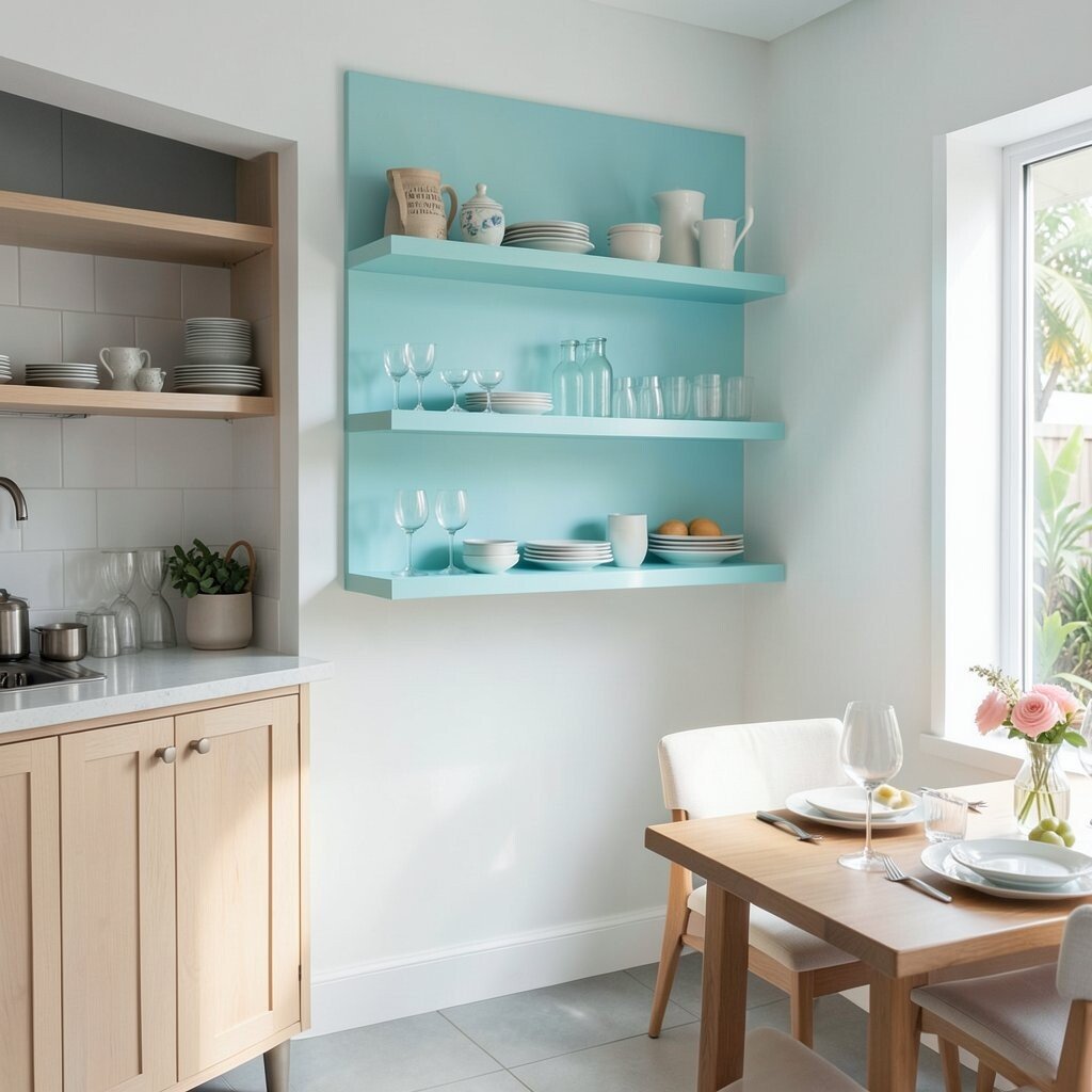
Aqua shelving adds a fresh, clean look that feels open and airy. It works well for showing dishes, glassware, or small decor items.
Painted shelves can brighten a wall without taking over the room. Place them near the service area or along a side wall, and style them with a few matching dishes so the display stays neat.
This choice can be cost friendly because shelving can serve both storage and design. It is also easy to refresh later with a new coat of paint if the brand style changes.
Aqua feels current because it blends well with beachy, modern, and casual restaurant styles. It gives the room a calm but colorful mood.
14. Goldenrod Booth Piping
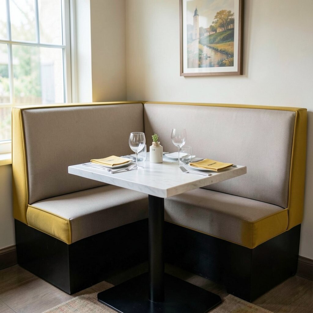
Goldenrod piping adds a small but powerful color touch to booth edges and seat seams. It gives the furniture a custom finish that feels thoughtful.
This detail works especially well when the rest of the booth is a neutral tone. Pair it with matching napkins, menu accents, or wall art to make the color feel connected, and use it to brighten older seating without replacing everything.
Small design details like piping can be a lower-cost way to update a dining room. They may not shout for attention, but they make the whole space feel more polished.
Goldenrod also fits well with retro and mid-century looks that are popular right now. It brings warmth while still feeling clean and simple.
15. Rainbow Entry Nooks
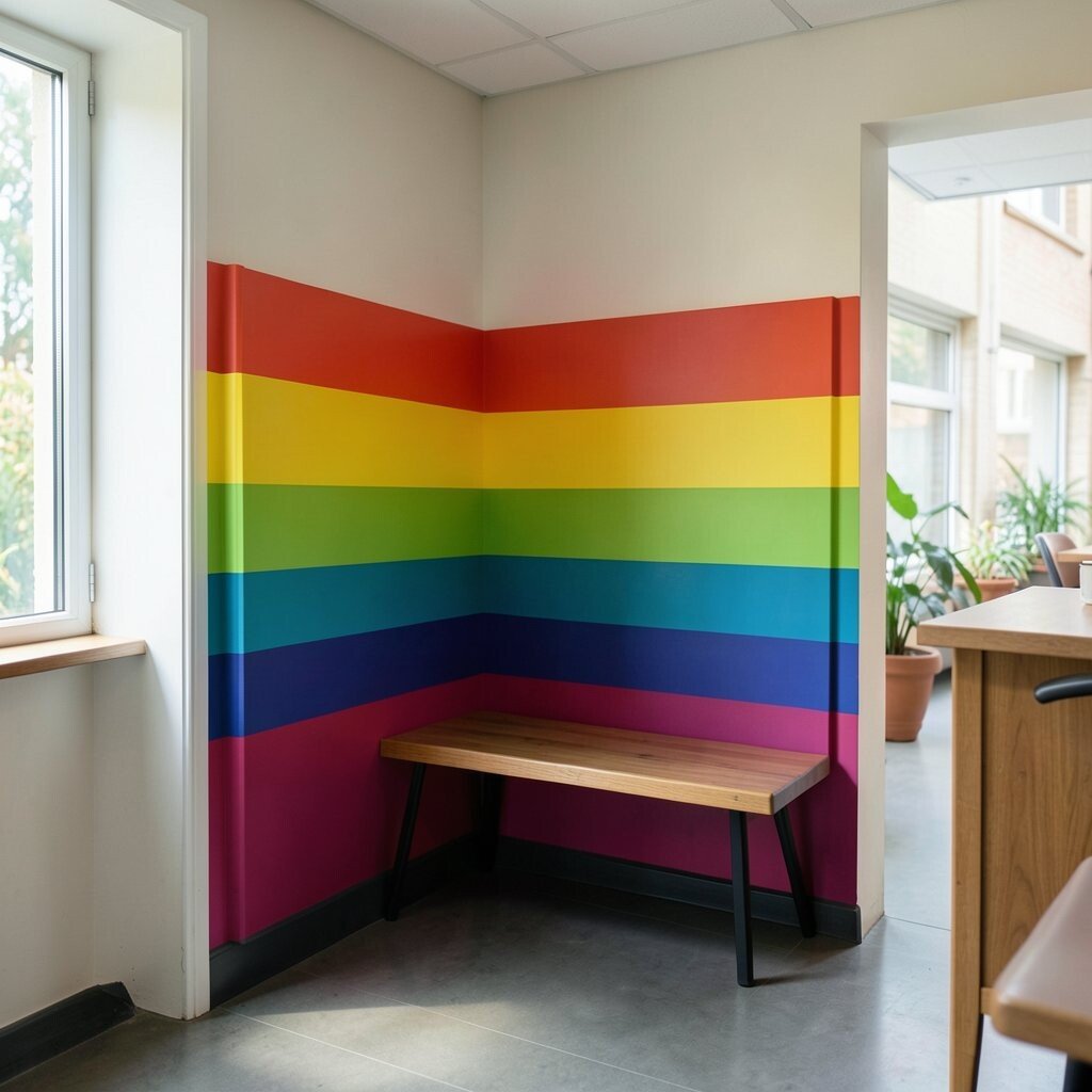
A rainbow entry nook makes the first step into the restaurant feel exciting. Bright color bands or blocks can create a happy welcome before guests even sit down.
Use this idea in a small entry wall, waiting bench area, or check-in corner. Keep the rest of the room calmer so the nook can do the talking, and choose washable paint or panels for easy care.
This can be a fun way to show a playful brand personality. It also gives guests a spot that feels great for photos and first impressions.
If you want to keep costs in check, use rainbow color only in a small zone instead of the whole room. That still gives a strong visual punch and keeps the design easy to manage.