Step into the vibrant world of bulletin boards where creativity meets inspiration. Imagine transforming a simple board into a masterpiece that captivates every passerby. These captivating tips reveal the secrets to avoiding common pitfalls in design.
1. Overcrowding the Space
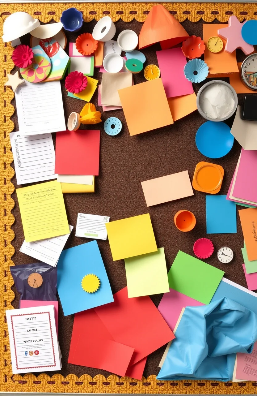
Imagine a bulletin board so full it overwhelms the eyes! Giving each element room to breathe helps keep everything clear and easy to understand.
Spacing makes your board look neat and lets each piece stand out. Think of it like arranging flowers in a vase—each one needs its own space to shine.
Try using contrasting colors to make important information pop. It’s amazing how a little space can make everything look so much better!
And don’t worry, you can keep costs low by reusing materials in creative ways. Your board will look polished and professional!
2. Ignoring a Theme
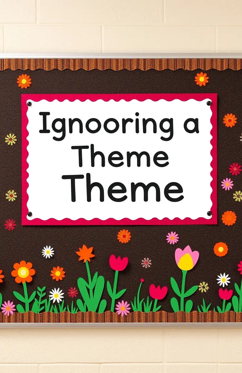
Sometimes, it’s tempting to throw everything onto the board. But having a theme makes everything connect beautifully.
A theme creates a story that everyone can follow. It’s like your favorite book, where each chapter adds to the adventure!
Consider using seasonal themes or school subjects for inspiration. This way, you can change it up and keep people guessing what comes next!
The best part? Themes don’t need to be expensive. Simple paper cutouts and color schemes can work wonders!
3. Using Dull Colors
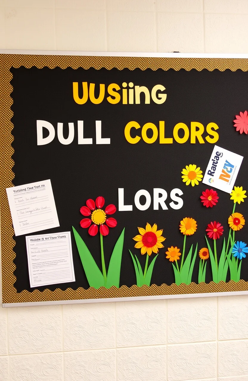
Colors can change the mood of your bulletin board in an instant. Bright colors grab attention and make everything look lively.
Imagine a board filled with gray and brown—it might make you sleepy! But add a splash of red or blue, and everything feels alive!
Try mixing and matching colors that you love. It’s like picking out your favorite outfit, and it shows off your style!
And guess what? You can find colorful materials at dollar stores, making it easy to stay on budget!
4. Forgetting to Update
Keeping your board fresh is key to keeping everyone interested. No one likes to see old, outdated information.
Updating regularly shows that you care and are engaged. Plus, it gives everyone a reason to keep checking back!
Set reminders to change up your board monthly or with each new event. It’s a great way to keep the excitement alive!
Updates don’t need to be costly—use what you have and add new touches as needed!
5. Not Using Layers
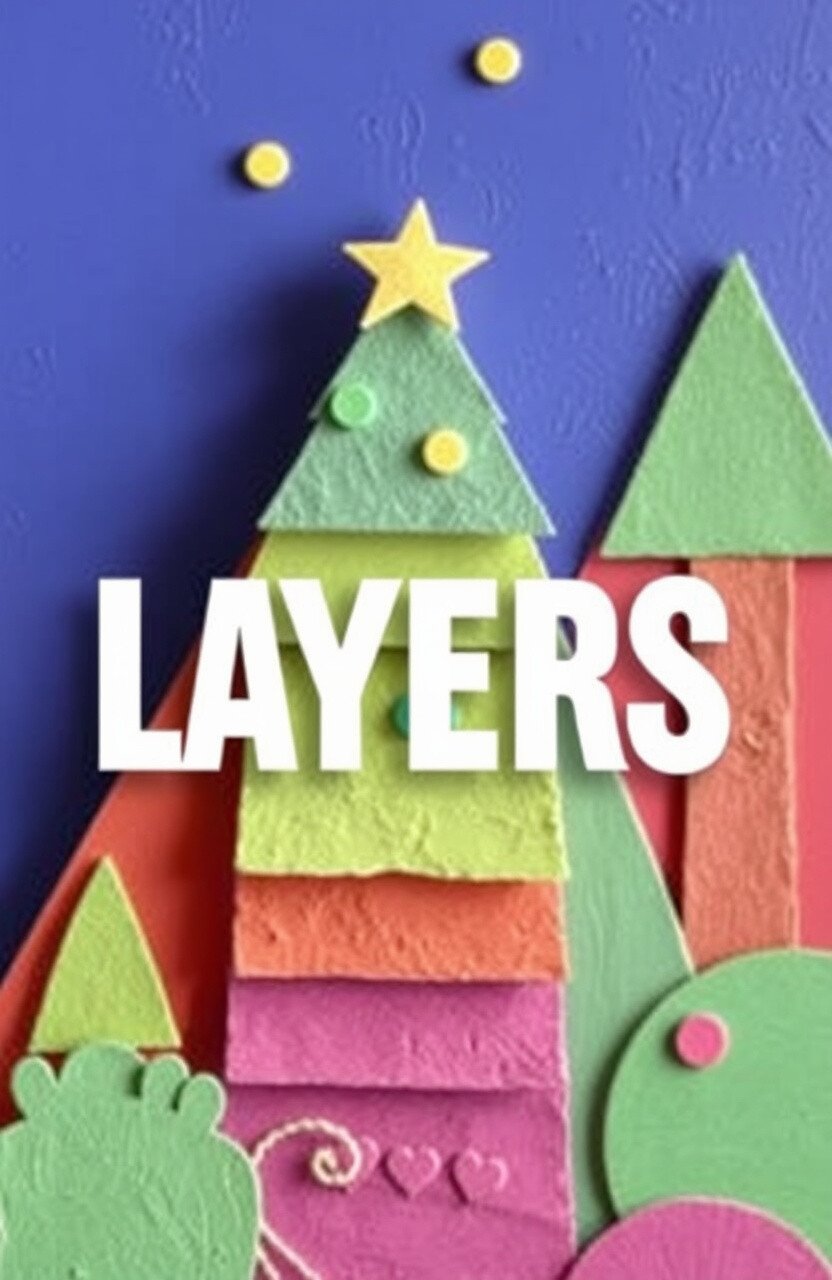
Flat boards can look boring, but adding layers makes everything pop! It’s like adding toppings to your favorite sundae.
Layers create depth and make your board feel more interactive. People will love getting close to see each detail!
Try using foam tape or cardboard to lift elements off the board. This simple technique can make a huge difference!
You can find these materials affordably at craft stores, making it a fun, low-cost project!
6. Overusing Text
Too much text can make a board hard to read. Keep it short and sweet for maximum impact.
Imagine trying to read a wall of text—it’s tiring! Instead, use bullet points or short phrases to get your message across.
Consider using fonts that are easy to read from a distance. Your audience will thank you for it!
This approach also saves on printing costs, as you can fit more on a single page!
7. Neglecting the Borders
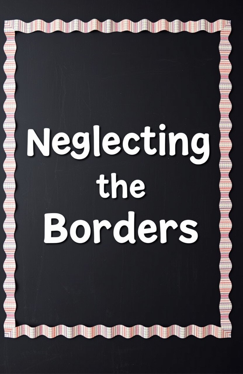
Borders can frame your board and make everything look complete. It’s like the icing on a cake!
Without a border, a board can feel unfinished. Adding one gives it a polished look that stands out.
Try using decorative tape or colored paper to create unique borders. It’s a simple way to add a touch of personality!
And best of all, these materials are affordable and easy to find. Your board will look amazing without breaking the bank!
8. Forgetting About Height
Placing items too high or too low can make them hard to see. Keep everything at eye level for the best visibility.
It’s like hanging a picture—if it’s too high or too low, you’ll miss the details! Keeping things at the right height makes a big difference.
Consider the average height of your audience when arranging your board. They’ll appreciate being able to see everything easily!
And remember, adjusting the height doesn’t cost a thing! It’s an easy fix that makes a big impact.
9. Ignoring the Background

The background is the canvas for your board. A plain background can make everything else look dull.
Using a vibrant background can set the tone for your entire board. It’s like painting the walls in your room—it changes everything!
Try using fabric or patterned paper for an interesting backdrop. It adds texture and makes your board stand out.
And you don’t have to spend a lot—use leftover gift wrap or old sheets for a budget-friendly option!
10. Not Involving Students
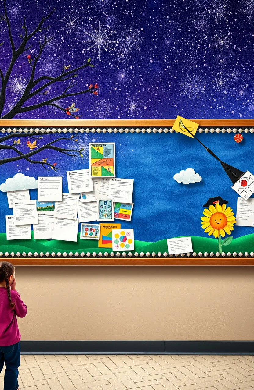
Getting students involved can bring fresh ideas to your board. It’s a chance for them to express their creativity!
Students love seeing their work on display, and it makes them feel valued. It’s like having a gallery of their achievements!
Consider holding a contest or asking for volunteers to contribute. You’ll be amazed at the unique perspectives they bring!
And guess what? It’s completely free! Plus, it builds a sense of community and pride.
11. Overloading with Decorations
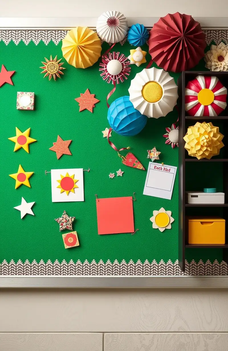
Too many decorations can make your board look chaotic. Sometimes, less is more!
Imagine a room filled with too much furniture—it feels cramped! The same goes for your board; keep it simple for a clean look.
Choose a few key pieces that match your theme. They’ll stand out more and won’t overwhelm your audience.
And by using fewer decorations, you’ll save money too! It’s a win-win for your budget and your design.
12. Ignoring Seasonal Changes
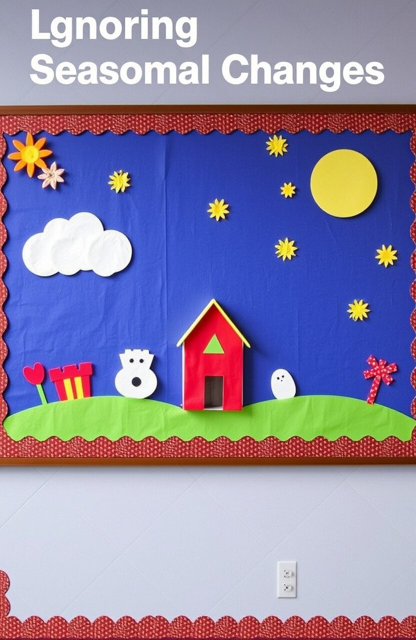
Updating your board with the seasons keeps it fresh and relevant. It’s like changing your wardrobe with the weather!
People love seeing new designs that match the time of year. It adds excitement and anticipation for what’s next.
Consider using seasonal colors and themes for inspiration. It’s a fun way to celebrate each time of year!
And you can use materials you already have, making it a cost-effective solution!
13. Not Using Technology
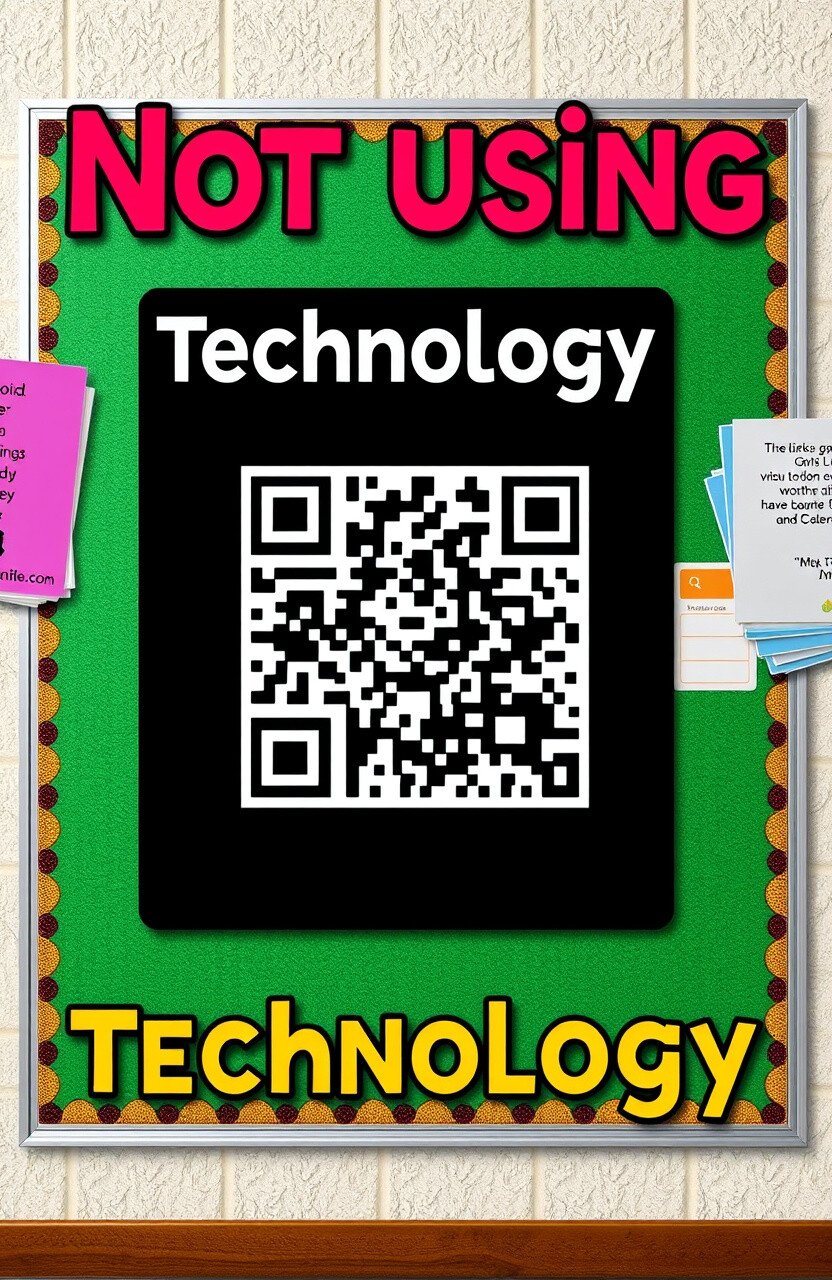
Technology can add an interactive element to your board. It’s like bringing your board to life!
QR codes or digital displays can share more information without taking up space. It’s perfect for tech-savvy audiences!
Consider adding a QR code that links to a video or website. It adds a modern touch that people love!
And guess what? You can create QR codes for free online, making it a budget-friendly option!
14. Forgetting to Proofread
Spelling and grammar mistakes can distract from your message. A quick proofread makes everything look professional.
It’s like having a stain on your favorite shirt—it catches the eye for the wrong reasons! Double-checking ensures everything is perfect.
Ask a friend or colleague to review your board before finalizing it. Fresh eyes can catch mistakes you might overlook.
And the best part? Proofreading is completely free! It’s an easy way to improve your board without extra cost.
15. Ignoring the Audience
Knowing your audience helps tailor your board to their interests. It’s like picking a gift they actually want!
Consider who will be viewing your board and what will capture their attention. A personalized approach makes a big impact.
Try adding elements that speak to their hobbies or favorite subjects. They’ll feel like the board was made just for them!
And personalization doesn’t have to cost extra. Use what you know about your audience to create something special!
16. Using Low-Quality Materials
Cheap materials can make your board look less appealing. Investing in quality makes a noticeable difference.
It’s like wearing a high-quality jacket versus a flimsy one—everyone can see the difference! Quality materials last longer too.
Consider using sturdy paper and strong adhesives for your board. These small changes can make your board look top-notch!
And don’t worry, you can find quality materials at discount stores. It’s an investment that pays off in the long run!
17. Not Testing Visibility
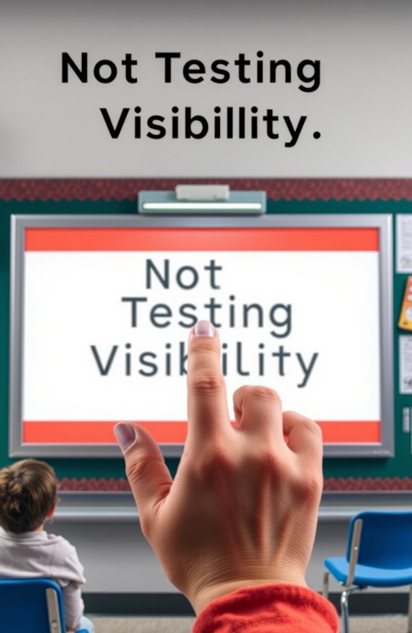
Make sure your board is easy to see from a distance. It’s like making sure everyone can see the stage at a concert!
Testing visibility ensures everyone can enjoy your board’s content. A clear view means more engagement and interest.
Try standing at different distances to check readability. Adjust as needed to make sure everything is visible.
And guess what? This doesn’t cost a thing! It’s a simple step that makes a big difference.
18. Forgetting About Safety

Safety is important, especially in a school setting. Ensure your board is secure and hazard-free.
It’s like making sure your shoes are tied before running—everything stays in place! Safety first means peace of mind for everyone.
Consider using safe adhesives and ensuring all elements are firmly attached. No one wants a board element falling unexpectedly!
And maintaining safety doesn’t require extra spending. Just a little time and care can prevent accidents!
19. Not Balancing Elements
A well-balanced board looks more appealing and organized. It’s like arranging a balanced meal—everything in harmony!
Balance helps guide the viewer’s eye across the board. It makes the whole design look cohesive and intentional.
Try placing larger elements at the center or evenly distributing them. This technique helps create a pleasing layout.
And the good news? Balancing your board is free! Just take your time to arrange everything thoughtfully.
20. Overlooking Lighting

Good lighting can make or break a bulletin board. It’s like choosing the right lighting for a photo shoot—everything looks better!
Proper lighting helps highlight the colors and details of your board. Shadows can hide important information and make things look dull.
Consider placing your board near natural light or using spotlights. It can transform the entire look and feel of your display.
And you don’t need expensive equipment. Simple desk lamps or LED strips can do the trick!
21. Neglecting Typography
Using the right fonts can make your board look professional. It’s like picking the perfect shoes for an outfit—it completes the look!
Good typography ensures readability and adds style to your board. It can make information stand out and look more inviting.
Try using bold fonts for headings and simple ones for text. This mix adds variety and helps guide the reader’s eye.
And you can find free fonts online, making it an affordable way to enhance your board!
22. Not Considering the Environment
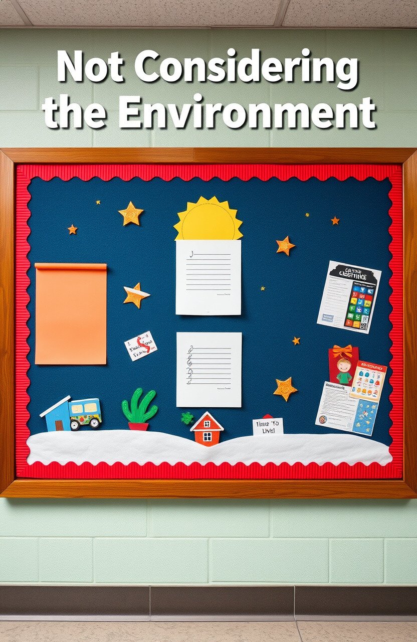
Take into account where your board is placed. The environment can affect how your board is perceived.
It’s like setting the mood with music—it changes how you feel about everything! Consider the surroundings to make your board fit perfectly.
Try coordinating colors and themes with nearby decor. It creates a seamless look that complements the space.
And best of all, this doesn’t cost anything! Just a little thought can make your board feel right at home.
23. Using Too Many Fonts

Too many fonts can make your board look chaotic. Stick to a few for a clean, cohesive look.
Imagine reading a book with different fonts on every page—it’s confusing! Consistency helps everything flow smoothly.
Choose two or three fonts that complement each other. This simple approach keeps your board looking polished.
And you’ll save time by not having to search for multiple fonts. It’s a stylish and efficient choice!
24. Neglecting to Label Sections
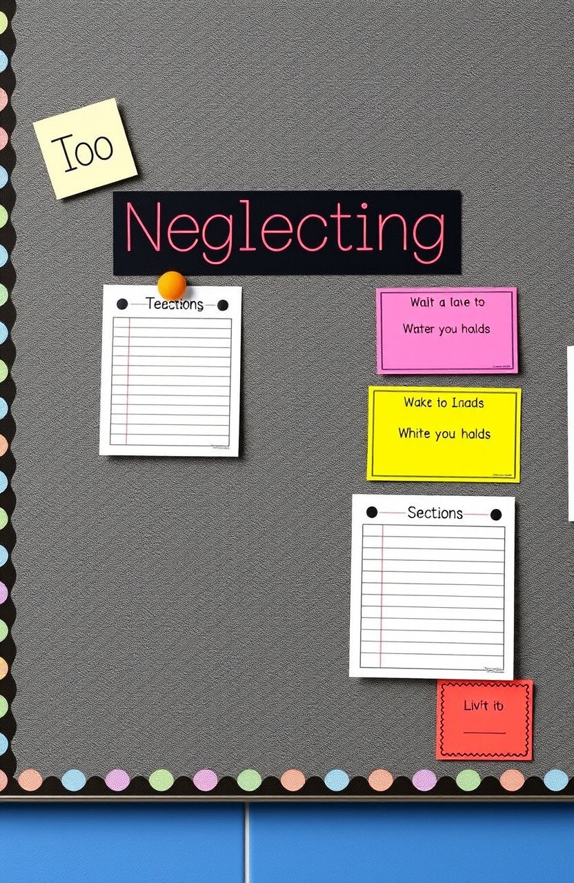
Labeling sections helps organize your board. It’s like using tabs in a binder—everything is easier to find!
Clear labels guide viewers to the information they need. It makes the board user-friendly and engaging.
Try using colorful labels or icons for different sections. It adds a fun element and helps with navigation.
And the best part? Labels are easy to make with simple paper and markers!
25. Ignoring Cultural Sensitivity
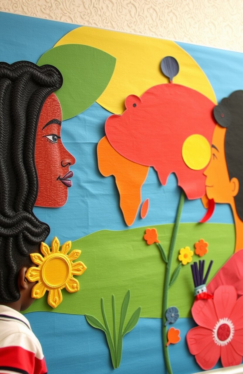
Consider cultural sensitivity when designing your board. It’s important to be inclusive and respectful.
It’s like being a good friend—understanding and acknowledging differences. It makes everyone feel welcome and valued.
Research and include diverse themes and perspectives. It enriches your board and shows thoughtfulness.
And you can do this with resources available online. It’s a meaningful way to connect with everyone!
26. Not Using Reusable Materials
Reusable materials can save money and the environment. It’s like having a wardrobe that never goes out of style!
Using items that can be repurposed makes updating your board easier. It’s a sustainable choice that feels good, too.
Consider using felt boards or corkboards that allow easy changes. They’re perfect for swapping out decorations without damage.
And you’ll find these materials are affordable and widely available. It’s an eco-friendly way to keep your board fresh!
27. Overlooking Simple Tools
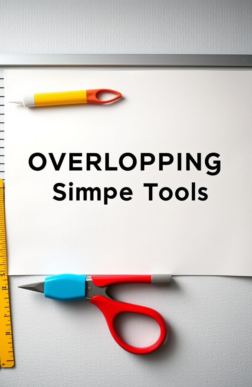
Simple tools can make designing easier and more fun. It’s like having the right tools in the kitchen—they make everything better!
Using basic tools helps create clean lines and precise cuts. It makes your board look professional and polished.
Try using paper cutters, rulers, and glue sticks for your projects. These tools save time and enhance your creativity.
And you can find them at any craft store for a low cost. They’re an investment that pays off with each new board!
28. Ignoring Feedback
Feedback can provide valuable insights for improvement. It’s like having a friend who tells you when something’s in your teeth!
Listening to feedback helps tailor your board to your audience’s needs. It ensures your board is always getting better.
Ask for opinions from students, teachers, or visitors. You’ll gain new ideas and perspectives you might not have considered.
And best of all, feedback is free! It’s a powerful tool that helps your board reach its full potential.
29. Overusing Clip Art

Clip art can make a board look outdated if overused. Sometimes, original artwork adds a personal touch.
It’s like wearing the same outfit as everyone else—it lacks individuality! Original designs make your board feel one-of-a-kind.
Try creating simple drawings or using student artwork. It adds charm and authenticity that’s hard to beat.
And using original art doesn’t cost anything extra. It’s a creative way to make your board stand out!
30. Forgetting to Plan
Planning your board design saves time and stress. It’s like making a grocery list before shopping—everything goes smoother!
A plan helps organize your ideas and materials. It ensures you have everything you need to create a stunning board.
Try sketching out your design or making a checklist. This simple step keeps your project on track and efficient.
And planning doesn’t cost a thing! It’s a small effort that makes a big impact on the final result.
31. Not Considering Maintenance
Maintenance keeps your board looking fresh over time. It’s like regular car check-ups—everything runs smoothly!
Regular upkeep prevents wear and tear, ensuring longevity. It shows you care about the presentation and quality of your board.
Consider doing a quick weekly check for any loose elements or damage. This habit keeps your board in top shape all year round.
And maintenance doesn’t require extra spending. A little attention goes a long way in preserving your hard work!
32. Overlooking Interactive Elements
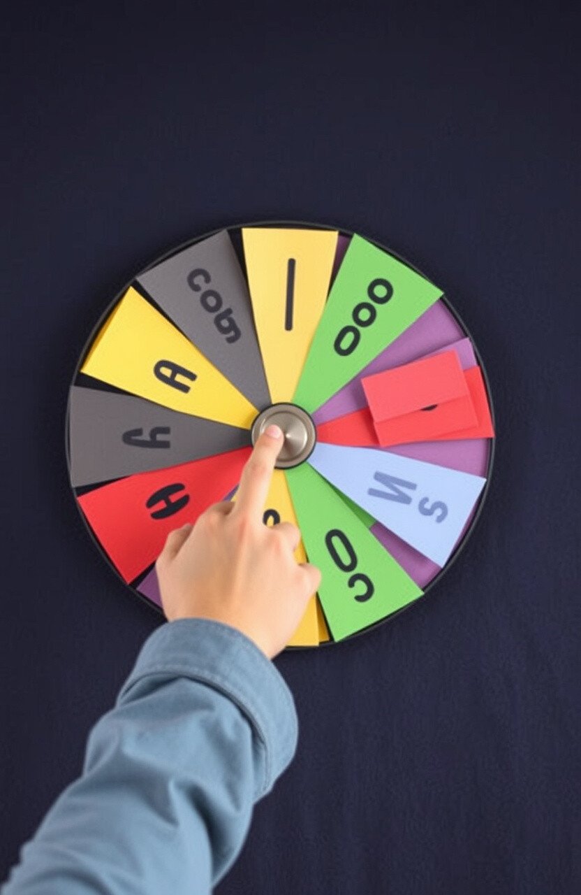
Interactive elements engage viewers more than static designs. It’s like a video game—everyone loves to participate!
Adding interactive features makes your board memorable and fun. It encourages people to spend more time exploring your display.
Try including flaps, sliders, or spin wheels for a hands-on experience. These elements create excitement and curiosity.
And you can create them with simple materials like paper and brads. It’s an inexpensive way to add a dynamic touch!
33. Ignoring the Calendar
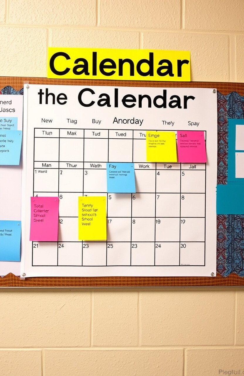
Calendars are useful for planning and showcasing events. They keep everyone informed and organized.
Imagine if no one knew about the school fair because it wasn’t on the board! A calendar ensures important dates are visible to all.
Consider adding a monthly or weekly calendar to your board. It helps everyone stay on track with upcoming activities.
And you can print calendars for free online, saving you money. It’s a practical addition that everyone appreciates!
34. Not Using Real Objects
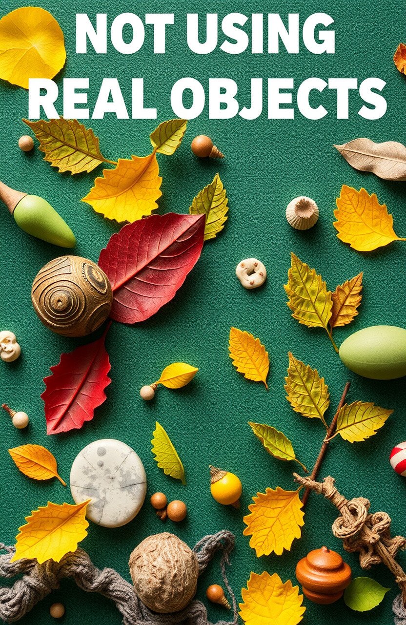
Real objects add texture and interest to your board. It’s like adding 3D elements to a flat surface—so cool!
Using tangible items makes your board feel more interactive. People love seeing and touching real-world elements.
Try incorporating items like leaves, fabric, or small trinkets. These additions create a tactile experience that’s unforgettable.
And you can find these items around your home or school. It’s a cost-effective way to bring your board to life!
35. Overlooking Inspirational Quotes
Inspirational quotes can uplift and motivate. They’re like a little cheerleader on your board!
Quotes add positivity and can resonate with viewers. They make your board not just informative, but also meaningful.
Consider adding quotes that match your theme or current events. It’s a simple way to inspire and connect with your audience.
And you can find quotes online for free. It doesn’t cost anything to add a touch of inspiration to your board!
36. Ignoring Sustainable Practices

Sustainable practices help protect the environment. It’s like being a superhero for the planet!
Using eco-friendly materials shows you care about more than just looks. It sets a great example for everyone who sees your board.
Try using recycled paper or energy-saving lights. These small changes make a big difference for our world.
And many sustainable options are budget-friendly. It’s a smart choice that benefits everyone!
37. Forgetting About the Edges
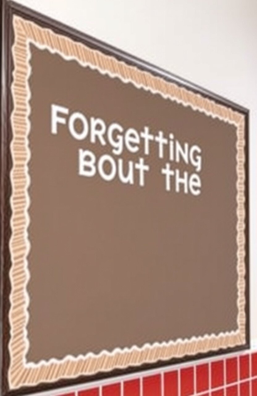
Edges can frame your board beautifully. It’s like putting a picture in a nice frame—it completes the look!
Well-defined edges make the board look polished and intentional. It’s the finishing touch that ties everything together.
Consider using trim or decorative tape to highlight the edges. It adds a neat outline that enhances the overall design.
And you can find these materials cheaply at craft stores. It’s an easy way to elevate your board’s appearance!
38. Not Using a Focal Point
A focal point draws attention and guides the viewer’s eye. It’s like the star of the show—it steals the spotlight!
Having a central element makes your board more engaging. It helps viewers know where to look first.
Try using a large image or bold text as the focal point. It creates a visual anchor that stands out.
And you can make a focal point with materials you already have. It’s a simple, cost-effective way to enhance your board!
39. Ignoring Emotional Appeal
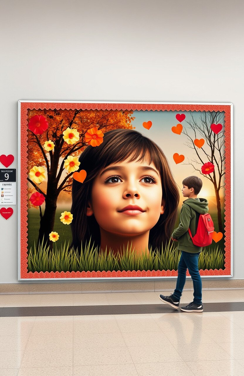
Emotionally engaging boards resonate more with viewers. It’s like a story that tugs at your heartstrings!
Adding emotional elements makes your board memorable and impactful. People connect better when they feel something.
Consider using relatable themes or personal stories. They create a deeper connection that stays with your audience.
And emotional appeal doesn’t cost extra. It’s about sharing experiences and feelings that everyone can relate to!
40. Overlooking Symmetry

Symmetry creates balance and harmony in design. It’s like a perfectly symmetrical butterfly—so pleasing to the eye!
A symmetrical board looks organized and aesthetically pleasing. It helps guide the viewer’s eye smoothly across the display.
Try arranging elements so they’re evenly distributed. This method makes your board feel cohesive and complete.
And symmetry is free! It’s a natural way to make your board look polished and professional.
41. Not Using Contrast
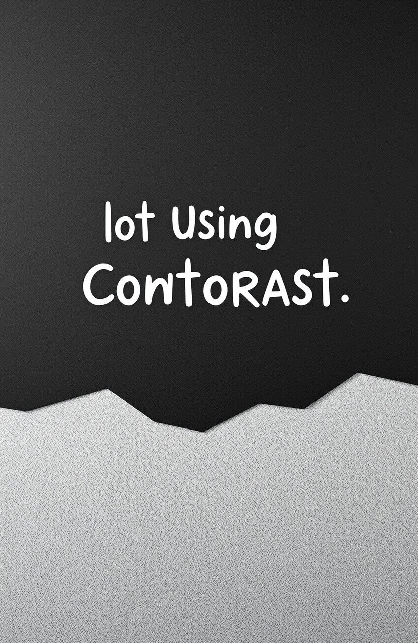
Contrast makes elements stand out and grab attention. It’s like a bright star in a dark sky—impossible to miss!
Using contrasting colors or textures highlights important information. It ensures nothing gets lost in the background.
Try pairing light and dark colors or smooth and rough textures. These combinations create visual interest and clarity.
And you can achieve contrast with materials you already own. It’s an effective way to make your board pop!
42. Forgetting to Test Durability
Durability ensures your board withstands time and use. It’s like having a sturdy backpack—it holds up well under pressure!
A durable board maintains its appearance and function over time. It saves you from constant repairs and replacements.
Consider using strong adhesives and weather-resistant materials. These choices help your board stay intact and looking great.
And durability doesn’t mean spending more. It’s about choosing quality materials that last longer!
43. Ignoring Multi-Sensory Elements
Multi-sensory elements engage more senses for a richer experience. It’s like a movie with sound, visuals, and touch—it captivates you!
Using different sensory inputs makes your board more memorable. It invites viewers to interact and explore further.
Try incorporating sounds, textures, or scents if possible. These elements create a unique and immersive experience.
And you can use everyday items to achieve this. It’s a creative way to make your board stand out!
44. Overlooking the Impact of Shapes

Shapes can add variety and interest to your board. They’re like the sprinkles on a cupcake—fun and delightful!
Using different shapes breaks the monotony and catches the eye. It adds a dynamic element to your design.
Try mixing circles, squares, and triangles in your layout. These shapes add movement and excitement to your board.
And you can cut shapes from paper you already have. It’s an easy way to enhance your board’s visual appeal!
45. Forgetting to Involve the Community
Community involvement adds diverse perspectives to your board. It’s like having a potluck—everyone brings something unique!
Engaging the community makes your board more inclusive and meaningful. It reflects the voices and ideas of many people.
Consider asking for input or showcasing community projects. It strengthens connections and makes your board a shared space.
And involving others is free! It’s a rewarding way to create a sense of belonging and unity.
46. Overlooking the Power of Humor
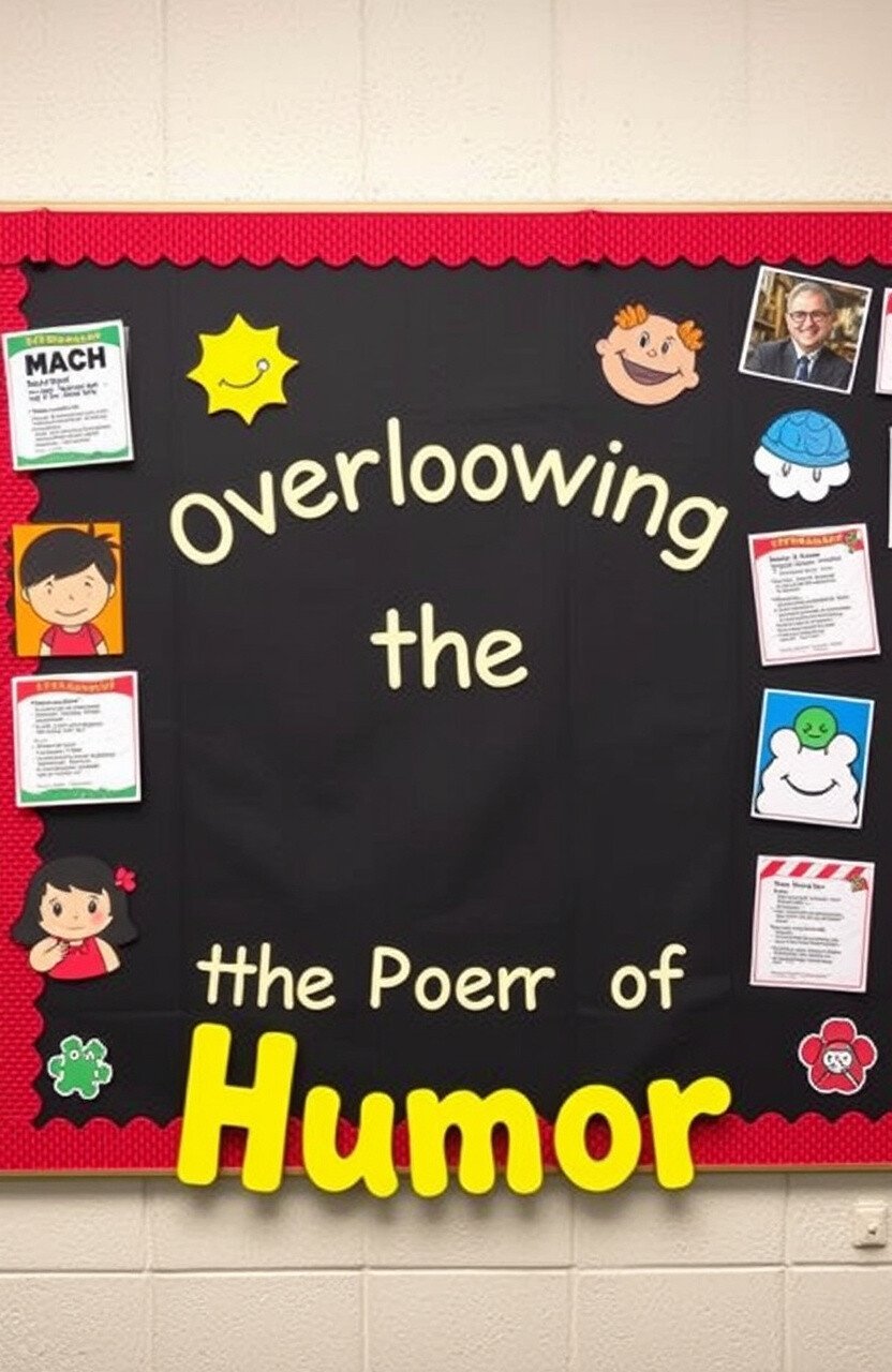
Humor can make your board more engaging and memorable. It’s like a good joke—everyone loves a laugh!
Adding humor creates a light-hearted atmosphere and captures attention. It makes your board a joy to visit and revisit.
Try incorporating funny images or puns related to your theme. These elements add personality and charm to your board.
And humor doesn’t cost a thing! It’s an inexpensive way to connect with your audience and brighten their day.
47. Ignoring the Importance of Scale
Scale affects how elements relate to each other on your board. It’s like the difference between a grand piano and a toy one—size matters!
Using the right scale creates balance and focus in your design. It helps viewers understand the hierarchy of information.
Try varying the sizes of elements to emphasize key points. This technique guides the viewer’s eye and adds interest.
And adjusting scale doesn’t require extra cost. It’s a simple way to make your board more effective and visually appealing.
48. Overlooking the Power of Patterns

Patterns add rhythm and repetition to your board. They’re like a catchy tune—you can’t help but notice them!
Using patterns creates visual interest and a sense of unity. It ties different elements together in a cohesive way.
Try incorporating stripes, polka dots, or chevrons in your design. These patterns add excitement and texture to your board.
And you can use leftover materials to create patterns. It’s an affordable way to make your board lively and engaging!
49. Forgetting to Celebrate Achievements
Celebrating achievements boosts morale and motivation. It’s like a pat on the back for a job well done!
Showcasing accomplishments encourages others and creates a positive environment. It’s a great way to highlight success and effort.
Consider creating a section dedicated to awards or milestones. It shines a spotlight on those who deserve recognition.
And celebrating achievements is free! It’s a meaningful way to foster a supportive and inspiring atmosphere.
50. Ignoring the Power of Storytelling
Storytelling captivates audiences and makes information relatable. It’s like reading a good book—you can’t put it down!
Using stories creates a narrative that engages viewers. It makes your board more than just a display—it’s an experience.
Try weaving a story into your theme or using sequential elements. This approach draws people in and keeps them interested.
And storytelling doesn’t require extra materials. It’s a creative way to make your board unforgettable and impactful!
51. Overlooking the Power of Collaboration

Collaboration brings diverse ideas and creativity to your board. It’s like a team sport—everyone contributes to the win!
Working together fosters a sense of community and shared purpose. It makes the board a collective effort and achievement.
Consider involving different classes or groups in your design process. This collaboration results in a board that’s rich in diversity and creativity.
And collaborating with others is free! It’s a rewarding way to create something truly special and inclusive.
