Gallery walls can add a burst of personality and style to any room, but getting them right requires a keen eye for scale and balance. Avoid common mistakes with these creative ideas that promise to make your walls more than just a backdrop.
1. Overcrowding the Space
Have you ever seen a gallery wall that looks more like a jumbled mess than a curated collection? Overcrowding is often to blame. Instead of attempting to display every piece you own, choose a select few that complement each other in theme or color. This approach allows each piece to breathe and shine.
By giving your artwork space, you create a sense of calm and focus. Try spacing pieces at least two inches apart. You’ll find this makes the wall look organized and intentional. Plus, fewer pieces mean less to dust!
2. Ignoring the Room’s Proportions
Imagine a tiny painting on a massive wall; it could look lonely and out of place. Consider the room’s size and the wall’s dimensions when planning your gallery. Larger walls can handle bigger or more pieces, while smaller walls benefit from a more modest display.
This ensures your gallery wall feels like part of the room, not an afterthought. Try using paper templates to visualize different layouts before committing. This trick saves time and prevents unnecessary nail holes.
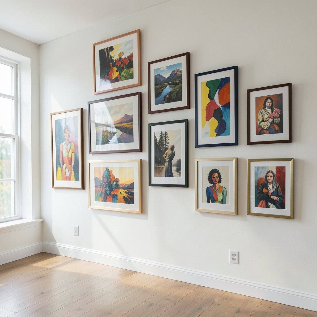
3. Sticking to One Size
Using artwork all the same size can make a gallery wall look flat and uninspired. Mix different sizes and shapes to create visual interest. Imagine a large central piece surrounded by smaller works—it draws the eye and creates a focal point.
This variety keeps the wall dynamic and engaging. Plus, it allows you to showcase a range of styles and subjects. Experiment with combining portraits, landscapes, and abstracts for a rich tapestry of art.
4. Disregarding Color Harmony
Clashing colors can disrupt the harmony of a gallery wall. Choose a color palette that complements your room’s decor and stick to it. This doesn’t mean everything has to match, but there should be a sense of cohesion.
Using color to tie pieces together can create a more polished and professional look. Consider using frames in similar colors to unify varied artworks. It’s a simple trick that makes all the difference.
5. Forgetting about Frame Styles
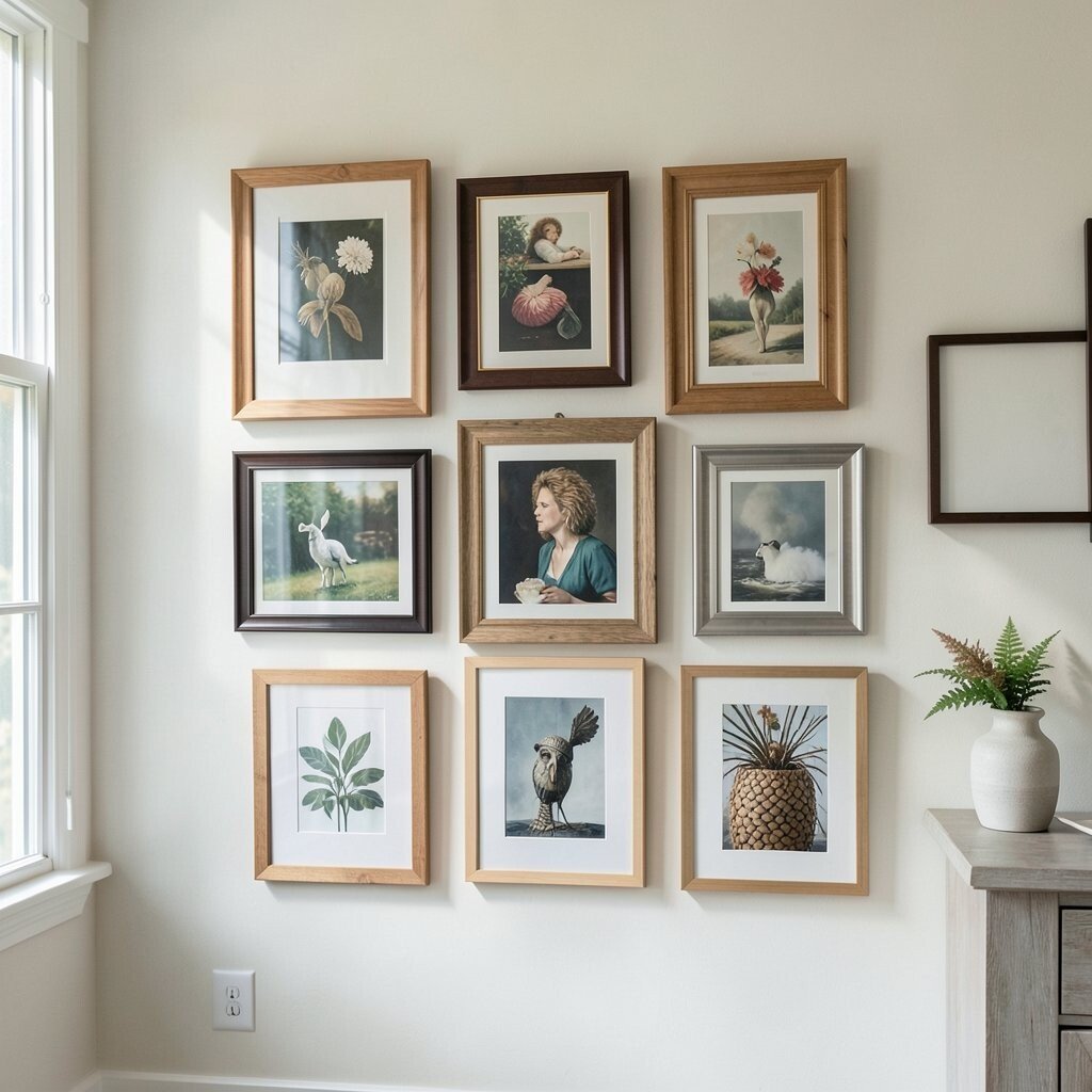
Mismatched frames can be charming, but they can also look chaotic if not done carefully. Aim for a cohesive look by using frames that share a common element, like color or material. This can bring a sense of order to even the most eclectic collection.
Consider frames that complement the art and the room’s decor. Wooden frames can add warmth, while metal ones offer a sleek, modern touch. Mixing these styles thoughtfully can create a balanced look.
6. Placing Art Too High or Low
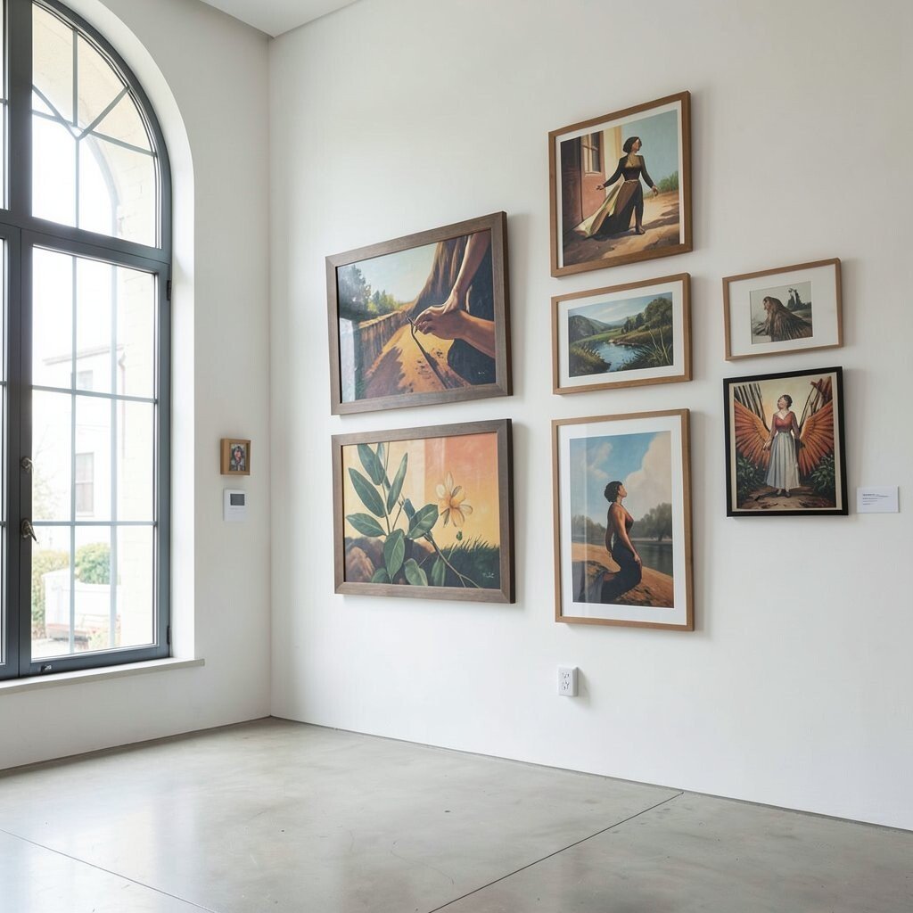
Hanging art at an awkward height can break the flow of a room. A good rule of thumb is to hang pieces at eye level, which is about 57 to 60 inches from the floor. This makes your gallery accessible and enjoyable for everyone.
If you have high ceilings, you might want to go a bit higher, but avoid too much deviation. Keeping art at a comfortable height invites viewers to engage without straining their necks.
7. Overlooking Lighting
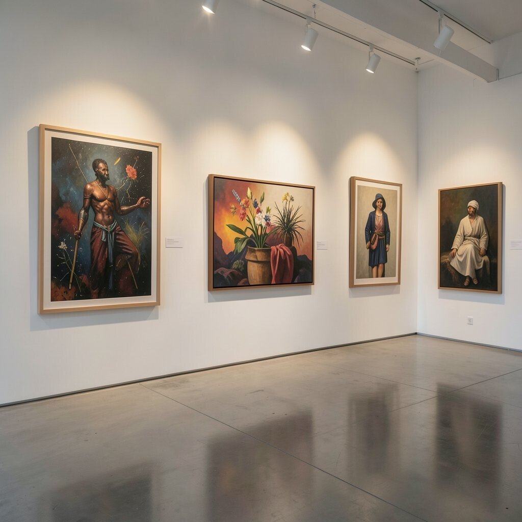
Lighting can make or break a gallery wall. Poor lighting can hide your artwork’s beauty, while strategic lighting can highlight its best features. Consider adding picture lights or spotlights to draw attention to your favorite pieces.
This not only enhances the art but also adds warmth and depth to the room. Investing in good lighting can elevate your gallery from ordinary to extraordinary.
8. Neglecting Personalization
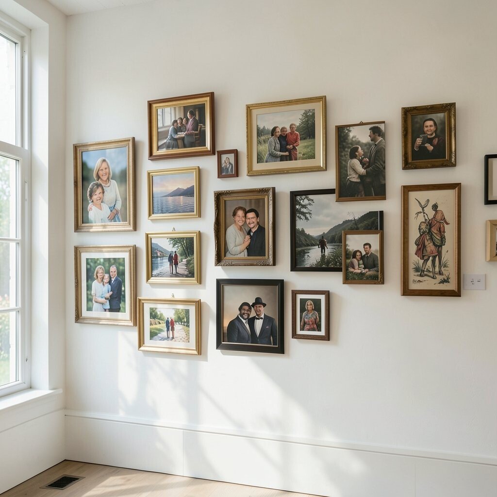
Your gallery wall should reflect your personality and tastes. Don’t be afraid to include personal items like family photos, travel souvenirs, or even your own artwork. These elements add a unique touch that can’t be replicated.
By mixing personal items with traditional art, you create a story on your wall. It’s an opportunity to share your journey and passions with others, making your space truly yours.
9. Choosing Only Artworks
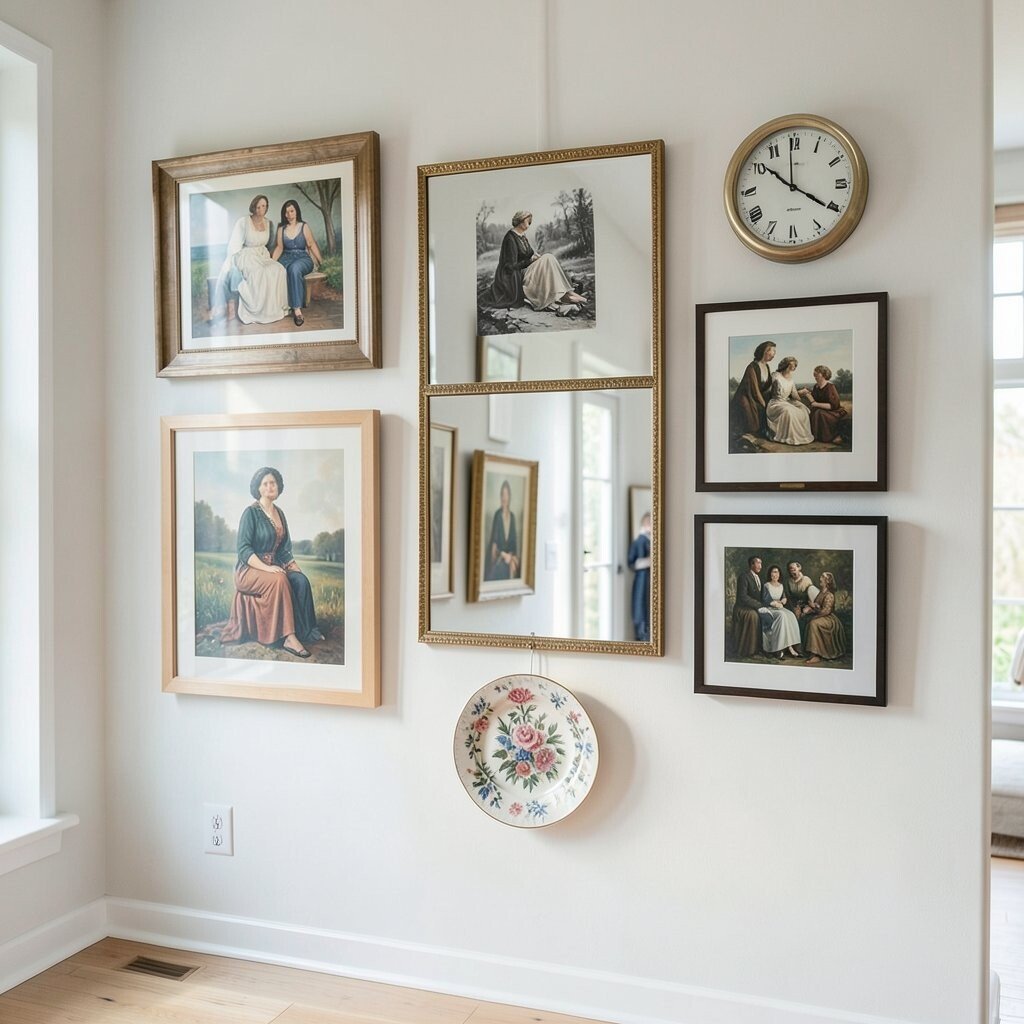
Why limit your gallery wall to just artwork? Consider incorporating mirrors, clocks, or decorative plates. These elements can add texture and dimension, breaking up the monotony of framed artworks.
Such additions can make your gallery wall interactive and functional. A well-placed mirror can reflect light and make a room feel larger, while a clock can add a practical element to your art display.
10. Forgetting About Themed Collections
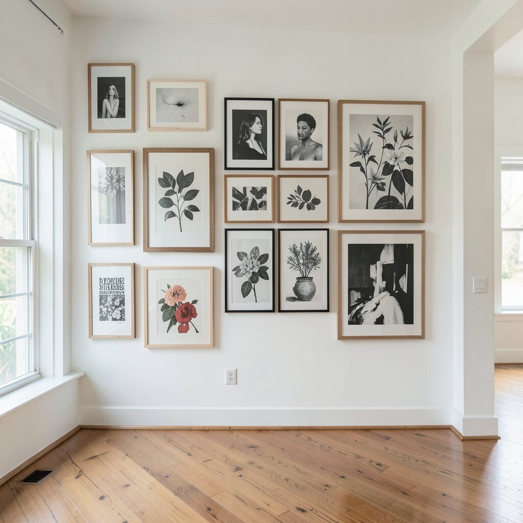
A themed gallery wall can create a powerful visual impact. Whether it’s black-and-white photography, botanical prints, or contemporary abstracts, a theme ties your collection together and tells a cohesive story.
Themes can also simplify the process of selecting pieces. Once you decide on a theme, you can focus your search, making the curation process more enjoyable and less overwhelming.
11. Ignoring Seasonal Updates
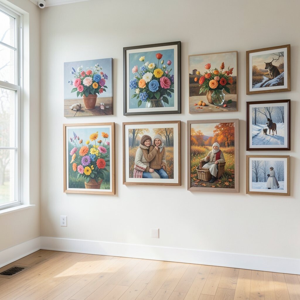
Why not refresh your gallery wall with the seasons? Swapping out a few pieces to reflect the time of year can keep your space feeling fresh and relevant. Think vibrant florals in spring, cool blues in summer, warm tones in fall, and cozy scenes in winter.
This approach keeps your gallery dynamic and engaging throughout the year. Plus, it offers an opportunity to showcase seasonal art that might otherwise stay tucked away.
12. Overlooking Texture
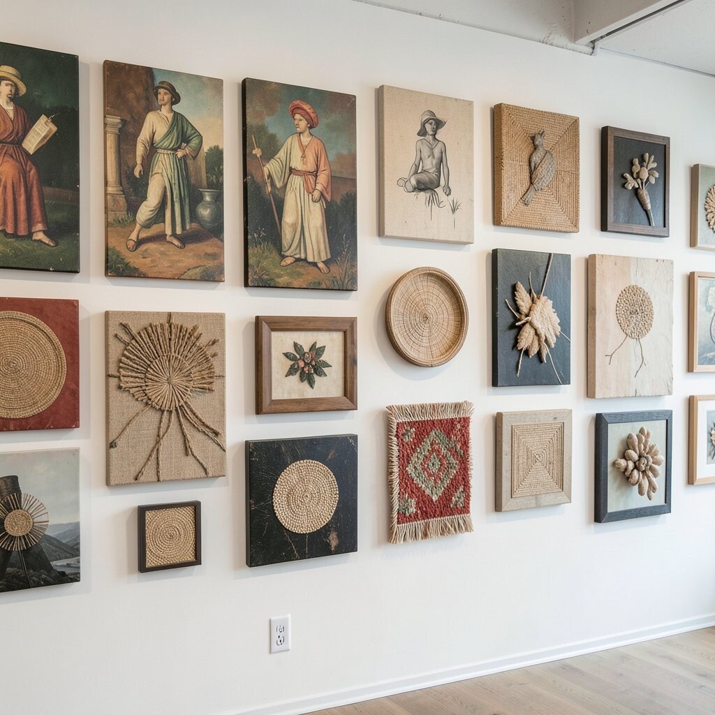
Incorporating different textures can add depth and interest to your gallery wall. Consider mixing canvas paintings with prints, textiles, or even three-dimensional objects like sculptures or woven art.
Texture invites viewers to not just look, but to feel the art. It engages more senses and creates a multi-layered experience that’s both visually and tactilely appealing.
13. Skipping Layout Planning
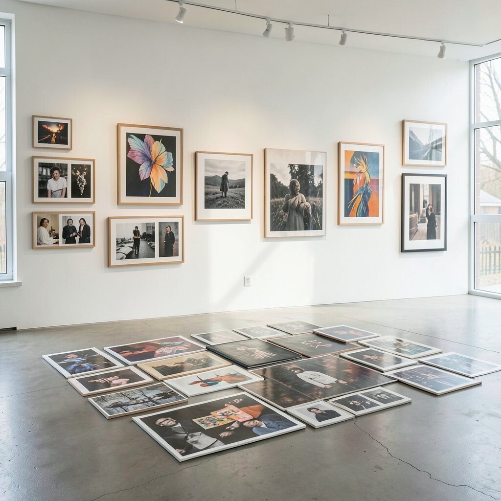
A successful gallery wall starts with a well-thought-out layout. Before hammering any nails, arrange your pieces on the floor to experiment with different configurations. This helps you find the perfect arrangement without committing right away.
Using this method saves time and avoids unnecessary holes in the wall. It also allows you to play with balance and flow, ensuring a harmonious display that pleases the eye.
14. Failing to Balance Symmetry and Asymmetry
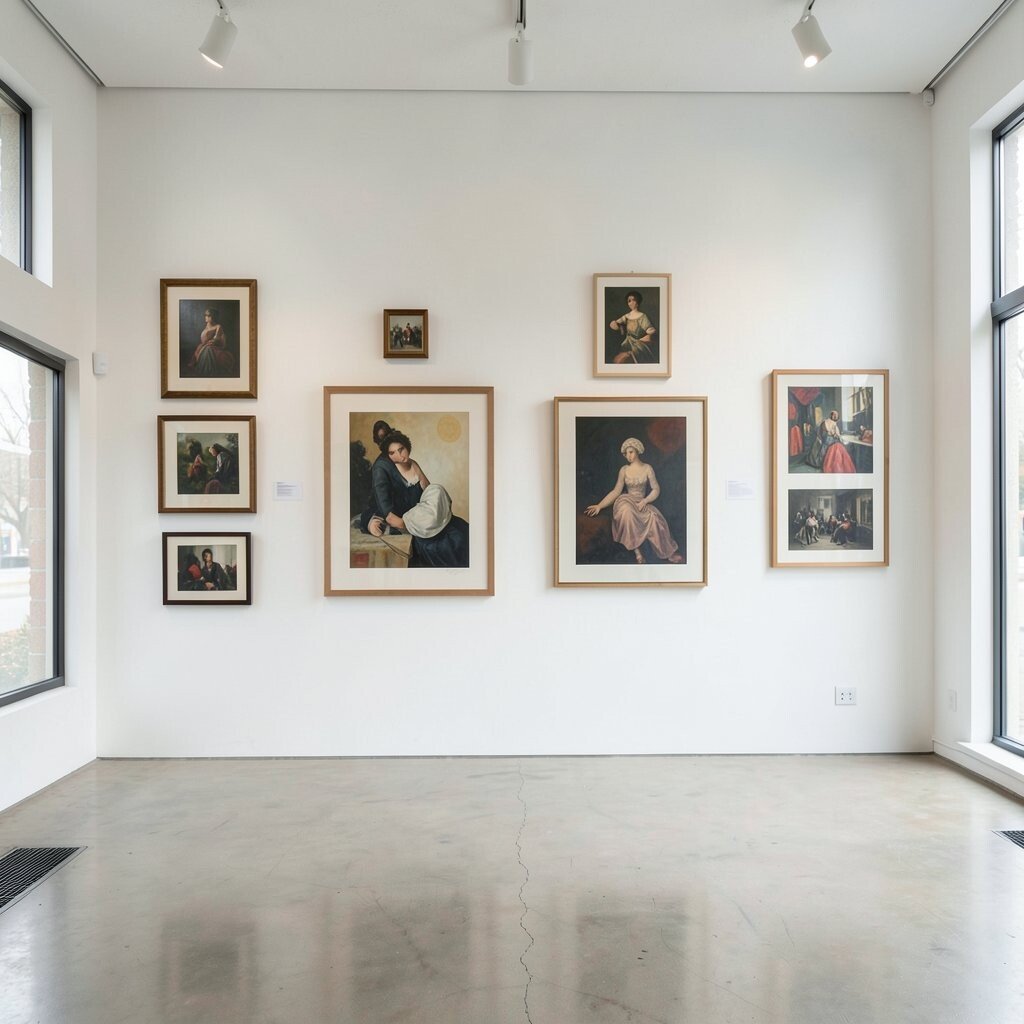
While symmetry can create a calm, orderly look, too much can be predictable. On the other hand, asymmetry can be exciting but may feel chaotic. Finding a balance between the two ensures your gallery wall is both dynamic and cohesive.
Try starting with a symmetrical base and then adding asymmetrical elements for interest. This approach offers structure with a touch of surprise, inviting viewers to linger and explore.