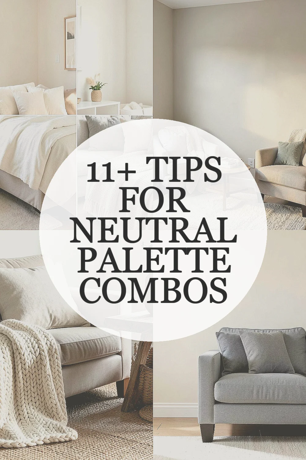
Neutral colors look calm, but they are never boring. They can change the whole mood of a room, outfit, or design in a quiet way.
1. Neutrals Are Not All the Same Shade of “Safe”
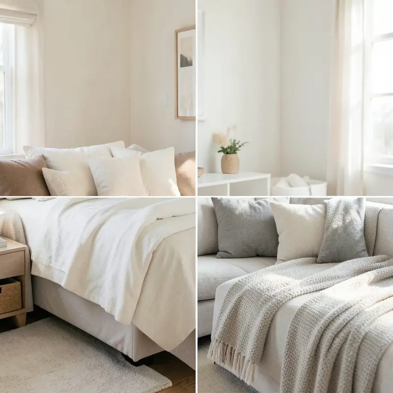
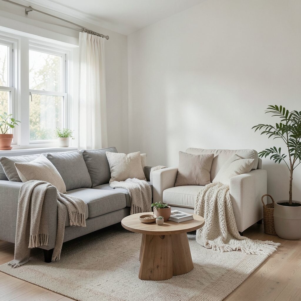
Beige, cream, taupe, gray, greige, and warm white all feel different in real life. One can look soft and sunny, while another feels cool and crisp.
That difference matters because the wrong mix can make a space feel flat or even a little dull. A smart mix brings out depth, warmth, and a clean layered look that feels more stylish than plain white alone. If you want a cozy feel, try warm neutrals with a touch of brown or sand; if you want a fresh look, pair cool gray with soft ivory.
2. Light Changes Everything
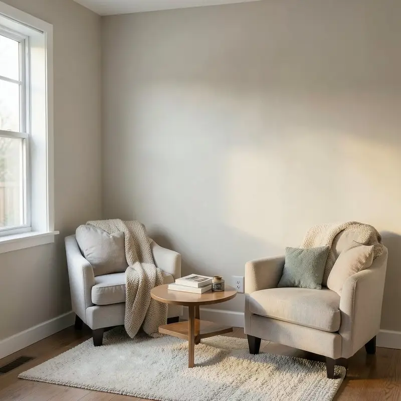
Neutral palette combinations can look rich in one room and washed out in another. Natural light, lamp light, and even cloudy weather can change how each shade shows up.
That is why a paint chip or fabric swatch can fool you at first glance. Test your colors on the wall, near a window, and beside your furniture before you spend more money.
Morning light often makes warm neutrals glow, while evening light can make cool tones feel softer. This is a great chance to personalize the look for your own home, since the same palette can feel bright, cozy, or elegant depending on where you place it.
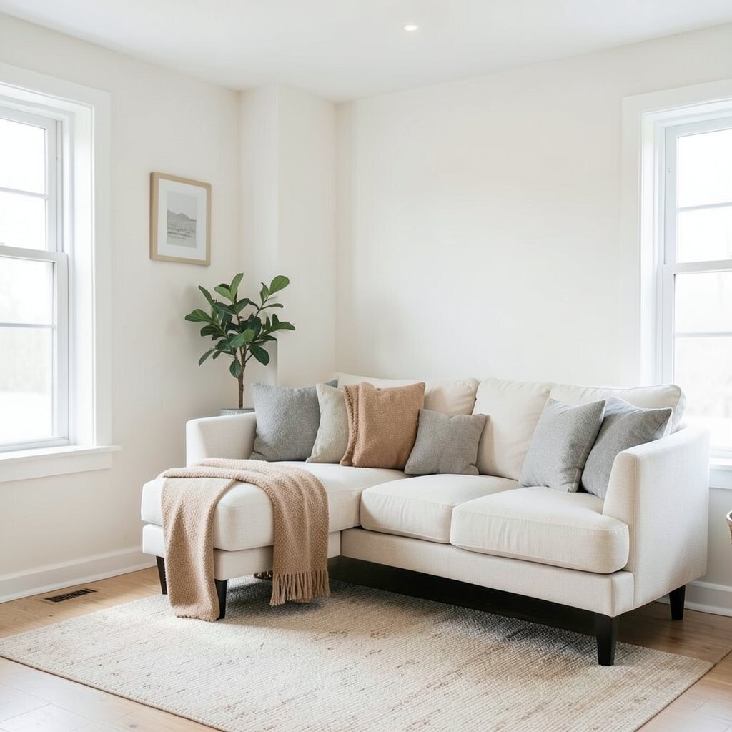
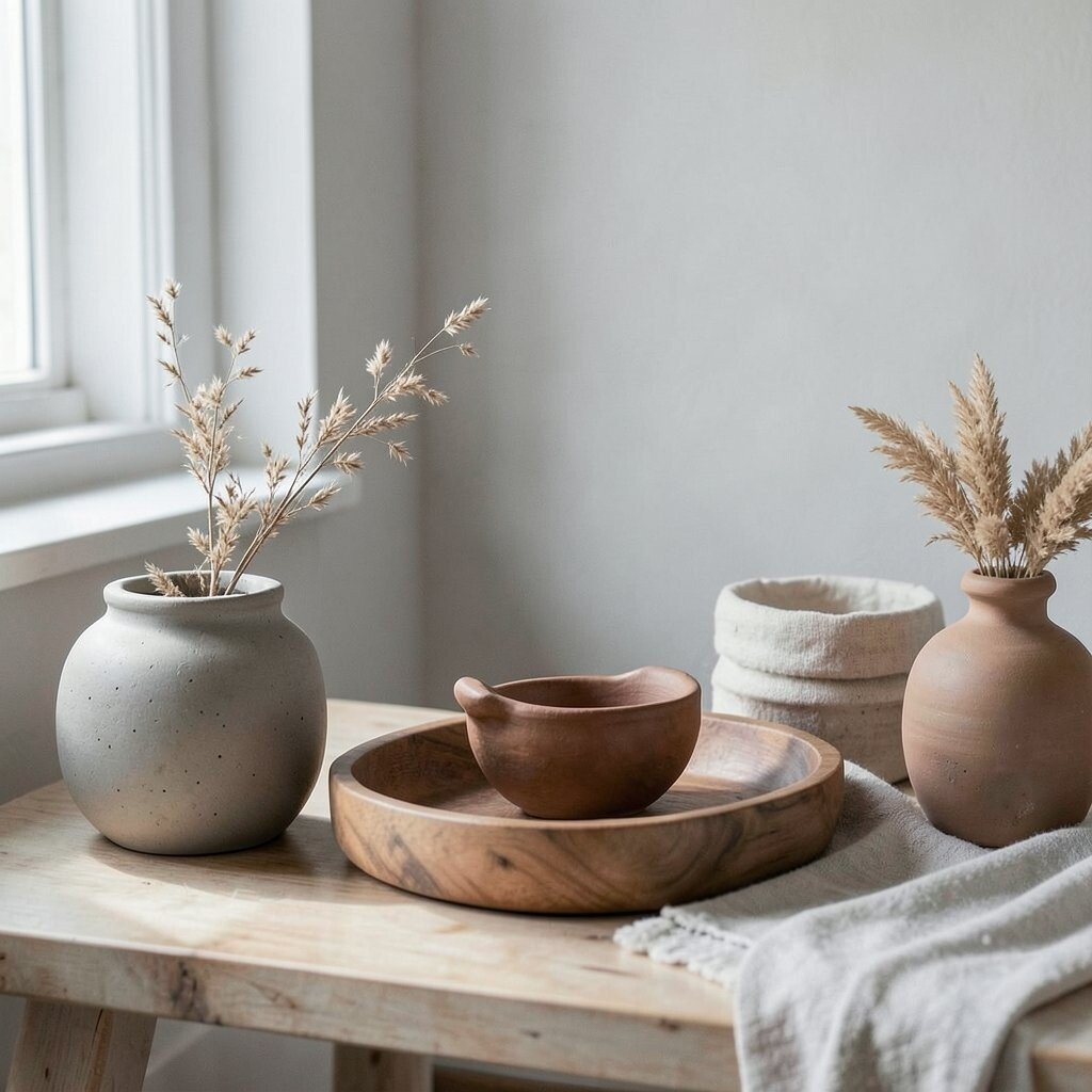
3. Texture Is the Secret Ingredient
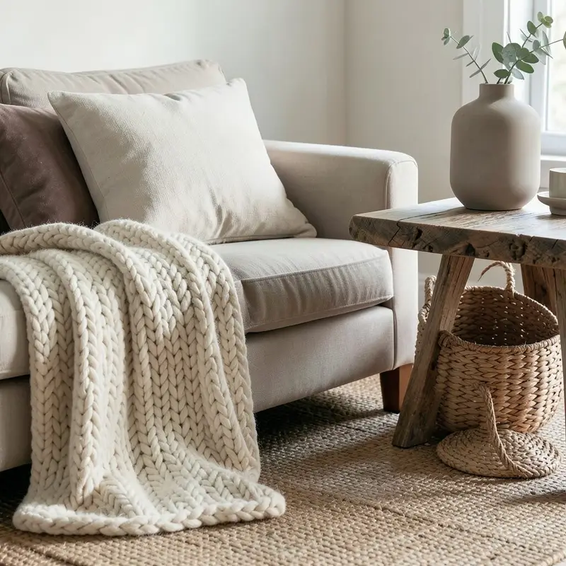
When colors stay quiet, texture gets to speak louder. Linen, wool, wood, stone, leather, and woven baskets make neutral combinations feel alive.
A room with only smooth surfaces can seem a little stiff, even if the colors are lovely. Add a chunky knit throw, a matte vase, or a grainy wood table to create contrast without adding loud color.
This also helps with cost, because texture can make simple items look more expensive. A plain beige pillow can feel special when it sits next to a soft velvet cushion or a rough jute rug.
Right now, layered natural textures are a big trend in homes and fashion, and neutrals are the perfect base for it. If you want a custom look, mix one shiny surface with one soft one and one natural one.
4. Warm and Cool Neutrals Can Work Together
Many people think warm and cool shades should never mix, but that rule is not always helpful. A soft ivory wall can look great beside a cool gray sofa if the rest of the room feels balanced.
The trick is to repeat each undertone in small ways so the eye feels calm. Try a warm wood frame, a gray pillow, and a cream rug to make the mix feel planned.
5. Small Changes Can Make a Big Difference
Neutral palette combinations do not need a full makeover to feel fresh. A new lamp shade, a throw blanket, or a set of curtains can shift the whole mood fast.
This is one reason neutrals are so practical for people who want style without spending too much. You can build a nice look slowly, piece by piece, and still keep everything easy to match.
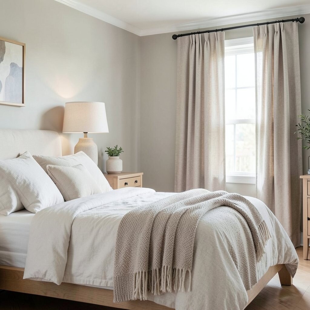
6. White Is Not Always the Best Base
Pure white can look bright and clean, but it can also feel sharp or cold. Softer base shades like oat, bone, and mist often feel more welcoming.
These gentler colors give your space a soft glow and make other neutrals stand out in a nicer way. They are also easier to live with because they hide tiny marks better than bright white surfaces.
If you want a more personal style, use off-white as the main color and then add your favorite neutral accent, like camel, slate, or mushroom. This keeps the room easy on the eyes while still feeling special and lived in.
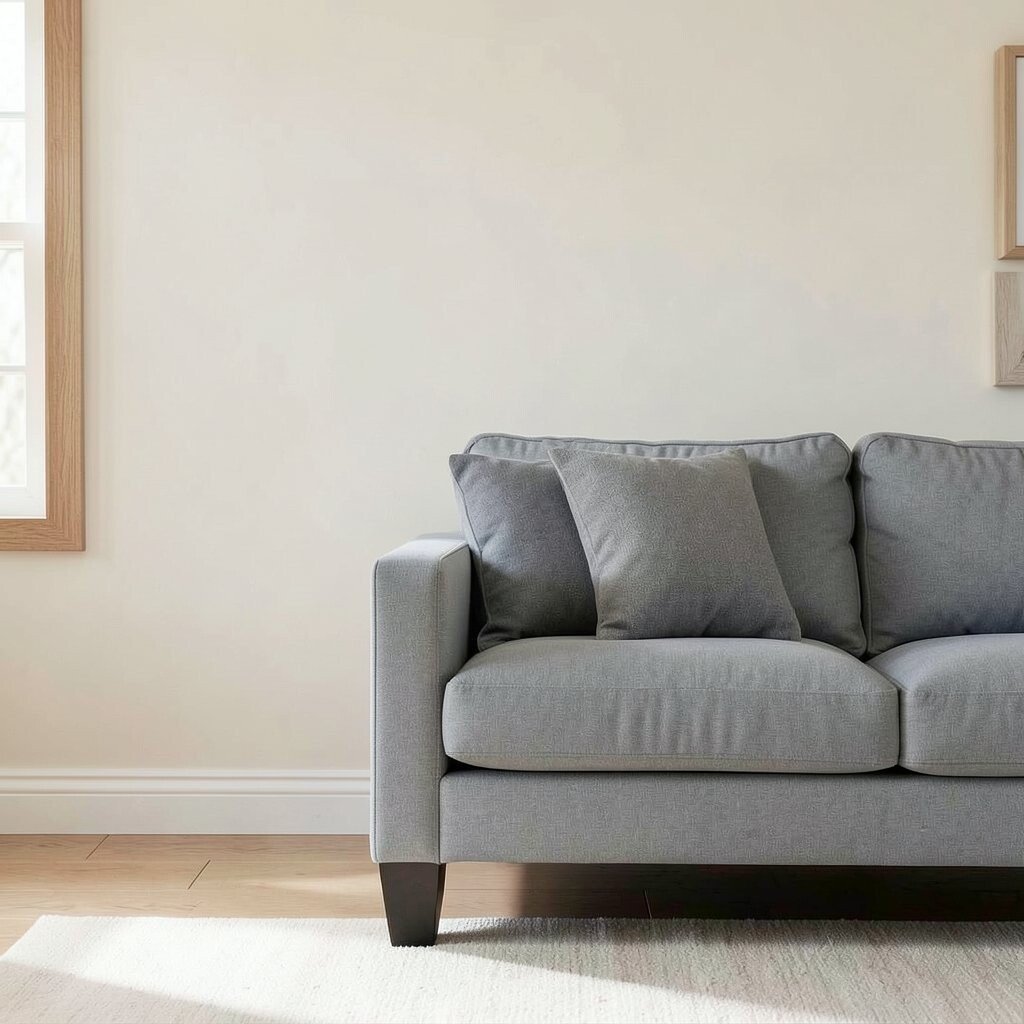
7. Contrast Keeps Neutrals From Falling Flat
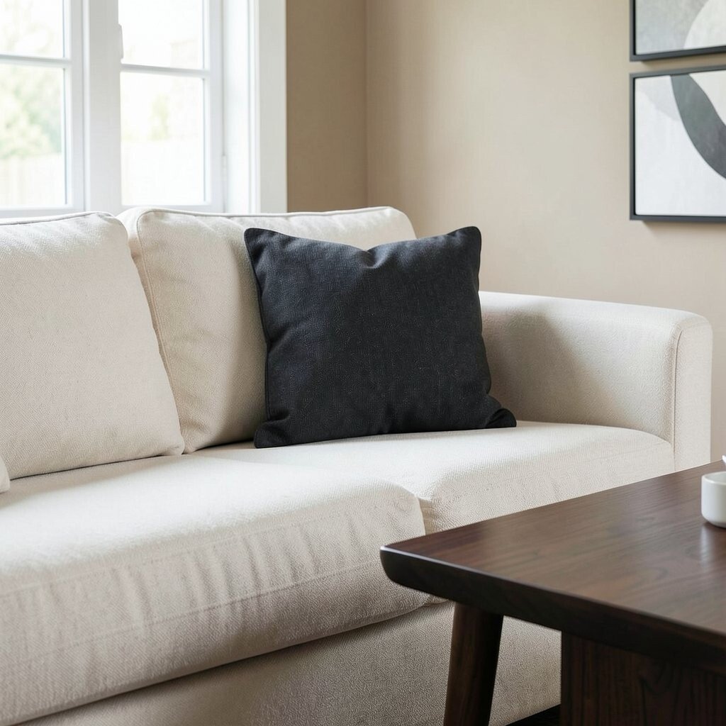
Even the softest palette needs a little contrast to feel interesting. Light and dark, rough and smooth, matte and shiny all help the eye move around the room.
A cream sofa against a charcoal pillow, or a sand wall with a dark wood table, can make the whole space feel more polished. You do not need bold color to get that effect; you just need enough difference to create shape.
Designers often use this trick in modern homes because it looks calm but not sleepy. It is a useful way to make budget-friendly pieces look more thoughtful and custom.
8. Neutrals Can Feel Very Personal
People often think neutral palette combinations are generic, but they can be deeply personal. Your favorite warm gray, your grandmother’s wooden tray, or a handmade clay bowl can shape the whole look.
That is what makes a neutral space feel like yours instead of a catalog page. Mix in objects with meaning, and the palette becomes part of your story.
9. Trends Keep Moving Toward Softer Earth Tones
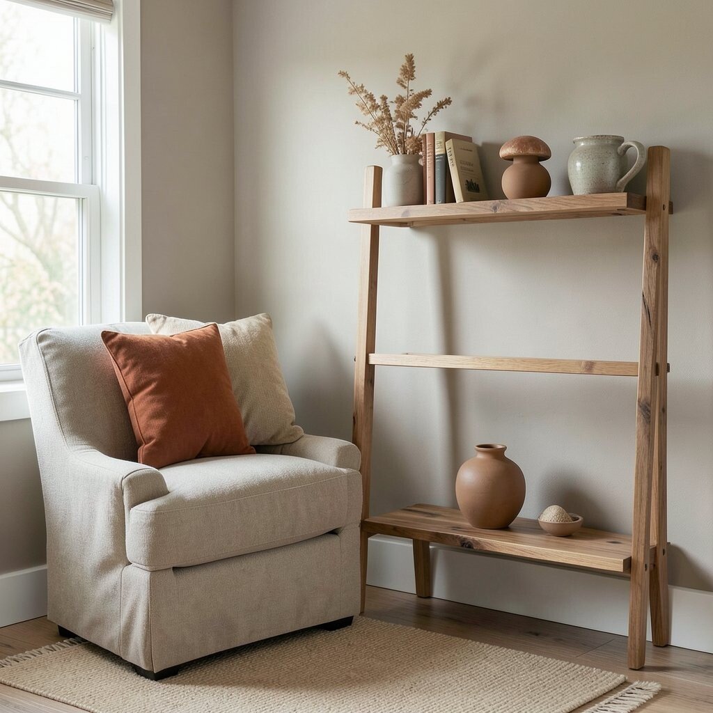
Right now, many homes and wardrobes are leaning into earthy neutrals. Clay, mushroom, sand, stone, and coffee tones feel calm, grounded, and easy to style.
These shades work well because they feel modern without trying too hard. They also pair nicely with natural materials, which helps the space look current and warm at the same time.
If you want to follow the trend without buying everything new, start with one earthy accent. A rust pillow, a tan vase, or a walnut shelf can update your palette in a simple and low-cost way.
The best part is that these tones usually age well, so you are less likely to get tired of them quickly. That makes them a smart choice for people who want style that lasts.
10. Neutrals Need a Focal Point
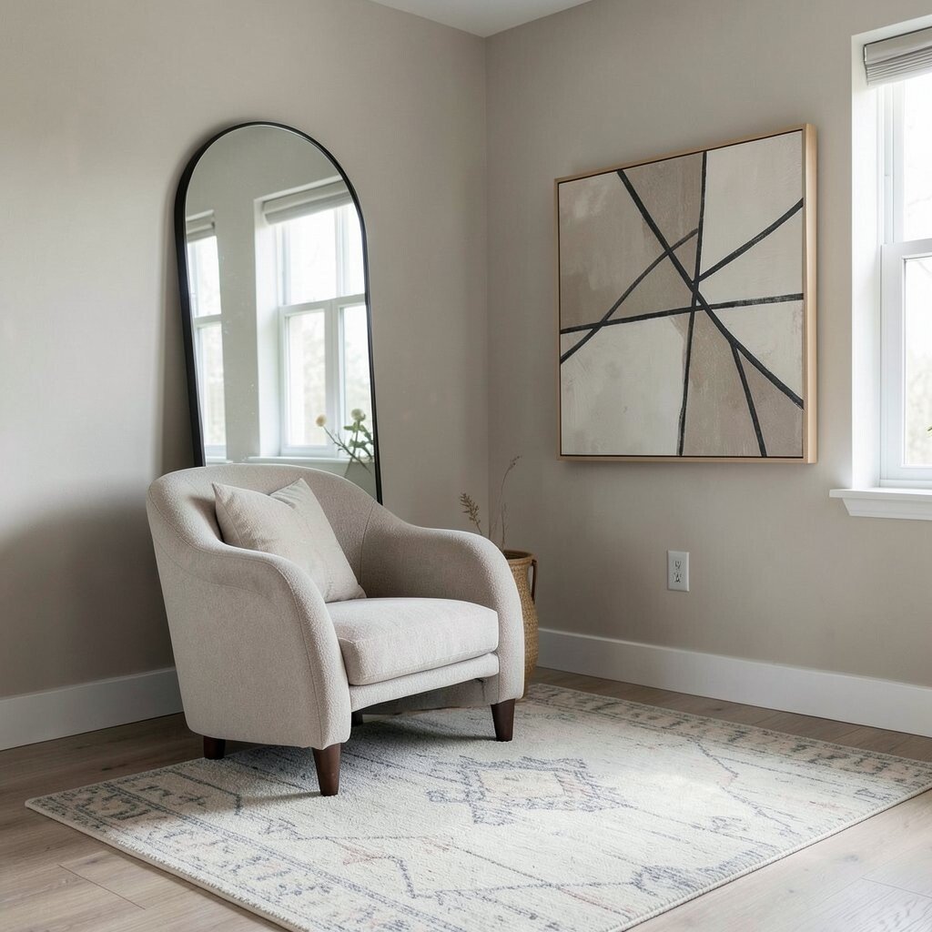
A neutral room can feel peaceful, but it still needs one thing that catches the eye. That could be a large mirror, a bold chair shape, a patterned rug, or a piece of art with strong lines.
Without a focal point, everything may blend together too much. With one, the room feels designed instead of unfinished, and the neutral colors get a chance to shine around it.
11. Layering Shades Is Better Than Matching Them Exactly
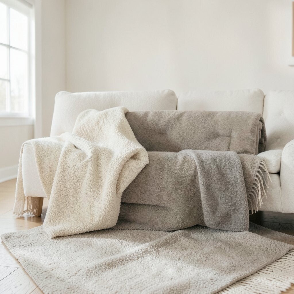
Perfect matching can make neutral palette combinations look stiff. A richer look comes from using several shades that sit close together but are not identical.
Think cream with oat, taupe with mushroom, or stone with soft gray. These small shifts make the palette feel soft, natural, and full of depth.
This approach is also kinder to your budget because you do not need to buy a full set from one brand. You can mix pieces from different stores, which often gives your space a more collected and unique feel.
If you want a simple rule, keep one shade as the main color and use two or three nearby shades around it. That gives you harmony without making the room look too neat or flat.
12. Neutrals Work Best When They Fit Your Life
A beautiful palette is not much help if it is hard to live with. The best neutral combinations match your habits, your light, your cleaning style, and the way you use the space every day.
If you have kids, pets, or a busy schedule, darker neutrals and textured fabrics may be easier to keep looking nice. If you love calm mornings and open spaces, lighter shades and airy materials may feel better to you.
That is the real magic of neutrals: they can be soft, strong, simple, or rich, all at once. When you choose shades that fit your daily life, the whole space feels more honest, more comfortable, and more beautiful to be in.