A thin web of lines can make any surface feel alive. When you notice veining, your design choices start to feel personal and grounded.
Let the grain and veins guide how you plan color, texture, and layout. The result looks thoughtful, not forced.
1. Marble-Like Veins as a Calm Background
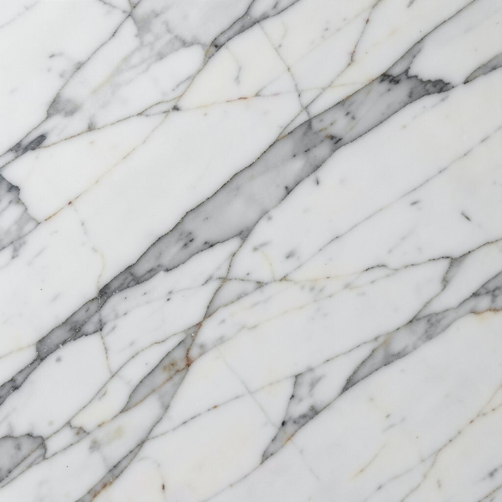
Imagine soft gray threads drifting across a pale field like smoke in morning light. The pattern feels steady, even when the room is busy.
Use this look as a background for layouts, fabrics, or even brand visuals. Pick veining that stays mostly in one direction so the eye can rest, then pair it with simple shapes and readable spacing. If you want a gentler mood, choose warm whites and light taupes instead of bold black and stark charcoal, and you will get calm without losing style.
2. Wood Grain with Tiny “Rivers” for Warm Texture
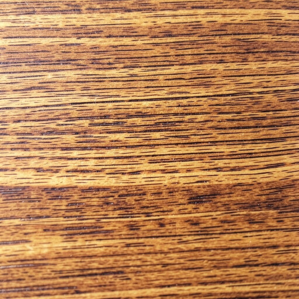
Picture a tabletop where darker lines run like small rivers through honey-colored wood. It looks cozy because the pattern changes slowly, like a story unfolding.
Bring that feel into design by choosing textures that repeat in a natural rhythm. Warm palettes and slightly irregular streaks help, and you can keep everything practical by matching the veining scale to the space, like fine grain for small graphics and bolder grain for larger surfaces. If you are working digitally, apply subtle texture overlays at low opacity so text stays crisp.
To personalize, echo the grain direction in your layout by aligning lines, buttons, or edges with the “flow.” This approach also helps with cost because you can get a similar effect using affordable laminate finishes or fine-print patterns instead of premium slabs. Right now, many interiors and product packaging lean into nature-first textures, and woodlike veining fits that trend beautifully.
3. Quartz Veins for Clean Contrast and Modern Layouts
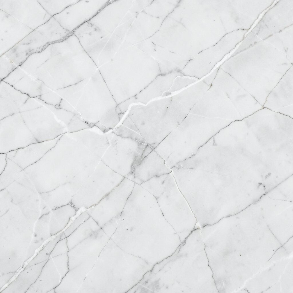
Think of bright stone where thin gray and white veins cross like elegant handwriting. The contrast feels sharp, so your design looks fresh instead of heavy.
Use quartz-style veining when you want a modern look with clear separation between elements. Choose a base color that matches the rest of your palette, then let the veins carry the accent work so you do not need loud blocks of color. You can also rotate the vein direction across sections so panels feel intentional, like a gallery wall.
For practical use, keep the veining subtle behind important details such as labels or instructions. Try testing on a print sample or a small mockup first because some veining patterns can overwhelm small text. When personalization matters, pick one vein “moment” and frame it like a focal spot on a poster, label, or countertop.
4. Onyx-Inspired Veins for Dramatic Focal Points
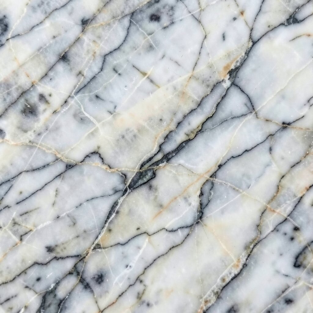
Imagine deep translucent stone with bold streaks that glow where light hits. The veins look like they are moving, even when everything is still.
Go for onyx-inspired veining when you want one strong focal point. It works well for hero images, feature cards, statement lighting, and even website banners, because the contrast naturally pulls attention. To keep it usable, limit the pattern to a single area, then balance it with plain backgrounds and clean typography.
If you are choosing physical materials, ask about lighting or finish options because the look changes a lot between matte and polished. Budget-wise, you can often mimic the drama with high-quality printed films or resin-look panels, then spend more on key details like hardware or framing. This style is popular in retail displays and luxury branding, and it still feels current when used with restraint.
5. Terracotta Veins for Earthy Posters and Packaging
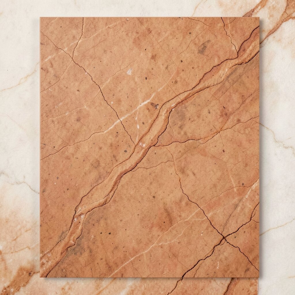
Picture terracotta surfaces where lighter streaks curl through red-brown warmth. The veins look like sun-baked clay, full of character.
Use this veining style for packaging, posters, and any design that should feel grounded and welcoming. Keep your palette earthy with cream, olive, and muted rust so the veins feel like part of the whole theme. For practical tips, choose a slightly lower contrast so the design stays readable on shelves and in quick snapshots.
Personalize it by matching the vein direction to your brand story, like arcing lines for a playful vibe or straight lines for a calm craft feel. Cost considerations are friendly here because terracotta-inspired patterns are widely available in textured papers, vinyl stickers, and affordable wraps. If you like current trends, you will see a lot of earthy packaging and slow-living aesthetics, and terracotta veining fits right into that look.
6. Feathered Veins for Soft Gradients and Gentle Branding
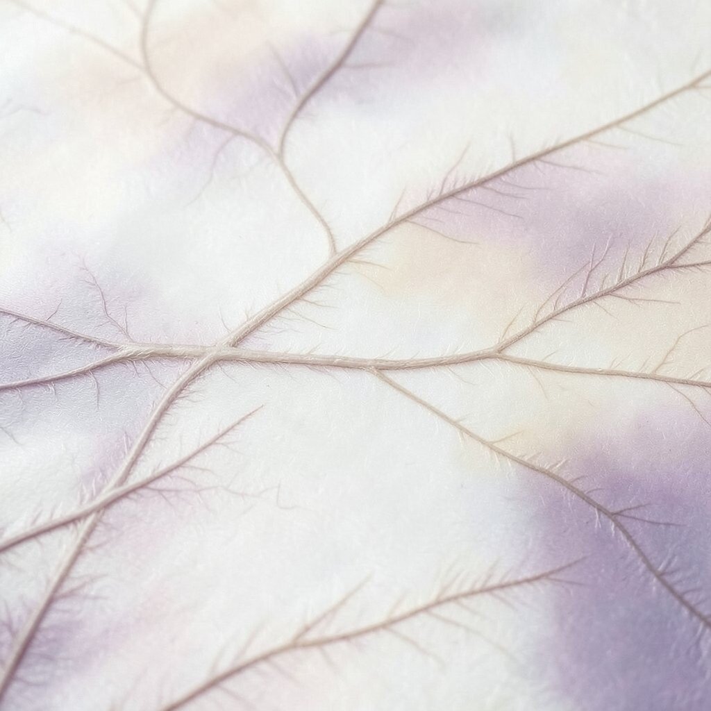
Imagine veins that spread like feathers, thinning out as they move. This creates a soft texture that feels airy, not rigid.
Use feathered veining to support gentle branding, like wellness, cafes, and friendly community projects. Pair it with soft gradients and rounded shapes so the whole design feels kind and approachable. If you are making digital assets, keep the pattern out of the main reading area and place it behind a translucent layer so it adds mood without hiding information.
7. Cross-Hatch Veins for Graphic Movement and Motion
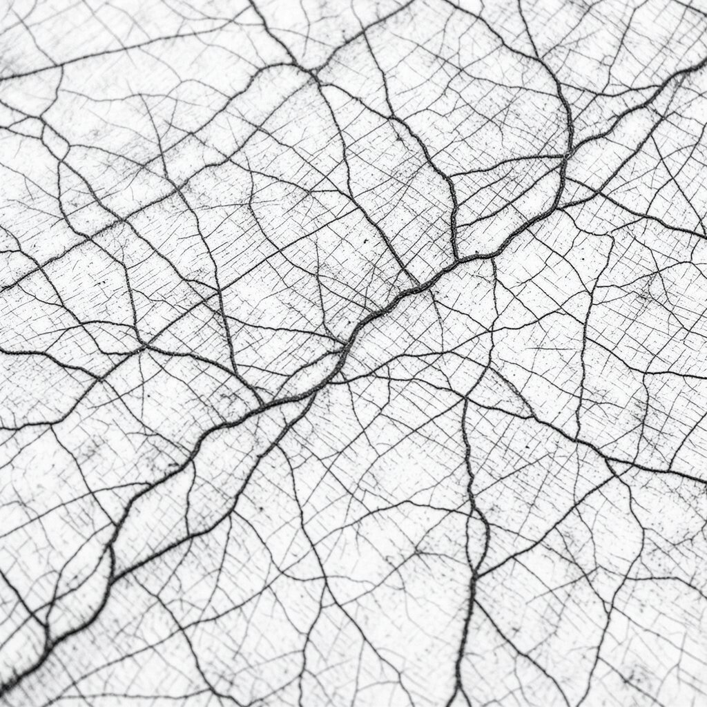
Picture stone where lines intersect, forming a subtle grid that still feels organic. The effect suggests movement, even though the texture stays flat.
Create a sense of motion by using cross-hatch veining in borders, separators, and background frames. It works especially well for posters, event tickets, and product screens because it adds structure while still looking natural. To make it practical, use a consistent scale and avoid mixing multiple vein styles in the same layout.
If you want personalization, change the intersection angle for different sections so each page feels related but not repetitive. This can be cost-friendly because you can create a similar look using lightweight repeating textures, then print only the areas that need the effect. Cross-hatch textures also match a modern trend toward patterned minimalism and structured backgrounds.
8. Stepped Veins for Architectural Plans and Wayfinding
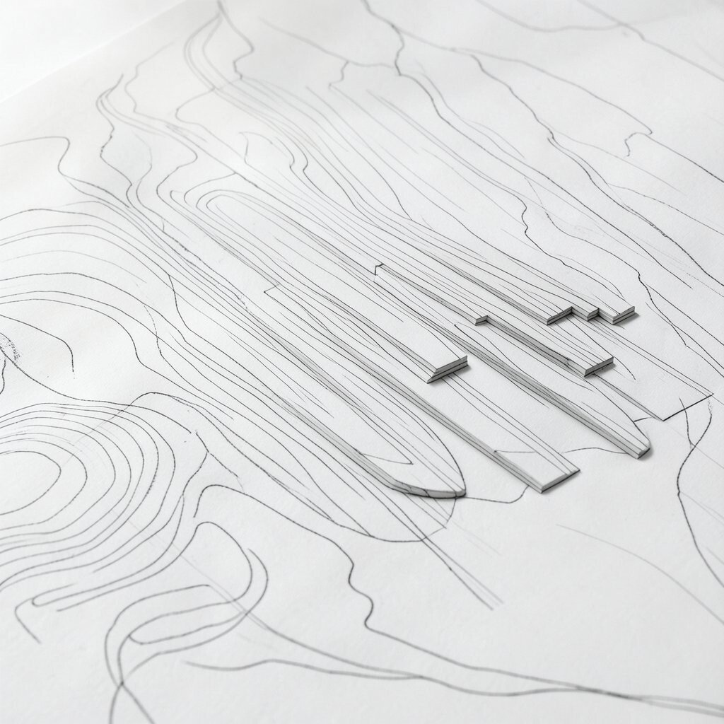
Think of veins that form staggered steps across the surface. The pattern feels built, like a path or a set of rooftops.
Use stepped veining to guide eyes through a layout the way wayfinding does in real places. It helps when you design maps, instructions, or multi-step product pages because the “steps” naturally break the flow into chunks. Keep your typography bold and high-contrast so the veins support, not compete with, the message.
9. Vein-Swirls for Energetic Headlines and Covers
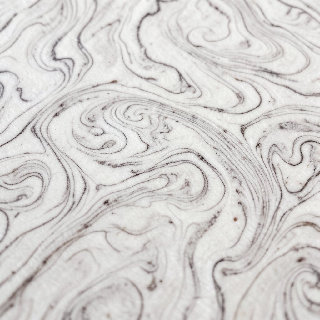
Imagine spiral veins curling outward, like a calm whirlwind trapped in stone. It instantly adds energy to any surface.
Use swirling veining for covers, hero headers, and headline backgrounds where you want your first glance to feel exciting. Swirls pair well with strong type choices and clean spacing, since the pattern already carries motion. For practical testing, try different crop positions because the center of a swirl can make or break the balance of the design.
10. “Vein Windows” for Framing Photos and Icons
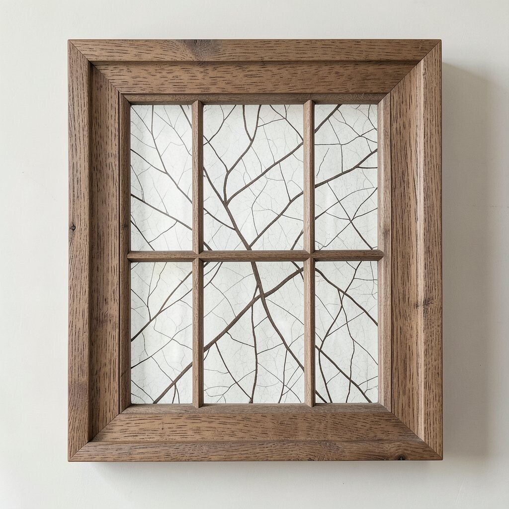
Picture a slab where a vein cluster forms a natural opening, almost like a window. That framing makes photos and icons look placed, not pasted.
Create vein windows by using patterned panels behind images with a clear border area. It is a great trick for galleries, social cards, and menu boards, because the veining gives a ready-made frame. Keep the center calmer than the edges so faces, products, or icons remain the main focus.
Personalize by aligning the “window” shape with your logo or mascot so it feels like part of your identity. Cost-wise, printed frames and textured backers can do the job without needing expensive stone. This kind of framing is trending in product storytelling and packaging, where brands want a tactile look without heavy materials.
11. Thin Vein Lines for Minimalist UI and Detail Work
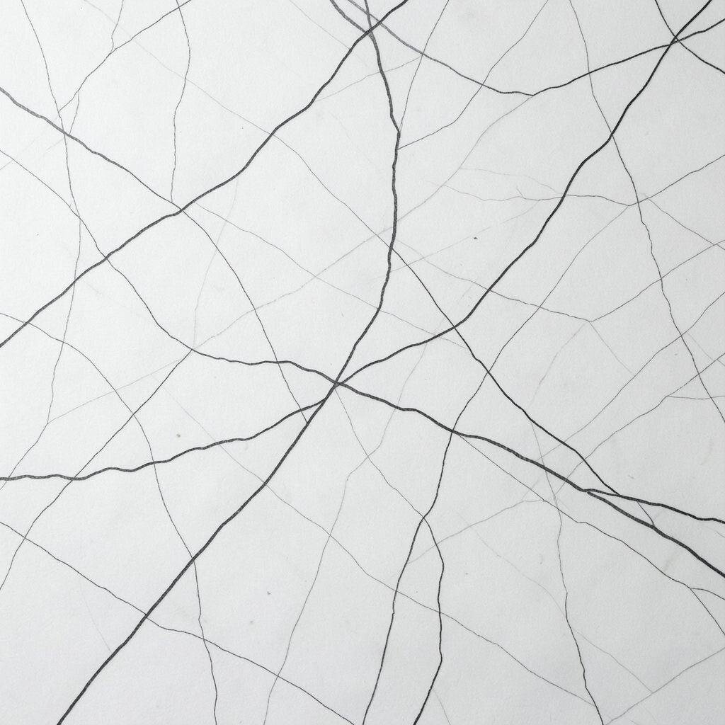
Imagine nearly invisible veins, like fine pencil marks under glass. They add interest while staying quiet, which suits minimalist design.
Use thin veining in UI backgrounds, dividers, and subtle cards where you want a soft upgrade instead of a full pattern takeover. Choose a low-contrast vein color so the layout stays readable and accessible. A practical step is to test at different screen brightness levels, because subtle textures can disappear or flare depending on the device.
12. Bold Vein Bursts for Event Branding and Signage
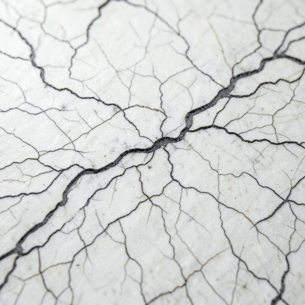
Picture veins that radiate outward, making a burst effect across the surface. The look feels celebratory, like confetti turned into stone.
Use bold vein bursts for event branding such as stages, banners, and wristband designs. It gives instant personality without needing many extra graphics. Keep text clean and well-spaced, and place key details in the calmer center so it stays easy to read from a distance.
For personalization, vary the burst color by section, like matching venue rooms or schedule tracks. Cost considerations are smart here because you can print bursts on lightweight vinyl or banners, then invest more on readable fonts and bold sizes for the audience view. This style is popular in pop-up events and modern community signage, and it still feels fresh when you keep the rest of the branding simple.
13. Veining as a Color Palette Generator
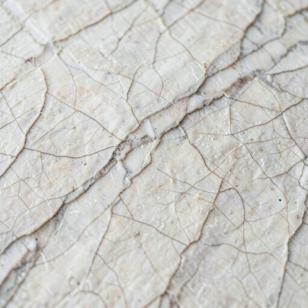
Look closely and you will see how veins naturally suggest multiple shades living together. One surface can give you a whole palette without guessing.
Use that idea for palette building in both digital and physical design. Pull one base tone, one vein highlight, and one mid-tone for accents, then test them across your layout. The benefit is that everything feels matched, because the colors come from one real source pattern.
To personalize, adjust saturation slightly so the palette fits your brand, like making veins brighter for a playful company or more muted for a calm studio. Cost-wise, this approach saves time, and time is money in design work. Right now, palette-led design is common because people want cohesive visuals, and veining naturally supports that trend.
14. Layered Veining for Depth in Craft and Styling
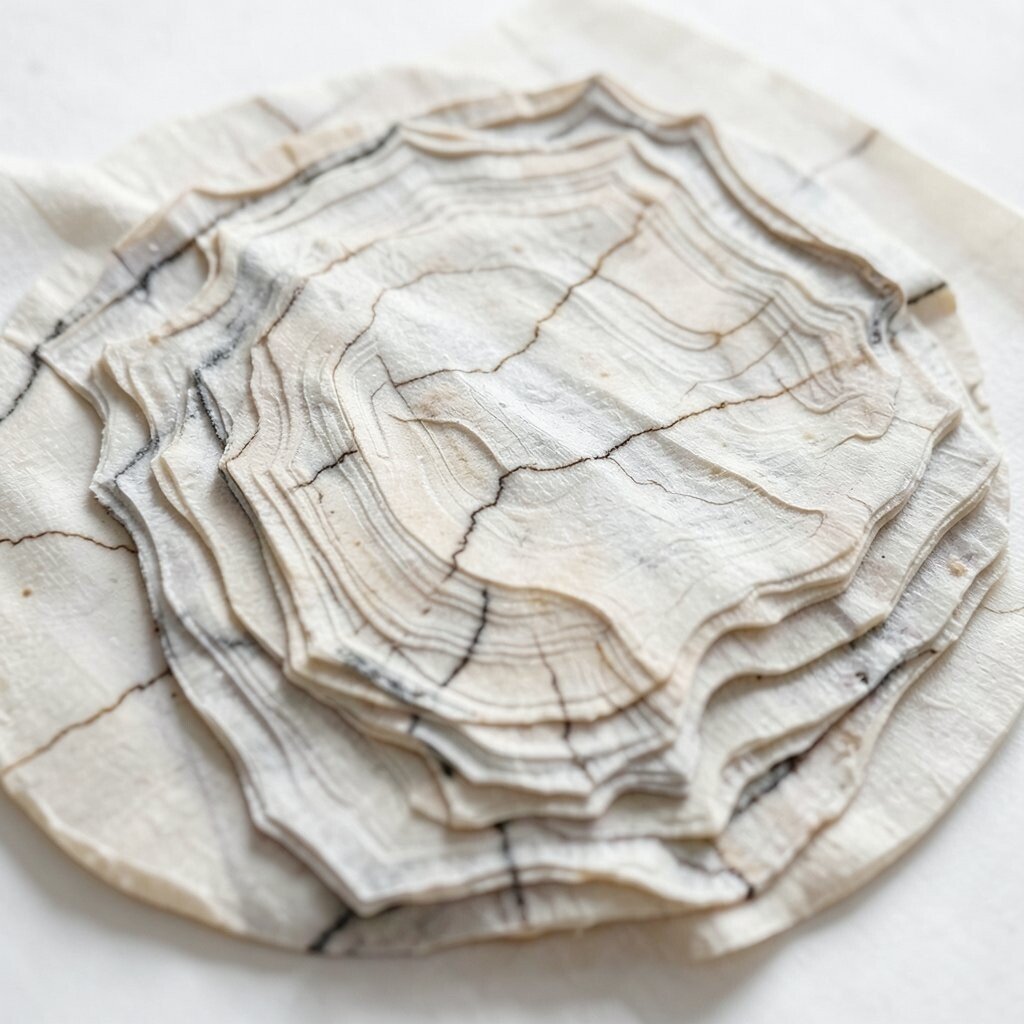
Imagine several vein textures stacked like overlapping sheets of glass. The surface looks deeper, as if light has places to rest.
Build depth by layering textures with care, such as using one veining print as a base and adding a second, lighter vein layer on top. This is great for crafts, scrapbooking, and even interior styling where you want surfaces to feel rich without adding heavy ornament. Use transparency and soft blending so the layers do not clash.
Personalize by changing the scale between layers, like large veins on the bottom and fine veins on top. If you are cost-conscious, buy one higher-quality pattern and pair it with simpler supporting prints, because layered design still looks premium when one layer is the star. Layered veining also matches the current love for tactile, multi-material surfaces.
15. Matching Vein Direction Across a Whole Set
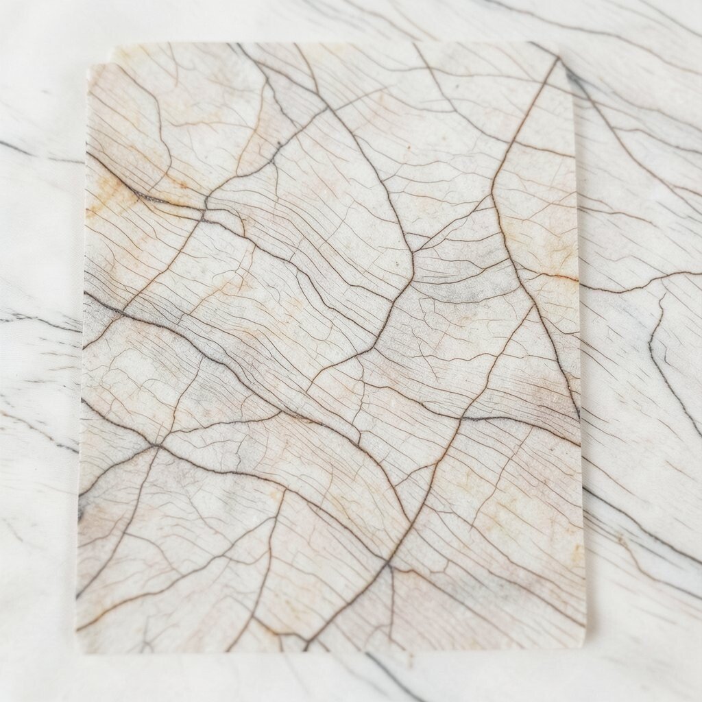
Picture every piece in a set sharing the same vein direction, like a synchronized wave. It makes the entire collection feel intentional and well planned.
This is a powerful choice for home interiors, product packaging systems, and brand templates. When the vein direction is consistent, your eye connects elements faster, and the design feels more professional. A practical tip is to create a simple reference image and reuse it for cropping so each item keeps the same “flow,” even if the size changes.
For personalization, you can shift the starting point of the vein for each product while keeping the direction aligned. Cost considerations are realistic here because you can source one vein pattern and reuse it across many items, reducing design time. Consistent veining is also a modern trend in collections, where brands and makers want a recognizable look from label to label.