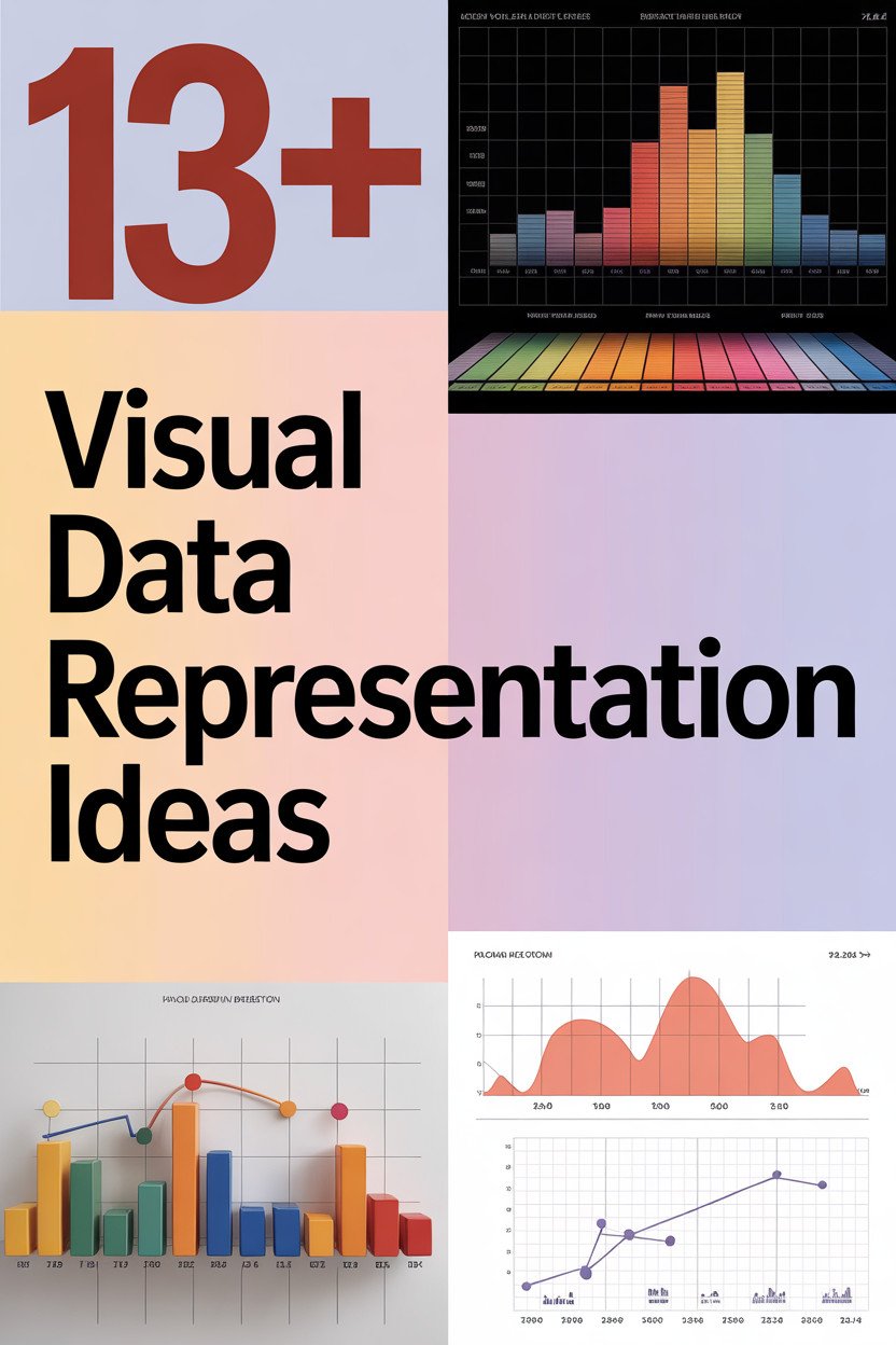
Have you ever wondered how to turn boring data into something beautiful and exciting? The world of visual data representation is full of vibrant possibilities just waiting to be explored.
1. Infographics
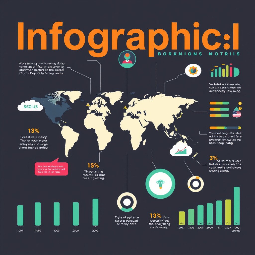
Infographics are like colorful stories that show information in a fun way. They use pictures and charts to make data easy to understand.
You can create infographics to share facts about your favorite hobby. They are unique because they combine art with information.
Try using free online tools to design your own. Infographics are cost-effective and great for social media sharing.
2. Interactive Charts
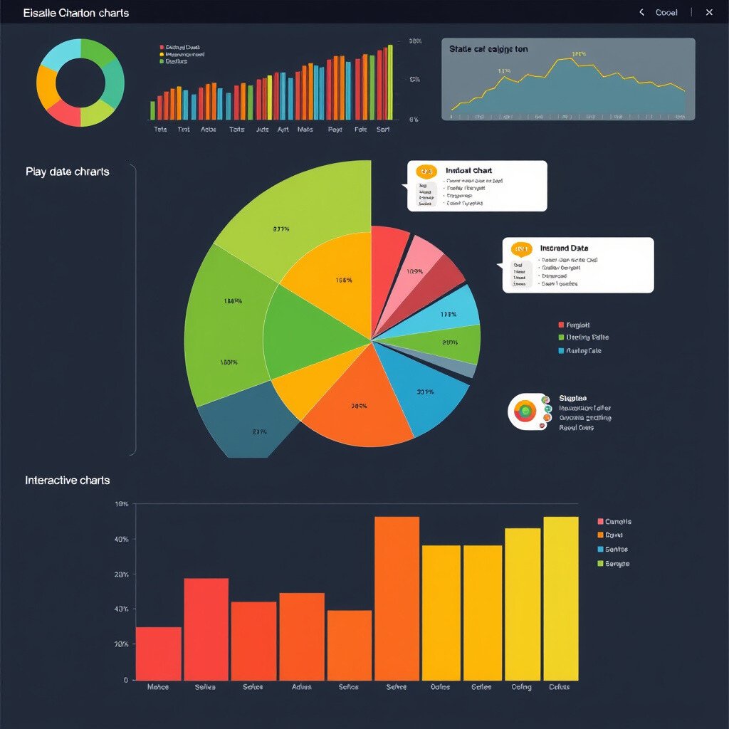
Interactive charts let you play with data! You can click and hover over parts to see more details.
These charts are perfect for websites and apps. They make learning fun and engaging.
Personalize them with your colors and themes. Some tools might cost a bit, but many offer free versions too.
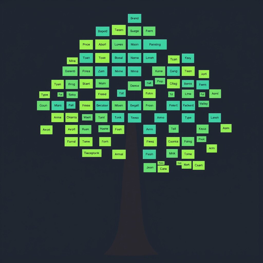
3. Mind Maps

Mind maps are like colorful trees of ideas. They help you organize thoughts and see connections.
Create a mind map for your next big project or story. It’s a unique way to plan and brainstorm.
Use markers and paper, or try digital tools. They’re affordable and perfect for creative minds.
4. Heatmaps
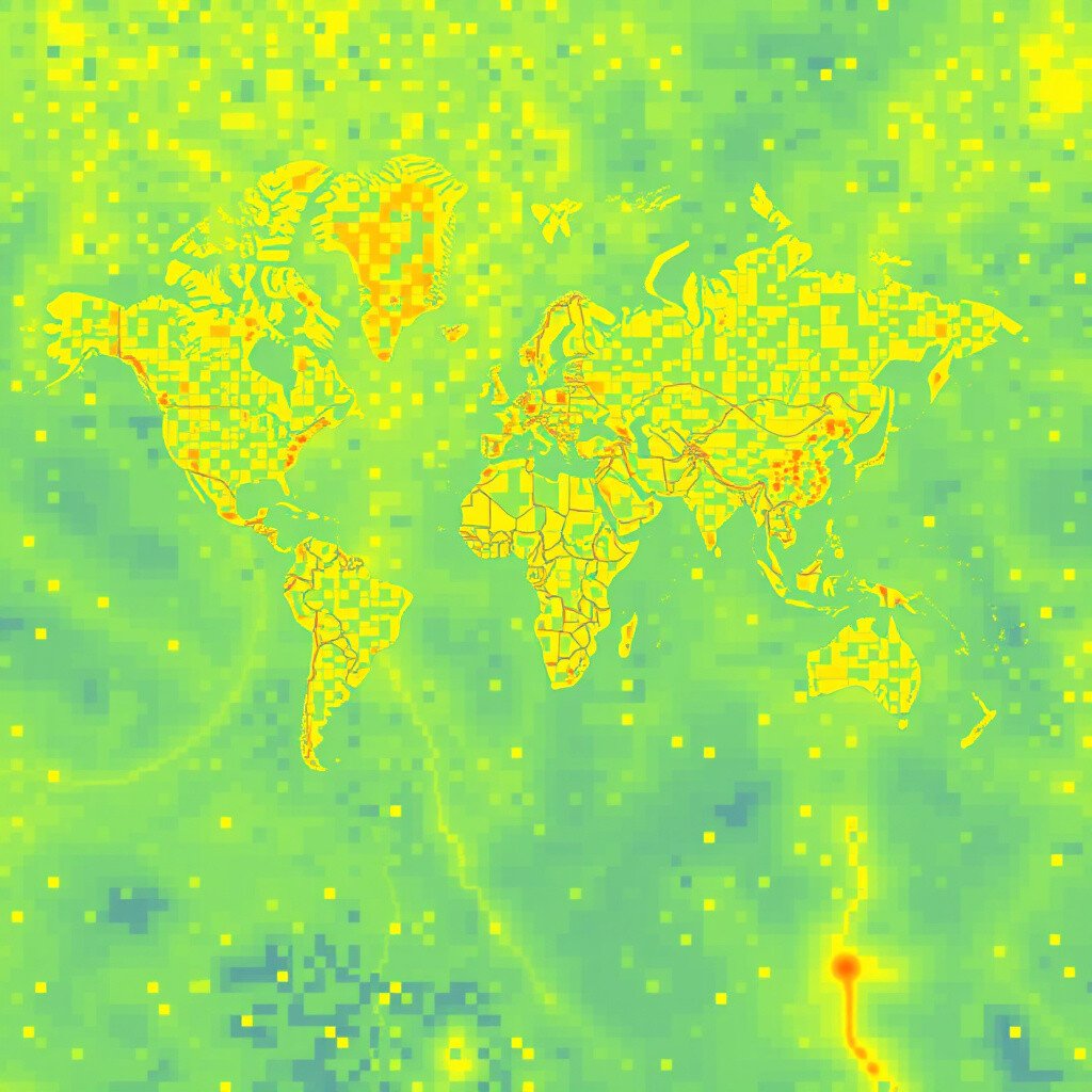
Heatmaps show you where people click or look the most on a website. They’re like a treasure map for user attention!
Businesses love heatmaps for improving website design. They’re unique for showing hot and cold spots visually.
Some tools offer free trials, so you can try before you buy. They’re cool for anyone interested in web design.
5. Data Dashboards

Data dashboards are like command centers for data. They show all your important info in one place.
Use them to track your fitness goals or finances. They’re unique because they keep everything organized.
Many apps offer customizable dashboards. Some might cost a bit, but the organization they bring is priceless.
6. Word Clouds
Word clouds turn words into art! They show which words are used the most in a fun way.
Create a word cloud from your favorite book or speech. It’s a unique way to see text visually.
Free online tools make creating word clouds easy and fun. They’re perfect for personal or school projects.
7. Flowcharts
Flowcharts are like maps for decisions. They show steps and choices with arrows and boxes.
Use a flowchart to plan your next vacation or project. They’re unique for breaking down complex tasks.
Simple tools make creating flowcharts a breeze. They’re budget-friendly and great for planners.
8. Bubble Charts
Bubble charts use circles to show data. The size of each bubble represents a value.
These charts are perfect for comparing things like expenses or preferences. They’re unique and visually appealing.
Online tools offer easy bubble chart creation. They’re often free, making them accessible for everyone.
9. Gantt Charts
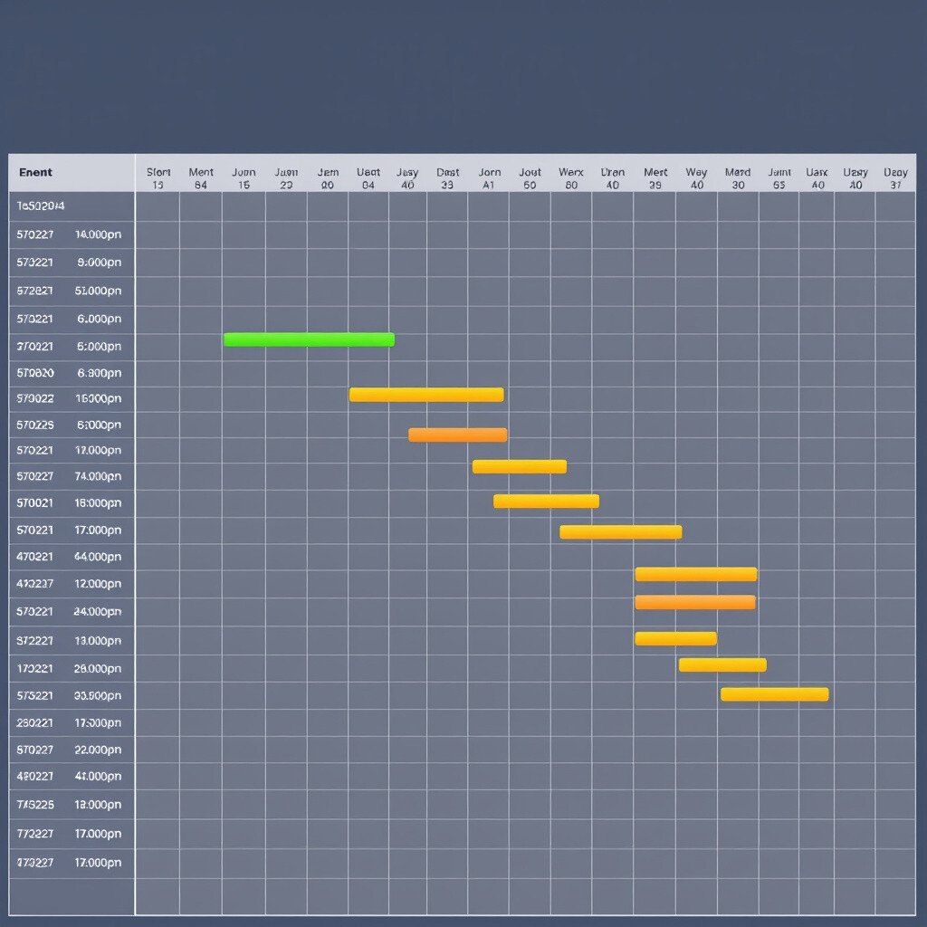
Gantt charts are timelines that show project schedules. They help you see what needs to be done and when.
Use a Gantt chart for planning a big event or project. They’re unique for time management and planning.
Some tools offer free Gantt chart features. They’re ideal for anyone who loves organization.
10. Treemaps
Treemaps use rectangles to show data. Each rectangle’s size represents a value.
They’re perfect for showing things like file sizes or budget breakdowns. Treemaps are unique for their compact visual style.
Try free tools to create treemaps. They’re budget-friendly and great for data lovers.
11. Timelines
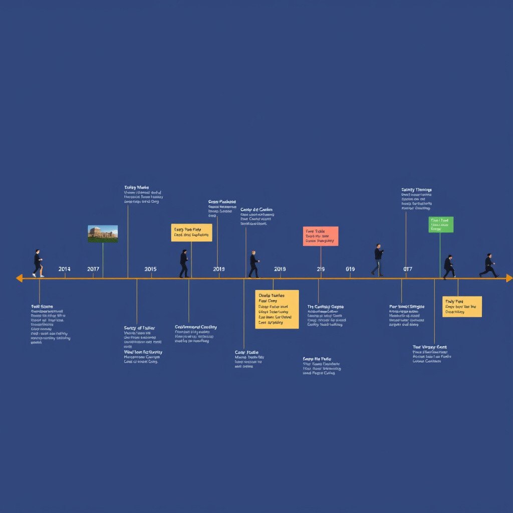
Timelines show events in order. They help you see how things happened over time.
Create a timeline of your life or a historical event. They’re unique for storytelling and education.
Many free tools make timeline creation easy. They’re perfect for personal or school use.
12. Sankey Diagrams
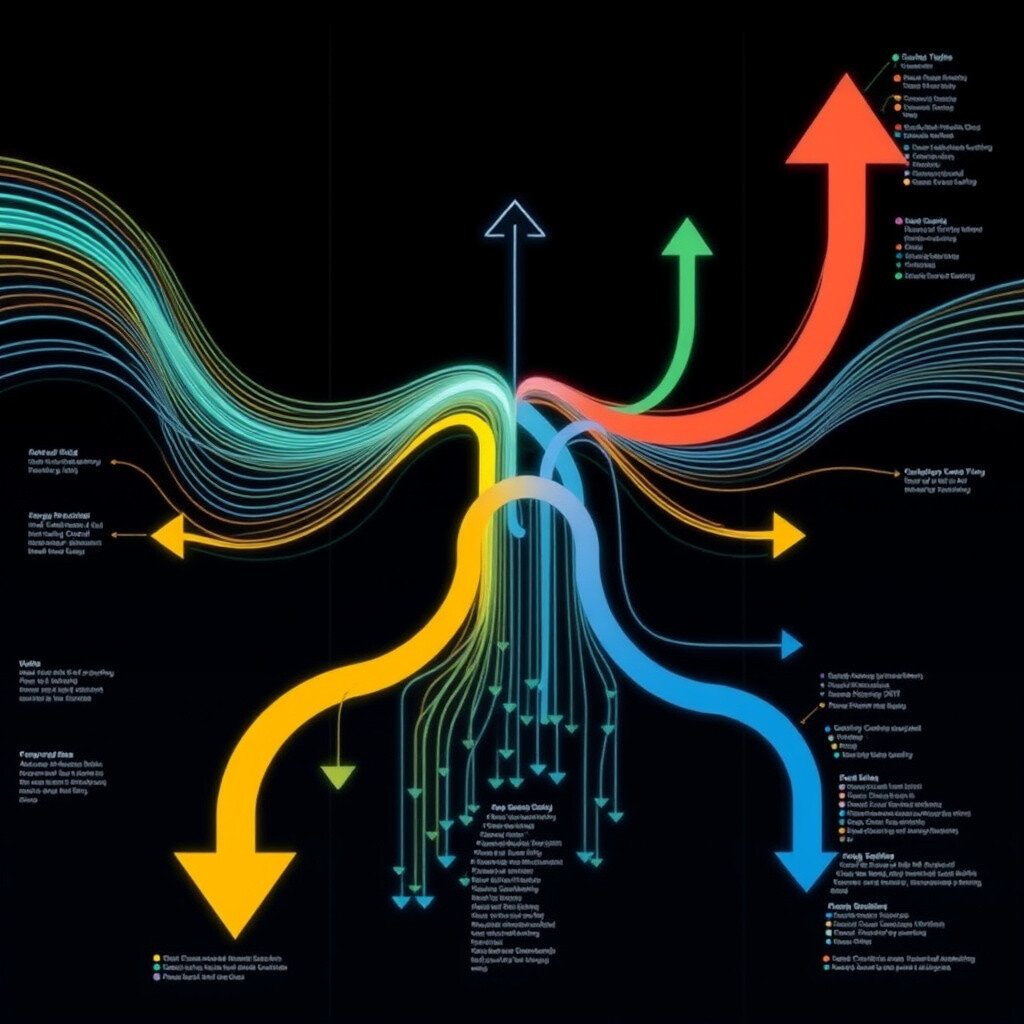
Sankey diagrams show flows. They use arrows to represent the size of the flow.
These diagrams are perfect for showing energy or money flows. They’re unique and visually striking.
Free online tools can help you create Sankey diagrams. They’re great for making complex data understandable.
13. Pie Charts
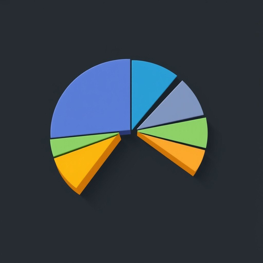
Pie charts show parts of a whole. They’re like a delicious slice of data!
Use pie charts to show how you spend your time or money. They’re unique for their simplicity and clarity.
Many free tools make pie chart creation easy. They’re ideal for quick and simple data representation.
14. Dot Plots
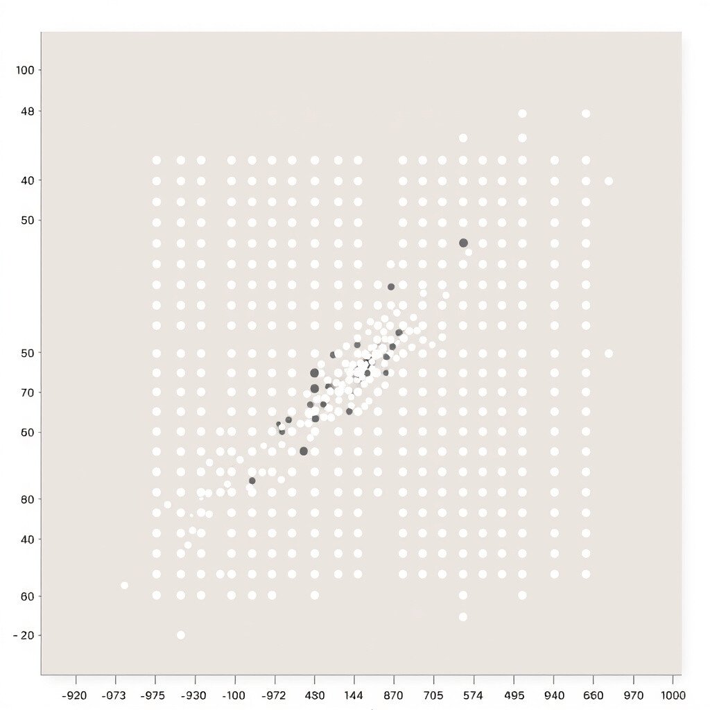
Dot plots show data points on a simple grid. Each dot represents a value.
They’re perfect for showing distributions and frequencies. Dot plots are unique for their simplicity and clarity.
Try free tools to create dot plots. They’re budget-friendly and great for detailed data analysis.