Sometimes the best art feels like a playful wink. Small choices can turn a plain layout into something people remember.
In this list, you’ll find cheerful, slightly oddball design moves that still work in real projects. Use them to add charm, clarity, and personality to posters, slides, websites, and brand visuals.
1. Sticker-Style Typography With Real Shadow
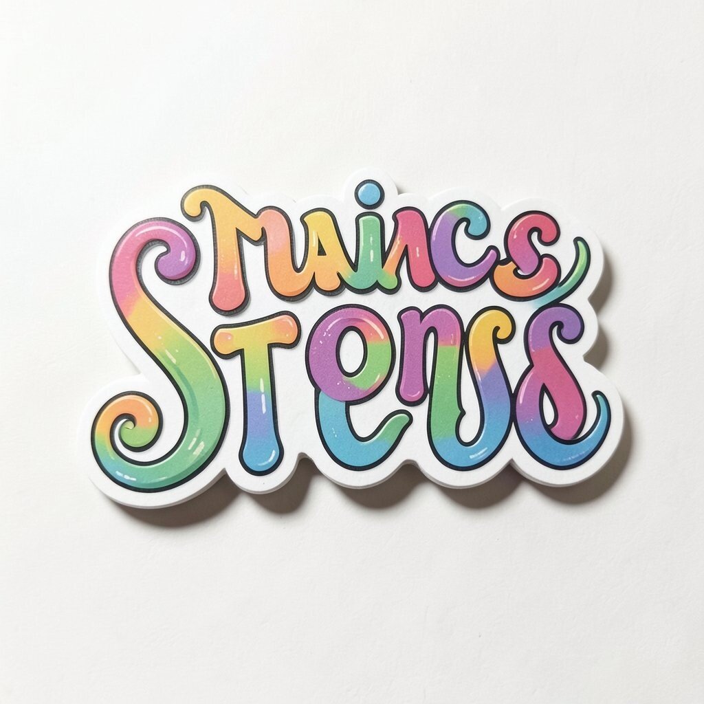
Pick a headline font that looks a bit like hand-cut lettering and give it a thick, soft drop shadow. If you add a subtle outline, the text instantly feels like it’s stuck on paper.
This approach is great for posters, event graphics, and social banners because it pops quickly on a busy feed. Keep the shadow direction consistent so it looks intentional, not accidental. For a practical twist, try two sizes of outline and swap them based on the background brightness to keep readability strong.
2. Pattern Breaks Using Tiny Confetti Interruptions
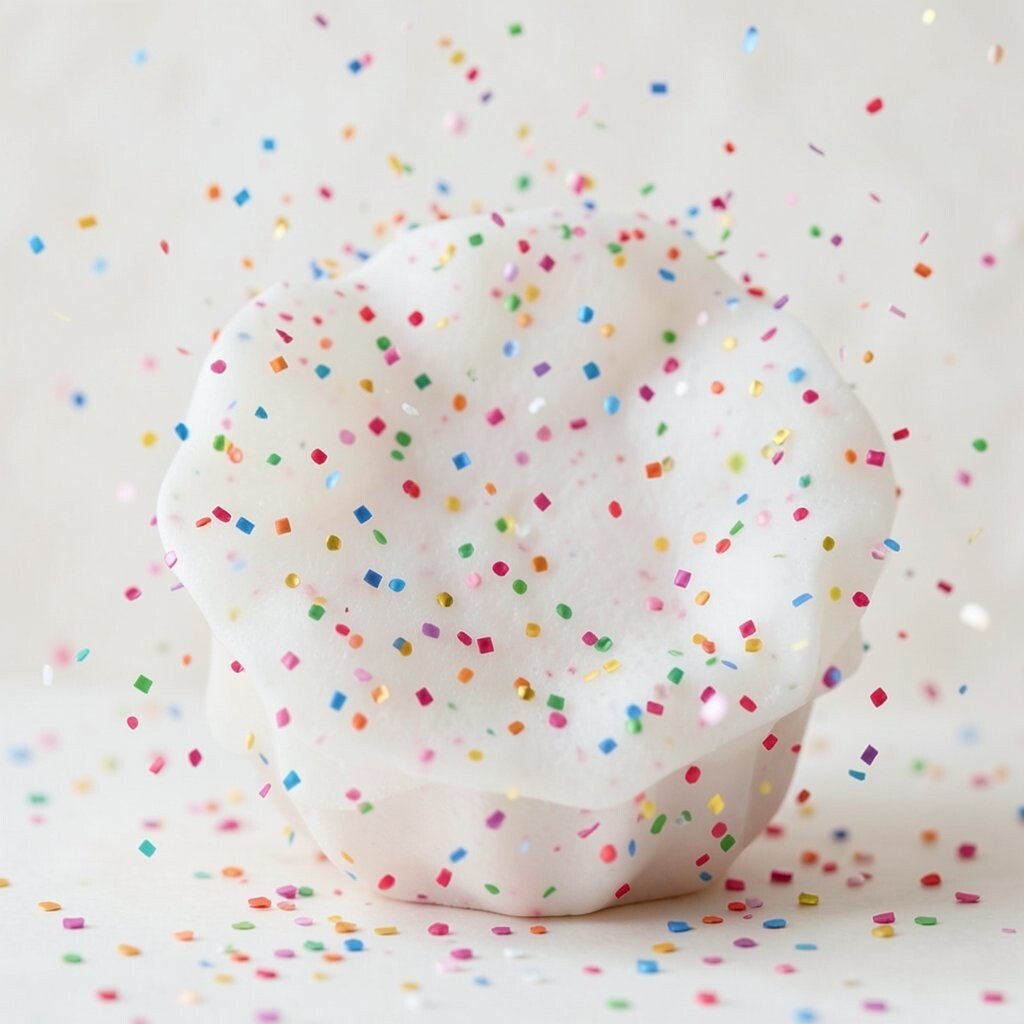
Start with a background pattern, then break it with small confetti shapes scattered like a celebration. You can keep most elements orderly while one section feels delightfully messy.
Designers love pattern continuity because it feels cohesive, but breaks add surprise and guide attention. Use this trick to draw the eye to a title, a button, or a key photo without making the rest too loud. Try matching the confetti colors to your brand palette, then add one accent color that only shows up in the break.
To control cost, reuse the same confetti set across multiple graphics and swap the placement. If you’re working in slides or a layout tool, duplicate a small group and adjust rotation for variety. Personalization is easy when each project uses a different “mood” color scheme for the confetti moment.
3. Hand-Drawn Borders That Look Imperfect on Purpose
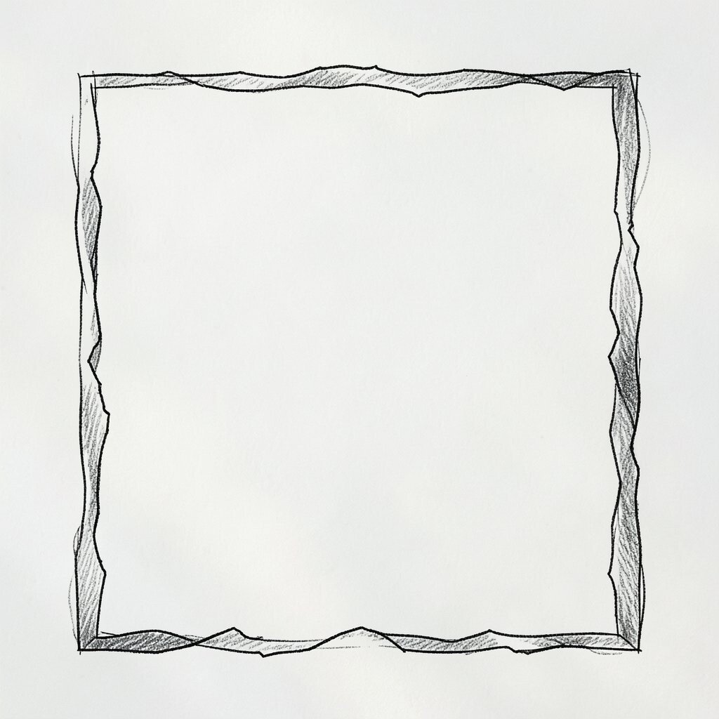
Instead of a straight frame, draw a border with slightly wobbly lines and uneven corners. Even a basic rectangle can feel warm when the edges have a human touch.
Imperfect borders add personality and can make a clean layout feel friendly, especially for invitations, portfolios, or learning materials. For practical design, keep the border thin so it doesn’t crowd the content. Choose one border style and apply it consistently across a series for a recognizable visual system.
Uniqueness comes from tiny variations, like different corner radii or small gaps where the line “stops.” You can generate this look with brushes, a free vector texture pack, or by drawing in a notebook and tracing. If you’re building a brand, pick one border family and use it like a signature across print and digital screens.
When budgets are tight, you can reuse a single border asset and recolor it for different themes. That small investment keeps everything cohesive without requiring new art every time.
4. Color-Coded Weather Icons for Context in Infographics
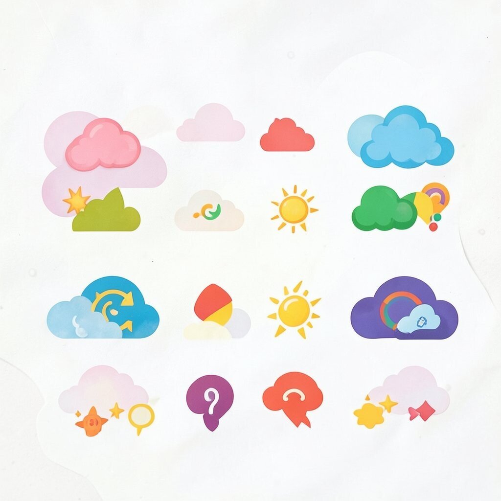
Use weather-like icons to represent mood, time, or progress instead of generic symbols. A small sun, cloud, or raindrop can act like a visual shortcut for people who scan fast.
This fits current trends toward more expressive micro-illustrations in dashboards and educational graphics. Keep the style consistent by picking a single icon set and setting a clear size rule. Place the icons beside labels so the meaning is obvious even without reading every word.
5. Collage Corners Using Paper Peels and Tape Shapes
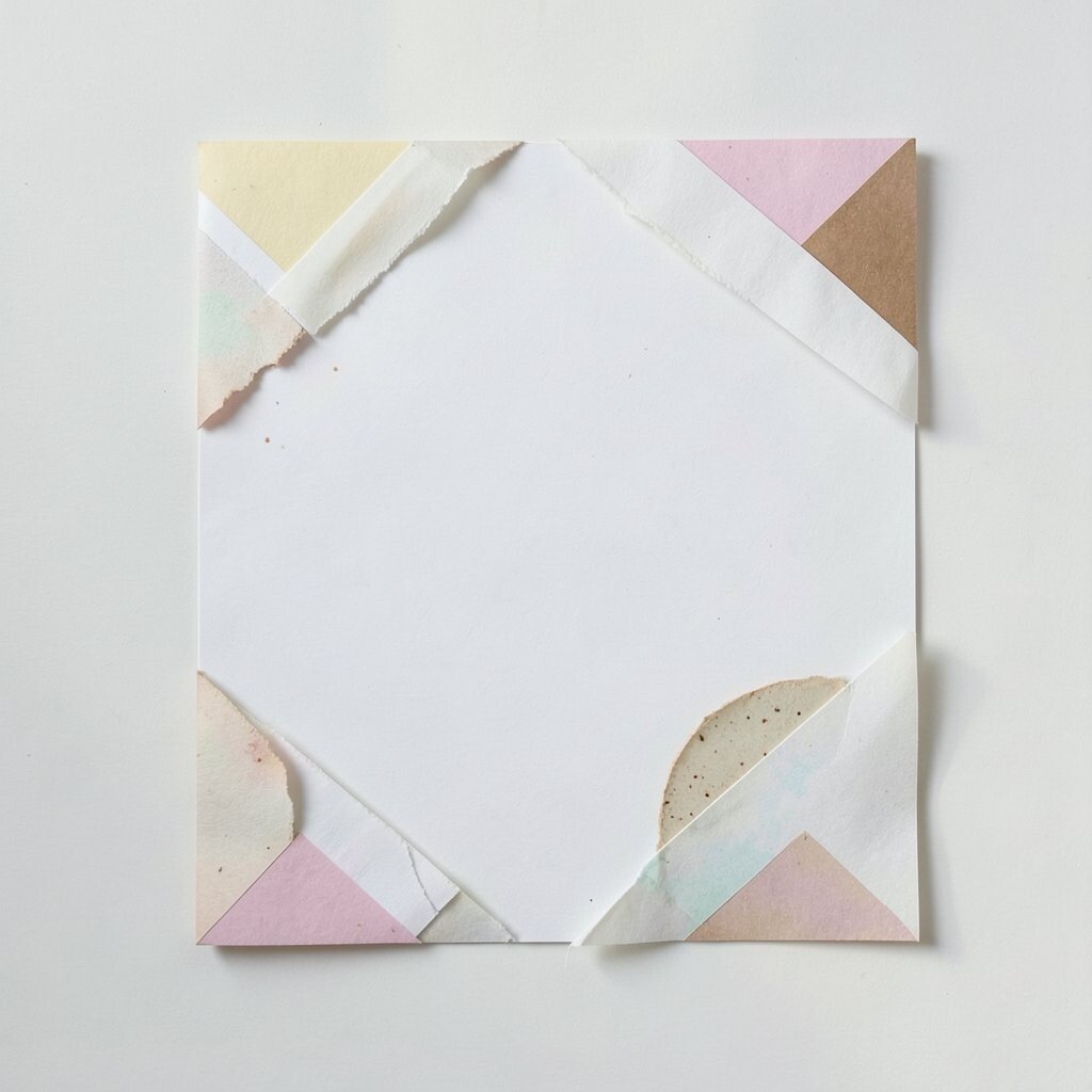
Make your layout feel crafted by adding collage corners, like paper peels and bits of tape in the margins. A few torn shapes can create depth without needing heavy 3D effects.
Collage visuals are unique because they bring a handmade mood into otherwise modern layouts. For practical tips, use one shadow style for all collage items so they feel like they belong together. Keep the taped areas close to the edges so the center content still has breathing room.
If you want cost control, create a small library of tape and paper textures and reuse them across multiple posters. Personalization can come from changing only the paper color, the tape pattern, or the orientation based on the theme. This also works well for brand campaigns where each series gets its own palette but shares the same design language.
6. Story-Flow Layouts With Curving Arrows and Path Lines
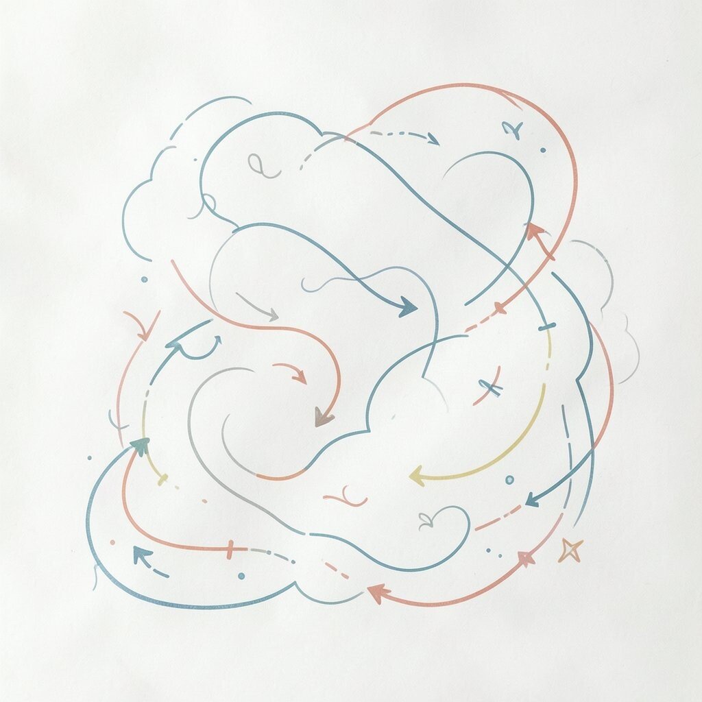
Turn your information into a journey by using curved path lines that guide the eye. Add arrows that look like they’re drawn with a marker, not like perfect office icons.
People love visual flow because it reduces confusion and makes content feel easier to follow. A playful curve can also make instructional graphics more engaging, especially for step-by-step processes. Keep the paths consistent in thickness and spacing so your page still feels clean and organized.
7. Gradient Backgrounds With One Oddball Color That Confirms the Theme
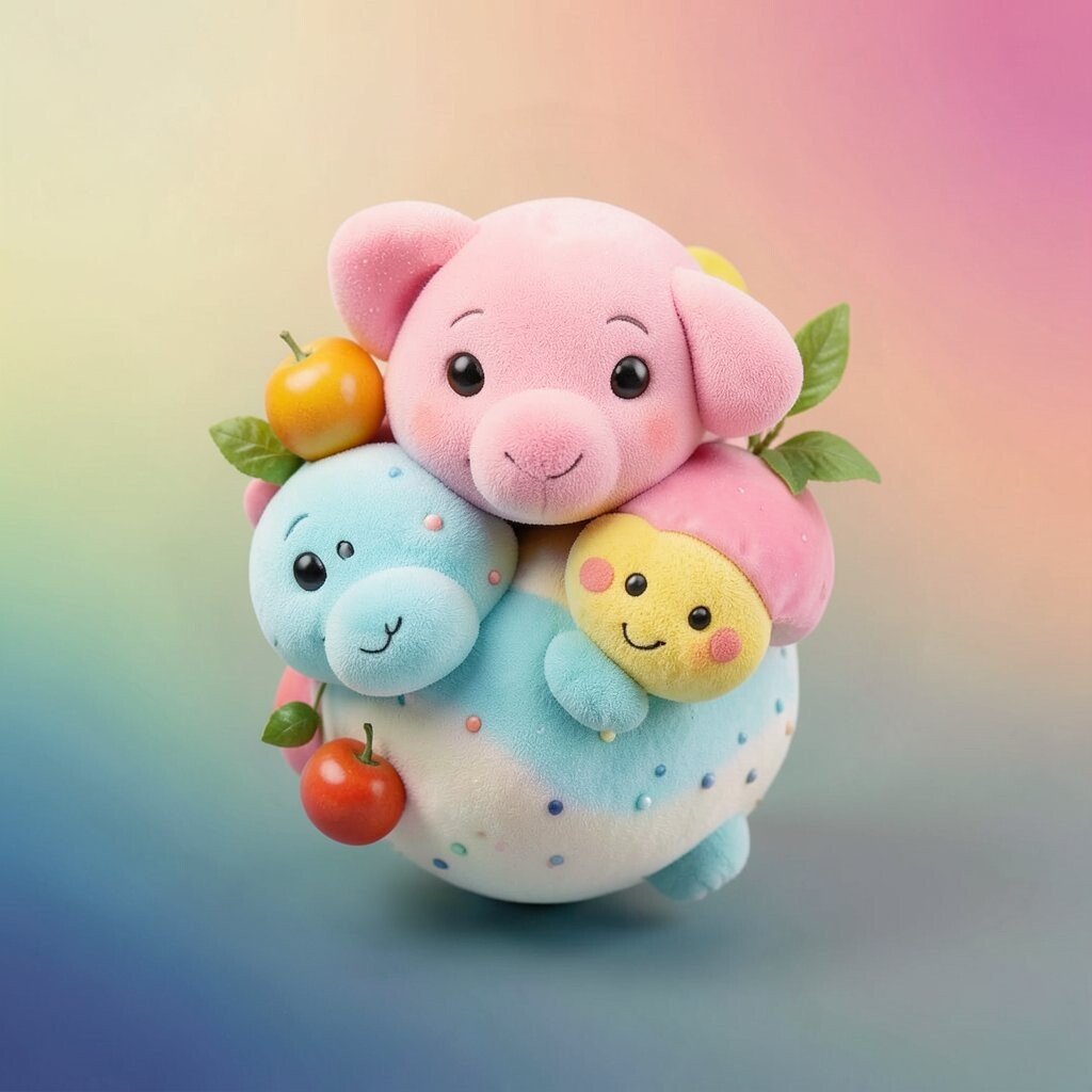
Choose a smooth gradient background, then add one intentionally “wrong” color spot like a tiny stain or a bubble. This surprise color helps your design feel whimsical while still staying purposeful.
Gradients are popular in current web and slide design, but the playful twist makes your work stand out. Use the oddball color as a cue for action, like highlighting a quote or a link. For readability, make sure text sits on the most neutral part of the gradient or add a subtle overlay behind it.
Cost considerations are easy here because gradients are fast to generate and scale cleanly. Personalization is simple too since you can swap the oddball color to match seasonal themes or event vibes. Keep a small set of approved gradients so your series looks related, not random.
8. Extra-But-Useful Icons That Look Like They Belong in a Toy Box
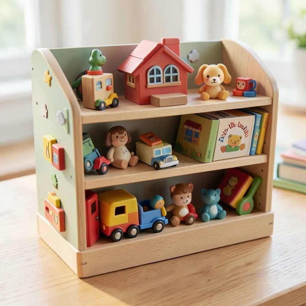
Pick icons that feel friendly and a little rounded, like those from toy packaging. Use them for actions and categories, not just decoration.
This trend toward expressive iconography helps visuals feel modern while still warm and approachable. Make icons consistent by using the same stroke weight or fill style across the set. For practical tips, keep icons to a small scale and pair them with short text so the meaning lands quickly.
9. Misaligned Grids With One Loyal Alignment Anchor
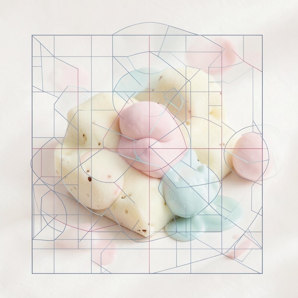
Start with a grid, then misalign a few elements on purpose while keeping one anchor perfectly aligned. That contrast creates a playful tension without turning your design into chaos.
People respond well to intentional structure because it feels credible, and the misalignment adds charm. Use this in magazine-style layouts, cover art, or portfolio pages where personality matters. Keep the misaligned elements within a predictable range so they still feel controlled.
Uniqueness shows up in the exact “off” positions, like nudging a title slightly above the baseline. To keep editing painless, decide the rule early, such as how far text can drift from the grid. When you personalize, swap the misaligned element for each project while keeping the anchor in the same place across a series.
For cost, this style is mostly layout work, so you don’t need extra illustrations. Just be mindful about spacing so it still prints and displays cleanly.
10. Speech-Bubble Captions That Explain Without Feeling Serious
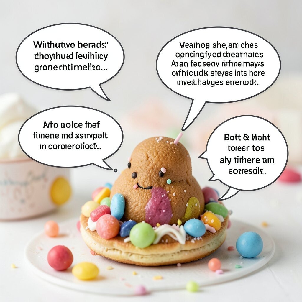
Place small speech bubbles near key visuals and let them carry tiny insights. Even a short phrase can make the page feel interactive.
These captions are memorable and friendly, which is great for presentations, children’s learning pages, and creative agency work. Keep the text short so the bubble doesn’t steal attention from your main message. Choose a consistent bubble shape, like rounded rectangles, to maintain a coherent look.
11. Photo Frames With Rounded “Lens” Handles
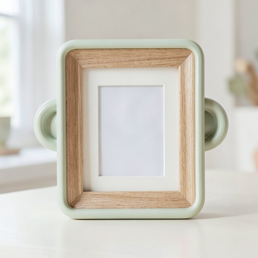
Give image thumbnails a frame that looks like a camera lens ring, with a small handle or tab. The visual cue feels playful while it still frames your content neatly.
This design idea is unique because it combines practical framing with a fun object metaphor. It works well for galleries, mood boards, and product shots where you want images to feel curated. For practical tips, keep the frame thickness consistent and use a soft shadow to separate it from the background.
Current trends favor bold framing and photo emphasis, and lens-like borders match that vibe. To keep costs low, use simple shapes and gradients instead of complex 3D renders. Personalization can come from changing the lens ring color based on the series theme, like “ocean,” “sunset,” or “forest.”
12. Kinetic-Style Dashes That Suggest Motion in Still Layouts
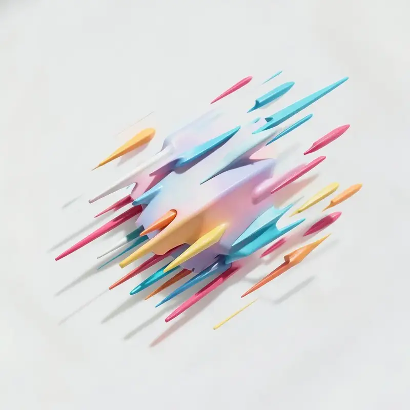
Even in static designs, you can suggest motion by using dashed lines that curve around content. Think of them as invisible movement trails leading to a headline or icon.
Motion cues improve scanning because they guide the eye along a path. This helps a lot in posters, splash pages, and slide decks where you want attention to land quickly. Use one motion style throughout a project so the effect feels cohesive, not random.
If you want uniqueness, make the dash pattern irregular in scale while keeping overall spacing tidy. Cost considerations are good because dashes are easy to create with built-in tools or lightweight vector shapes. For personalization, assign different “motion speeds” by changing dash length and gap sizes per section.
13. Layered Typography With One “Mistake” That Becomes the Hook
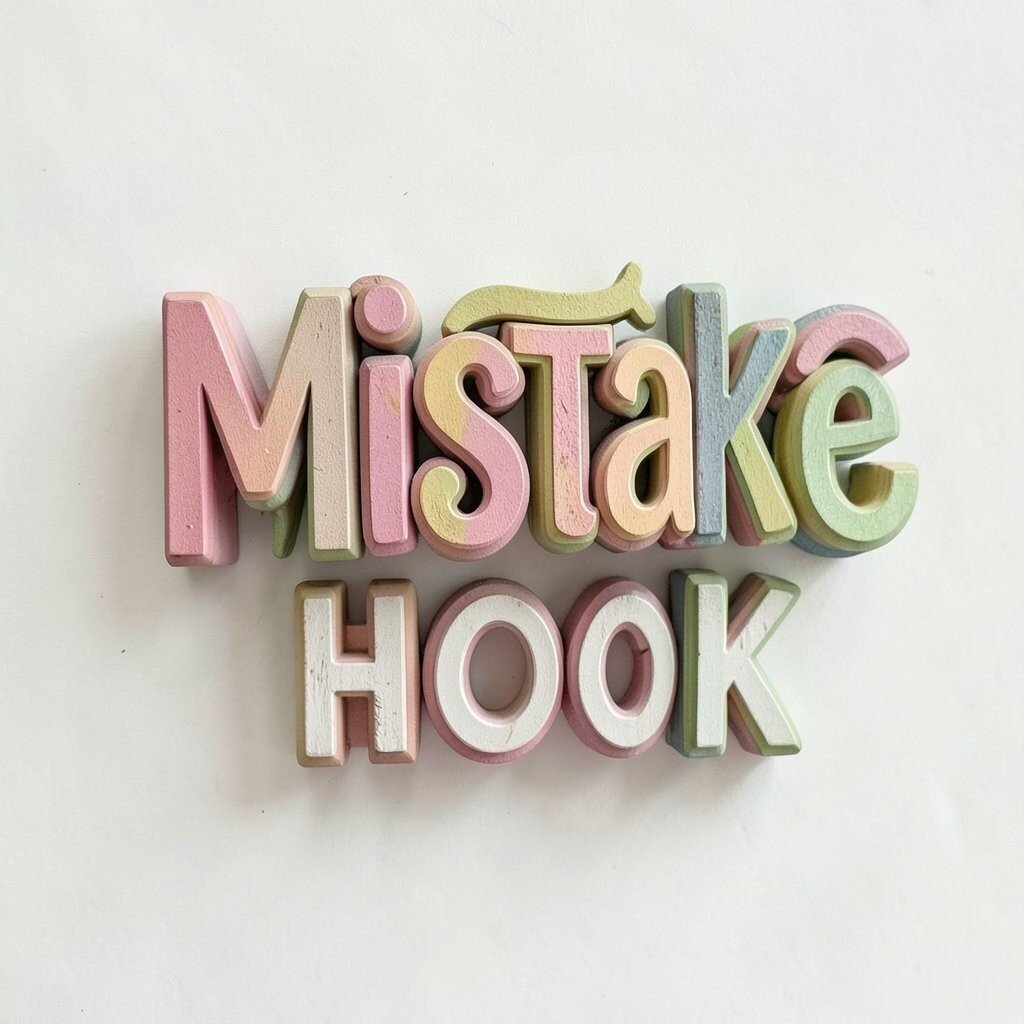
Stack two text layers, then intentionally alter one detail like letter spacing or color for a single word. That tiny flaw can become the highlight instead of a problem.
Layered type feels modern and creative, and the deliberate “mistake” adds whimsy without hurting readability. Use it for quotes, campaign tags, or hero headings where you want a memorable signature. Keep the altered word distinct by using contrast that still meets basic accessibility needs.
Uniqueness grows from choosing which word gets the playful treatment and how you adjust it. For practical tips, keep the overall hierarchy clear by maintaining the same font size for the main word. Personalization is simple too since you can swap that hook word per theme while keeping the stacking effect consistent.
14. DIY-Looking Stamps for Dates, Categories, and Small Metadata
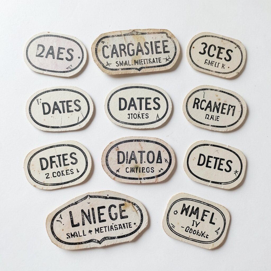
Add stamp-like graphics for dates, tags, or section labels, like a postmark on paper. Use slightly faded ink effects and uneven edges to make them feel real.
Stamps bring a charming editorial vibe and can make metadata feel less boring. This works especially well in event posters, travel brochures, and portfolio case studies. Keep the stamp size small and place it near the related content so it supports scanning rather than blocking it.
15. Fun Layout Spacing With Oversized Captions That Trade Place With Photos
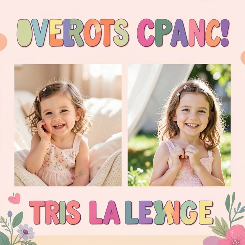
Let captions be large and sometimes let them overlap or “float” beside photos. When the caption and image trade usual roles, the layout feels lively and unexpected.
Oversized captions are popular in modern design because they create strong typographic rhythm. The benefit here is faster storytelling since text becomes part of the visual composition, not just a label. For practical tips, align the caption edges to a grid even if it’s big, so the overlap still feels tidy.
Cost considerations stay friendly because you’re mainly adjusting layout and type styles, not commissioning new art. Personalization can happen by changing caption shape, like adding a rounded background pill or a playful outline. If you’re working on web, keep responsive behavior in mind so overlaps don’t hide important text on small screens.
Uniqueness comes from deciding which part overlaps, like the first line or the last word, and repeating that choice across a set for a recognizable pattern.
16. Seasonal Mini-Themes With Consistent Characters or Motifs
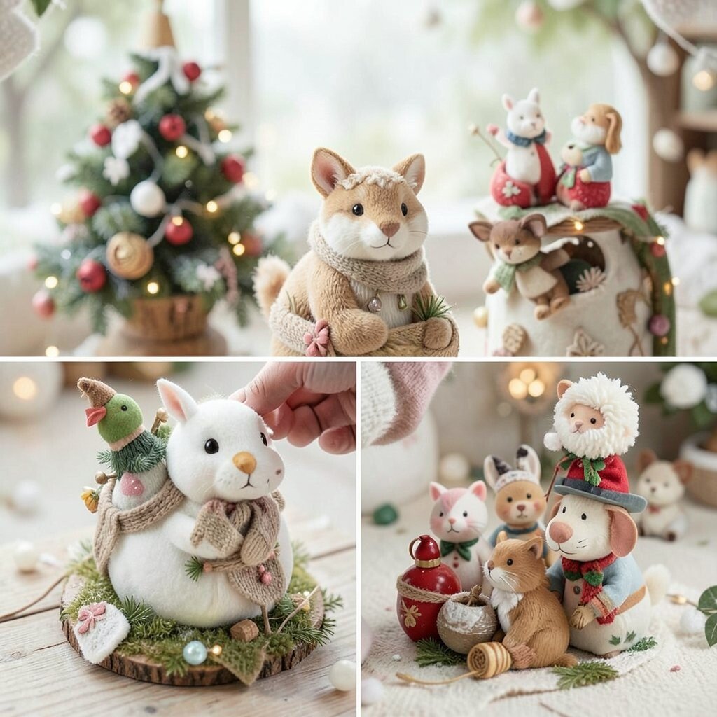
Give your project a mini theme using a recurring motif, like tiny leaves, friendly stars, or pocket-sized creatures. Keep it consistent so viewers feel like they’re following a familiar character.
This is a great way to personalize a series while still staying practical across different formats. Motifs can appear in corners, as separators, or as accents in icons, and that makes the whole system feel designed, not assembled. Use current trends toward brand mascots and micro-illustrations to keep things fresh, but keep the style simple so it’s easy to apply.
For cost, start with a small set of elements and reuse them in new colorways. If you’re creating in a tool with symbol libraries, you can swap colors and resize quickly for each new theme. Uniqueness comes from how the motif interacts with real content, like wrapping a line around a headline or peeking from behind a card.
Most importantly, choose a motif you genuinely enjoy, because the design will feel more natural when you keep returning to it.