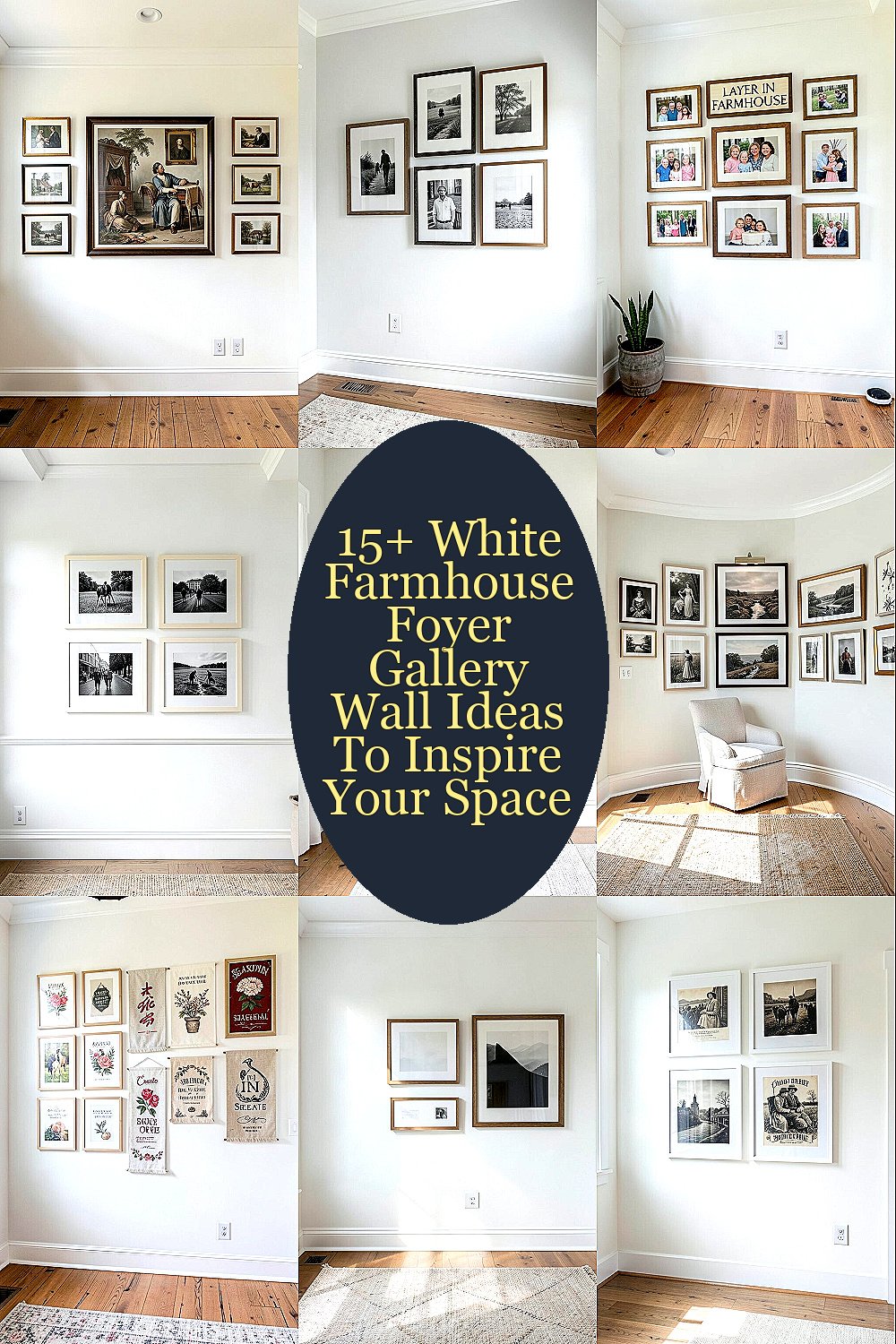
The first thing you see when you step inside sets the tone for every day. A white farmhouse foyer gallery wall can make that moment feel warm, organized, and quietly special.
With the right mix of frames, photos, and textures, you can turn a plain wall into a welcoming focal point that fits your life.
1. Start With a Classic Centered Collage

Choose a clean arrangement where the biggest piece sits in the middle and everything else supports it. In a white farmhouse foyer, the symmetry feels tidy while still looking lived in.
Use frames in white, cream, or black for contrast so the wall stays bright. Keep matting consistent and wipe the glass often, since foyers show smudges more than other rooms. When you center the gallery above a console or bench, it visually anchors the entryway.
2. Mix Tall and Horizontal Frames for Movement
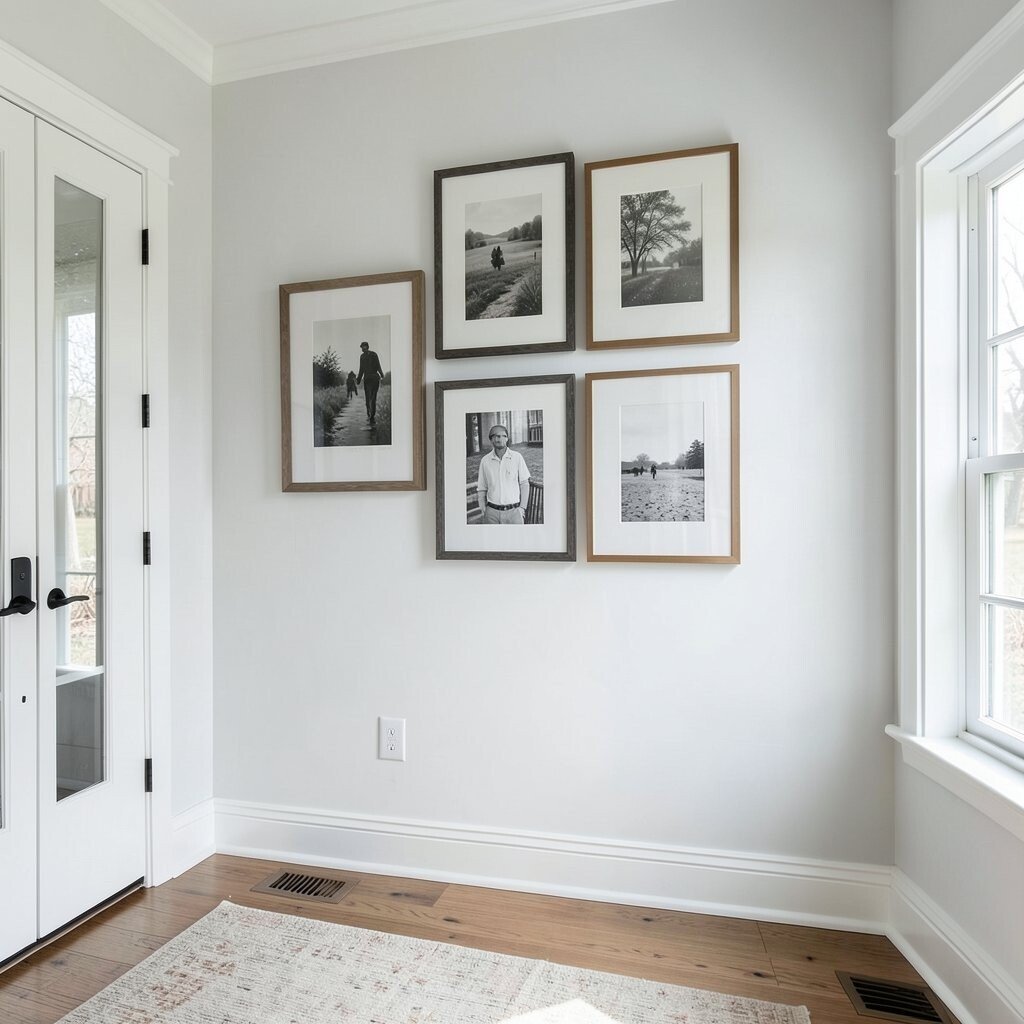
Instead of lining up everything at the same height, blend tall frames with wider ones so the wall feels like it has rhythm. You will notice the change right away when you walk in, especially if your foyer has a narrow stretch.
Choose a few larger pieces for balance, then surround them with smaller photos and prints. This layout helps you use odd-sized wall space without buying custom frames.
Try placing one tall piece closer to the center and letting the shorter frames fan out from it. It looks intentional, and it makes the wall feel fuller without overcrowding.
3. Layer in Farmhouse Signs With Family Photos
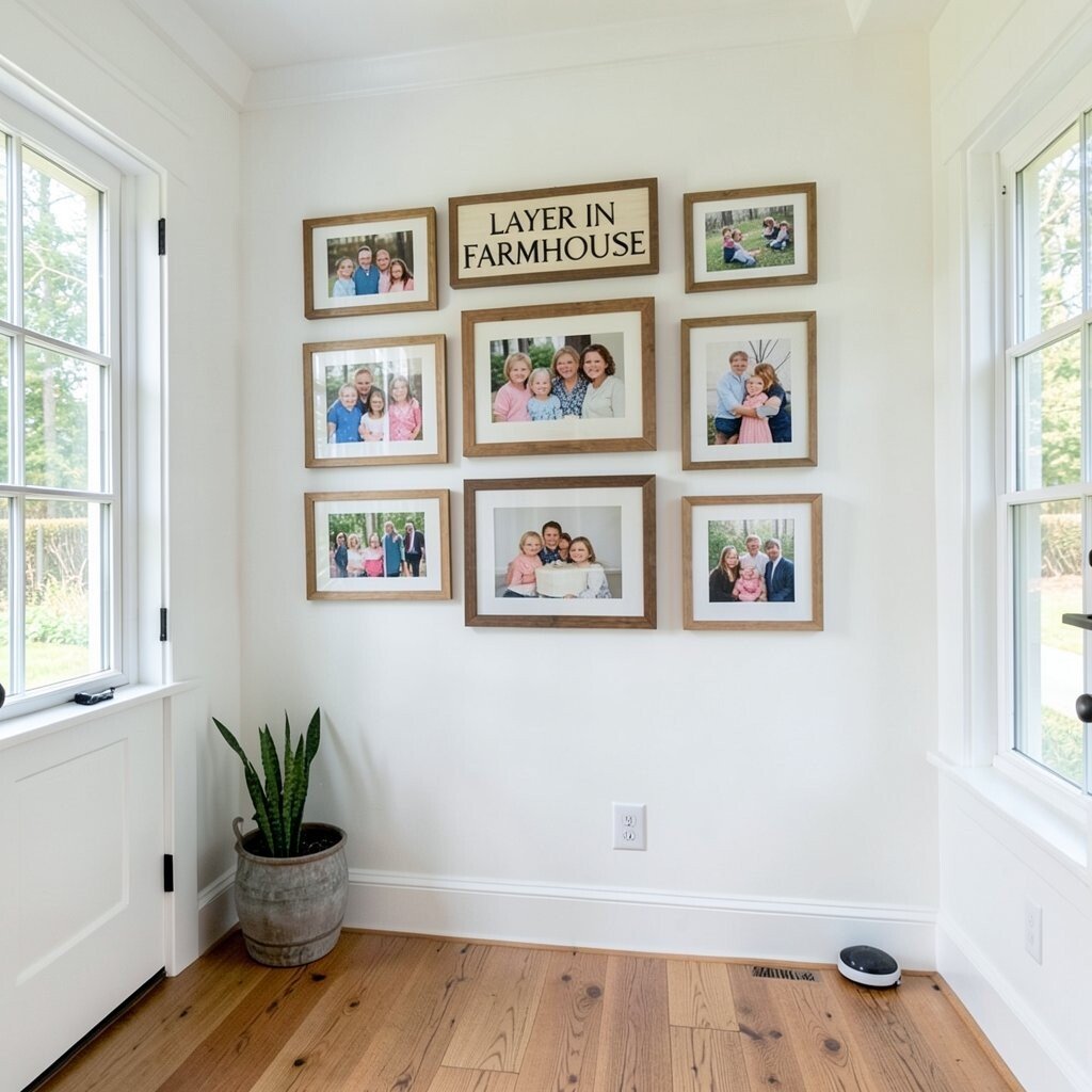
Bring true farmhouse character by pairing small vintage-style signs with your favorite family photos. The white wall makes the lettering pop, and the mix keeps the gallery from feeling too formal.
Use signs for warmth, then use photos to keep it personal and meaningful. For visual balance, match frame finishes across the set even when the content changes.
For a smooth look, keep the font sizes in a similar range and avoid using too many different lettering styles. You can also print your own rustic quotes on textured paper for a budget-friendly feel.
If you want a fresh twist, add one small botanical print next to the photos. It softens the look and makes the wall feel connected to the rest of your home.
4. Go for Black-and-White Photography With Cream Frames
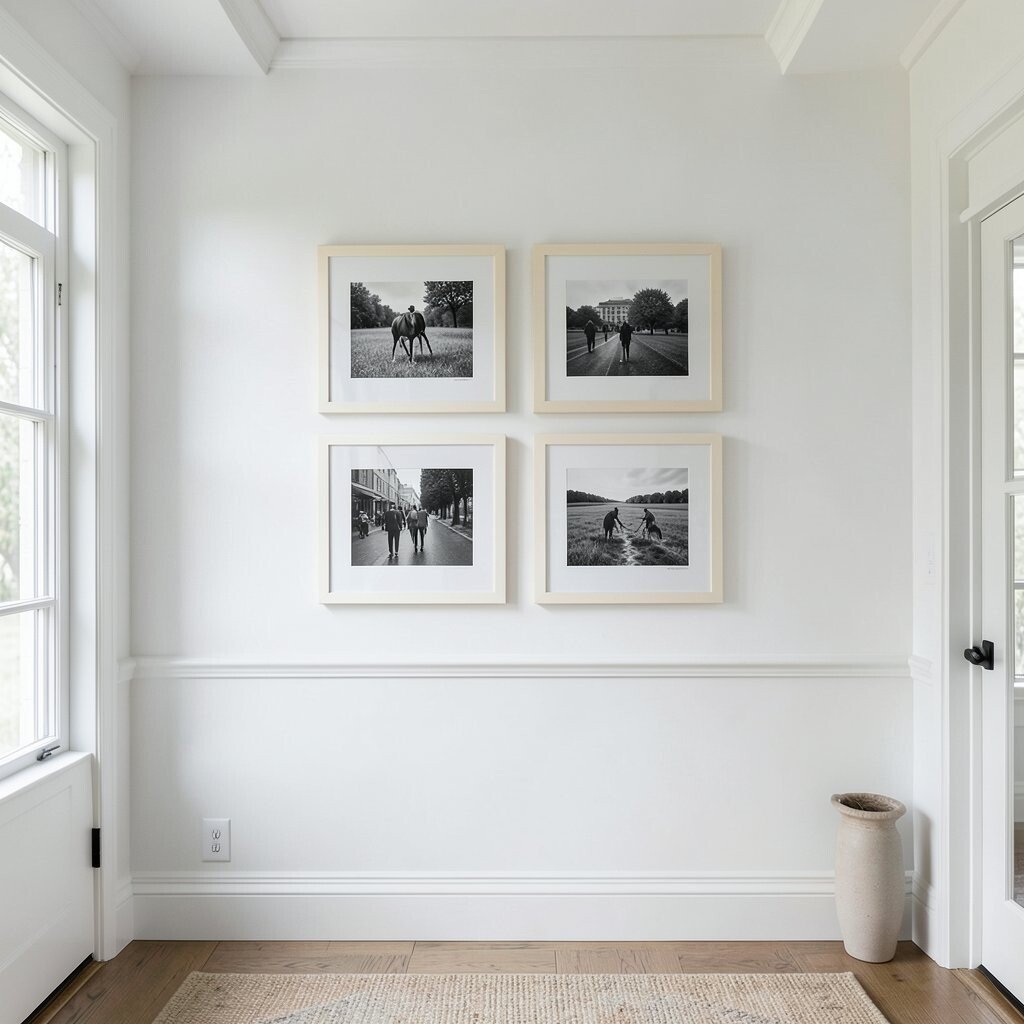
Black-and-white photos look crisp against white walls, and they fit the farmhouse mood without feeling busy. When you pick images with clear subjects, like portraits or well-lit landscapes, the gallery looks high-end.
Use cream or off-white frames to keep everything gentle and cohesive. This pairing also hides glare better than shiny gold finishes, which matters in bright entryways.
5. Add a Large Statement Piece Behind the Smaller Frames
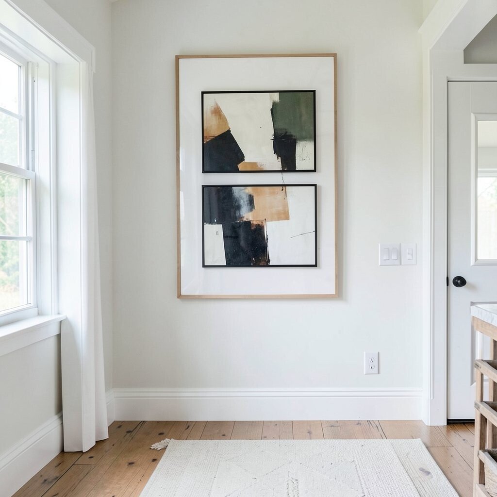
Start by choosing one bigger artwork, like a framed farmhouse print, a map, or a simple linen canvas. Place it slightly higher than eye level so it catches attention as soon as you enter.
Then build the smaller frames around it like supporting characters. Use a mix of photo sizes and mat colors to create depth while still keeping the whole wall clean.
If you are worried about cost, borrow the idea without buying expensive art by printing a quality image at a local shop. You can also swap in seasonal prints so the gallery changes with the year.
6. Use a Slightly Curved Layout for a Softer Look
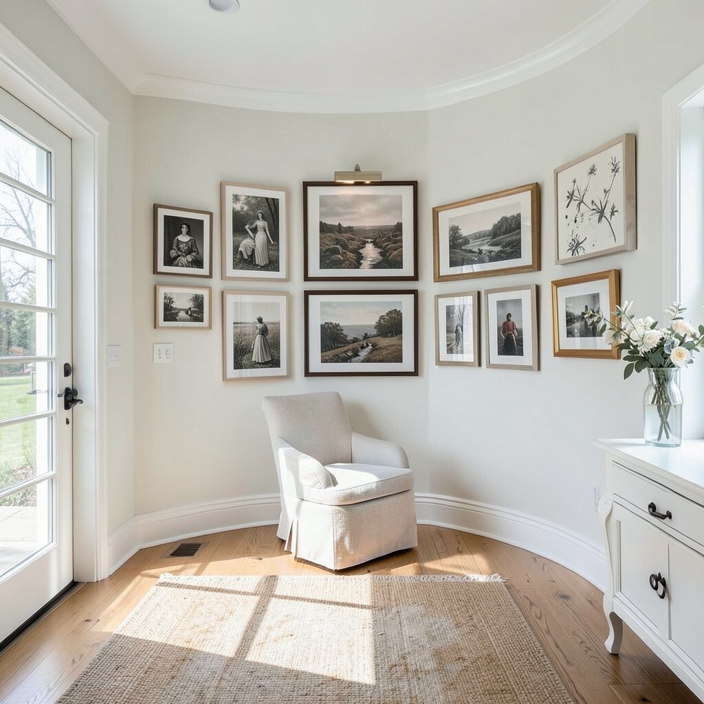
A curved gallery wall feels friendly and relaxed, which matches the farmhouse style so well. Even a gentle arc can make the wall feel more organic than strict grids.
Try arranging frames so the edges follow a slow curve, with the largest pieces closest to the center. This trick works beautifully in foyers because it guides the eye toward the entry without feeling rigid.
Keep spacing even, then adjust only the outer frames if you need to fit the wall. A level and painter’s tape help you shape the curve before you drill anything.
7. Create a Themed Set With Seasonal Banners or Prints
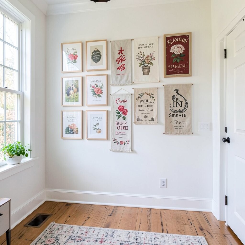
Farmhouse decor looks especially charming when it changes with the seasons. A gallery wall with interchangeable prints lets your foyer stay fresh without replacing the entire setup.
Use frames that are easy to open so you can swap in new art every few months. Pick themes that match your wall color, like winter greenery, spring florals, or fall leaves in muted tones.
For a simple budget move, choose one consistent frame style and print new artwork on the same size paper. That keeps everything cohesive even as the content updates.
8. Make Negative Space Part of the Design
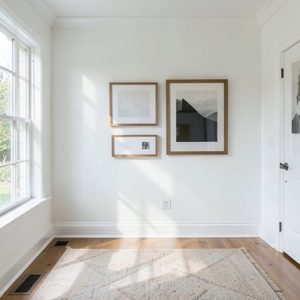
If your foyer has limited wall space, leaving breathing room is a great strategy. Negative space keeps the gallery from feeling crowded and helps each piece stand out.
Choose fewer frames but make them larger, and let the white wall do some of the work for you. This style also makes the wall feel calmer for busy mornings.
Use consistent spacing between frames and keep the alignment clean. You can measure the spacing once with tape and repeat it so the look stays neat.
9. Pair Vintage-Style Prints With Modern White Frames

You can get farmhouse charm and a more updated feel by mixing vintage subjects with clean white frames. The contrast is subtle, but it makes the wall look layered rather than old-fashioned.
Look for prints with simple lines, like old farm scenes, antique handwriting, or soft botanical illustrations. Then choose white frames with thin profiles so the art stays the star.
If you find mismatched frames at a thrift store, spray-paint them to match. This can be a fun weekend project, and it usually costs much less than buying everything new.
10. Add Texture With Woven Mats and Linen-Style Prints

White farmhouse foyers look extra inviting when you add texture. Woven mats, linen-style paper, and fabric-like prints bring depth that flat photos cannot match.
Use neutral colors like sand, oatmeal, and soft gray so the textures blend with the white wall. This also helps you hide small imperfections in print quality because the texture adds interest.
For practical upkeep, keep frames sealed and wipe them gently with a dry cloth. Texture makes the gallery feel warm, and it can make even simple art look special.
11. Use Uniform Frame Sizes With Different Artwork
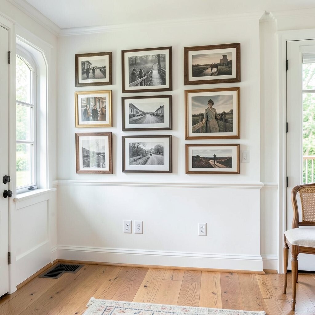
A clean, uniform grid is perfect when you want order in a busy entry. It also makes it easier to plan your wall because the math stays simple.
Pick one frame size and use it for every piece, then vary the images underneath. Mix photos, prints, and one or two larger artworks by using different mat sizes instead of changing the frame.
This approach feels polished and helps the foyer look bigger. It also keeps costs predictable because you can buy frames as a set or search for the same size at resale shops.
12. Frame Mirror-Style Pieces for Extra Light
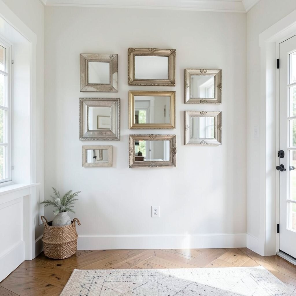
If your foyer feels dim, consider adding one reflective element in the gallery. A mirror-style frame or glossy print can bounce light across the space.
Pair the reflective piece with matte art like watercolor florals or soft farmhouse photos. The mix keeps the gallery balanced, so it does not look too shiny.
Keep placement near the brightest spot so the reflection works with your lighting. This tiny design choice can make your whole entry feel brighter without adding new fixtures.
13. Build a Family Photo Story With a Loose Timeline

Instead of random images, arrange family photos like a story that moves through time. Even if it is not perfectly chronological, the idea gives the wall meaning.
Start with older photos, then add newer ones, and finish with something that feels current like a recent family portrait. The gallery becomes a conversation starter for guests and a comforting sight for you.
To keep the look neat, keep the same mat color across the story. You can also standardize your photo editing so skin tones and lighting match more smoothly.
14. Try a Floor-to-Console “Stair-Step” Arrangement

In many foyers, the wall and console height do not match perfectly, so a stair-step layout can help. Place some frames higher and others lower so the group follows the eye line from the console up to the wall.
This style works well when you have a bench, baskets, or decor on the table that visually competes with the wall. By stepping the frames, you avoid blocking important items and you create a smooth layered feel.
Use painter’s tape to test heights before hanging, and measure from the console surface rather than from the floor. You will get a more flattering result because foyers are used at different angles throughout the day.
15. Add One Color Accent While Staying Mostly White
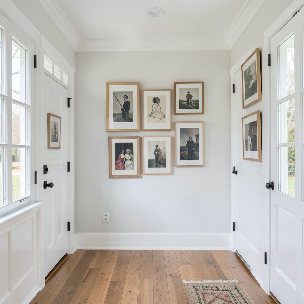
A mostly white gallery can still feel fun when you add one gentle accent color. Think muted sage, dusty blue, or warm terracotta, and repeat that color in small touches across the frames.
For example, use a few prints with greenery tones and choose mats that echo those shades. This keeps the farmhouse vibe while adding personality that feels current.
If you want to stay on budget, use printable art from your own photos and adjust the color slightly in editing. Repeat the accent color in one or two frames only so the look stays airy, not chaotic.
16. Create a Gallery With Farmhouse Maps and Coordinates
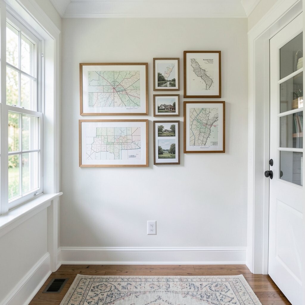
Farmhouse maps feel special because they look timeless and meaningful at the same time. Add coordinates for a home place, a wedding location, or where a favorite memory happened, and the gallery becomes deeply personal.
Choose map prints with soft ink tones so they blend with the white wall. Then frame them with classic white or black frames to keep the look crisp.
This idea is unique because it mixes design with storytelling without needing complicated styling. Print the coordinates on plain paper for a simple upgrade, then use a mat to make it look professionally finished.
When you place the map pieces near family photos, the whole gallery feels connected and intentional. It is a warm way to make your entryway feel like home every single day.