Color can change the mood of a room in a heartbeat. A smart palette can make everyday spaces feel fresh, cheerful, and full of life.
1. Soft Lemon and Cream
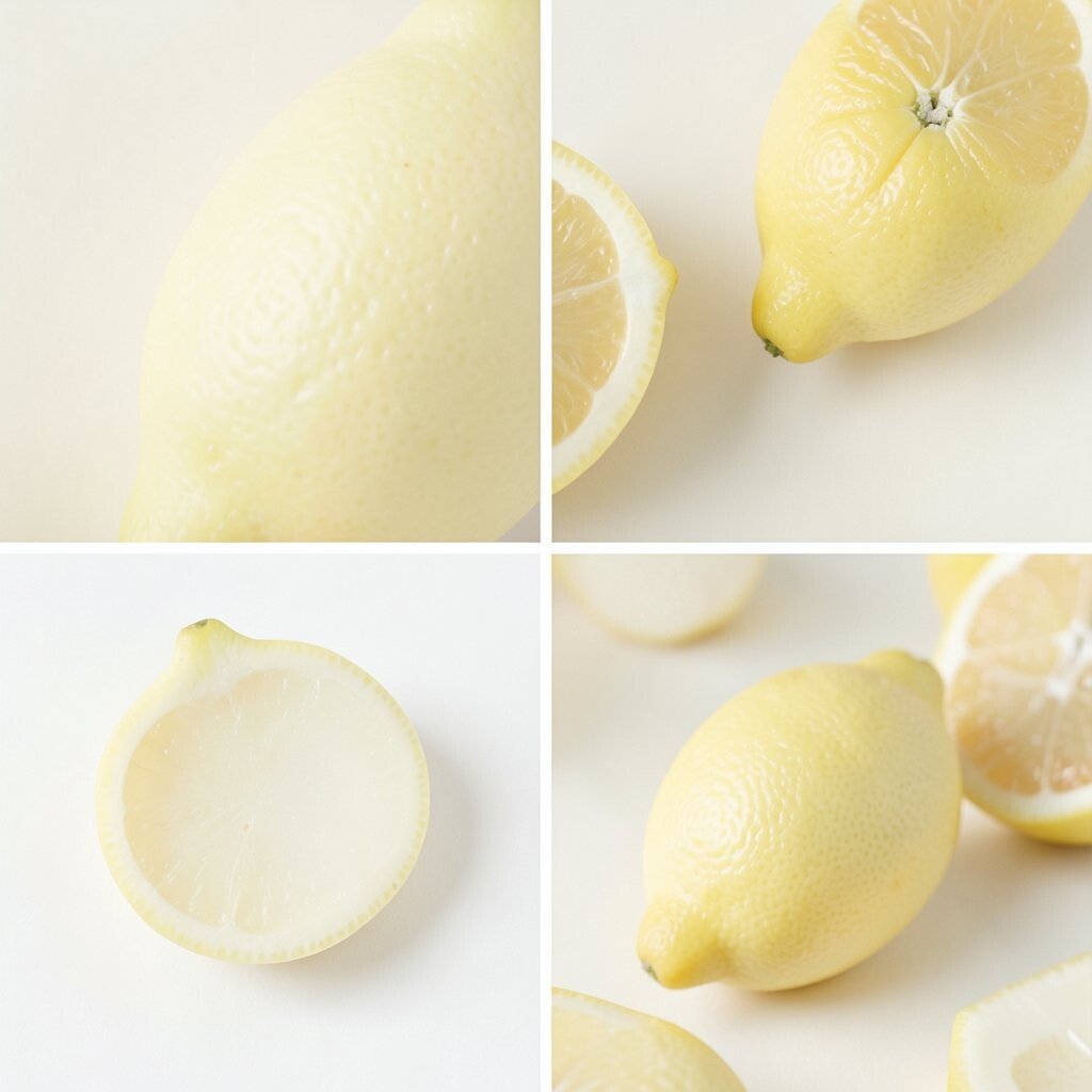
Soft lemon and cream make a room feel sunny without being too loud. The look is warm, airy, and easy on the eyes.
This palette works well in kitchens, breakfast nooks, and small living rooms because it adds light and a happy feel. It is also a budget-friendly choice since cream paint and pale yellow accents are easy to find in many stores. Try lemon dish towels, a cream rug, or a pale yellow lamp shade to bring the idea to life.
2. Sky Blue and White

Sky blue and white create a clean, open look that feels calm right away. The colors remind many people of a bright day outdoors.
This pairing is great for bedrooms, bathrooms, and home offices because it can help a space feel peaceful and neat. It also fits today’s love for simple, fresh interiors that do not feel too busy.
Add white curtains, blue pillows, or a painted accent wall to shape the room in a personal way. If you want to keep costs low, start with small items like throw blankets or framed art before changing bigger pieces.
3. Coral and Sand
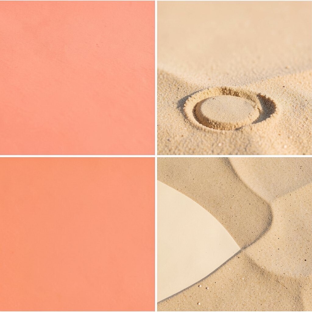
Coral and sand bring a warm beach feel that is cheerful but still soft. The mix looks lively without becoming too bright.
This palette can make a room feel friendly and relaxed, which is helpful in family spaces and guest rooms. Coral gives the room energy, while sand keeps it grounded and easy to live with.
Use coral in pillows, vases, or artwork, then balance it with sandy beige furniture or walls. If you like a more modern style, choose matte finishes and simple shapes for a cleaner look.
For a low-cost update, swap in coral candles or a sand-colored table runner. Small changes can make the whole space feel new.
4. Mint and Charcoal
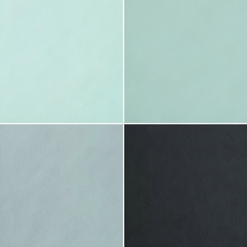
Mint and charcoal make a fresh pair with a little edge. The mint feels light and cheerful, while charcoal adds depth and style.
This combo is useful in kitchens, laundry rooms, and teen spaces because it feels neat but not boring. It also works well for people who want color without making the room look too sweet.
5. Peach and Ivory
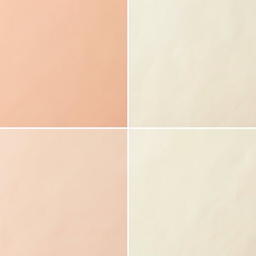
Peach and ivory create a soft glow that feels gentle and welcoming. The room can look bright, calm, and a bit romantic.
This palette is lovely for nurseries, bedrooms, and reading corners because it adds warmth without sharp contrast. Peach is also a current favorite in home design since it feels friendly and modern.
Try peach pillows, ivory curtains, or a warm-toned rug to shape the mood. If you want to save money, use peach in small accents and keep larger pieces neutral.
6. Lavender and Dove Gray
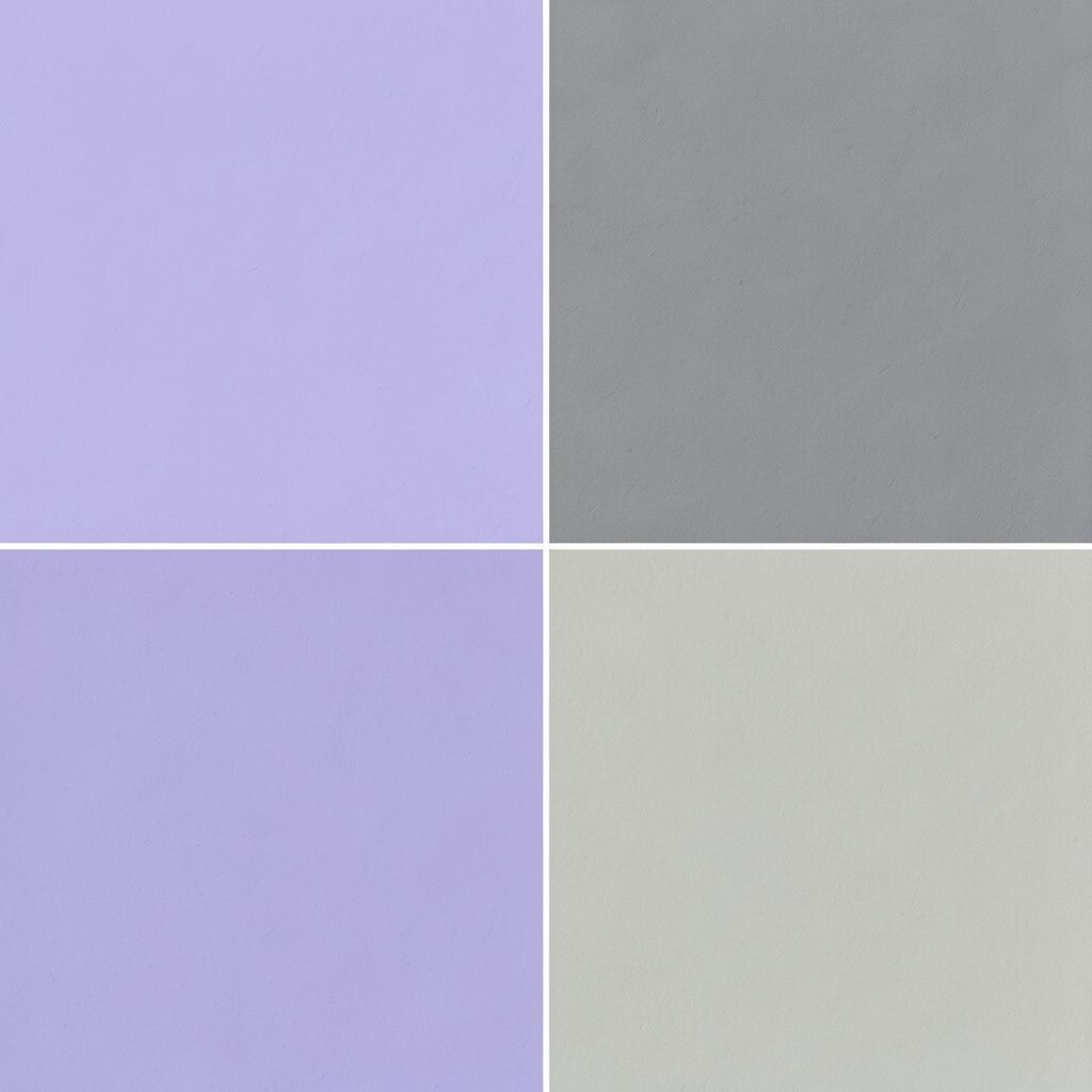
Lavender and dove gray make a room feel dreamy and soft. The colors are light enough to brighten a space, but they still feel calm.
This palette is great for bedrooms and sitting areas where comfort matters. It can also make a small room seem more open because both colors stay on the gentle side.
Use lavender in art, bedding, or a vase, and bring in dove gray through chairs, blankets, or paint. A few shiny metal details can make the room feel more polished without much extra cost.
If you want a personal touch, add a patterned pillow that mixes both colors. That small piece can tie the whole room together.
7. Aqua and Driftwood
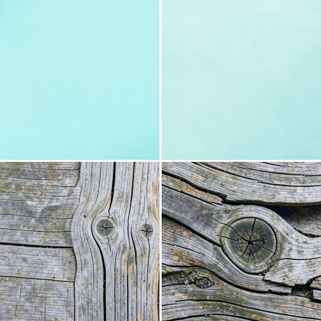
Aqua and driftwood bring a cool, coastal feel that is easy to enjoy. The mix feels breezy and natural at the same time.
This palette works well in bathrooms, sunrooms, and casual living rooms because it feels clean and relaxed. Driftwood tones keep aqua from feeling too bright, which helps the room stay balanced.
Try aqua towels, a driftwood shelf, or a pale wood coffee table to build the look. If your budget is tight, even a few sea-glass-colored jars can make a difference.
For a more personal style, add shells, woven baskets, or beach photos. The room will feel like your own peaceful getaway.
8. Buttercream and Sage
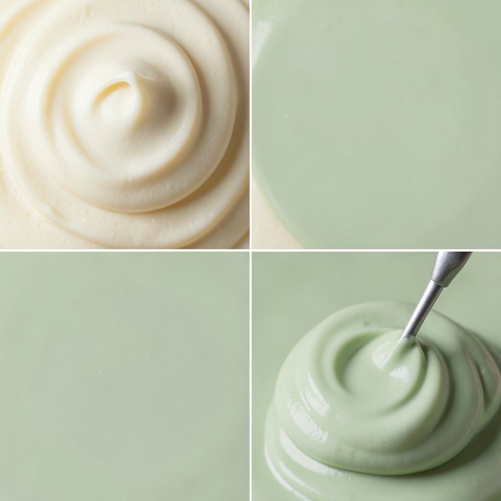
Buttercream and sage make a room feel soft, natural, and sunny. The colors work together like a quiet garden in the morning light.
This palette is nice for dining rooms, kitchens, and family spaces because it feels warm and easy to live with. It also fits the growing trend of bringing nature-inspired colors indoors.
Use sage in curtains or chairs, and add buttercream through walls, lamps, or pillows. If you want a low-cost update, paint one small wall and bring in a few matching decor pieces.
9. Blush and Warm Taupe
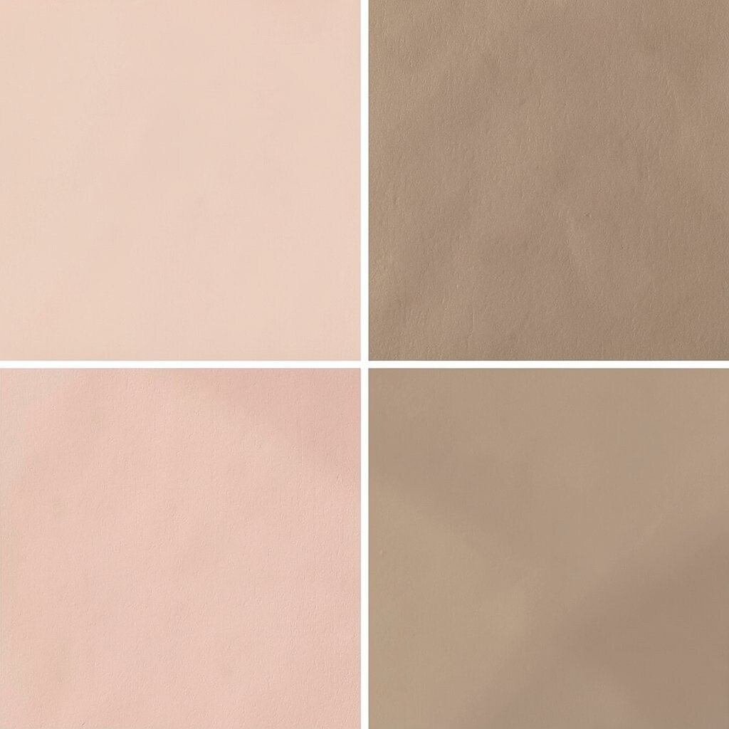
Blush and warm taupe create a soft, cozy look that feels modern and kind. The colors are gentle, but they still add charm.
This palette is perfect for bedrooms, dressing areas, and calm living spaces because it makes the room feel cared for. It also suits people who want a pretty look without using strong color.
Blush works well in art, blankets, or a chair, while taupe can anchor the room in rugs, furniture, or paint. To keep the space from feeling too sweet, add black frames or simple wood accents.
For a personal touch, mix in a favorite photo wall or a handmade ceramic piece. Those details make the room feel special and lived in.
10. Teal and Soft Gold
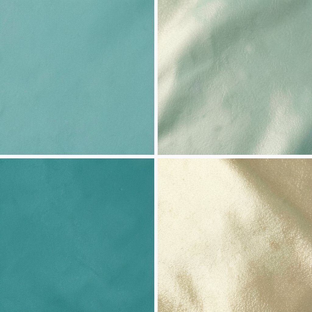
Teal and soft gold bring a rich, cheerful look that feels stylish right away. Teal adds depth, and gold gives the room a warm glow.
This palette can make a space feel more finished, especially in living rooms, dining rooms, and entryways. It is a strong choice for anyone who wants color that feels bold but still elegant.
Use teal on a statement chair or wall art, then add soft gold through lamps, mirrors, or drawer pulls. If you want to keep the cost down, choose small gold accents instead of large shiny pieces.
Mix in a few plain neutral items so the room does not feel too full. That balance helps the colors stand out in a good way.
11. Raspberry and Pale Gray
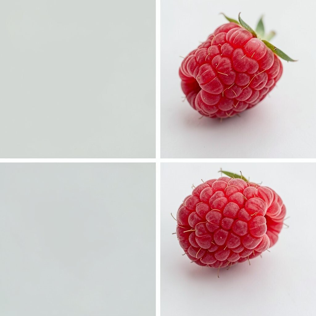
Raspberry and pale gray make a lively yet balanced palette. The raspberry feels bright and playful, while pale gray keeps things calm.
This combo is useful in creative spaces, kids’ rooms, and modern living rooms because it adds energy without becoming messy. It also feels fresh in a time when many people want color with a clean look.
Try raspberry pillows, a gray sofa, or a colorful print on the wall. If you want a softer style, use raspberry in small pieces and let gray do most of the work.
A few simple changes can make the room feel brighter without a big spending plan. A new throw, lamp, or rug may be all you need.
12. Olive and Linen
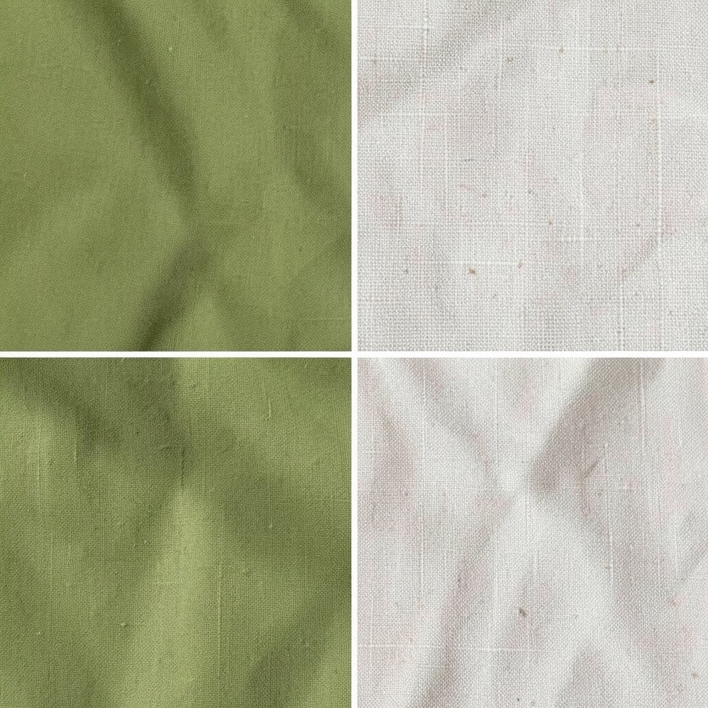
Olive and linen create a calm, earthy space that feels warm and steady. The palette brings in a natural look that is easy to enjoy every day.
This pairing fits bedrooms, reading rooms, and quiet corners because it helps the room feel restful. Olive is also a strong trend in home design since it adds color without feeling too loud.
Use linen curtains, olive cushions, or a textured throw to build the style. If you want a personal twist, add plants or woven baskets for extra natural charm.
Cost-wise, this palette can be very flexible because many linen and olive items are sold in simple, affordable styles. You can start small and still get a complete look.
13. Tangerine and White
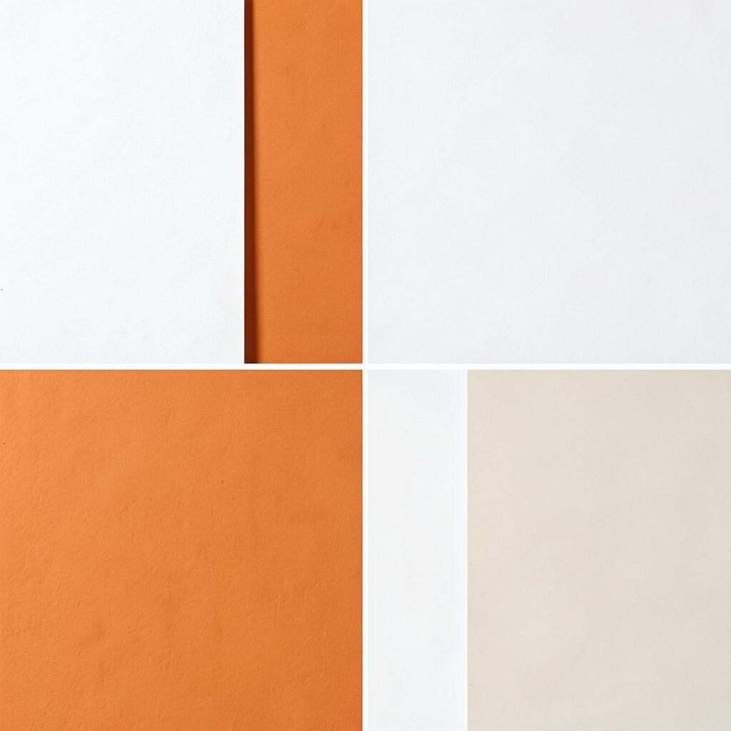
Tangerine and white make a room feel bright, bold, and full of cheer. The white keeps the orange from taking over, while tangerine brings the fun.
This palette is great for kitchens, playrooms, and craft spaces because it adds energy and a happy mood. It can also make a plain room feel more alive in a very quick way.
Try tangerine stools, white walls, or orange art to create the look. If you want a lower-cost option, use removable decor like pillows, trays, or storage bins.
Keep the rest of the room simple so the color can shine. A few clean lines and bright details can make the space feel fresh and modern.
14. Cobalt and Sandstone
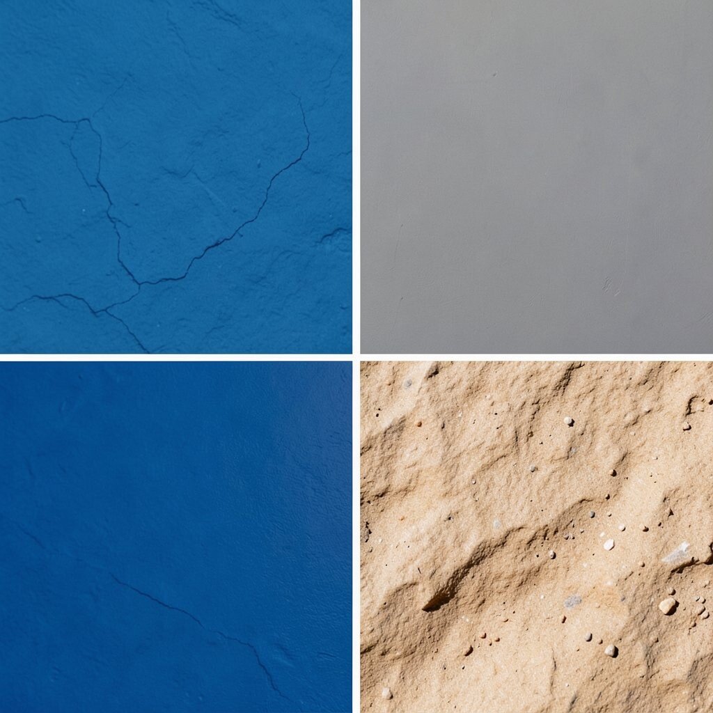
Cobalt and sandstone create a strong, polished look with a natural base. The deep blue feels bold, and the sandy tone keeps it from feeling too heavy.
This palette works well in offices, living rooms, and entryways because it makes a smart first impression. It also gives a room a current style that feels rich without needing many extra colors.
Use cobalt in pillows, a rug pattern, or a painted accent, and bring in sandstone through furniture or curtains. If you want to save money, start with one cobalt piece and let the rest stay neutral.
Personalize the room with books, pottery, or framed travel photos. Those items help the palette feel more like home.
15. Rose and Stone
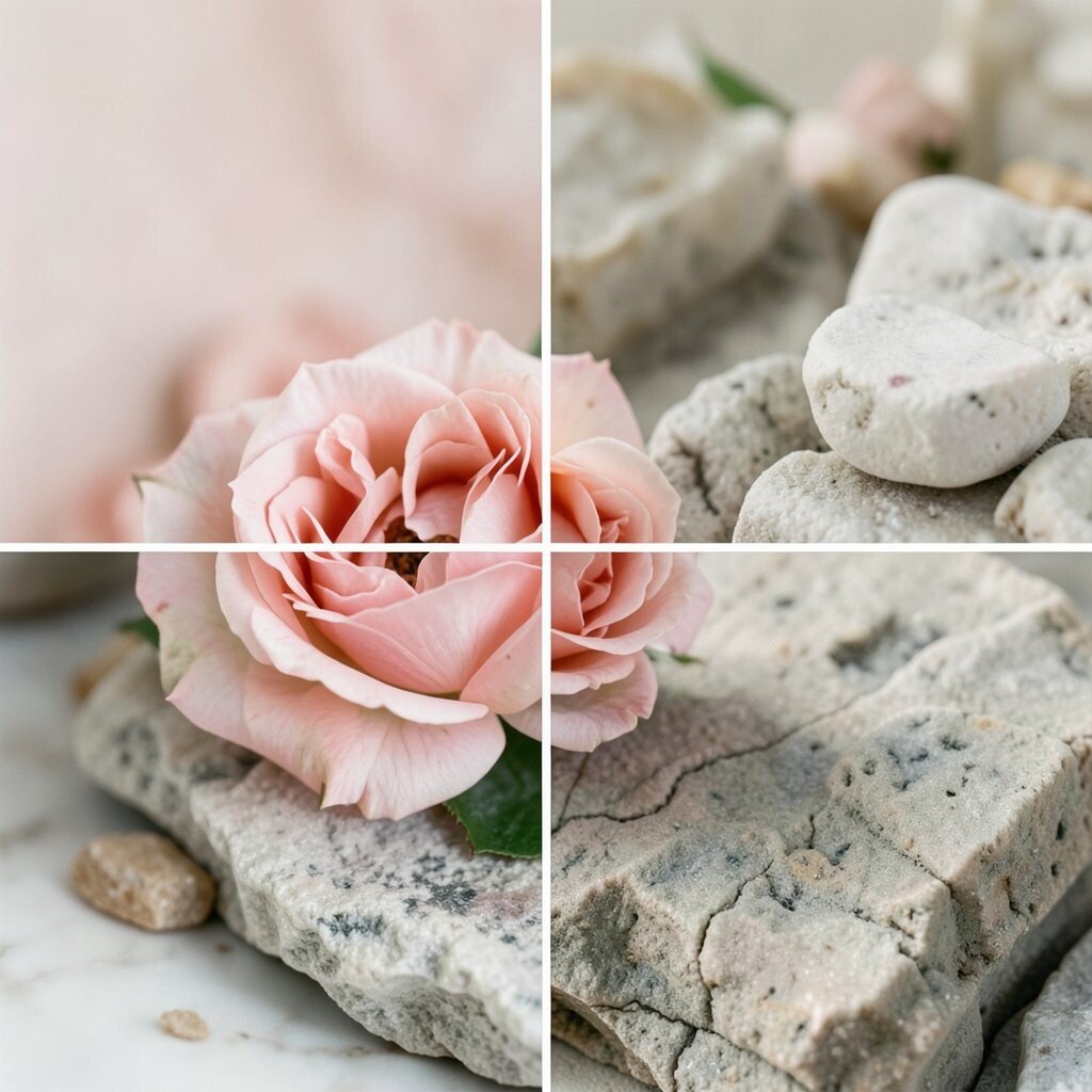
Rose and stone make a gentle mix that feels calm and classy. The rose adds warmth, while stone gives the room a solid, quiet base.
This palette is lovely for bedrooms, bathrooms, and sitting rooms because it feels soft but not dull. It also works for people who want a pretty room that still feels grown-up.
Try rose bedding, stone-colored chairs, or a textured rug to bring the palette together. A little brass or matte black can add just enough contrast to keep the room interesting.
If you are watching your budget, choose one rose accent and several stone-toned basics. That approach can still give a full and stylish result.
16. Seafoam and Pearl
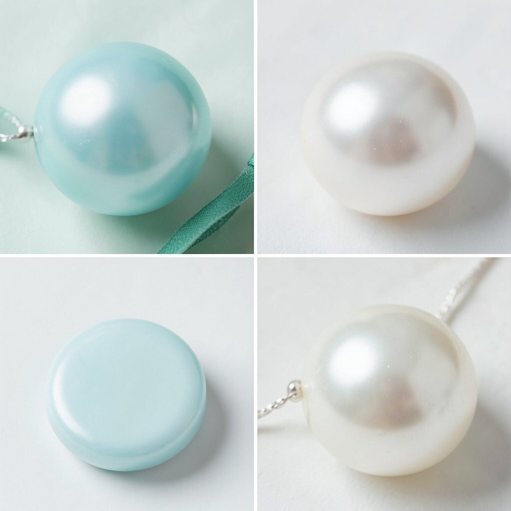
Seafoam and pearl create a fresh, light look that feels airy and clean. The colors seem to glow softly in natural light.
This palette is a nice choice for bathrooms, bedrooms, and small apartments because it can make spaces feel larger and brighter. It also fits well with simple, spa-like styles that are popular right now.
Use pearl curtains, seafoam towels, or a light rug to build the mood. If you want a personal touch, add glass jars, shell decor, or a favorite framed print.
For cost savings, start with textiles instead of paint or furniture. Soft fabric changes can be quick, easy, and affordable.
17. Marigold and Slate
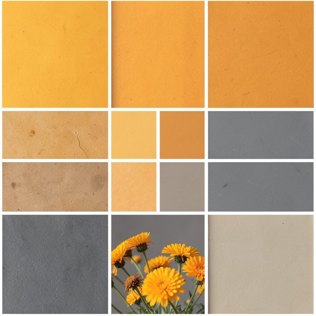
Marigold and slate make a bold, cheerful pair with a grounded feel. Marigold brings sunshine, and slate keeps the design steady.
This palette works well in dining rooms, hallways, and home offices because it feels lively but still neat. It can also help a room stand out in a friendly, welcoming way.
Try marigold pillows, slate shelves, or a patterned rug that uses both colors. If you want a more subtle look, use marigold in small pops and let slate cover the larger areas.
Because the colors are strong, you do not need a lot of decor to make them work. A few well-chosen pieces can do the job nicely.
18. Powder Blue and Almond

Powder blue and almond create a soft, cozy look that feels light and sweet. The palette is gentle, but it still brings a fresh feeling to the room.
This pair is great for bedrooms, nurseries, and reading spots because it helps the space feel calm and open. It also works well in homes that lean toward classic, easy styles.
Use powder blue bedding, almond curtains, or a light wood dresser to shape the room. If you want a personal touch, add family photos in simple frames or a handmade quilt.
Costs can stay low if you focus on accessories first. Even a new pillow set or lamp shade can change the mood in a nice way.
19. Plum and Warm Beige
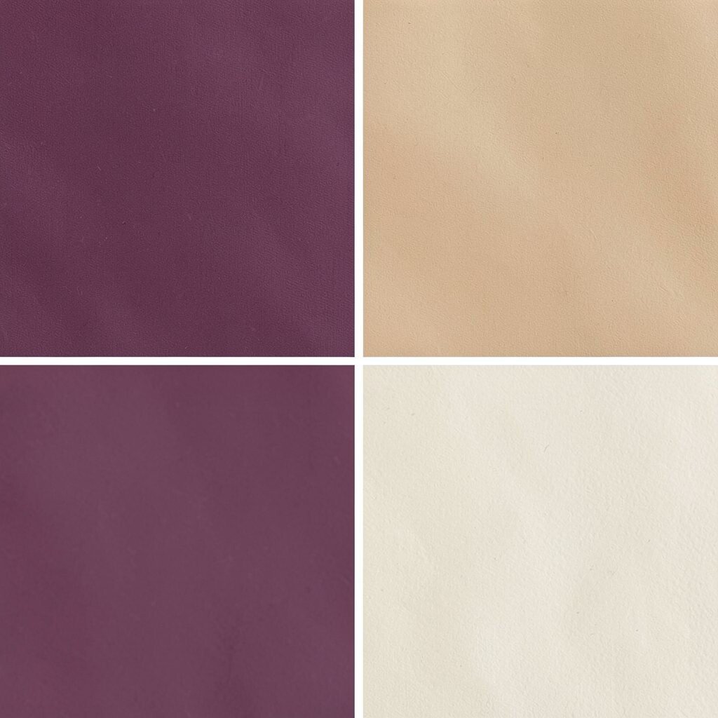
Plum and warm beige make a room feel rich, cozy, and welcoming. The plum adds drama, while beige keeps the look soft and balanced.
This palette is a smart fit for living rooms, dining rooms, and bedrooms where you want a little more depth. It can also make a plain room feel more special without needing too many items.
Try plum drapes, beige furniture, or a deep-colored vase on a shelf. If you want to keep the style easy to live with, use beige for the larger pieces and plum for accents.
Current trends often mix deep jewel tones with calm neutrals, and this palette fits that idea well. It feels stylish but still comfortable.
20. Apple Green and White
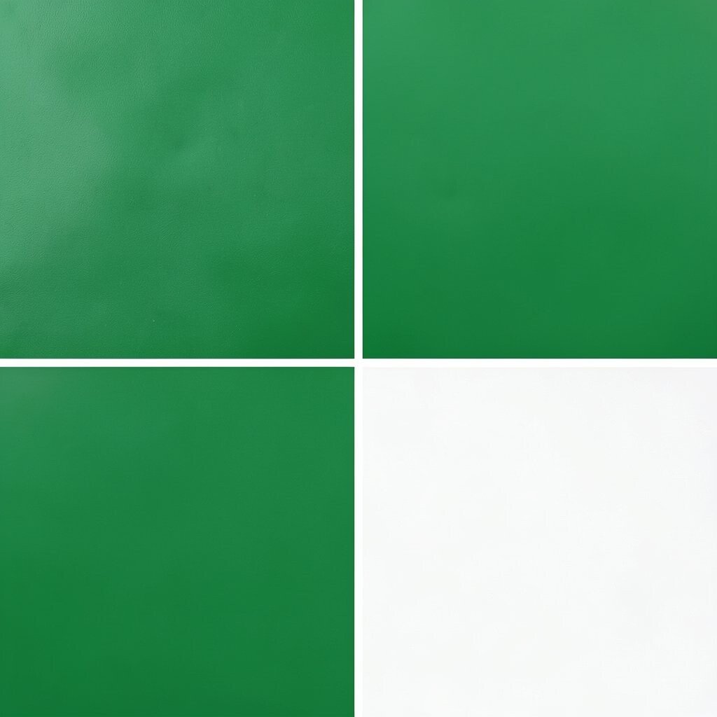
Apple green and white bring a crisp, happy look that feels full of life. The green gives the room a fresh spark, and the white keeps it bright.
This combo is ideal for kitchens, playrooms, and laundry spaces because it makes the room feel clean and cheerful. It can also help a small room feel more open and lively.
Use apple green in stools, dishes, or art, and keep the main surfaces white. If you want a budget-friendly update, try green storage baskets or a simple patterned rug.
Add a few plants to make the color feel even more natural. That small touch can make the whole room feel more cheerful.
21. Ice Blue and Soft Beige
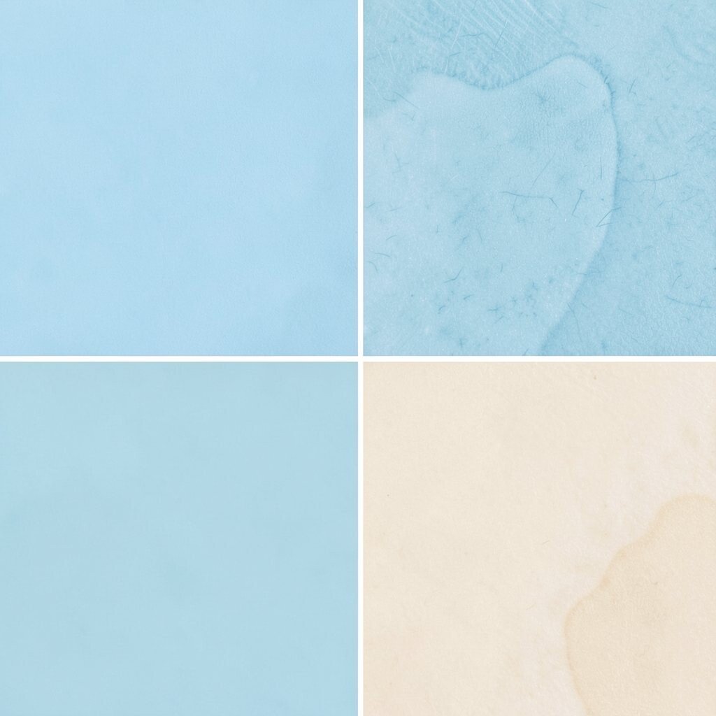
Ice blue and soft beige make a quiet, polished palette that feels cool and calm. The blue adds freshness, while beige gives the room warmth.
This pairing works well in bedrooms, guest rooms, and study spaces because it helps the room feel peaceful. It also suits homes that need a gentle color lift without a bold change.
Try ice blue pillows, beige walls, or a woven chair to bring the look together. If you want to make the room feel more personal, add books, candles, or a favorite throw.
Cost can stay manageable because both colors are common in many decor items. You can build the style a little at a time and still get a lovely result.
22. Cherry Red and Cream

Cherry red and cream create a bright, classic look with lots of charm. The red brings excitement, and cream softens the whole space.
This palette is a good pick for dining rooms, kitchens, and accent walls because it feels warm and full of personality. It is also a strong choice for people who like a more playful, eye-catching room.
Use cherry red in a chair, a lamp, or a piece of art, then let cream cover the larger areas. If you want to keep the room from feeling too busy, choose simple shapes and clean lines.
For a lower-cost update, try one red accent piece and a few cream textiles. That can be enough to make the room feel fresh and fun.
23. Turquoise and Wheat

Turquoise and wheat make a sunny, easygoing palette that feels welcoming right away. The turquoise adds sparkle, and wheat brings a soft, natural base.
This mix is great for living rooms, porches, and casual family spaces because it feels bright but not too formal. It also gives a room a relaxed style that can work in many homes.
Try turquoise art, wheat-colored rugs, or a light wood table to build the look. If you want a personal touch, add travel items or handmade decor in similar tones.
Because the palette is flexible, you can mix in neutral pieces you already own. That can help keep costs down while still making the room feel new.
24. Mauve and Soft White
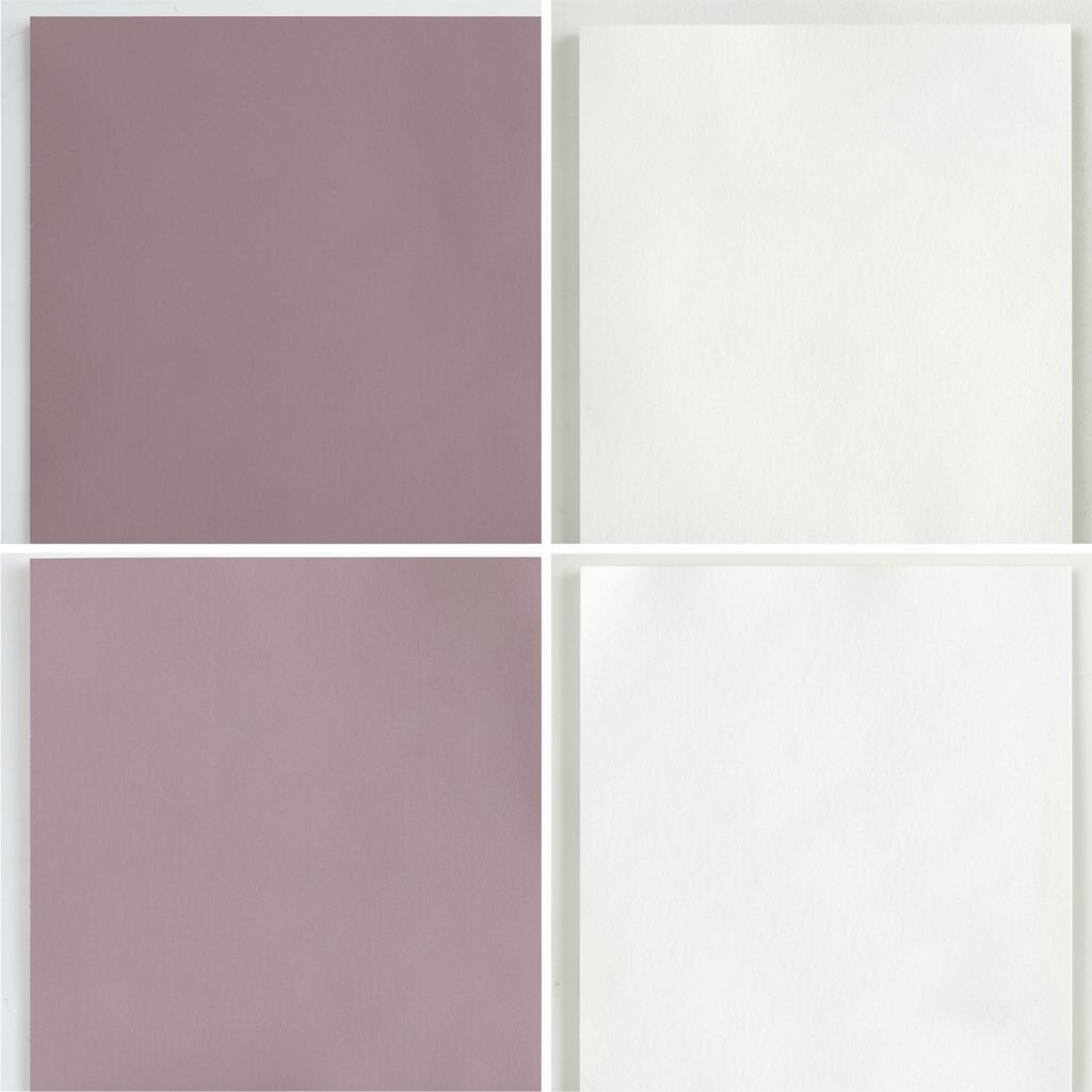
Mauve and soft white create a gentle, elegant look that feels calm and sweet. The mauve adds color, while soft white keeps the room bright and open.
This palette is lovely for bedrooms, dressing spaces, and quiet sitting areas because it feels peaceful and pretty. It also works well with the current trend of muted colors that feel refined and easy to live with.
Use mauve in bedding, flowers, or wall art, and bring in soft white through curtains or furniture. If you want the room to feel more personal, add a few favorite books or a special mirror.
Small updates can go a long way here. A new lamp or pillow set may be all you need to refresh the space.
25. Lime and Cool Gray

Lime and cool gray make a lively, modern pair that feels fresh and upbeat. The lime gives the room energy, and gray keeps it from feeling too wild.
This palette is a fun choice for offices, game rooms, and creative corners because it helps the space feel active and bright. It can also make a simple room feel more playful without a full makeover.
Try lime in a chair, desk item, or wall print, then balance it with gray furniture or rugs. If you want to save money, use lime only in small pieces so the room stays easy to update later.
A few black details can sharpen the look and make the colors pop. That gives the room a cleaner, more finished feel.
26. Terracotta and Pale Blue
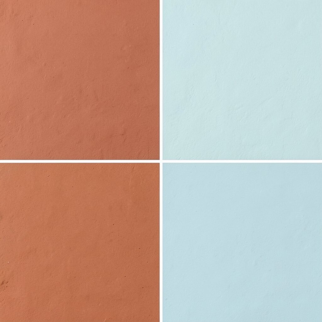
Terracotta and pale blue create a warm-and-cool mix that feels interesting and cozy. The terracotta adds earthiness, while pale blue keeps the room light.
This palette works well in living rooms, kitchens, and bedrooms because it has a balanced look that feels both calm and lively. It is also a nice option for people who want something a little different from the usual color pairings.
Use terracotta pots, pale blue pillows, or a patterned rug that blends the two tones. If you want a personal touch, add handmade ceramics or wall art with natural shapes.
Cost can stay reasonable because terracotta decor is often affordable and easy to find. A few well-placed pieces can make the whole room feel thoughtful and warm.
27. Violet and Butter Yellow
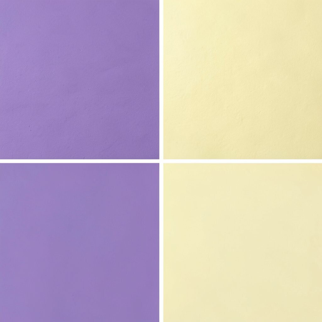
Violet and butter yellow make a joyful, eye-catching palette that feels bright and creative. The violet adds depth, and the yellow brings a soft burst of sunshine.
This combo is ideal for art spaces, kids’ rooms, and cheerful living areas because it gives the room a fun spirit. It also fits a modern trend of using playful color mixes that feel bold but still friendly.
Try violet cushions, butter yellow curtains, or a colorful print that includes both shades. If you want to keep the room balanced, use one color as the main star and the other as a smaller accent.
For a personal touch, add handmade items, favorite toys, or framed artwork in matching tones. Even a small dose of this palette can make the room feel bright and full of personality.