The right colors can quietly change how a room feels. Small swaps often lead to big mood shifts.
When you choose a palette with intention, everything from lighting to textures starts to make more sense. Let these real-feeling before and after ideas guide your own color experiments.
1. Warm Beige to Soft Terracotta
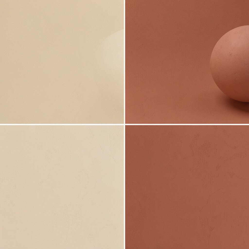
Before, the space looked flat with beige walls and muted cream accents. After, soft terracotta tones brought warmth without turning the room loud.
You might notice how terracotta works like a friendly glow, especially near natural light. Add it through a sofa throw, a few framed prints, or a painted accent wall. This change helps the room feel more lived-in and cozy while still staying stylish. If you worry about cost, start with peel-and-stick wallpaper or a removable accent in terracotta, then upgrade larger pieces later.
2. Cool Gray to Fresh Sage
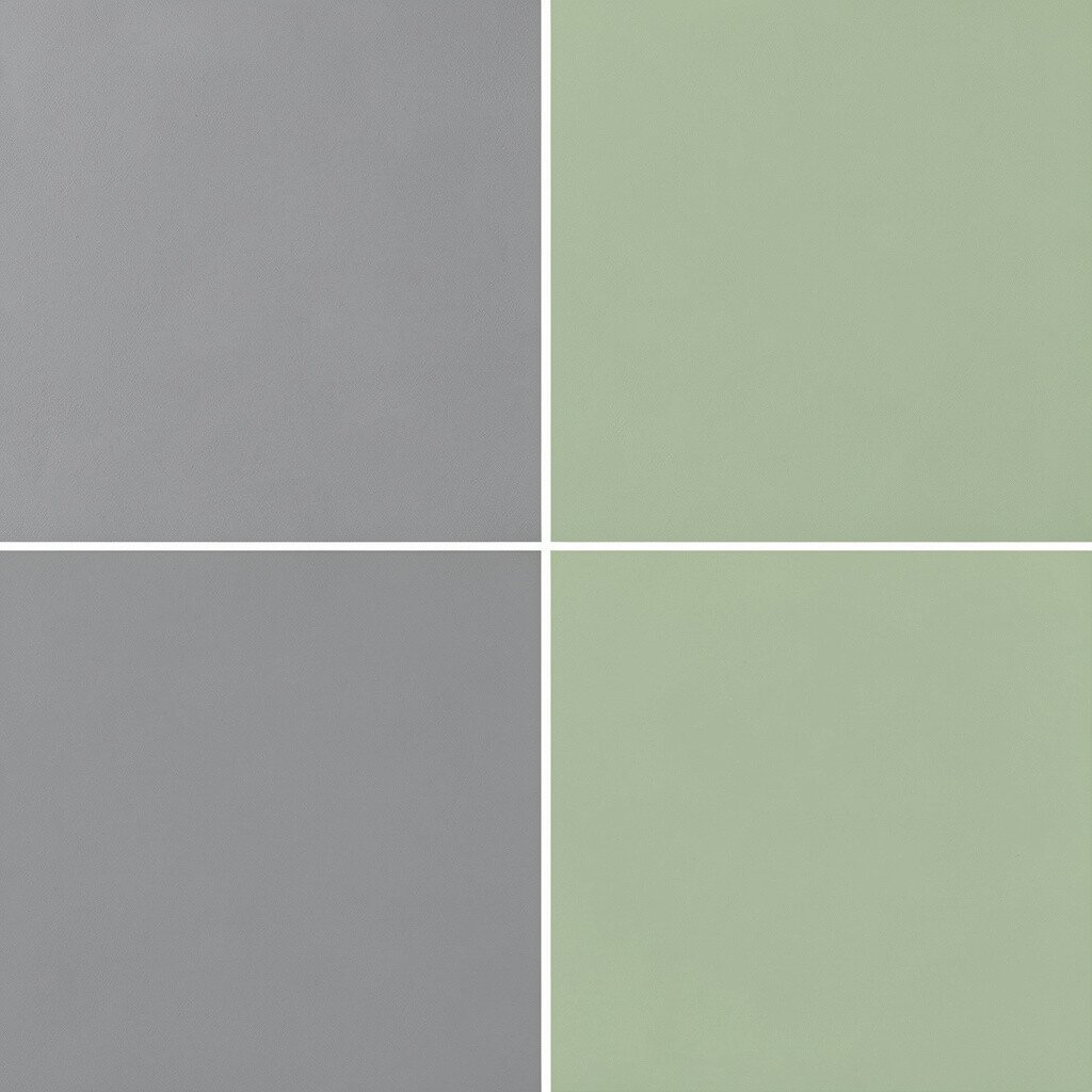
In the before look, gray felt a bit cold, like the space was waiting to be warmed up. In the after look, sage green gave it a gentle, breathable vibe.
Sage pairs nicely with light woods and simple metal details, so the design stays current and calm. Try swapping a gray curtain for sage, or repaint just the bathroom vanity area first. This kind of palette can help you relax, and it also makes white surfaces look cleaner. For personalization, choose a sage that leans more yellow for a sunlit feel, or more blue for an airy feel.
If you’re watching spending, focus on smaller items like pillow covers, art mats, and plant pots. Current trends often favor nature-inspired greens, so this switch can feel modern without chasing anything too trendy.
3. Navy Monochrome to Navy with Buttery Gold
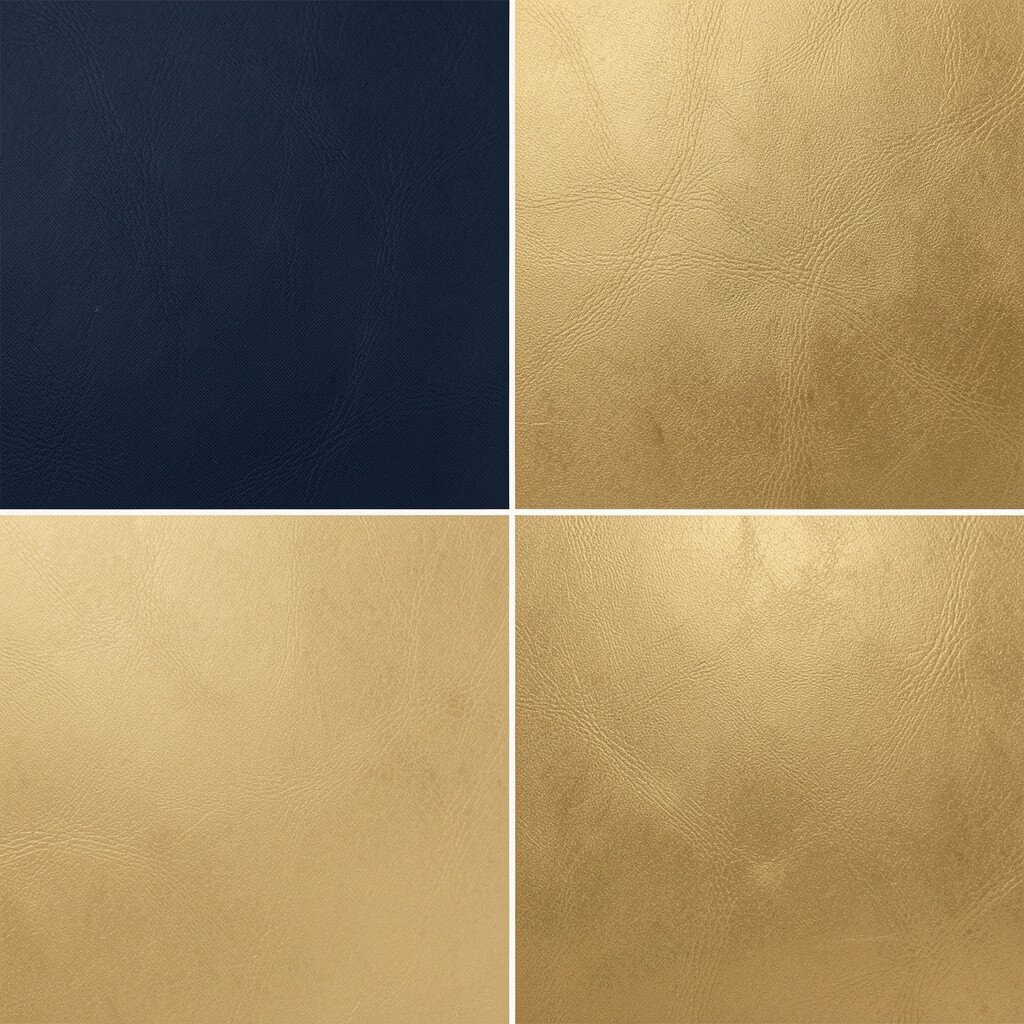
Before, everything in deep navy looked sharp but a little heavy. After, a touch of buttery gold softened the mood while keeping that strong base.
Gold accents can be subtle, like brushed cabinet pulls, picture frames, or a warm-toned lamp. This combination boosts contrast, making the navy feel richer instead of gloomy. You also get a more welcoming atmosphere for guests because the gold reflects light. For cost considerations, consider thrifted frames you can repaint with metallic spray paint.
To personalize, match the gold to the finish you already own, like warm brass or antique gold. It’s a popular direction in contemporary interiors because it balances elegance with comfort.
4. White and Black to Off-White with Charcoal Lines
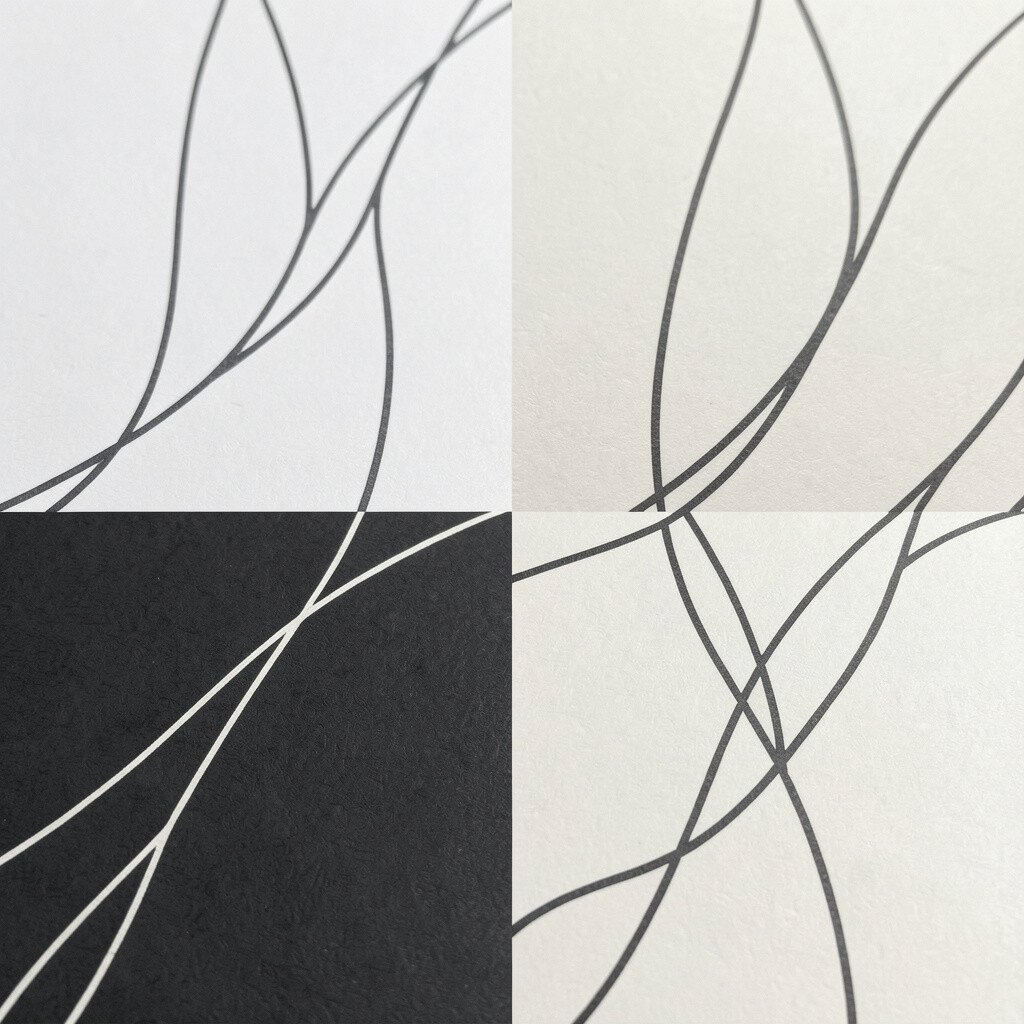
Before, stark white and black created a high-contrast look that sometimes felt too intense. After, off-white walls and charcoal lines made the same style feel calmer and easier to live with.
This approach keeps things crisp while reducing harsh shadows from overhead lighting. You can achieve it by painting the walls an off-white shade and using charcoal for trim, shelving, or a patterned rug border. The benefit is that small decor items stand out without looking like they’re competing for attention. If you want a practical start, swap a black accent chair cover for charcoal and keep the rest steady.
5. Teal to Ocean Blue with Light Tan
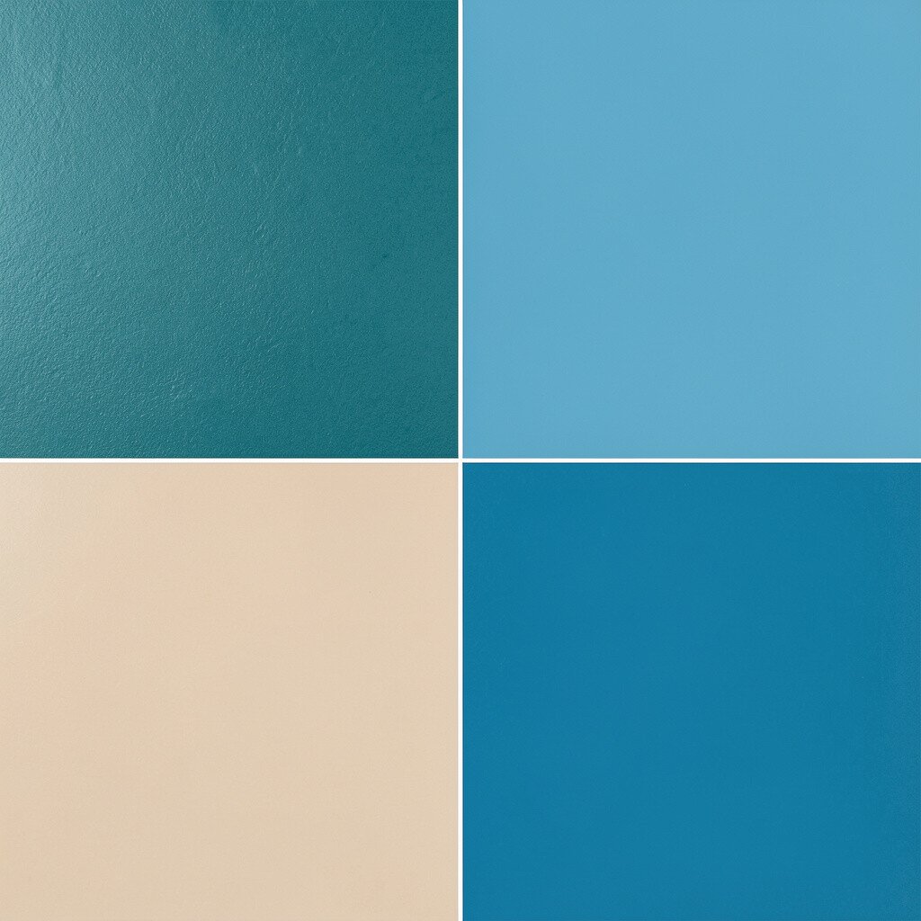
Before, teal curtains and accessories gave a strong color block effect. After, ocean blue walls paired with light tan made everything look more cohesive.
Ocean blue feels expansive, like a calmer version of teal, especially when you add tan for balance. This palette supports a clean, modern look that still feels friendly. You can test it without committing by using removable paint samples and switching textiles like bed linens or a dining table runner.
For personalization, choose ocean blue that matches the depth you want, from gentle sky-tones to deeper sailor shades. Cost stays manageable because you can shift the palette mainly through fabric and artwork first.
6. Muted Pink to Blush with Ivory
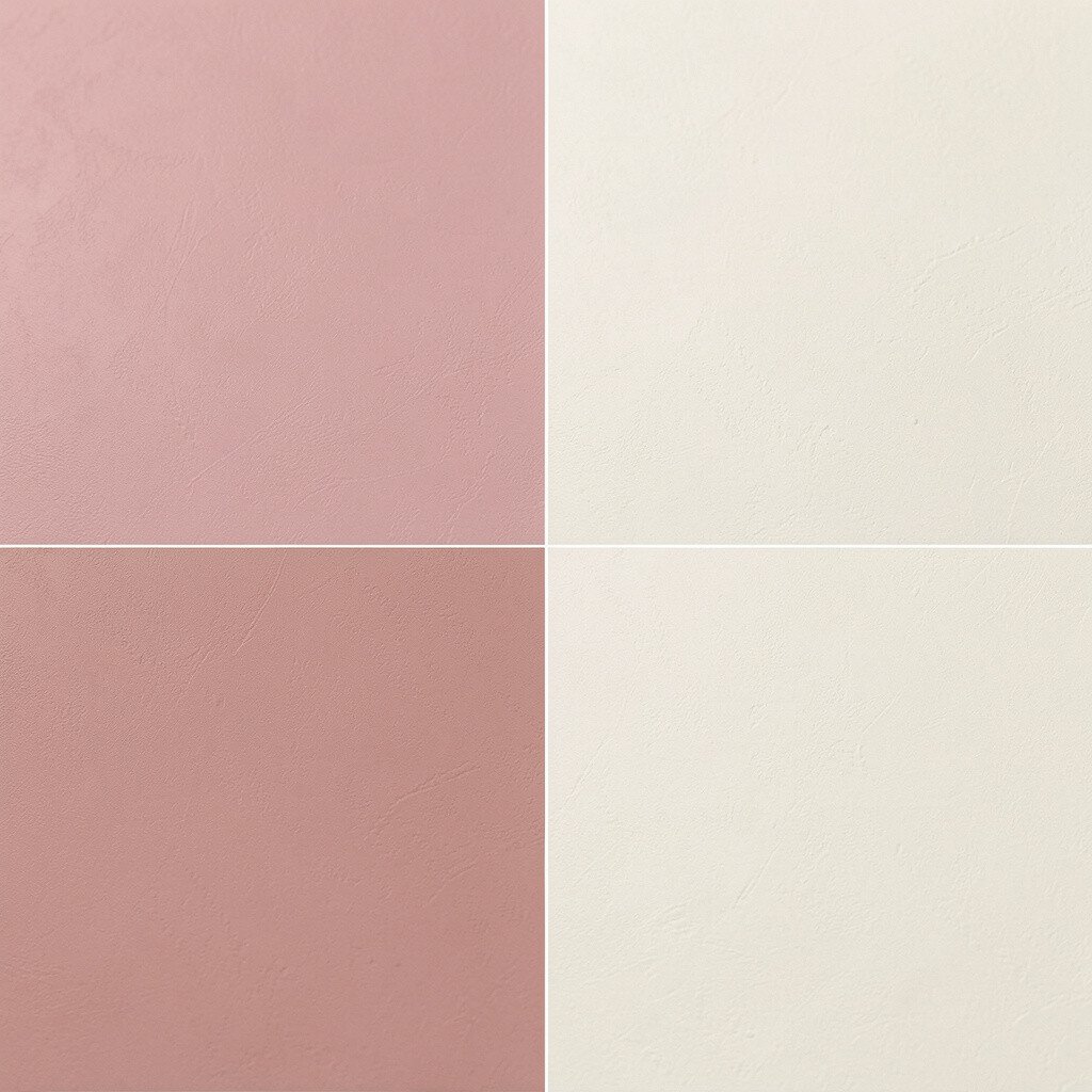
Before, muted pink looked a bit dull and tired under warm bulbs. After, blush with ivory made the color feel fresh and bright again.
Blush helps a room look softer while ivory keeps the overall style light and airy. If your space lacks natural light, this change can make it feel more open. Try replacing one wall color or updating a feature like a headboard, then add ivory through bedding, curtains, or ceramics. A practical win is using paint on a single focal piece like a small dresser or shelving unit.
This palette feels especially appealing for bedrooms and reading corners because it supports a calm, comfortable mood. It also fits current aesthetics that favor soft neutrals with gentle color pops.
7. Monochrome Brown to Cocoa and Cream
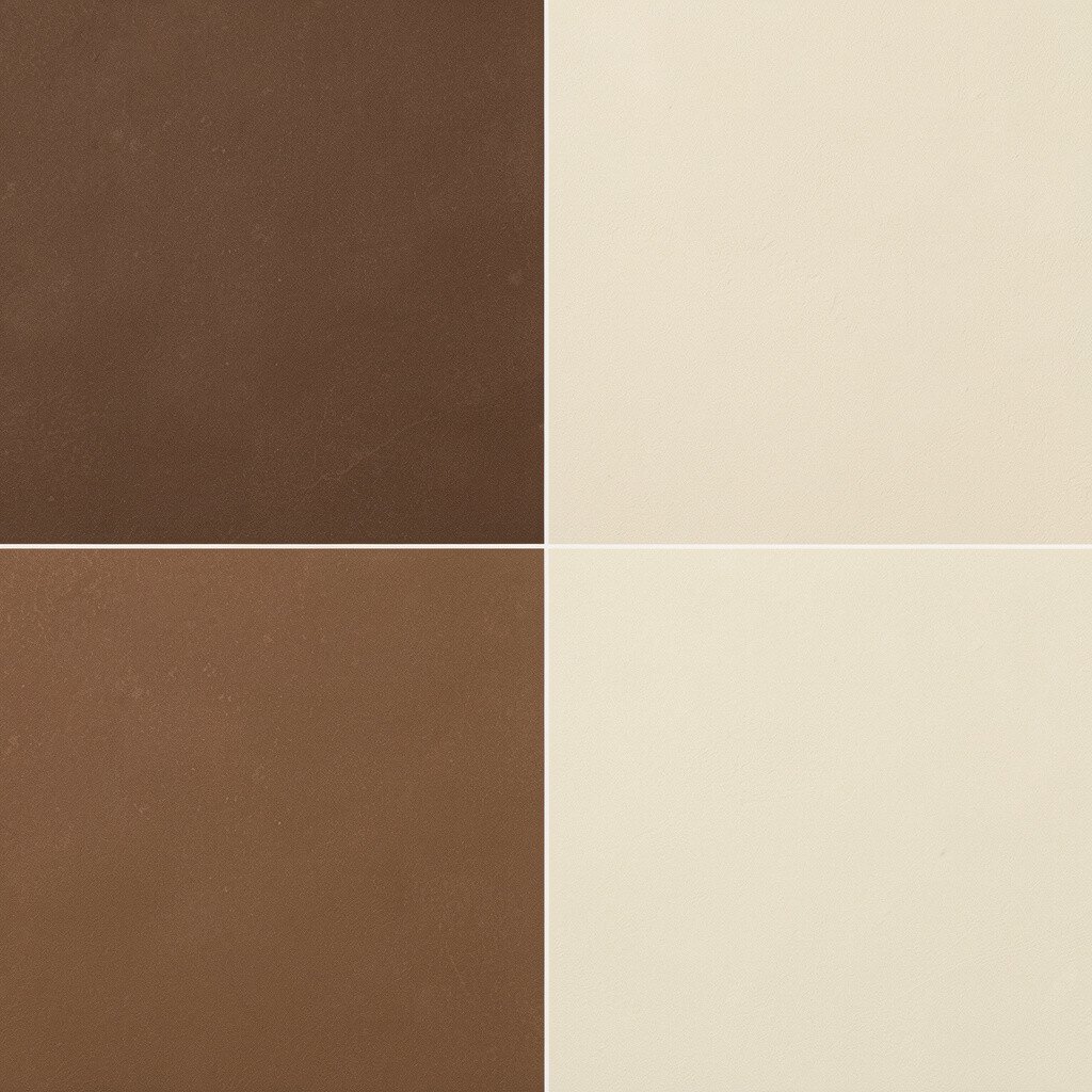
Before, the room relied on browns that all felt similar in tone. After, a cocoa and cream scheme created clearer depth and a more intentional look.
Cocoa brings richness, while cream adds contrast that makes surfaces look cleaner. You can create the effect by keeping your flooring and larger furniture pieces steady, then choosing new textiles in cocoa and off-white. The benefit is that the room starts to feel layered instead of flat. If you’re budget-minded, focus on rugs and curtains first since they cover large areas quickly.
To personalize, look for cocoa shades with a red or neutral undertone, then coordinate with the undertone in your wood furniture. This combo is unique because it feels warm, classic, and modern at the same time.
8. Bright Red to Deep Brick
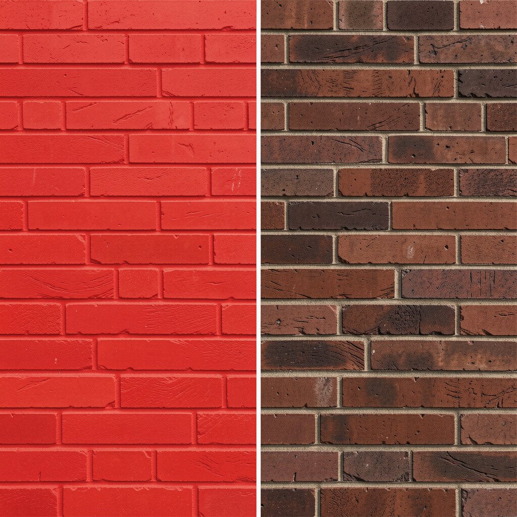
Before, bright red accents felt energetic but a little overwhelming. After, deep brick added the same warmth with a more grounded, grown-up tone.
Brick tones are great because they hold interest while staying wearable for everyday spaces. You can swap red cushions for brick ones, or choose a brick-colored vase and wall art to anchor the look. This helps reduce stress on the eyes and makes the room feel more balanced. If you’re thinking about cost, paint is often the cheapest way to change the feel, so try an accent wall first.
9. Light Yellow to Butter Cream with Olive
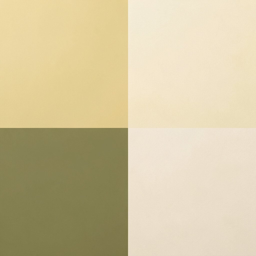
Before, light yellow looked sunny but sometimes too sharp. After, butter cream softened it, and olive accents added a natural, grounded contrast.
This color shift gives you a cheerful vibe without the overstimulation. Butter cream pairs beautifully with earthy materials like linen, cotton, and light oak. Add olive through plants, artwork, or throw blankets so the palette feels intentional rather than random. For personalization, pick an olive that matches your style, from muted sage-like greens to richer moss tones.
If you want to manage cost, shop for one standout olive item, like a large cushion or a patterned curtain panel, then let smaller accessories support it. Current trends keep leaning toward warm neutrals with nature greens, so this direction feels fresh.
10. Cool White to Warm White with Sand Tones
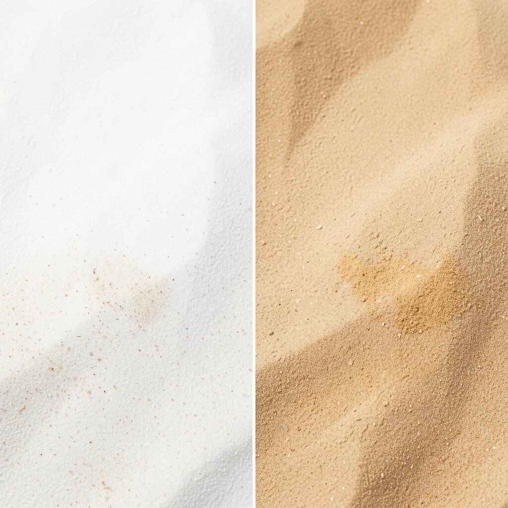
Before, cool white made the room feel a little clinical and grayish. After, warm white walls and sand-colored accents created a cozy, welcoming backdrop.
Warm whites also make metals look better, especially brass, bronze, and copper finishes. This change helps the whole room look cleaner while keeping it soft. You can start by switching bulbs to warmer temperatures, then adjust textiles in sand, camel, or tan. The best part is that you don’t have to repaint everything to feel the difference.
11. Lavender to Lilac with Muted Charcoal
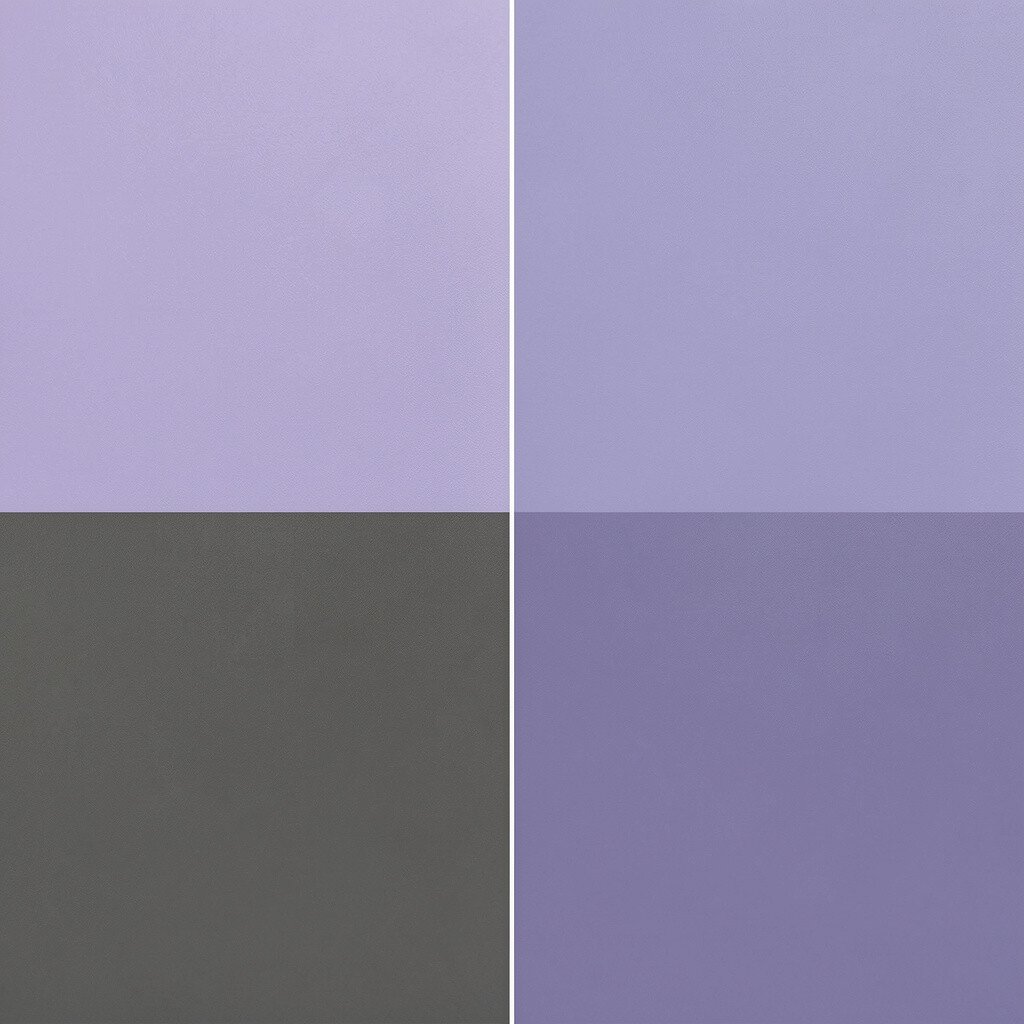
Before, lavender looked sweet but a bit one-note. After, lilac plus muted charcoal created a balanced, stylish contrast.
Lilac brings personality and charm, and charcoal keeps it from feeling too soft or sugary. This is a great palette for a home office, creative studio, or bedroom where you want calm energy. Practical steps include swapping wall art frames to charcoal finishes and choosing a lilac accent rug or bedding set. If you’re watching the budget, consider using removable decals for a wall pattern instead of painting large areas.
To personalize, decide if you want the lilac to feel more pink or more blue, then match charcoal with your existing dark furniture. This combination feels unique because it balances playful color with modern structure.
12. Forest Green to Forest Green with Creamy Linen
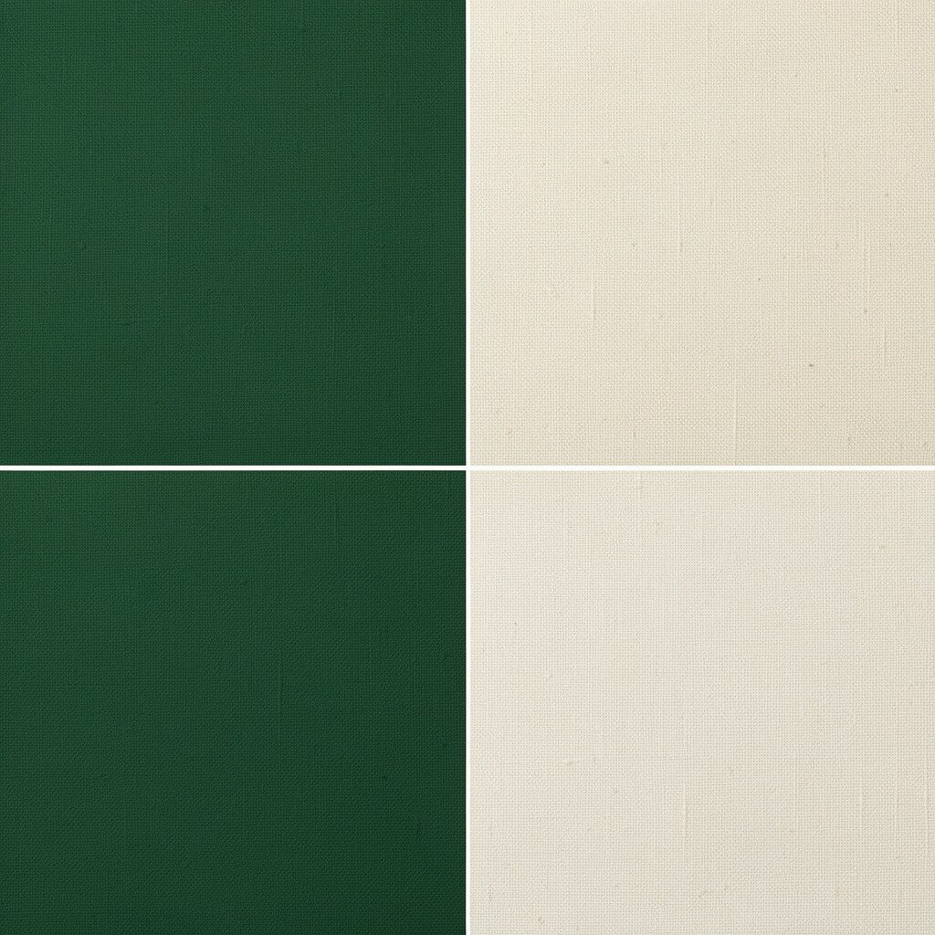
Before, forest green felt heavy because it was repeated everywhere. After, creamy linen tones lightened the room and let the green feel intentional.
When you add light textures, forest green becomes more elegant than overwhelming. Use cream through curtains, upholstery, or a chunky knit throw that shows off the texture. This gives visual breathing room while keeping the bold color. A practical tip is to choose one “green hero” item, then keep surrounding items lighter so the palette feels designed, not crowded.
If you want to save money, update fabric first and delay bigger purchases. Current trend energy loves rich greens, but the best results often come from pairing them with soft, natural off-whites.
13. Bright Orange to Terracotta Sunset
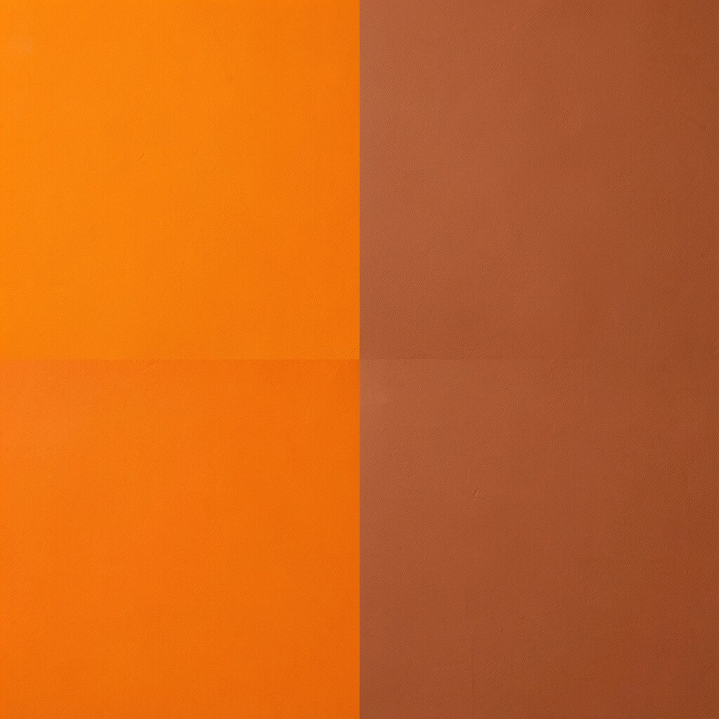
Before, bright orange looked fun but hard to style with everything else. After, terracotta sunset tones made the orange feel deeper, warmer, and easier to repeat.
Terracotta keeps that energetic warmth while adding a grounded, earthy quality. You can use it in paint, a feature wall, or through ceramics and patterned textiles. This change helps your decor feel coordinated, since you can find lots of compatible neutrals like beige, cream, and natural wood. For personalization, blend in a small amount of warm brown or soft pink so the “sunset” idea feels smooth instead of sharp.
Cost considerations are friendly here because you can do a quick refresh with rugs, cushions, and light fixtures. If you want a low-risk move, paint just one small cabinet or use a removable wall panel.
14. Light Blue to Soft Dusty Rose
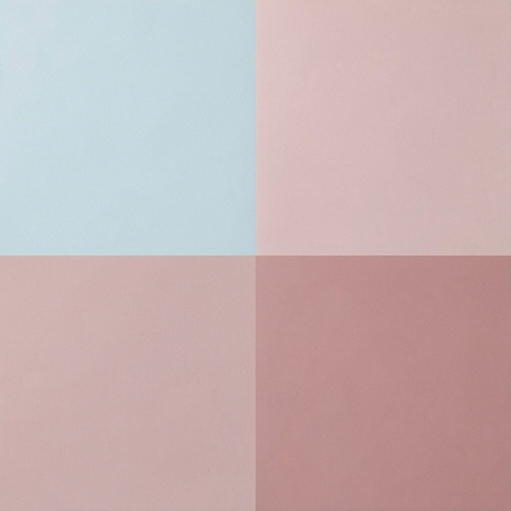
Before, light blue made the space feel distant and a bit too airy. After, dusty rose tones brought comfort and a subtle romance to the same layout.
Dusty rose works well with warm woods, cream textiles, and gentle lighting. It gives the room warmth without making it feel overly colorful. You can test the look with a new duvet cover, wall art, or a few decor pieces in muted pink. Practical tips include choosing rose shades with a hint of taupe so it reads elegant instead of overly bright.
For uniqueness, pair dusty rose with soft gray accents instead of pure black. This keeps the palette modern and makes it feel like a curated style choice rather than a quick trend.
15. Monochrome Teal to Teal with Warm Copper
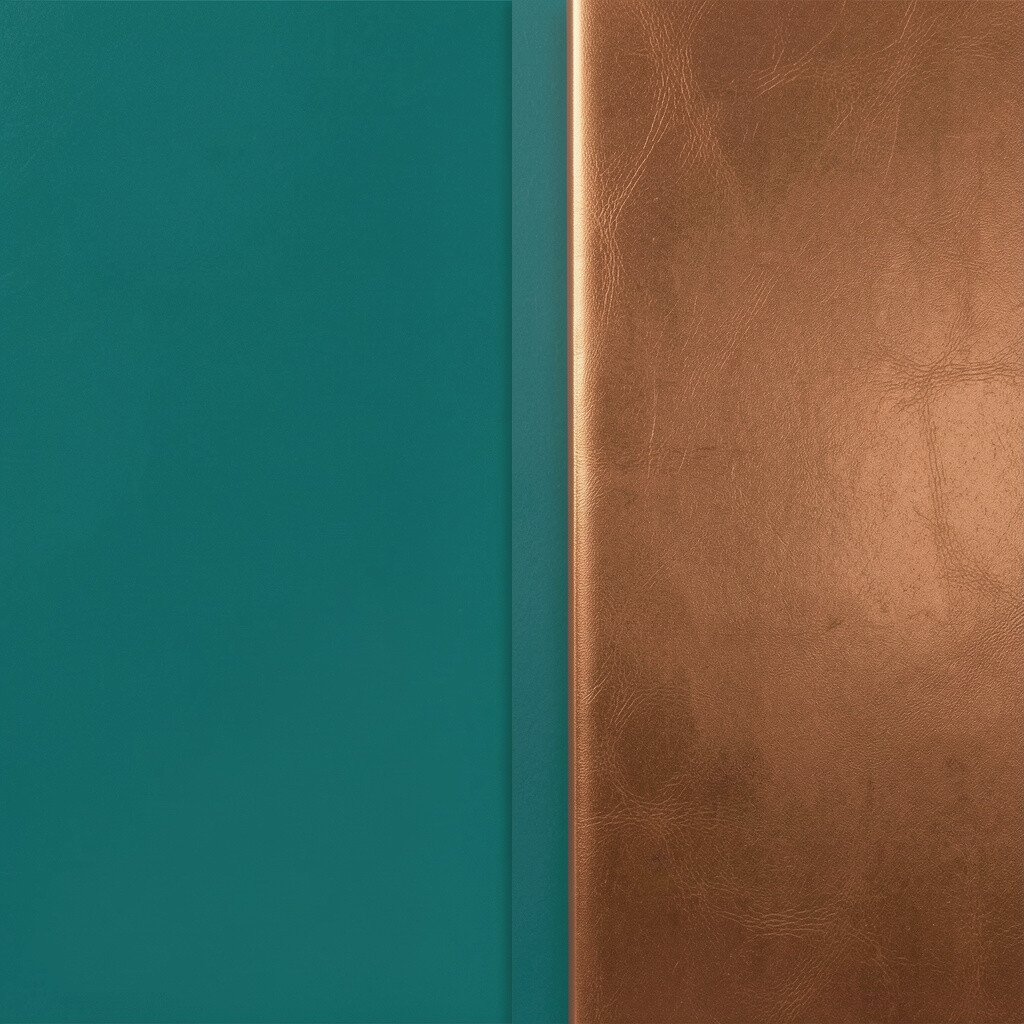
Before, monochrome teal created a strong but slightly flat visual mood. After, warm copper accents added sparkle and movement while keeping the teal as the main star.
Teal plus copper feels like a coastal sunset, with color contrast that feels lively but still refined. Add copper through light fixtures, cabinet handles, picture frames, or a decorative bowl. This improves the lighting experience because copper reflects warmth that balances teal’s cool nature. If you’re cost-conscious, try painting small metal objects with copper-toned spray paint before buying new hardware.
16. Neutral Beige to Greige with Navy Detail
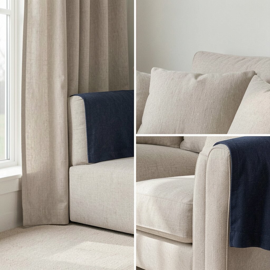
Before, beige was nice but it didn’t give much personality to the room. After, greige created a smoother backdrop, and navy details made the style feel intentional.
Greige sits between gray and beige, so it looks balanced under different lighting. Navy adds depth and anchors the palette, especially in frames, pillows, or a dining chair accent. This is a practical scheme because you can keep existing furniture and just adjust the accessories and paint tones. For personalization, choose navy that matches your favorite jeans shade or your existing dark accents.
Cost considerations are often easier with this plan since it can be done step by step. Current design trends keep favoring greige bases with darker accents, and the result tends to feel timeless rather than temporary.
17. Crisp White and Beige to Chalky Sage and Natural Wood
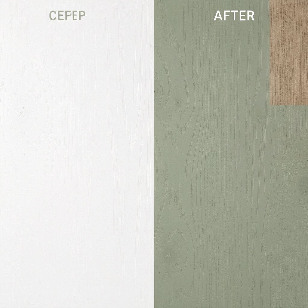
Before, crisp white and beige made the space feel tidy but slightly too plain. After, chalky sage and natural wood made the room feel softer, warmer, and more welcoming.
Chalky colors add a gentle, matte quality that hides minor wall imperfections and diffuses light nicely. Natural wood tones bring realism and texture, so the room feels grounded instead of overly styled. Practical tips include swapping out glossy decor for matte finishes, choosing a sage-colored rug, and adding a few wood pieces like trays or shelving. If you’re watching expenses, focus on one big textile like curtains or a rug, since those changes show up immediately.
For uniqueness, mix different wood tones lightly, like honey and light oak, so the sage feels modern and organic. This kind of palette matches current trends toward calm, natural interiors that still look design-forward.