Alphabet wall lines turn simple letters into a living part of your space. They’re playful, practical, and surprisingly personal in every room.
When you arrange characters into clean lines, your walls start telling stories. Even small changes can make your home feel more intentional and warm.
1. Name-Line With a Calm Baseline
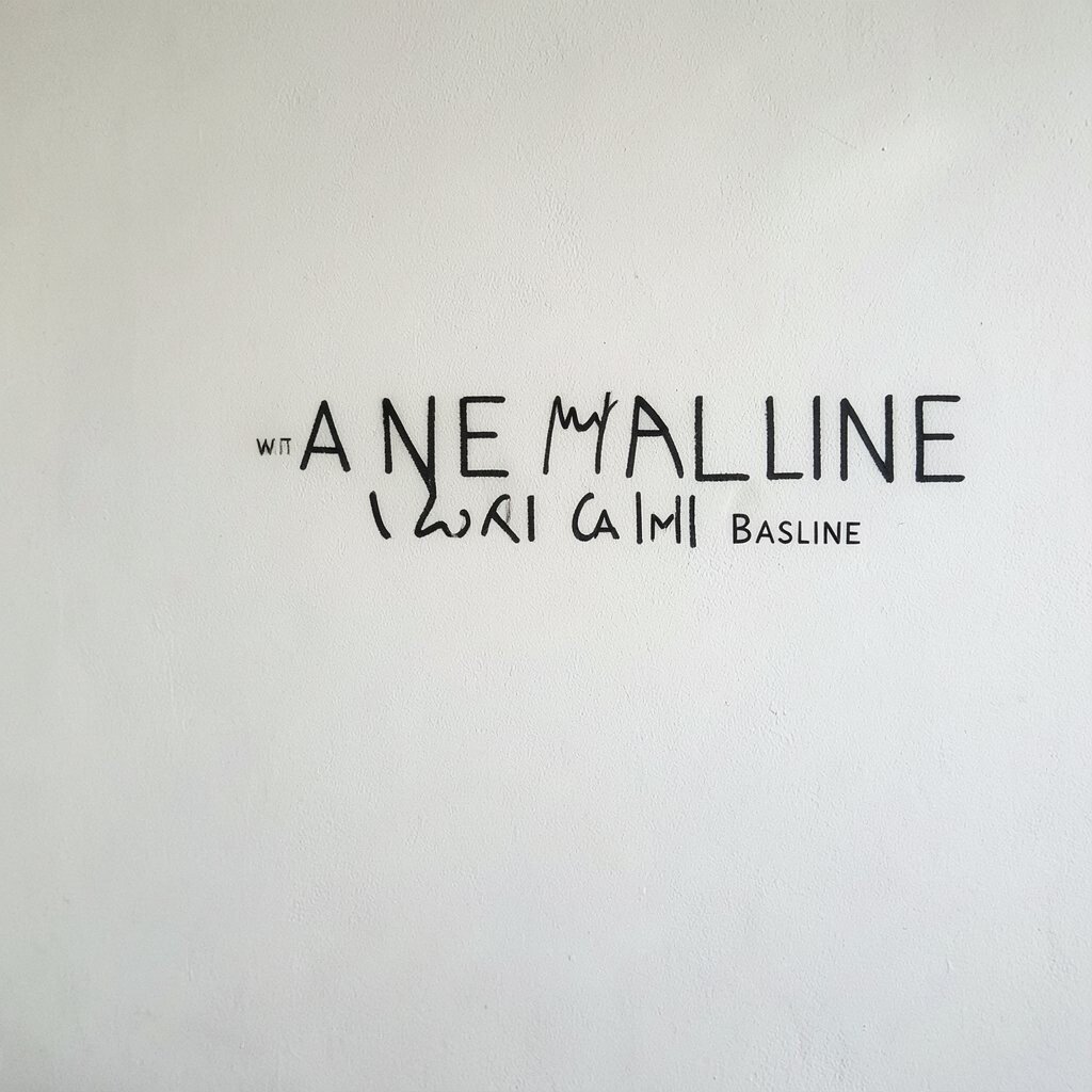
Picture a single horizontal line that holds your family name in neat, matching letters. The baseline sits at eye level, so it feels like a gentle frame instead of loud wall art.
Use a matte finish vinyl decal or painted stencil so the letters look crisp. Keep the font simple with rounded edges to match everyday life, and leave a little empty space above and below for balance. This kind of line makes small rooms feel tidier and helps visitors understand your style fast.
For personalization, swap in initials for a grand name if you want something more subtle. Consider using two colors, like charcoal and soft cream, so the alphabet stays easy on the eyes. If you rent, peel-and-stick letters are usually a low-risk choice and can be moved when your taste shifts.
2. Quote Line With Mixed Letter Heights
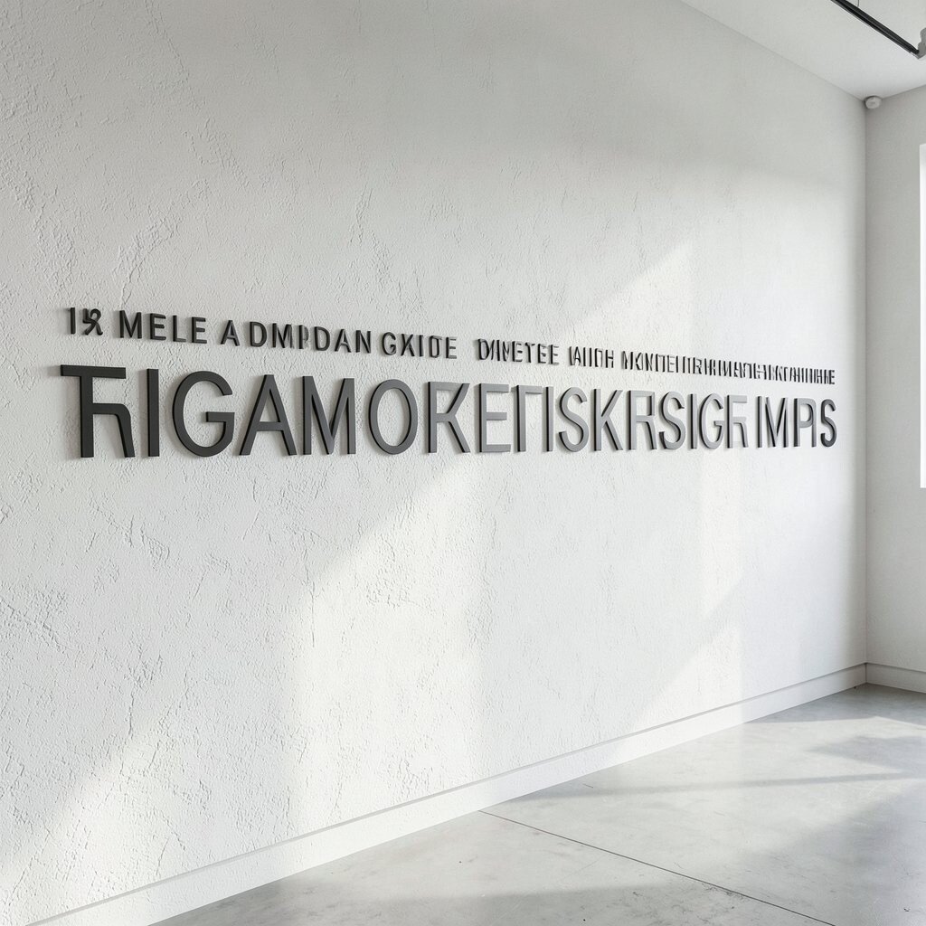
Imagine a short phrase turned into a skyline of letters, with some words slightly taller than others. The effect looks lively, like the wall is breathing and moving even when everything is still.
Choose a quote that matches your mood, such as “Home is where love lives,” and set it in a long wall line across one side of a room. Vary letter heights using a simple font pair, or make a few taller characters with thicker paint strokes. This creates visual rhythm, which is especially helpful in long hallways.
For a practical approach, print letters as templates and trace them lightly before you commit with paint or markers. A single bold color usually costs less and keeps the look modern. You can also switch words out for seasons, like “Gather” for fall and “Relax” for summer.
3. Alphabet Ladder Spelling From Left to Right
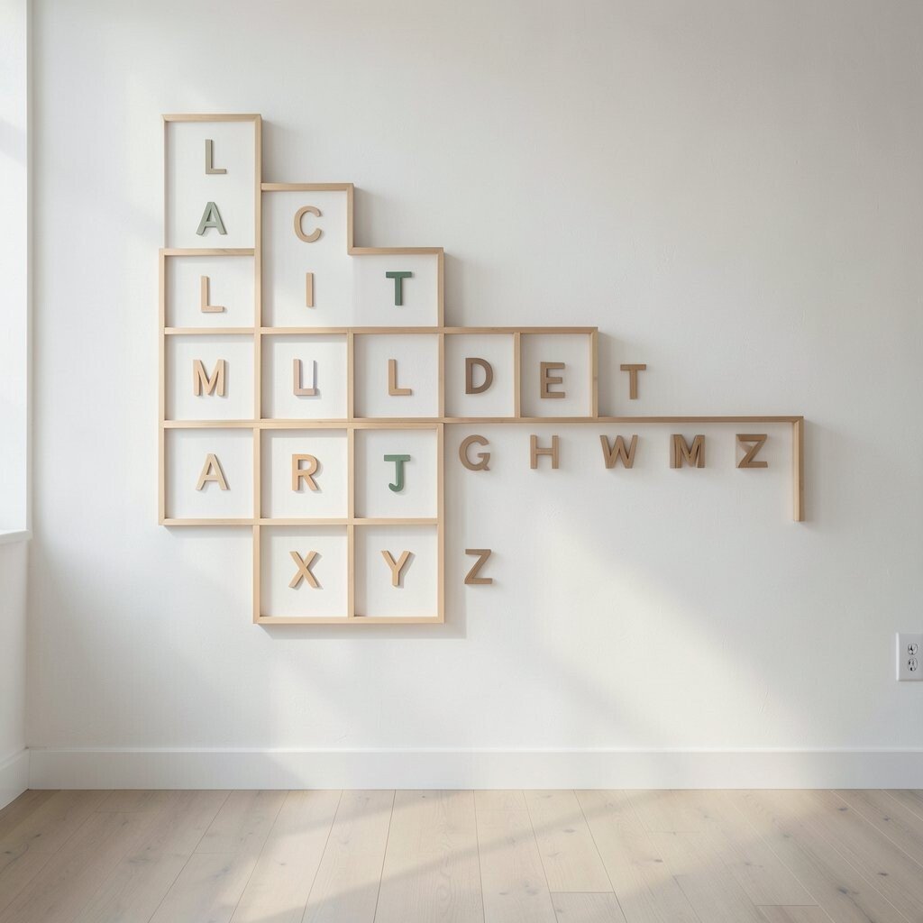
Think of an alphabet line that steps upward, like a ladder, with each letter slightly higher than the one before it. The letters look fun and energetic, while still staying organized.
Place the ladder on a kids’ wall, a learning corner, or near the desk in a home office. Use large, readable letters so it supports everyday reading, not just decoration. When the alphabet is arranged in order along a smooth path, kids can glance up and practice without realizing they’re studying.
To personalize, add the child’s first letter at the start and their favorite color at the base step. If you want a budget-friendly option, use printed foam letters from a craft store and arrange them carefully. Keep the spacing consistent so the line doesn’t look messy, and use a clear protective seal if you’re painting directly on the wall.
You can also match the ladder to your room colors by choosing one accent shade and one neutral. A ladder design fits current decor trends that lean toward playful education, especially in calm, organized spaces.
4. Script Serif Line for a Vintage Mood
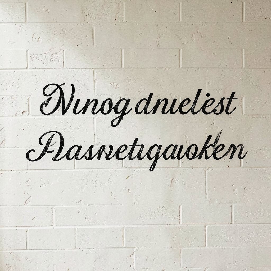
Picture a long alphabet line in elegant script serif letters that gently curve along a straight track. It gives your wall a vintage feel without needing heavy frames or clutter.
Choose an old-world style font and apply it in a single color like deep navy, espresso brown, or muted sage. Keep the line length proportional to the wall, so the letters feel graceful rather than squeezed. This type of decor benefits your home by adding character while still looking clean from far away.
For a practical touch, use stencil brush sets to get sharp edges, especially with flowing letters. It’s usually cheaper than custom signage, and you can reuse stencils for other projects. If you want personalization, spell a meaningful date or a family value word instead of the full alphabet.
5. Minimal One-Word Letter Strip
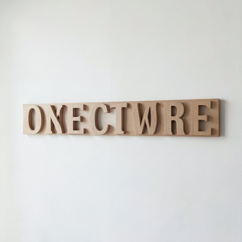
Imagine a narrow band of letters, like a strip of typography, running across the wall near the top. It feels modern because it doesn’t try to do everything at once.
Pick one word that matters, such as “Breathe,” “Belong,” or “Create,” and set it in a single line with evenly spaced letters. Use thin paint strokes or small vinyl letters to keep the line light and airy. This benefits busy spaces by adding personality without blocking furniture views or making rooms feel tight.
For personalization, choose a letter style that matches your personality, from bold block to delicate handwritten. If cost matters, vinyl is often the most affordable route, and you can buy only the letters you need. You can also place tiny accent dots or small stars to make the line feel custom.
6. Mixed-Material Alphabet Line With Wood + Paint
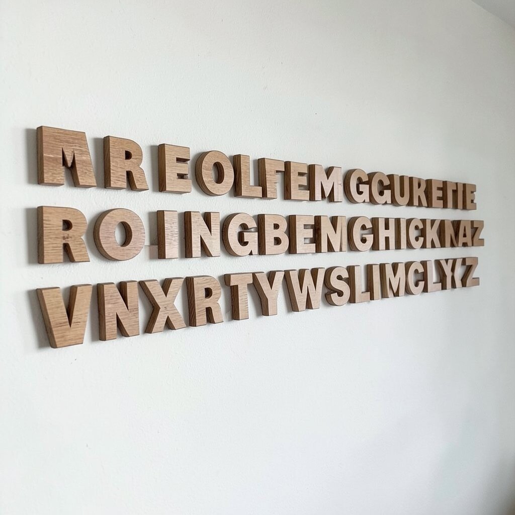
Picture letters cut from thin wood placed along a clean line, with some letters painted and others left natural. The mix of textures looks cozy and gives the wall depth you can’t get from flat decals.
Use a simple base like a long strip of matching wood trim, then mount your alphabet letters slightly above the trim. This benefits your home by adding warmth, which is great for modern farmhouse, Scandinavian, or cottage styles. Keep the number of colors low so the wood doesn’t overwhelm the room.
For personalization, paint only the vowels with one accent color while leaving consonants wood-toned. It’s practical too, because you can make a few letters at a time as your budget allows. A small craft kit can be enough, and you can gradually build your full alphabet line over time.
7. Back-to-Back Letter Line for Shared Spaces
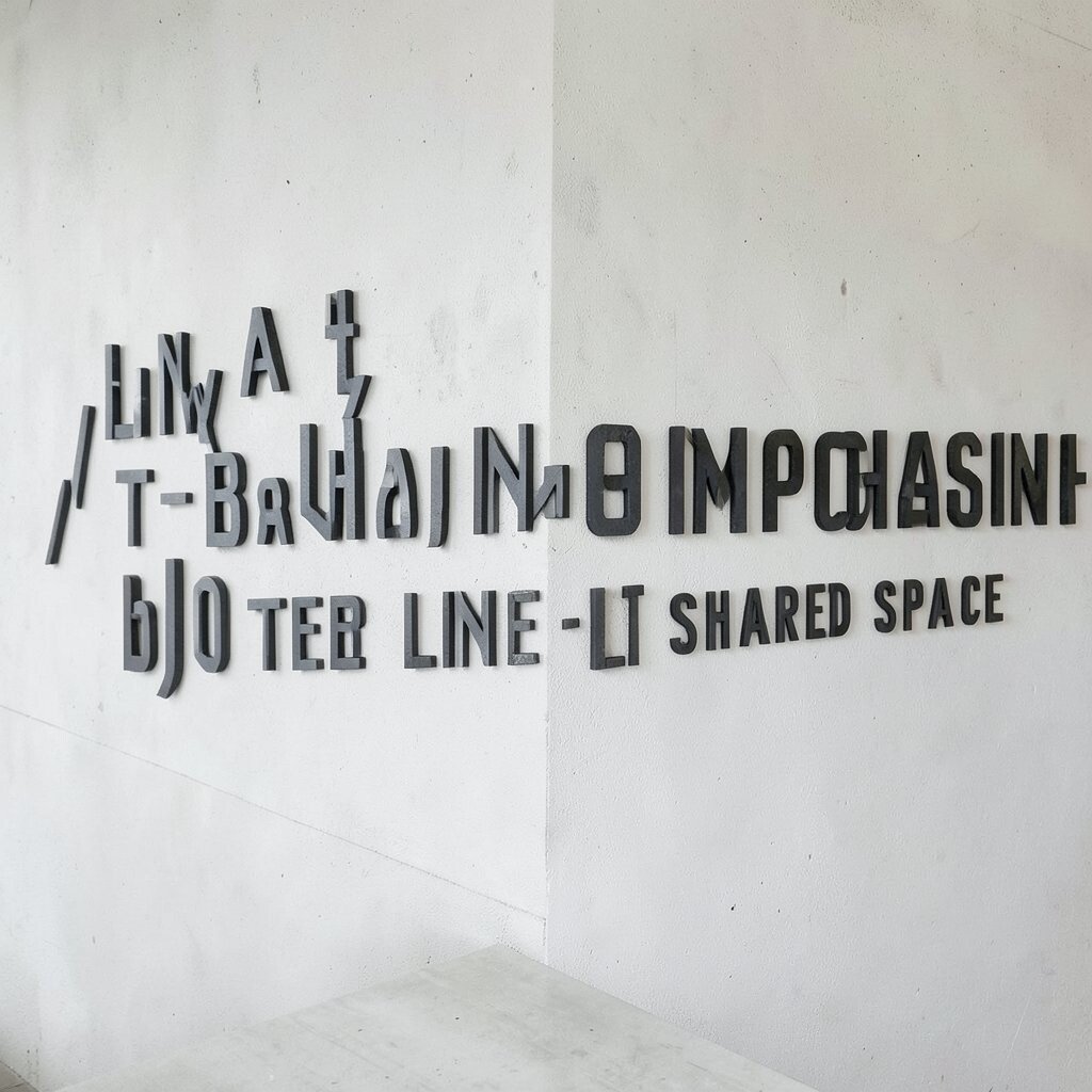
Imagine two alphabet lines facing each other from opposite walls, or one long line that reads differently from each side. It creates a clever “wait, read that again” moment that feels playful and smart.
To make this work, choose letters and spacing that align with how you see the wall from different angles. In shared spaces like a kitchen and dining area, you can coordinate two phrases that mirror each other. This benefits your decor by making the space feel connected instead of separated.
For personalization, include two names or two values, one for each side of the home’s daily flow. Cost is usually manageable because you can use vinyl lettering for both lines. If you want a trend-forward look, keep the style minimal and the line thickness consistent for a clean, gallery feel.
8. Alphabet Line Above a Gallery Wall
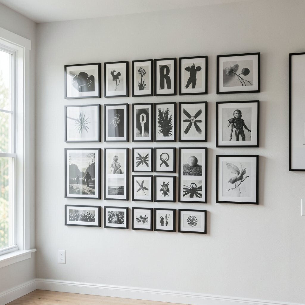
Picture a thin line of letters hovering just above framed art, as if the alphabet is greeting everything below. It softens the visual jump between pieces and ties the wall together.
Use lowercase letters in a simple font, and keep the line short enough to leave room for frames. This benefits your home by creating a neat visual guide that makes the gallery wall look intentional. When the alphabet shares similar color tones with the frames, the whole display feels calmer.
For practical tips, measure the top edge of your frames and align the letter baseline with it. Vinyl decals work well here because you can adjust placement without damaging walls. Personalize by using a word that links your gallery theme, like “Family” or “Stories.”
Current decor trends favor layered, text-based styling, and an alphabet line can help you do it without adding more frames.
9. Chalkboard Alphabet Line for Easy Updates
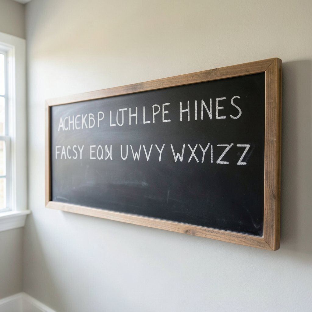
Imagine a chalkboard strip with large, spaced letters drawn in light strokes. The line looks friendly and leaves your wall room to change whenever you want.
Apply chalkboard paint to a narrow section of wall and write an alphabet line with dust-friendly chalk. This benefits your home by giving you a functional decor piece, so it can act like a message board without needing a separate item. You can update the letters to match holidays, parties, or your weekly meal vibe.
For personalization, write your child’s favorite animals after a few letters, or switch between “good morning” and “good night.” Chalkboard styles are trending in homes that like cozy, interactive design. Cost is also reasonable, since paint kits are often less expensive than pre-made signage.
10. Alphabet Line With Tiny Icons Between Letters
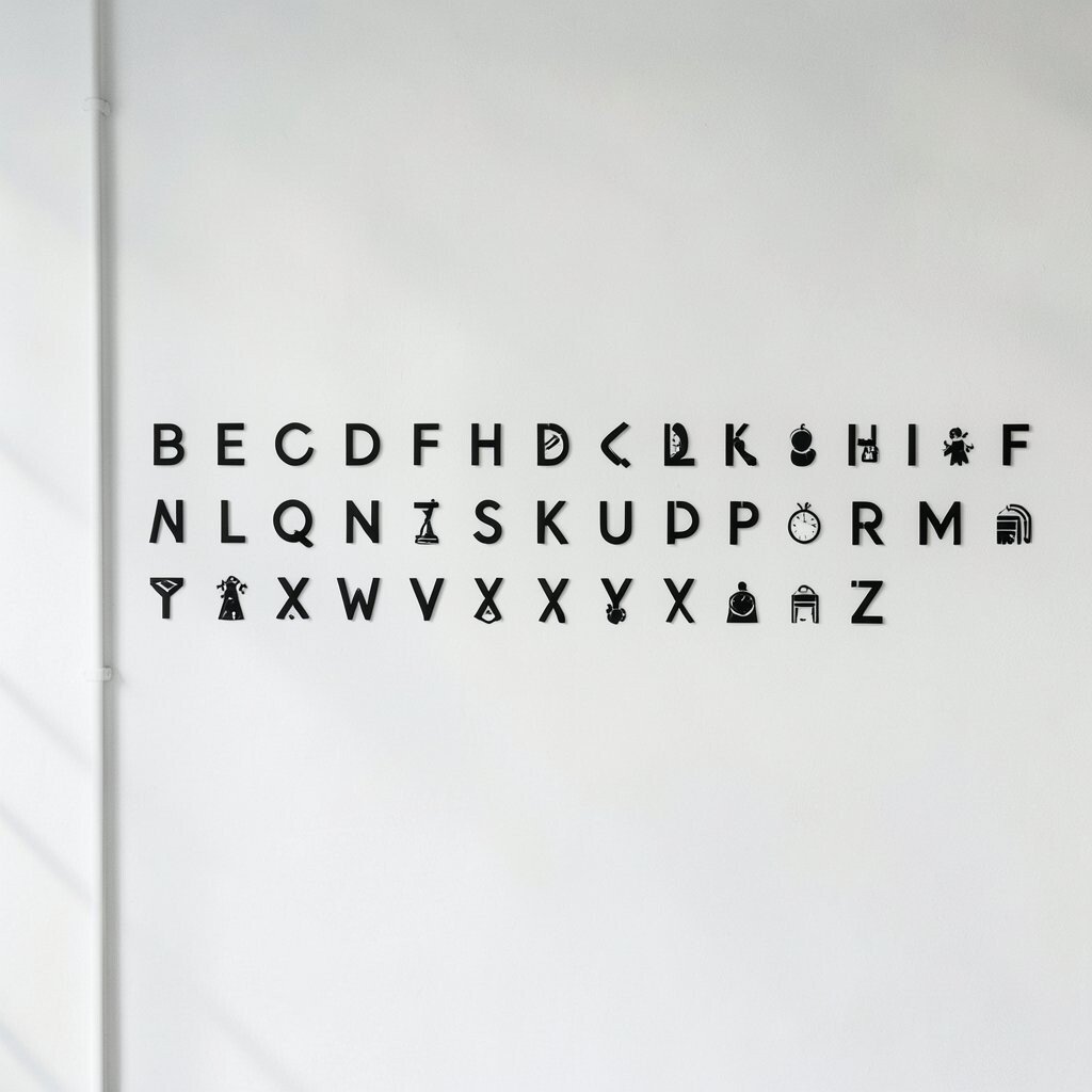
Picture your alphabet line with little icons sitting between letters, like stars, hearts, or simple leaf shapes. The spaces feel playful, and the line becomes a mini pattern.
Use vinyl icon decals and letter stickers to build the line with consistent spacing. This benefits your home by turning a basic alphabet idea into something visually rich, yet still neat. Keep icon sizes small so the line doesn’t compete with furniture or wall decor.
For personalization, choose icons that match your life, like musical notes for a music-loving family or bubbles for bath-time routines. If cost is a concern, start with one icon set and repeat it, buying only what you need. This design is unique because it blends letters and illustration without turning the wall into a busy collage.
Consider a matte white wall with one accent color, which keeps the look modern and current.
11. Raised Letter Line Using Foam or Craft Letters
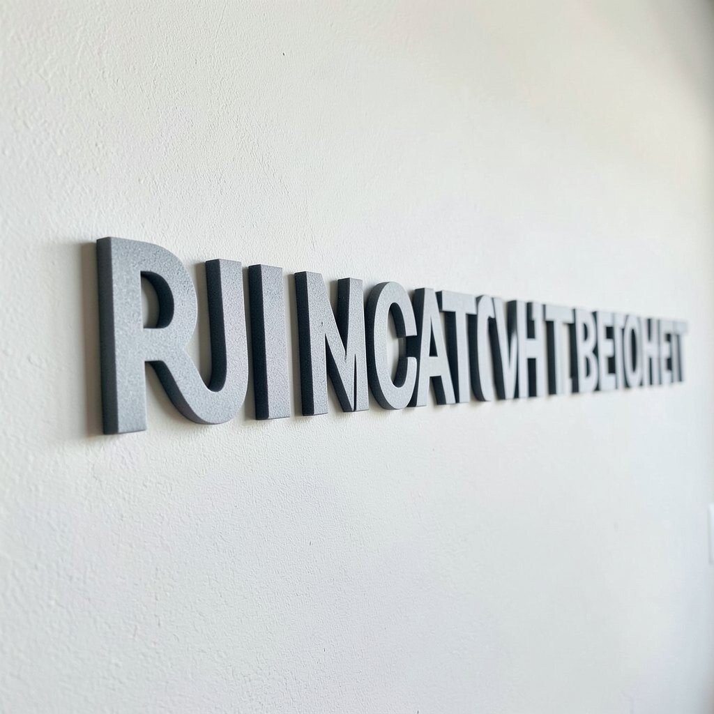
Imagine an alphabet line that casts tiny shadows because the letters sit slightly raised. That gentle shadow makes the line look three-dimensional and gives your wall a soft glow in daylight.
Use foam letters, craft wood letters, or felt letters, then mount them in a straight baseline across the wall. This benefits your home by adding texture, which works especially well in plain rooms that need warmth. Choose one color for most letters, then add a contrasting shade for the first letter of a name or important word.
For practical tips, dry-fit each letter before gluing and keep a consistent gap using paper strips. Cost is often friendly because craft letters are widely available, and you can use coupons at local stores. Personalization is easy since you can spell a family name, a place name, or a favorite mantra.
12. Alphabet Line in a Color-Blocked Wave
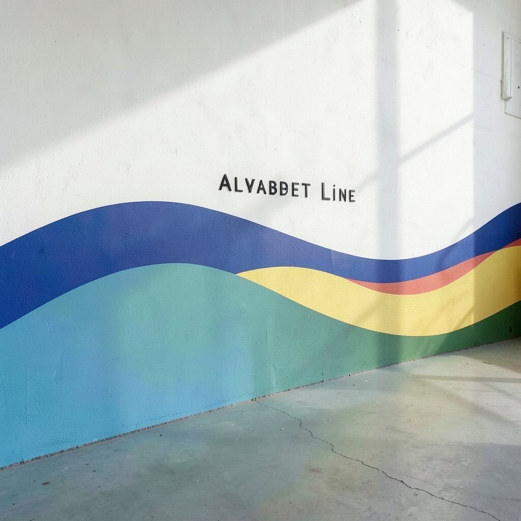
Picture an alphabet line that doesn’t sit flat, but follows a gentle wave made of color blocks. Each letter rides the wave, so it looks like a fun design pattern rather than plain text.
Choose two to three colors and paint alternating blocks under or behind each letter. This benefits your home by adding movement to a wall that might feel too straight or too quiet. The result looks playful while still keeping a clean structure because the alphabet controls the layout.
For personalization, use your room’s existing palette, like terracotta and cream for warm spaces or navy and white for crisp ones. It’s practical because you can tape off sections and paint in steps without freehand stress. Cost considerations are manageable since painter’s tape, basic craft paint, and a stencil can do most of the work.
13. Letter Line in a Framed Long Strip Layout
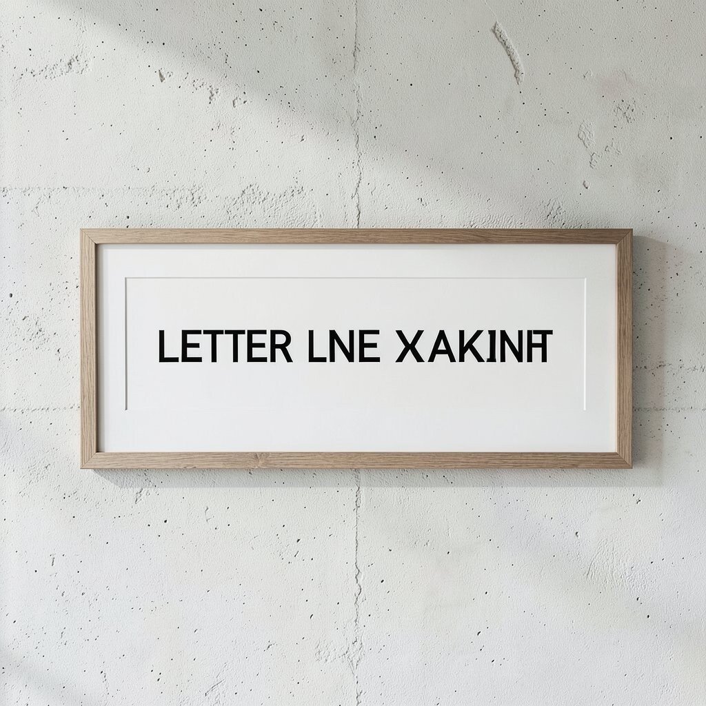
Imagine your alphabet letters placed inside a long, slim frame like a modern picture bar. The frame keeps everything neat and gives the wall line a finished, high-end look.
Use a narrow shadow box style frame, or make a simple wood frame with thin trim. This benefits your home by protecting letters from dust and making cleanup easy. If you like rotating decor, you can place letters on removable cardstock so you can change the wording without redoing the whole design.
For personalization, print letters in your chosen font and add small paper cutouts behind them, like maps or patterns. Cost can vary, but secondhand frames often make this idea budget-friendly. This design feels unique because the alphabet line looks like art that happens to be made of language.
Pair it with current trend colors by matching the frame to your hardware and picture frames.
14. Alphabet Line With Marble-Effect or Faux-Stone Letters
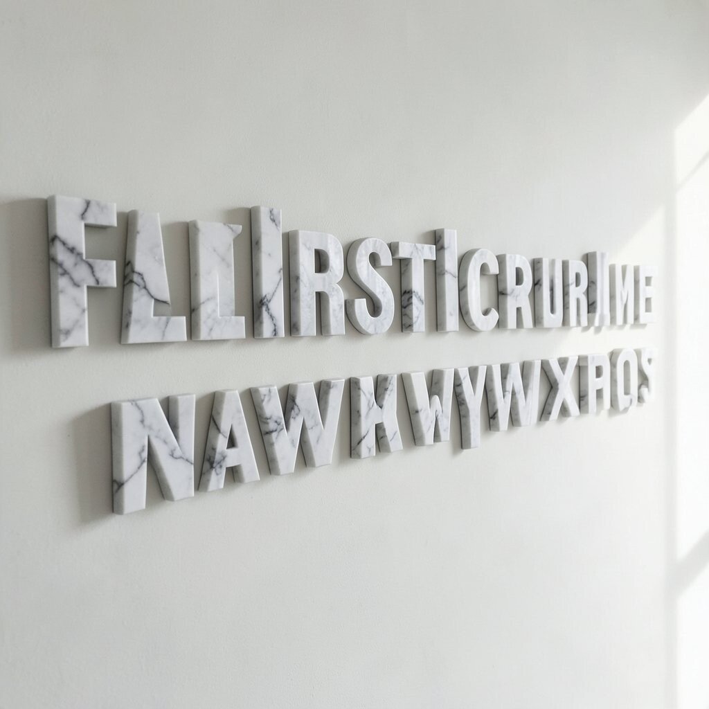
Picture letters that look like marble, with soft swirls and subtle speckles running through them. The alphabet line becomes elegant, turning everyday language into luxury-style decor.
Use paint pens or faux stone spray products to create the marbled effect on letters before placing them on the wall. This benefits your home by elevating the space without needing expensive stone or countertop upgrades. Keep the background simple so the letters stay the focal point.
For practical tips, practice on a scrap piece first so you can find the right swirl density. Cost is often lower than real stone signage, and you can control the budget by doing fewer letters or only key letters in marble effect. Personalization comes naturally because you can match the marble tones to your room, like warm beige or cool gray.
15. Alphabet Line Using Fabric Banners and Felt Letters
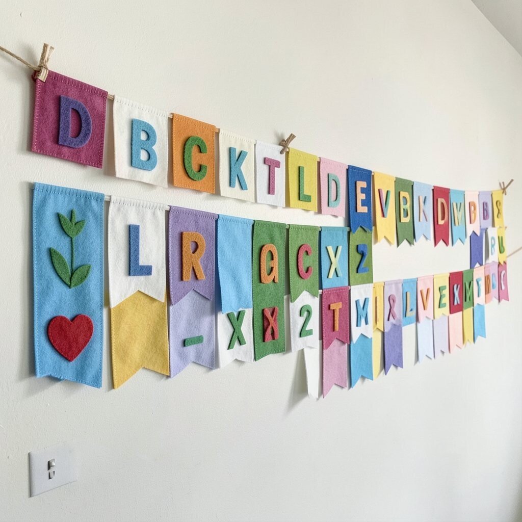
Imagine a cloth banner stretched across a wall with soft felt letters stitched on. The alphabet line feels cozy and gentle, like a handmade quilt but for your wall.
Choose sturdy fabric, then pin or sew letters along a straight line with matching thread. This benefits your home by adding softness, which is great in rooms with a lot of hard surfaces like tile or polished wood. It also makes the decor more forgiving if you have pets or kids who bump into things.
For personalization, spell a family word and add tiny stitched details, like dots, ribbons, or simple shapes. Cost considerations are usually friendly since felt sheets and thread are affordable, and you can use scraps you already own. This is also a unique way to keep the alphabet line from feeling permanent, because you can swap the banner layout later.
16. Alphabet Line With Light-Up LED Letter Segments
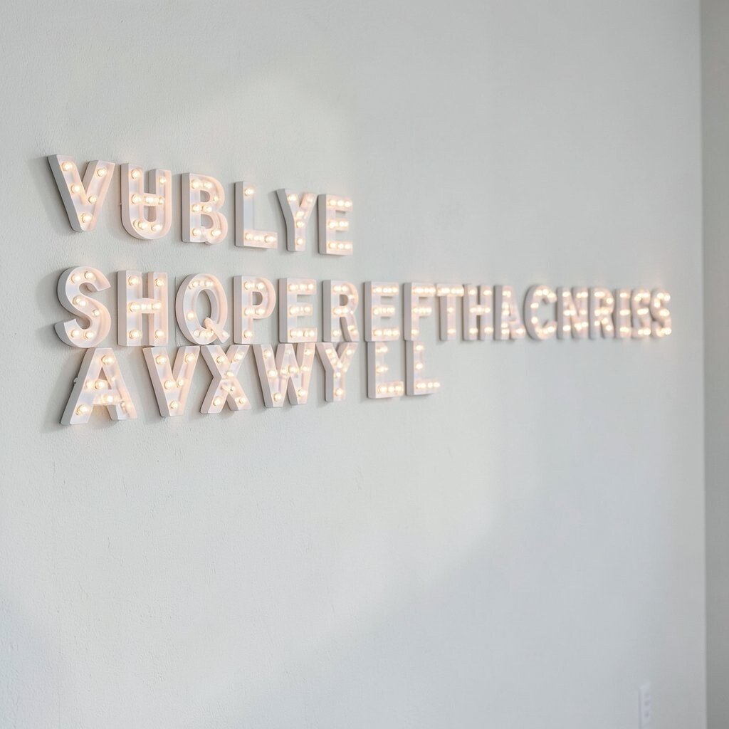
Picture the alphabet line at night, glowing softly like a sign, with letters spaced just far enough to feel airy. It creates a cozy mood without turning your room into a bright store display.
Choose warm white LED strips or light-up letter pieces and mount them along the baseline. This benefits your home by making evenings feel calm and inviting, especially in living rooms and bedrooms. Keep brightness moderate and use neutral tones to avoid overpowering the space.
For practical tips, plan wiring ahead of time and hide cords behind trim or cable covers. Cost can be higher than vinyl, but it’s often worth it for a long-lasting feature. Personalization is easy by choosing initials, a short word, or even the alphabet subset you want most for daily inspiration.
Current trends lean toward warm lighting and text-based accents, so this fits right in.
17. Alphabet Line as a Ruler-Style Measurement Motif
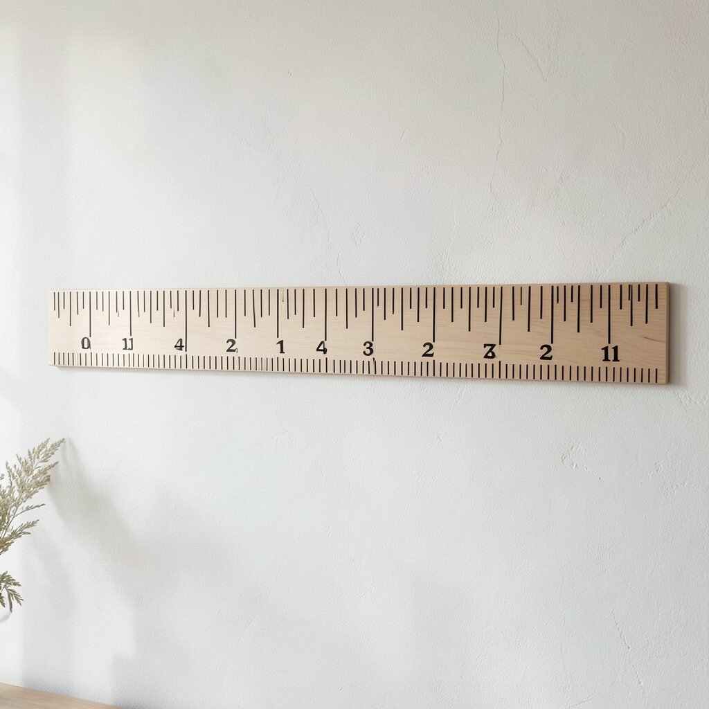
Imagine an alphabet line drawn like a ruler, with letters paired with tiny measurement marks. The look feels smart and playful, blending education with decor.
Paint or stencil a long line with inch-like tick marks, then place letters above them in a simple alphabet order. This benefits your home by creating an interactive visual cue, which is great for study spaces and kids’ bedrooms. It also adds structure, making the room feel more organized.
For personalization, add the year your family moved in near one end, or label a “reading time” section with your child’s favorite letters. Cost is manageable because stencils and craft paint are usually inexpensive. If you want uniqueness, use unusual letter placement, like A at the center and the rest moving outward like a target.
18. Alphabet Line With Ombré Color Fade
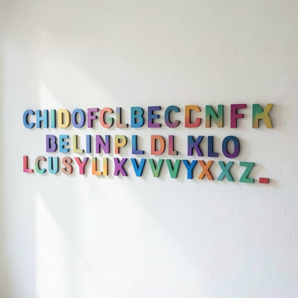
Picture letters that fade from one color to another along the line, like a gentle sunset. The alphabet looks smooth and artistic, even though it’s just typography.
Paint each letter in a slightly different shade, or use gradient vinyl if you want the process to be faster. This benefits your home by adding color variety without needing multiple busy patterns. Ombré designs also make walls feel brighter because the gradient draws your eyes across the line.
For practical tips, plan the color steps before you paint so the fade stays even. Cost considerations are usually fine since paint costs less than many decorative murals, and gradient vinyl options can be affordable too. Personalization is simple by choosing colors that match your pillows, curtains, or seasonal accents.
19. Alphabet Line With Coordinate-Style Placement for a Landmark Word
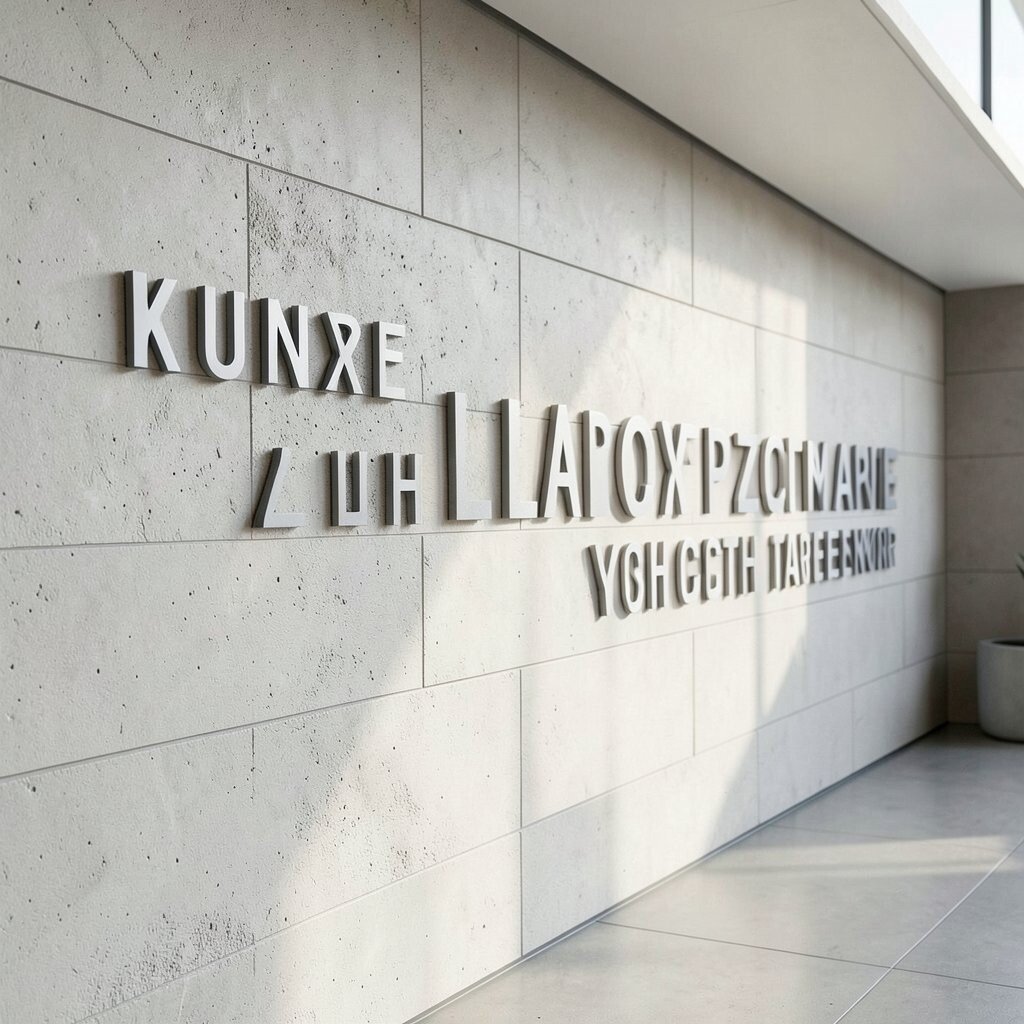
Imagine your alphabet line arranged like a coordinate system, with numbers or small markers beside letters. Then, instead of random letters, it spells a landmark word like a city, neighborhood, or meaningful place.
Use a clean font and keep the markers subtle so the design looks modern rather than technical in a loud way. This benefits your home by adding storytelling, since the word is tied to memory and belonging. It’s also a unique way to make wall decor feel like a map without the mess of many elements.
For personalization, use your favorite place’s initials and add small dots that match travel photos in tone. Cost can be controlled by printing only the letters and markers you need, then applying vinyl or adhesive paper. If you’re following current trends, this aligns with the love for curated, travel-inspired decor and minimal design.
Try placing it near a doorway or entry table so you see it every day when you come and go.
20. Alphabet Line With Your Favorite Song Title Letters
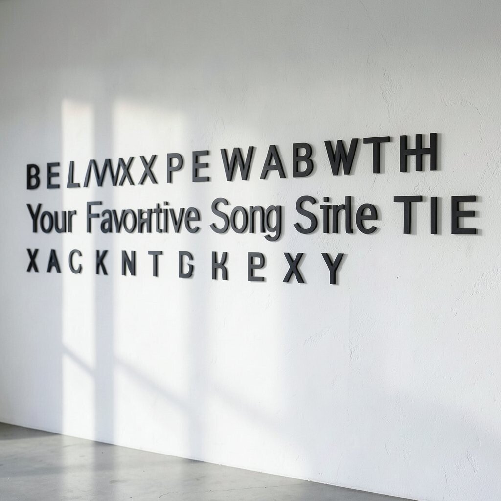
Picture an alphabet line that spells part of a favorite song title in bold, confident letters. It feels like a quiet music poster, but it’s personal to your own life.
Choose the title words carefully, then set them in a single horizontal line with strong spacing. This benefits your home by adding emotional meaning, which turns decor into something you enjoy living with. Use color choices that match your listening mood, like black and cream for classic vibes or bright accents for playful rooms.
For practical tips, use a stencil to keep letter shapes consistent, especially if you’re painting directly. Cost is usually manageable since you can do this with vinyl letters, paper prints, or paint and basic brushes. Personalization is powerful here, because you can swap the line later for a new favorite song whenever your taste changes.
Keep the look trend-friendly by choosing a clean font and limiting the palette, so the wall stays modern and easy to style around.