
Your kitchen backsplash can do more than protect the wall. It can add rhythm, warmth, and personality every time you cook.
Herringbone tile patterns make that happen with a look that feels both classic and fresh.
1. Classic White Herringbone With Slim Grout Lines
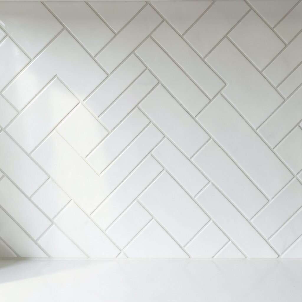
Picture bright white tiles forming a zigzag that feels crisp and clean. The grout lines look delicate, so the whole wall feels airy and neat.
This style makes small kitchens feel bigger because the light bounces around easily. You also get a timeless look that works with subway tile floors, shaker cabinets, and simple hardware. For practicality, use a grout color that matches closely so splashes don’t stand out, and seal the grout if your tile or grout needs it.
2. Warm Off-White Herringbone With Soft Beige Grout
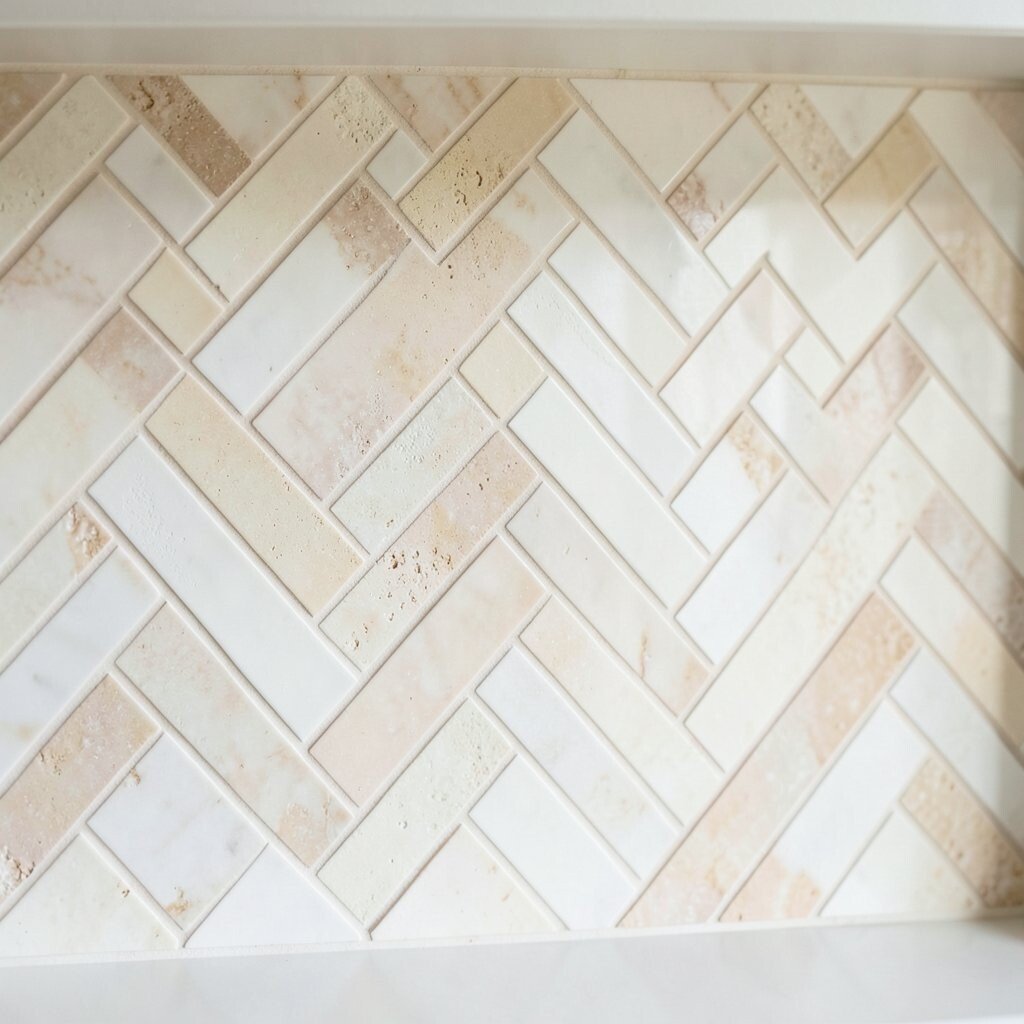
Think of creamy off-white tiles paired with grout that leans beige. The result looks cozy, like a sunlit room with calm tones.
This combination hides everyday mess better than high-contrast grout. It also feels inviting next to wood cabinets and brass faucets. To keep it looking polished, wipe spills quickly and choose an easy-clean finish for the tiles.
If you want personalization, add a warmer countertop or a slightly darker shelf to balance the softness. For cost, off-white ceramics and porcelain are often budget-friendly compared with rare natural stones. When updating, you can also reuse existing outlet covers so the project stays focused on the backsplash.
3. Matte Black Herringbone For A Bold Modern Kitchen

Imagine black tiles arranged in a crisp herringbone pattern. Even in low light, the diagonal lines make the wall look sharp and designed.
Matte surfaces hide smudges better than shiny ones, which is great for busy kitchens. The pattern also adds depth, so the backsplash doesn’t look flat or boring. Choose a grout that’s charcoal or dark gray so the pattern reads cleanly rather than patchy.
To keep things practical, ventilate well while cooking so grease stays lower on the walls. Personalize the look with warm lighting under cabinets or a blackened faucet. If you’re cost-conscious, look for quality porcelain matte finishes, since they often mimic expensive stone at a lower price.
4. Creamy Marble Look Herringbone With Vein Movement
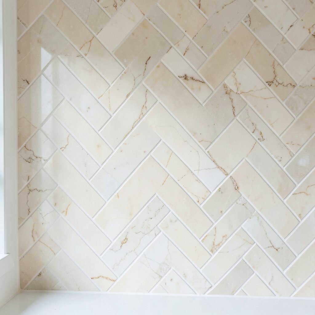
Close your eyes and picture marble-look tiles with subtle veining running through. In a herringbone layout, that movement looks extra dynamic, like gentle waves.
This option gives you an elegant feel without the heavy maintenance that real marble can require. It also pairs beautifully with natural wood, light countertops, and gold accents. For practical care, choose tiles labeled as stain-resistant and consider a grout sealer so daily splashes don’t sink in.
5. Brushed Nickel Or Stainless Tones With Sleek Contrast
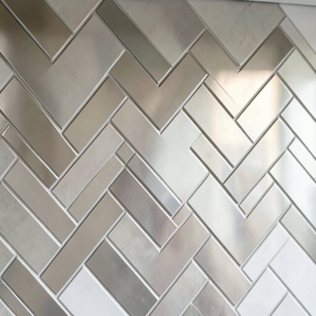
Imagine a cool-toned backsplash that catches the light softly. The herringbone pattern gives the metal-like color extra texture and shine.
You get a modern look that works well with stainless appliances and clean-lined cabinets. Because the pattern creates visual breaks, it can help the wall feel less busy than a flat sheet. For practical tips, wipe gently with a non-abrasive cleaner and avoid harsh scrubbing pads that can dull finishes.
To personalize, mix the backsplash tones with lighting in warm white so the steel feel stays welcoming. For cost, metallic-looking tiles can range widely, so compare sample tiles in your lighting before committing. If budget is tight, consider smaller accents in metallic tones paired with a more affordable main tile.
6. Terracotta Herringbone For An Old-World Kitchen

Picture terracotta tiles laid in a neat zigzag, each piece warming the whole wall. The earthy color looks especially pretty with natural materials.
This backsplash brings warmth and character, and it pairs well with open shelving and rustic wood. Terracotta-style tiles also help create a cozy kitchen vibe that feels lived-in. For practical upkeep, use a sealed finish and clean with mild soap so the color stays rich over time.
To personalize, think about adding a matching ceramic canister set or patterned textiles nearby. Budget-wise, terracotta can be mid-range, but installation labor matters because tile layout requires careful alignment. If you want a similar look without the full cost, look for porcelain tiles that mimic terracotta tones.
7. Subway Color Herringbone With Color-Blocked Calm
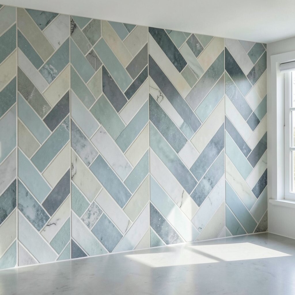
Picture a gentle herringbone pattern using a subway-inspired color, like pale gray or sage. The diagonal layout keeps the wall from looking flat while staying calm.
This works for people who love color but want it to feel soft and wearable. A muted herringbone backsplash can also make countertops look more organized and intentional. Choose a grout shade close to the tile so the pattern reads as cohesive rather than scattered.
8. Ocean Blue Herringbone With Crisp White Grout
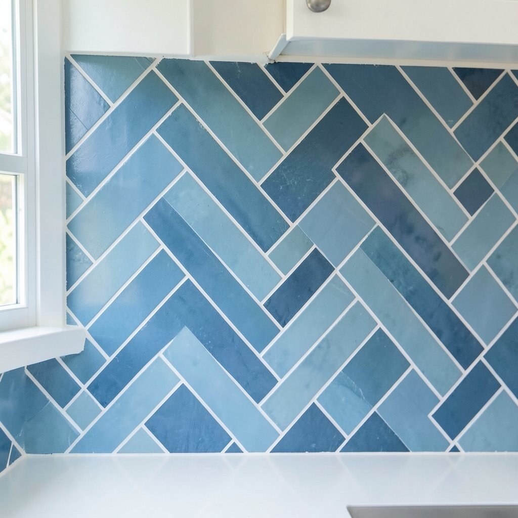
Imagine ocean blue tiles forming a tidy zigzag above the counter. The pattern looks like a splash of color that still feels structured.
Blue herringbone backsplashes add personality without overwhelming the room, especially with crisp white grout. The grout contrast makes the design pop, which is great if your kitchen is otherwise neutral. For practical tips, seal grout if recommended and clean quickly after cooking to prevent discoloration.
Personalize by matching a rug or dishware to the blue tone so everything feels connected. For cost considerations, glossy ceramic options can be more affordable than certain natural stones. If you want a high-end look, choose tiles with consistent sizing to reduce layout headaches and labor costs.
9. Two-Tone Herringbone Alternating Warm And Cool Tiles
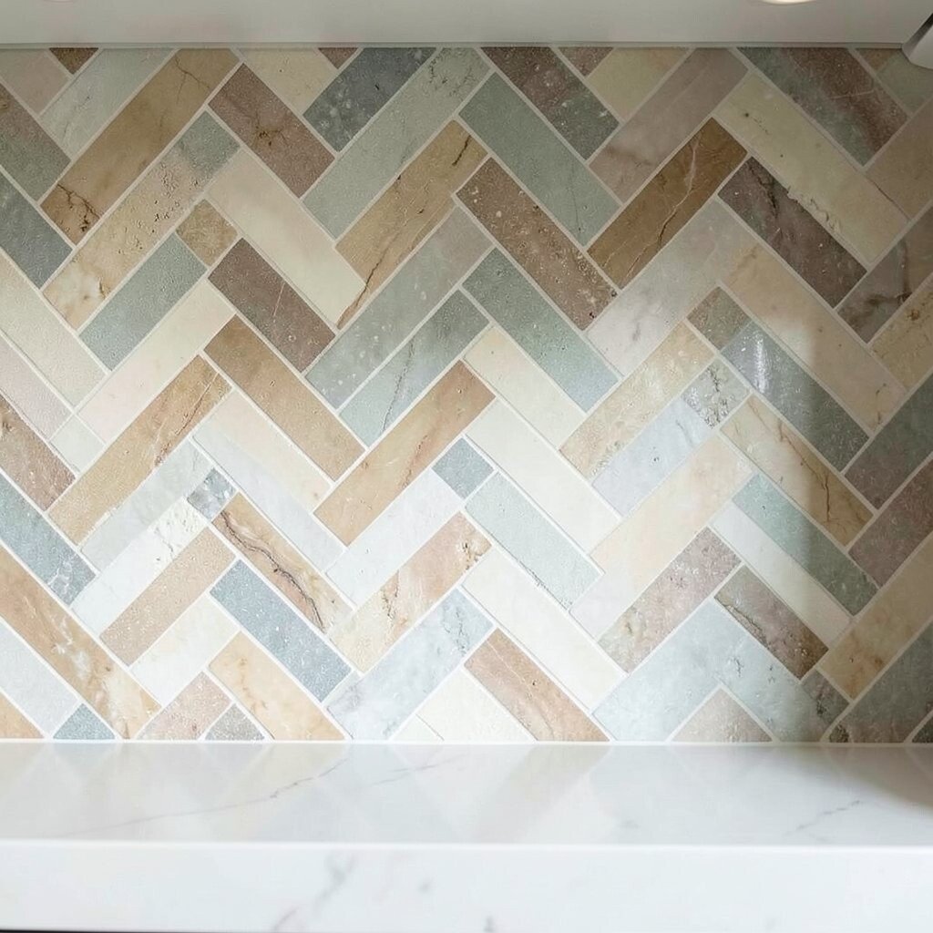
Picture a herringbone backsplash that alternates two shades, like warm cream and cool gray. The result looks playful, yet still tidy and intentional.
This approach adds uniqueness because your backsplash becomes a pattern story, not just a grid. It also helps hide minor imperfections since the eye moves across color changes. To keep it practical, dry-lay a few rows to confirm the rhythm, then stick to a consistent tile orientation.
Personalization can be simple, like choosing two colors that match your cabinets and backsplash edge trim. Cost-wise, two-tone designs can be similar to single-color installs, but extra planning time may affect labor. If you want to lower cost, pick tiles from the same collection line to reduce variation and waste.
10. Sage Green Herringbone For A Fresh, Garden Kitchen
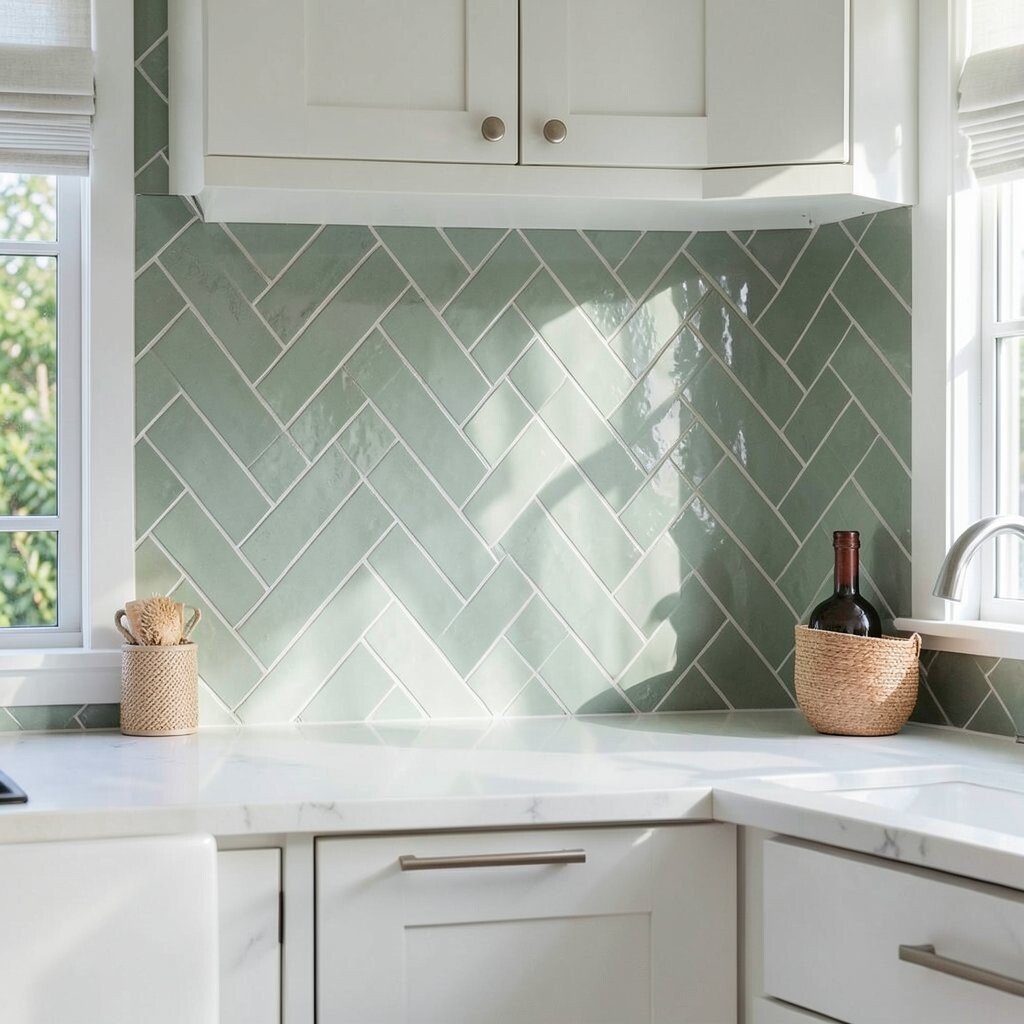
Think of soft sage green tiles arranged in a clean herringbone pattern. The color feels fresh and calm, like herbs on a sunny windowsill.
This trend-forward shade pairs well with white counters, light woods, and natural stone. The herringbone pattern gives the color extra movement, so it never looks one-note. For practical care, choose a finish that resists staining and seal grout if needed for your climate and cooking habits.
11. Earthy Brown Herringbone With Glossy Depth

Imagine rich brown tiles laid in a herringbone pattern with a glossy finish. Each piece reflects light in small flashes, giving the wall depth.
This style feels luxurious and grounded, especially with dark countertops or warm cabinet tones. It can also hide minor smudges better than lighter colors, which is helpful for everyday cooking. For practical tips, don’t use harsh cleaners and wipe with a microfiber cloth to keep the shine looking smooth.
To personalize, consider pairing the backsplash with bronze or copper accents so the warmth feels cohesive. Cost considerations depend on finish and tile material, but many brown glossy porcelain options fit typical renovation budgets. Before you buy, check how the tile looks under your actual kitchen lighting, because brown can shift from warm to cool.
12. Light Gray Herringbone With Steel Accents

Picture light gray tiles forming a refined zigzag above your sink. The tone stays neutral, while the pattern adds style that feels built-in.
This is a great choice if you want modern balance without strong color. Gray herringbone also works with both warm and cool metals, depending on the undertone. For practical upkeep, choose grout that suits your cleaning routine and seal if your grout is porous.
13. Classic Carrara Marble-Effect Herringbone With White Grout

Imagine crisp marble-effect tiles with bright white background and gentle gray veining. In herringbone form, the lines create a structured elegance that feels upscale.
This backsplash looks amazing with white cabinets, light stone countertops, and simple black hardware. It also gives a clean visual frame around the cooking area, which helps the whole kitchen feel more finished. For practical tips, use a grout sealer and wipe regularly since lighter grout can show stains if ignored.
Personalization can be as easy as adding a slim wooden tray on the counter for a softer touch. Cost considerations often favor porcelain marble-effect tiles over natural stone, which can reduce your overall budget. If you plan to install yourself, order extra tiles since herringbone cuts can create more waste.
14. Iridescent Herringbone That Shifts With Light
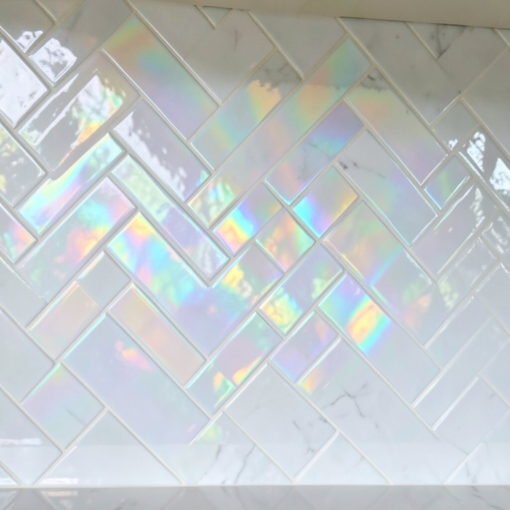
Picture iridescent tiles that glow differently as you move through the room. The herringbone pattern makes those color shifts feel even more lively.
This idea brings a little magic to the everyday, especially when paired with simple cabinetry and minimal decor. It’s also a smart way to add uniqueness without needing bold primary colors. For practical tips, choose a tile designed for kitchen walls and avoid anything that feels too delicate for frequent cleaning.
To personalize, match the undertone to your lighting, like warm gold bulbs or cool daylight. Cost considerations can be higher for specialty finishes, so shop for sales or comparable finishes in durable materials. If budget is tight, use iridescent tiles as an accent zone and keep the rest a solid neutral.
15. Patterned Herringbone With Small Mosaic Inserts

Imagine a main herringbone field with tiny mosaic pieces woven into the design. The wall looks detailed, like a subtle piece of art.
This style adds visual richness while still keeping a clear overall rhythm. Mosaic inserts can also help break up large monotone areas, making the backsplash feel more customized. For practical tips, plan grout lines carefully so the inserts don’t make the wall feel crowded or uneven.
Personalize by choosing mosaic inserts that match your cabinet color, countertop specks, or even your kitchen hardware. Cost considerations may rise because mosaic tiles can increase labor and require more careful placement. To manage costs, limit the insert pattern to a band near the stove or sink.
16. Classic White Herringbone With Subtle Warmth From Creamy Undertones

Picture “white” tiles that aren’t stark, but gently creamy. The herringbone shape makes the undertone feel even smoother and warmer.
This is a smart compromise if you love bright kitchens but want them to feel less cold. Warm white also photographs beautifully and makes everyday dishes stand out on the counter. For practical upkeep, pick grout that blends with the warmth so splatters don’t create noticeable spots.
17. Handmade Look Herringbone With Slight Texture
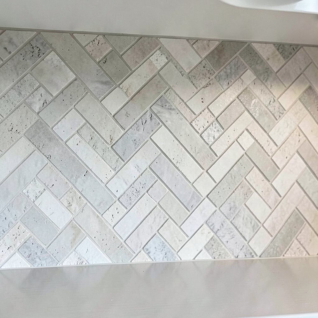
Imagine tiles with a handmade feel, like tiny variations in color and finish. In a herringbone layout, those small differences look charming and natural.
This style feels unique because it doesn’t look factory-perfect, and that’s the point. Texture can also help hide light scuffs better than ultra-smooth finishes. For practical tips, choose glaze that cleans easily and keep cleaning tools gentle to protect the surface.
To personalize, choose a color that echoes your dining area or the tone of your flooring. Cost considerations vary because “handmade look” can mean different quality levels, so check sample cards and ask about tile thickness. If you want to keep costs down, buy slightly more uniform handmade-look tiles rather than ultra-premium ones.
18. Beige And Blush Herringbone For A Soft, Modern Cottage Style
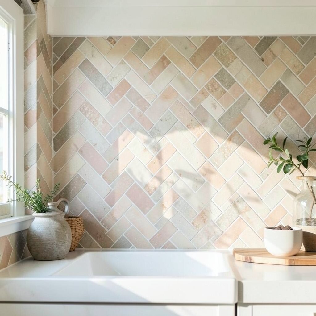
Picture blush-tinted and beige tiles stacked into a gentle herringbone pattern. The colors feel calm and welcoming, like a cozy blanket for your kitchen wall.
This backsplash idea creates a modern cottage vibe without going overly rustic. It also pairs nicely with creamy cabinets, light wood floors, and vintage-inspired faucets. For practical care, choose a tile finish that resists water spotting and use a grout color that matches so cleaning stays easy.
19. High-Contrast Herringbone With Black Tiles And White Grout
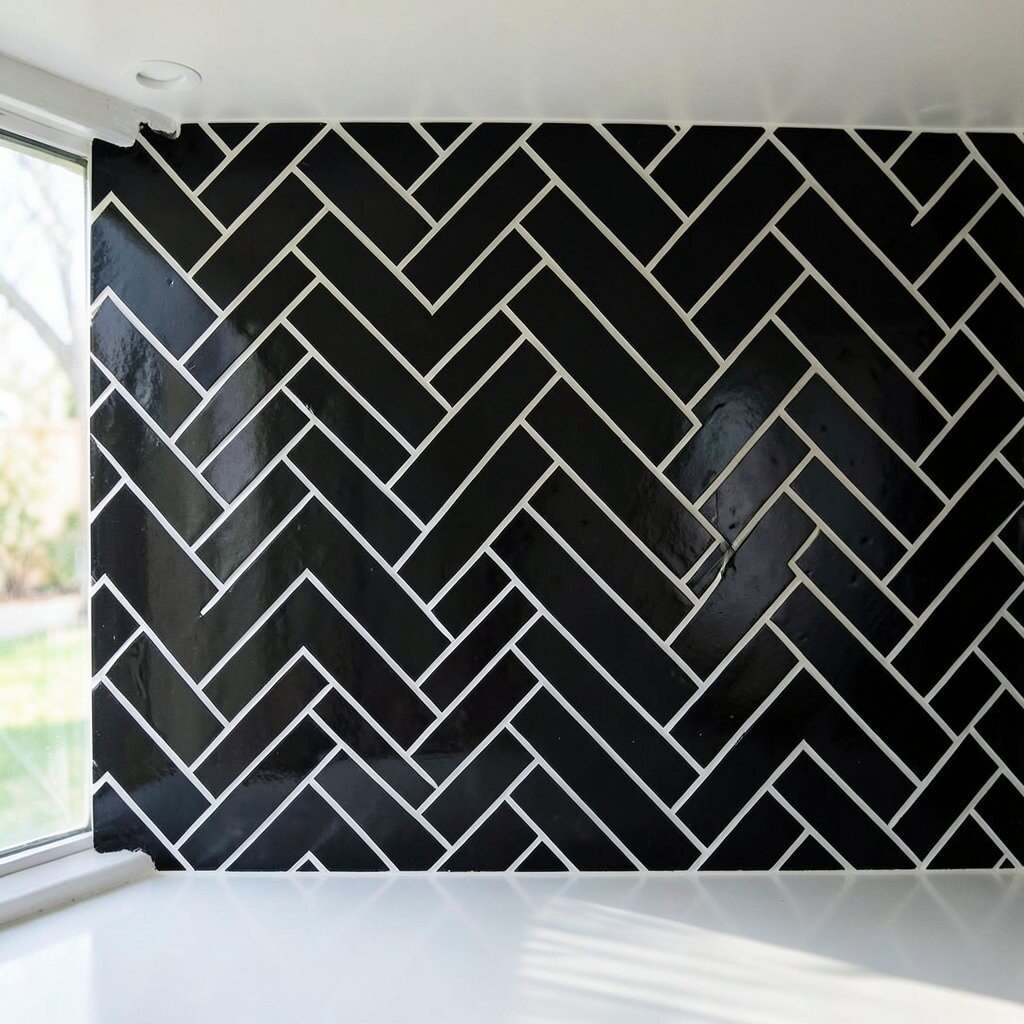
Imagine bold black tiles with crisp white grout lines that draw a clear zigzag. Every row looks like a graphic design, sharp and confident.
This high-contrast combo looks great in kitchens with light countertops and sleek cabinet fronts. It also makes the backsplash stand out as a focal point, so you can keep other decor simpler. For practical tips, consider maintenance because bright grout can show dirt, meaning you’ll want regular gentle cleaning.
Personalization can be as simple as adding black hardware or a black pull-out faucet to match the tile. Cost considerations are often reasonable since black-and-white ceramic tiles are widely available. If you want a premium feel, choose a tile with a consistent sheen rather than patchy surface reflections.
20. Terrazzo-Style Herringbone With Speckled Charm

Picture terrazzo-style tiles with little specks scattered across each piece. The herringbone pattern turns that speckle texture into a lively, organized design.
This style feels fun and distinctive, while the speckles can hide stains better than solid colors. It also gives you flexibility, because the specks often contain multiple tones that can match your countertops. For practical upkeep, seal grout if your product recommends it and use mild cleaners to preserve the tile finish.
To personalize, choose speckles that align with your cabinet color or countertop movement. Cost considerations may be moderate, but installation can be slightly higher because terrazzo patterns look best with careful alignment. If you want to cut costs, choose a terrazzo look that comes in consistent repeats rather than ultra-random variations.
21. Tall-Stack Herringbone Only On The Lower Half Of The Wall
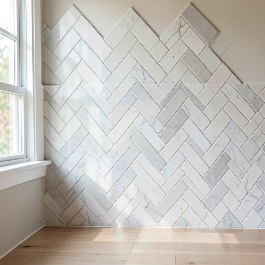
Imagine herringbone tile covering only the lower portion of the wall, like a stylish apron. The top wall can stay paint or a simpler finish, making the backsplash feel light and balanced.
This layout is practical for renters and budget-conscious remodels because it reduces tile and grout area. It also helps the kitchen feel less heavy, especially in small spaces or kitchens with open shelves. For practical tips, install a clean, straight edge and consider a trim piece so the transition from tile to paint looks crisp.
Personalize the look by matching the paint color to the tile undertone. Cost considerations are usually lower because you buy less tile, and you may spend less on labor. If you plan to update again in the future, this design makes it easier to refresh without redoing the whole wall.
22. Herringbone With Vertical Accent Stripe At The Center
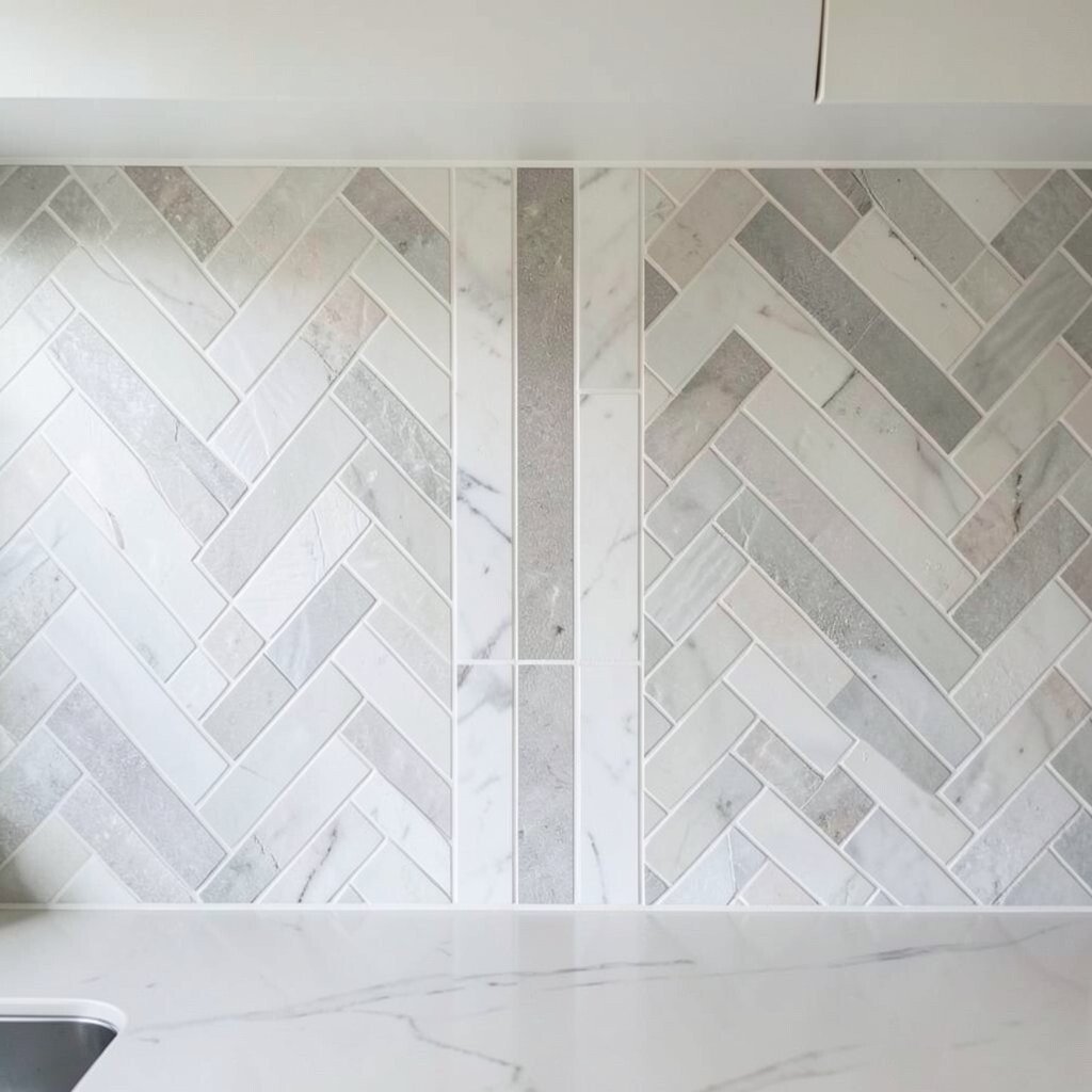
Picture a classic herringbone backsplash that includes one vertical accent stripe near the center. The accent might use a slightly different tile size, color, or finish for a striking focal point.
This idea feels unique because it blends a familiar pattern with a designed moment. It also helps visually anchor the space above the stove or sink, especially if those fixtures sit off-center. For practical tips, measure carefully and dry-fit the center stripe so the symmetry looks intentional from every angle.
To personalize, choose an accent that matches your hardware, like a metallic stripe or a warmer shade that echoes wood tones. Cost considerations can stay manageable if the accent uses fewer tiles or a thinner material. If you’re working within a budget, you can also add the accent using a narrow tile border rather than a full wide strip.