Some designs stop you in your tracks. Others stay with you because every little detail feels alive.
1. Layered Botanical Linework
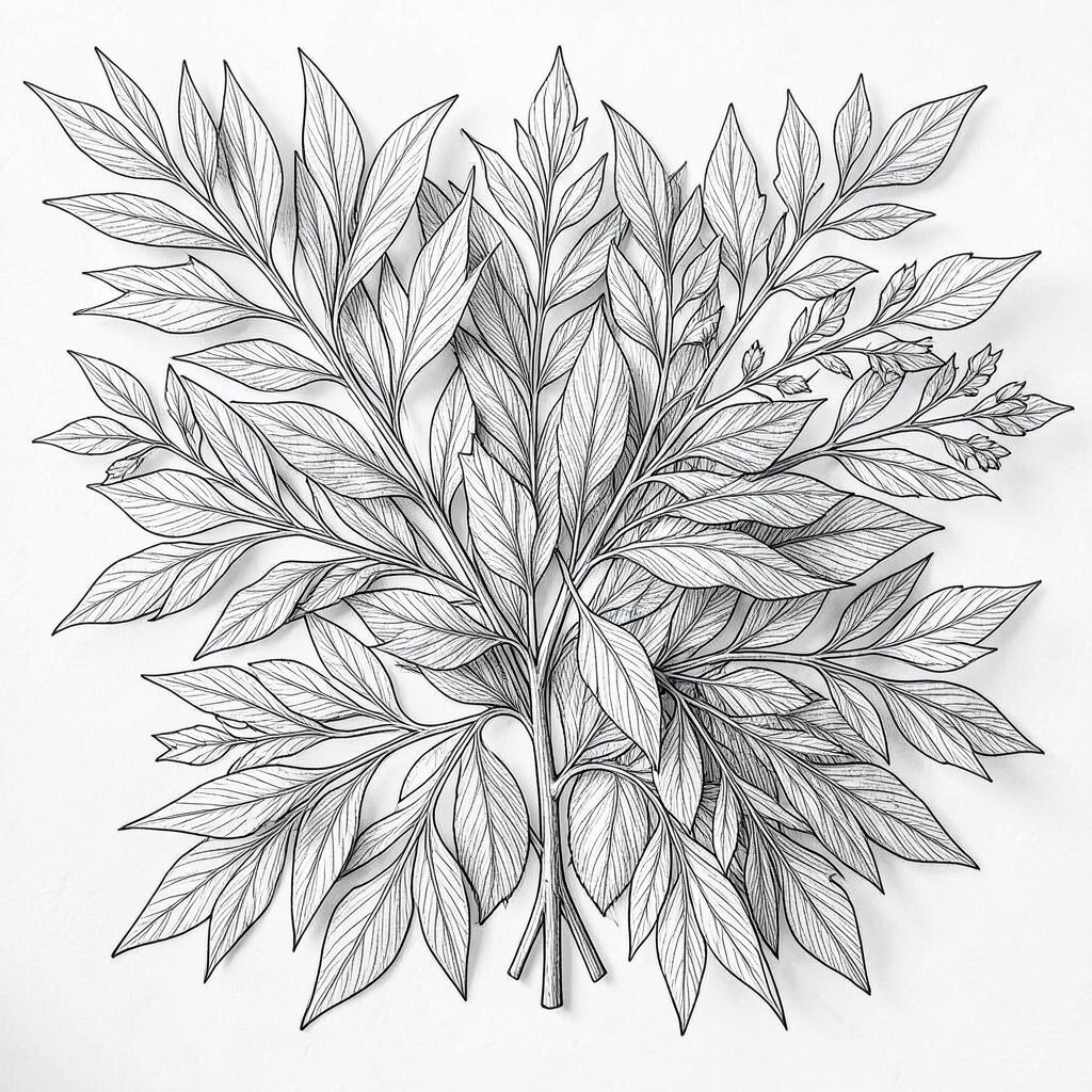
Layered botanical linework brings a soft, elegant feel that looks delicate from far away and rich up close. Thin stems, curling leaves, and tiny flower shapes create a calm visual rhythm that works well for posters, packaging, and wall art.
This style is useful because it feels fresh, timeless, and easy to adapt to many themes without losing its charm. You can keep the look budget-friendly by using one ink color, then add your own touch with thicker outlines, small bursts of color, or a personal favorite plant.
2. Geometric Shadow Play
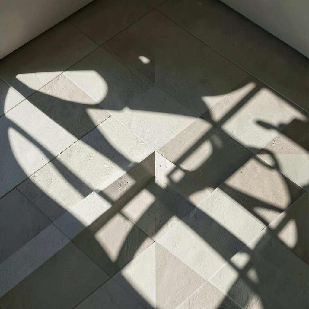
Geometric shadow play uses bold shapes and careful light effects to create a scene that feels deep and modern. Squares, circles, and triangles can overlap in ways that make the whole image seem to shift as you look at it.
It gives your work a clean edge, which is why it fits so well with branding, album art, and digital posters. If you want a more personal feel, choose shapes that match your style, and keep costs low by building the design from simple flat forms before adding shadow layers.
Right now, this kind of crisp geometry is popular in app visuals and web art because it reads well on screens. A small change in shadow size or angle can make the whole piece feel unique without needing a lot of extra tools.
3. Vintage Poster Collage
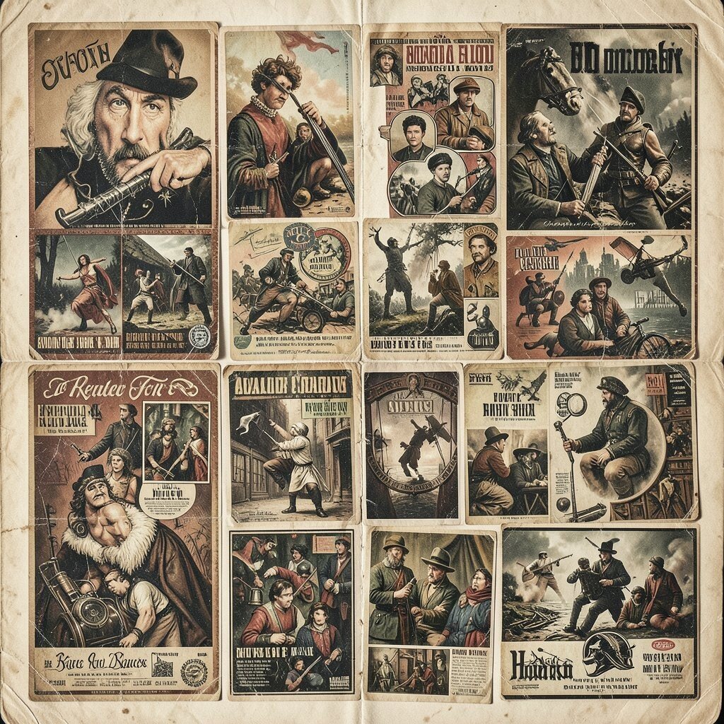
Vintage poster collage mixes old paper textures, worn edges, and bold lettering to make something that feels nostalgic and full of character. The look can include faded ads, ticket stubs, grainy photos, and clipped illustrations that sit together in a busy but charming way.
This approach works well when you want warmth and personality, since it can feel handmade even in a digital file. It also helps tell a story fast, and you can save money by using public-domain images, scanned scraps, or your own photos instead of buying new assets.
Many creators use this style for zines, event flyers, and social graphics because it has a strong voice. Adding a favorite color tint or a small handwritten note can make the collage feel more like your own.
Try leaving a few rough edges in place so the piece feels honest and not too polished. That little bit of imperfection often gives the design its best charm.
4. Minimal Ink and Paper Texture
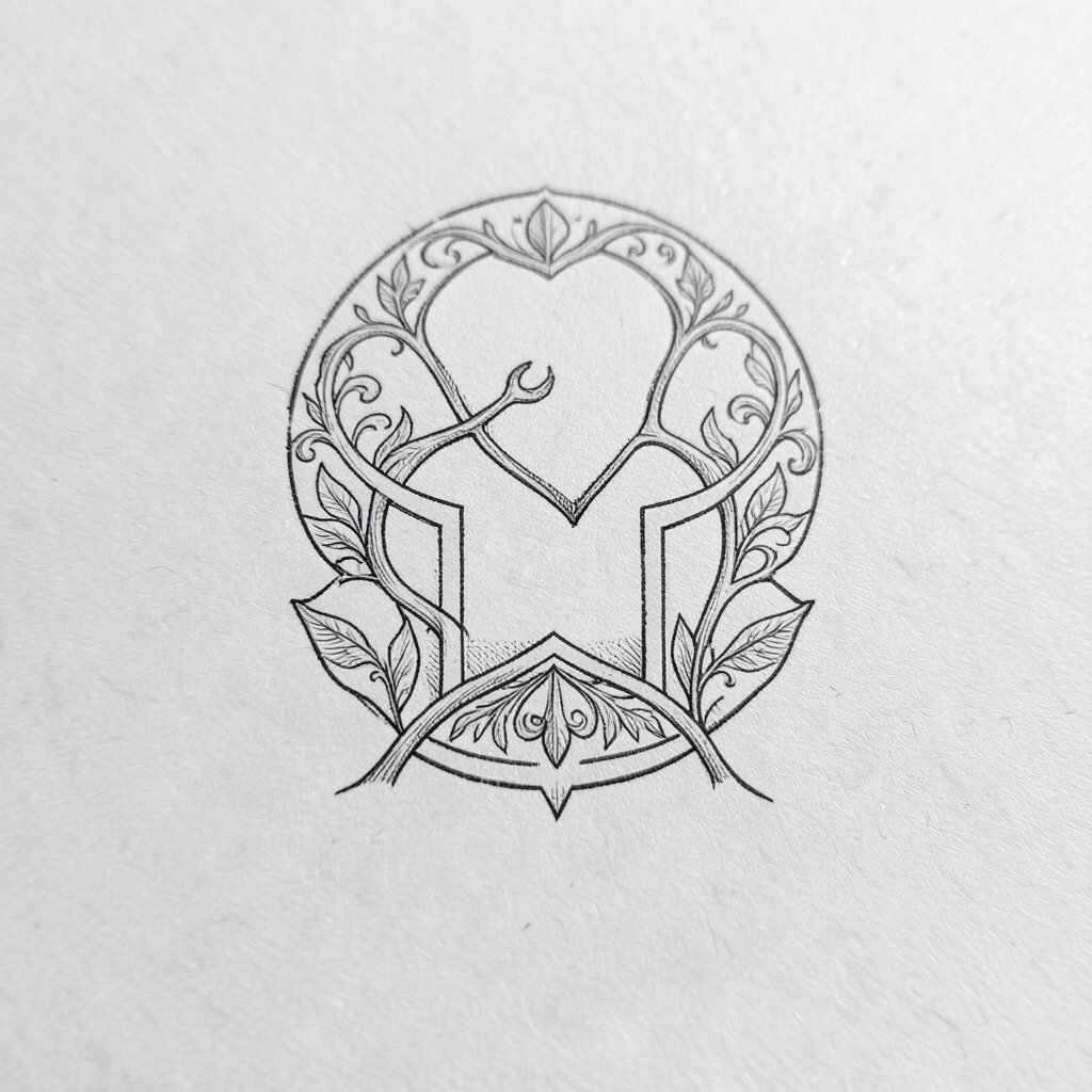
Minimal ink and paper texture creates a quiet look that feels soft, open, and easy to read. The design often uses a lot of blank space, a few dark strokes, and a subtle paper grain that makes the surface feel real.
This style is helpful when you want your message to stand out without extra noise around it. It also keeps production costs down because you do not need many colors or heavy effects, and you can personalize it with a favorite typeface or a small sketch mark.
5. Iridescent Fluid Forms
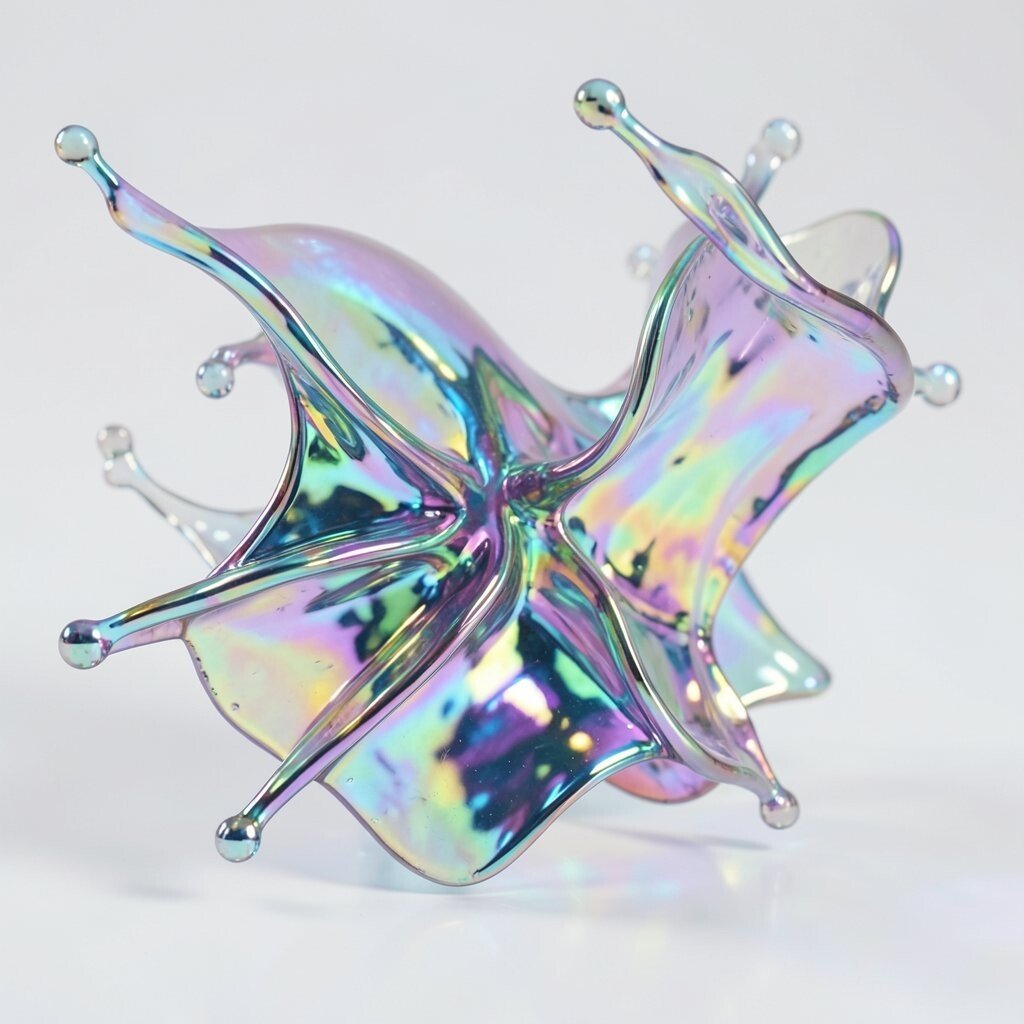
Iridescent fluid forms look shiny, smooth, and a little magical, as if light is moving across the page. Soft curves, oil-slick colors, and glassy highlights give the design a dreamlike feel that works well in motion graphics and posters.
It can make a project feel current because glossy gradients and liquid shapes are still strong in modern visual work. If you want to keep it practical, start with a simple shape set and add color shifts only where they matter most, which can also help with file size and cost.
Personal touches matter here, since a custom color blend can change the whole mood from calm to playful. A brighter palette can feel lively, while cooler tones can make the same form feel sleek and quiet.
This look is a good fit for creative brands that want something eye-catching without using too many hard edges. Even a small iridescent highlight can make plain layouts feel more special.
6. Hand-Drawn Map Details

Hand-drawn map details bring a sense of journey, memory, and place to a design. Curved roads, tiny trees, dotted routes, and little labels can make the page feel like a secret guide waiting to be read.
This style stands out because it feels personal and handmade, even when built on a screen. It can also be practical for invites, travel pieces, and story projects, and you can keep costs low by drawing simple symbols instead of full scenes.
To make it your own, include places that matter to you, such as a favorite café, a hometown street, or a made-up land with names you love. The result feels more meaningful when the details come from real memories.
7. Layered Cut-Paper Scenes

Layered cut-paper scenes have a crafted look that feels cozy and strong at the same time. Each layer adds depth, like stacked paper shapes building a tiny stage for trees, houses, clouds, or abstract forms.
The style is appealing because it looks tactile and warm, and it works well for editorial art, cards, and children’s projects. You can make it on a tight budget with colored paper and glue, or create a digital version that still keeps the handmade feel.
Many designers like this look because the edges create natural shadows that add interest without much effort. You can make the scene feel more unique by using unusual color pairings or by adding one special object that tells a story.
A gentle mix of matte colors often looks better than anything too bright, especially when the goal is a soft and friendly mood. That balance helps the piece feel calm, rich, and easy to enjoy.
8. Neon Grid Futurism
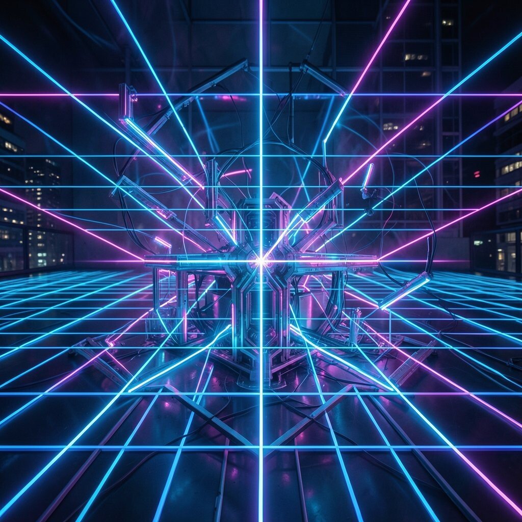
Neon grid futurism pairs dark backgrounds with glowing lines and sharp perspective to create a bold digital world. The effect can feel like a city at night, a game level, or a screen from a story set far ahead in time.
This design idea is strong for music art, tech themes, and social covers because it grabs attention quickly. You can keep it affordable by using simple grid guides, then adding one or two bright glow colors instead of building a full complex scene.
It feels especially current when used with chrome accents, clean type, or animated elements. For a personal twist, shift the grid color toward your favorite shade or add symbols that match your own interests.
9. Ornate Frame and Pattern Work
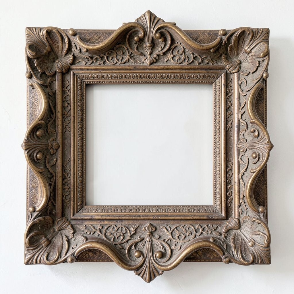
Ornate frame and pattern work fills the edges with detail so the center feels framed like a treasured object. Swirls, dots, floral curls, and repeating shapes can turn a plain layout into something rich and graceful.
This style helps guide the eye, which makes it useful for certificates, covers, menus, and luxury branding. It can be done without spending much, since repeating forms are easy to draw or build from simple digital parts.
If you want the result to feel unique, mix one traditional pattern with one unexpected shape, such as a star, shell, or leaf from your own sketchbook. That small change can keep the design from feeling too stiff.
Muted gold, deep blue, and cream tones are still popular because they give the piece a classic look. Even so, a brighter palette can work just as well when the goal is a playful, modern mood.
10. Soft 3D Clay Shapes
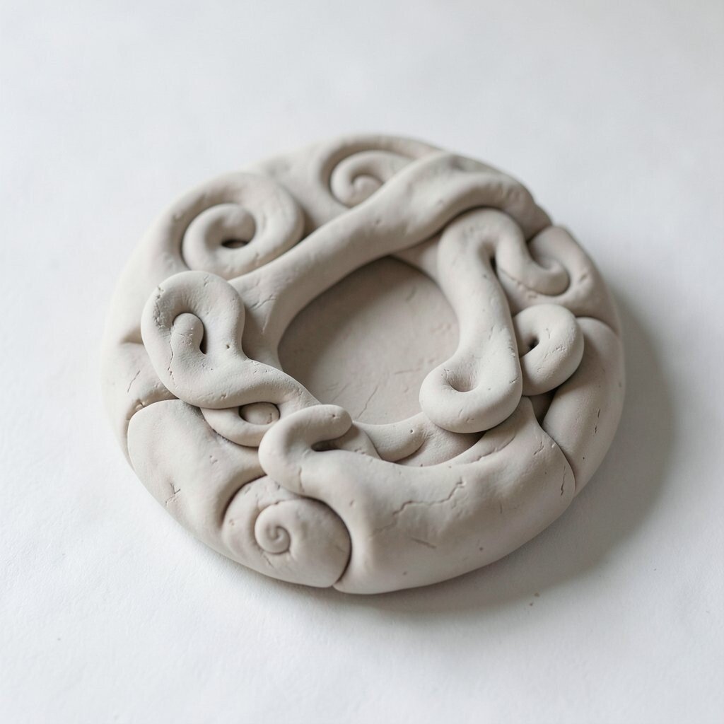
Soft 3D clay shapes look round, friendly, and touchable, almost like objects made from colorful modeling clay. Their smooth curves and gentle highlights give the design a playful depth that feels warm instead of sharp.
This look is useful for product art, app icons, and kid-friendly visuals because it makes objects easy to understand at a glance. It can also be cost-friendly in digital form since a few rounded shapes can carry the whole design without many extras.
You can personalize the scene by shaping the forms around your favorite foods, pets, or hobby items. That makes the design feel more alive and less like a stock image.
11. Abstract Water Reflection
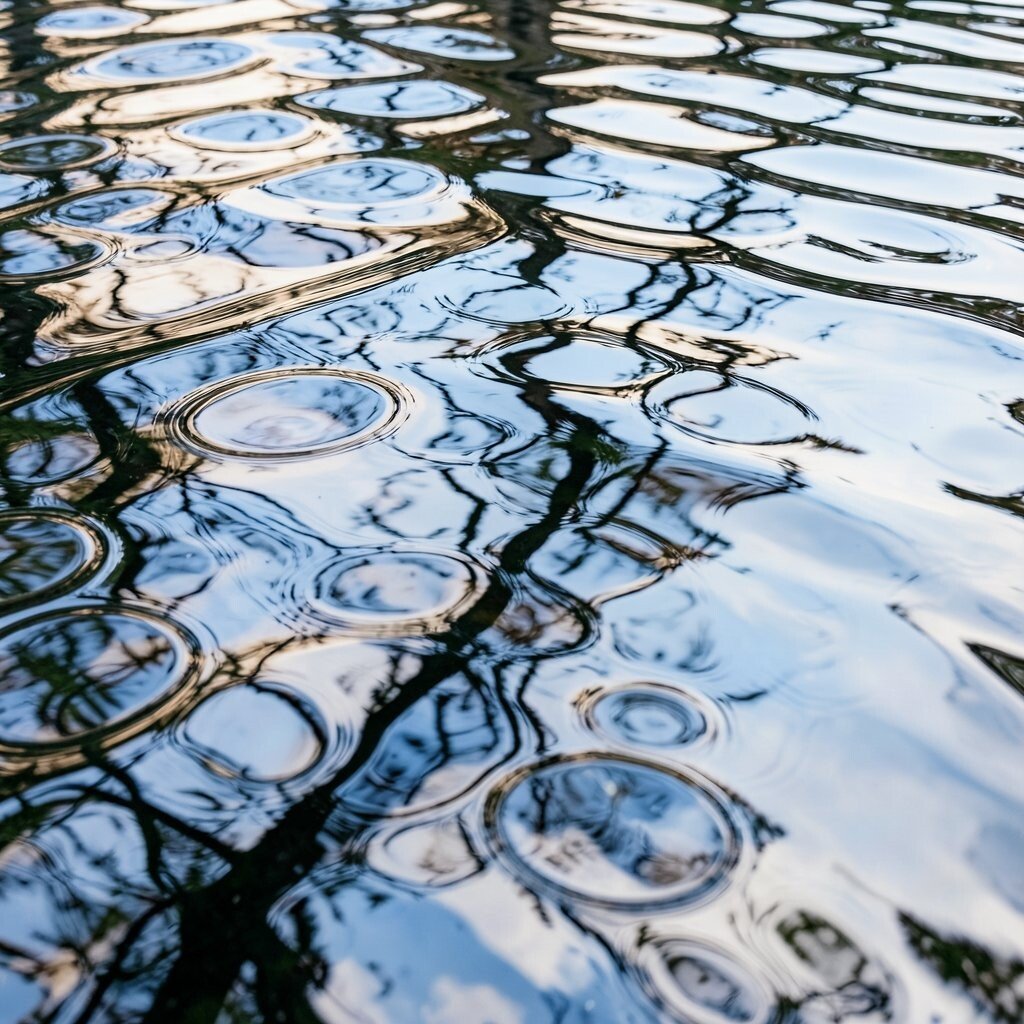
Abstract water reflection uses ripples, broken mirror shapes, and shifting light to make a design feel cool and calm. The surface can seem both smooth and active, with forms that stretch and blur like reflections on a lake.
This idea works well for album covers, wellness pieces, and fashion visuals because it feels elegant and a little mysterious. It can also be made with a simple color set, which helps keep costs down while still giving the image a rich look.
When building this style, try using one main shape and then echoing it in softer, lighter layers beneath it. That creates the feeling of reflection without making the art too crowded.
Deep blues and soft silver tones are common right now, but warmer shades can make the same design feel more personal. A reflection effect based on your own photos or letters can give the piece a stronger story.
12. Folk Art Symmetry
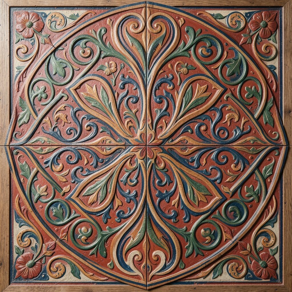
Folk art symmetry brings balance, charm, and a handmade spirit to the page. Mirrored flowers, birds, hearts, and stars can sit around a center point and create a design that feels cheerful and steady.
This style is great for posters, textiles, and gifts because it feels joyful and easy to remember. It can be done with simple tools, so the cost stays low, and you can make it special by using colors linked to your family, town, or culture.
One reason people love this look is that it feels both old and fresh at the same time. A slightly uneven line or a hand-painted shape can add just enough uniqueness to make the design feel alive.
Bright folk colors are still popular in handmade and digital spaces because they bring energy to the work. If you want a softer result, choose dusty tones and let the symmetry do the heavy lifting.
13. High-Contrast Type and Image Mixing
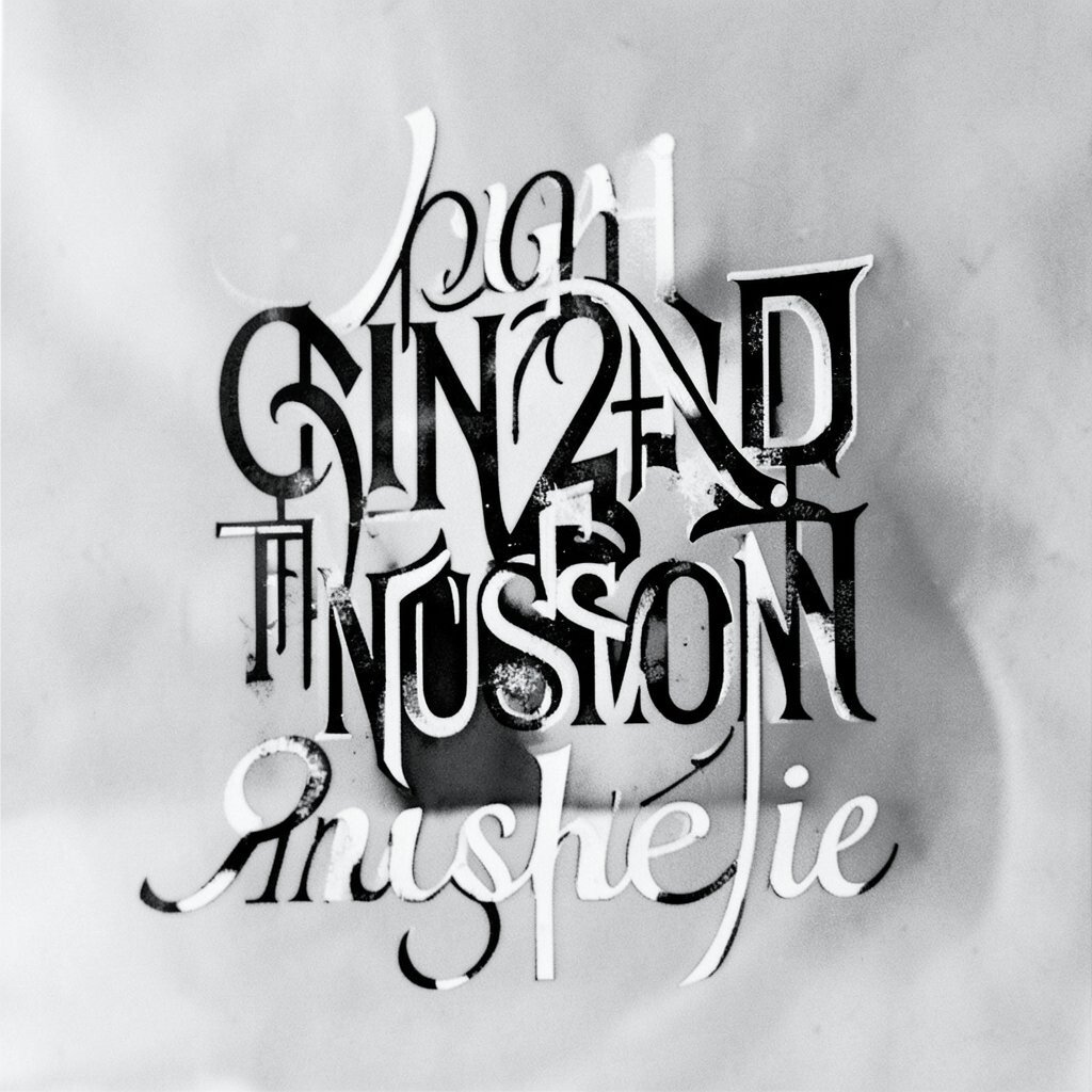
High-contrast type and image mixing blends bold letters with strong photos or graphics so the design feels direct and exciting. The text may cut across the image, sit in blocks, or overlap with shapes in a way that creates instant visual tension.
This style is useful when you need a message to stand out fast, which is why it shows up in ads, covers, and social posts. It can stay affordable if you work with one strong photo and a limited font set, then add personal flair through color choice and spacing.
Try keeping the message short and choosing a typeface that matches the mood of the image, since that makes the piece easier to read. A well-placed contrast point can make even a simple layout feel high-end and intentional.
14. Dreamscape Micro-Details

Dreamscape micro-details fill a scene with tiny stars, floating petals, tiny windows, and little hidden symbols that reward a close look. From a distance, the art can feel soft and dreamy, but up close it reveals a whole world of careful marks.
This idea gives you room to tell a story in a playful way, and that makes it useful for book art, fantasy branding, and personal prints. You can keep the project manageable by starting with a few core shapes, then adding details slowly so the work stays neat and does not become too costly in time.
Current trends in illustration often favor layered worlds and small surprises, so this style fits right in while still feeling special. Adding private symbols, favorite animals, or tiny objects tied to your life makes the piece feel deeply personal and memorable.
Soft glow effects, pastel skies, and gentle sparkles can make the scene feel magical without needing a lot of color. When the details are placed with care, the whole design feels like it has something secret to say.