The stairs can feel like a hallway that never changes. A bold railing color can make the whole trip feel happier.
Pick a shade that matches your mood, your home, and the way you move through space.
1. Electric Blue Handrail With White Details
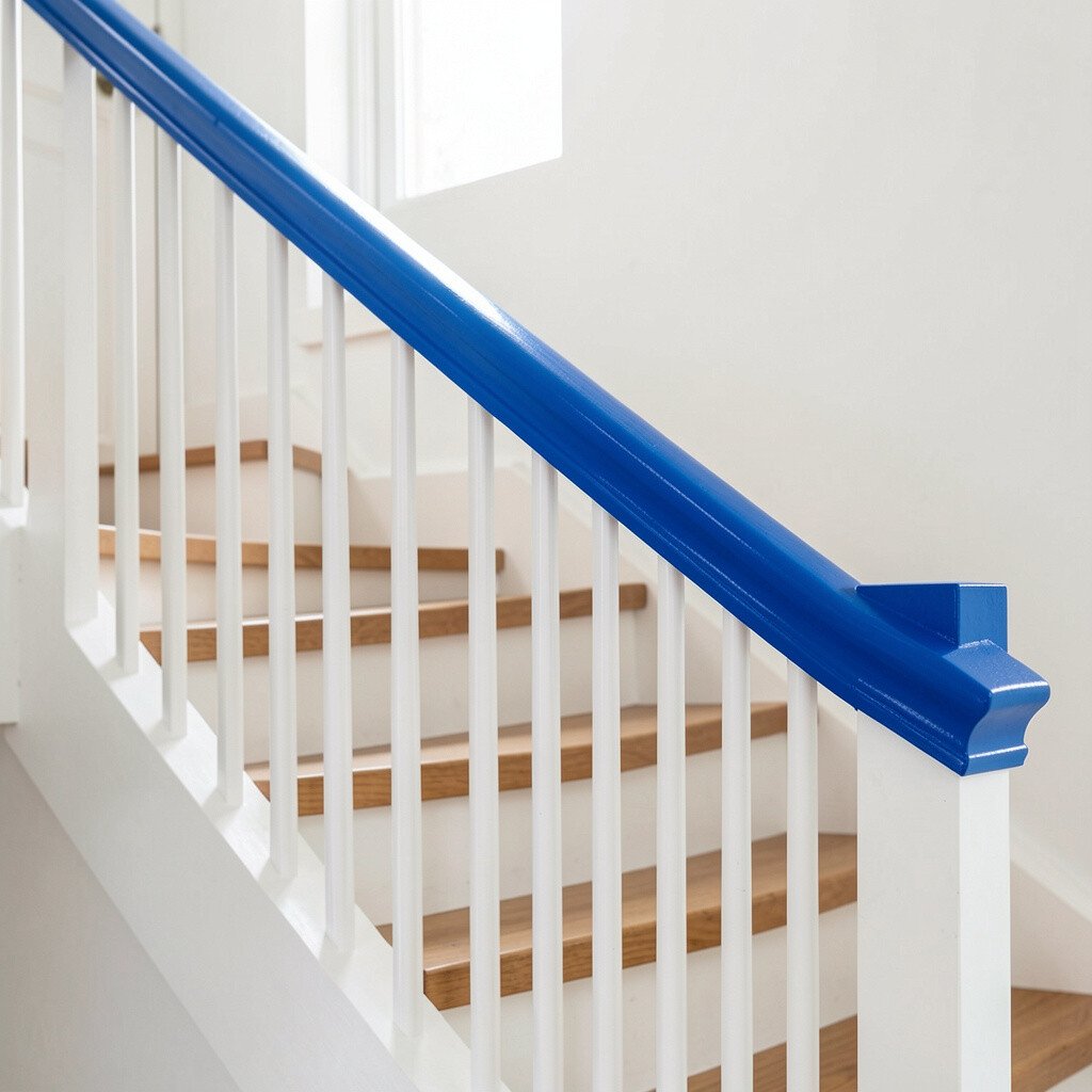
Electric blue can look sharp and cheerful the moment you step onto the first stair. The glossy tone catches light and makes the banister feel freshly painted even in the evening.
A bright blue railing adds a clear path upward, which can make the stairs feel safer and easier to use. Choose white for the posts or trim so the color stays crisp instead of busy. Keep the blue close to existing accents like a front door color, a runner rug, or framed art, so the look feels planned and not random.
2. Sunset Orange Railing For Warm Evenings
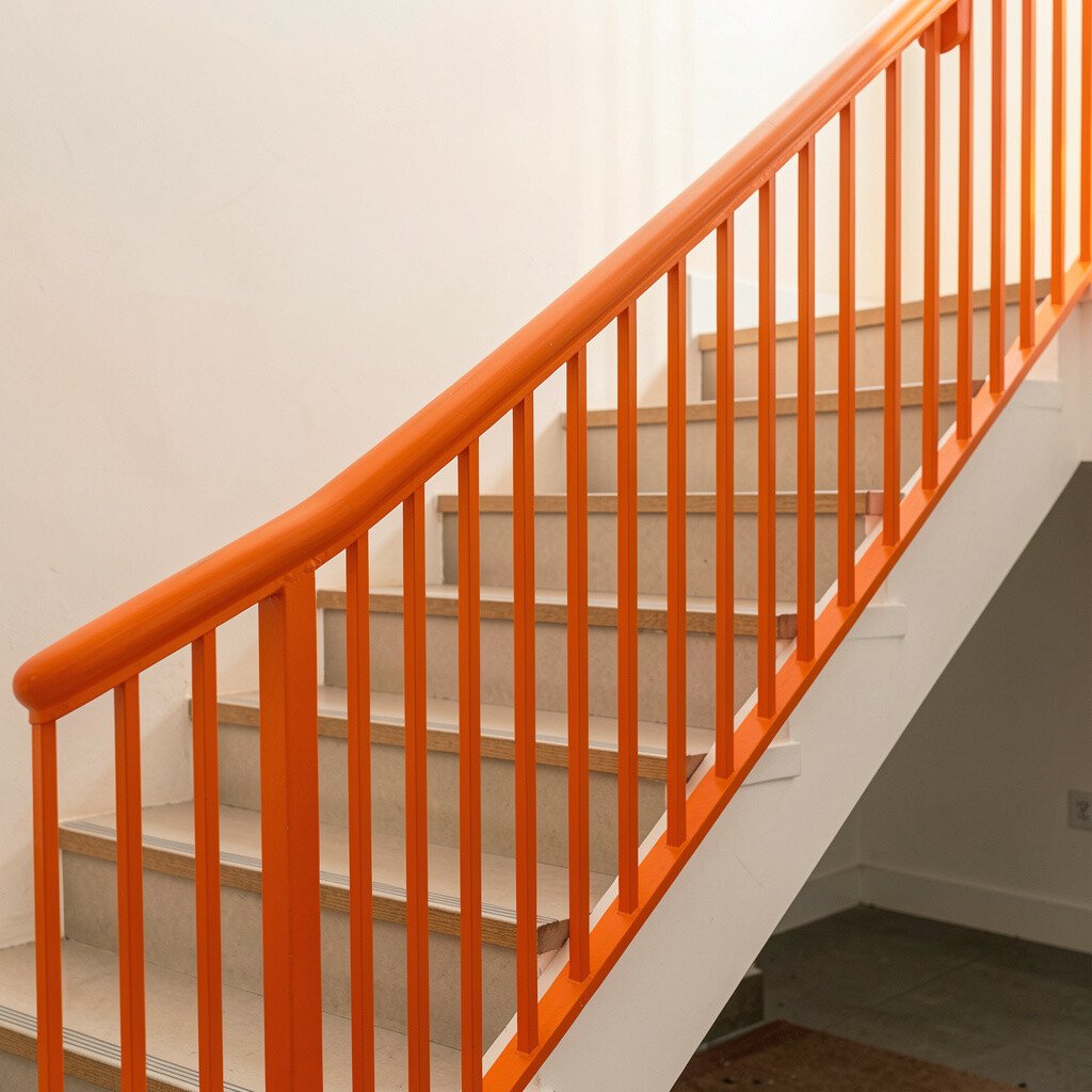
Sunset orange brings warmth to a stairwell that might otherwise feel cool or plain. The color glows softly against neutral walls and makes shadows look more lively.
If you want a welcoming feel, orange is a great choice because it makes everyday moments feel brighter. Pair it with dark iron balusters or matte black posts for a high-contrast look that still feels cozy. A practical move is to finish the rail with a durable clear coat so the surface wipes clean after daily use.
To personalize it, consider matching orange to a nearby lamp shade or a kitchen backsplash accent. For cost, orange is often easiest to achieve with a quality paint system, which can be more budget-friendly than specialty coatings. Current trends lean toward warm, saturated hues like terracotta and tangerine, and orange on stairs fits that direction nicely.
3. Bold Emerald Green With Brass-Like Accents
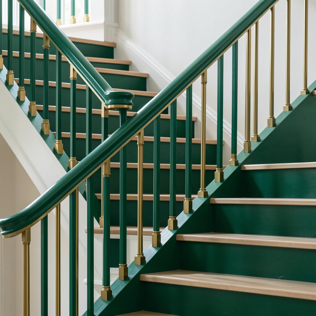
Emerald green feels bold but still classy, especially when it’s paired with warm metallic touches. You can picture deep color wrapping around the handrail while light dances on the corners.
This kind of railing can give your home a boutique feel without changing the layout. It also helps visually define the handhold, which can make moving up and down feel more confident. Use semi-gloss or satin for the rail surface so it’s easy to grip and not too slick.
If you want a unique look, try emerald green for the handrail while keeping the balusters a lighter neutral. Brass-like accents work beautifully, whether that’s through hardware, wall brackets, or decor. When thinking about cost, emerald paint plus proper prep usually offers a good balance of impact and affordability, especially if you do some sanding and priming yourself.
4. Hot Pink Stair Banister For A Playful Moment
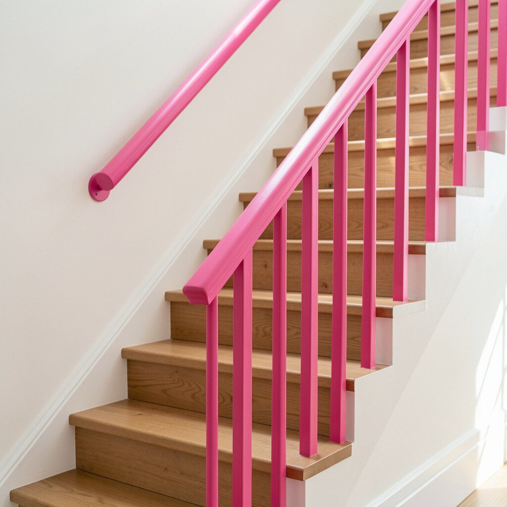
Hot pink is the kind of color that turns a staircase into a focal point. It feels fun, creative, and full of energy, especially in homes with white walls and light floors.
You’ll notice how hot pink can make the whole entryway feel more lively. For practical tips, use a satin finish and consider adding anti-chip primer if the rail has old wear marks. Balance the strong color with calm colors nearby, like light gray, soft beige, or clean wood tones.
5. Royal Purple Rail That Feels Like Jewelry
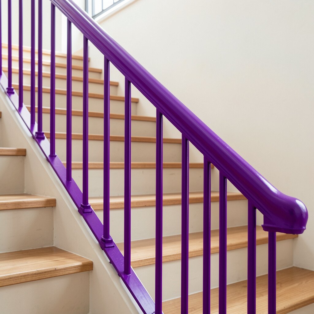
Royal purple can look rich and dramatic, like a gemstone in your hallway. It creates a bold visual line that stands out beautifully against dark trim or light paint.
This color can also add personality without needing lots of extra decor. When you plan the color, keep the rest of the space slightly quieter so the railing remains the star. For personalization, match purple to a throw pillow, a piece of wall art, or even a curtain accent.
In terms of cost, purple may require an extra step for full coverage, depending on the starting color of the rail. A good primer and two or three solid coats can make the result look even and professional. A current trend is mixing bold paint with simple hardware, so consider clean brackets or sleek fasteners to keep the vibe modern.
6. Crisp Lime Green For A Fresh, Clean Look
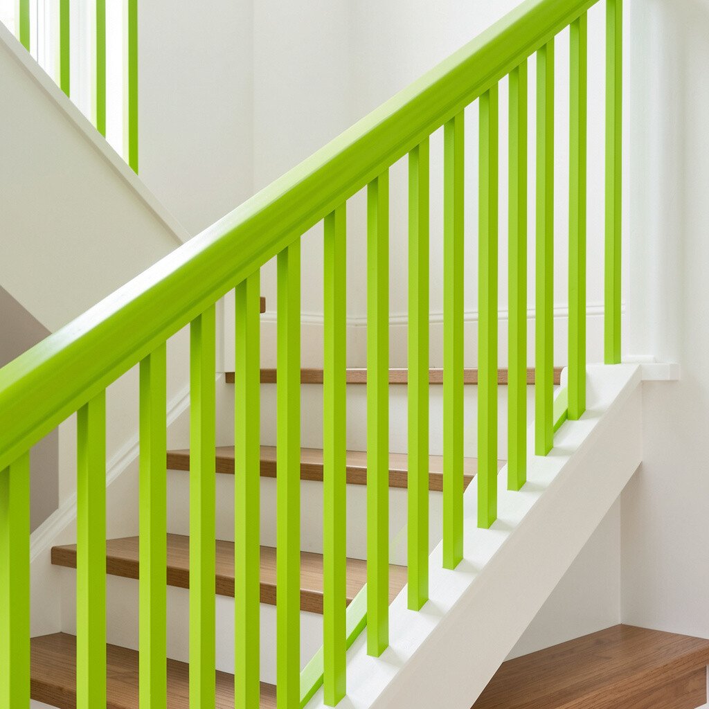
Lime green can feel like morning air in color form. It looks bright and clean and can make a staircase feel more open.
If your walls are off-white or warm gray, lime green creates a lively contrast that still feels fresh. Choose a finish that wipes easily, because handrails pick up fingerprints and dust fast. A practical idea is to use painter’s tape with extra care around corners so the edges stay sharp.
7. Turquoise Rail Paired With Natural Wood Tones
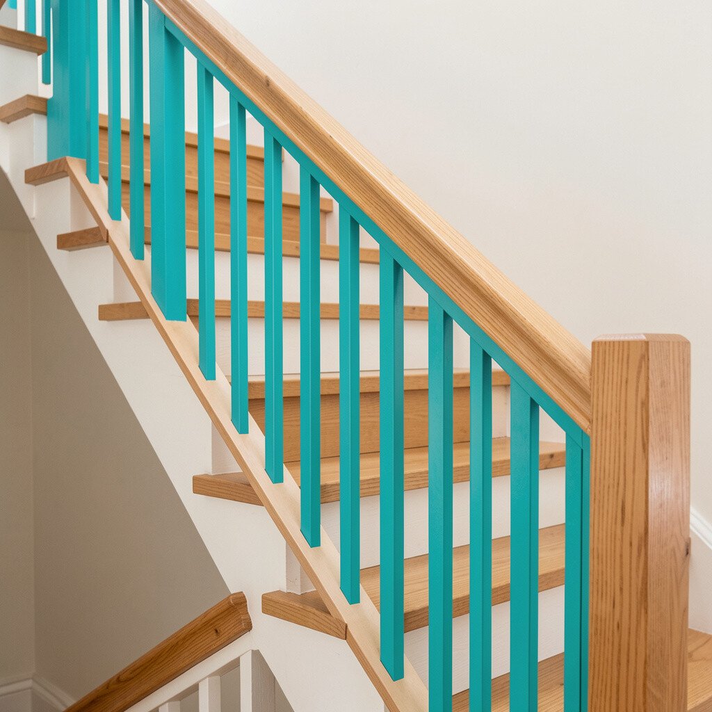
Turquoise adds a coastal feeling, even if you live far from the beach. The color can look calm and cheerful at the same time, like sea glass catching the sun.
This style works especially well when the stairs already have natural wood tones. Turquoise on the handrail gives a cool contrast and helps the rail stand out for easier grip. To personalize, you can echo the turquoise in a small basket, a wall frame, or a patterned runner.
For uniqueness, combine a turquoise handrail with either white balusters for a light look or darker ones for a richer vibe. Cost can vary based on whether you need railing repairs or full refinishing before painting. If your rail is in good shape, a paint-and-seal approach can deliver a big visual upgrade without going overboard.
8. Red Stain Style For A Classic Yet Bold Feel
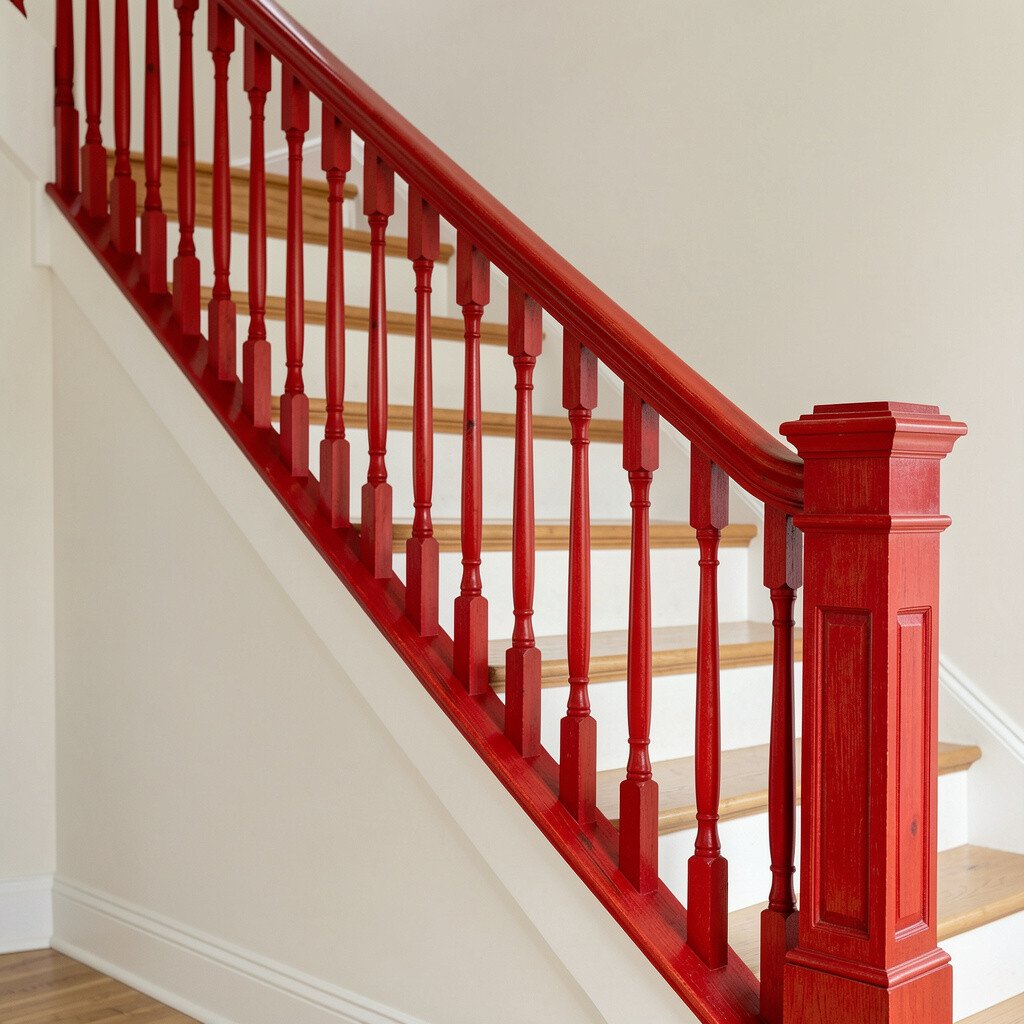
A red stained railing can look traditional, but the bold tone makes it feel new. Instead of relying only on paint, staining shows wood grain while giving the banister a strong identity.
Red stain can also be easier to maintain when the rail is sealed well, since the finish helps repel dirt. Pair it with neutral walls and simple black hardware for a balanced look that still feels warm. If you love the idea but worry about being too loud, start with a darker red-brown close to cherry, which usually blends well with many rooms.
9. Matte Black Rail With Electric Yellow Accent Stripe
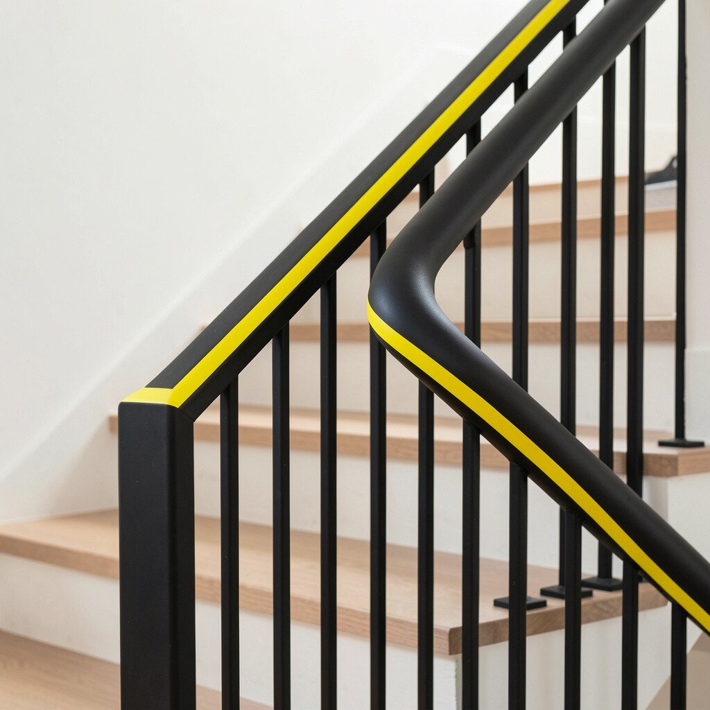
Matte black feels strong and modern, and the electric yellow stripe adds a playful punch. The combination is dramatic, yet it can still look clean and intentional.
A practical benefit is that black hides small scuffs better than light colors, which is great for busy households. Use the yellow only on the top rail edge or as a thin midline so it draws the eye without overwhelming the stairs. You can also match the yellow to light fixtures, outlet covers, or a nearby hallway wall accent.
To personalize this look, decide whether the stripe is straight and minimal or slightly curved for a custom feel. In terms of cost, adding a stripe may be more time than money, because careful taping improves the final result. Current trends often favor high-contrast two-tone designs, and this setup fits that style perfectly.
10. Deep Navy With Soft Gold Hardware
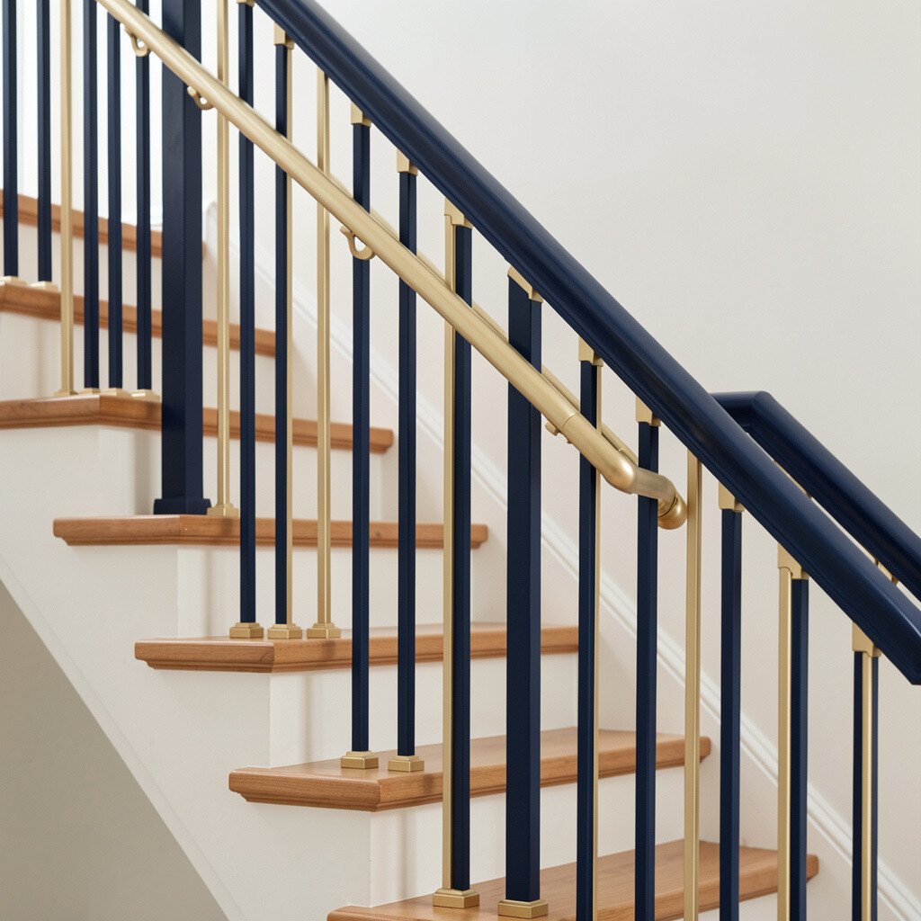
Deep navy can feel calm, bold, and sophisticated all at once. It looks especially striking with warm gold hardware and light-colored walls.
This color choice can make your home feel more finished, like you picked a coordinated theme. It also works well for stairs because navy doesn’t show every tiny smudge as much as some lighter shades. For practical tips, use a sand-and-prime process if the rail is glossy, so the new color bonds properly.
11. Teal Gradient Look Across The Handrail
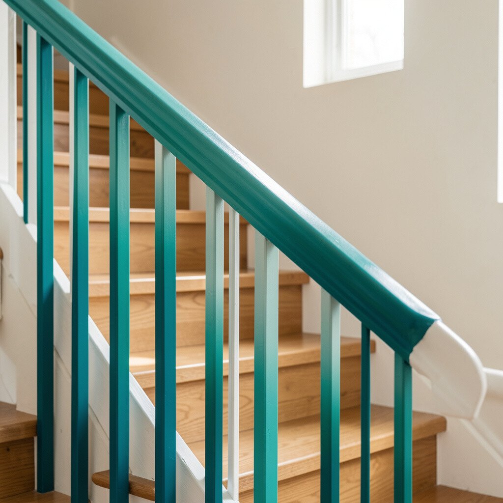
A teal gradient can make your staircase feel artistic, like a small mural you move through. The handrail becomes a smooth streak of color that changes slightly from top to bottom.
Gradients are unique because they don’t look like a standard paint job, and that surprise keeps the space feeling special. To make it practical, use painter’s tape or a blending tool so the transition stays smooth where you grip the rail. Keep the balusters neutral so the color shift stays the main attraction.
For personalization, you can make the gradient subtle with a light-to-medium teal, or go bold with darker teal at the base. Cost considerations include extra paint and careful blending time, but the impact is usually worth it. This style also matches current trends toward color blocking and creative finishes, especially in homes that lean modern or eclectic.
12. Coral Pink For A Cheerful Family Home
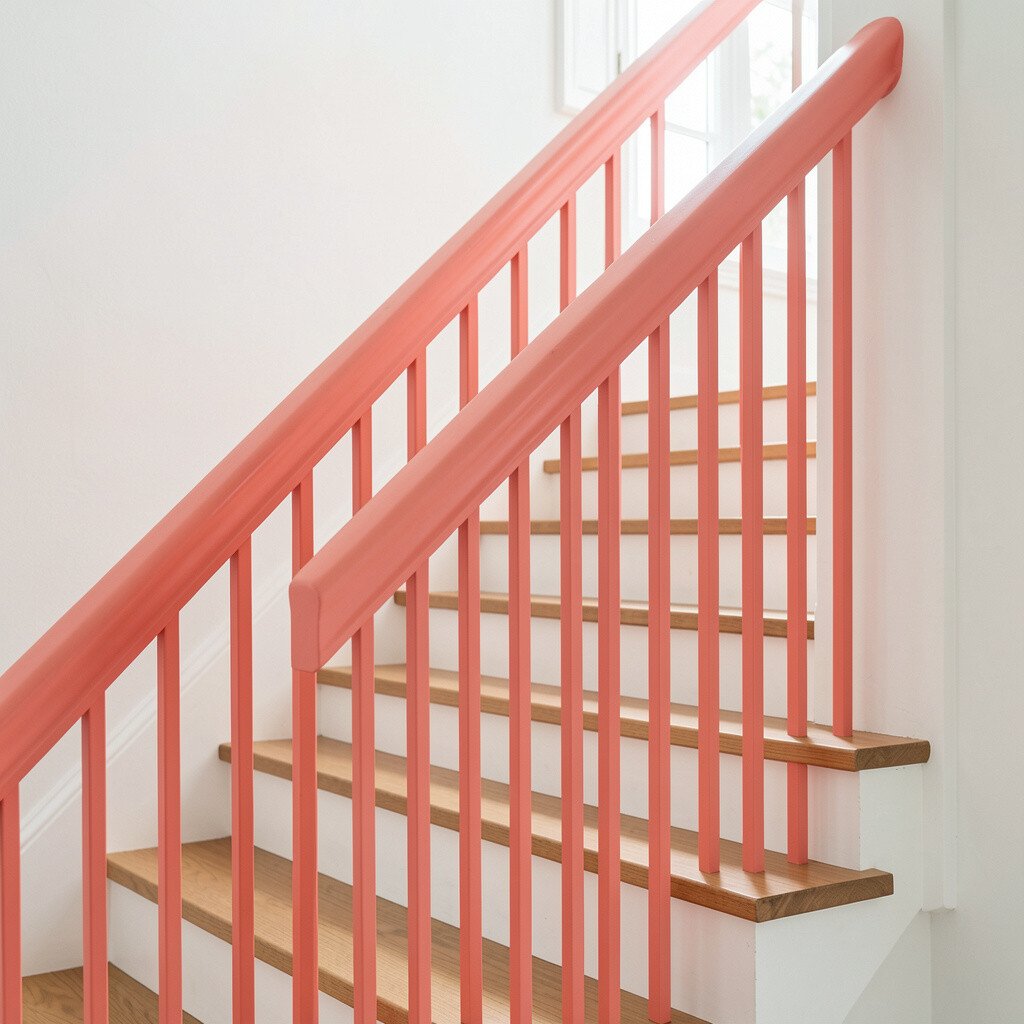
Coral pink brings a friendly vibe that works in many types of homes. It feels bright without looking neon, so it can be both playful and cozy.
This railing can brighten mornings and make the stair area feel welcoming to guests. Choose coral with a smooth, durable finish so it holds up to daily contact. A smart step is to confirm the wall and trim colors first, since coral looks best when it has a partner color somewhere nearby.
13. White Rail With Bold Color Blocking Panels
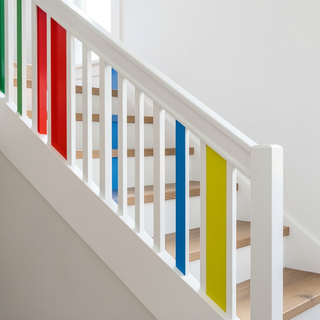
White railings with bold color blocking are a great option if you want color but not everywhere. The main rail stays easy to match, while the panels give you a pop of personality.
Color blocking adds a clean, graphic feel that looks modern. For a practical approach, paint sections that are reachable from standing height so the design stays consistent and intentional. You can use two shades, like cobalt and coral, to create a lively pattern that still feels organized.
To personalize, align the blocks with steps or with the spacing of balusters so the design looks neat and balanced. Cost is often moderate because you’re using paint strategically rather than covering every surface with a heavy color. Current trends favor clean geometry, and this approach fits right in without needing a full redesign.
14. Bright White Rail With Magenta End Caps
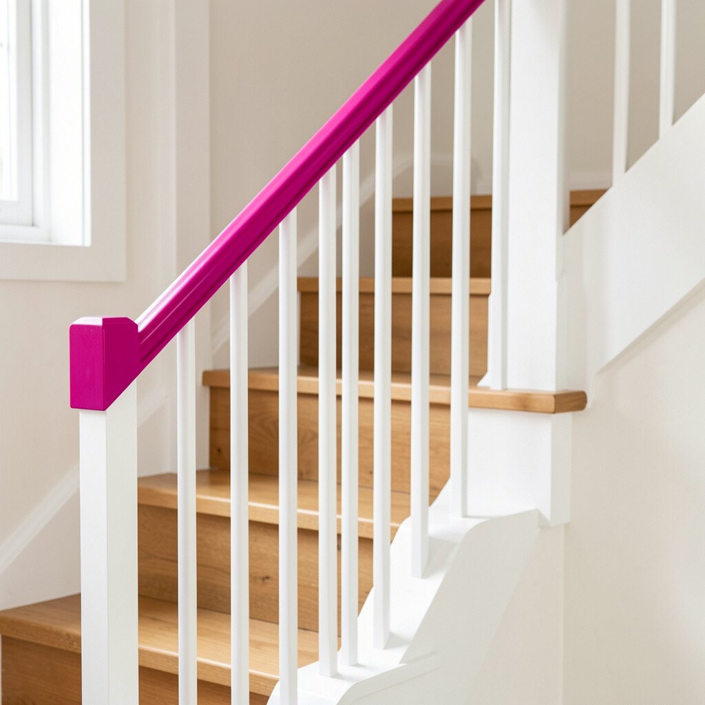
Magenta end caps feel like a signature detail on an otherwise simple rail. The bright touch at each end draws the eye and makes the whole staircase look styled.
This is a unique way to add bold color without committing to a full-handrail change. It also helps with practicality, since you’re only painting smaller areas that are easier to control and cover evenly. For personalization, coordinate magenta with a nearby accent wall, a seasonal wreath color, or even a bold rug pattern.
In cost terms, small details can be budget-friendly because paint usage is lower. If you’re working with professionals, ask about matching the paint sheen to the rest of the finish so the end caps don’t look mismatched. Trends show people loving small, high-impact accents, and magenta end caps deliver that effect.
15. Mustard Yellow Rail For A Retro Pop

Mustard yellow brings a retro feeling that can look surprisingly modern. It adds warmth and character, especially in spaces with wood floors or vintage-inspired decor.
A practical benefit is that mustard can hide minor scuffs fairly well, which is helpful in high-traffic stair zones. Pair it with deep green plants nearby or warm gray walls to keep the palette grounded. If you want uniqueness, try a slightly textured finish that echoes a handmade pottery look.
For personalization ideas, match the mustard to metal accents like brushed bronze or warm brass, or echo it in a hallway runner design. Cost is usually reasonable because yellow can be done with paint and sealing, though you may need extra coats for even coverage. Current trends embrace warm yellow tones, so a mustard rail can feel both nostalgic and fresh.
16. Emerald Meets Azure With Two-Tone Balusters
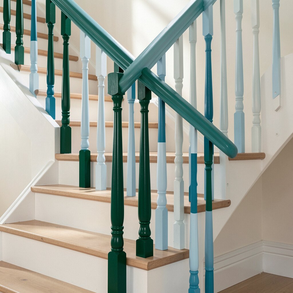
Two-tone balusters let you mix emerald and azure for a lively, layered look. The result feels like color waves moving up the staircase rather than a single flat hue.
This design is unique because it adds depth while keeping the handrail area comfortable and easy to coordinate. Use emerald on the handrail and azure on the balusters, or swap them for a different mood. For practical tips, keep the colors in the same family of saturation so the staircase doesn’t feel chaotic.
To personalize, choose which color shows more based on how your light falls in the stairwell. Cost considerations include more paint colors and extra time for careful spacing, but the final look often feels high-end. If you want to stay trendy, this kind of color pairing matches the current love for bold contrasts and custom detail in entry spaces.