The right wall color can change how a room feels in seconds. Small choices can make your space look smarter, calmer, and more you.
1. Pick a Mood First
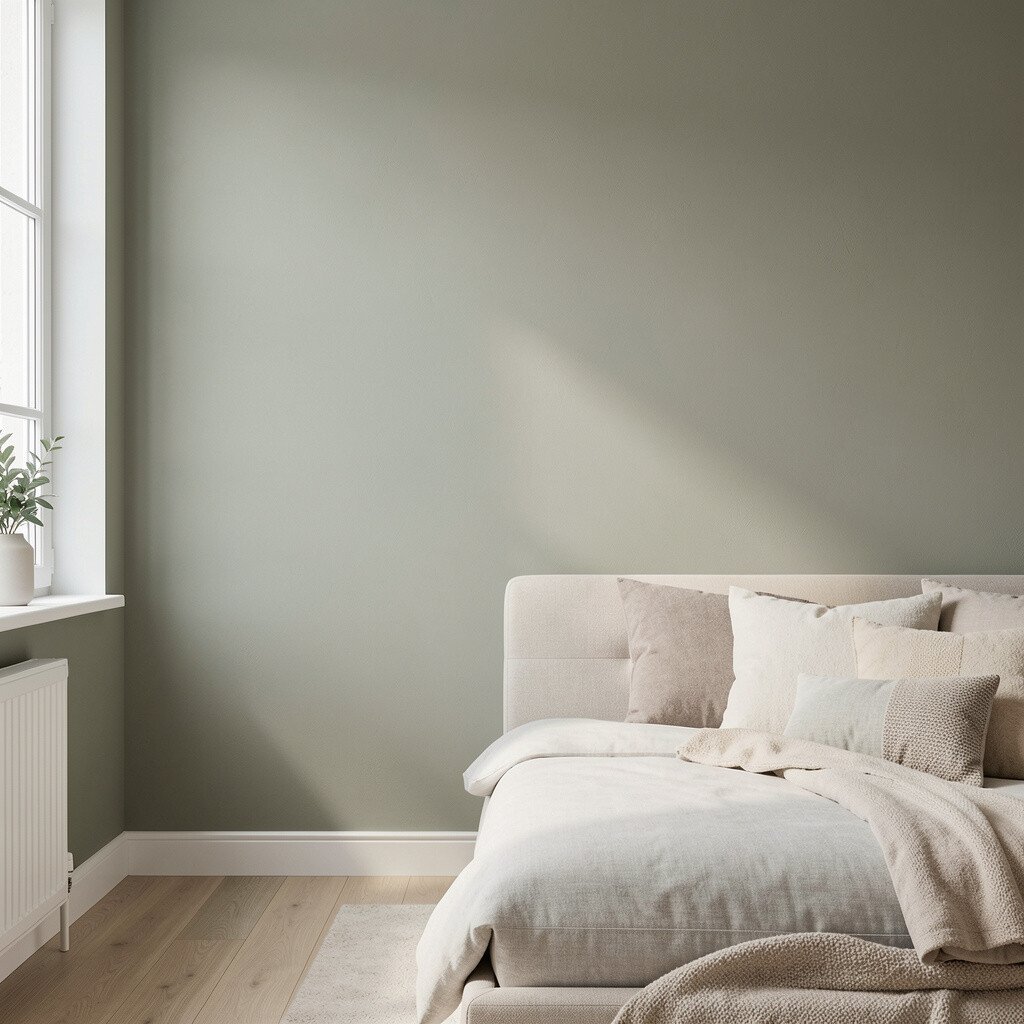
Start by thinking about the mood you want every day. A soft, warm palette can feel welcoming, while cooler shades can feel crisp and calm.
When you match color to mood, you avoid that “pretty but wrong” feeling. For a living room, try creamy neutrals with muted earthy tones, and you may find conversations feel easier. In a bedroom, slightly deeper colors can help the space feel more restful.
2. Use Light Like a Secret Ingredient

Natural light acts like a free color corrector, so notice how the room looks at morning and evening. South-facing rooms often look brighter and may make cool colors feel even cooler.
North-facing rooms can look dim, so colors may shift toward gray if you are not careful. Consider testing paint swatches on two walls, since each wall catches light a little differently.
If you have dark flooring or heavy curtains, you can balance it by choosing a lighter wall shade or a satin finish that bounces light around. For current trends, many people are choosing warm off-whites and creamy beige tones because they photograph well and stay flattering in any lighting.
3. Choose a Finish That Matches Your Life
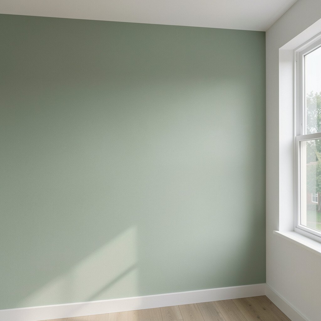
Wall paint finish changes how color shows up, so it is not just a style decision. Matte hides flaws and softens the look, while eggshell adds a gentle glow and handles everyday life better.
If your space has kids, pets, or frequent cleaning, an eggshell or satin finish can look fresh longer. Satin can also make colors feel richer, especially in rooms with fewer windows.
Try to match finish to the room’s traffic level. A kitchen or hallway often benefits from a finish that resists scuffs, while a low-traffic dining room can enjoy a calmer matte look. You can also save money by focusing higher-end paint in the most visible areas first.
4. Create Depth With Two-Tone Color
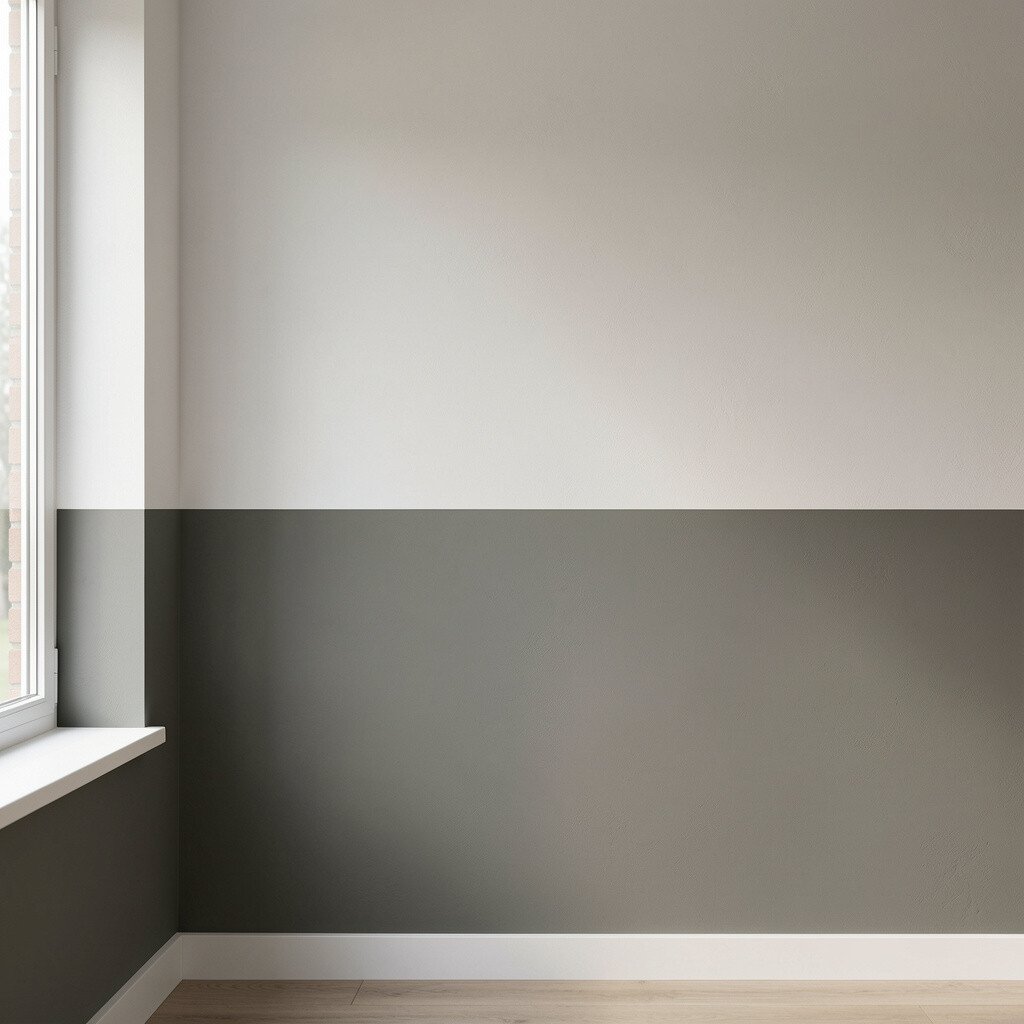
Two-tone walls add depth without needing complex design. A lighter color on top and a richer shade below can make ceilings feel taller and spaces feel grounded.
For a practical approach, keep the transition line neat with painter’s tape and a steady hand. You can also add a vertical stripe using a slightly darker shade to make the wall feel taller and more dynamic.
5. Try Accent Walls the Modern Way
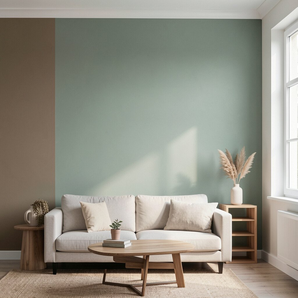
Accent walls can look bold, but the trick is to choose the right place for them. Pick the wall that draws the eye when you walk in, like behind a sofa or the headboard.
Instead of a loud single color, consider a tone-on-tone effect using a slightly different shade of the same color family. This keeps the look stylish while still giving you a clear focal point.
Current trends lean toward textured, earthy accent colors, including olive greens and clay tones, because they feel warm and not overly trendy. If you want to keep cost low, you can paint only the accent wall and use your existing decor to “bridge” the colors with pillows and artwork.
6. Layer Color With Texture Effects
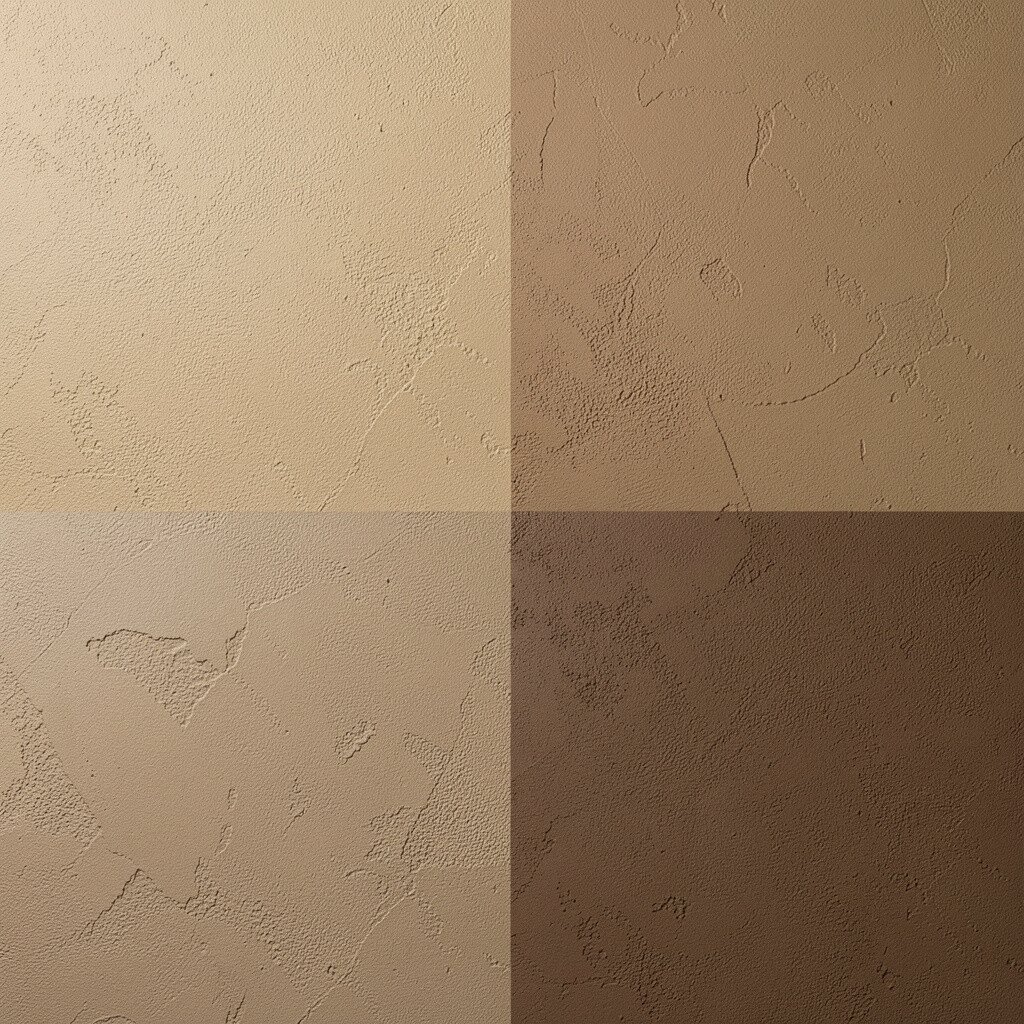
Texture can make paint look more interesting, even when colors stay simple. A subtle plaster look, limewash style, or sponge effect can add soft movement across the wall.
Visually, you will see light and shadow play, which makes the room feel deeper. This is a great choice if you want uniqueness without adding furniture or heavy decor.
For a practical tip, choose a test area first because texture can be more noticeable than you expect. If you have uneven walls, a textured approach can help hide small imperfections while still looking intentional.
7. Use Contrast to Define Zones
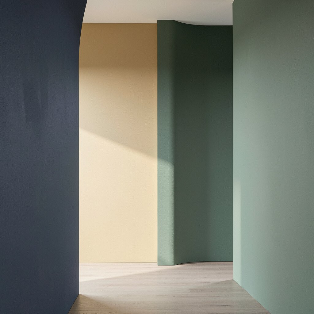
Color can quietly separate areas in an open floor plan. Even when walls are not fully divided, a different shade can mark where your living space ends and your dining or work area begins.
Try a slightly darker wall color behind a desk or a media wall so it feels focused. Contrast also makes it easier to arrange furniture because the room visually “holds” your layout.
8. Make Ceilings Work for You
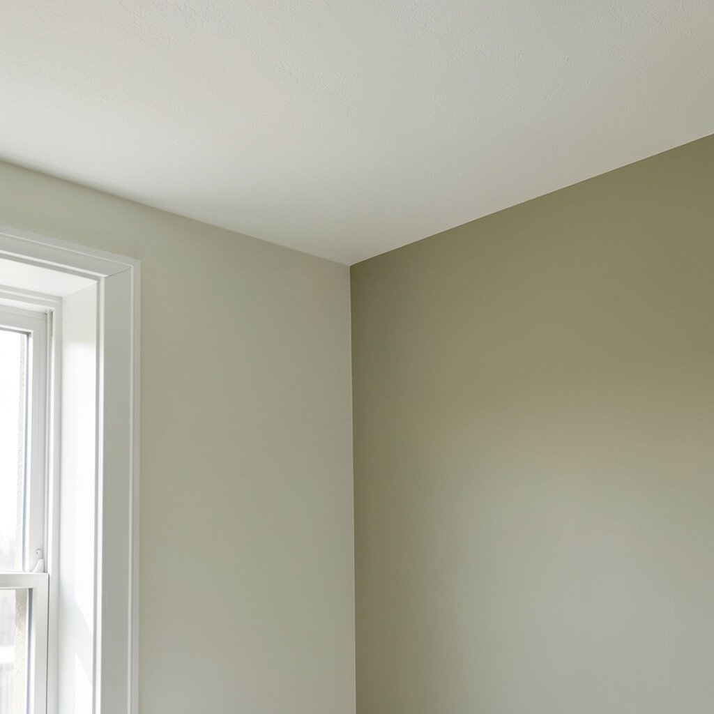
Ceilings are often ignored, but they can change the entire vibe. Painting a ceiling a light tint, like a whisper of blue or warm white, can make the room feel taller.
If the walls are darker, a brighter ceiling helps balance everything and keeps the room from feeling heavy. For a fun twist, you can paint a narrow band near the ceiling line in a complementary shade to add a gentle design moment.
9. Pick Undertones, Not Just Colors
Two paints that both seem “gray” can look totally different because of undertones. Some grays lean green, some lean blue, and some lean warm like taupe.
Look at undertones beside your flooring, trim, and metal finishes, since those will be the real comparison. This careful matching helps the wall color feel intentional rather than random.
To personalize the result, choose undertones that “echo” elements you already own, like warm wood cabinets or cool chrome fixtures. You may also save money by avoiding repainting caused by undertone surprises after the first coat dries.
10. Paint Like You Mean It With Technique
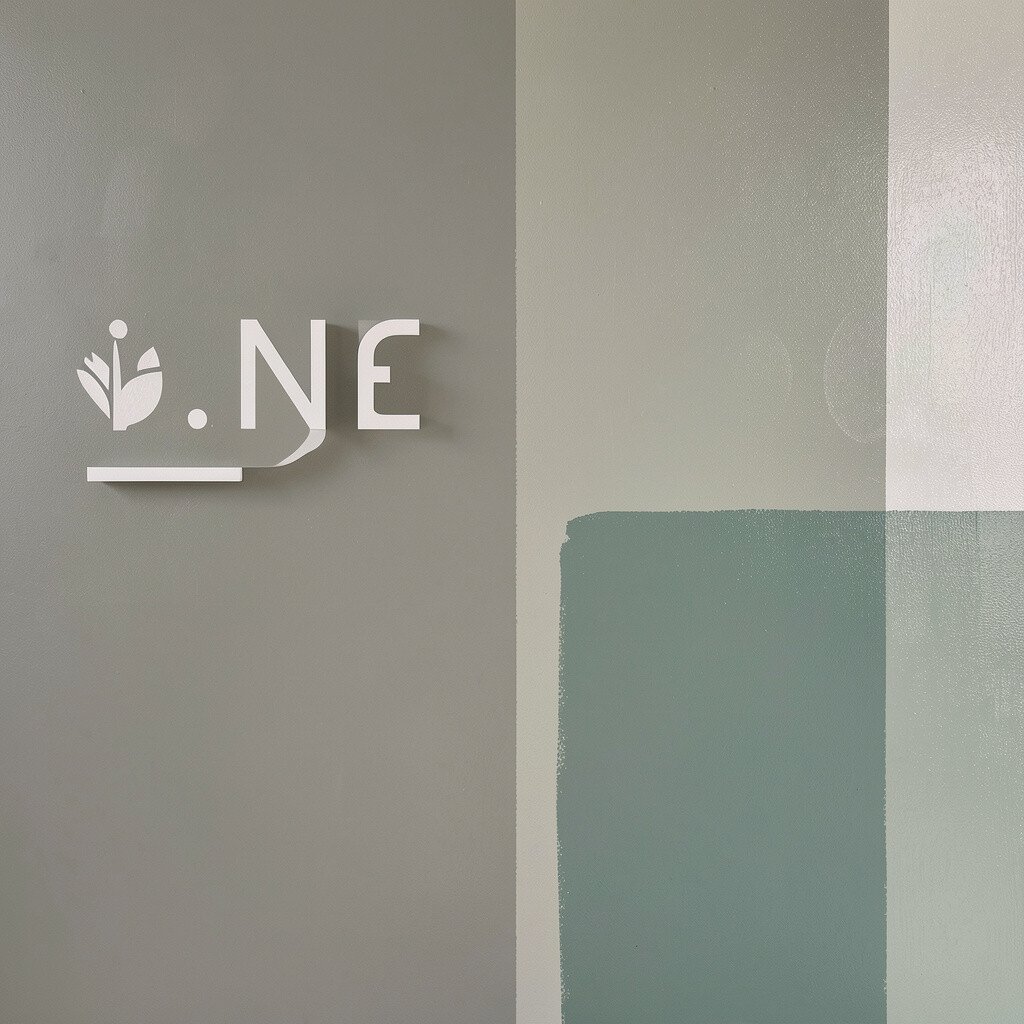
Good technique makes color look smoother and more professional. Use even strokes, keep a wet edge, and do not rush between sections.
Cut in carefully around trim, then roll from top to bottom to reduce streaks. If you want a special look, a second layer with a different tool, like a rag or dry brush, can add a gentle color effect.
For practical results, plan your work so each wall finishes while paint is still fresh. Consistent application also helps the color appear true, which matters most for deep or saturated shades.
11. Personalize With Color Ties and Soft Accents
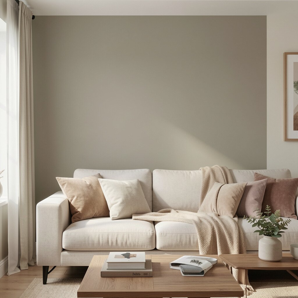
You can personalize wall color without committing to bold paint everywhere. Matching your color choices to rugs, curtains, and art keeps the room cohesive and makes it feel designed.
For example, if you choose a warm wall shade, pick artwork with similar warmth so everything feels like it belongs. If your walls are cool, add warm accents through lamps or wood tones to keep the space from feeling too sterile.
12. Budget Smart Without Losing Style
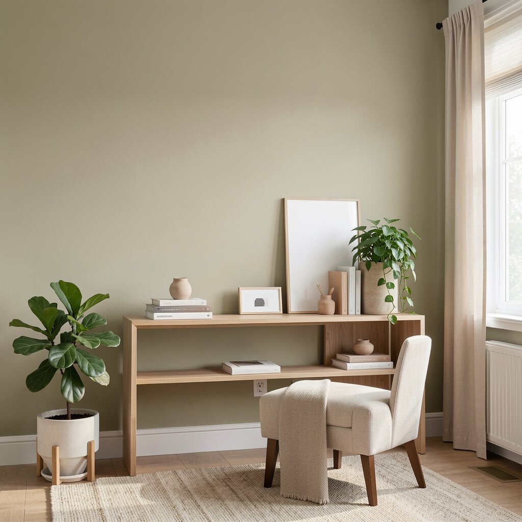
Color effects can fit many budgets, but you get better results when you spend in the right places. Painting a single feature wall first is often a smart way to test your style before committing further.
Buying small sample pots helps you avoid expensive mistakes, especially with tricky hues like deep greens and bold blues. Today’s trends also encourage “mix and match” approaches, so you can use affordable paint for large areas and spend more on accent finishes in smaller spaces.
If you want a polished look, invest in quality tape, rollers, and painter’s supplies, because those tools affect how clean the color lines turn out. When you plan ahead and limit repainting, you protect both your time and your wallet while still getting that wow factor.