Bold color block bouquets feel like wearable art for your space. They turn everyday moments into something bright and memorable.
1. Sunset Tango Block Bouquet
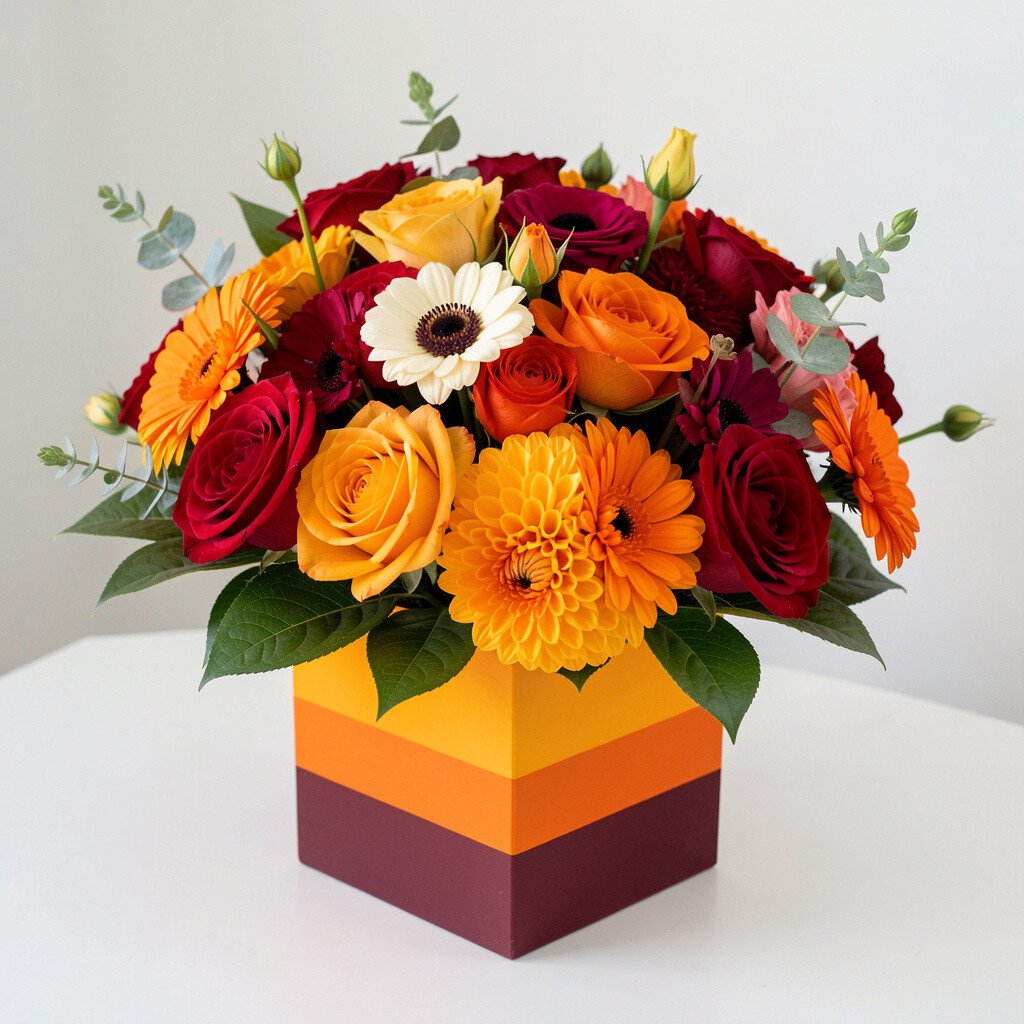
Picture a bouquet that mixes warm coral, golden yellow, and a punch of deep plum like sunset lights on a city wall. The petals look playful yet polished, with clean edges where colors meet.
This kind of bouquet brings instant cheer to a room without needing extra décor. It also photographs beautifully, which makes it a smart pick for events and everyday desk moments. To keep it from looking messy, choose stems with similar thickness so the block shapes stay crisp.
2. Citrus Pop & Pure White Grid Bouquet
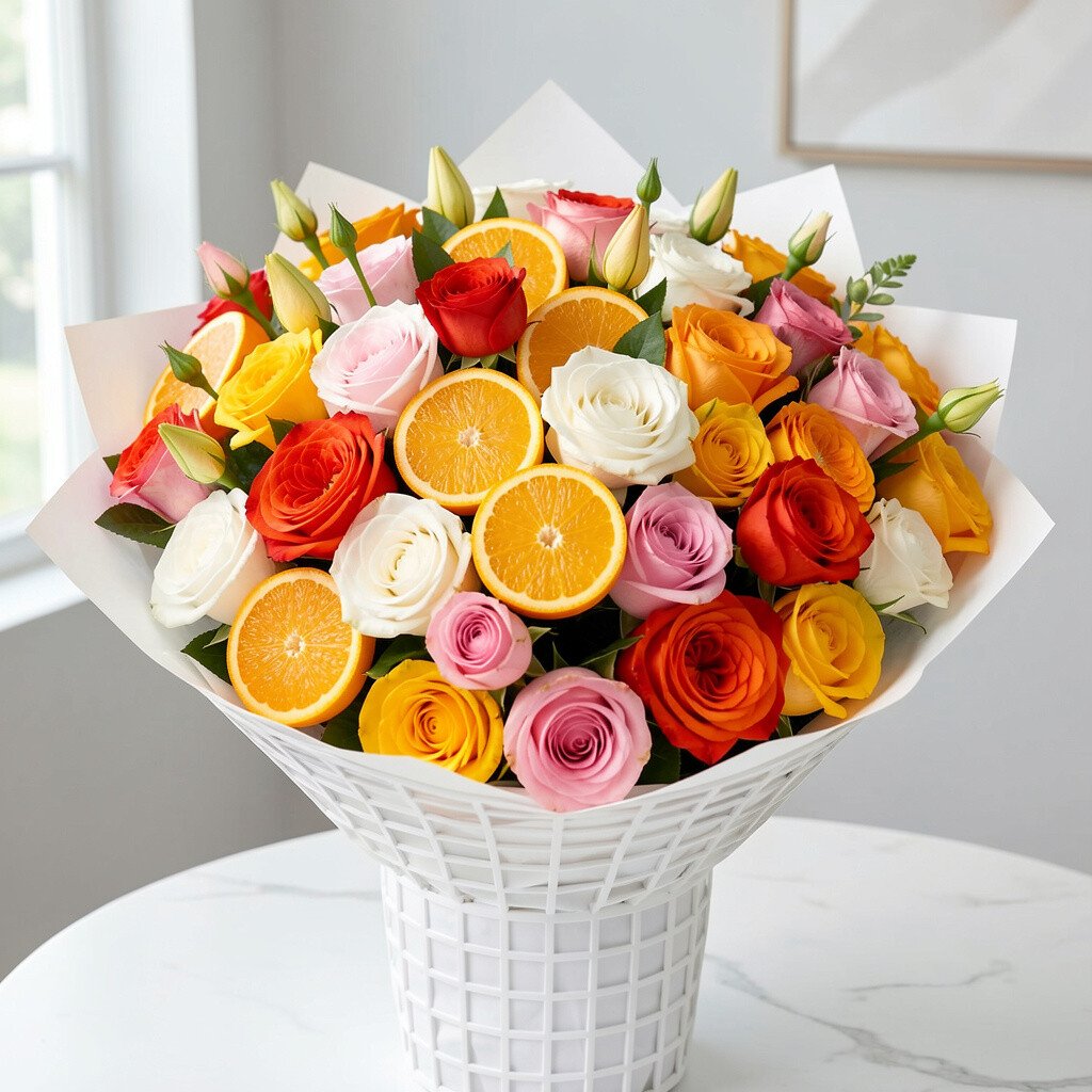
Think lime, orange, and bright tangerine set against smooth pure white blooms. The look is fresh and modern, like a neat color grid on a summer poster.
The bright contrast helps your bouquet stand out in photos and makes skin tones look warm and lively. For a practical approach, start with white as your base and tuck citrus tones in even intervals. If you want it to last longer, trim stems at a slant and change the water every day.
To personalize, add one surprising accent like a tiny cluster of berries or a single ribbon in a matching neon shade. It can cost a little more if you chase vivid seasonal citrus colors, but using dyed or naturally similar-toned flowers can help control the budget.
3. Ocean Teal, Sky Blue, and Seafoam Stack Bouquet
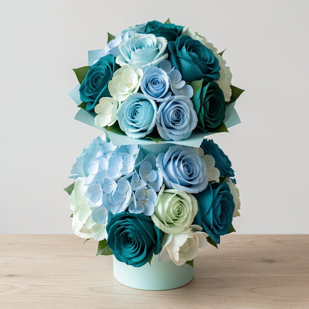
Imagine layered bands of teal, sky blue, and seafoam arranged so each shade feels like its own mini landscape. The cool tones give a calm vibe while still looking bold.
This bouquet is great for modern homes because it pairs well with glass, stone, and minimal furniture. A simple way to make it look intentional is to group flowers by color before arranging, instead of mixing everything at once. Keep the stems evenly spaced so the “stack” effect stays clear.
For uniqueness, add a little movement with wispy greens or a few airy blooms that lean slightly outward. If cost matters, choose one main flower for each color band and fill with affordable greenery to build volume.
You can also mirror the palette in table settings by adding teal napkins or sky-blue candles. That small match makes the whole look feel thoughtfully designed.
4. Magenta Bloom Blocks With Black Accents Bouquet
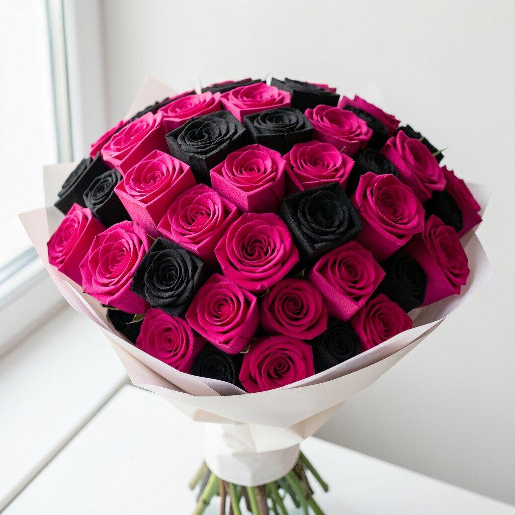
Picture magenta dominating the bouquet with clean blocks of hot pink and soft blush. Then, a few black accents appear like artful punctuation, often from dark foliage or specialty flowers.
This combo feels edgy and modern, especially in spaces with dark wood or sleek metal finishes. If you want it to look classy, keep the black accents small and placed at the edges. Choosing one type of dark greenery can make the bouquet feel uniform.
5. Coral Rose, Apricot, and Butter Yellow Color Block Bouquet
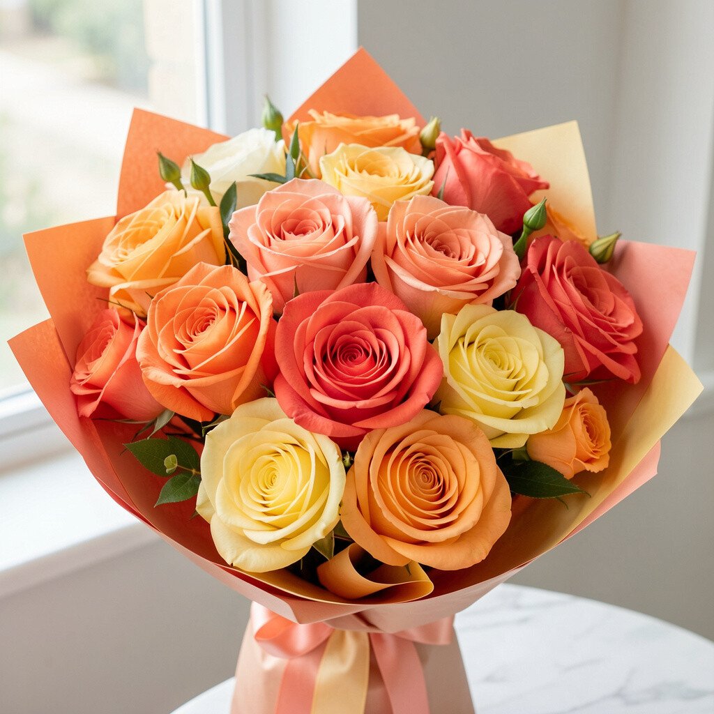
This bouquet feels like a warm handshake, with coral roses, apricot blooms, and butter yellow highlights. The colors blend gently but still hold firm boundaries like painted panels.
You get a cheerful look that works for birthdays, anniversaries, or just-because mornings. It’s also easy to personalize since you can shift the balance toward peach or toward yellow depending on the vibe you want. If you’re arranging at home, use painter’s tape on a blank board to sketch where each color block will land before adding flowers.
As for cost considerations, these warm shades often have plenty of seasonal options, which can make it budget-friendly. For extra uniqueness, add one matte-textured flower or a ribbon with a slightly different finish, like satin versus cotton.
6. Emerald Green, Cream, and Gold Leaf Block Bouquet
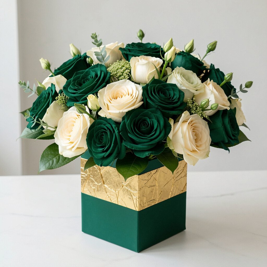
Imagine emerald blooms paired with creamy flowers and a few golden leaf touches. The result is rich, balanced, and perfect for a modern holiday moment or a chic dinner table.
This palette adds a feeling of depth without being heavy. A practical tip is to treat gold accents like salt in cooking, using only a small amount so the bouquet stays elegant. When arranging, keep creamy flowers as the middle layer so the green still looks bold around the edges.
7. Lavender Fields With Periwinkle and Chalk White Bouquet
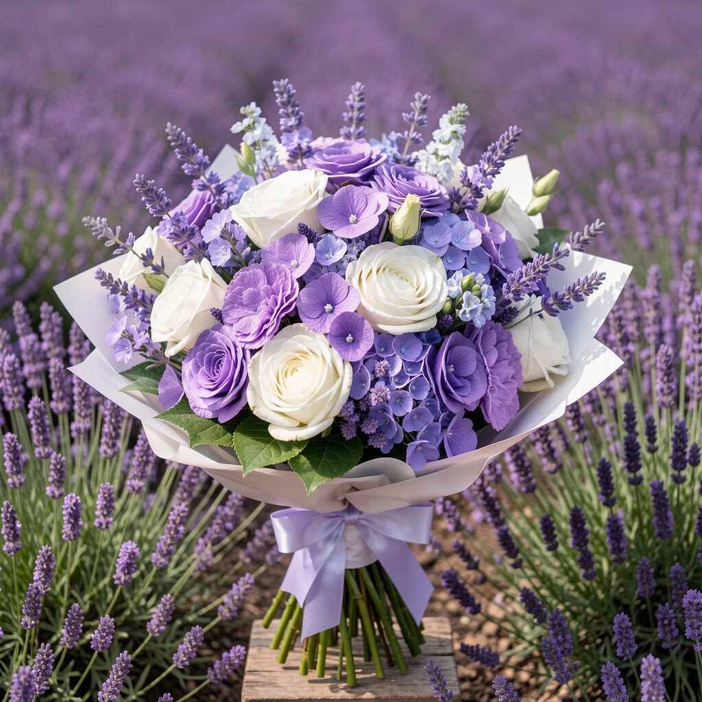
Lavender and periwinkle create a soft block look that still feels graphic, especially when paired with chalky white blooms. The overall effect looks dreamy but also thoughtfully structured.
This bouquet brings a calm mood while staying stylish for modern interiors. To keep the blocks readable, use fewer varieties and let each color tone take the spotlight. Changing water often and cutting stems fresh helps delicate petals last longer.
For uniqueness, add a touch of silver-toned foliage or a thin ribbon that matches the cool undertone. If you need a budget-friendly version, pick one main lavender flower and use greenery to build the shape instead of adding rare blooms.
8. Terracotta, Rust, and Sand Modern Block Bouquet
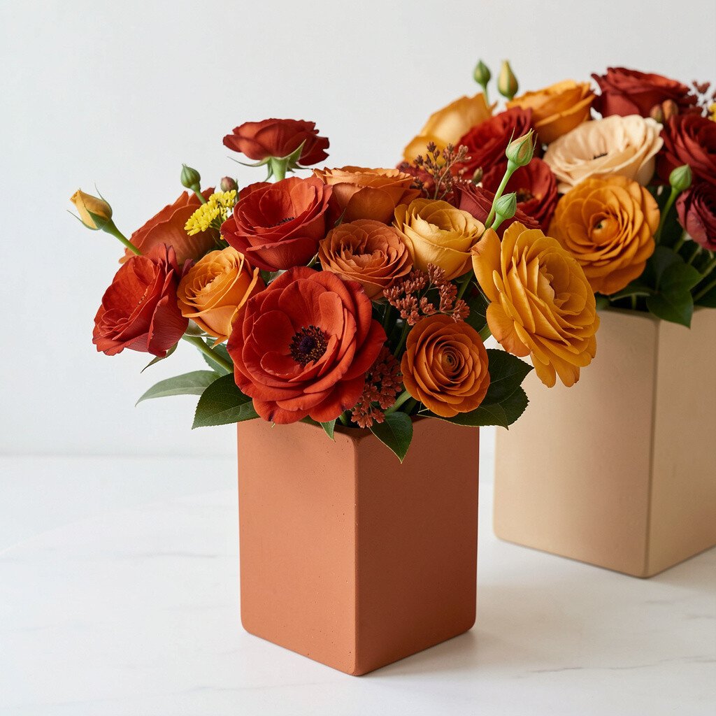
Picture terracotta and rust tones that feel warm and grounded, with sand-colored flowers creating a steady base. The blocks look like earthy tiles arranged into something beautiful.
This bouquet works wonderfully for modern aesthetics because it pairs well with neutral walls, linen textures, and minimalist décor. For practical results, choose flowers with sturdier stems so they hold their shape, especially if you want clean edges. Add greenery in a controlled way, focusing it where you want transitions between colors.
9. Bubblegum Pink, Fuchsia, and White Stripe Bouquet
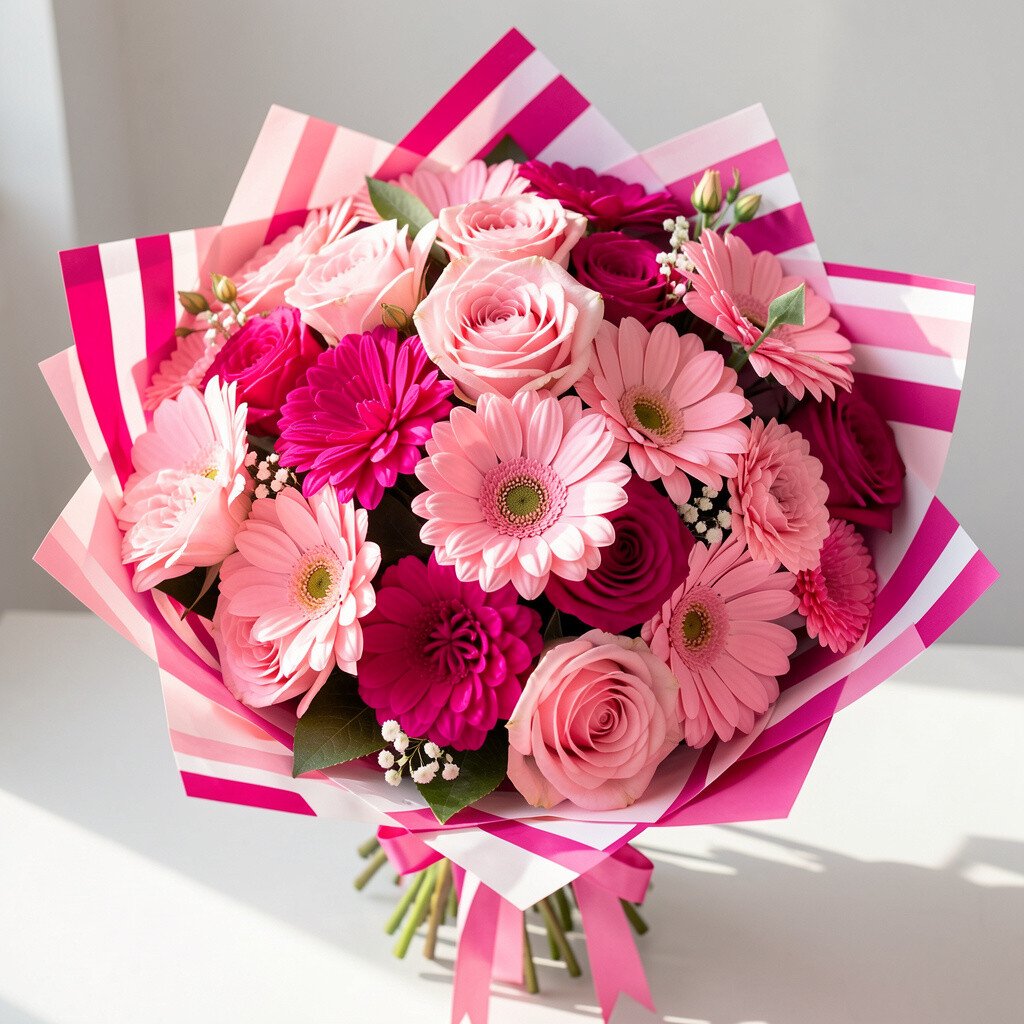
Bubblegum pink and fuchsia create a bold two-tone punch, while white blooms form crisp “stripe” spaces. The bouquet looks fun, youthful, and visually energetic.
This is a great pick for celebrations because the bright contrast feels upbeat. To make it feel modern instead of chaotic, keep the white sections thick enough to act like separators. A simple personalization idea is to match the bouquet ribbon to the color of your party balloons or table napkins.
In terms of cost, pink shades can vary widely based on season, so consider using a more common flower in one tone and upgrading only one or two featured blooms. Adding one unique texture bloom, like something with ruffled petals, can elevate the look without raising costs too much.
10. Teal Hydrangea-Like Blocks With Warm Peach Highlights Bouquet
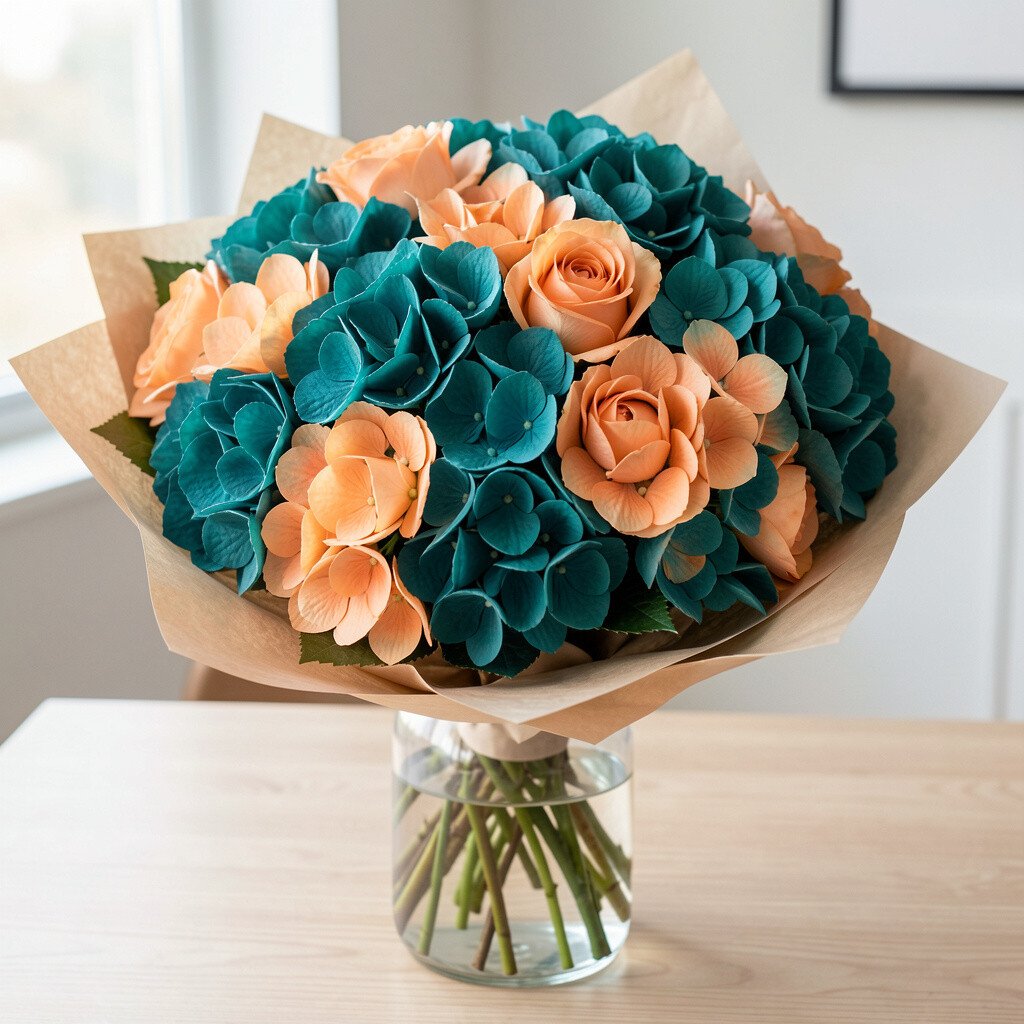
Imagine blocky clusters of teal flowers with warm peach highlights tucked like surprise sparks. The contrast feels fresh and modern, like ocean air mixed with sunset warmth.
The teal base creates a strong visual anchor, while peach adds a friendly glow that keeps the bouquet from feeling too cold. A practical tip is to keep peach accents limited to one side or the top so the shape looks intentional. If you’re arranging yourself, group stems by color and build a “frame” before filling the middle.
11. Red Cherry, Coral Tips, and Cream Center Bouquet
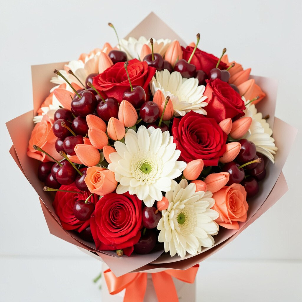
Picture deep red flowers forming confident blocks, with coral tips that fade into a creamy center. It looks rich, lively, and balanced like a modern still-life painting.
This bouquet is ideal when you want a bold focal point for a dining table or entryway. For best longevity, use a clean vase and refresh water often, especially if the weather is warm. Personalize by adding a thin green ribbon or a small cluster of leaves that echoes the green in your home décor.
Cost can be managed by choosing one main red flower and filling with simpler cream blooms. If you want extra uniqueness, use two red tones instead of one, so the blocks show gentle variation without losing clarity.
12. Chartreuse Green, Soft Gray, and White Modern Bouquet
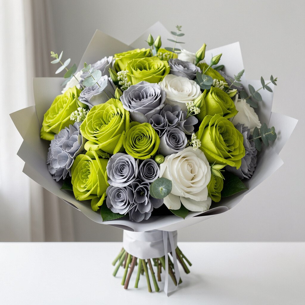
Chartreuse green paired with soft gray and crisp white gives a clean, contemporary look. The bouquet feels like a design studio palette that still feels friendly.
This combo stands out in neutral rooms, especially where you have light walls or natural wood. A practical approach is to keep gray as the quiet middle layer and let chartreuse show up at the edges. If you want a sharper color block effect, avoid overly mixed multi-colored flowers and stick to single-tone varieties.
13. Sapphire Blue, Electric Purple, and Icy White Bouquet
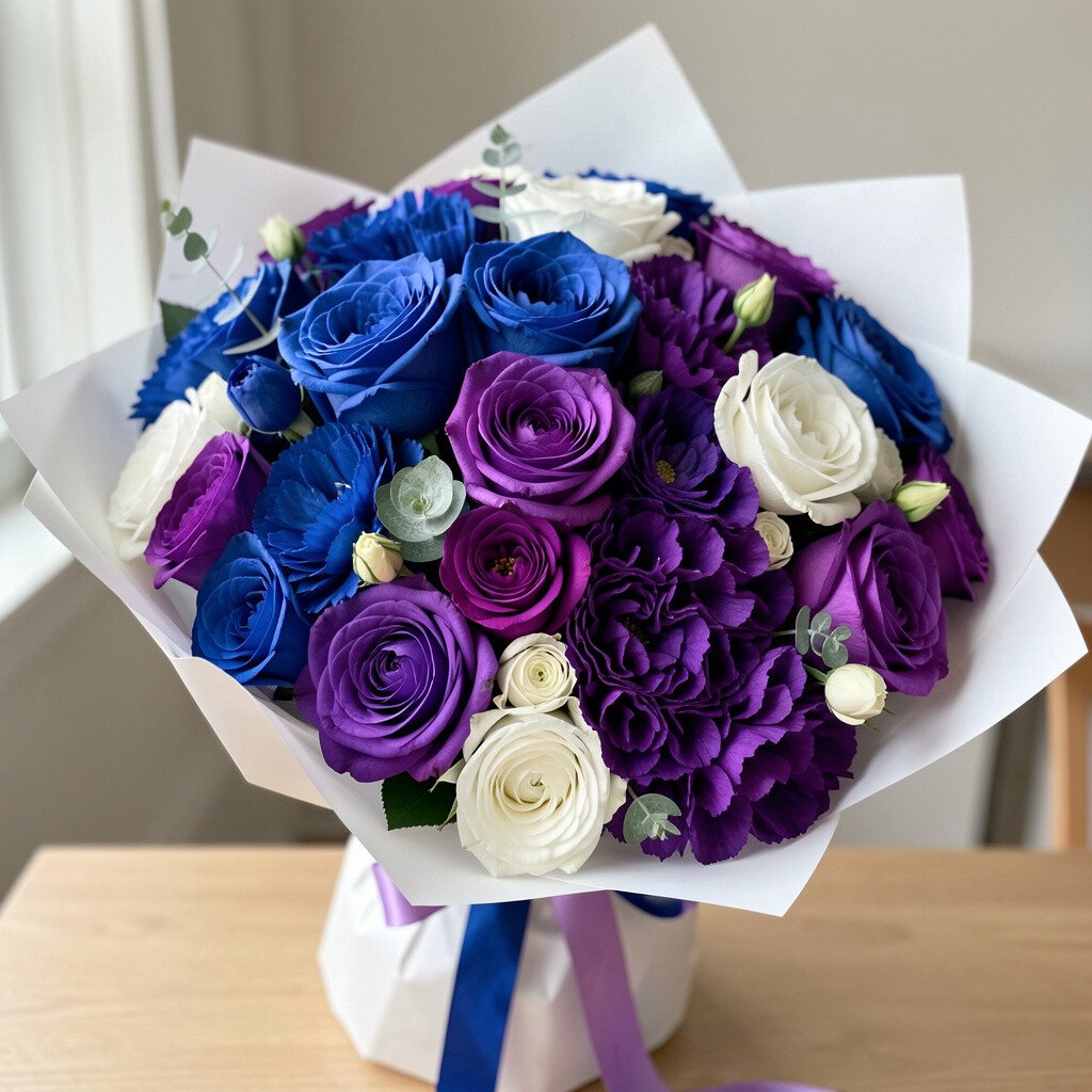
Sapphire and electric purple create a dramatic two-color block, and icy white flowers calm everything down. The bouquet feels bold, modern, and ready for a night event or gallery-style gathering.
This palette looks stunning under indoor lighting, which makes it a great choice for dinners and weddings. To keep the look polished, use white blooms as dividers so each color remains easy to see. For personalization, add a silver-toned ribbon or a few metallic-looking stems if you like a little sparkle.
Because intense blues and purples can be pricier, consider using greenery to stretch volume while keeping the strongest tones in the visible areas. You’ll still get the block look even with simpler filler flowers.
Trim stems, remove leaves below the water line, and keep the bouquet away from direct sun so the colors stay fresh longer.
14. Lemon Yellow, Sea Glass Mint, and White Blossom Grid Bouquet

Think lemon yellow and sea glass mint arranged like a tidy grid with white blossoms separating each color band. The overall look feels bright, airy, and very modern.
This bouquet is perfect for spring vibes and makes kitchens or home offices feel more welcoming. A practical tip is to use a narrower vase or container so the bouquet stays upright and structured. If you want your color blocks to look even, measure your stem lengths and keep them consistent.
15. Black Cherry Maroon, Rose Blush, and Warm Ivory Bouquet
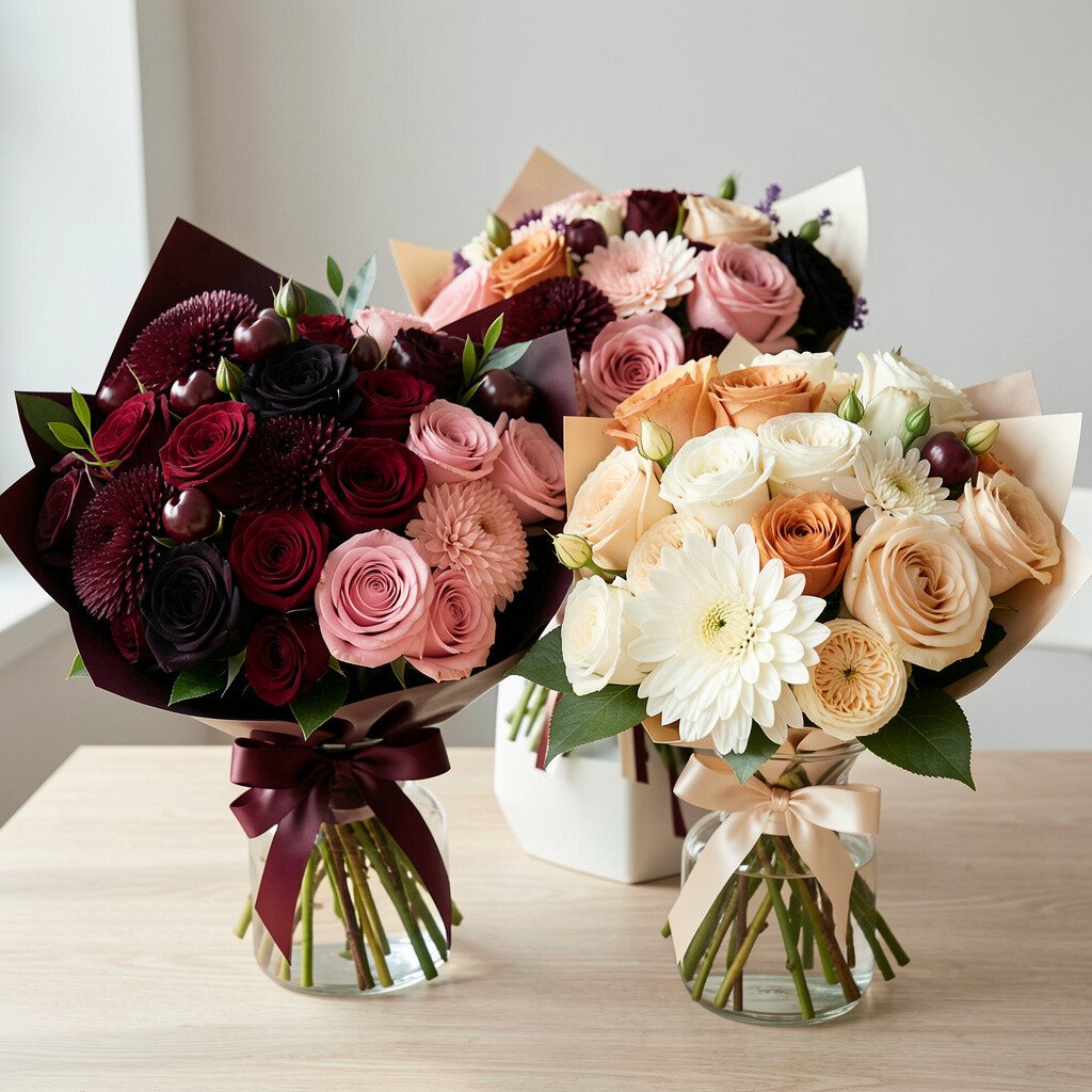
Maroon blooms that feel almost black create a bold foundation, with rose blush and warm ivory rounding out the color blocks. The palette feels romantic, but the structure keeps it modern.
This bouquet adds depth without needing bright neon colors. For practical results, keep blush and ivory slightly more airy so the maroon remains the main visual anchor. Personalize with a textured fabric wrap, like linen or a subtle knit, to match your home’s materials.
Maroon flowers can sometimes be season-dependent, so budget-friendly options might include using deep red blooms and pairing them with blush and ivory. If you want uniqueness, add a small number of unusual shapes, like star-shaped flowers, to create a signature look.
16. Bright Orange, Coral Pink, and Creamy Off-White Bouquet
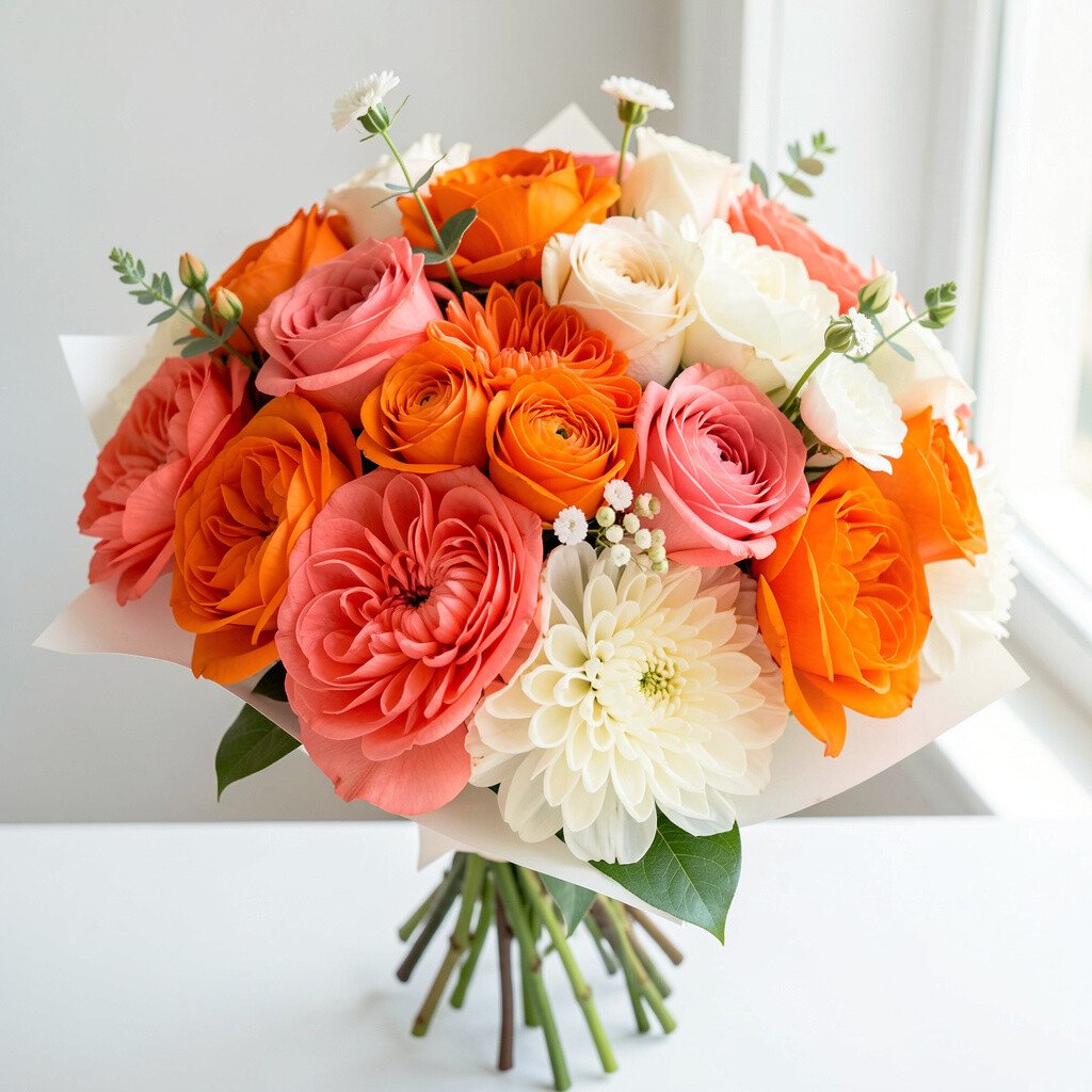
Bright orange and coral pink create a high-energy block effect, while creamy off-white gives gentle space between the colors. It looks fun, bold, and surprisingly elegant.
This bouquet feels like a mood boost, great for weekend dinners or a friend’s new apartment. To keep it from looking too loud, keep the off-white portion generous enough to soften the transitions. A practical tip is to choose flowers with sturdy petals so they hold their shape and don’t droop too quickly.
17. Powder Blue, Cloud White, and Soft Lilac Block Bouquet
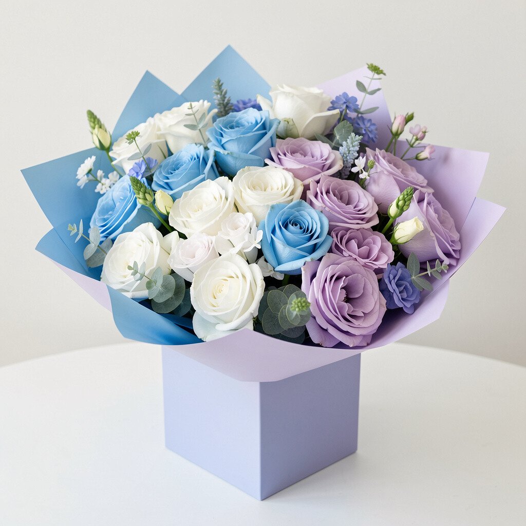
Powder blue and soft lilac look light and modern when paired with cloud white. The bouquet creates a clean block effect that feels calm, airy, and stylish.
This color story works well for minimalist spaces and makes windows and glass décor look extra bright. For personalization, add a thin ribbon in a matching tone and keep the wrap simple. Cost can be controlled by mixing one main flower with supportive greens and using cloud white blooms as the filler that stretches the bouquet.
To help your flowers last, keep them out of heating vents and mist the greenery lightly if the air is dry.
The gentle palette also makes it easy to match outfits, so it’s great when you’re planning a coordinated look.
18. Neon Lime, Tangerine, and White Pop Bouquet

Neon lime and tangerine feel like a modern street mural, and white pops in between keep the colors crisp. The bouquet looks energetic and fresh, like it’s ready to move.
This is a fun choice for parties, playful events, and creative workplaces. For practical tips, limit the neon tones to two main color areas so the bouquet stays structured. If you want it to feel more wearable, add a white ribbon and keep the greenery minimal.
Cost considerations matter here because neon shades are sometimes harder to find naturally. Using the closest seasonal shades and adding color accents with ribbon or dyed-looking petals can help you stay within budget while keeping the bold effect.
19. Charcoal Gray Flowers With Blush Blocks and Gold Thread Bouquet
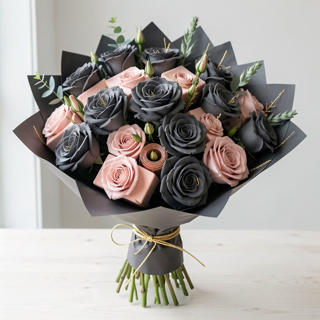
Charcoal gray flowers paired with blush blocks look striking and modern, especially when you add delicate gold thread accents. The bouquet feels like high-fashion styling, with smooth transitions and strong edges.
This palette gives a moody elegance that still feels friendly. A practical tip is to keep blush concentrated in the mid-layer so the bouquet doesn’t look flat. Personalize by choosing a wrap fabric that matches your home style, like satin for a dressy look or matte paper for a calmer vibe.
Gold thread accents can add cost, so you might use a small amount strategically near the top. If you want uniqueness without spending more, add a textured flower with a distinctive shape so the bouquet has variety even with simple materials.
20. Forest Green, Muted Rose, and Creamy Lemon Block Bouquet
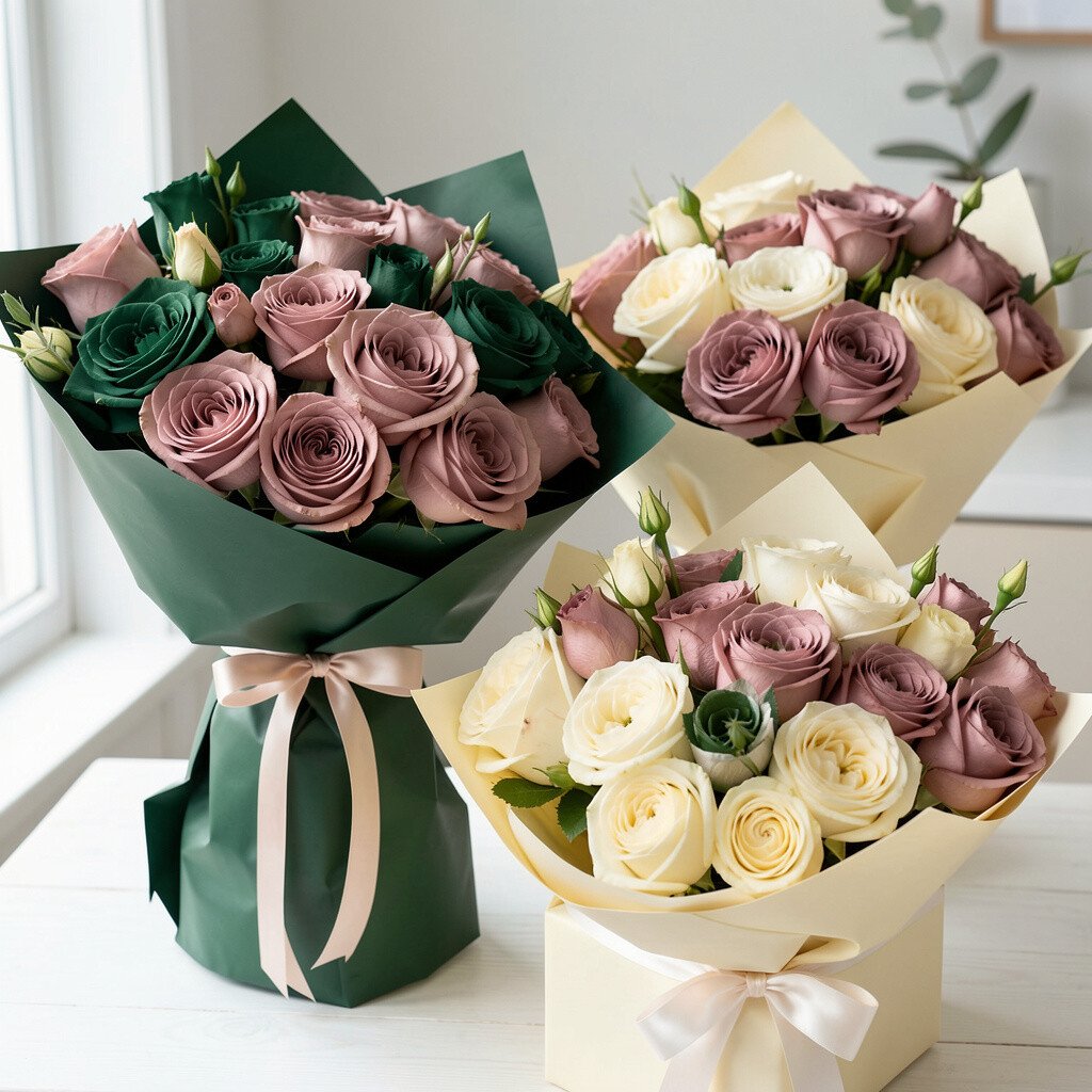
Forest green creates a strong base, muted rose adds a soft romantic block, and creamy lemon brings a bright finishing touch. The mix feels balanced, modern, and grounded with a lively edge.
This bouquet works beautifully for everyday styling because it pairs with both dark and light décor. A practical tip is to place the rose blocks where you want the eye to linger, usually around the center and upper half. For personalization, consider a seasonal twist by swapping the lemon tone for a warmer gold or a cooler pale yellow depending on the month.
In cost terms, forest green can often be built with affordable greenery and one or two main flower types. That way you get volume without overspending, while still maintaining bold, readable color blocks.
To keep everything looking fresh, trim stems, use a clean vase, and remove any leaves sitting below the water line so the bouquet stays neat.