
Color can make a lounge feel alive the moment you walk in. The trick is choosing artwork that tells your story while still feeling comfortable.
If you enjoy mixing styles, eclectic design is your best friend.
1. Gallery-Wall Pop With a Statement Sofa
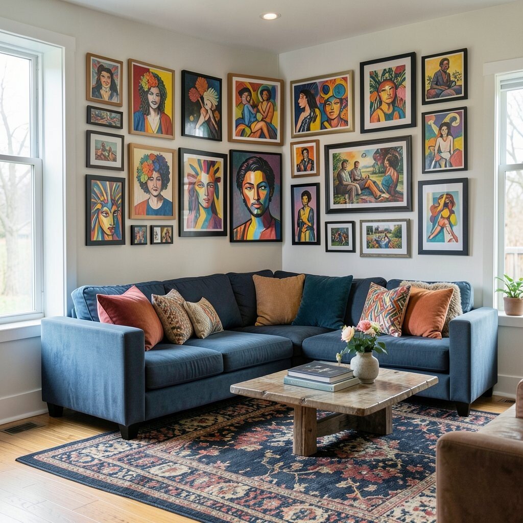
A bright gallery wall works like a visual soundtrack for your lounge. Pair it with a sofa in a friendly neutral so the art can be the loudest voice without making the room feel chaotic.
Choose mixed frames in colors like teal, brass, and warm wood for a layered look. Hang one large anchor piece at eye level, then add smaller prints around it to create movement. Try using a temporary paper grid to plan spacing, which helps you avoid crooked rows and saves time.
2. Bold Color-Block Art on a Calm Backdrop
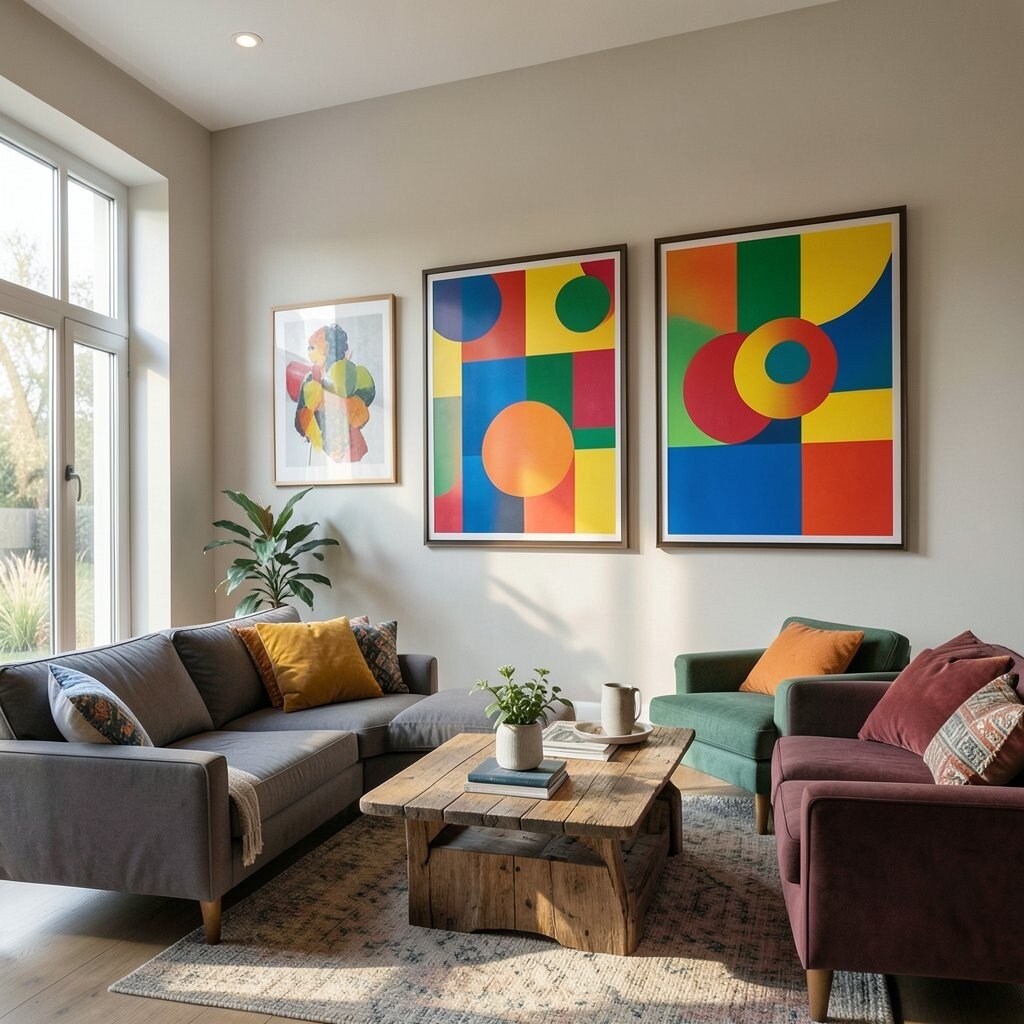
When your walls are quiet, colorful art can take center stage without fighting your furniture. Color-block canvases feel playful and modern, especially in lounges where you want both comfort and energy.
Use a single oversized piece or a set of coordinated panels in bright blocks like coral, cobalt, and lemon. Keep the rest of the room in soft tones such as cream, oatmeal, or light gray to maintain a cozy balance. This approach is budget friendly because one or two strong pieces can do the work of a full collection.
If you want a personal touch, select colors that match a favorite rug or throw blanket so everything feels connected. Consider printing your own abstract shapes from a favorite photo editing app if you enjoy DIY. That way you get custom art without paying gallery prices.
3. Vintage Travel Posters With Eclectic Side Tables
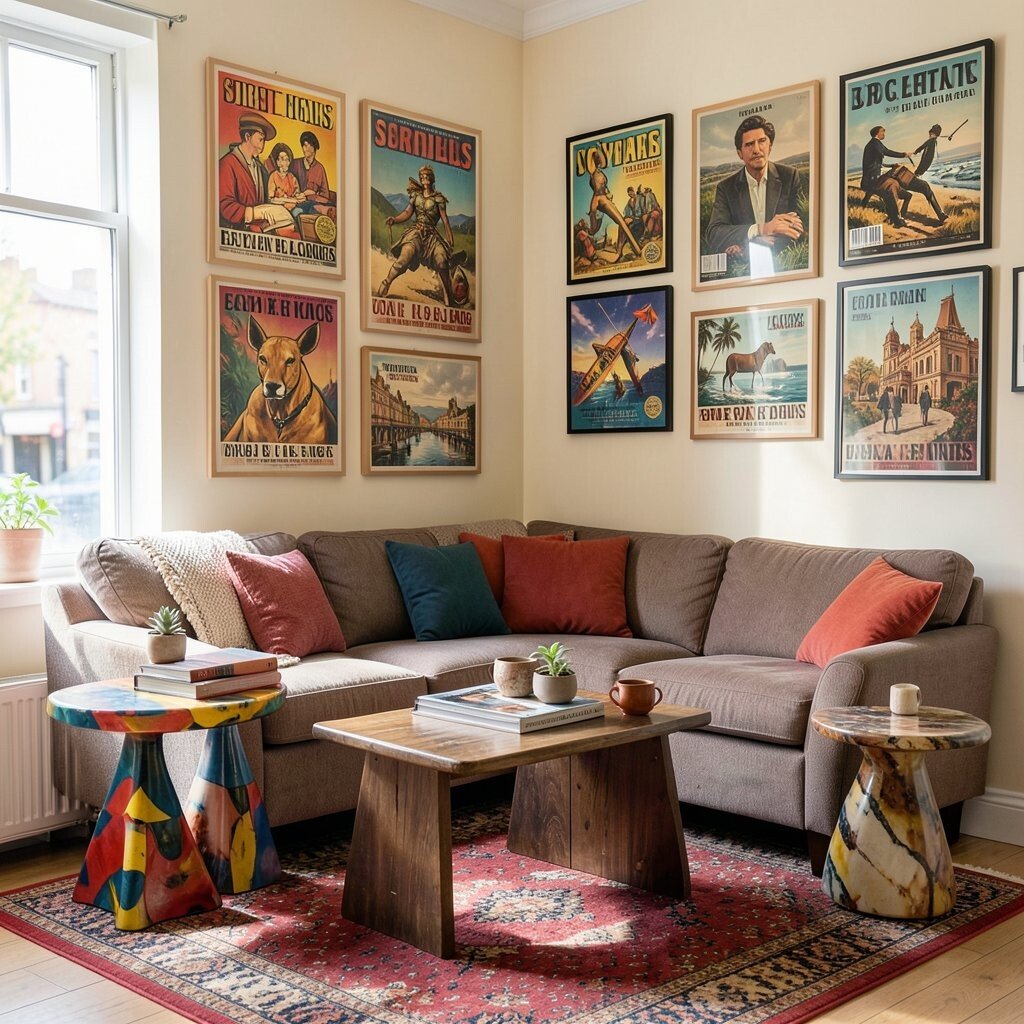
Vintage travel posters bring charm, nostalgia, and a sense of movement to a lounge. You can frame them neatly or keep some in mismatched frames for a more lived-in vibe.
Look for bold typography and scenic illustrations, then mix sizes so the wall feels like a storybook. Pair the posters with eclectic side tables like a rounded rattan drum, a slim iron stand, or a colorful ceramic base. This creates a layered look that still feels tidy and intentional.
For practical placement, group posters by color theme, such as warm sunsets or cool ocean blues. If originals are too expensive, search for reprints or thrift store finds and check the paper quality before you buy. Personalize by adding one framed map print near a lamp that you love, so the room feels like it belongs to you.
Many people are also using vintage-inspired color palettes right now, like saturated terracotta and deep sea tones. That trend makes older artwork feel fresh and current in modern spaces.
4. Mixed-Medium Abstracts Over a Textured Reading Nook

An abstract mixed-medium piece looks even better when your lounge has texture. Think of a reading nook with a chunky knit throw, a linen chair, and a layered rug that all invite touch.
Choose artwork with visible brush strokes, collage bits, or painted edges to echo the tactile feel of textiles. The benefit is that the art and the room share a “handmade” quality, which helps everything look cohesive even when styles differ. For cost control, hunt for smaller works by local artists or studio prints and rotate them as you collect.
5. Colorful Botanical Prints With a Modern Ceiling Light

Botanical artwork can be bright and modern, not old-fashioned. Choose prints with vivid greens, pink blossoms, and unexpected color accents to keep the vibe fresh.
Place a few framed botanical prints on one wall and use a modern ceiling light with a clean shape to balance the details. This contrast helps the artwork feel intentional rather than crowded. Keep frames in a single metal finish like black or gold so the mix of greens still looks polished.
For personalization, pick plants that match your real-life interest, such as citrus, tropical leaves, or tiny wildflowers. If you want an easy budget win, use high-quality art prints from reputable creators and upgrade to glassless frames if you like a lighter look. A lot of homes are using nature-inspired color lately, because it makes rooms feel calm yet expressive.
6. Ocean-Inspired Artwork With Coastal Meets City Styling

Ocean blues can be bold, especially when you pair them with city-style decor. Look for artwork that mixes wave patterns with graphic shapes, like a seascape that also has geometric energy.
Try hanging a large framed print above the sofa and add two smaller pieces on each side to complete the scene. The benefit is that you get a calming theme while still keeping an eclectic feel. To personalize, include artwork that reflects your travels or favorite beach memories, even if the art style differs.
For practical upkeep, choose water-resistant frames if your space gets humid, like near open windows. If you are on a budget, search for canvas prints with good color saturation and check customer reviews for print quality. Trends right now favor “coastal color” that includes deep teal, ink blue, and seafoam instead of only light sand tones.
7. Bold Portraits and Silhouettes Around a Lounge Bar

Portrait art adds personality fast, especially when you place it near a lounge bar cart or built-in shelf. You can use colorful faces, abstract silhouettes, or even stylized figures that look like they belong in a contemporary gallery.
Arrange pieces so faces appear at different heights, which makes the wall feel dynamic. This also helps the bar area feel less like storage and more like a designed feature. For personalization, match one artwork color to your glassware or bar accessories, like amber glass or teal coasters.
Cost-wise, portraits can be affordable when you buy prints instead of originals. Look for local artist markets or online print shops, and choose frames you can reuse for future swaps. When you rotate one or two pieces seasonally, the lounge always feels current without spending much.
Another trend that fits this style is using “character art” that feels bold and human, not overly polished. That imperfect energy makes eclectic lounges feel warm.
8. Sunset Gradient Canvases With Warm Wood and Gold Accents
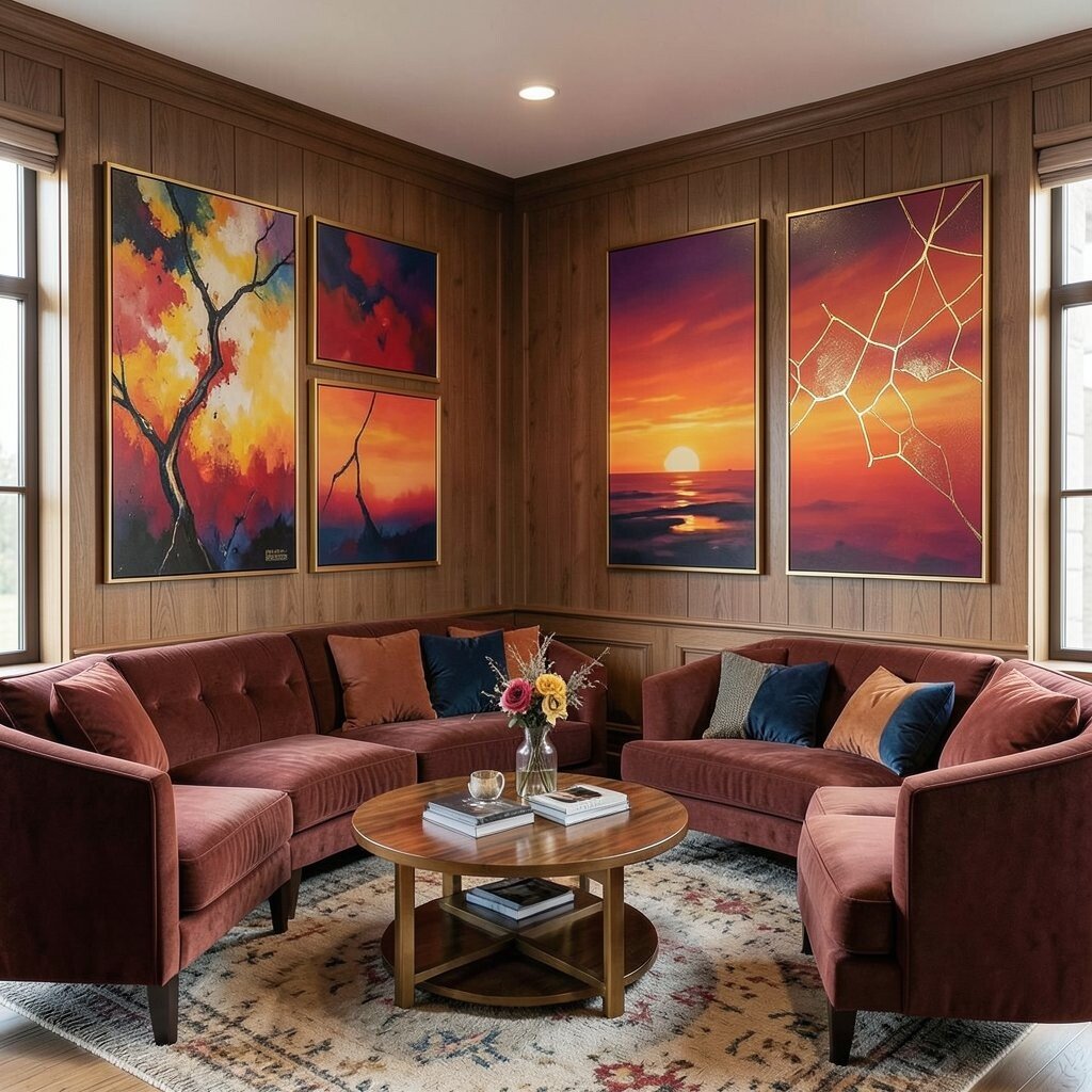
Sunset gradients look dreamy and modern, and they work beautifully in eclectic lounges. The way colors blend from pink to orange to deep purple can soften harsh lighting and make the room feel glowing.
Pair gradient canvases with warm wood furniture and small gold details like a brass lamp or a gilded picture rail. This gives you a comforting layer of warmth, which is a real benefit when evenings are dim. For practical tips, hang the art slightly higher than you think, especially if you have tall back chairs that can visually block the lower area.
If you want to personalize, choose colors that echo your favorite sweater, candle, or throw blanket. Budget friendly options include pre-stretched canvases or print-and-frame versions that still hold color well. The current trend is “color drenching” but in a softer way, using gradients instead of only solid blocks.
9. Pattern Play With Art That Shares Colors With Your Rug
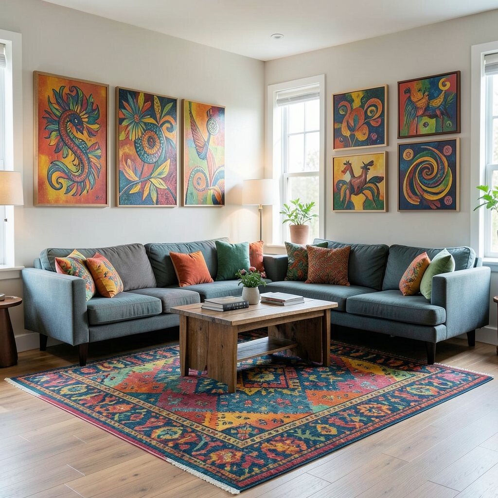
Patterns can feel scary, but when your artwork and rug share colors, the mix becomes easy. Pick an artwork with at least three tones that appear in your rug, such as navy, mustard, and coral.
Then choose frames that help the colors connect, like thin black frames for strong contrast or light wood frames for warmth. This creates a visual bridge between different textures and prints. A practical tip is to keep the wall spacing consistent, so even with different designs, the layout still feels organized.
For uniqueness, combine one bold abstract print with one or two graphic pieces that have repeating shapes. If you love DIY, you can paint simple patterned forms on cardstock and frame them as art cards. Cost considerations are easier here because you can use smaller budget pieces and still get a full look thanks to the shared color story.
10. Colorful Ceramic Art and Framed Prints Together
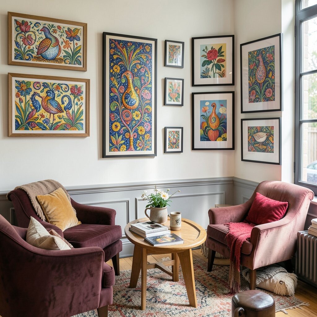
Eclectic lounges look amazing when you mix wall art with tabletop art. Colorful ceramics, like painted plates, small sculptures, or decorative pottery, can sit near framed prints to create a layered gallery effect.
Choose one hero color, such as turquoise, and let it show up in both the frames and the ceramics. The benefit is that the room feels collected instead of random. For practical placement, group ceramics in clusters of odd numbers on shelves or the coffee table, then hang art slightly behind them to form depth.
To personalize, display ceramics that match your cultural heritage or that remind you of places you love. You can often find these items at flea markets, craft fairs, or boutique thrift stores for less than big retail decor. Current trends also favor “curated clutter,” where meaningful objects feel intentional and lived in.
11. Monochrome Frames With One Wildly Colorful Artwork
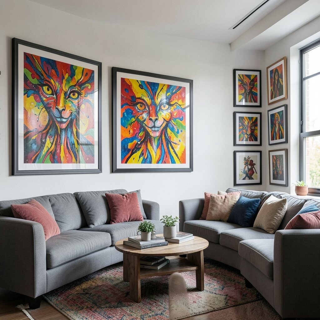
Want eclectic energy without overdoing it? Use monochrome frames on the wall and let one artwork be the star with a burst of color.
This method keeps everything clean and easy to style while still giving your lounge a wow moment. Pick a single bright piece, like a neon pop abstract or a colorful portrait, and keep the surrounding art in muted tones such as black, white, and soft gray. A practical tip is to choose frames with the same thickness so your eyes read the wall as one designed grid.
For cost, this can be smart because you invest more in one statement artwork and spend less on coordinating prints. Personalize by choosing that wild piece based on the color you want to feel most in your day, like uplifting yellow or calming teal. This look matches a trend toward “controlled contrast,” where one strong element gives maximum impact.
12. Art-Led Color Strategy Using the Accent Throw

Start with a colorful throw blanket or cushion, then build your art selection around it. When you treat that fabric as your color compass, everything feels instantly connected and less stressful to plan.
Choose artwork that repeats at least two colors from the throw, such as a teal pattern and a warm amber shape. This creates a visual loop that makes the lounge feel thoughtfully styled. For personalization, tie in a quote, symbol, or image style you genuinely enjoy, so the art reflects your taste rather than just a palette.
Cost considerations can be gentle with this approach because you can purchase affordable prints in the right colors and frame them consistently. A practical tip is to lay the throw on the sofa, place art options next to it, and view them in the room’s lighting, not only in daylight. Right now, many designers are using “room color stories” instead of random decor, because it looks fresh and feels intentional.
This strategy also helps when you swap textiles later, since you already have a system.
13. Sculptural Wall Art With Colorful Abstract Panels

Wall art can be more than flat prints, and sculptural pieces bring movement to an eclectic lounge. Think of three-dimensional panels, layered metal art, or wood cutouts painted in rich colors.
These pieces catch light and cast soft shadows, which adds depth even if your walls are simple. The benefit is that you do not need a large quantity of items to get a strong visual impact. For practical tips, mount sculptural art with sturdy hardware and measure carefully so it sits centered over the seating area.
For uniqueness, mix the sculptural piece with smaller framed prints that echo its palette. If you want to keep costs down, consider painted wood wall art or mix mediums like fabric wall hangings alongside abstract prints. Current trends lean toward tactile decor, and sculptural art is a perfect way to meet that vibe.
14. Playful Kids-Style Color With Adult Comfort

Yes, you can use bright, playful art even in an adult lounge. The trick is choosing pieces with bold color but comfortable subject matter, like abstract doodles, colorful shapes, or friendly animal silhouettes.
Place a few colorful prints above a low credenza, then balance the fun with cozy seating and soft lighting. This keeps the room from feeling chaotic while still showing personality. For practical personalization, pick one style theme, like rounded shapes or thick brush lines, so the wall feels like a curated collection.
Budget friendly options include art from independent illustrators and print packs sold in sets. You can also frame simple art made from your own sketches or saved graphic posters you love. This approach aligns with a current trend toward joyful maximalism that feels upbeat, not cluttered.
When you keep upholstery fabrics in warm neutrals, bright art feels inviting instead of overwhelming.
15. Minimalist Layout With Maximal Color Art Frames

A minimalist layout lets the room breathe, and maximal color frames add instant character. Use a simple furniture arrangement with clean lines, then place colorful artwork in frames that stand out like candy.
Try lacquered frames in saturated shades, such as magenta, lime, or ocean blue, and keep the art content consistent in style. This gives you an eclectic punch without too many competing patterns. For practical tips, keep the number of main artworks small but larger in size, so you get impact and easier styling.
Personalize by choosing frame colors that match your favorite accent item, like a lamp base or a ceramic bowl. Cost considerations are flexible here because framing alone can create the color moment even if the prints are affordable. Right now, many lounges lean into this contrast by pairing calm layouts with loud frame palettes for a high-end look that still feels approachable.
Once you commit to the frame color, everything else becomes simpler, including future artwork swaps.