When your windowsill gets color, the whole room starts to feel more awake. Small changes can make a surprisingly big difference in how sunlight looks and how your home feels.
Pick shades that match your mood, your furniture, and the kind of light you get each day. Even a simple paint job or a cheerful set of planters can bring instant charm.
1. Tangerine Pop with Sunlit Charm
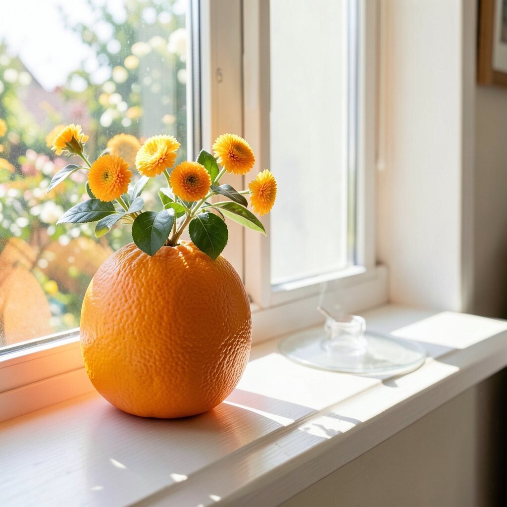
Imagine a windowsill that glows like fresh oranges when the morning sun hits. The bright tangerine feels playful without being loud, and it can make nearby neutral walls look warmer.
Start with a paint sample on one side of the sill and check how it looks at different times of day. Pair it with white or light wood frames so the color stays crisp, not cluttered. For practical care, wipe the surface gently and use a finish that can handle occasional splashes from watering.
2. Lemon Yellow for a Clean, Crisp Vibe

Lemon yellow brings a fresh, clean feeling that reminds you of citrus and clear skies. It works especially well in kitchens, small dining spaces, and sunny corners where you want energy.
Try a semi-sheer yellow on the sill for a softer glow, then add matching accents like a simple ceramic dish or a striped pot. This color helps reflect light, so your plants and décor look brighter and more cheerful.
If you want to keep costs low, use peel-and-stick color sheets cut to fit the sill. You can personalize by choosing a matte finish for a modern look or a gentle satin finish for a lively shine.
3. Coral Blush for Cozy Warmth
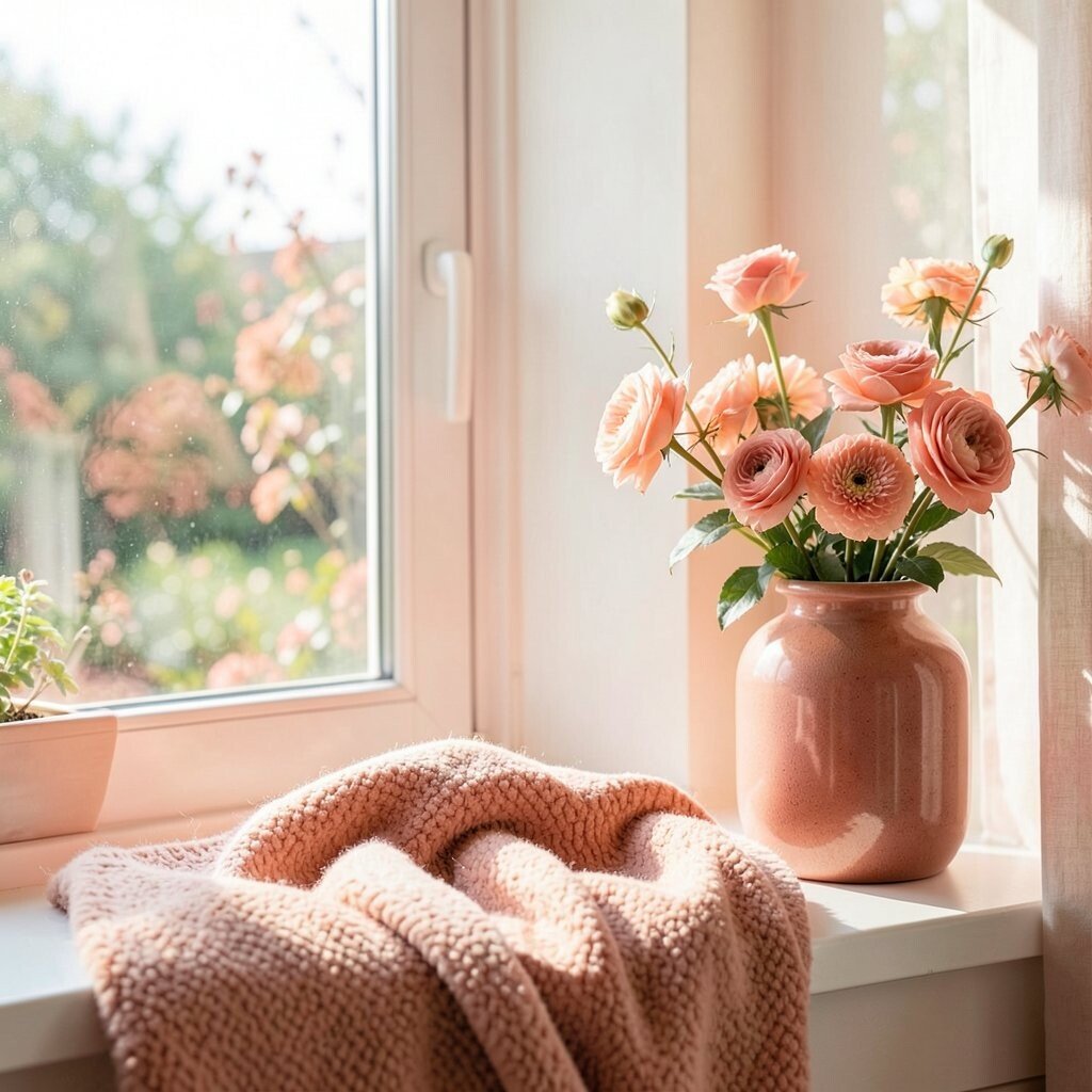
Coral blush adds warm, friendly color that feels like a hug. It pairs beautifully with creamy whites, light beige, and natural rattan textures, giving your space a welcoming glow.
Use coral on a painted sill or choose coral-colored planters and trays if you don’t want to paint. Add a few matching accessories, like a terracotta mug or a patterned curtain panel, to tie the look together.
Because coral sits between pink and orange, it’s unique in a way that feels gentle but still bright. For practical tips, pick a durable outdoor-friendly paint or sealant if your sill sees a lot of sun and moisture from watering.
4. Turquoise Splash for a Fresh Coastal Mood
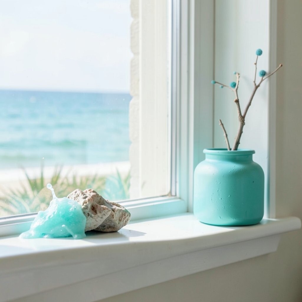
Turquoise is like a mini ocean view right at your window. It makes daylight feel brighter and gives the room a relaxing, vacation-like vibe.
Balance turquoise with sand-colored linens or warm wood furniture so the look feels grounded. To keep it practical, use sealed planters and a tray to catch water, since turquoise looks best when everything around it stays tidy and clean.
5. Grass Green for Lively Plant Energy
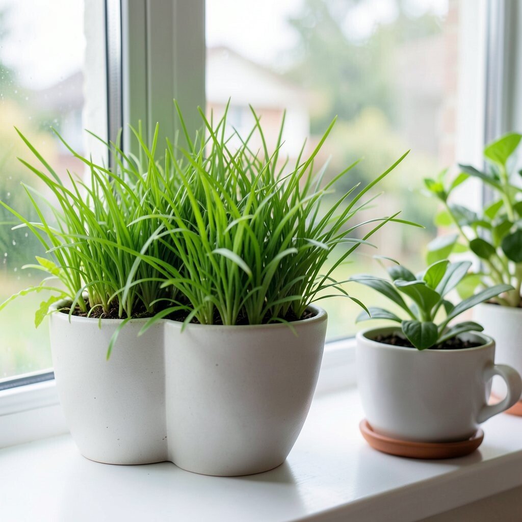
Grass green turns your windowsill into a little garden scene. The shade looks lively next to leafy plants and it makes greenery pop even more.
Choose a deeper green for a bold look or a light green for a calm, airy feel. If you’re styling, group plants by height and add one trailing plant to soften the edges.
For personalization, try green only on the front edge of the sill and keep the back neutral. This method can save paint and helps the design look intentional, even when your décor changes with the seasons.
6. Periwinkle Dreamy Blue for Soft Focus Style
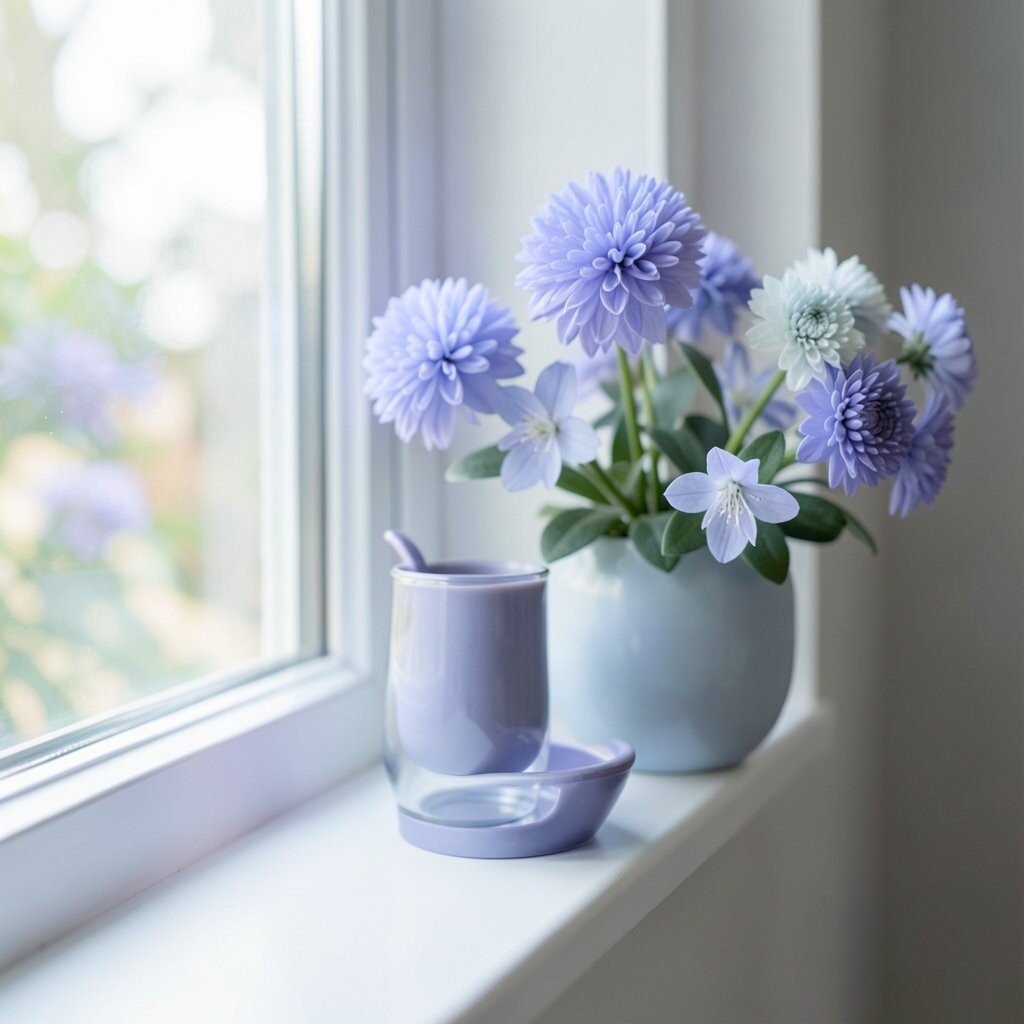
Periwinkle blue feels calm and dreamy, like a sky that stays gentle all day. It can make your room feel airy, especially if you have beige or cream walls.
Go for a satin blue on the sill, then add simple décor like pale ceramics or a light fabric runner. This color is also great for personalizing your seasonal style since it blends well with spring florals and cozy winter textures.
If you’re not ready to paint, try colored contact paper beneath a clear glass organizer. It keeps the bright look while protecting the surface from water spots and daily wear.
7. Bold Raspberry Accent for a Fun Gallery Feel

Raspberry brings a playful, artsy energy to your windowsill. It instantly adds personality, like a pop of color in a gallery where everything feels curated.
Use raspberry on a narrow section of the sill, such as the inner edge where light hits most. Then style with white or black planters to keep the look modern and easy to maintain.
For practical tips, choose a high-quality paint or a washable finish because bright colors show scuffs faster. If cost matters, paint a removable tray in raspberry and swap it whenever you feel like changing the vibe.
8. Sunny Gold for a Luxe, Warm Glow
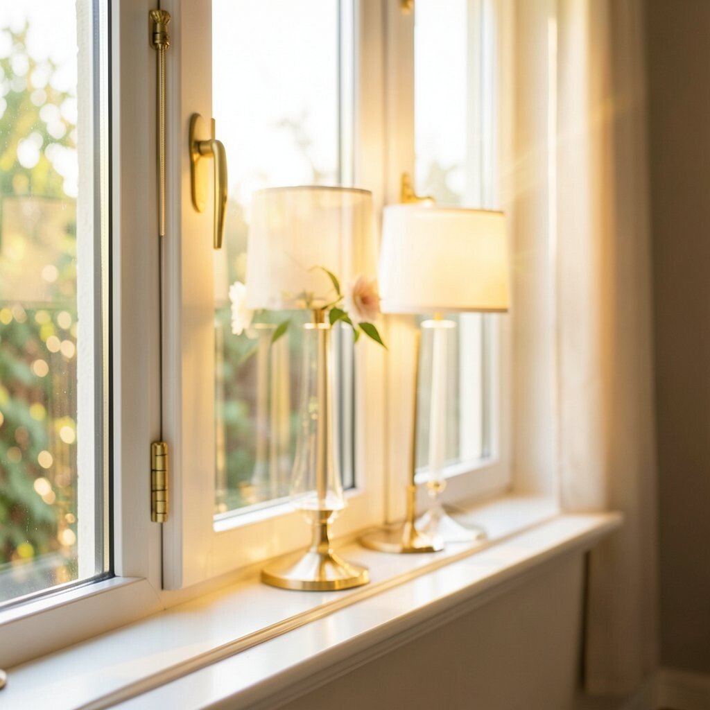
Gold on a windowsill looks like warm sunlight you can hold. Even a subtle gold tone can make your room feel more styled and a little more special.
Try metallic gold paint with a light hand so it doesn’t overpower the space. Pair it with warm creams, brass frames, or light wood, and keep décor simple so the gold stays the star.
9. Cornflower Blue for Classic Cheer

Cornflower blue is bright, friendly, and a bit nostalgic in the best way. It makes rooms feel clean and cheerful without turning them into a circus of colors.
Consider painting the sill, then adding patterned pots with tiny hints of white and soft navy. This creates a unique, coordinated look that still feels relaxed.
To keep things practical, use plant saucers and wipe drips right away because vivid blue can show water marks. It’s a smart option when you want a bright result with fewer items to style.
10. Bright White with a Color-Underlayer Twist

Bright white can still feel exciting when you add color underneath or around it. This approach keeps the sill looking crisp, while the colored accents make light bounce in a new way.
Try placing a thin colored panel under a clear organizer, or use a bright ribbon runner along the front edge. It’s a budget-friendly trick that lets you personalize the look without major work.
11. Sapphire Deep Blue for Dramatic Contrast

Sapphire is bold and dramatic, and it makes sunlight look extra striking. If your room already has neutral furniture, this deep blue can add instant depth and uniqueness.
Balance sapphire with warm textures like wood, cream textiles, and natural stones to keep the mood cozy. For practical care, seal the surface and keep planters on trays to avoid staining from water.
If you love trends, deep saturated blues are popular because they photograph well and feel modern. You can start small with a painted tray or a set of matching plant stands before committing fully.
12. Peachy Nude for Soft, Bright Comfort

Peachy nude creates a gentle brightness that feels welcoming and calm. It works well in bedrooms, reading nooks, and spaces where you want color without feeling overstimulated.
Style it with warm whites, oatmeal fabrics, and subtle patterns to keep the look cohesive. This shade is unique because it brightens the area while still feeling soft and forgiving.
For personalization, mix peach with light terracotta accents, like a small watering can or a ceramic figurine. To manage cost, consider repainting only one visible section and using removable décor for the rest.
13. Sky Gray with a Light Blue Hint

Sky gray sounds simple, but it can look surprisingly bright in the right light. It gives a modern, airy feel while the faint blue undertone keeps everything lively near the window.
Use it if you want color but also want something that blends with many styles, from modern to farmhouse. Pair it with chrome accents or pale wood for a clean, updated look.
To keep it practical, use a stain-resistant paint or a sealed finish, since gray tones can hide dust but still show fingerprints. This is a smart option if you like changing your décor often, because the sill color won’t fight your new accessories.
14. Neon Mint for a Fresh, Trendy Pop
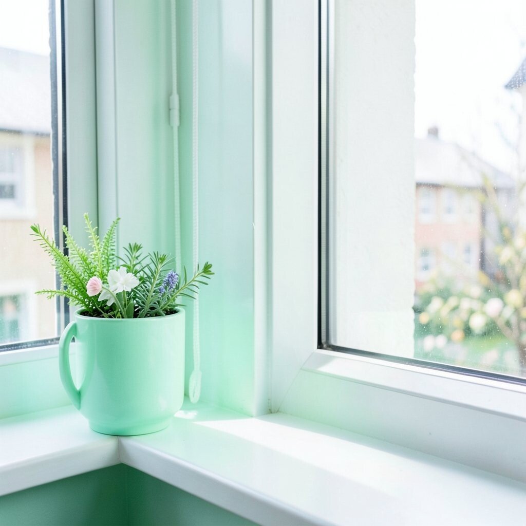
Neon mint is the kind of bright that makes you smile when you walk by. It feels playful and current, especially in rooms with white walls and simple furniture.
Use neon mint carefully so it stays stylish, not chaotic. A great approach is painting just the front edge of the sill or using mint planters and a matching watering tray.
For cost considerations, try a removable shelf liner in neon mint beneath a clear organizer. You get the look quickly, and you can switch it out later when your taste changes.
15. Cherry Red for High-Impact Cheer
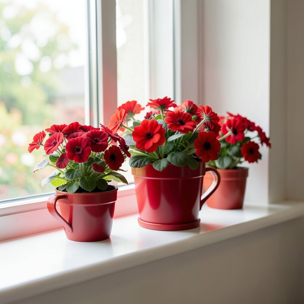
Cherry red brings instant excitement and makes your window area feel like a bold focal point. It can add personality to a room that feels too plain or too quiet.
Pair cherry red with neutral décor like black, white, or warm gray so it looks sharp. Add small touches such as red blooms, a red candle, or a patterned throw pillow to connect the sill to the rest of the room.
Because red can be intense, consider using a matte finish to soften it and reduce glare. Keep the practical side in mind by using coasters and drip trays, since bright colors show wet spots easily.
16. Lavender Soft Purple for Calm Creativity

Lavender soft purple feels calm, creative, and gentle enough for everyday living. It can make your windowsill look dreamy without being too dramatic.
Style with white ceramic pots and a few purple-toned flowers or herbs to create a natural match. This color is especially unique when paired with silver frames or light gray walls.
If you want an easy personalization trick, alternate lavender accessories with plain greenery so the sill stays balanced. For practicality, use durable plant saucers and keep soil mess contained with a small tray liner.
17. Butter Yellow with a Vintage Twist
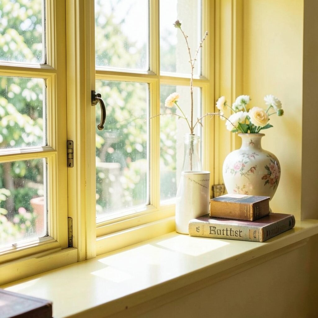
Butter yellow has a warm, vintage feel that looks inviting and friendly. It makes your windowsill feel like a little breakfast nook, even if you don’t eat there.
Look for soft matte finishes and warm-toned décor, like striped fabrics or wood shelves, to highlight the vintage vibe. This shade is great for adding uniqueness because it’s bright but not as loud as neon yellow.
To keep costs down, try a peel-and-stick strip on the sill front, then style with a matching napkin holder or small tin. It’s an easy way to personalize your look while protecting your surface from daily wear.
18. Warm Chocolate Brown for Grounded Brightness
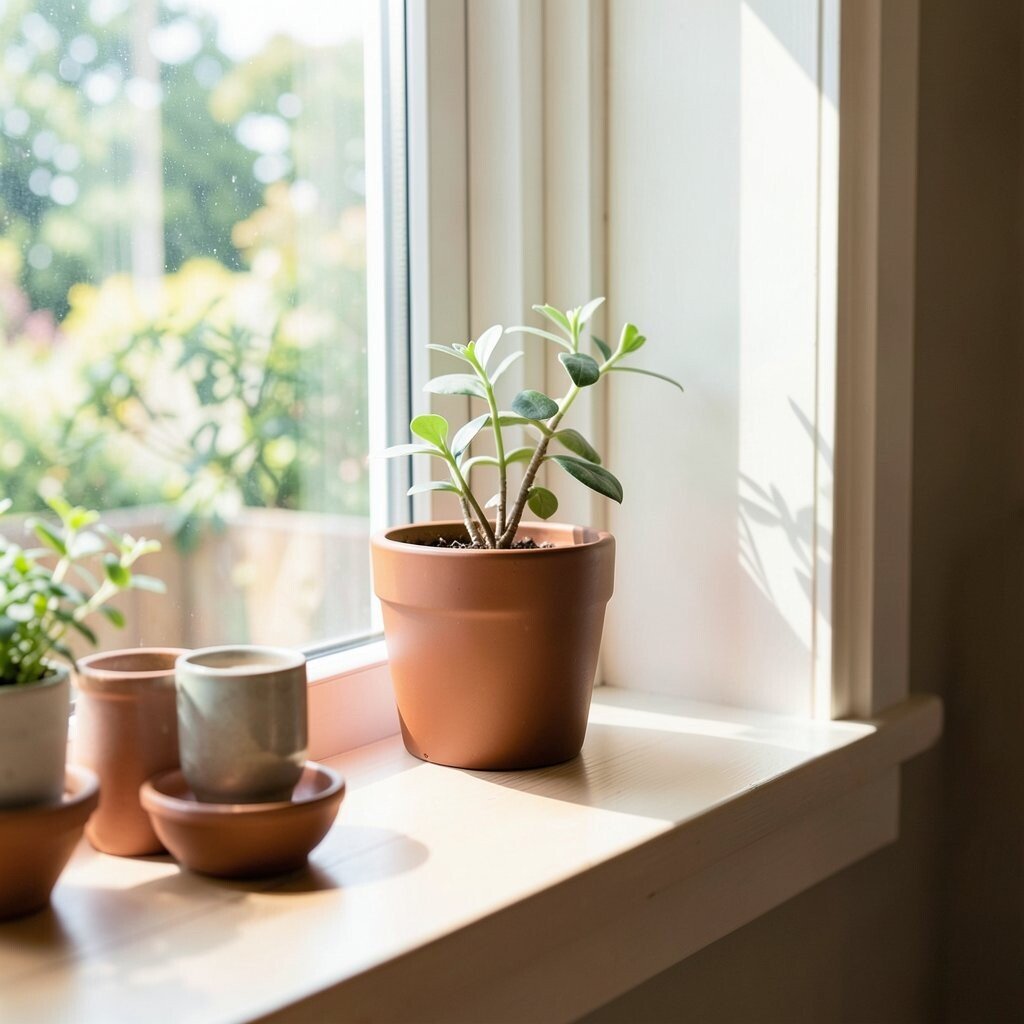
Warm chocolate brown might not be the first color you think of, but it can make bright items look even brighter. It creates a cozy base that makes plants, flowers, and colorful décor stand out.
Pair brown with colorful planters in teal, coral, or yellow for a balanced contrast. This approach feels unique because it’s not just bright color, it’s bright color on a grounded foundation.
For practical tips, use a sealed finish to prevent moisture damage, especially if you water plants near the sill. You can also refresh the look with a small brown tray instead of painting the whole sill, which helps with budget and flexibility.
19. Bright Navy with White Polka Details
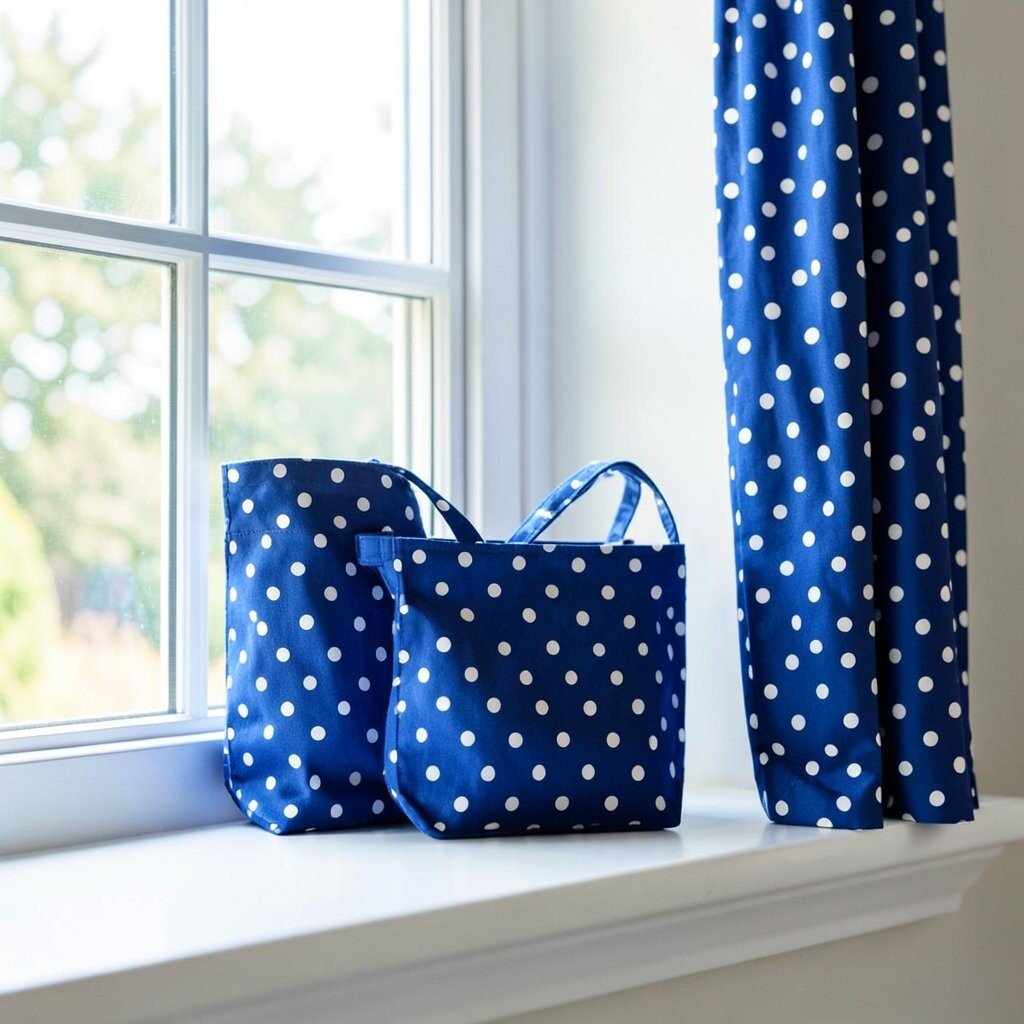
Bright navy can look crisp and modern, and white polka details add charm. This combination feels playful, like a cute pattern you’d want on a favorite shirt.
Try painting the sill navy, then use painter’s tape to form simple dots or use removable vinyl dots for a clean look. The benefits include better light contrast, plus a design that feels intentional even with minimal décor.
20. Emerald Statement Green for a Bold Focal Point
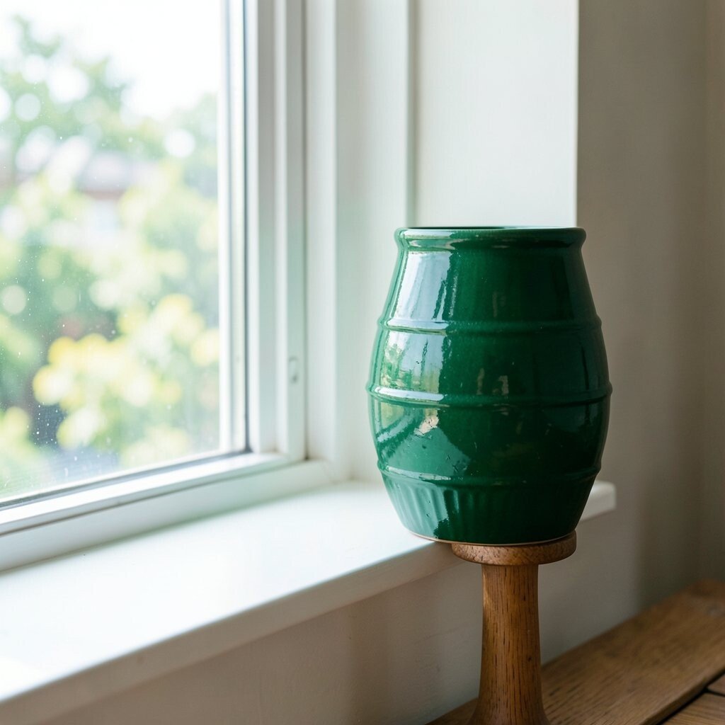
Emerald statement green turns the windowsill into the visual star of the room. It feels rich, modern, and confident, especially when sunlight pours in.
Style around it with neutral décor and one or two complementary colors like gold or cream. For practical care, use sealed paint and keep plants on trays, because emerald can show dust and streaks more than lighter shades.
To personalize, add a small rotating display such as a seasonal wreath, a framed print, or a stack of colorful books. If cost is a concern, begin with a large painted tray or a shelf liner, then upgrade later if you love the look.