
Stairs are the quiet workhorse of your home, and color can make them feel inviting. The right shade also helps wear patterns look intentional instead of random.
Below are classic color ideas with practical ways to match them to your space, your budget, and your daily life.
1. Warm White With Soft Cream Undertones
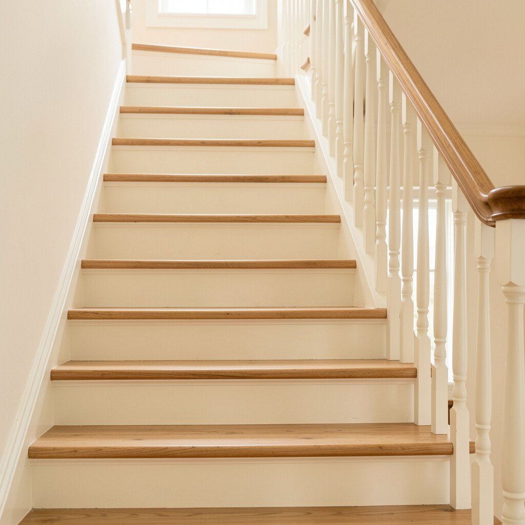
A warm white with a gentle cream undertone can make stairs feel airy, even in narrow hallways. You’ll notice how light bounces off the steps and treads without looking harsh.
This choice is great when you want a clean look that still feels cozy. Consider painting the risers and using a slightly glossier finish on the treads for easier cleaning and better scuff resistance.
To personalize it, pair the stair color with a classic runner pattern or a simple solid carpet. For a budget-friendly upgrade, refresh banister spindles and handrails in the same warm family so everything feels tied together.
2. Timeless Greige That Bridges Everything
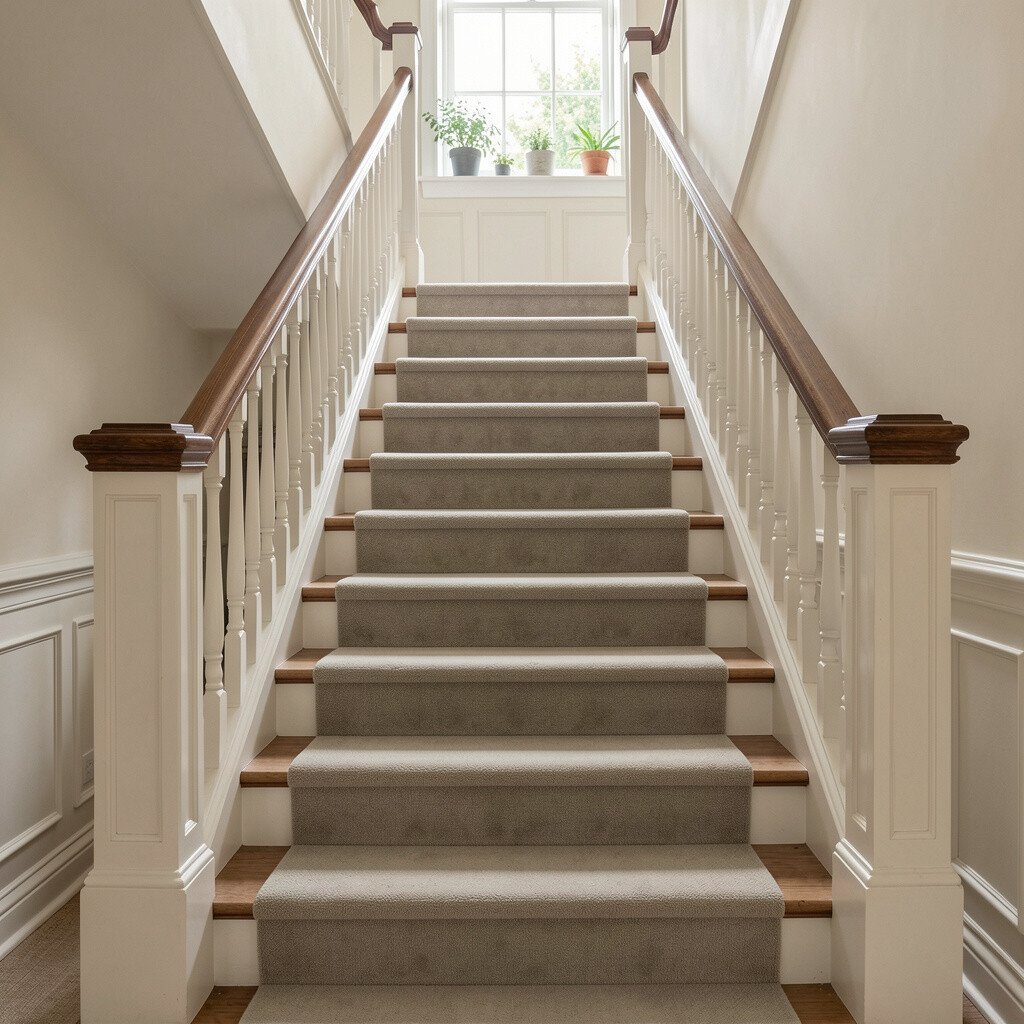
Greige sits in that sweet spot between beige and gray, so it works with many wood tones and metals. On stairs, it can hide everyday marks better than true white.
You get a polished, calm look that fits both traditional and modern homes. If your walls are already neutral, this color helps the stairs look naturally “meant to be there” instead of oddly mismatched.
For practical results, pick a paint that resists scuffs and scrub marks, especially on the tread surfaces. Match your railing finish to your hardware, like oil-rubbed bronze or brushed nickel, to keep the classic vibe consistent.
3. Espresso Brown For Rich, Grounded Charm

Espresso brown brings a deep, grounded feel that instantly makes a stairway feel special. The darker color adds contrast to lighter walls and makes railings stand out in a beautiful way.
It’s also unique in the sense that it can look elegant or cozy depending on lighting. In warmer bulbs, the brown reads rich and welcoming, while cooler light can give it a sleek tone.
If you want a practical approach, consider painting risers espresso and using a durable topcoat on treads to handle foot traffic. When you want personalization, add a runner in muted tones like tan, rust, or olive so the stairway feels designed rather than plain.
Budget-wise, darker paints can reduce the need for multiple color coats if your stairs are prepped well. Still, take sanding and primer seriously, because smooth prep helps the finish look crisp over time.
4. Classic Slate Gray With a Slight Blue Hint
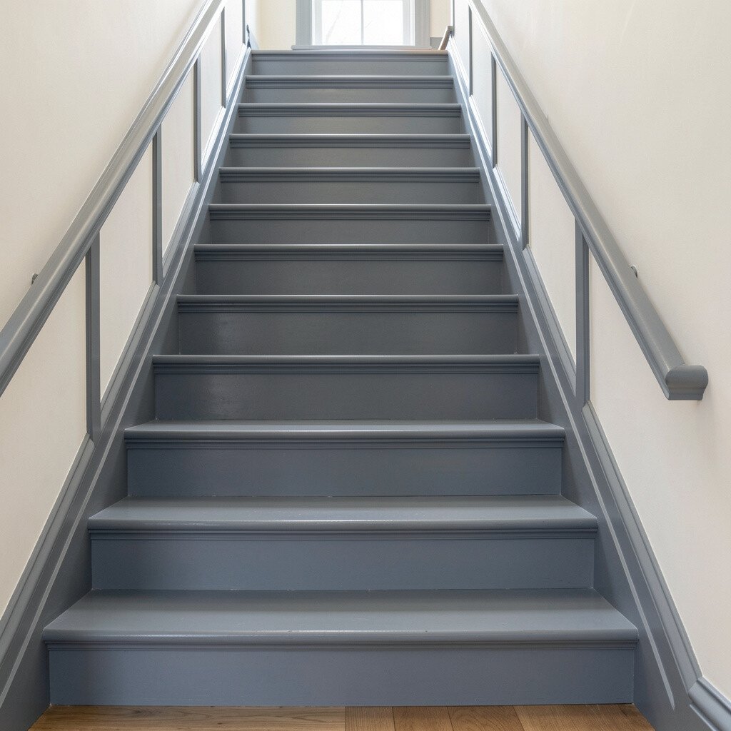
Slate gray with a faint blue hint feels classic yet fresh, like weathered stone. It gives stairs a calm, steady look and pairs nicely with many wall colors.
This shade tends to camouflage small scuffs, which is helpful if you have kids, pets, or lots of daily traffic. Use a satin or semi-gloss finish on high-touch areas so cleaning stays easy.
To make it personal, frame the edges of steps with a thin contrast strip in a warmer tone. You can also coordinate the railing by painting spindles in a complementary gray or keeping them in white for a crisp, traditional contrast.
5. Soft Sage Green For a Fresh Classic Mood
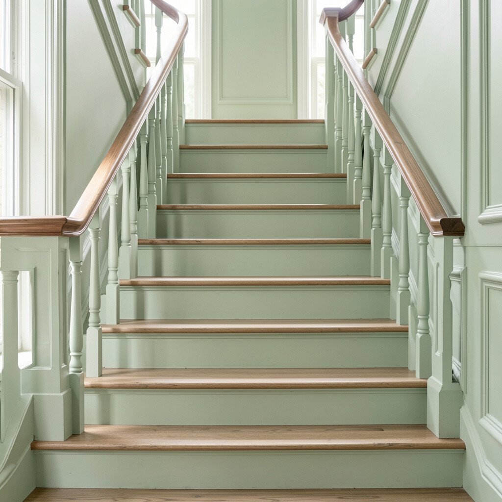
Soft sage green gives your stairs a gentle, classic feel without going too bold. It can make the whole hallway look calmer, especially when paired with natural wood.
Because it’s muted, it hides small marks better than you might expect and doesn’t scream for attention. This is a great choice if you like color but want it to feel timeless and livable.
For practical tips, test the shade in daylight and evening light, since green can shift depending on your bulbs. Add personalization with a neutral runner and warm brass hardware, like matching light fixtures or cabinet pulls.
6. Antique Gold Accents Over Neutral Walls
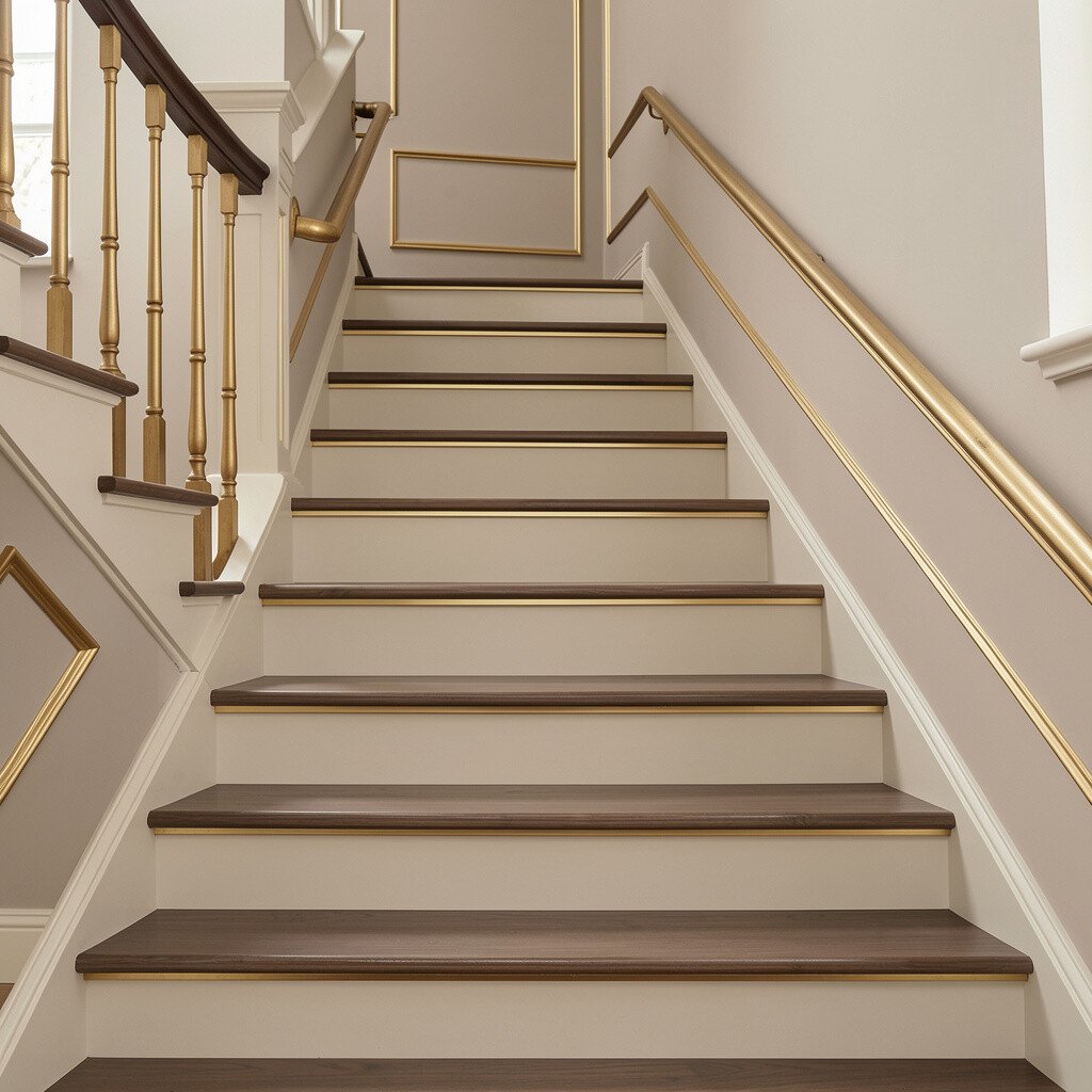
If you want classic stair color ideas with a twist, use a neutral base and add antique gold accents where light hits. A handrail, newel posts, and trim can look elegant when they’re finished in a warm, aged metallic tone.
This approach keeps the stairway timeless while still feeling special, because gold accents catch light as you move. It also supports practical living since metal finishes can be easier to wipe clean than paint alone.
To keep it balanced, choose a base color like cream, greige, or light taupe, then use antique gold only on railings and select details. For cost considerations, you can update the look by painting the trim and leaving the treads alone, then upgrade later if you choose.
7. Natural Maple Tones With a Clear Protective Finish
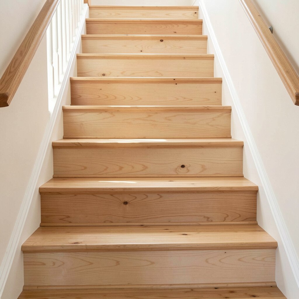
Staying close to natural wood is classic, warm, and easy to match with almost anything you already own. Light maple tones brighten stairs and make the grain look clean and welcoming.
It’s also a uniqueness win because no two wood grains look exactly the same. If you love the feel of wood, you can make it practical by applying a durable clear topcoat made for floors and stairs.
For practical tips, clean thoroughly, sand lightly for adhesion, and apply a protective finish in thin, even coats. Personalization is simple, too, since you can warm or cool the wood tone by choosing a slightly tinted clear coat.
8. Chalky Light Taupe For Cozy, Low-Stress Style
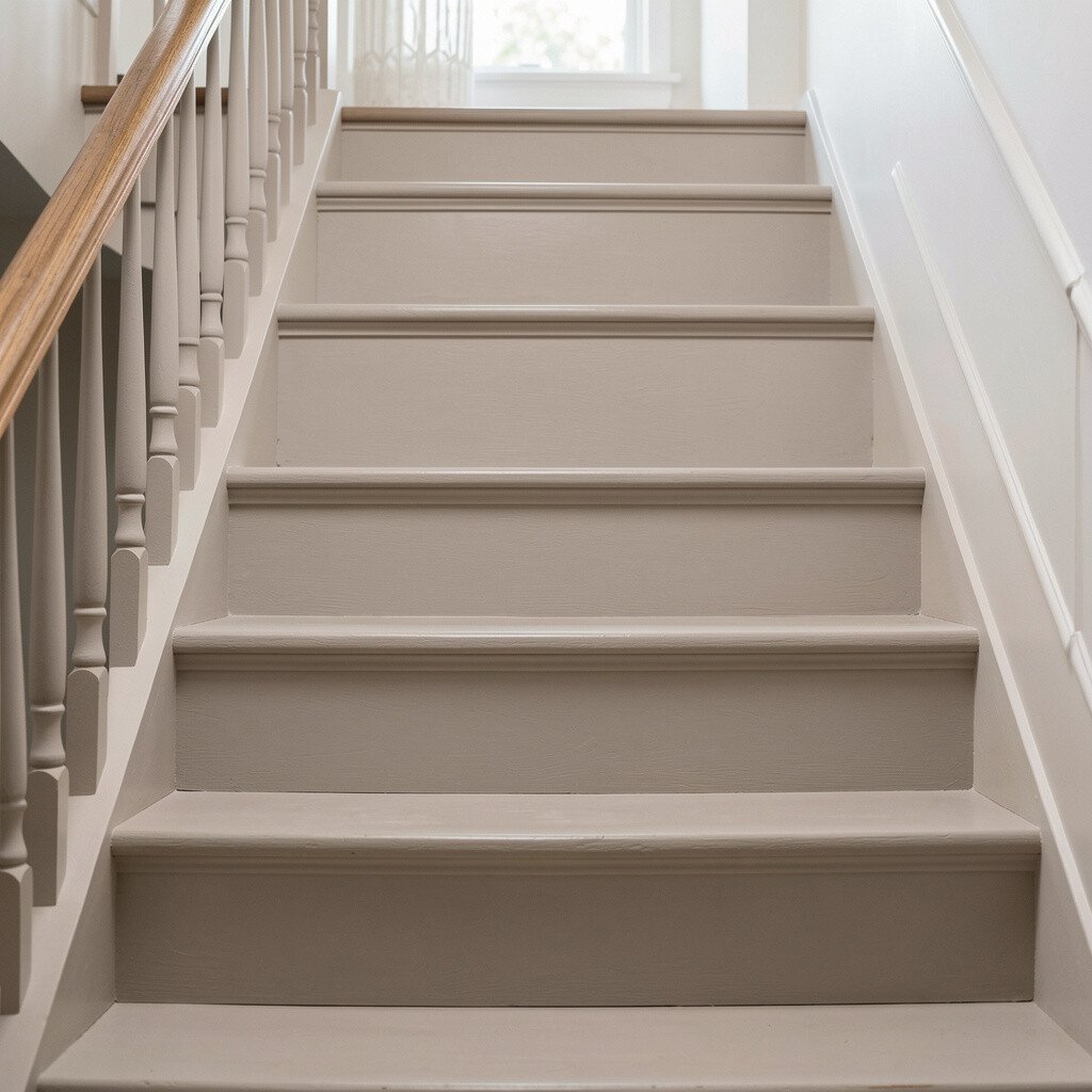
Chalky light taupe looks soft and comfortable, like a well-loved neutral. It gives stairs a classic backdrop while still adding warmth to the hallway.
You get benefits for real life because taupe hides dust and small smudges better than many lighter shades. It also works with both warm and cool metals, which helps if you haven’t updated everything yet.
To personalize, consider a runner with subtle texture or a vintage-inspired pattern that won’t date quickly. If you’re thinking about cost, taupe is forgiving during repainting, so touch-ups blend more easily than high-contrast colors.
9. Navy Blue For A Classic, High-End Contrast
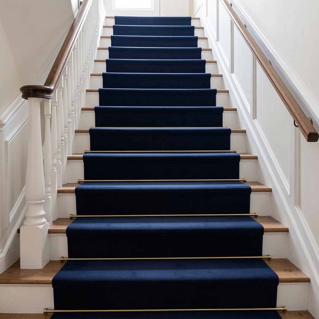
Navy blue feels timeless and a bit dramatic, like a traditional library or an old-world front door. On stairs, it creates crisp contrast, especially against white walls or light flooring.
This color is unique because it adds depth without needing bright decor to look “finished.” Navy also pairs well with classic materials like wood, brass, and dark stained railings.
For practical tips, choose a paint formulated for trim and railings, and use a tougher finish on treads if you paint them. If you’re worried about wear, you can paint only the risers navy and keep treads a lighter color with a protective coating.
Personalization is easy with accessories like warm cream runners and simple wall art in muted tones. When budgeting, remember that darker colors can show uneven prep, so take time sanding and priming for a smooth, even finish.
10. Charcoal Black For Bold Traditional Drama
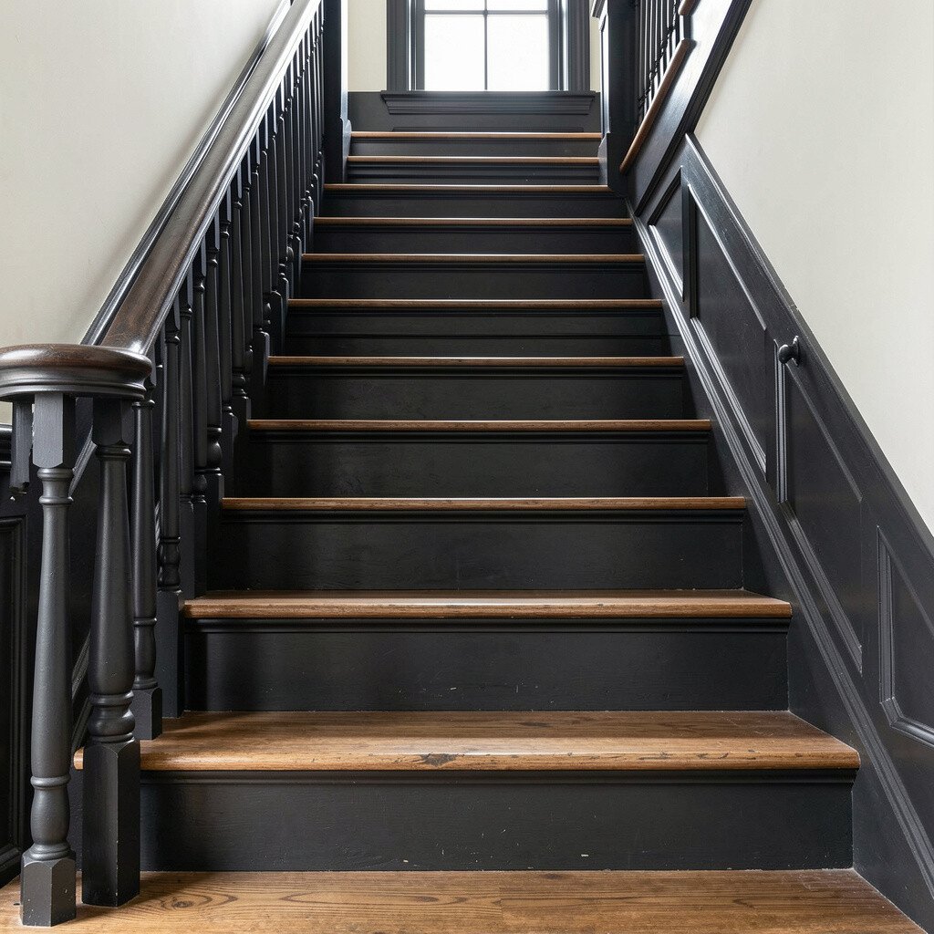
Charcoal black gives stairs a sharp, classic drama that feels confident and stylish. The color makes railings look crisp and can turn an ordinary stairway into a statement.
This choice is great for modern-traditional homes, especially when paired with light walls and warm lighting. It also helps hide some scuffs, although you’ll still want a durable finish on walking surfaces.
For practical tips, use a semi-gloss or satin product rated for high traffic, and plan for extra prep so the final look stays smooth. Personalize the vibe by adding a patterned runner or keeping the runner minimal and letting the color do the talking.
11. Classic Brick Red For Warmth That Feels Vintage
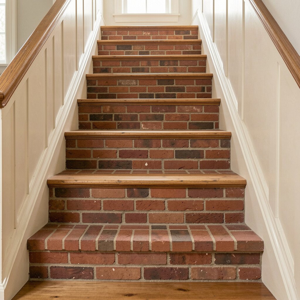
Brick red adds a warm, vintage feel that can make a hallway feel lived-in and welcoming. It works beautifully with cream walls, natural wood, and soft gold accents.
This stair color idea feels unique because brick red has an earthy character that doesn’t look trendy for a short season. It can also make the space feel cozy in colder months while still looking rich and grounded year-round.
For practical tips, consider painting the risers brick red and using a more neutral tone on treads for balance and easier maintenance. Add personalization with a runner in tan or muted rose so the tones feel coordinated rather than busy.
Cost-wise, brick red may take a bit more attention during prep and priming to avoid blotchiness. If your stairs have stains, primer is your friend, and a quality primer can save you from repainting later.
12. Soft Oyster White With Traditional Trim Contrast
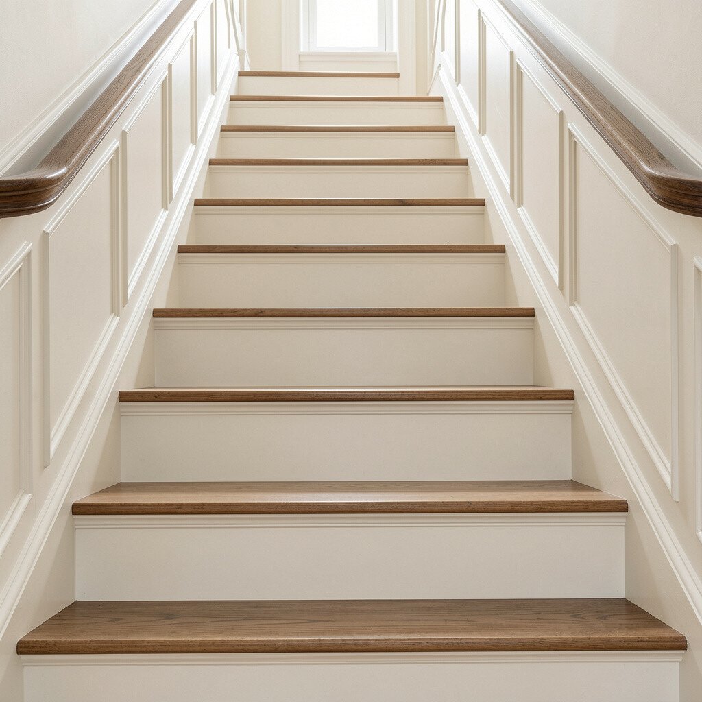
Soft oyster white is a classic favorite because it feels creamy and elegant without leaning too yellow or too gray. It creates a bright stairway that still looks gentle and timeless.
You’ll benefit from a color that feels forgiving, especially if you have changing decor over the years. Oyster tones also look great with traditional trim, since the color stays refined even when you add patterned textiles.
To personalize, paint the handrail and balusters in crisp white or warm wood stain to create a clean frame. If you want a practical shortcut, focus on high-visibility areas first, like the risers, trim, and rail, then decide later about tread coverage based on wear.
For cost considerations, choose a durable finish on treads and a standard wall-and-trim paint on risers depending on your traffic level. This layered approach can help your budget last longer while keeping the staircase looking polished.