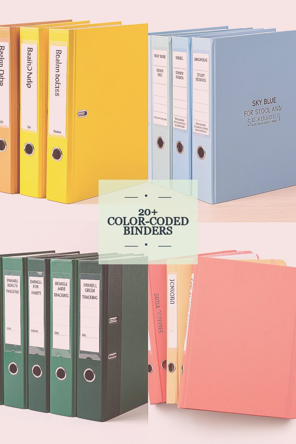
Your desk can feel calmer in a single afternoon. Pick the right binder colors, and your system starts working even before you do.
Keep reading for practical ideas that fit real life, from school notes to home projects.
1. Sunny Yellow for Brain-Dump Notes

Grab a bright yellow binder and feel the energy it brings to your workspace. The cover looks cheerful, and the pages inside feel easier to open when you are ready to write fast.
Use this binder for quick notes, reminders, and messy ideas you do not want to lose. If you attach sticky tabs, you can sort topics as you go without slowing down. Try a simple color match where each section has a small yellow label so you always know where the “in-progress” stuff lives.
2. Sky Blue for School and Study Sessions
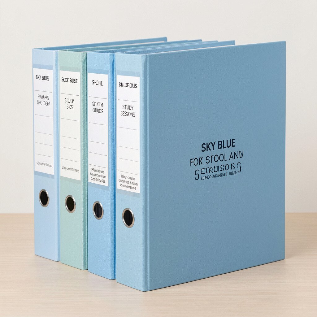
A sky blue binder looks clean and calm, like quiet morning light. It signals focus, so it is a great choice for classes, reading notes, and assignment tracking.
Keep your study schedule pages here, along with graded worksheets and key summaries. For practical organization, put a clear plastic sleeve on the front for any weekly handouts, then slide completed items into the right section afterward.
3. Emerald Green for Health, Habits, and Tracking
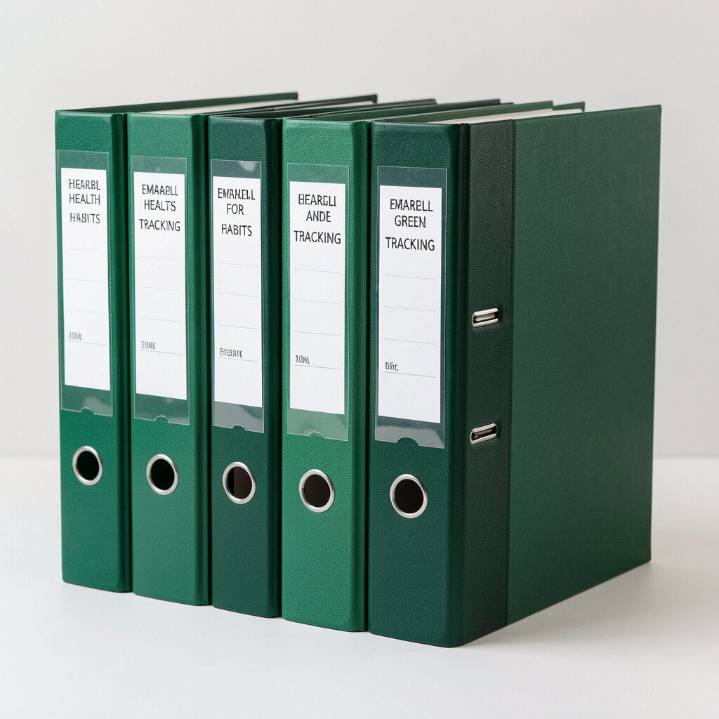
When you hold an emerald green binder, it feels like you are taking care of your future self. The color stands out without being loud, which helps during busy weeks.
Use it for meal plans, workout logs, sleep notes, and doctor visit papers. A simple tip is to add a page for weekly goals right at the front, then keep all routine check-ins in the same place so you do not hunt for them later.
For personalization, add a small paper “habit map” sheet and update it monthly. Many people like using color-coded inserts now, and green fits perfectly with wellness-themed organization trends.
4. Coral Pink for Creative Writing and Journals
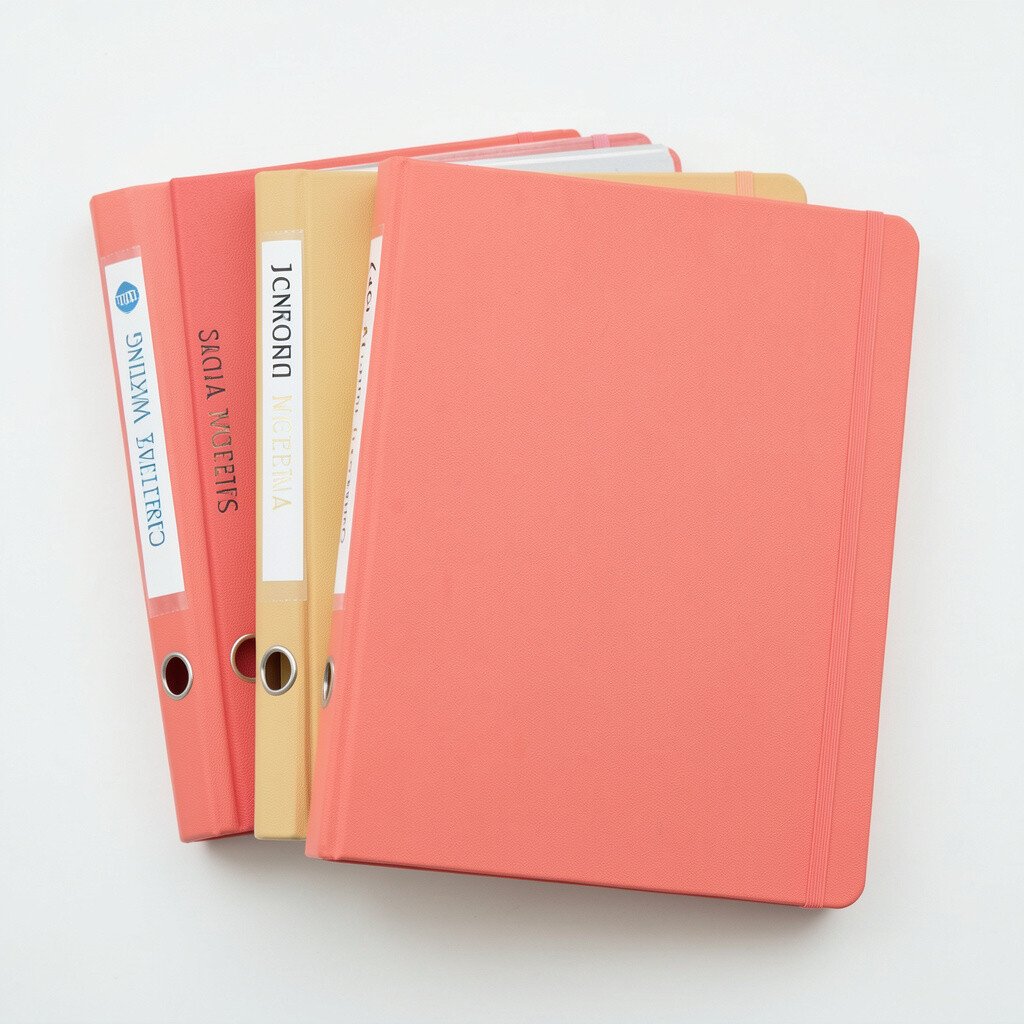
Coral pink makes your binder feel warm and expressive the moment you see it. It is especially good for drafts, storytelling ideas, and reflections that you want to revisit.
Try keeping each writing project in its own set of pages with a divider labeled by date or theme. If you like variety, use different shades of pink inside with tab colors so you can flip to the right mood quickly.
5. Deep Navy for Taxes, Receipts, and Proof
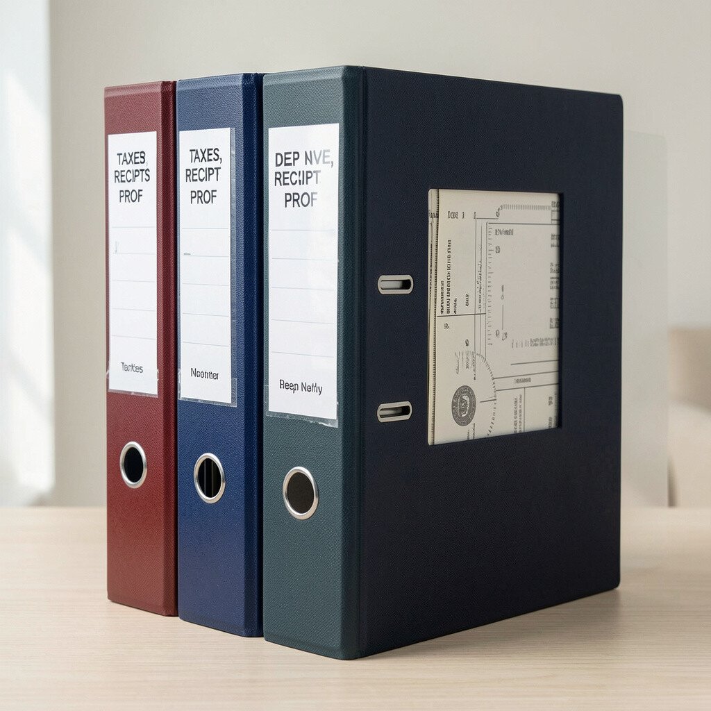
A deep navy binder looks serious in the best way, like you are ready for anything. It is a strong visual anchor for documents you only need when it matters.
Store receipts, tax forms, warranty cards, and important proof of purchase in this binder. For practical tips, use page protectors and keep a mini index on the first pages so you can find items fast.
If you want a trend-friendly setup, consider printing QR codes for digital copies of documents and placing them in the sleeve area. Navy often pairs well with a “keep it safe” mindset, and it helps you feel confident about staying organized.
6. Forest Teal for Home Improvement and Projects
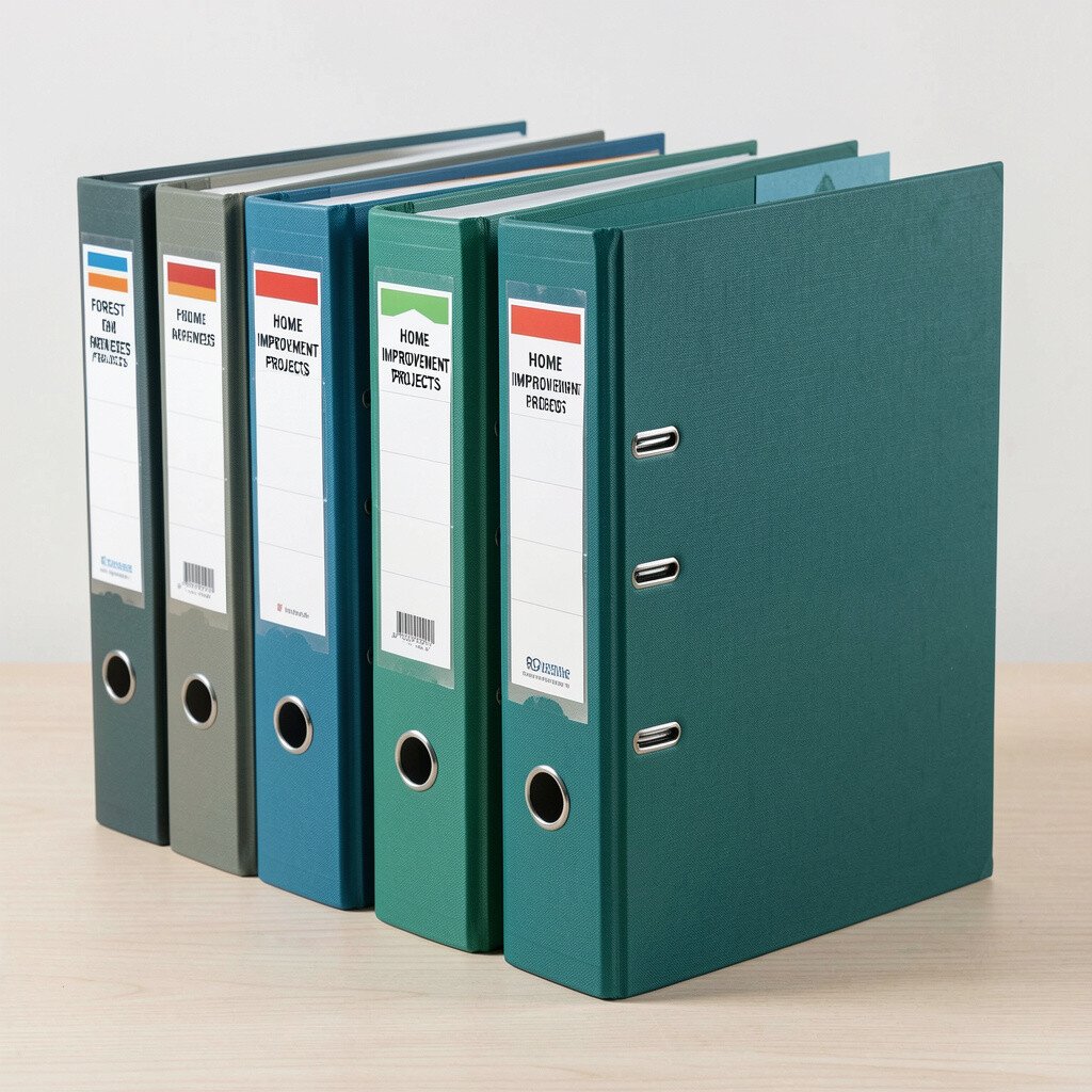
Forest teal gives off a steady, hands-on vibe, like a tool bench with everything in reach. The color makes the binder feel practical, not just pretty.
Use it for manuals, project checklists, paint color samples, and “to buy” lists. Put a pocket folder at the front for receipts from hardware stores, then add sections for each room so future you can plan faster.
To personalize it, add a printed timeline for the project stages and keep it near the front cover. Teal is a popular choice in modern home organization because it feels natural and updated.
7. Burgundy for Legal Papers and Life Documents
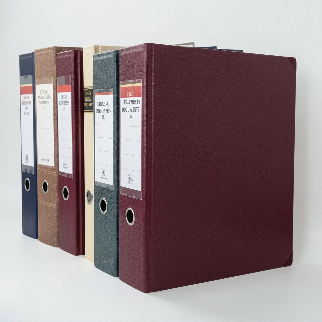
Burgundy looks rich and solid, which helps you treat important documents with care. It also makes the binder feel distinct from the bright colors you use for daily tasks.
Keep copies of leases, contracts, IDs, and forms here, and always store them in page protectors. A good practical method is to group documents by year, then add a tab so you can flip to the right set in seconds.
8. Bright Orange for Home Chores and Weekly Tasks
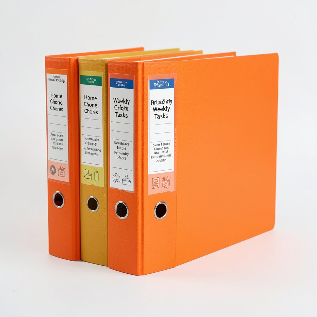
Orange has a “get it done” feeling, which is perfect for chore plans and weekly routines. Seeing it on the shelf reminds you that organization can be active, not passive.
Use this binder for cleaning schedules, maintenance checklists, and household call notes. For better usability, keep one section for daily tasks and another for monthly projects, and put the current week sheet right in the front pocket.
9. Lavender for Family Memories and Photos on Paper
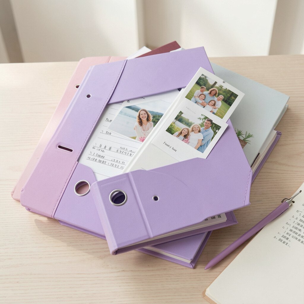
Lavender brings a soft, nostalgic mood, which is great for saved letters and printed pictures. The binder cover invites you to slow down and remember.
Store scanned photo prints, printed ticket stubs, and handwritten notes here. Add a divider for each year, and consider using different tab styles so the memories feel curated.
Personalization can be simple, like adding a small quote page at the front or using decorative stickers in the margins. Many people are leaning into memory-first organizing lately, and lavender supports that gentle trend.
10. Charcoal Gray for Tech Setup and Device Notes
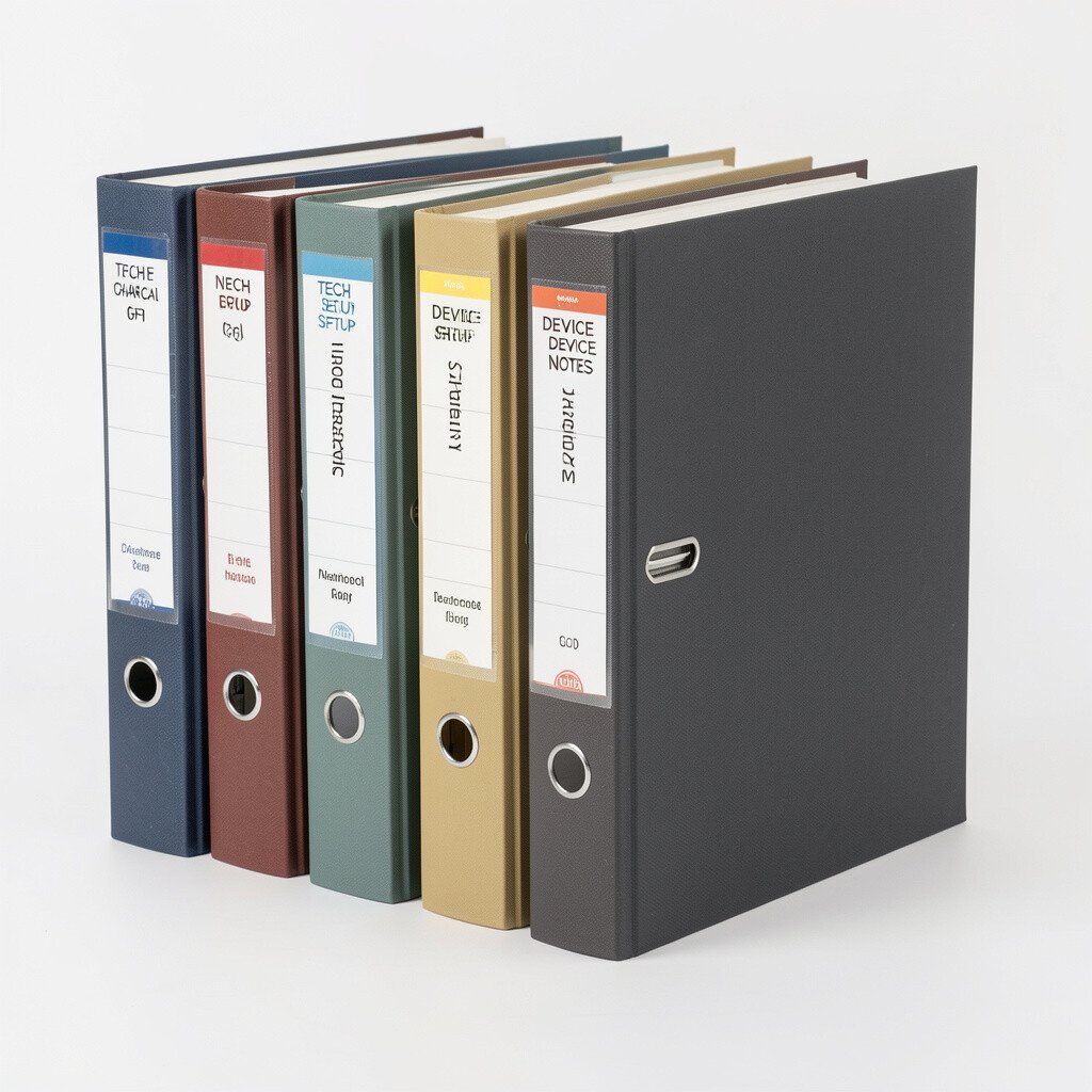
Charcoal gray feels sleek and modern, which fits well with anything digital. It is also a great color if you want your binder system to look tidy and professional.
Put manuals, Wi-Fi passwords stored in a secure note page, troubleshooting checklists, and device warranty info inside. For practical tips, keep a clear sleeve for cables and a “device map” sheet that lists what each gadget does.
11. Lime Green for School Projects and Experiments
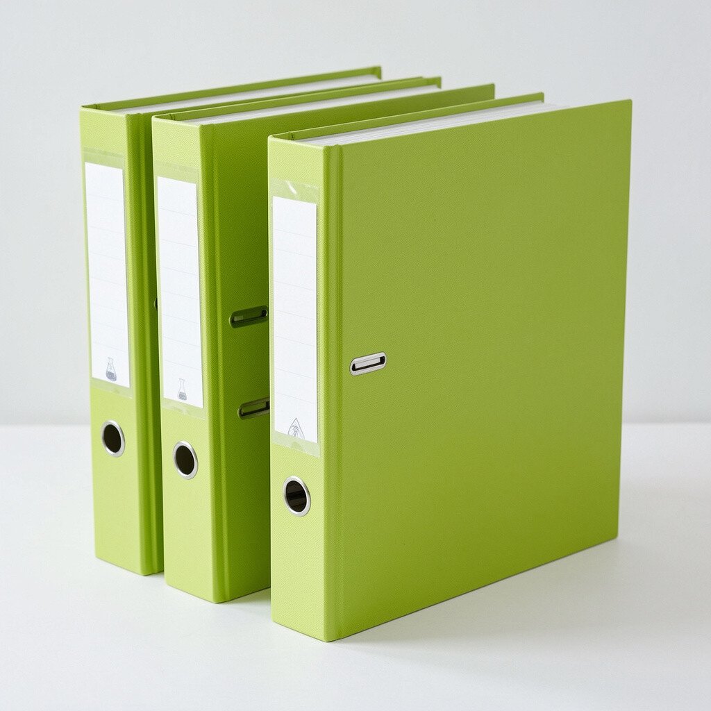
Lime green is playful and noticeable, so it works well for projects that change often. Every time you reach for it, your brain knows you are switching into making mode.
Use it for science notes, art project plans, and assignment drafts. Keep a running “materials list” sheet in the front so you can update it each time you start a new experiment.
If you want to personalize the binder, add a checklist page with date lines and a space for quick results. Lime also matches current student trends of color-coded sections that keep group work organized.
12. Teal Blue for Travel Plans and Itinerary Pages
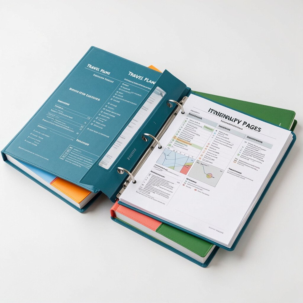
Teal blue looks like ocean air, and it makes travel planning feel lighter. It is a good choice when you want your trip details to feel organized but still exciting.
Store itineraries, booking confirmations, packing lists, and local maps in page protectors. A practical tip is to keep an “arrival day” pocket at the front with everything you need for check-in so you do not dig through pages while tired.
13. Silver for Inventory, Lists, and Home Catalogs
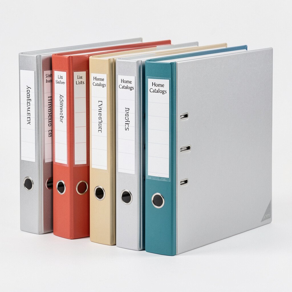
A silver binder gives a neat, organized feel, like you are keeping a smooth record of your world. It also pairs nicely with clean handwriting and simple layouts.
Use it for inventory lists, appliance records, and item tracking for insurance. If you want it to feel extra useful, store photos of items and a short description sheet in the same section.
Personalization could include a repeating format where each entry has date, purchase details, and replacement cost. People are increasingly building home inventories for peace of mind, and a silver binder fits that modern responsibility.
14. Royal Purple for Goals and Vision Boards
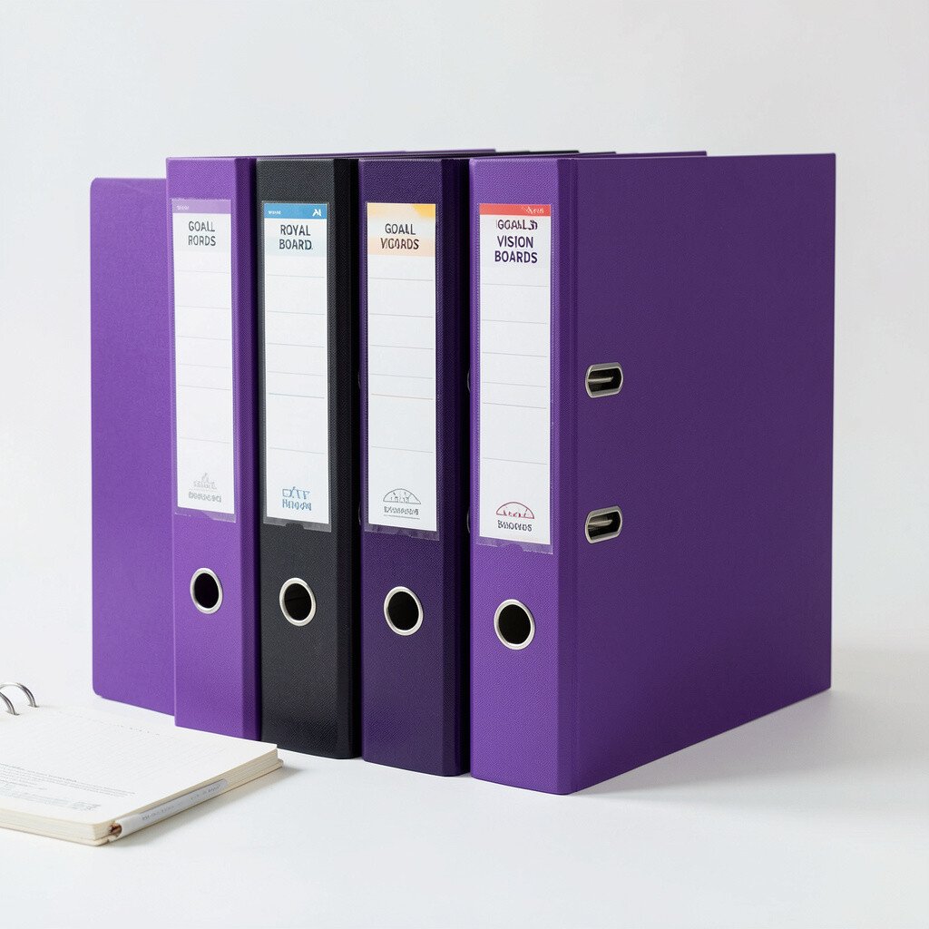
Royal purple feels bold and motivating, like a reminder that you can aim high. It is a great binder for your goals because it looks inspiring even when you are not in a goal-setting mood.
Keep vision pages, goal trackers, budget goals, and progress notes inside. To make it actionable, add a monthly review section so you can look back and adjust plans without starting over.
15. Golden Yellow for Budgets and Spending Plans
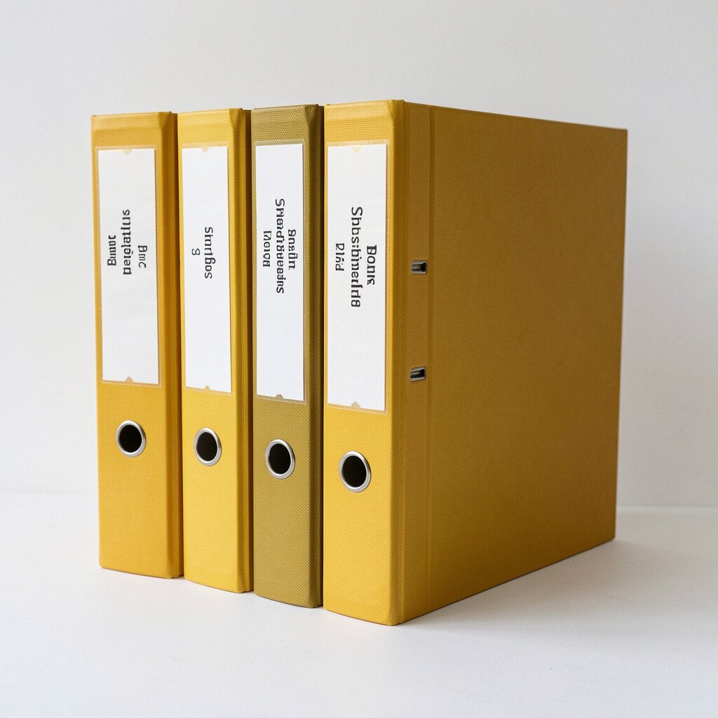
Golden yellow feels optimistic, and it can make money planning feel less stressful. The binder becomes a friendly place to write down numbers without dread.
Store budget spreadsheets printed on paper, monthly expense checklists, and savings plans. For practical organization, keep a front sleeve for the current month’s spending sheet so it stays easy to grab.
To personalize, add a small “win of the month” page where you note what you did well. Yellow also fits current planning trends where people mix structure with encouraging visuals.
16. Sky Gray for Work and Professional Notes
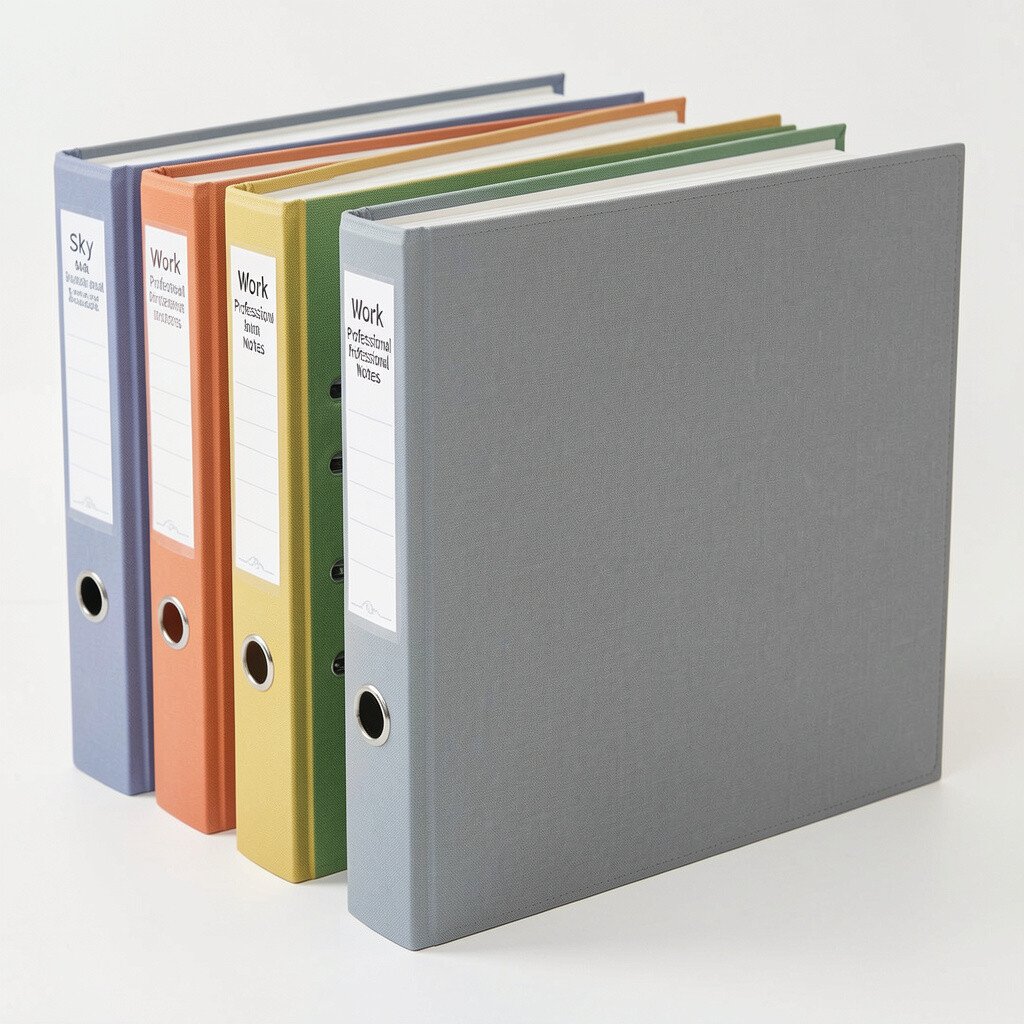
Sky gray reads as calm and focused, which helps you switch into work mode. It also looks professional, so it travels well between home and office.
Use it for meeting notes, workflow checklists, and training documents. A practical tip is to keep a section for “open tasks” with dates, so follow-ups never get buried.
17. Bright Red for Forms, Signatures, and Action Items
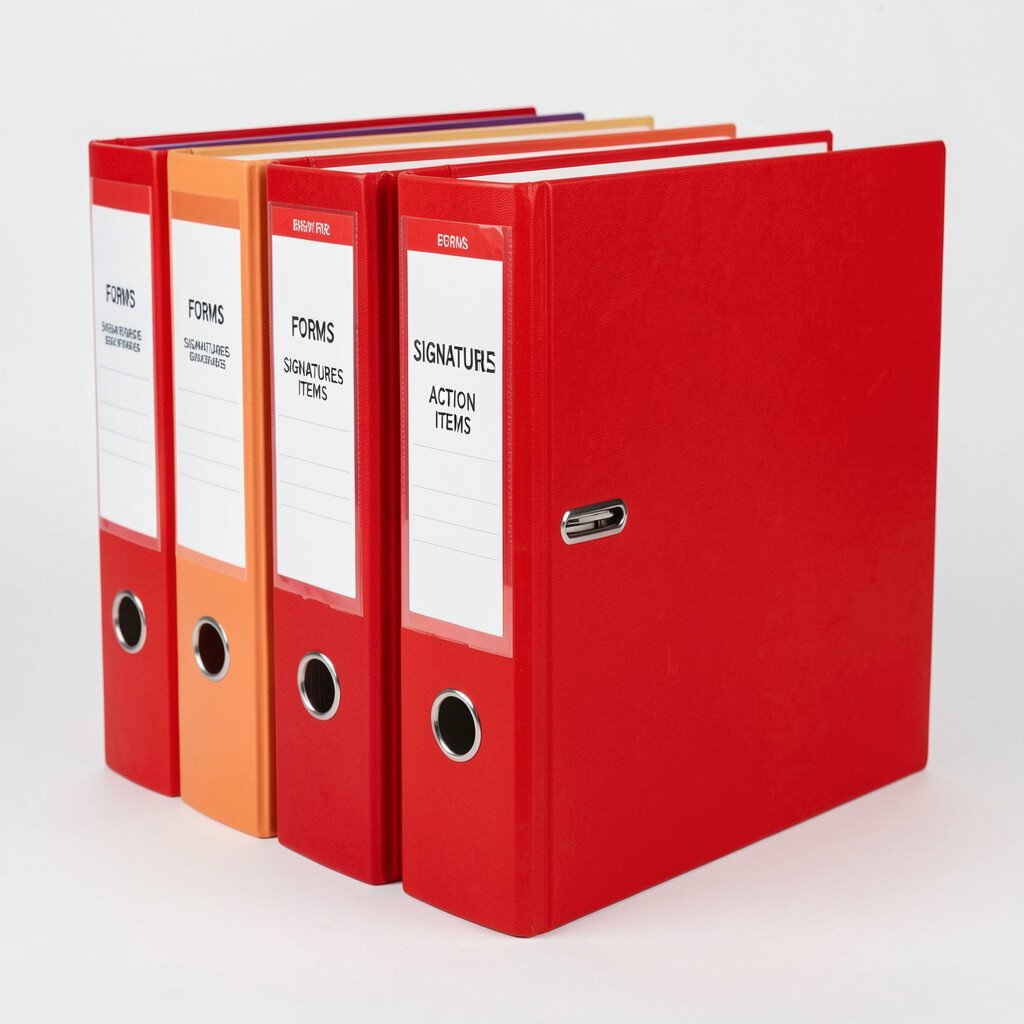
Bright red is impossible to ignore, and that makes it perfect for urgent paperwork. When you see it, you know something needs attention soon.
Use this binder for permission slips, signed forms, deadlines, and action logs. For practical tips, keep a single page called the action sheet at the front and update it weekly.
If you want a personalization twist, use red tabs for priority categories and softer colors for supporting documents. People also love using high-contrast colors now because it makes fast scanning easier on busy days.
18. Soft Beige for Cooking Recipes and Kitchen Reference
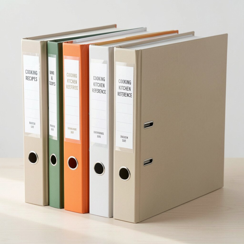
Soft beige feels cozy and inviting, which is perfect for recipe binders you actually use. It also hides small splatters better than bright colors, which matters in a kitchen.
Store handwritten recipes, meal plan pages, and cooking conversion notes here. For practical tips, put frequently used recipes near the front and keep the rest sorted by category like breakfast, dinner, or baking.
19. Forest Brown for Paperwork Backups and Archives
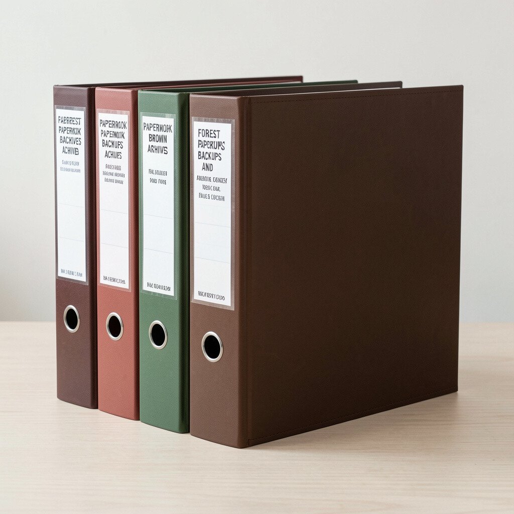
Forest brown looks grounded and steady, like a place for records that matter. It is a good color when you want an “archive” binder that does not get touched every day.
Use it for old projects, completed tax years, past certificates, and saved school portfolios. Add a simple numbering system using tab order so you can find files quickly later without re-reading everything.
Personalization ideas include labeling the spine with the year range and adding a short “what’s inside” card on the first page. Many people prefer warm neutral archives now because they fit both home and office decor.
20. Bright Mint for Learning Resources and Skill Practice
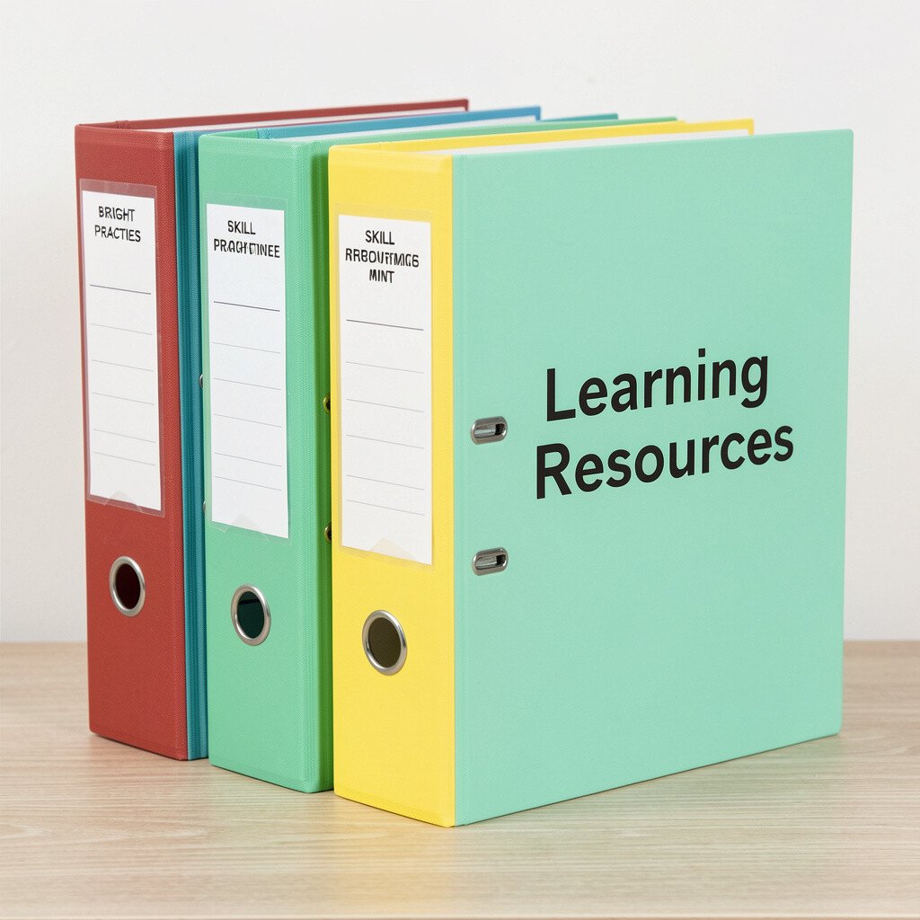
Bright mint feels fresh and light, like you are starting a new study session. It is a great binder for any learning that you revisit over time.
Keep language notes, practice worksheets, and study guides inside with clear section dividers. For practical tips, add a “next practice session” page so you can jump into the right material without flipping around.
21. Black for Sensitive Notes and Secure References
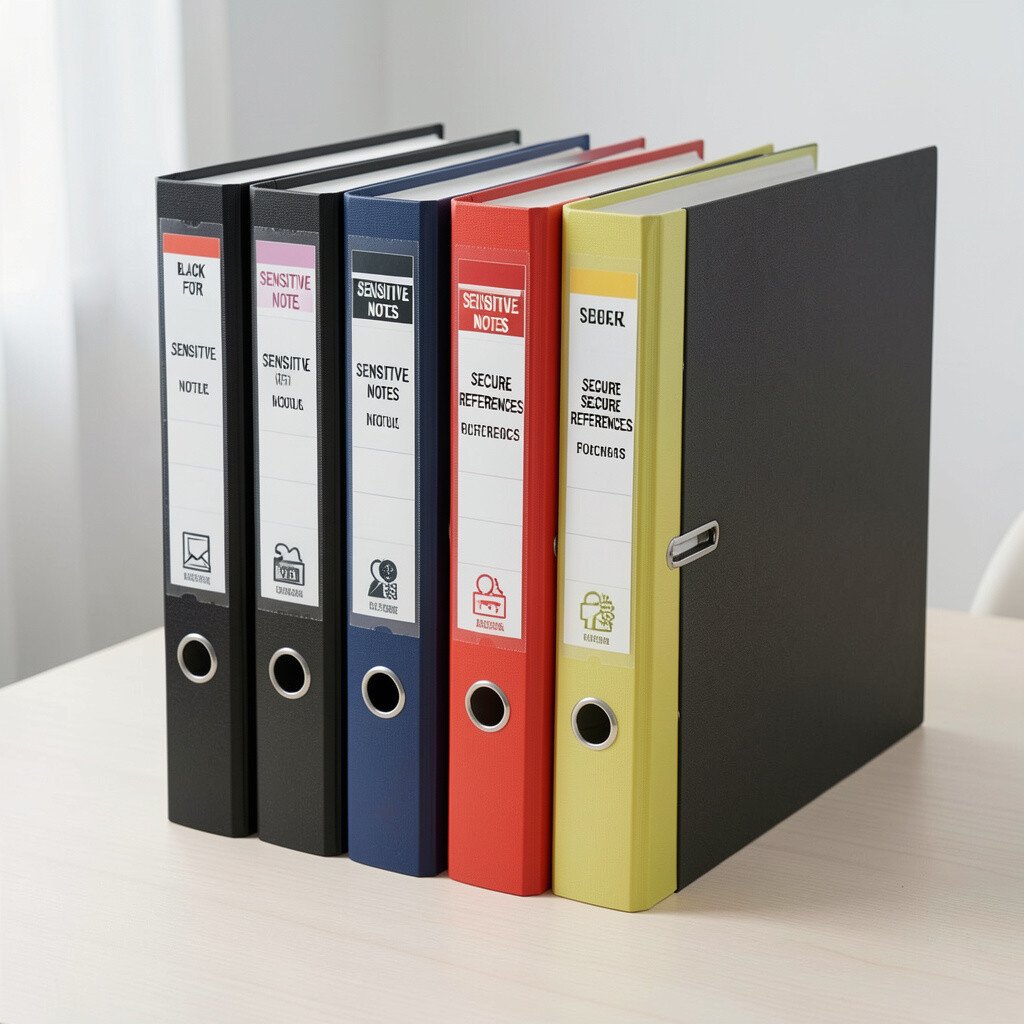
Black looks bold and gives a strong sense of privacy. It is ideal when you store sensitive information you want to keep separate from everyday papers.
Use it for private lists, passwords written safely in a trusted system, and important personal documents kept under lock when needed. A practical tip is to limit what goes inside, so it stays manageable, and to use page protectors for added protection.
To personalize, use a simple label on the spine and a discreet index page so you can locate items while staying discreet. Black also matches a current trend of creating “separate zones” for sensitive organization at home and in shared spaces.