
Bright rooms feel like fresh air for your mind. The right colors can make everyday moments feel lighter and more fun.
1. Sunny Yellow With Soft White Trim
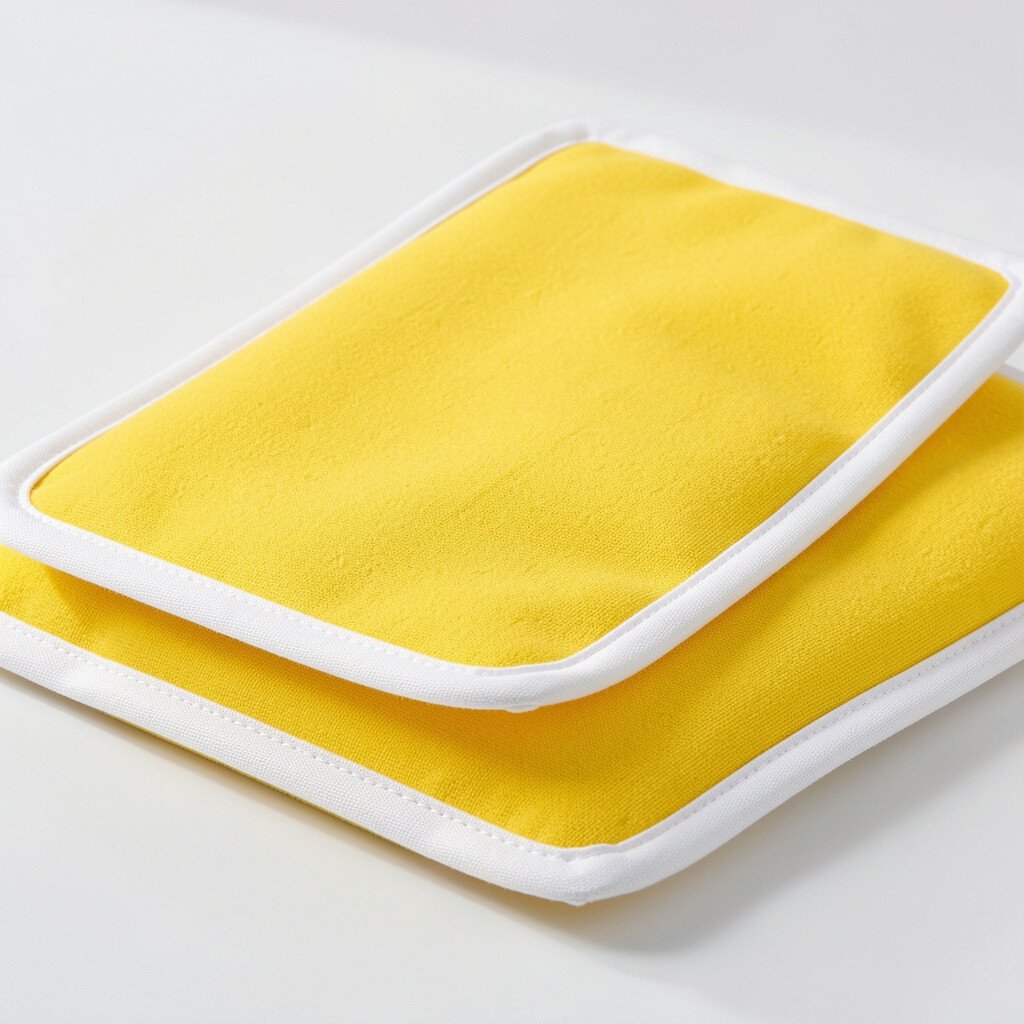
Imagine sunlight bouncing off walls the moment you step inside. Yellow like a lemon glow brings warmth without feeling heavy, especially when paired with soft white trim.
Choose a buttery shade for the main walls and paint moldings, doors, and window frames in a gentle off-white. This combo keeps the room airy while still looking cheerful and finished. For a practical balance, add a light rug in warm cream and keep curtains in sheer white so the yellow stays bright all day.
2. Coral Accent Walls With Calm Seafoam
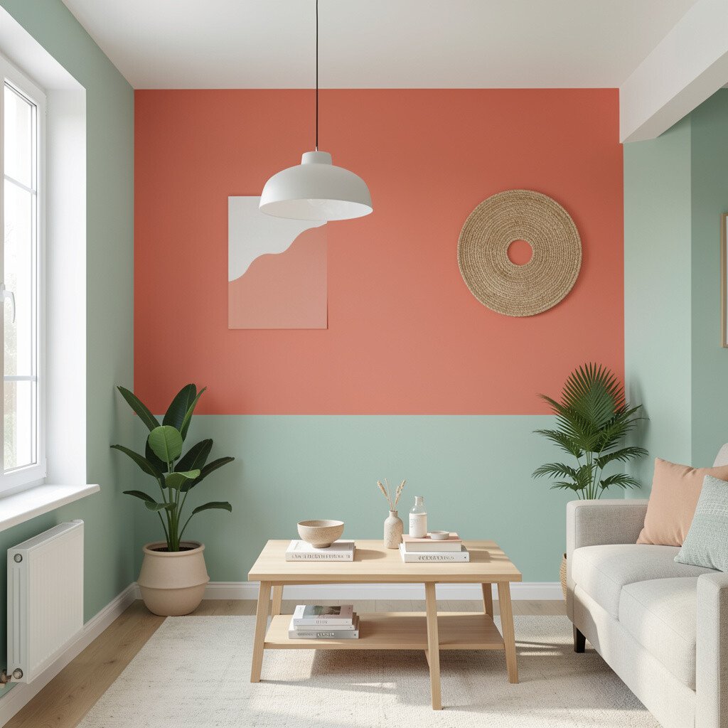
Coral looks playful, like you’re decorating with a piece of summer. Pairing it with seafoam tones down the boldness so the space feels welcoming.
Paint one wall coral and use seafoam for the remaining walls or for a lower half panel look. Add white shelving and woven baskets so the colors feel styled, not loud. To personalize, pull one coral hue into small items like pillow covers, a bedside lamp, or a picture frame.
If you’re worried about cost, focus paint spending on one accent wall and reuse existing furniture finishes. This style also fits current trends toward warm color pops, especially in living rooms and entry areas where you want instant joy.
3. Blush Pink Walls With Warm Wood Floors
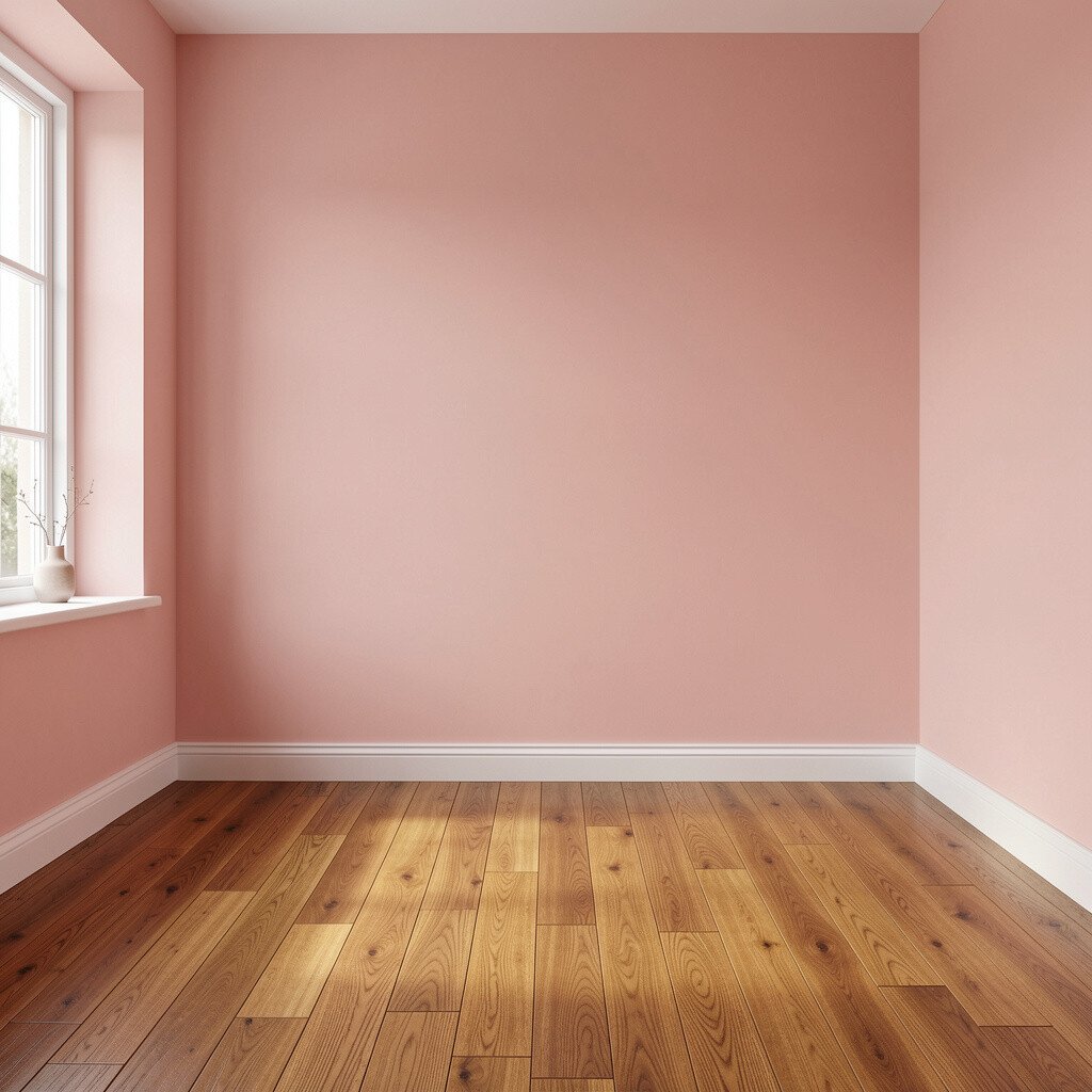
Blush pink brings comfort that still feels upbeat. When it meets warm wood, the whole room looks inviting and lived-in.
Go for a dusty blush rather than an ultra-bright shade so it flatters daylight and softer lamps. Keep hardware and light fixtures in brushed gold or warm nickel to match the wood tones. Add curtains in oatmeal or light linen for a calm backdrop that lets pink feel gentle, not sugary.
For practical personalization, repeat the blush in decor like a throw blanket, a small art gallery, or a vase with fresh flowers. If you’re updating on a budget, paint the walls first, then add one new fabric item to make the color feel intentional.
4. Sky Blue Walls With Crisp Navy Details
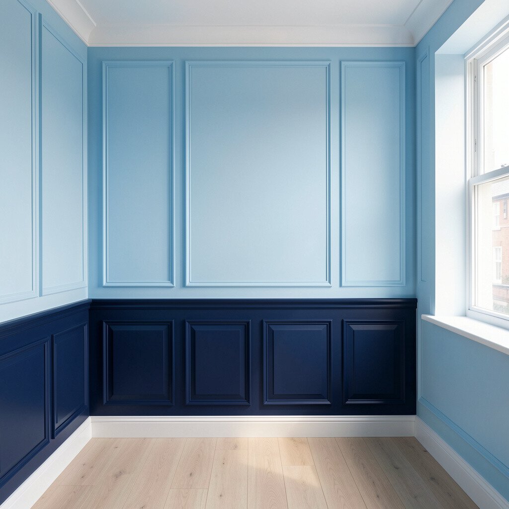
Sky blue makes rooms feel open, like there’s room to breathe. Add crisp navy accents and it instantly looks styled with confidence.
Paint the main walls in a sky tone and bring navy in through frames, cushions, or a rug pattern. This pairing gives brightness a clean edge, which is great for kitchens, workspaces, or hallways. To keep it from feeling too sporty, include warm textures like a knit throw, a wood desk, or a soft area rug.
5. Mint Green Paired With Natural Rattan
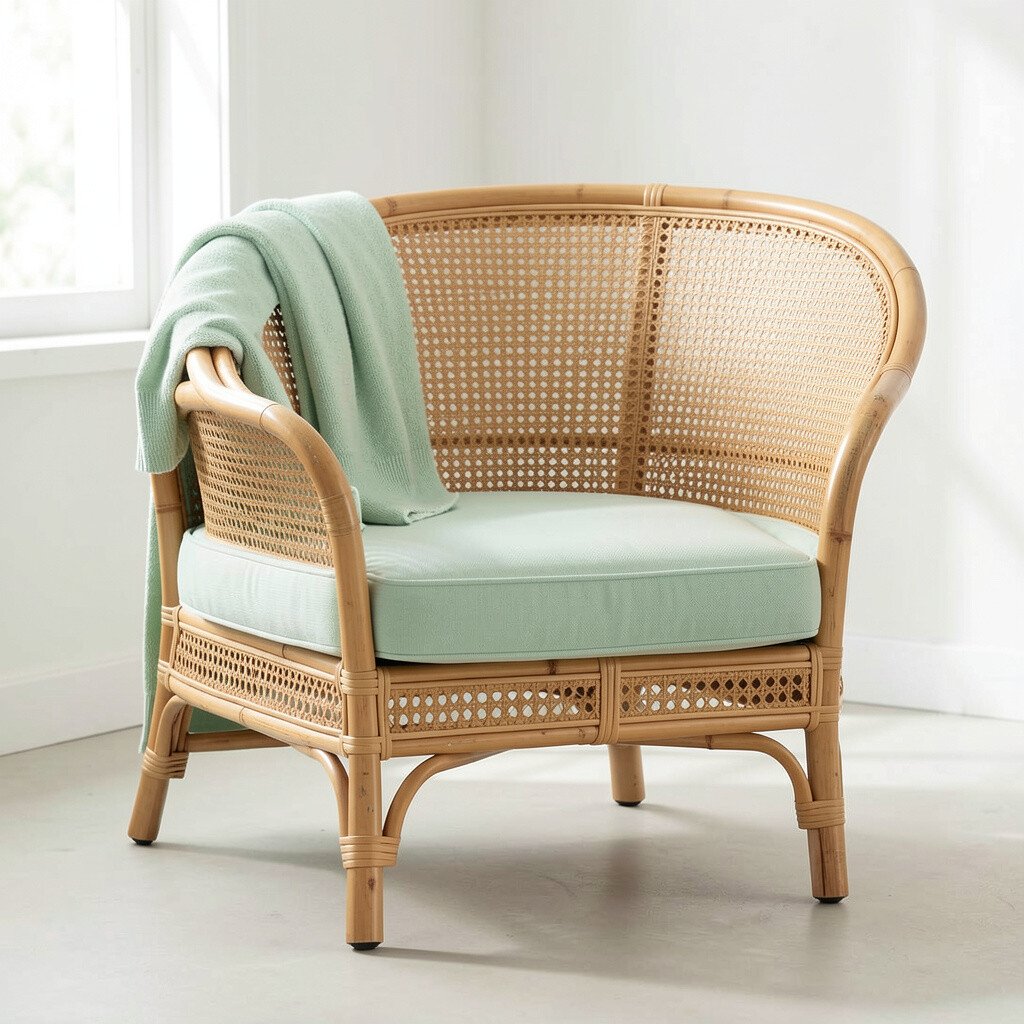
Mint green feels fresh and modern, almost like a cool drink on a hot day. It also works beautifully with natural textures that make a room feel grounded.
Choose a light mint and then style with rattan chairs, a woven pendant light, or storage baskets. The green stays bright, while the natural materials add comfort and uniqueness. For personalization, match your mint with artwork that has soft greens and sandy neutrals so everything looks connected.
If you want to control costs, swap one or two accessories first since small changes can shift the entire mood. Current trends favor airy, nature-inspired palettes, so this look feels current without being complicated.
6. Turquoise Highlights With White Marble-Look Surfaces
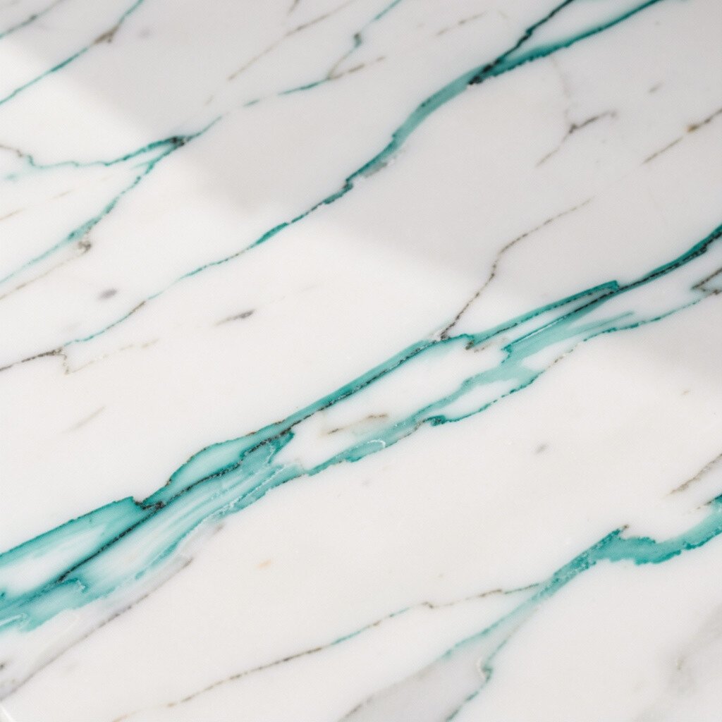
Turquoise brings energy, like ocean color with a sunny smile. White marble-look counters or backsplashes make it crisp and bright.
Use turquoise as an accent through tiles, a backsplash panel, or painted cabinets on select areas. Pair with white surfaces and keep the rest of the room in clean, simple tones for balance. A practical trick is to repeat turquoise in two or three spots, such as a vase, a framed print, and a small wall shelf, so it feels designed.
7. Lavender Softness With Light Gray Balance
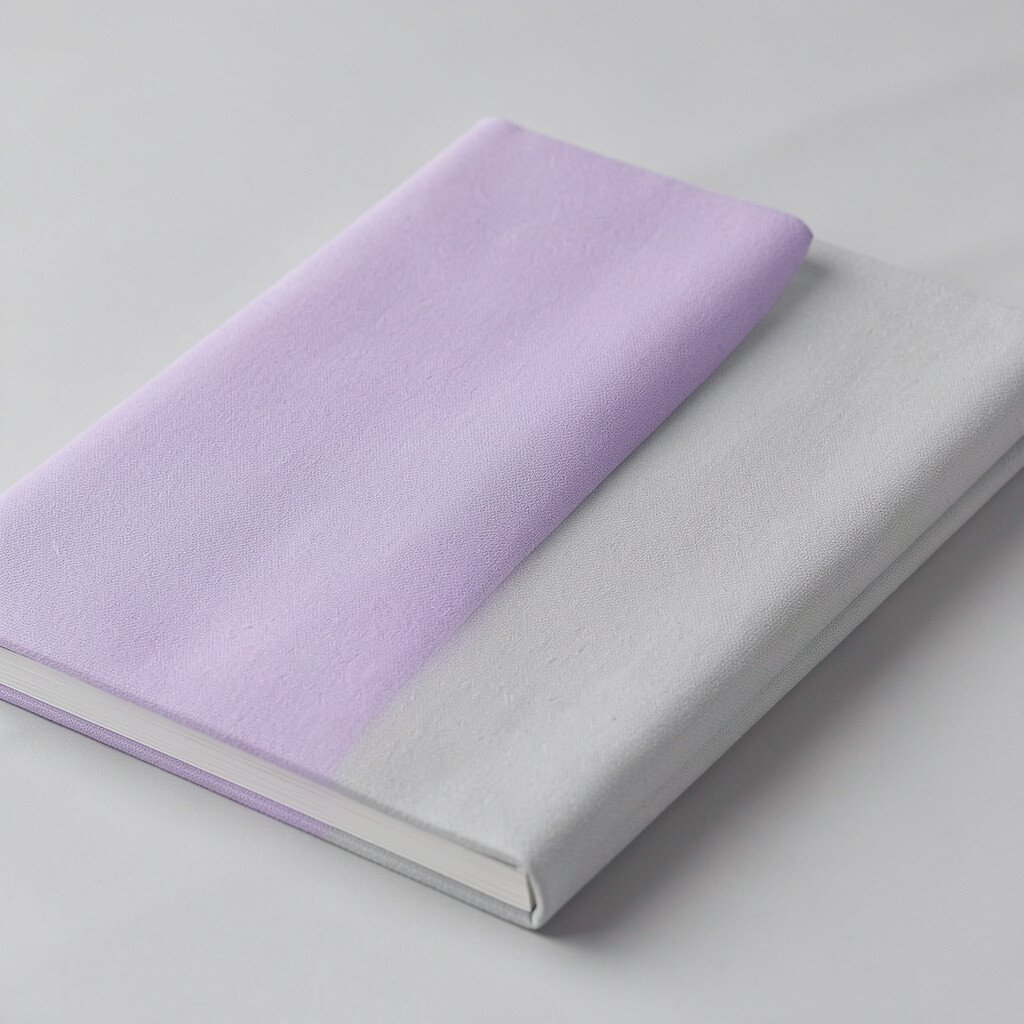
Lavender can feel dreamy, but the right shade keeps it cheerful. When it’s balanced with light gray, the room feels calm instead of sleepy.
Pick a muted lavender like a spring flower tint and use light gray for ceilings, trim, or large pieces like sofas. This combination helps lavender look modern and not overly romantic. Personalize with pastel artwork, a textured throw, or patterned curtains that include both lavender and gray.
If you’re working with a tight budget, paint only one large wall in lavender and let the gray create the rest of the calm base. This method gives the room personality while keeping your project manageable.
8. Apple Green Walls With Sunny Orange Decor
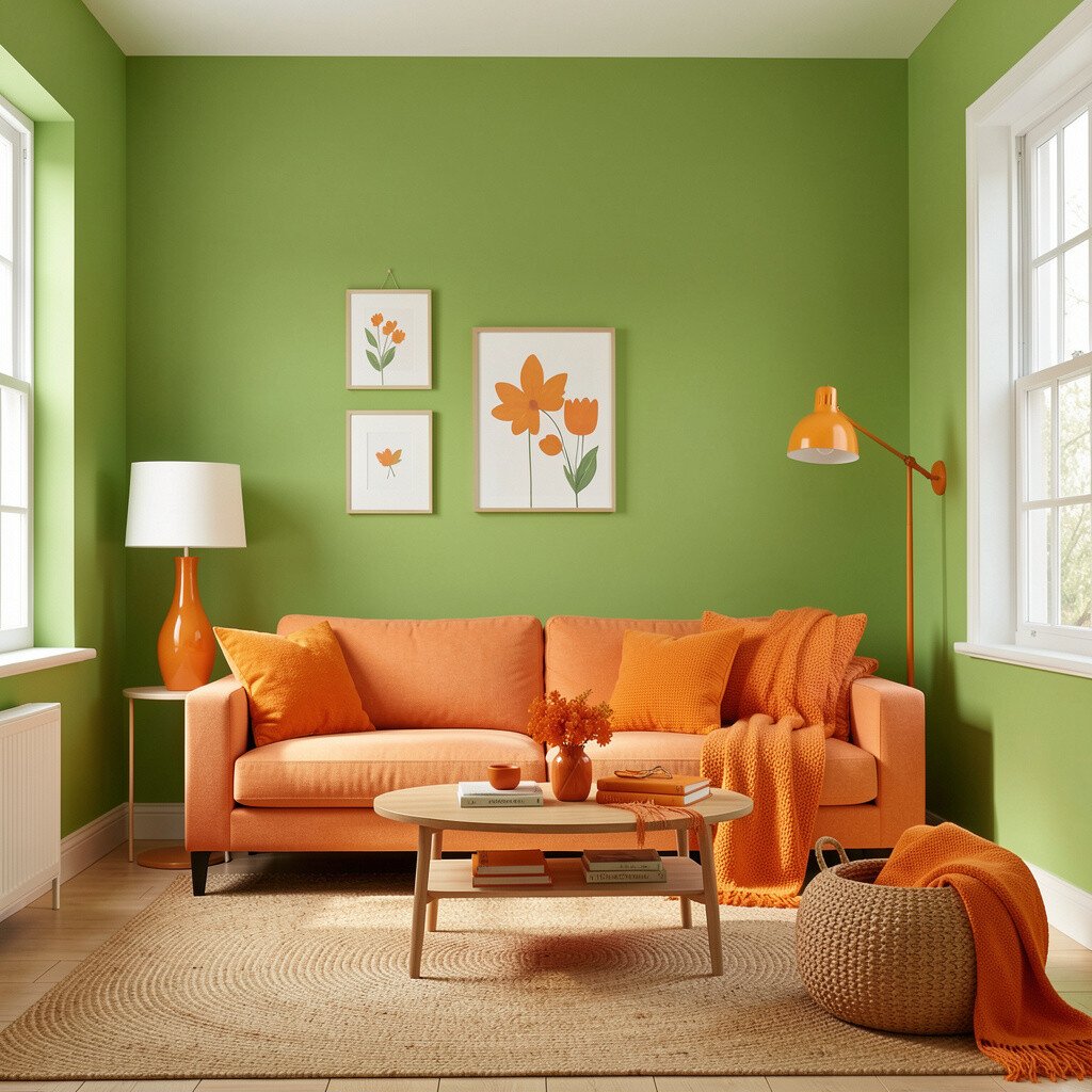
Apple green feels lively, fresh, and a little playful. When you add sunny orange accents, the room turns into a cheerful playground.
Keep the apple green as the main wall color, then use orange through pillows, wall art, or small decor like a bowl or lamp shade. Use white trim and neutral furniture to stop the palette from getting overwhelming. For practical tips, choose two main shades and limit the rest to whites and light woods so your room stays bright and easy to match.
9. Golden Ochre With Creamy Beige Layers
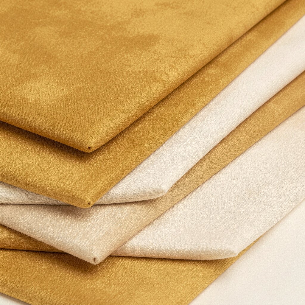
Golden ochre adds warmth that makes a room feel welcoming. It also looks rich without needing dark furniture or heavy styles.
Paint walls in a soft ochre and layer creamy beige through rugs, curtains, and upholstered seating. This helps the color feel balanced and gives your room a smooth, sunny glow. For personalization, add brass accents or warm terracotta ceramics that echo the ochre.
To manage cost, you can use paint for the walls and spend on one or two standout pieces, like a statement mirror. This style feels unique because it’s bold yet gentle, and it pairs well with current trend ideas like warm neutrals plus one lively color.
10. Warm Peach With Bright White Windows
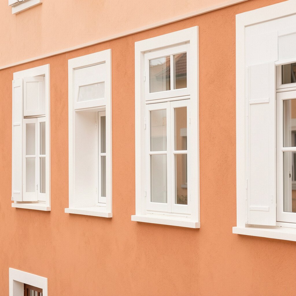
Warm peach makes walls look like they’re lit from within. It pairs especially well with bright white windows and trim.
Choose a peach tone that leans slightly creamy, then use crisp white for all edges and frames. The contrast makes the room feel clean and bright, even on cloudy days. Add practical comfort by using light, breathable fabrics and choosing a rug that ties together peach and white.
If you want it to feel more personal, bring peach into a patterned pillow, a framed print, or a small collection of art in matching frames. This is a great option for bedrooms and dining rooms when you want cozy happiness without going too bold.
11. Raspberry Accents With Soft Butter Base
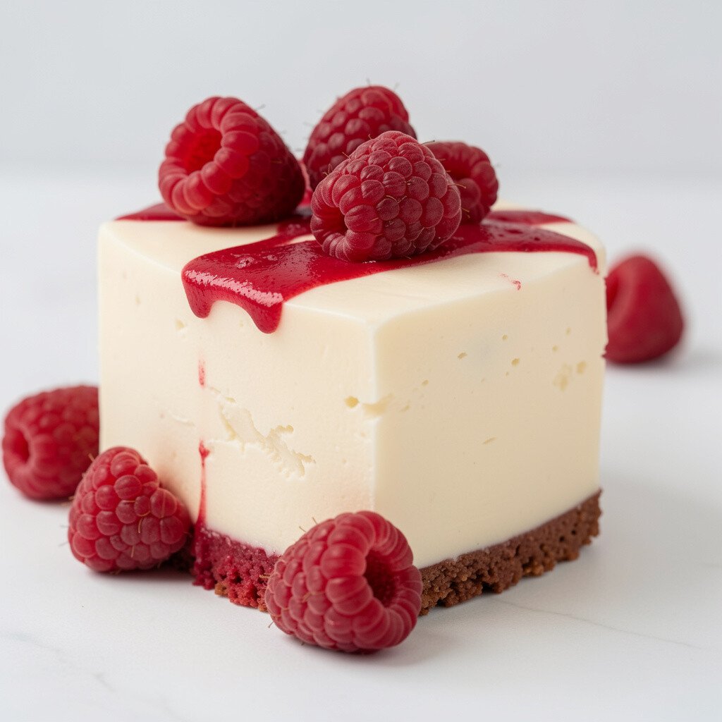
Raspberry looks bold, but it can feel elegant when the walls stay buttery and light. The contrast makes your room feel lively without making it chaotic.
Use a soft butter color on most walls and bring raspberry in as accents through art, curtains, or a single piece of furniture. Keep other items in cream, light wood, or gentle gray to keep the palette balanced. For practical tips, try a raspberry throw blanket or a set of matching frames so the color shows up consistently.
12. Charcoal-None With Mint and Lemon Pops
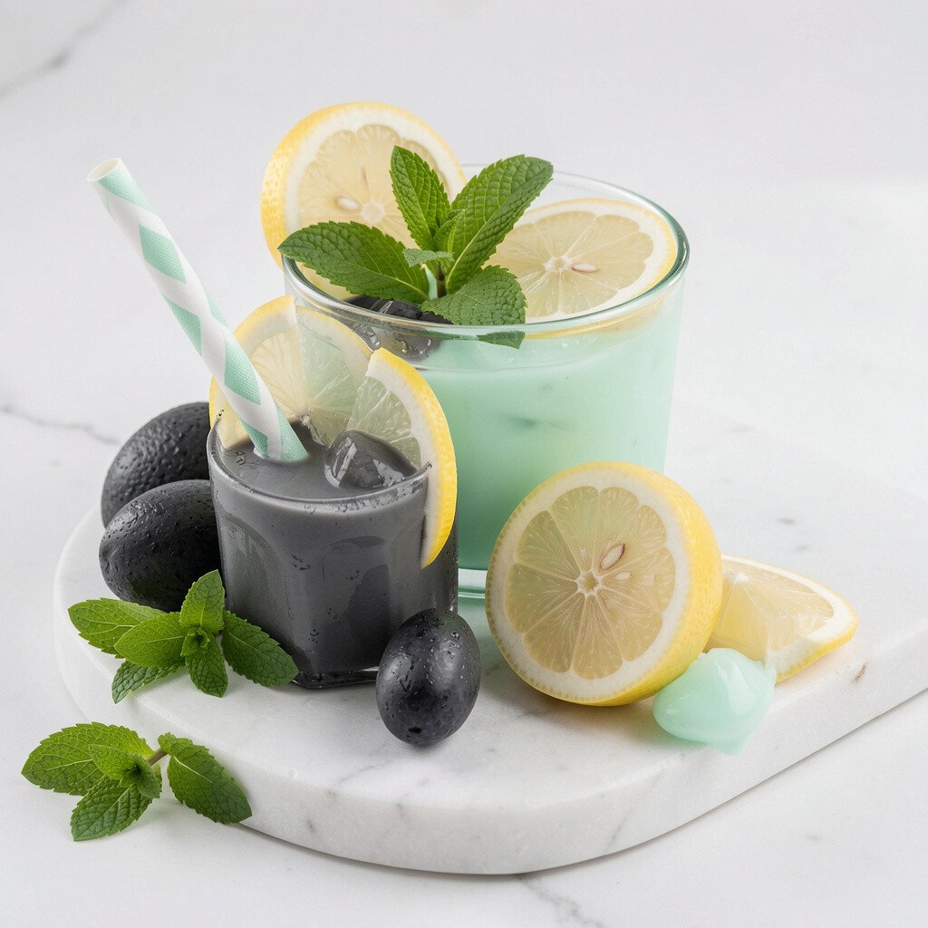
It’s easy to think green rooms must be subtle, but mint can be the star. Add lemon pops for a cheerful twist that keeps everything feeling fresh.
Paint walls in mint and choose lemon for small items like vases, wall shelves, or a patterned cushion. Keep larger furniture pieces in white, oatmeal, or light wood so the room stays bright. If your space gets lots of sun, this palette will look extra happy, but if not, you can counter it with bright lamps and reflective surfaces.
To personalize, look for art that mixes mint and yellow tones or add a cheerful gallery wall in matching frame colors. This kind of color pairing fits modern trends toward playful, high-energy interiors.
13. Creamy Beige With Turquoise Textiles
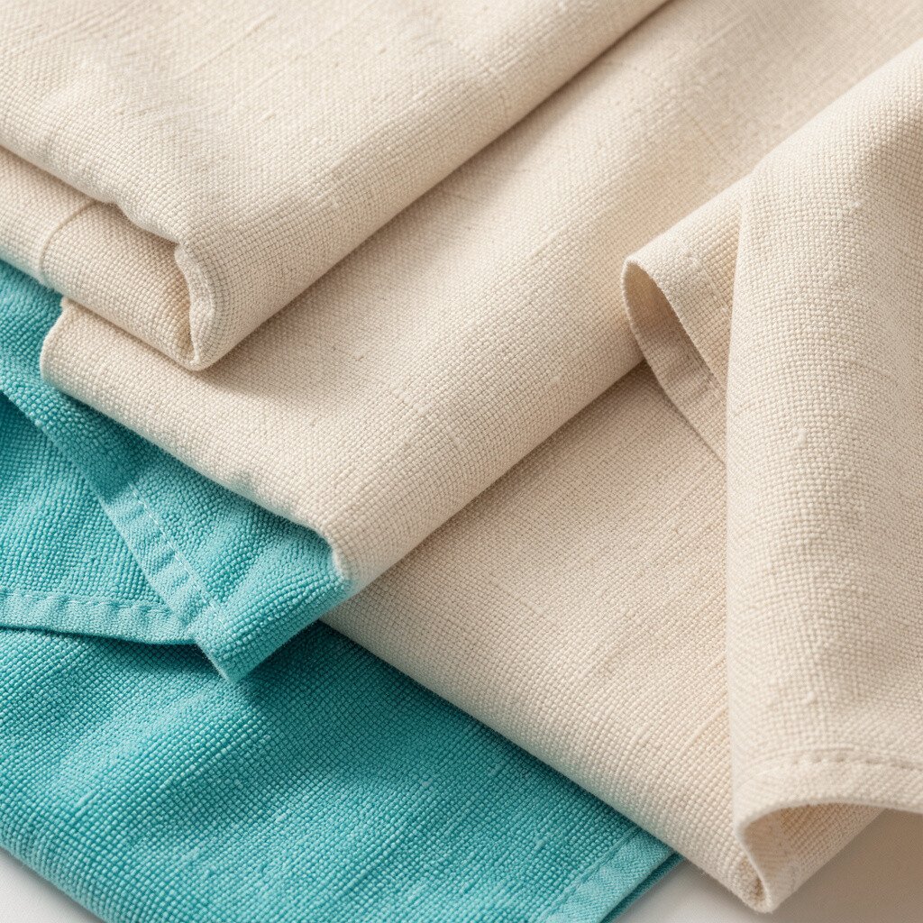
Beige can feel boring, but it’s a perfect stage for bright colors. Turquoise textiles add instant joy while keeping the room calm.
Use creamy beige on walls and add turquoise through curtains, bedding, or an upholstered chair. This approach is practical because textiles are easy to swap when you want a new mood. Personalize by choosing a pattern that includes turquoise plus a little white, so it blends naturally with the walls.
If you’re keeping costs low, shop for one statement item like a rug or comforter, then build the rest with smaller decor. Beige with turquoise accents also looks unique because the focus stays on texture and color together.
14. Light Coral and Off-White Wallpaper Patterns
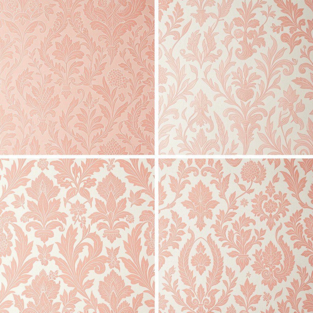
Wallpaper can make a room feel instantly styled and cheerful. A light coral pattern on off-white brings personality without needing bold paint everywhere.
Pick a wallpaper with a small to medium pattern that includes off-white backgrounds and coral shapes. Pair it with off-white walls in other areas so the room stays bright and cohesive. For personalization, match the pattern colors with one or two simple accessories like a coral-toned lamp or patterned throw pillows.
From a budget view, consider applying wallpaper to a single feature wall or the upper half of a room. This keeps the impact high and the project manageable while still giving that “wow” effect.
15. Soft Gray-Blue With Bright Chartreuse Art
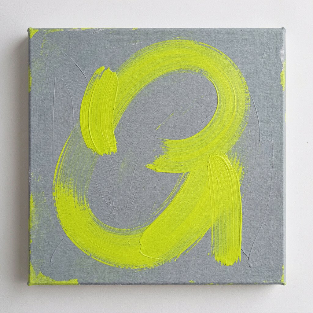
Gray-blue might sound cool and calm, but it can still support a happy look. Add chartreuse art and the room turns energetic in the best way.
Use a soft gray-blue for walls and bring chartreuse in through a large framed print, a gallery wall, or colorful planters. Keep furniture in white or light oak to prevent the palette from feeling too intense. A practical tip is to place chartreuse art across from a window so the light makes the color pop.
16. Bright White Walls With Pastel Rainbow Accents
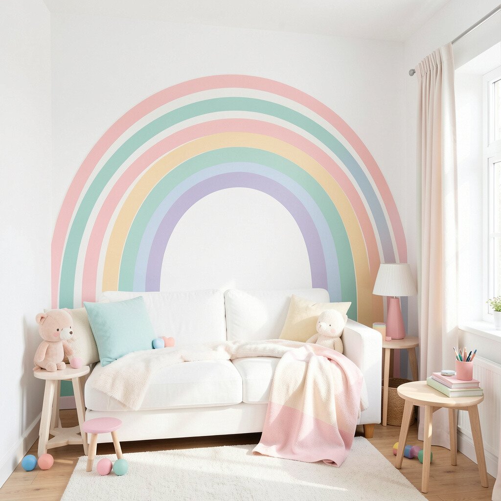
Starting with bright white walls is like giving your room a clean canvas. Pastel rainbow accents add joy while keeping everything light and open.
Choose pastel colors for small items like cushions, ceramics, a patterned rug, and artwork. You can pick a full rainbow or just two to three shades that you love most. For personalization, try mixing one solid color cushion with one patterned fabric that includes several pastels so the room looks curated.
Cost-wise, this is a smart option because you can update slowly. Shop for one accent at a time and your room will gradually look more vibrant with each new piece.
17. Golden Yellow With Textured Linen Drapes
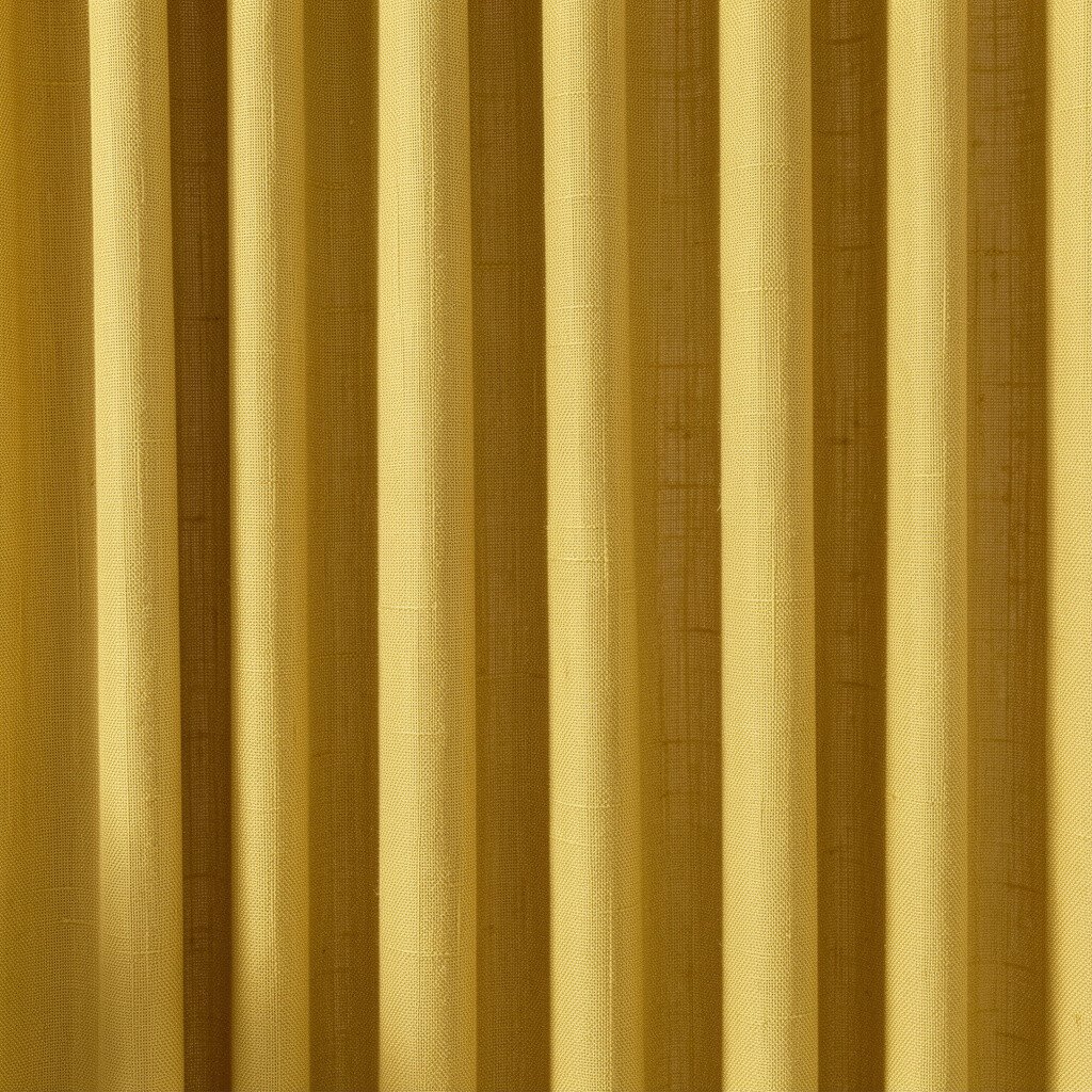
Golden yellow feels sunny, but texture makes it feel even more luxurious. Pair it with textured linen drapes to keep the room soft and bright.
Choose a warm yellow that leans slightly honey and then add linen curtains in cream or pale gold. Texture helps prevent the color from feeling flat, and it adds a cozy sense of depth. For personalization, choose tiebacks or curtain rings in a finish that matches your hardware, like brushed brass or warm nickel.
18. Punchy Lemon With Neutral Furniture and Black Frames
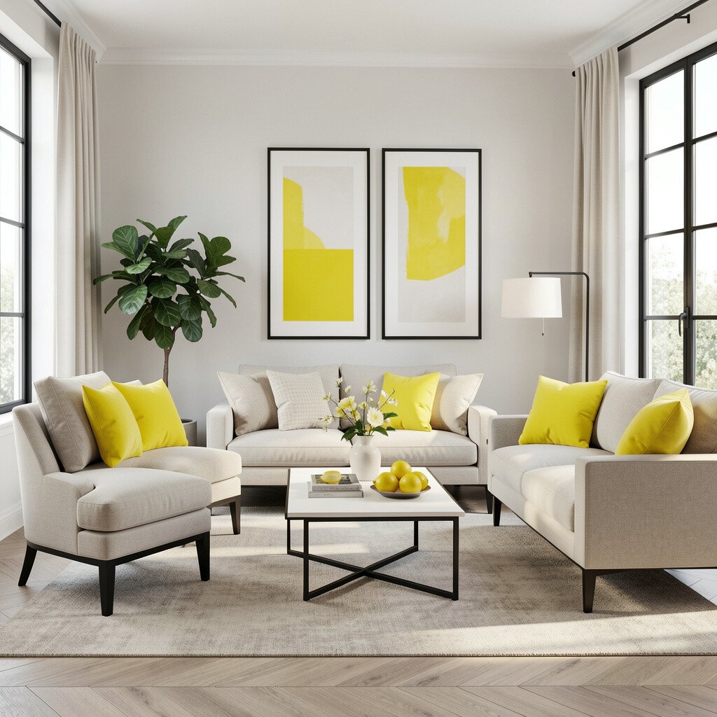
Lemon color looks cheerful and modern, especially when it’s balanced. Neutral furniture keeps it grounded while black frames add crisp style.
Paint the walls lemon or use lemon in a feature wall, then choose sofas and chairs in beige, cream, or light gray. Add black picture frames, a black floor lamp, or a black metal shelf for a clean contrast. A practical tip is to use two to three black elements so the look feels intentional, not random.
This style is unique because it mixes happy color with graphic structure, which feels on-trend in many design circles right now. If you want to keep costs in check, focus on paint and frames first, then let your accessories bring the final shine.
19. Sky Blue and White Paneling With Coastal Textures
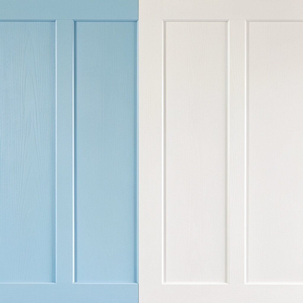
Classic paneling can make a room feel charming and bright at the same time. Sky blue plus white creates a coastal look that feels fresh and friendly.
Paint the lower part of the wall sky blue and keep the paneling and trim white for a clean, crisp finish. Add coastal textures like rope baskets, a light wood coffee table, and soft cotton bedding. Personalize with nautical-inspired art, but keep it subtle so the room still feels warm and welcoming.
For practical cost considerations, if paneling is too much, use peel-and-stick molding strips to create the look in small sections. This gives you the charm without the heavy construction work.
20. Lilac Wall Niches With Bright White Display Shelves
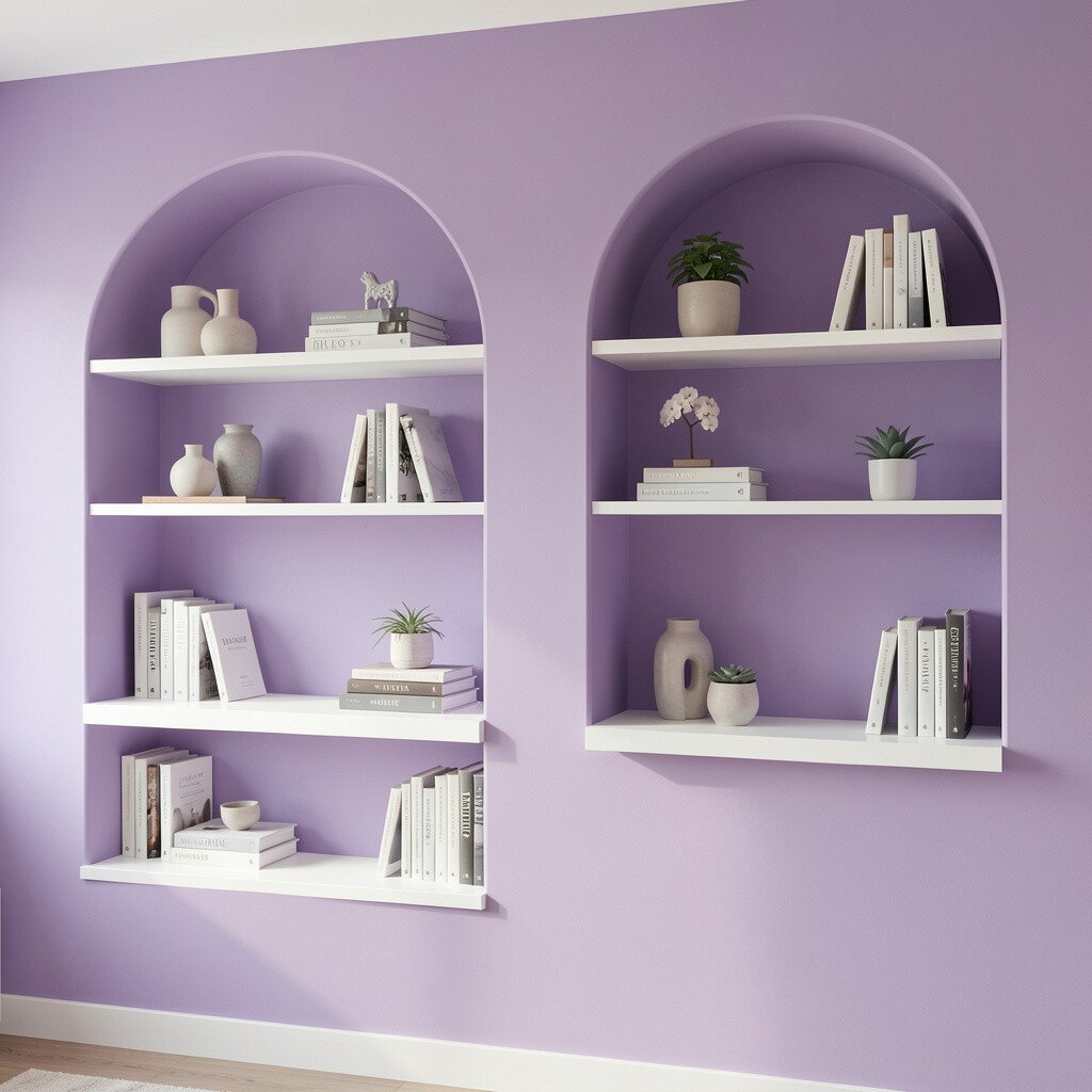
Color inside wall niches feels special and a little like a mini stage. Lilac niches can create a dreamy highlight while bright white shelves keep it crisp.
Paint built-in niches lilac and use white shelves to display books, small plants, or decorative vases. This setup adds uniqueness because the color feels layered, not just painted on flat walls. For personalization, choose decor that includes both lilac and white so everything looks tied together.
If you’re working with existing shelves, you can refresh by painting the niche surfaces first. It’s a targeted upgrade that delivers a big visual effect without repainting the whole room.
21. Terracotta Accent Wall With Soft Sage Rest
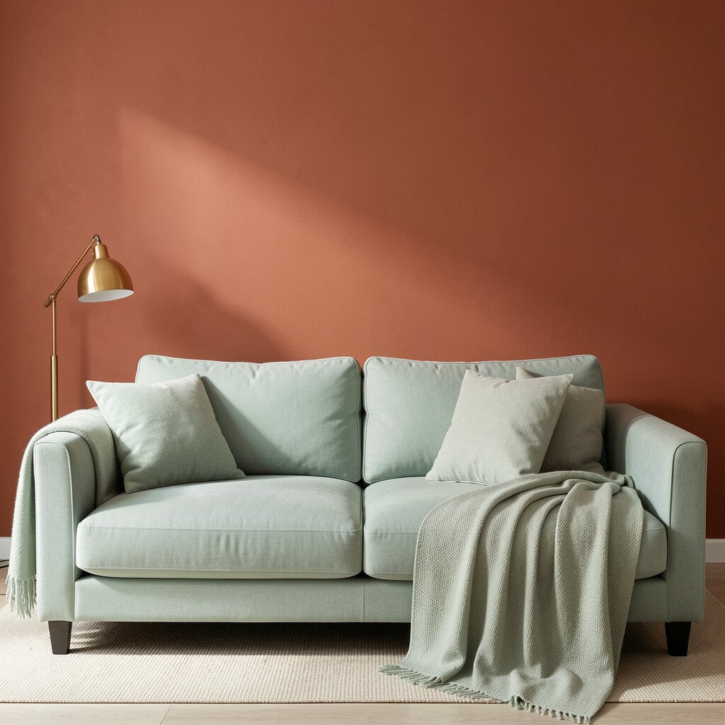
Terracotta brings earthy warmth, and it pairs beautifully with soft sage. Together they create a room that feels cozy, bright, and full of character.
Paint one accent wall terracotta and keep the rest of the room in sage or sage-leaning neutrals. Use cream fabrics and light wood details to keep the palette sunny and not too dark. For practical tips, add greenery like eucalyptus or potted herbs to enhance the natural vibe.
Personalize with artwork that includes terracotta and sage tones so your walls and decor feel coordinated. Cost-wise, an accent wall is a smart move, and it aligns with current trends toward warm earthy colors with fresh green highlights.
22. Turquoise and Soft Pink Mix With Floating Shelves
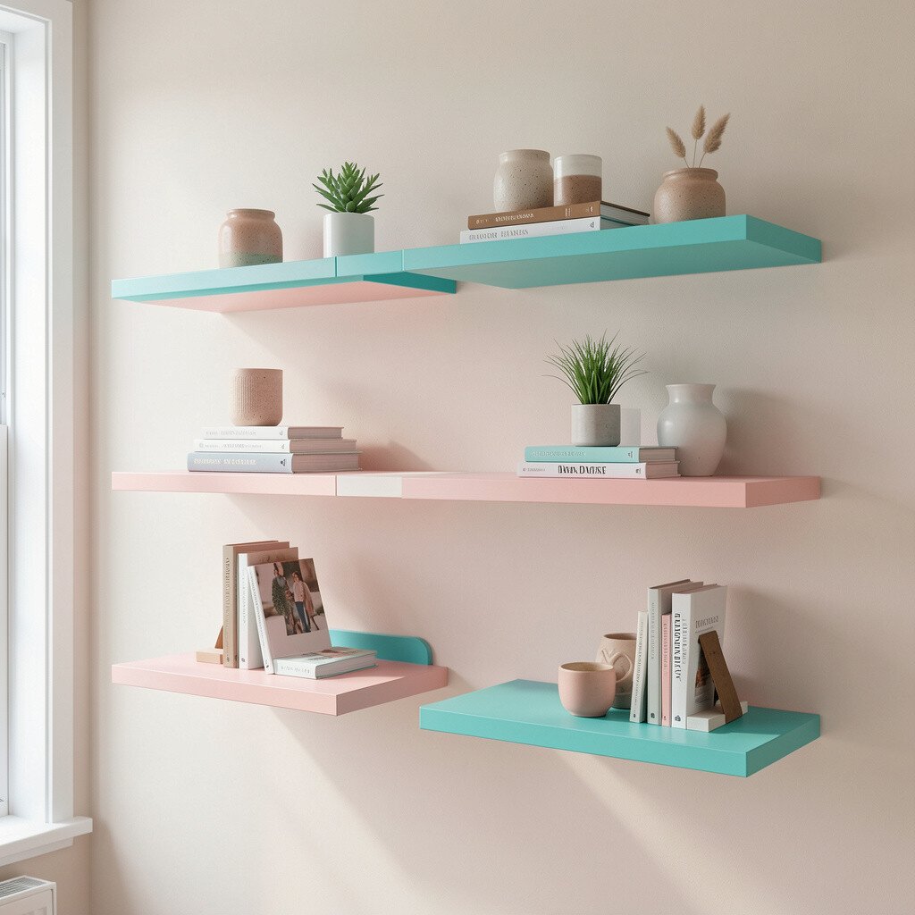
Mixing turquoise with soft pink can look bold, but it also feels friendly when the shades are balanced. Floating shelves help you display color in a tidy way.
Use turquoise as a main accent and soft pink in smaller areas like shelves backs, decor items, or a painted panel. Keep the rest of the walls in a neutral, so the mix feels like a cheerful conversation instead of a full-on party. A practical tip is to group items by color and height so the shelves look neat and styled.
For personalization, add a rotating mix of books, framed photos, and small plants so the room changes with your life. This style is unique because it blends playful color with functional storage, making brightness useful as well as pretty.