Color can make a plan feel instantly more doable. The right pairing turns ordinary spaces and projects into something you actually want to use.
Here are bold, practical color combos that work for design, branding, school projects, and personal style. Each one includes simple ways to apply it without spending a lot.
1. Sunlit Coral With Cream and Teal
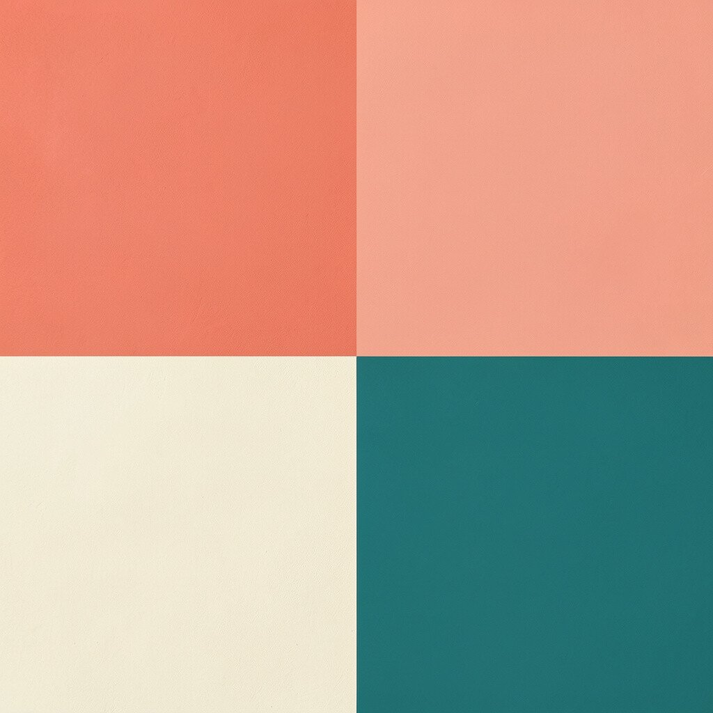
This scheme feels like a warm afternoon with a cool breeze. Think coral walls or accents, soft cream backgrounds, and teal details that pop on signs or borders.
Use coral as the main highlight so it feels energetic, then balance it with cream for calm. Add teal in small doses like trim, buttons, or patterned fabric to keep it fresh. If you want an easy personalization, match teal to something you already own, like a notebook cover or a favorite mug.
Cost stays friendly because cream and coral can be achieved with off-the-shelf paints or simple craft dyes. Look for current trends that favor “sun-kissed” tones and playful seaside accents in product design and home decor. Try a practical test by painting or printing small samples before committing to full coverage. If you work on a logo, keep the coral in the mark and let cream carry the text for readability.
2. Classic Navy With Soft Gold and Ivory
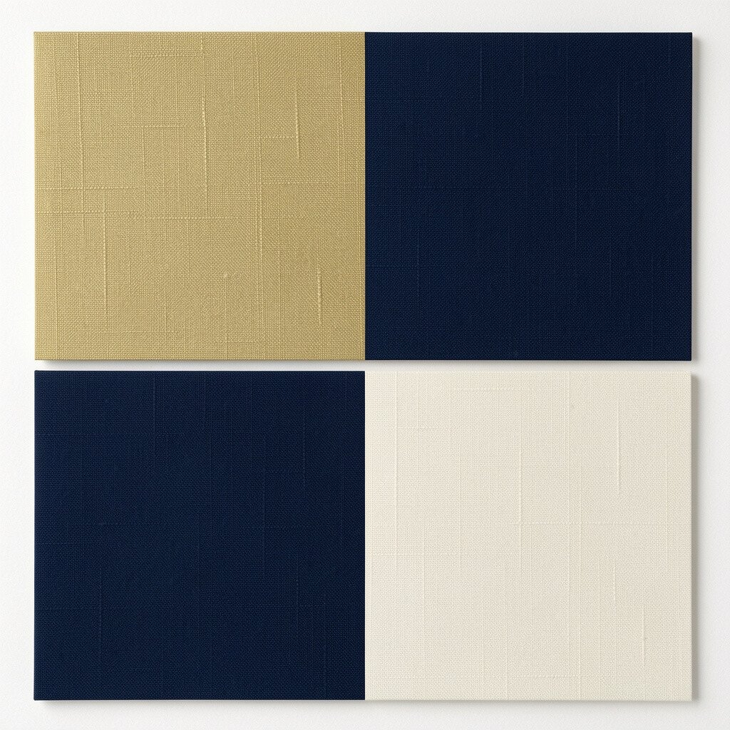
Navy and gold feel confident and polished without being loud. Picture deep blue as the base, ivory as the airy backdrop, and soft gold accents on frames, headings, or icons.
Pair navy with ivory for strong contrast that still feels warm, especially in printed flyers and websites. Use gold sparingly on the “most important” parts like a callout shape, a divider line, or a small pattern. Choose a gold that leans light rather than super shiny to avoid looking too harsh in daylight.
This combo is great for teams, clubs, and professional projects that still need a creative spark. It’s also easy to personalize by swapping the accent shape, like circles for a tech vibe or angled lines for a sporty mood. For cost considerations, navy and ivory often come in reliable basics, and gold accents can be done with craft vinyl or metallic pen details.
3. Forest Green With Butterscotch and Warm Sand
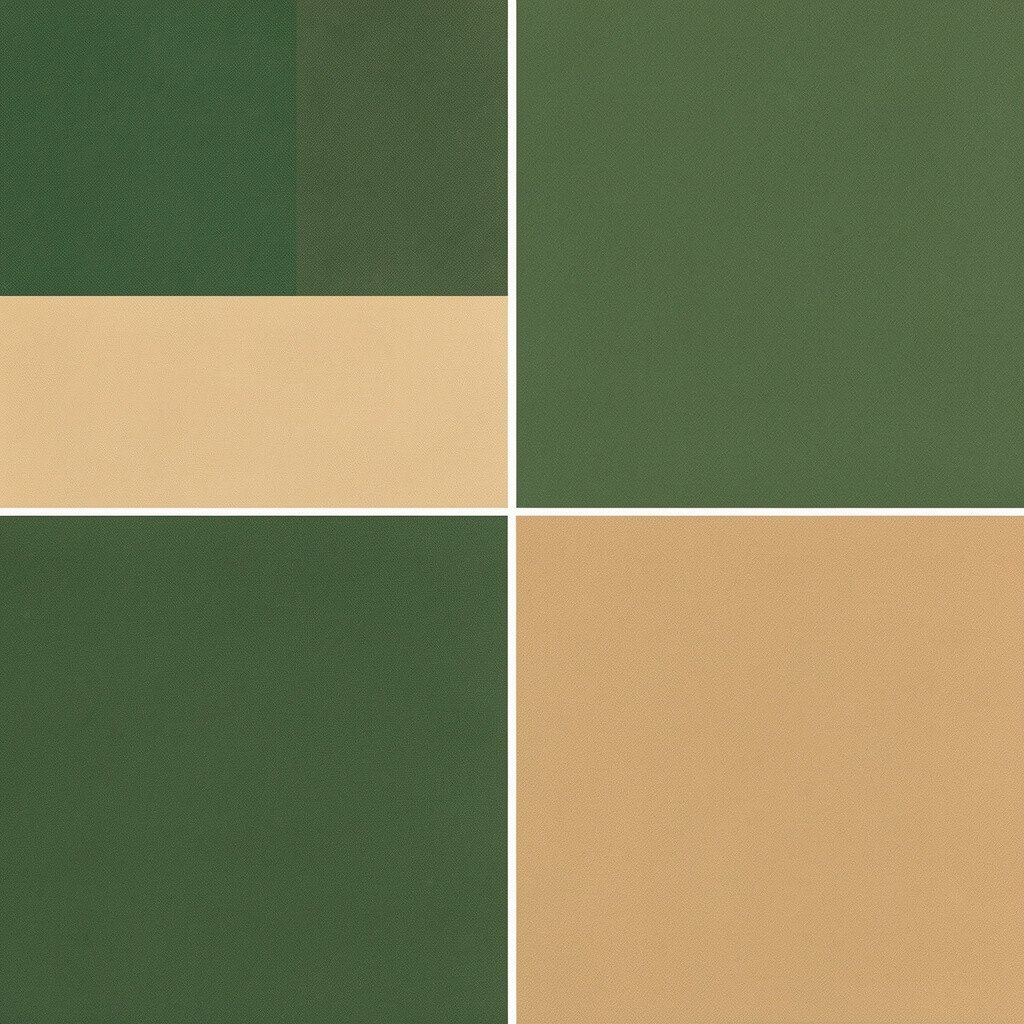
Forest green brings depth, like a shaded path through trees. Butterscotch adds a friendly sweetness, while warm sand keeps the whole palette grounded and inviting.
Start with warm sand as the main background, then layer forest green for structure and balance. Add butterscotch in small areas such as labels, buttons, or fabric stripes to make the design feel lively. This is a nice choice when you want uniqueness, because earthy tones tend to look thoughtful instead of generic.
For practical tips, use forest green for headings and larger blocks, then reserve butterscotch for tiny sections like icons or corner decorations. When you personalize, match butterscotch to a natural element you like, such as a wood grain, cinnamon, or a favorite tea color. If you’re budgeting, you can mix warm sand tones with matte white and a gentle beige to reduce costs on paint and art supplies.
4. Bright Lime With Charcoal and Cool White
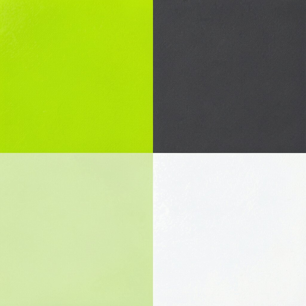
Lime feels like a highlighter that learned how to design. Imagine charcoal backgrounds with lime accents and cool white space so everything stays crisp and readable.
This palette is perfect for posters, workout plans, and tech-style dashboards that need strong visibility. Use charcoal to control contrast, then sprinkle lime for emphasis on key steps or features. Keep cool white around the layout edges so the lime doesn’t feel overwhelming.
5. Sky Blue With Coral Pink and Soft Gray
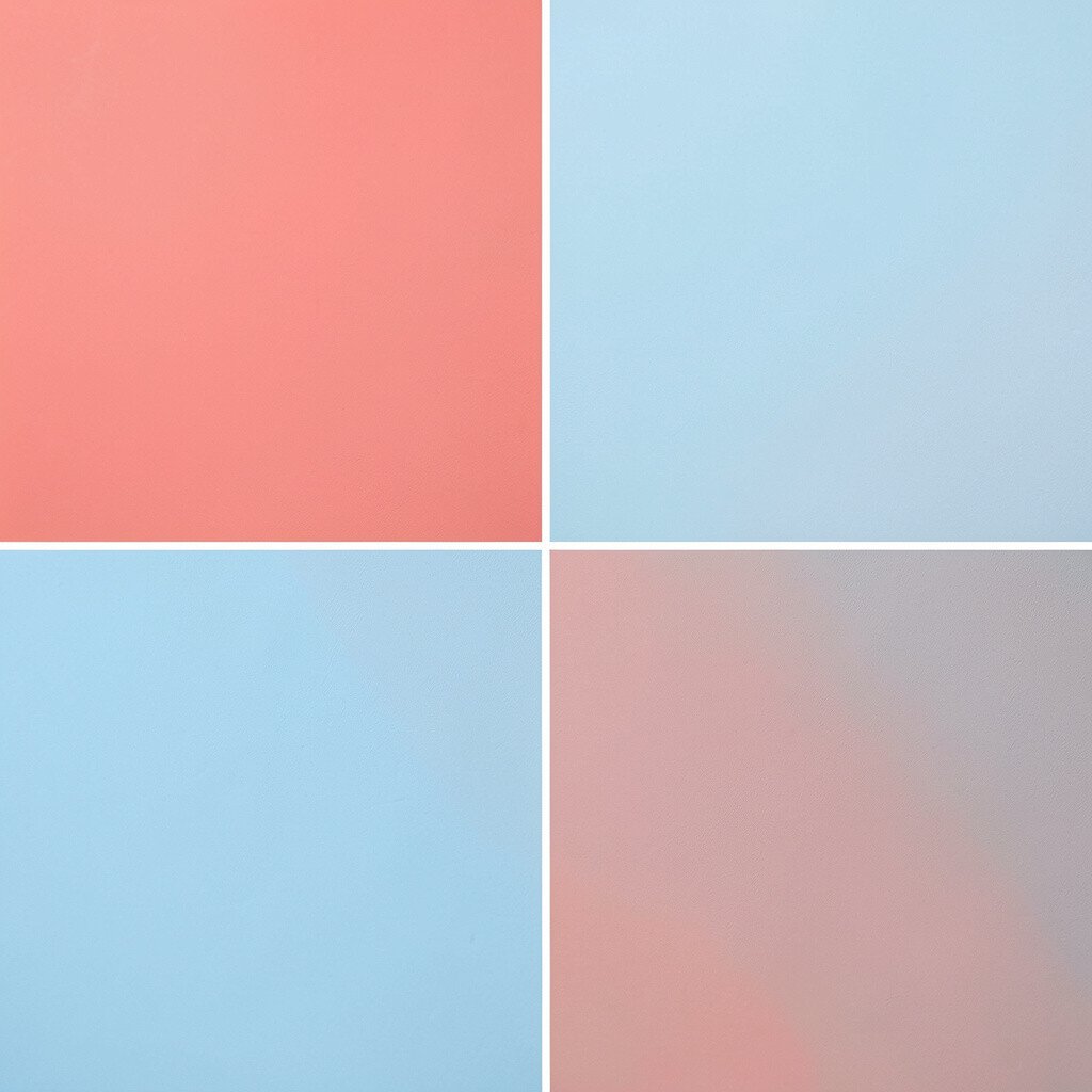
Sky blue sets a calm, open mood like a morning with no rush. Add coral pink for warmth, then use soft gray to keep transitions smooth and modern.
Use sky blue as the main field for pages, room walls, or large backgrounds, and coral pink for buttons, captions, or small shapes. Soft gray works like a mediator, helping the coral and blue feel like they belong together. If you want an easy uniqueness boost, choose coral accents that match the print style you like, such as tiny dots, stripes, or watercolor edges.
This combo also fits current trends toward airy “fresh” color stories in social graphics and product packaging. For cost considerations, soft gray and sky blue are widely available in inexpensive paints and inks. A practical way to test the palette is to swap the gray with white if your space gets a lot of natural light, or add a bit more gray if the light is dim.
6. Burgundy With Dusty Rose and Cream
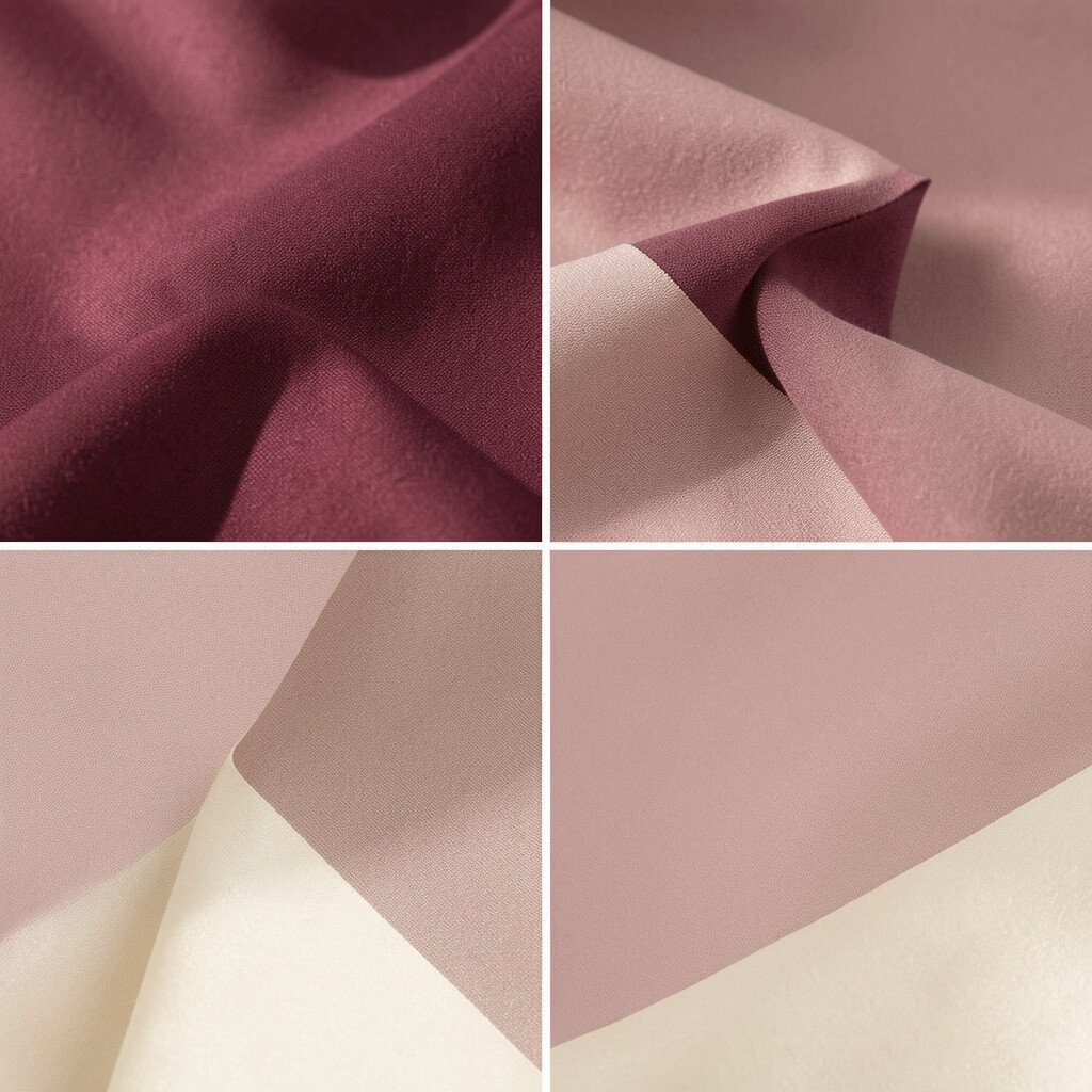
Burgundy feels cozy and artsy, like a favorite sweater color. Dusty rose softens the mood, and cream keeps everything light enough to look inviting.
Start with cream for the background so the palette stays gentle and readable. Place burgundy in the main blocks or typography, then add dusty rose for smaller elements such as borders, icons, or pattern details. This combination brings uniqueness because it’s richer than basic red while still feeling approachable.
If you’re making a brand kit, choose burgundy as your primary “voice” color and dusty rose as the secondary accent. For personalization, repeat a small shape across materials, like tiny hearts or rounded corners, to tie everything together. To manage cost, shop for cream and burgundy first, then create dusty rose using a toned-down pink watercolor or a mixed paint sample.
In current design trends, people keep shifting toward “warm romantic” palettes for invitations, studios, and lifestyle brands. This scheme works nicely for that vibe while staying practical for everyday use. Make it actionable by limiting burgundy to headings and larger sections, then letting cream handle body text and open space.
7. Turquoise With Terracotta and Light Linen
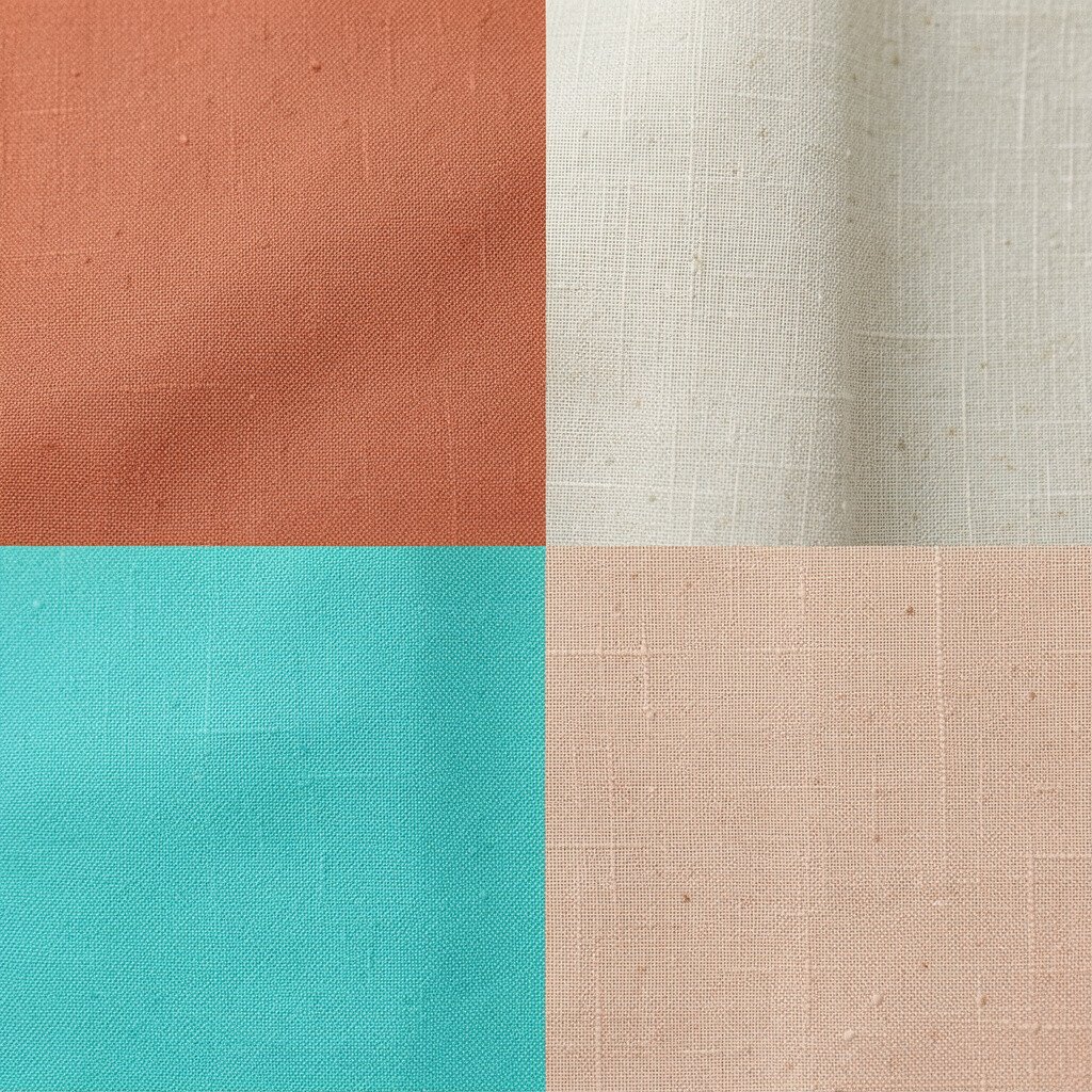
Turquoise brings a playful, ocean-bright feeling to any project. Terracotta adds a grounded, sunny warmth, and light linen keeps the palette airy and natural.
Use light linen as your main background for calm coverage, then bring turquoise forward in headings, headers, or feature blocks. Add terracotta as the “anchor” color for buttons, labels, or small illustration touches. This pairing looks unique because it balances cool and warm tones without needing overly bright extras.
Try personalization by pulling terracotta from something real in your life, like a plant pot, a clay bead, or a book cover. For practical tips, keep turquoise as the dominant color and terracotta as the secondary pop so the palette doesn’t become muddy. Cost-wise, linen-like tones are easy to find, and terracotta accents can be made with terracotta markers, stained paper, or warm-orange craft paint.
8. Monochrome Charcoal With Neon Cyan Accents
Monochrome designs can still feel exciting when you add the right pop. Imagine charcoal gray as the foundation, clean white text space, and neon cyan sparking through small details.
This scheme is a strong pick for modern tech themes, event badges, and quick study materials. Neon cyan highlights steps, navigation elements, or key data points, while charcoal keeps the overall layout focused. Make sure you use cyan sparingly so it stays special instead of everywhere.
For personalization ideas, match neon cyan to a brand color you already use, such as a hoodie logo or a favorite digital icon. You can also vary the pattern style, like using thin cyan lines for a sleek look or thicker shapes for a bolder vibe. If you’re cost-conscious, buy one neon ink or marker and use it to accent printables, then rely on standard gray and black for the rest.
9. Mustard Yellow With Olive Green and Creamy White
Mustard yellow has a cheerful, grounded energy that feels vintage and new at the same time. Olive green adds earthy balance, and creamy white keeps the look bright and friendly.
Start with creamy white for backgrounds, then use mustard yellow for headings, big shapes, or warm highlight sections. Add olive green for balancing lines, icons, or secondary text so the palette stays natural. This combo stands out because it feels like a living room turned into a design studio.
Practical tip: choose one shade of green and stick to it across all materials so the olive doesn’t drift. For personalization, add texture such as canvas grain, stamped dots, or a subtle paper roughness to make mustard feel more intentional. Cost considerations are usually manageable since mustard and olive are common in craft supplies, and creamy white is easy to match with many basics.
10. Bright Magenta With Jet Black and Pale Lilac
Magenta makes everything feel bold, playful, and a little bit dramatic. Pair it with jet black for sharp contrast and pale lilac for a soft glow around the edges.
This is a great choice for posters, album art, or creative campaigns that need instant attention. Use jet black for structure and readability, then apply magenta as the main highlight on key words, icons, or photo frames. Pale lilac works like a gentler buffer, preventing the magenta from feeling too intense.
If you want uniqueness, consider mixing matte and glossy finishes, like matte backgrounds with shiny stickers for accents. For practical tips, keep magenta in thicker shapes or larger areas, while lilac can be used for thin lines, gradients, or subtle backgrounds. Cost can be controlled by using one expensive-looking element only, such as a single sticker set or a metallic magenta pen, while the rest uses basic inks and paper.
11. Soft Teal With Coral Touches and Light Beige
Soft teal feels calm but still interesting, like a sea glass color you want to hold. Coral touches add friendly warmth, and light beige keeps everything grounded and wearable.
Use light beige as the main base so the palette stays gentle and easy on the eyes. Place soft teal in larger blocks, then add coral in small bursts for emphasis like small icons, corner accents, or dividers. This combination is unique because it feels balanced rather than overly loud.
A practical tip is to keep the coral touches consistent in size, so the design looks deliberate. Personalization can happen by choosing a coral shade that matches your favorite product packaging or a fabric you already own. For cost considerations, beige and teal are often available as standard paints, and coral accents can be made with simple markers or vinyl labels instead of expensive custom materials.
Current trends often highlight soothing “coastal minimal” styles, and this palette fits that vibe well. Try it on digital slides too, using teal for titles and beige for the background while saving coral for key numbers or short phrases. The result feels modern, clear, and ready for sharing.
12. Ocean Blue With Seafoam and White
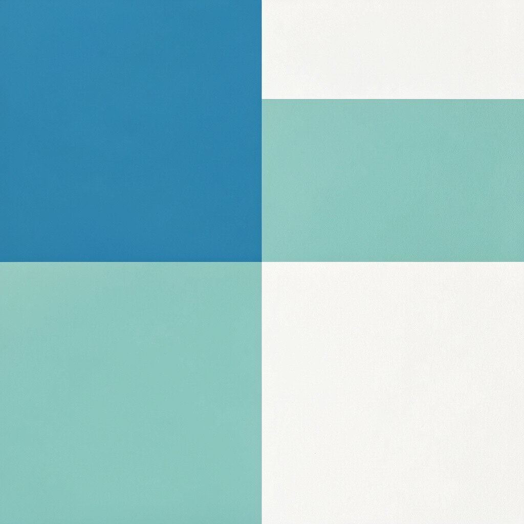
Ocean blue and seafoam feel like a fresh shoreline, clean and full of movement. White ties it all together, making layouts feel light and breathable.
Use white as your main background so text and graphics stay readable, especially in presentations and worksheets. Put ocean blue in headings, larger shapes, and main visuals, then use seafoam as the secondary color for small highlights and icons. This scheme is practical because it naturally supports clarity and doesn’t rely on heavy contrast alone.
Personalize by adding small patterns that match your theme, like wave lines, dotted bubbles, or tiny sailboat shapes. For practical tips, keep seafoam as the “helper color” for spacing elements, such as borders and underlines, to create consistent structure. Cost-wise, white and ocean blue are easy to find in basic supplies, and seafoam can often be mixed quickly using a bit of green with white.
13. Ruby Red With Creamy Tan and Deep Plum
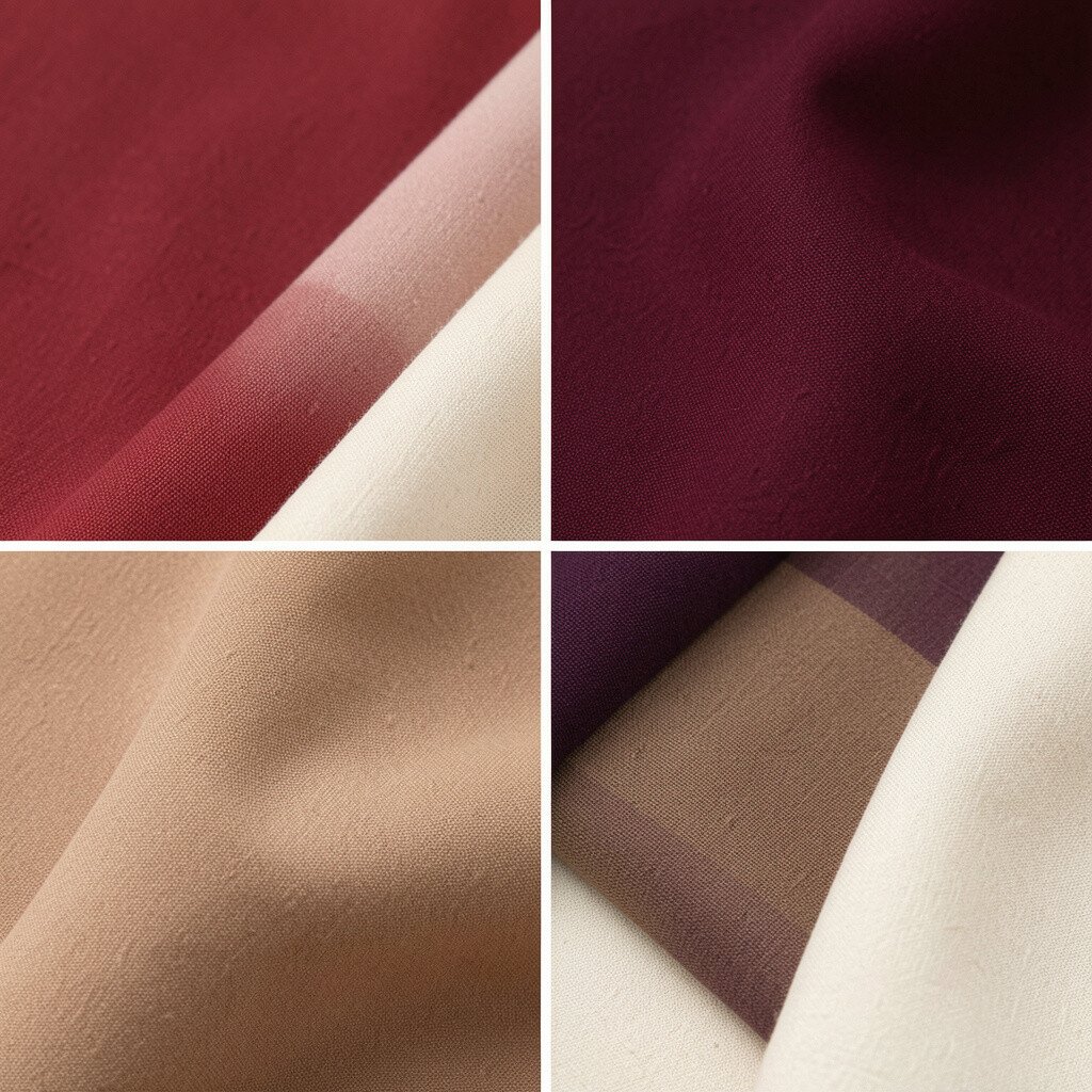
Ruby red brings strong emotion, like a confident voice in a room. Creamy tan softens the intensity, and deep plum adds a richer shadow that makes the palette feel complete.
This combination is perfect for invitations, handmade goods, and brand moments that need personality. Use creamy tan as the calming base, apply ruby red to main headlines or central elements, and add deep plum for outlines, borders, or secondary text. It’s unique because it feels dramatic but still warm, not harsh.
For practical tips, don’t let ruby red cover everything; reserve it for the “main character” parts so the design stays readable. Personalization can be as simple as adding a pattern you love, such as subtle floral shapes, and repeating that pattern across labels or packaging. Cost considerations are also manageable since tan and deep plum can be achieved with common craft pigments, and ruby accents can be done with fewer, high-impact details.
If you want to match current trends, consider pairing warm, jewel-like colors with soft neutrals for a modern, elevated look. This palette works especially well in both print and digital formats because it offers strong contrast with a creamy buffer. Once you try it, you’ll likely find it’s easy to create a whole set of coordinated pieces without starting from scratch every time.