
The walls of a game room can set the mood before you even start a match. The right abstract pieces add energy, color, and personality without needing a full makeover.
1. Burst-Color Canvas Triptych

Picture three matching abstract panels that feel like movement froze mid-sprint. Bright blocks of magenta, teal, and sunshine yellow make the whole corner look louder in the best way.
Choose a triptych with thick paint textures so the art stays interesting from across the room. This kind of layout helps your eyes land naturally on your setup, which makes the space feel organized even when gaming gets intense. For an easy win, measure the wall first, then center the middle panel at eye level and let the side panels frame your screen or seating. If you want to keep costs friendly, look for canvas prints instead of original paintings, and pick bold colors that match your room accessories.
2. Neon Geometric Splatter Poster

Think of geometric shapes bursting like playful fireworks across a dark background. Neon lines and tiny splatters create a vibe that feels fast, fun, and slightly futuristic.
Use this style when your game room already has a lot of electronics and you want the wall art to feel like part of the action. It also works great in smaller spaces because the crisp angles guide the eye and prevent the wall from feeling flat. To personalize it, pick a palette that matches your controller colors, headset lighting, or chair accents. For cost control, consider unframed posters in a simple frame, since large impacts can come without expensive materials.
You can also hang it slightly higher than usual, so it sits in the same visual area as your monitor. Pair it with a dim lamp or LED strip so the neon colors pop more at night. If you like rotating decor, keep a second poster ready so you can switch moods during different seasons.
3. Fluid Acrylic Wave Wall Statement

Imagine a wide artwork that looks like painted water sliding across glass. Soft swirls of blue, coral, and lavender give a calm energy, like the room is breathing.
This type of piece helps balance the sharpness of gaming gear with smoother visual lines. When you have busy shelves or cable runs, fluid abstract art can make the room feel less cluttered. Try choosing a piece with a few repeated colors, so it ties into your rug, curtains, or desk accessories. If you are on a budget, look for print-on-canvas versions that still keep the wave texture effect.
For personalization, place it behind or beside your seating so it becomes your go-to background when you take photos. A simple black frame can make the colors feel even richer without extra fuss. Keep the rest of the wall decor minimal so the waves stay the star.
4. Rainbow Brushstroke Grid

This idea brings back the fun of doodling but makes it look grown-up. A grid of bold brushstrokes in rainbow shades creates a pattern that feels bright and balanced.
It benefits your room by giving your wall a clear structure, even though the colors are playful. Because the strokes are varied, the art still feels unique instead of repetitive. To make it practical, hang it in a place where you can see it while you sit, but keep it away from glare from windows. For personalization, match the grid colors to your console cases, fun wall decals, or gaming chair upholstery.
5. Sunset Dust Abstract Spray Art
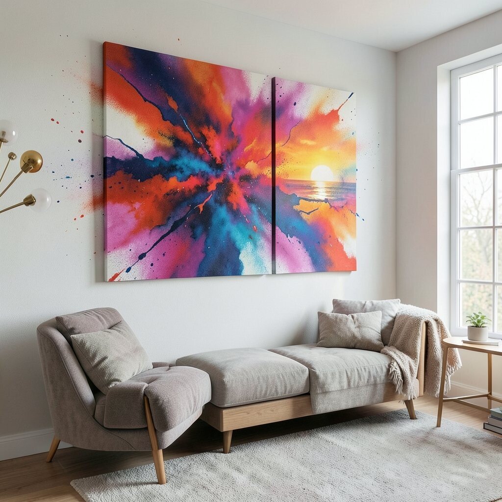
Picture warm dusk tones fading from orange to rose, with small speckles like floating dust. The overall look is soft, but the color feels bold enough to energize the room.
This style is great when you want abstract art that feels welcoming after a long session. It also benefits focus by adding soothing movement instead of hard, intense shapes. If you want it to look right, choose a piece with a wide gradient so it fills the wall space nicely without needing extra decor. For cost considerations, open-box prints and online marketplaces can offer huge size options at a lower price.
Personalize it by selecting a sunset palette that echoes your monitor glow or your desk lamp warmth. Try placing it above a console table so the artwork supports the room’s layout instead of competing with it. If you like seasonal changes, keep a cooler-toned abstract ready for later in the year.
6. Monochrome Contrast With One Loud Accent
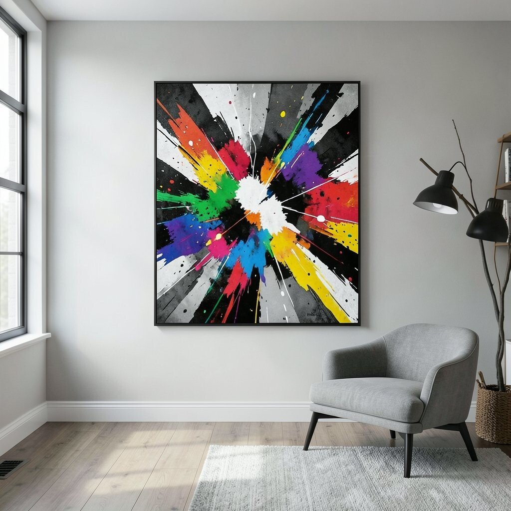
This design uses mostly black, white, or gray, then adds one surprising color like bright lime or electric red. The contrast makes the accent color look even more dramatic.
It benefits gamers who want visual energy without overwhelming the senses. Because most of the tones are neutral, the piece stays unique and stylish even as your game decor changes. To make it practical, pick a frame that matches your desk or monitor stand, so the room looks intentional. For personalization, choose the single loud accent to match your keyboard color, desk mat, or controller light.
If you want a budget-friendly option, search for “minimal abstract” prints, which are often cheaper than highly textured originals. Hang it where the color accent can catch light, especially near LED lighting. This approach also works well if you already have colorful posters or shelf displays, since the wall art stays calmer.
7. Tropical Color Block Lifted Texture Art
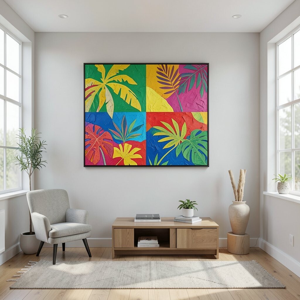
Imagine stacked color blocks that feel like they have raised layers, like paper cutouts in paint. Greens, sunshine yellows, and hints of ocean blue bring a tropical energy to your room.
This kind of art adds benefits by creating depth, so it looks interesting even when you are not fully focusing on it. It is also unique because the textures can create shadows, making the piece look different during the day. For practical tips, use painter’s tape to map where the blocks will sit, then align the layers carefully so it looks clean. Personalize it by repeating one color from your room theme, like lime for a neon vibe or turquoise for a beachy feel.
When cost matters, look for artworks that are meant to be installed with simple hardware, since shipping and framing can add up. If you can, choose a medium size that fits your wall without needing multiple pieces. This style also pairs well with natural wood shelves because the bright colors stand out more.
8. Interlocking Shapes Spin Poster
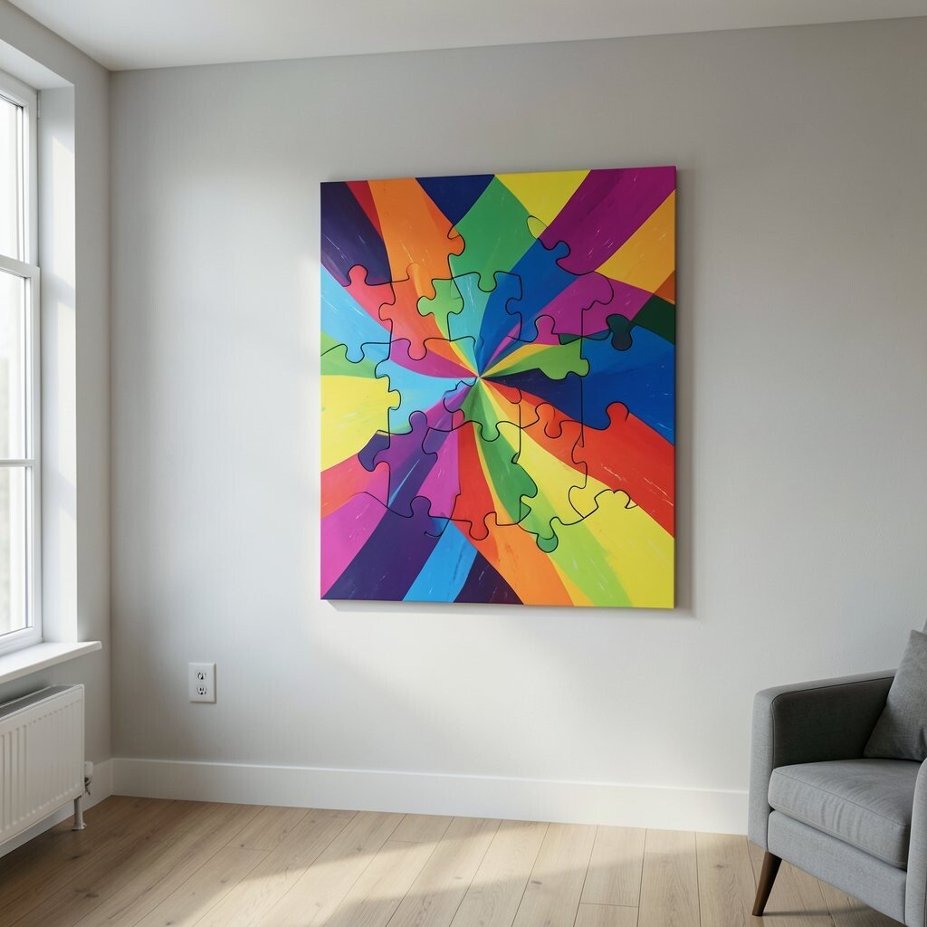
Think of circles, triangles, and ribbons that seem to twist around each other. The colors can be playful or bold, but the feeling is always dynamic and alive.
This is a strong option when you want art that feels like motion, which matches the energy of a game room. It benefits your space by giving the wall a sense of flow, so the room feels connected from one side to the other. For personalization, select a limited palette and repeat it across shapes, so the piece looks unified. You can keep it affordable by choosing a modern graphic print, which often gives you a big look without an original price tag.
9. Cosmic Nebula Drip Abstract
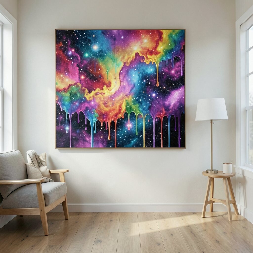
Picture deep purples and blues with bright star-like specks, plus paint drips that look like slow falling stardust. It feels like your wall turned into a mini galaxy.
This piece is great for a room that already has sci-fi vibes, controller chargers, or fantasy themed shelves. It also benefits your mood because the galaxy colors feel immersive without being chaotic. For practical tips, make sure the dark parts are not too close to dark furniture, or the artwork might disappear. Personalize it by choosing specks in colors that echo your LED lights, like pink, cyan, or gold.
If you want to keep costs lower, consider canvas prints with a drip effect, since they can mimic the look of textured originals. Hang it slightly above eye level so the “stars” feel like they are floating. For an extra touch, add a small shelf below it with a couple of themed items, but keep it tidy so the nebula stays the focus.
10. Warm Earth Tones With Unexpected Pop
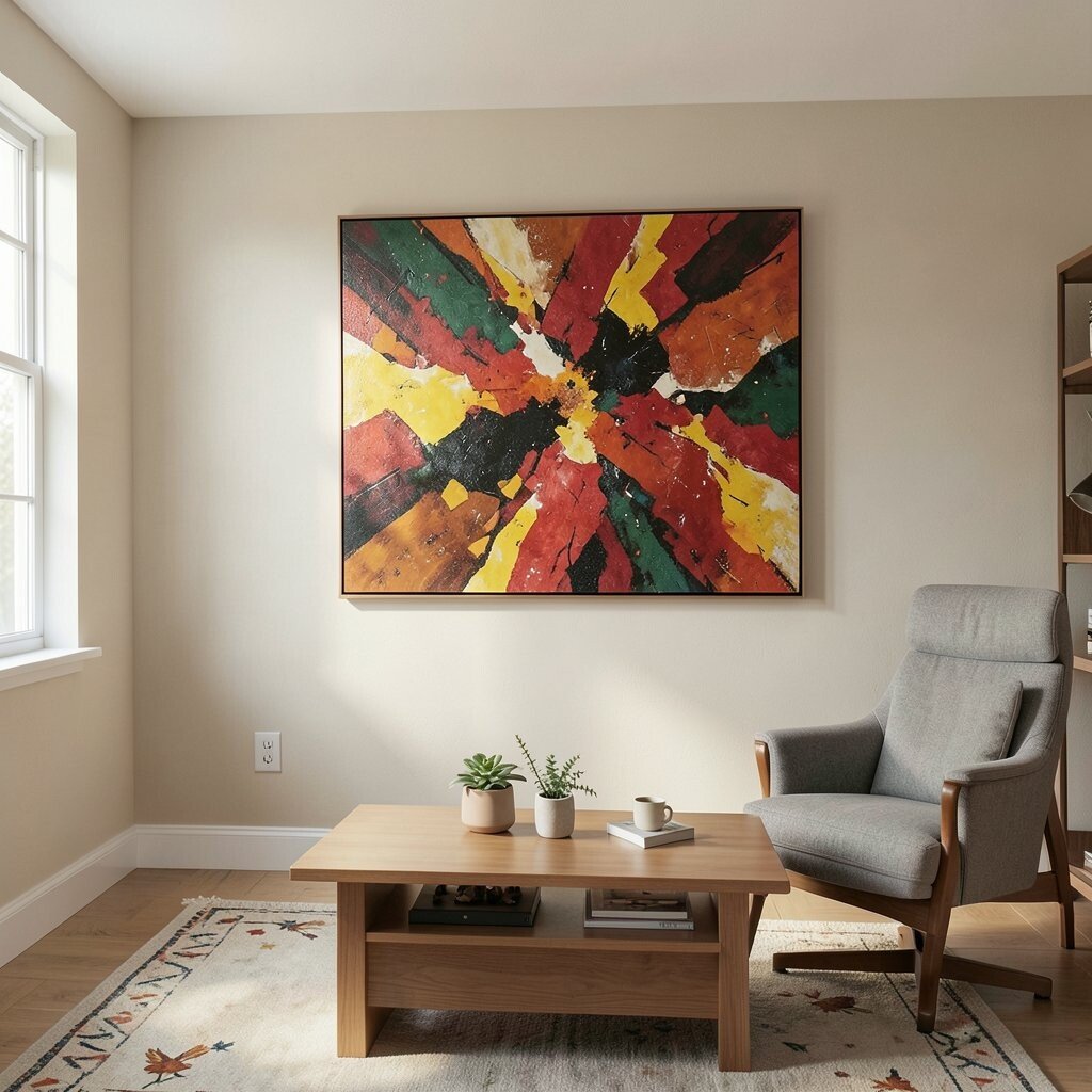
This abstract looks grounded, using terracotta, rust, and soft creams, then adding one unexpected punch of color. That pop might be teal, bright yellow, or even a vivid cobalt spot.
The benefit here is balance, especially if your game room has wood finishes and comfy neutrals. The uniqueness comes from the contrast between calm earth tones and a lively accent that draws your eyes. For practical tips, place it near your main gaming zone so the accent color becomes a visual anchor. Personalize it by repeating the accent color in small items like cable organizers, a throw blanket, or a mouse pad.
Cost can be reasonable with affordable print options, especially when you choose a piece with simple shapes rather than ultra-detailed textures. If you prefer less fuss, pick a ready-to-hang canvas so framing time stays short. This style also looks great in rooms that use warm lighting, since earth tones glow nicely.
11. Bold Circle Orbit Wall Art
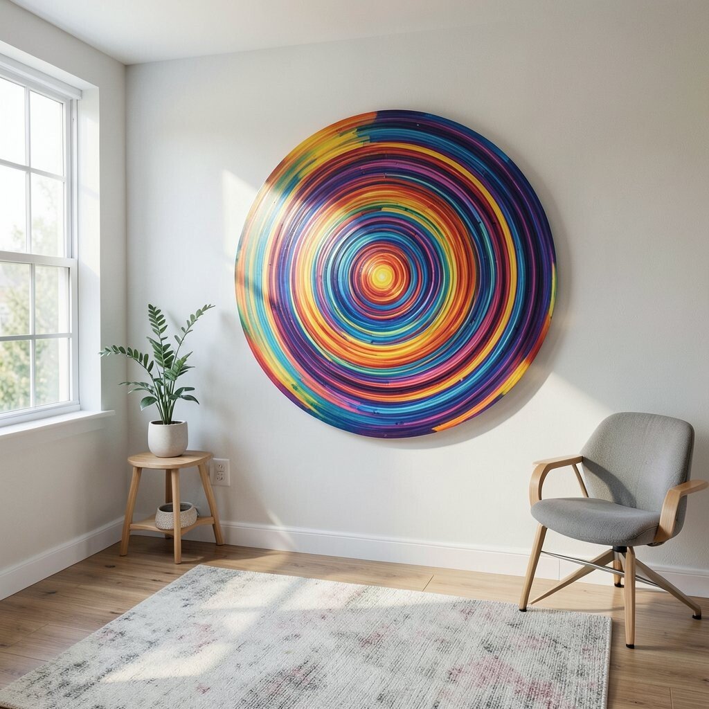
Imagine a set of large circles, like planets, overlapping with bright outlines. The colors feel crisp, and the layout suggests a gentle orbit around the center.
This benefits the room by creating a clear focal point, which is helpful when you have multiple zones like desk, console, and seating. It is unique because the circle shapes add rhythm without making the wall feel repetitive. For personalization, match circle colors to your team colors, or pick shades that match your gaming lighting settings. To keep practical costs down, choose a lightweight print that is easy to hang and won’t require heavy-duty mounts.
Try centering the artwork with your monitor or TV so it frames the “center of play.” If you have two monitors, consider a wide version so the circles feel balanced across the wall. This design also pairs well with wall shelves since the shape outlines look good next to simple hardware.
For a modern trend feel, look for “orbit” or “planet” abstract designs, which have been popping up in contemporary decor collections lately. The result is colorful, clean, and still relaxed enough for everyday gaming.
12. Ink Splash In High-Gloss Frame
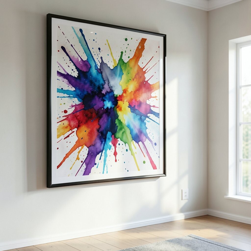
Picture a black and white ink splash that suddenly bursts with color at the edges. A high-gloss frame can make the artwork look extra vivid, like it has a fresh, wet finish.
This style brings benefits because the contrast makes your wall art stand out even in low light. It also feels unique since ink splashes naturally look different every time, so your piece won’t feel mass-produced. For practical tips, use a frame with protective glass if the room gets dusty or if you have pets. Personalize it by selecting accent colors that fit your setup, like electric blue for a cool tech vibe.
Costs can vary, but you can often find affordable ink-style prints that still look high-end once framed. Choose a frame size that makes the splash fill the center rather than leaving too much empty space. If you want to switch things up later, keep a similar color palette so replacements still match your room theme.
13. Coastal Prism Angular Panels
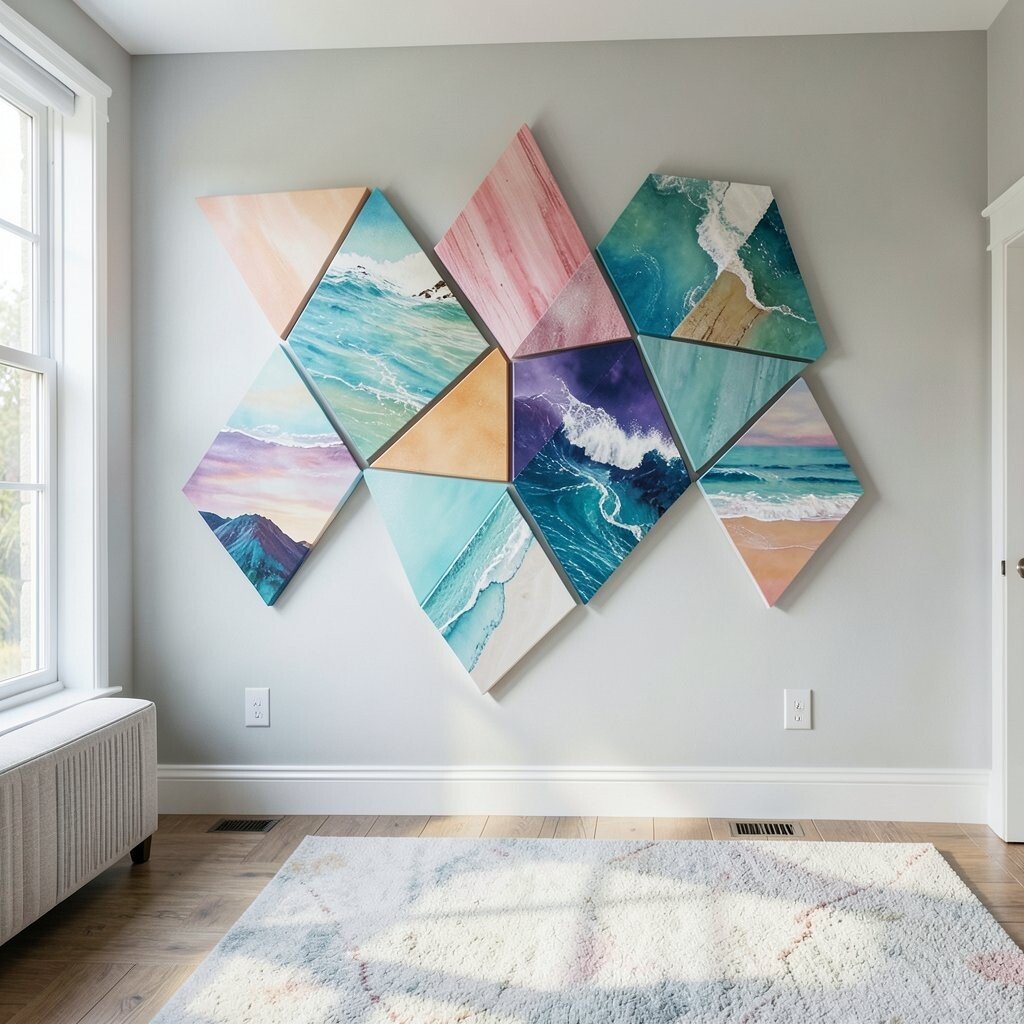
Imagine angular panels that look like stained glass, but in modern abstract form. Colors like seafoam green, aqua, and warm peach blend into a coastal prism look.
This benefits your game room by adding a light, airy energy that keeps the space from feeling heavy. The uniqueness comes from the prism angles, which catch light and make the art feel interactive. For practical tips, hang it where there is some ambient lighting, since the glassy look can feel more alive. Personalize it by choosing colors that echo your desk items, such as a turquoise mug or a peach accent lamp.
If you want to stay within budget, look for printed panels made to look like stained glass without the real glass weight. Try spacing the panels evenly so the angles look intentional rather than random. This style pairs nicely with neutral carpets and white shelves because the colors show off clearly.
14. Neon Candy Ribbon Abstract
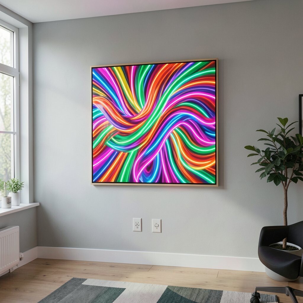
This artwork looks like ribbons of paint winding across a bright background. The colors can be pink, lime, and orange, giving a candy-like glow to your wall.
It benefits your room because the ribbon movement makes everything feel playful and lively. It also feels unique when you pick a piece with a clean, smooth curve, since that “flow” can soften the room’s angles. For practical tips, choose a size that matches your wall height so the ribbon arcs don’t feel cramped. Personalize it by mirroring the ribbon colors in small accessories like headphone stands or LED strips.
Cost is often manageable with modern abstract prints, especially when you choose a single large piece rather than multiple smaller ones. If your walls are busy with posters, this can still work because the ribbons create a continuous visual path. Consider a matte finish if glare from lights makes glossy art look too shiny during daytime.
15. Bold Checker Fade Canvas

Think of a checker pattern that fades from one color to another across the canvas. It creates a fun optical rhythm, like your wall has its own subtle pulse.
This benefits your game room by adding structure while still staying colorful. The unique part is the fade, which makes the pattern feel modern rather than old-school. For practical tips, hang it across from your main screen so the eye can rest on the pattern between games. Personalize it by picking check colors that match your keyboard lighting or the color in your favorite game artwork.
If you want cost considerations, checker designs are common in print shops, so you can shop around easily for sales. Choose a canvas print that is deep enough to give the pattern a slight edge effect. This piece also looks great with simple, solid-color frames or no frame at all on stretched canvas.
To keep it from feeling too loud, balance the wall with calmer decor, like solid-colored storage bins or a plain shelf backdrop.
16. Bright Mandala Detour Artwork
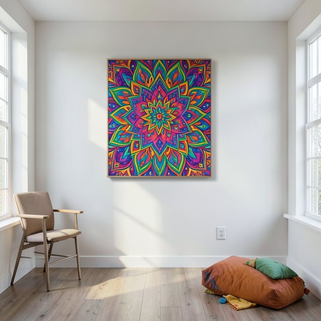
Instead of a perfect mandala, this one looks like circles and lines pulled into an abstract detour. Colors can be bright and cheerful, like turquoise, coral, and bright yellow in layered strokes.
This benefits your space by adding a sense of focus and calm, even though the art is colorful. It is unique because the design feels intentional but still playful, like a creative twist on a classic motif. For practical tips, keep the artwork centered on the wall above a shelf or game console so it becomes your visual centerpiece. Personalize it by selecting colors that match your room’s theme, such as game icons or a favorite sports palette.
Cost-wise, look for prints on paper or canvas that mimic layered line work, since true textured originals can be pricey. A simple frame can make the lines pop, especially if you choose one in a neutral black or white. If you have multiple wall pieces, use similar colors so the mandala does not fight with other art.
17. Sunset Lagoon Diptych With Borders
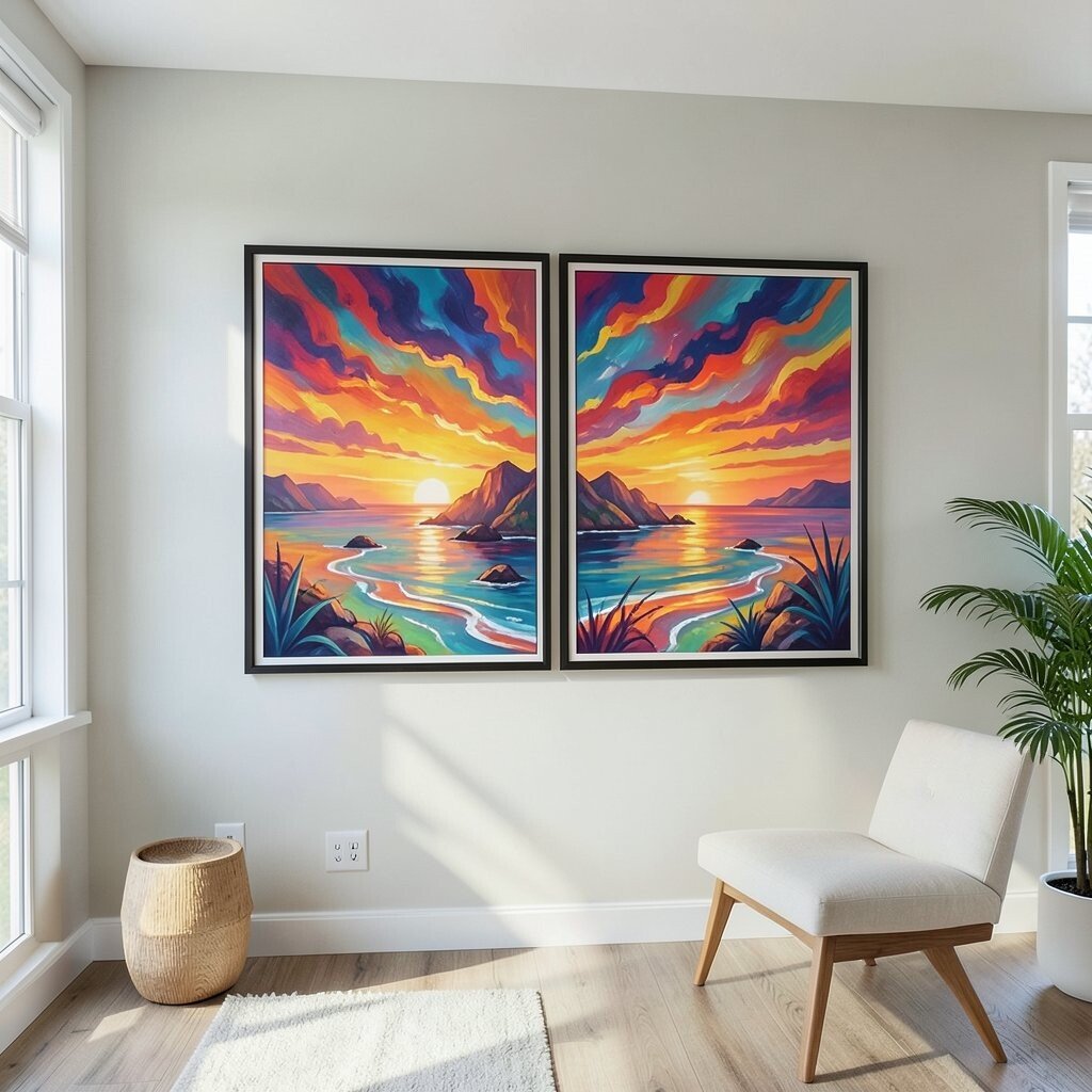
Envision two matching abstract pieces that feel like panels from a bigger painting. One side leans orange and rose, while the other flows into teal and soft purple, like a sunset meeting water.
This benefits the room by adding a clear two-piece rhythm that looks great in most layouts. The uniqueness comes from the border-like separation, which helps each panel hold its own color story. For practical tips, keep a small gap between the diptych pieces so the boundary is visible and the artwork looks intentional. Personalize it by picking one or two colors that repeat in your bedding, rug, or storage accents.
Cost considerations are often favorable with diptychs because many brands offer matching pairs in standard sizes. If you want to save more, search for “set of two” abstract canvas prints rather than separate listings. Hang it at a height that works with your seating, so it feels like it surrounds the play area rather than towers over it.
18. Bold Splatter Typography-Style Abstract

This abstract style uses shape and splatter as if letters were hinted but never fully formed. It feels like graphic design meets street art, with bright color bursts and energetic spacing.
It benefits your game room by adding a modern street vibe that pairs well with posters and collectibles. The uniqueness comes from the “almost words” feel, which keeps people curious without becoming clutter. For practical tips, keep the rest of the wall decor simple so the splatter stays readable as art, not as noise. Personalize it by choosing colors that match your headset, such as electric blue or neon green.
Cost can be reasonable because typography-inspired prints are widely available and often produced in different sizes. Choose a medium size first, then adjust based on how it looks next to your gaming setup. If you love DIY, you can also commission a local artist to create a custom color palette while keeping the composition similar to a print you like.
19. Bright Minimal Lines On Dark Background
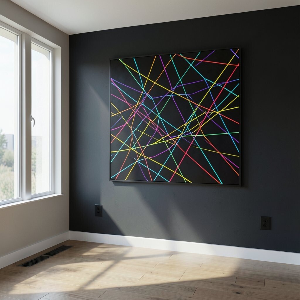
Imagine a mostly dark canvas with thin, bright lines that curve and intersect. The effect feels like energy zipping across the wall, like a game map drawn in neon.
This benefits your room because minimal art can reduce visual overload when you have many gadgets. It is unique because the lines create movement without filling the whole space with heavy color. For practical tips, use a frame that matches your desk or console color so the art looks crisp. Personalize it by selecting line colors that match your LED lighting or your controller buttons.
For cost considerations, thin-line abstract prints are often affordable while still looking sleek. Choose a size that is tall enough to stand out behind a gaming chair, especially if the room lighting is dim at night. If you want more impact, place a small floor lamp angled toward the art so the lines catch light and feel extra bright.
20. Mosaic Splash Photo-Style Abstract
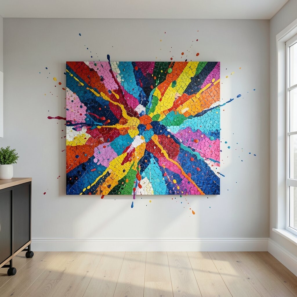
This idea looks like a mosaic made from different paint textures, almost like the artwork is built from many tiny moments. Bright colors pop in small sections, giving a lively, energetic look from far away.
It benefits your game room because mosaics feel rich and detailed, which makes the wall interesting during breaks. The uniqueness comes from the “many pieces” feel, since each tile can look like it belongs to a different story. For practical tips, choose a frame with good quality glass or acrylic if you want easy cleaning. Personalize it by choosing a mosaic palette that matches your wall shelves or your favorite game colors.
Cost can be flexible here, since mosaic-style art comes in both budget prints and higher-end textured versions. If you want a cost-smart route, start with a print that includes texture in the design, then upgrade to a textured piece later if you love it. This style also looks great paired with solid-colored wall shelves, because the art provides the energy while the shelves keep things tidy.
21. Geometric Bloom Color Wheel Piece
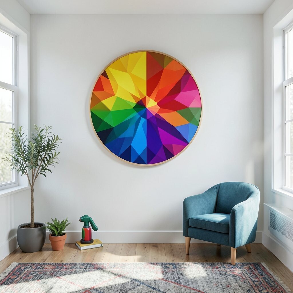
Picture a color wheel made of geometric shapes, where each segment bursts into its own abstract pattern. The overall effect is joyful and helps your brain feel like the room is “ready to play.”
This benefits your game room by adding lots of color variety while still staying organized. It is unique because it mixes structure with creativity, so it feels designed rather than random. For practical tips, use a size that fits the wall area without covering your entire blank space, and hang it centered so the wheel looks balanced. Personalize it by selecting segment colors that echo your game posters, your chair, or even your gaming room lighting theme.
When considering cost, color wheel abstracts are popular, so you can find affordable versions in different materials. Canvas prints often give a nice upgrade for the price, and they look great with simple frames. If you like current decor trends, geometric bursts and color wheel motifs have been showing up a lot in modern interiors because they feel fun but still clean.
Try adding a small matching accent item on the opposite wall, like a bright game-themed sign, so the room feels like it has a consistent color language.
22. Custom Nameplate Accent With Abstract Background
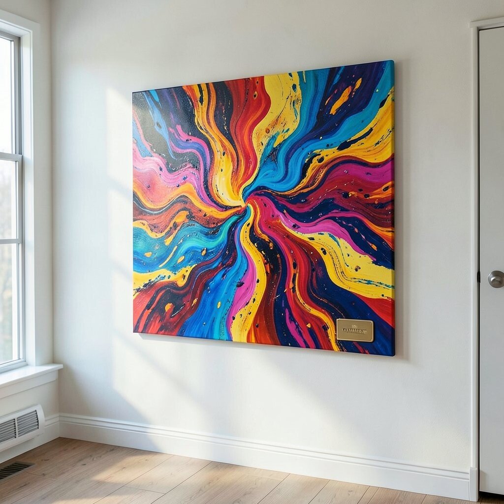
This artwork combines a colorful abstract background with a personalized nameplate style element, without making the whole wall feel formal. You get the fun of color and the special feeling of something made just for your space.
It benefits your game room by turning wall art into a personal feature, which is what makes rooms feel unforgettable. The uniqueness comes from mixing abstraction with personalization, so it feels different from typical generic wall prints. For practical tips, choose the background colors first, then make sure the name text contrasts clearly so it is easy to read. Personalize it with your gamer tag, your team name, or even a phrase that sets the vibe like “main arena” or “co-op zone.”
Cost considerations are important here, since custom pieces can cost more than standard prints, but you can manage it by choosing simpler typography and a single custom panel. Many online shops let you upload text and choose an abstract background, which can be more affordable than commissioning a full original painting. If you want the best value, order the biggest size you can afford, because personalization looks strongest when it fills the space.
For a modern trend touch, match the typography style to the abstract shapes, like using curved letters that echo flowing paint. Hang it where it can be seen during loading screens so the room feels like it is cheering you on.