
White cabinets set a clean stage for color to speak up. The right contrast can make your kitchen feel lively, personal, and full of style.
1. Deep Navy With Brass Accents

Imagine white cabinet doors paired with deep navy walls or island panels, creating a crisp, confident look. Brass hardware glints like jewelry and makes everyday chores feel a little more special.
This contrast brings a calm richness without looking heavy. It also helps white surfaces stay bright, so the room feels open even when you add bold color.
2. Charcoal Gray For Modern Edge
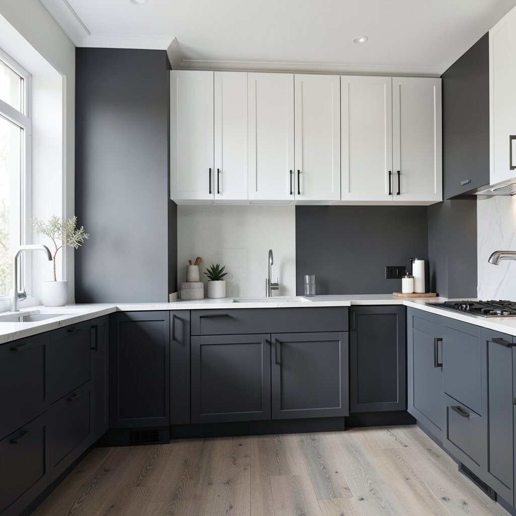
Charcoal gray countertops or a backsplash can turn a simple kitchen into a sleek space. The white cabinets act like a high-contrast frame that sharpens every line.
Using gray in a matte finish keeps fingerprints less noticeable and looks modern for years. You can also repeat charcoal in barstools, light fixtures, or under-cabinet shadows.
For practical results, match the undertone by choosing either warm gray or cool gray so nothing looks muddy. If you want a softer feel, pick a textured backsplash that adds depth without losing clarity.
3. Emerald Green For Rich, Jewel-Tone Drama
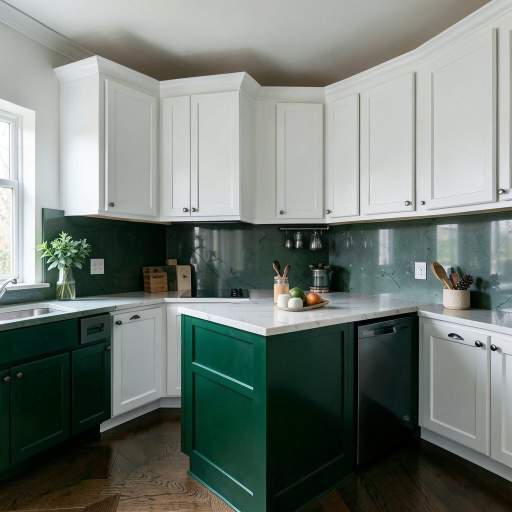
Emerald green subway tile or painted cabinet trim looks like a jewel box next to bright white. The cabinets keep the color from overwhelming the room, so it still feels airy.
You’ll get a bold statement that feels classy, not loud. Green also pairs naturally with wood tones, so open shelves can display cutting boards, ceramics, and plants.
To make it wearable, start with smaller zones like the backsplash, a statement range hood, or painted cabinet interiors. Consider durable, wipeable finishes because kitchens see splashes and steam every day.
4. Warm Terracotta For Cozy Energy
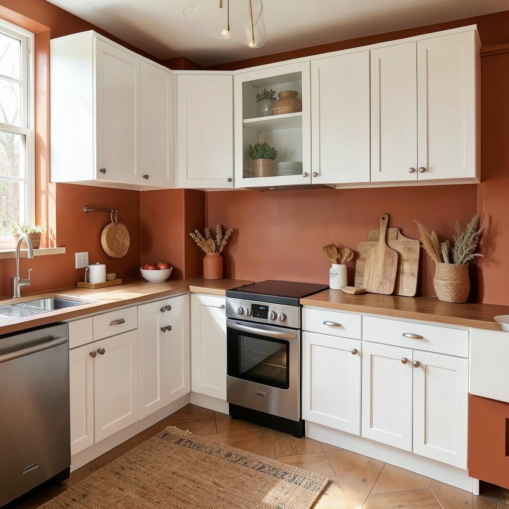
Warm terracotta brings a sunny, earthy feel when it contrasts with crisp white cabinets. Picture terracotta tiles behind the stove, paired with simple white fronts and light wood shelves.
This color choice adds comfort and makes the kitchen feel inviting. It’s especially great if you enjoy rustic touches, woven baskets, and natural textures.
5. Black Accents For Crisp, High-Drama Lines
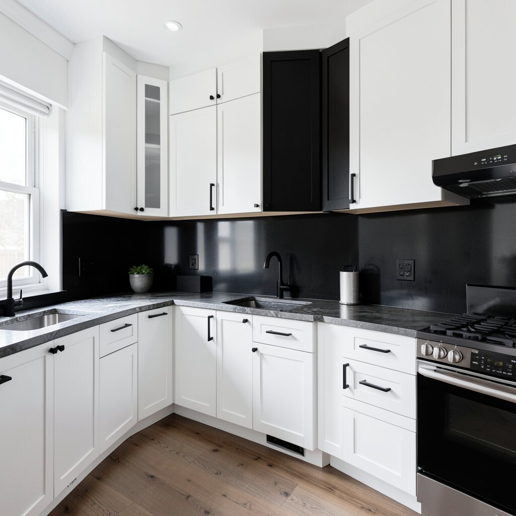
Black accents can make white cabinets look even cleaner and more tailored. Think black pulls, a black faucet, or a dark framed window where light can bounce around.
You get a sharp, modern look without committing to huge painted surfaces. It’s also easy to update later by swapping hardware or adding a black countertop edge.
For personalization, mix black in more than one place so it feels intentional. Try black pendants over an island or a black cooktop surround to anchor the whole design.
6. Teal Blue For Playful Coastal Charm
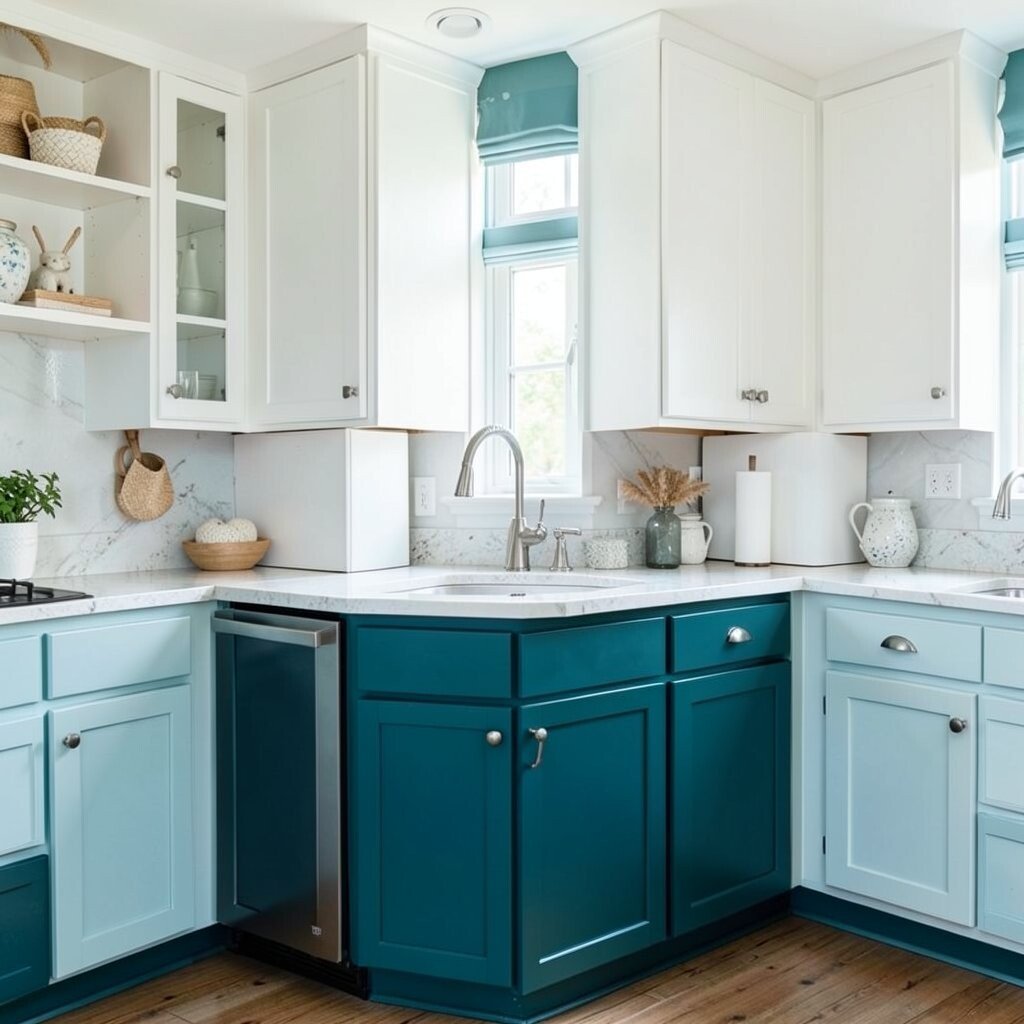
Teal pairs beautifully with white cabinets because it sits between blue and green. A teal backsplash or lower cabinets can give a cheerful coastal vibe while staying stylish.
This contrast brightens up the kitchen and adds personality to a space that might otherwise feel too plain. Teal also looks great with brass, white quartz, and light oak cabinetry details.
Keep it practical by choosing a glazed tile that’s easy to scrub. If you’re unsure, paint a single cabinet island or a pantry door so you can judge the look in natural daylight.
7. Dusty Rose For Soft Statement Beauty
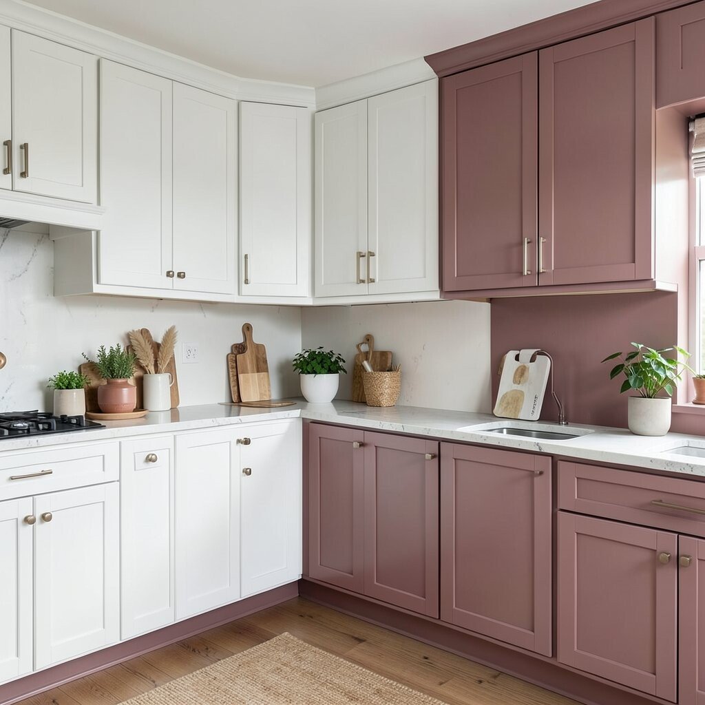
Dusty rose can be surprisingly bold when used against white cabinets. Picture rose-toned cabinet doors on an accent section, with the rest of the kitchen staying bright and calm.
This color feels warm and friendly, and it adds a gentle glow to the room. It can also make neutral decor, like beige rugs and cream curtains, look richer.
To keep the look balanced, choose muted rose tones instead of neon. Pair with warm metals like gold or rose-gold to keep the palette cohesive.
8. Burnt Orange For Bold, Sunlit Mood
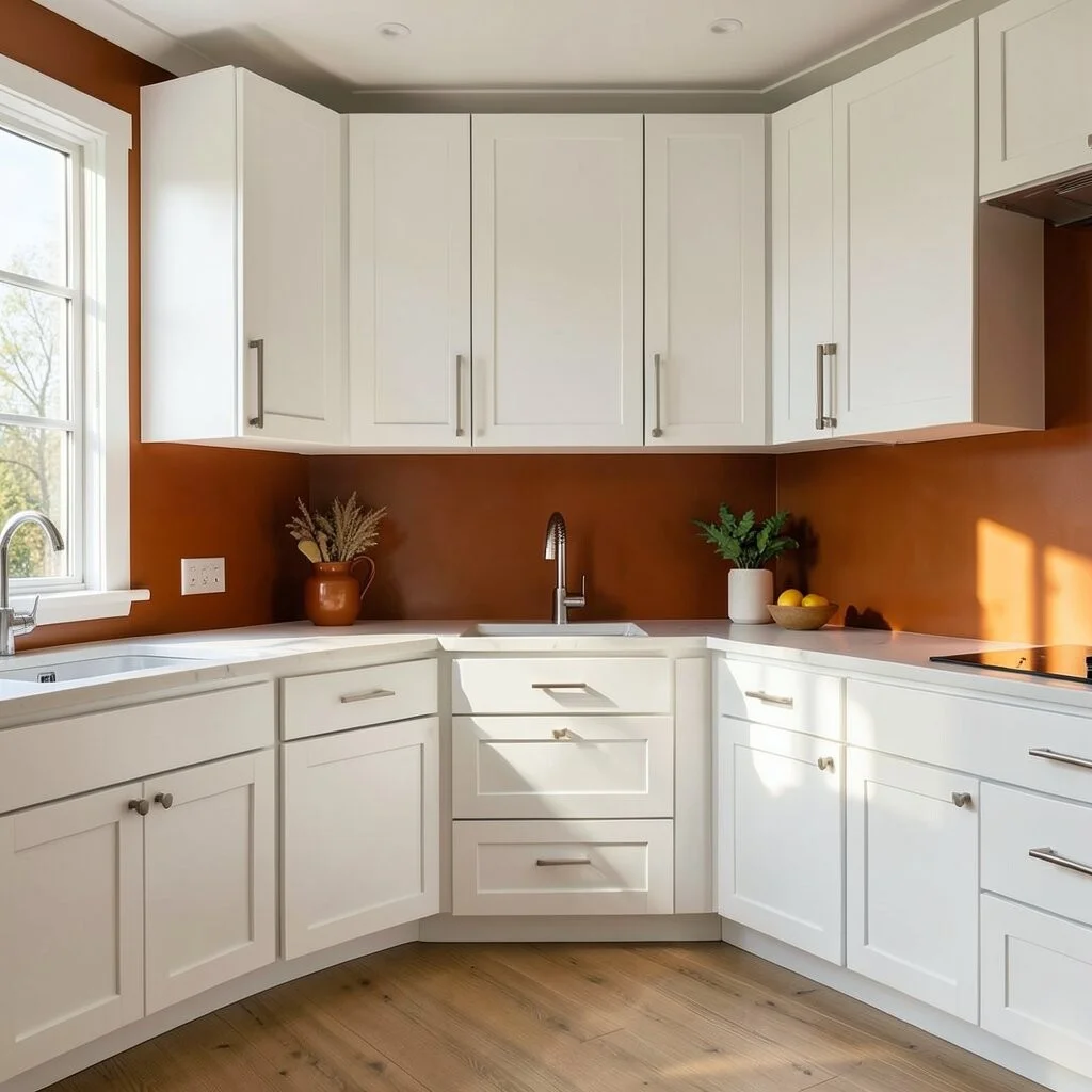
Burnt orange is the kind of contrast that turns a kitchen into a mood. White cabinets make the orange feel purposeful, especially when you use it as a backsplash or statement wall panel.
The benefit is instant energy and a feeling of warmth, even on cloudy days. It’s unique, but you can still make it livable by repeating orange in small decor touches.
9. Burgundy For Luxurious, Evening-Feel Depth
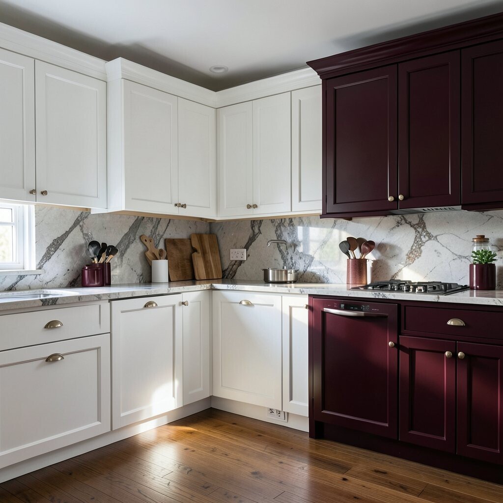
Burgundy against white cabinets feels rich and slightly dramatic. Imagine burgundy glass tile behind the sink, with white cabinets framing the color like a gallery wall.
This contrast creates depth, making your kitchen feel more layered and expensive. Burgundy also pairs well with dark wood, cream linens, and antique-style fixtures.
For practical tips, choose a tone that leans either deep red or wine so it won’t look brown in certain lighting. Test paint samples in the room because warm bulbs can shift the shade.
10. Forest Green For Classic, Timeless Character
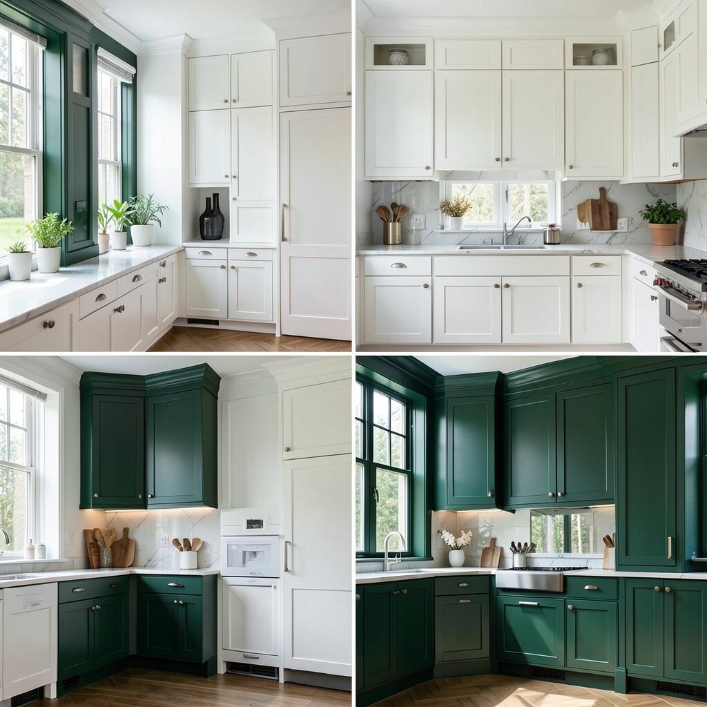
Forest green can look classic when it meets crisp white cabinets. A forest green island or cabinet lowers gives you a strong focal point that still feels grounded.
This pairing is great for both modern and traditional kitchens. It also helps hide small scuffs on the green surfaces compared with bright paint.
11. Royal Purple For Creative, Artistic Flair
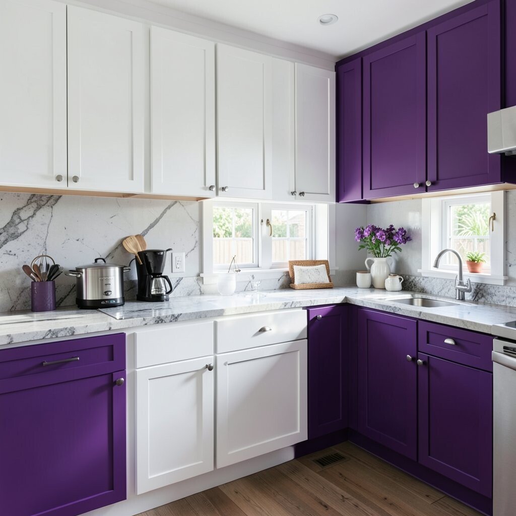
Royal purple brings an art-studio vibe to a white kitchen. You can use it on upper cabinets, a feature wall, or even a patterned tile that shows off the color in multiple tones.
This contrast is unique and memorable, and it shows you love design with confidence. It also pairs nicely with matte black hardware and light stone countertops for a balanced look.
To keep it from feeling too intense, use purple in a controlled area and rely on white to do the rest. Consider soft lighting, like warm LED under-cabinet strips, to make the color feel cozy.
12. Mustard Yellow For Bright, Happy Personality
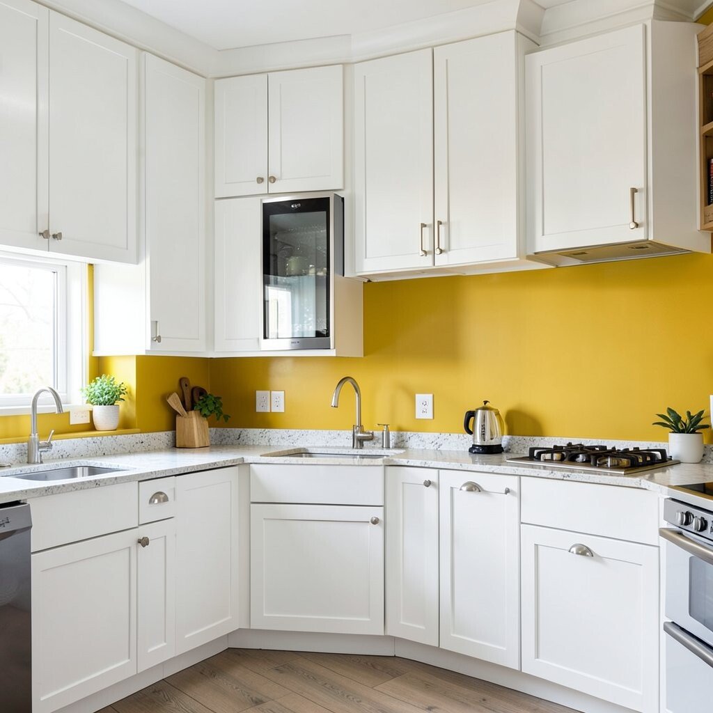
Mustard yellow feels cheerful and a little vintage when paired with white cabinets. Try mustard on a backsplash or a set of lower cabinets so the color hits right when you walk in.
This contrast lifts the entire room and makes everyday cooking feel more upbeat. Yellow also works well with natural wood and simple white stone, giving you a light, inviting palette.
If you want it easier to live with, start with tiles or a single painted wall. Use white grout or a light neutral grout to keep the backsplash looking clean over time.
13. Olive Green For Natural Calm And Texture
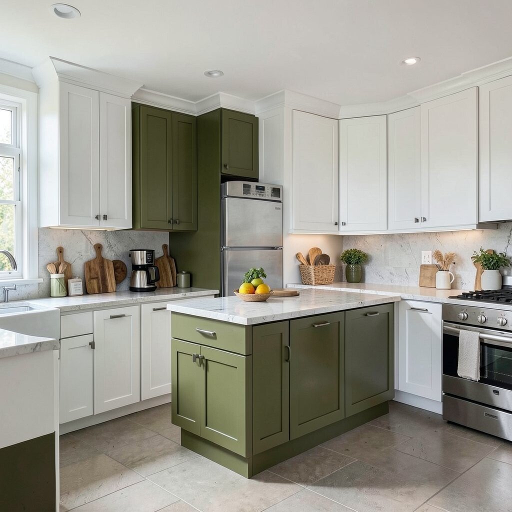
Olive green creates a calm, nature-inspired contrast next to white cabinets. Think olive ceramic tiles, green glass accents, or a painted pantry door with warm wood shelving.
This color choice feels grounded and cozy, especially if your kitchen already has lots of natural materials. It’s also a practical option because olive tones can camouflage minor wear.
For personalization, mix olive with off-white, tan, and brushed nickel hardware. You can also add woven textures, like a basket for produce, to echo the earthy mood.
14. Light Buttery Cream For Softer Contrast
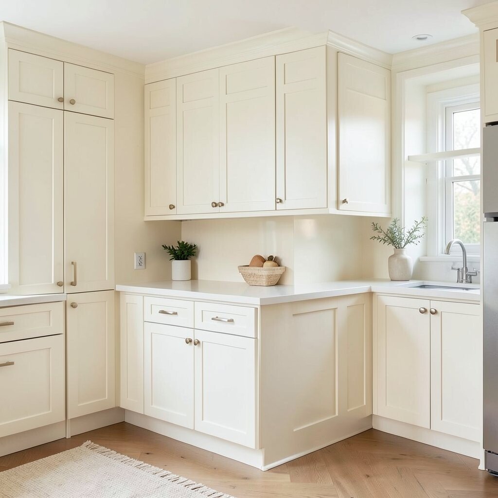
If you want something bolder than white but not too intense, go for buttery cream. It looks stunning when used in cabinet sides, trim, or a creamy backsplash mosaic that still lets white lead.
This contrast keeps the room bright while adding warmth and depth. It’s a nice trend direction for people who love “nearly neutral” palettes that feel inviting.
15. Metallic Copper For Warm Glow And Vintage Charm
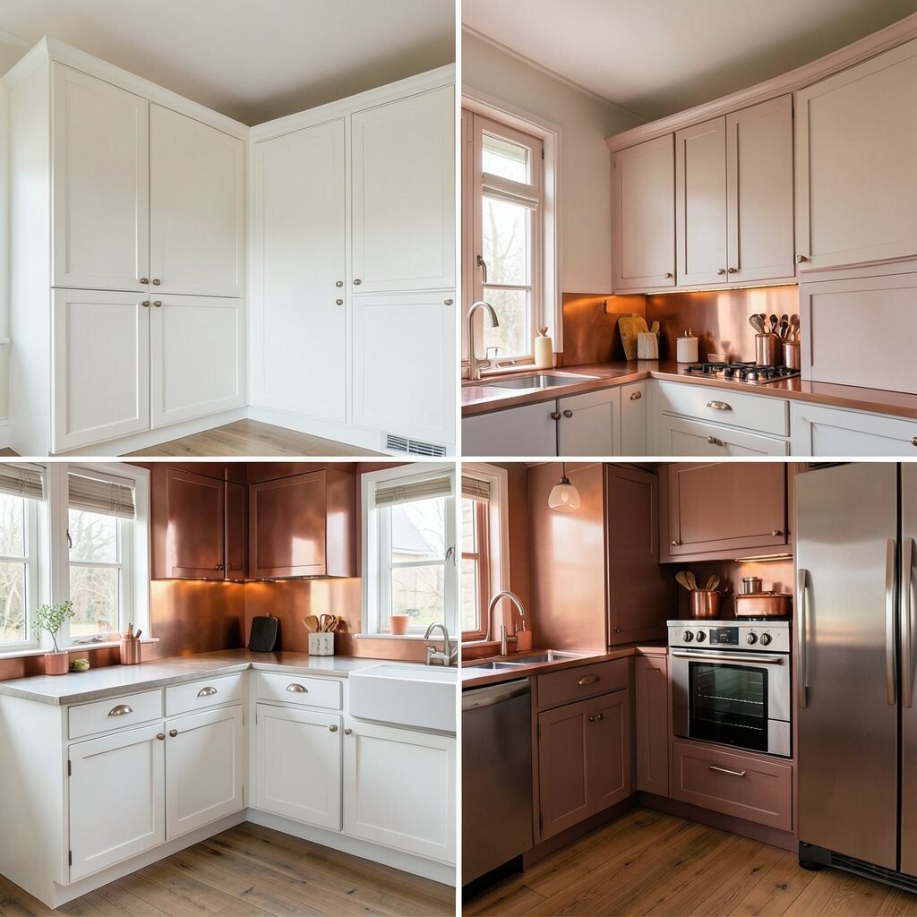
Copper accents can make white cabinets feel warm and radiant. Imagine a copper backsplash in small panels, copper pendant lights, or a copper-toned faucet paired with crisp white fronts.
The benefit is a soft glow that shifts beautifully across the day. Copper also feels unique because it looks different in sunlight, which makes your kitchen feel alive.
To keep upkeep manageable, choose finishes that are designed for kitchen splashes and wipeable surfaces. If you’re worried about cost, focus copper on lighting or hardware first, then expand to bigger surfaces later.
16. Stainless Steel Gray For Clean, Everyday Power
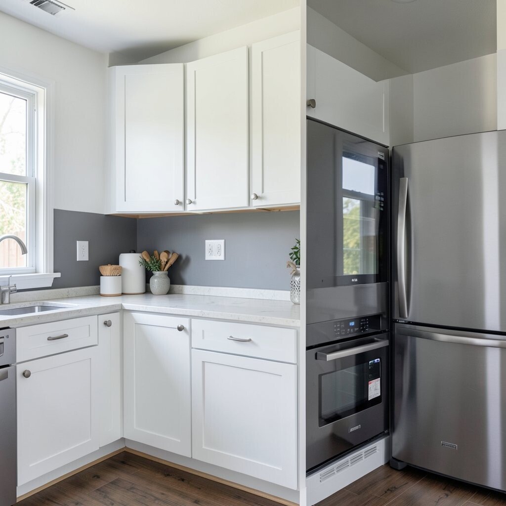
Stainless steel gray is a contrast that feels both modern and practical with white cabinets. It can show up as a backsplash panel, cabinet pulls, or even a full sink wall for a sleek look.
This pairing works because it holds up well with daily cleaning and frequent use. It also fits current trends toward bright, airy kitchens with streamlined finishes.
To personalize, mix stainless with warm wood or matte black accents so it doesn’t feel too cold. Choose brushed finishes that reduce visible water spots compared with highly polished surfaces.
17. Cornflower Blue For Fresh, Breezy Contrast
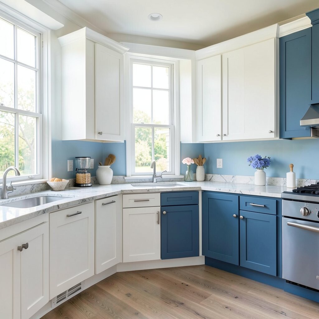
Cornflower blue can make white cabinets feel crisp and bright. Picture a cornflower tile backsplash with white grout, plus simple white cabinets that keep the space airy.
This contrast feels playful and clean, like a fresh towel in the sun. It’s a great way to add color without making the kitchen feel cluttered.
For practical tips, use durable tile or paint formulated for kitchens and steam. If you want the look to last, pair the blue with neutral countertops and steady metals like chrome or brushed nickel.
18. Espresso Brown For Rich, Classic Warmth
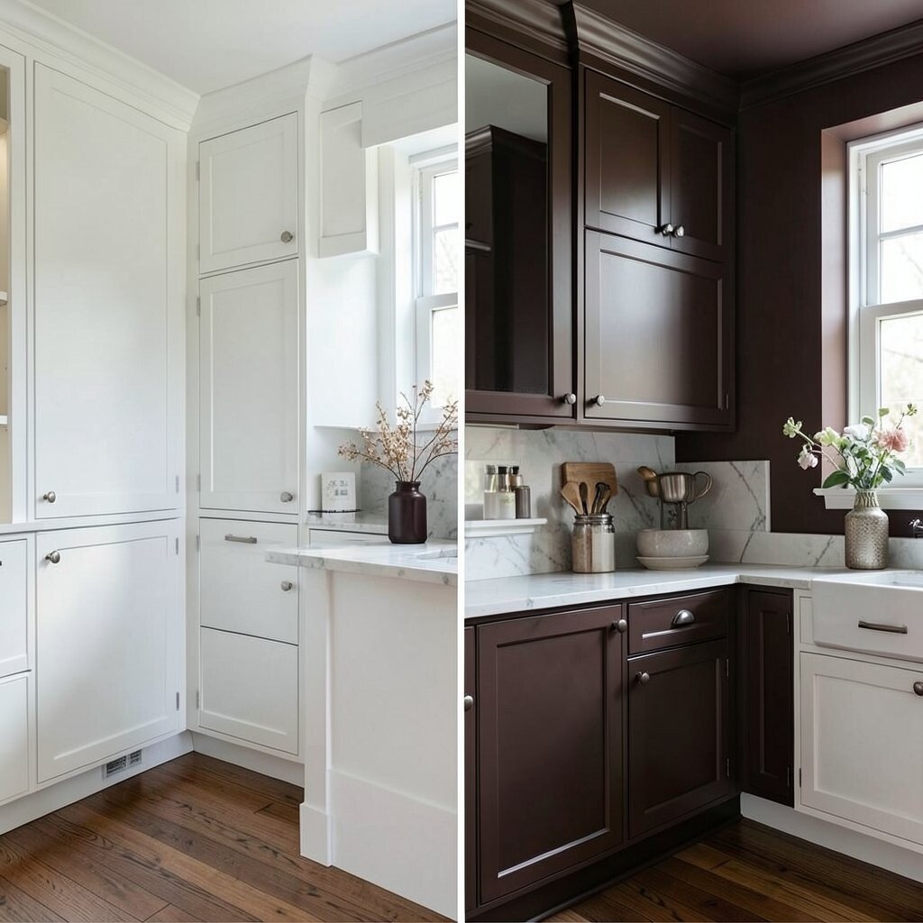
Espresso brown next to white cabinets creates a classic contrast with a cozy twist. You can use espresso as the countertop tone, a lower cabinet color, or even a wood-slat accent section.
This choice adds warmth and makes the kitchen feel grounded. It also helps white surfaces look intentional, like the whole room belongs together.
19. Bright Red For Maximum Statement Impact
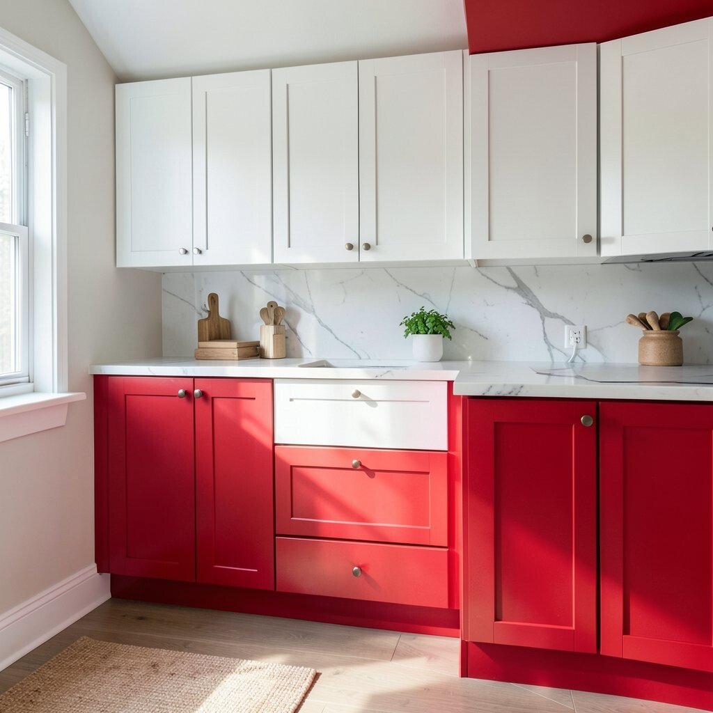
Bright red is the ultimate bold contrast for white cabinets. Imagine red cabinets on an island or a dramatic backsplash that makes the entire kitchen feel like a design moment.
The benefit is instant personality and a strong focal point. Red also pairs well with white stone and black accents, so you can balance the energy with sleek details.
To keep it practical, choose a high-quality paint or cabinet finish that resists scuffs. If full red feels like a lot, try red cabinet hardware and a red runner instead, then scale up if you love it.
20. Powder Blue For Light, Dreamy Calm
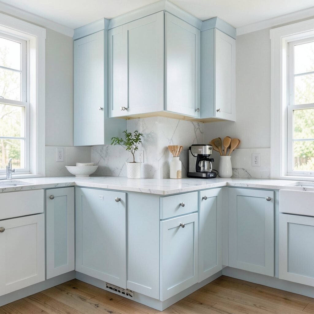
Powder blue offers a softer contrast that still feels stylish with white cabinets. A powder blue backsplash or painted cabinet trim gives the room a gentle, calming mood.
This contrast can make your kitchen feel airy, especially in spaces with lots of daylight. It’s also unique because it’s not the usual navy or gray, so it stands out in a good way.
For personalization, pair it with white quartz and warm brass so the blue feels fresh, not chilly. Keep the rest of the decor simple so the color remains the hero.
21. Cool Lavender For Quirky, Modern Charm
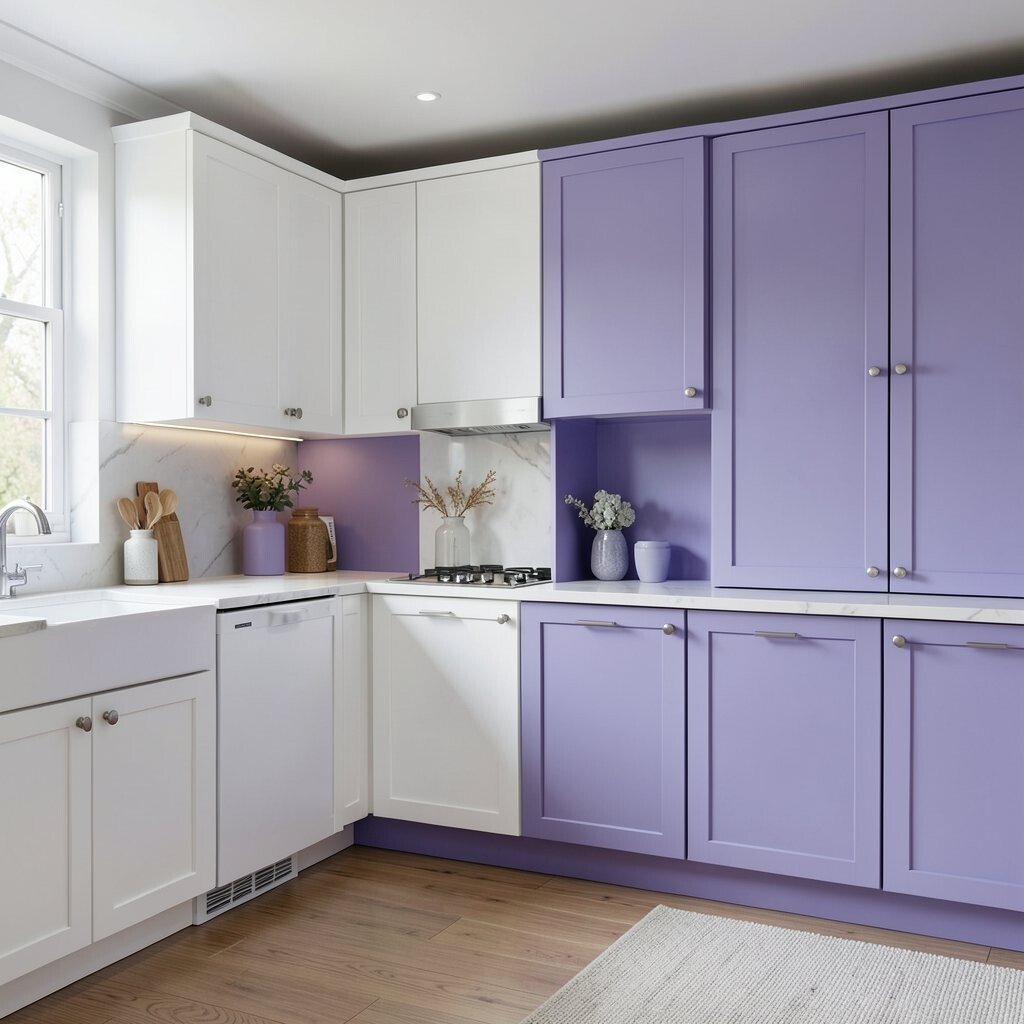
Lavender can add a quirky modern charm to white cabinets. Think lavender-toned tiles, a painted pantry, or even lavender cabinet doors that look lovely in the morning light.
This contrast feels creative and fresh, and it can make a plain kitchen feel like your personal style page. Lavender also works well with white and light gray because the palette stays gentle.
For practical tips, choose a satin finish that’s easier to wipe than flat paint. If you want to manage cost, start with tile behind the stove or a small wall section instead of repainting everything.
22. Black And White Pattern For Graphic Punch

A black and white patterned backsplash gives crisp contrast that feels bold but structured. When paired with clean white cabinets, the pattern becomes the statement without needing heavy paint changes.
This approach is unique because it adds movement and personality, like a graphic artwork you can cook beside. It also helps hide small stains and chips compared with solid surfaces, depending on the tile type.
To personalize, choose a pattern scale that matches your kitchen size and countertop length. Larger patterns can feel dramatic in bigger spaces, while smaller repeats keep compact kitchens feeling tidy.