
Your shutters can change the whole mood of a house. A simple color shift can make the front feel fresh, warm, bold, or calm.
1. Classic Black

Black shutters give a home a crisp and polished look that feels timeless. They stand out most on light siding, and that strong contrast makes windows look neat and sharp.
This color works well for many house styles, from simple cottages to grand brick homes. It also hides dirt well, which is a nice bonus if you want lower upkeep and a smart look that lasts without much fuss.
2. Bright White
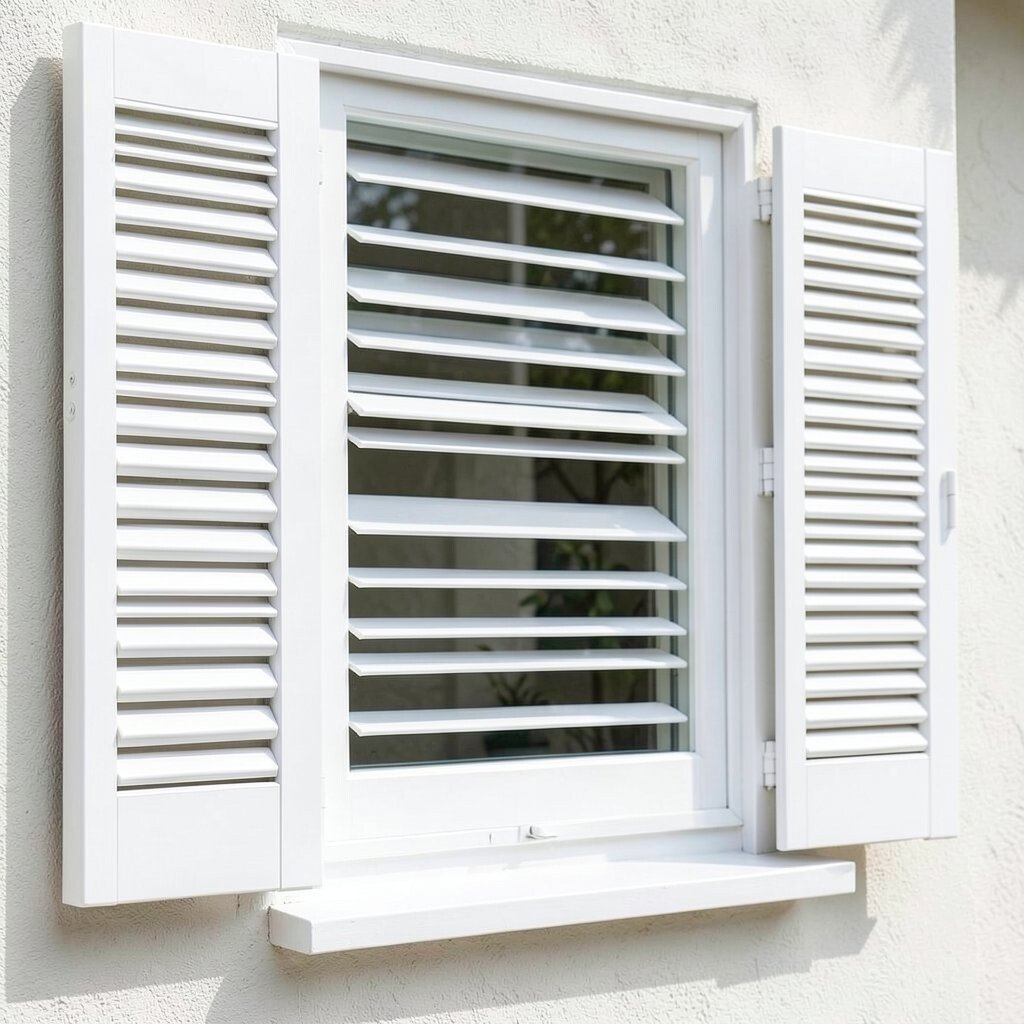
White shutters bring a clean, bright feeling that can make the whole front of a house seem lighter. They are a great match for dark siding, soft green walls, or deep red brick.
Because white looks fresh and neat, it can help older homes feel cared for and cheerful. If you want a softer effect, choose an off-white with a little cream, since pure white can feel too sharp in strong sun.
White is also a popular choice in homes that lean toward cottage charm or coastal style, so it feels current without trying too hard. Keep in mind that lighter shades may show dust more easily, but they are often easy to repaint and usually do not cost much to match with the rest of the exterior.
3. Deep Navy Blue

Navy blue shutters add color without shouting, and that makes them easy to love. They look rich against white trim and can give a front porch a calm, welcoming feel.
This shade works nicely if you want something a little different from black but still classic. You can pair it with brass house numbers or warm wood accents for a look that feels personal and well planned.
Navy also fits the trend of darker, moodier exteriors that still feel friendly. It can be a smart choice if you want a color that hides wear well and looks refined without needing a fancy budget.
4. Soft Sage Green

Sage green shutters bring a gentle, natural look that feels peaceful and easy on the eyes. The color can blend with gardens, trees, and stone paths, which makes the whole home feel connected to the yard.
This shade is a nice pick for homeowners who want color with a soft touch. It can also make a house feel more personal if you like earthy tones, and it often pairs well with cream trim, wood doors, and simple porch decor.
5. Charcoal Gray

Charcoal gray shutters offer a sleek look that sits between black and lighter gray. They can add depth without making the front of the house feel too heavy.
The shade is useful on both modern and traditional homes, especially when you want something calm and stylish. A good paint choice here can save money over time, since gray is flexible and usually easy to match with future updates on doors, trim, or siding.
Charcoal has become a favorite in many neighborhoods because it feels current but not trendy in a loud way. If you want to make it your own, add a front door in warm wood tones or a bright accent color to give the house a little spark.
6. Warm Red

Red shutters bring energy and a sense of welcome to the front of a home. They look especially striking on white, gray, or beige walls, where the color can really sing.
This choice has a cheerful, classic feel that works well on farmhouses and traditional homes. If you want a look that feels bold but still rooted in tradition, red can be a fun option, and it often costs the same as other common paint colors.
To keep red from feeling too bright, choose a deeper brick red or barn red. That softer shade is easier to live with and can make the home feel warm instead of loud.
7. Olive Green

Olive green shutters give a house a grounded and earthy look. The color pairs well with stone, tan siding, and wood details, which helps the front feel calm and natural.
This shade is a nice way to bring in color while keeping a home relaxed. It can also be a good fit if you want a less common look, since olive feels a bit more special than basic green and still stays easy to match with porch plants and outdoor furniture.
Many homeowners like olive because it blends into the yard in a soft way during every season. If you are watching the budget, using one steady earthy color across shutters, trim accents, and planters can help create a rich look without buying many different finishes.
8. Soft Beige
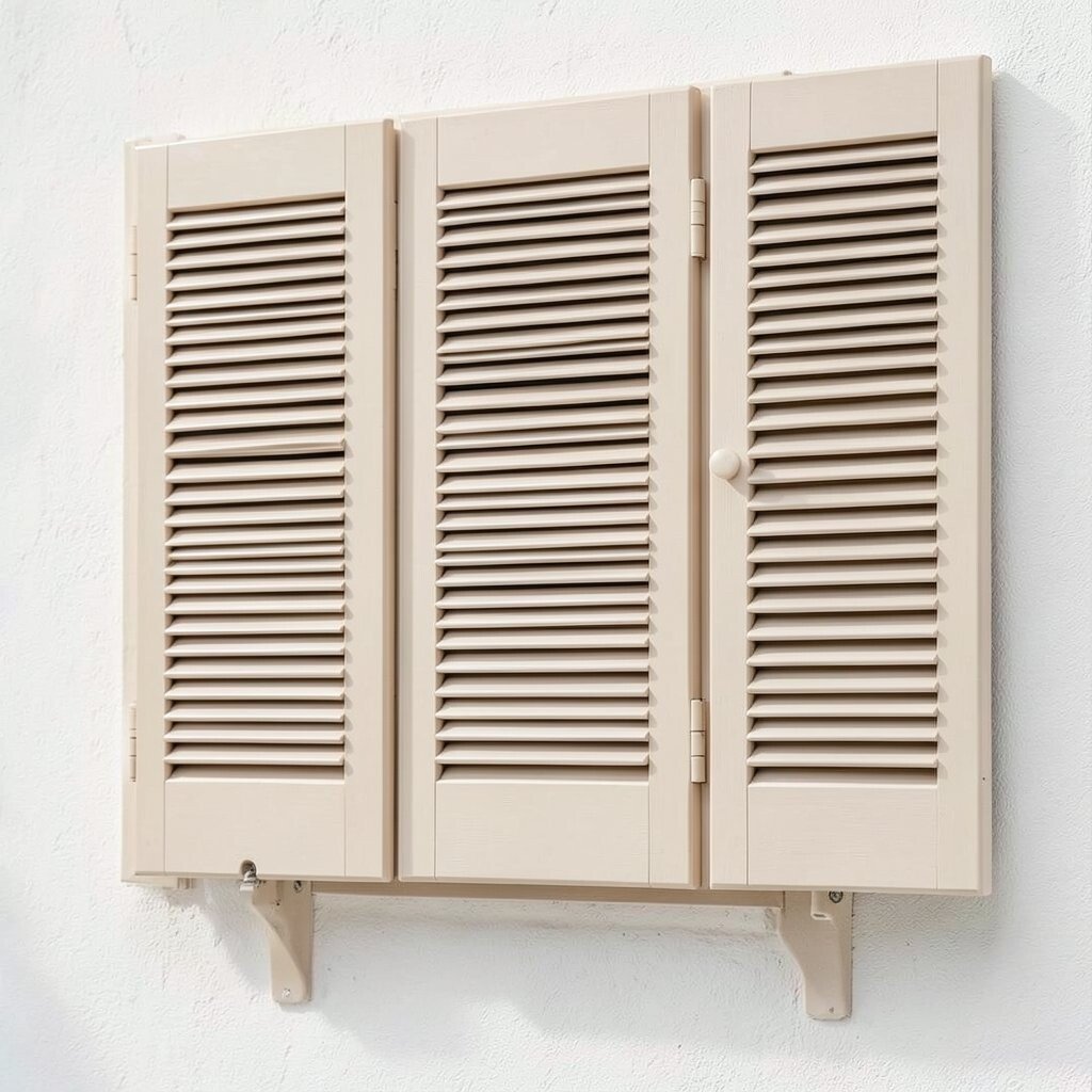
Beige shutters create a smooth, gentle look that feels warm and easy to live with. They work well on homes that already have strong texture in brick, stone, or board-and-batten siding.
This color is a smart choice when you want the shutters to support the home instead of steal the show. You can personalize the look by choosing a beige that leans more sandy, golden, or taupe, depending on the mood you want.
Beige also stays close to today’s softer neutral trends, which many people like for a quiet and polished front. It can be a cost-friendly option too, because a neutral shade is easy to keep matching when you later update doors, lights, or planters.
9. Dusty Blue

Dusty blue shutters bring a cool, gentle charm that feels fresh without being too bright. The color can make a house look airy and calm, especially when paired with white trim or pale siding.
This shade works beautifully for coastal-inspired homes and older cottages. If you want a look that feels a little dreamy, dusty blue is a lovely pick, and it can be easier on the eyes than a strong navy or a sharp sky blue.
Because it is soft and easygoing, dusty blue is a good choice for homeowners who want color that feels inviting all year. It also fits current trends that favor muted shades, and it can be an affordable way to bring personality to the front without changing the whole exterior.
10. Pure Forest Green
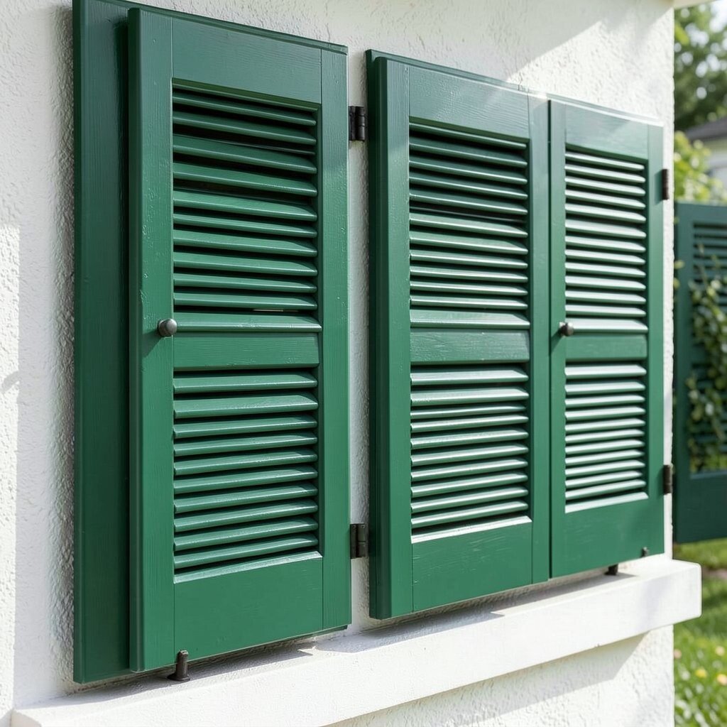
Forest green shutters give a house a rich, grounded look that feels deep and classic. They look beautiful beside brick, cream siding, and dark wood accents, creating a strong sense of style.
This color can help a home feel tied to the land around it, which is nice if you have lots of trees or a big garden. It is also a smart way to add character without chasing a flashy trend, and that makes it a solid long-term choice.
For a more personal touch, pair forest green with copper lights or a painted front door in a warm neutral. The color can be a bit dramatic in the best way, yet it still feels calm enough to live with and easy to keep looking neat.
11. Creamy Ivory

Creamy ivory shutters bring warmth and softness to a front exterior. They can make a home feel bright in a friendly way, especially when the siding is darker or more colorful.
This shade is less stark than white, so it works well if you want a gentler look. It is also helpful if you like a classic style that feels a little cozy, and it usually blends with many trim colors without needing expensive matching work.
Ivory is a nice choice for homes that need a quiet lift rather than a bold change. It fits well with current tastes for soft, warm neutrals, and it can help older homes look cared for while keeping the paint plan simple.
12. Muted Teal

Muted teal shutters add a playful but grown-up touch to a home. The color sits between blue and green, which makes it feel lively, cool, and a little unexpected.
This shade can be a great pick if you want your house to stand out in a friendly way. It pairs well with white siding, gray stone, and pale tan brick, and it gives you a chance to show style without making the front too busy.
Teal is also a good way to follow the trend toward color that feels fresh but soft. If you want to keep costs in check, use the same teal on a mailbox, bench, or flower pots so the whole entry feels coordinated with one paint choice.
13. Rich Burgundy

Burgundy shutters bring a deep, warm look that feels elegant and welcoming. They can make a house seem more finished and can look especially nice with cream, taupe, or pale gray siding.
This color feels unique because it is bold without being bright. It works well if you want a traditional look with a little drama, and it can also hide small marks better than lighter shades, which makes upkeep easier.
Burgundy has a cozy feel that suits homes with brick walkways, dark doors, or warm porch lighting. If you want the look to feel more personal, add natural wood decor or soft greenery so the color has a chance to shine without feeling too heavy.
14. Stone Gray

Stone gray shutters bring a soft, balanced look that feels neat and modern. The color has enough depth to stand out, yet it stays calm enough to work with many home styles.
This is a practical choice if you want something that will age well and not feel dated too fast. It also gives you room to add brighter door color or colorful flowers, which helps the front feel more alive without needing a full repaint later on.
Stone gray is often chosen by homeowners who like simple style with a little polish. It can be a budget-wise option too, since gray tones are easy to coordinate with exterior updates and usually do not fight with other colors already on the home.
15. Soft Lavender
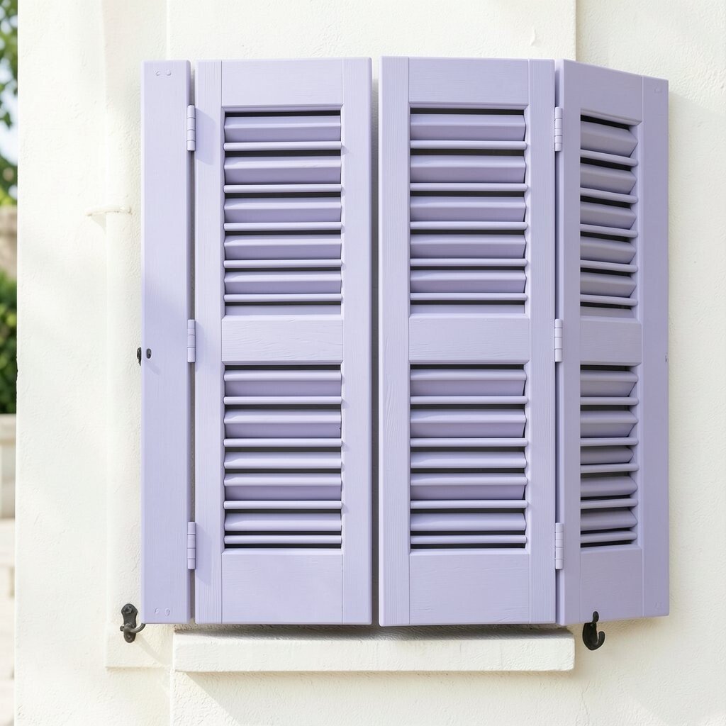
Soft lavender shutters give a home a sweet and charming look that feels a little whimsical. The color can brighten the front without becoming too loud, especially on white or light gray houses.
This shade is a great fit for cottage homes and creative homeowners who want something less common. It adds personality in a gentle way, and that can make guests smile before they even reach the door.
Lavender also works well with the trend toward lighter, more playful exterior colors that still feel tasteful. If you want a cheaper way to make it stand out, keep the rest of the front simple with plain trim and a few potted plants so the shutters get the attention.
16. Warm Taupe

Warm taupe shutters create a soft, earthy look that feels steady and natural. They can blend nicely with brick, tan siding, or stone, making the whole house look put together.
This color is especially useful if you want subtle charm instead of a bold statement. It gives you a nice middle ground between gray and beige, and that balance makes it easy to match with changing porch decor through the seasons.
Taupe is a thoughtful choice for homeowners who care about long-term style and simple upkeep. Because it sits in the neutral family, it often pairs well with other exterior updates, so you may spend less over time when making small changes around the entry.
17. Bright Hunter Green

Hunter green shutters bring a strong classic look that feels rich and steady. The shade can make a home look polished and gives a nice contrast on light siding or white brick.
This color stands out in a deeper, more refined way than softer greens. It is a smart pick if you want your house to feel custom and full of character, and it can look especially good with brass hardware, dark planters, and natural wood touches.
Hunter green is still popular because it feels traditional while also fitting the current love for deeper outdoor colors. If you are thinking about cost, this shade can be a good value since it works across many house styles and helps you build a strong look without needing many extra accents.