
Vintage color is like a mood you can wear. When the shade fits, everything else feels easier.
From faded denim blues to buttery creams, the right vintage tone can make your outfit look pulled together without trying too hard. Keep reading and match your style to colors that already have history.
1. Find Your “Signature” Vintage Neutral

Start with a vintage neutral that feels like home. Think of worn-in creams, soft greys, and warm taupes that look good even when you pair them with bright pieces.
Try choosing one neutral and using it in multiple places, like a jacket, bag, or scarf. This helps your look feel consistent, and it makes mixing colors less stressful.
2. Pair a Faded Denim Blue With Everyday Staples

Denim that looks lived-in has a way of making outfits feel relaxed and real. Picture medium wash blues with gentle whiskers and lighter edges that catch light like sun on fabric.
It works especially well with plain tees, striped tops, and simple boots. You get an instant casual vibe, and the color hides wear instead of showing it fast.
For a budget-friendly route, look for denim shirts, skirts, or canvas bags in good condition. If you want it to feel more polished, match denim blue with brown leather or off-white accents.
3. Match Warm Reds to Your Skin’s Glow

A vintage red shouldn’t look harsh. Look for tomato reds, brick tones, and muted cherry shades that feel warm and cozy on the skin.
These colors often make cheeks look brighter and eyes look more vivid. When you wear the right red, you can skip heavy makeup because the shade already brings energy.
Try it by testing small items first, like a vintage cardigan, belt, or lipstick in a classic stain. If you’re unsure, choose a red with a brown or orange undertone rather than a pure blue-red.
Cost can vary, so check for pieces with minor pilling or light fading that you can easily spot-clean. In many cases, the color still looks beautiful even when the texture isn’t perfect.
4. Choose Forest Green for Bold Calm Energy
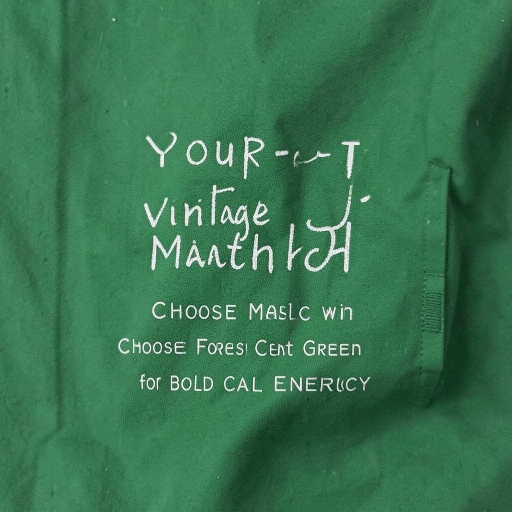
Forest green is deep but not loud, and vintage versions feel extra grounded. Imagine mossy tones, faded botanical greens, and velvety dark shades that look good in both daylight and evening light.
When you wear it, you get a calm confidence that still turns heads. It also pairs well with tan, cream, gold jewelry, and vintage-inspired prints.
5. Balance Blush Pink With Your Favorite Patterns

Blush pink in vintage fabrics can look sweet without feeling childish. Look for dusty rose, faded petal shades, and soft pinks that almost look like they’ve been in a well-loved wardrobe for years.
This color flatters many people, especially when it sits near your face. If you love prints, blush makes patterns feel calmer and helps stripes or florals look more connected.
Try a pink scarf, a short cardigan, or a simple blouse and pair it with one darker anchor color like navy or chocolate. When you want variety, match the blush with different textures such as denim, corduroy, or suede.
6. Go for Vintage Marigold When You Want Sunlit Style

Marigold and antique gold feel like late afternoon light. Vintage versions often have a softened edge, like mellow ochre and buttery yellow that doesn’t shout.
This shade can add warmth to your whole outfit, even if the rest of your clothing stays simple. You’ll look more awake, and photos often capture the glow beautifully.
Wear marigold near your face with a knit top, vintage blouse, or earrings with a warm finish. If you’re worried about being too bright, start with a smaller piece like socks, a headband, or a patterned pocket square.
7. Find Chocolate Brown for Easy Match Confidence

Chocolate brown is one of the most practical vintage colors because it works almost everywhere. Think warm espresso tones, saddle browns, and worn leather colors that look rich without being flashy.
It pairs naturally with cream, denim blue, olive, and classic black accents. When your wardrobe includes brown, you can build outfits quickly and still feel put together.
Look for vintage belts, boots, or outerwear made with sturdy materials. If you want less cost, try accessories first since small items can deliver the look without the big-ticket price.
8. Try Muted Navy for a Vintage-Inspired Alternative to Black

Navy in vintage styles feels classy but softer than black. Picture faded indigo, smoky deep blues, and coats that show subtle color depth as they move.
It’s a great match when you want a darker outfit that still looks friendly. Navy also makes other colors, like rust or cream, look richer.
9. Match Antique White With Your Clean, Cozy Aesthetic

Antique white and cream tones bring a gentle vintage feel that works in every season. Imagine off-white sweaters, aged linen, and fabric that looks like it’s been washed with care many times.
This color makes your outfit feel clean, soft, and calm. It’s also forgiving, because it hides tiny stains better than bright white sometimes does.
To make it look intentional, pair antique white with warm metals like gold or brass. You can also layer it over denim or under earthy browns to keep the look grounded and stylish.
10. Choose Charcoal Grey for Sharp Contrast Without Harshness

Charcoal grey gives you the cool elegance of black with more breathing room. Vintage charcoal often looks like soft slate, with gentle fading that adds visual texture.
This shade is perfect if you love a clean look but want something less strict. It also helps colorful accessories stand out without fighting your outfit.
Try a grey vest, a blazer, or a pair of trousers and keep the rest of the palette simple. For personalization, add one vivid item like a vintage scarf in teal or burgundy to create a signature accent.
11. Use Vintage Teal to Add Depth to Plain Outfits

Teal that’s been softened by time feels creative and modern at the same moment. Think aged turquoise, muted aquamarine, and deep teal that looks almost like ocean water.
This color can elevate a basic tee or simple sweater so it looks styled. It also works with both warm and cool tones, which makes outfit-building easier.
If you want practical tips, start with a scarf, hat, or small bag in teal. For cost, vintage accessories are often more affordable than full garments and still give you that color hit.
12. Find Dusty Lavender for Dreamy, Light-Filled Looks

Dusty lavender is airy and gentle, and vintage shades feel even softer. Picture mauve-lavender knits, pale lilac with a hint of grey, and floral prints where the purple seems washed by time.
This color can make your skin look fresh and your overall outfit feel calm. You’ll also get a dreamy vibe that looks great in spring photos and cozy winter layers.
13. Match Rust and Terracotta for Earthy Magnetism
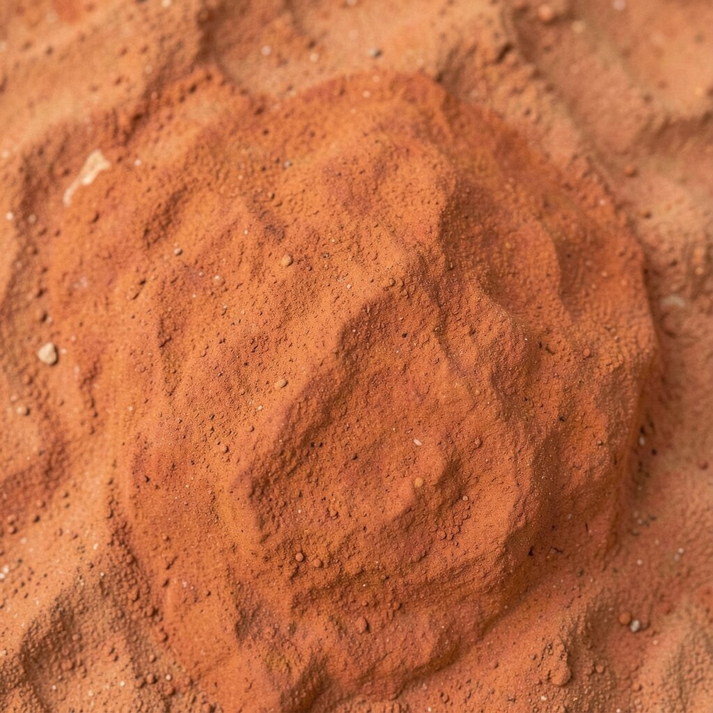
Rust and terracotta bring warmth and character that feels bold without being too bright. Look for vintage brick orange, faded clay, and softened rust that almost looks like baked earth.
These colors make neutral outfits feel more alive and rich. They also pair easily with denim, olive, cream, and dark brown leather.
Try terracotta with a simple white shirt or cream sweater to keep it wearable. For personalization, choose a fabric with texture, like corduroy or suede, because it makes the color look even more special.
14. Pick Olive Green for a Nature-Driven Wardrobe
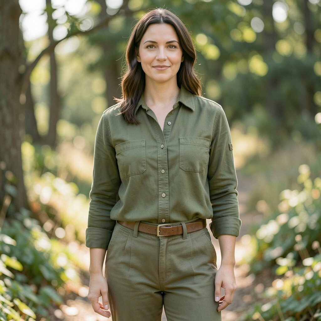
Olive green is perfect when you want a vintage color match that feels grounded. Vintage olive often has a slightly yellowed tone, like worn army surplus or mossy leaves.
It’s a great color for everyday because it pairs well with almost any warm neutral. You’ll look stylish in a quiet way, and it hides small scuffs or color variations nicely.
15. Choose Sage for Soft Layers and Gentle Contrast

Sage is one of those vintage colors that seems to match almost everyone. Picture faded green-grey knits, lightly washed shirts, and calm tones that feel airy and relaxed.
This shade makes your outfit feel fresh, especially when you pair it with cream, denim, and light brown accessories. It also works well with floral prints, since sage doesn’t overpower them.
For practical styling, wear sage as a top layer and keep the colors underneath simple. If you want trend energy, mix sage with slightly warmer pinks or peachy vintage tones for a modern warm-soft balance.
16. Use Vintage Burgundy to Add Serious Depth

Burgundy can look elegant and strong in vintage form. Imagine wine-like shades, dried rose reds, and deep maroon that feels luxurious but still wearable.
This color adds drama without turning your outfit into a costume. It also makes skin tones look richer, especially when the fabric has a slight sheen or cozy knit texture.
If you want a low-risk start, choose a burgundy accessory like a scarf, knit hat, or small handbag. Cost can be reasonable for smaller vintage items, and you still get the “wow” effect of that deep color.
17. Match Vintage Mustard for a Retro Edge

Mustard is a vintage classic that instantly adds a retro edge. Look for softened mustard tones, sometimes with a slight brownish or golden cast that feels vintage rather than neon.
This color looks great with denim, black, and cream, so you can build outfits without overthinking. It also pairs well with textures like wool, suede, or corduroy for extra character.
To personalize, mix mustard with a second warm color in small doses, like rust or terracotta. If you’re shopping, check the stitching and fabric weight so the color stays bold and true.
If the price feels high for clothing, consider a vintage mustard belt or a pair of socks to get the trend feel for less.
18. Go for Antique Gold and Brass Accents

Even when your clothes stay neutral, vintage gold and brass details can change everything. Think of faded buttons, warm jewelry tones, and bag hardware that catches light like old coins.
This is a smart match when you want personalization without changing your whole closet. It helps warm vintage colors feel richer and makes cool colors feel more intentional.
19. Choose Smoky Rose for a Romantic Yet Grounded Look
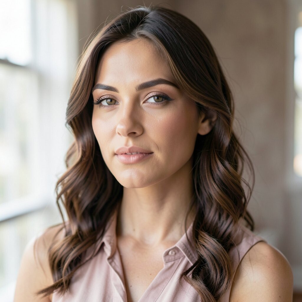
Smoky rose is romantic, but it’s not too sweet. Vintage versions often read as muted mauve, dusty blush, and rose with a grey undertone that feels grown-up.
It flatters many complexions and works beautifully with neutral outfits. When you wear it, your look feels soft, but you still get visual depth.
20. Match Creamy Beige With Your Minimal Style Mood

Beige can be incredibly chic when it looks like vintage fabric. Think sandy creams, oatmeal tones, and softly faded trousers that look comfortable from day one.
This color match supports a minimal style because it’s calm and easy to pair. It also helps you lean into texture, like linen, wool, or chunky knits, which is where vintage charm shows up.
For practical tips, choose one beige piece with a great texture and keep the rest of the colors muted. For personalization, add a patterned vintage accessory that brings in one accent color like teal or rust so your outfit feels styled.
21. Find Vintage Black With Warm Undertones

Black is never truly just black in vintage pieces. Look for deep charcoal, ink-black with a slight brown cast, or black that looks soft and aged instead of flat and harsh.
This color option gives you that classic foundation while staying friendly. Warm-leaning black tones pair well with gold accessories and warm colors like terracotta and olive.
To keep it flattering, avoid pairing very cool greys with warm vintage black all the time. Instead, mix it with creams, tans, and earthy hues so the palette feels cohesive.
Cost-wise, vintage outerwear and dresses can cost more, so consider starting with a scarf, belt, or shoes if you want the vibe sooner.
22. Build Your Color Match With One “Anchor” and One Accent

The easiest way to find your perfect vintage color match is to build from an anchor shade. Pick one color that you love near your face, like antique white, olive, or burgundy, then add one accent that makes you smile.
This method keeps outfits simple while still giving you personality. You’ll feel confident because the colors relate to each other, even when the rest of your closet is mixed.
Try anchoring with navy or charcoal and accenting with marigold, teal, or rust. For personalization, match the accent to your favorite vintage texture, like ribbed knit, soft velvet, or lightly distressed denim.
When you shop, compare fabric condition alongside color since faded color can look gorgeous while worn texture may not. A small, well-chosen vintage piece can be more cost-effective than buying many new items that don’t quite match your style.