The wall in your mind is already finished. Now it’s time to make it real, one bold mark at a time.
Graffiti can feel like a loud song, even when it’s small. With the right approach, your space can look fearless, playful, and totally yours.
1. Patterned Tag Autobahn
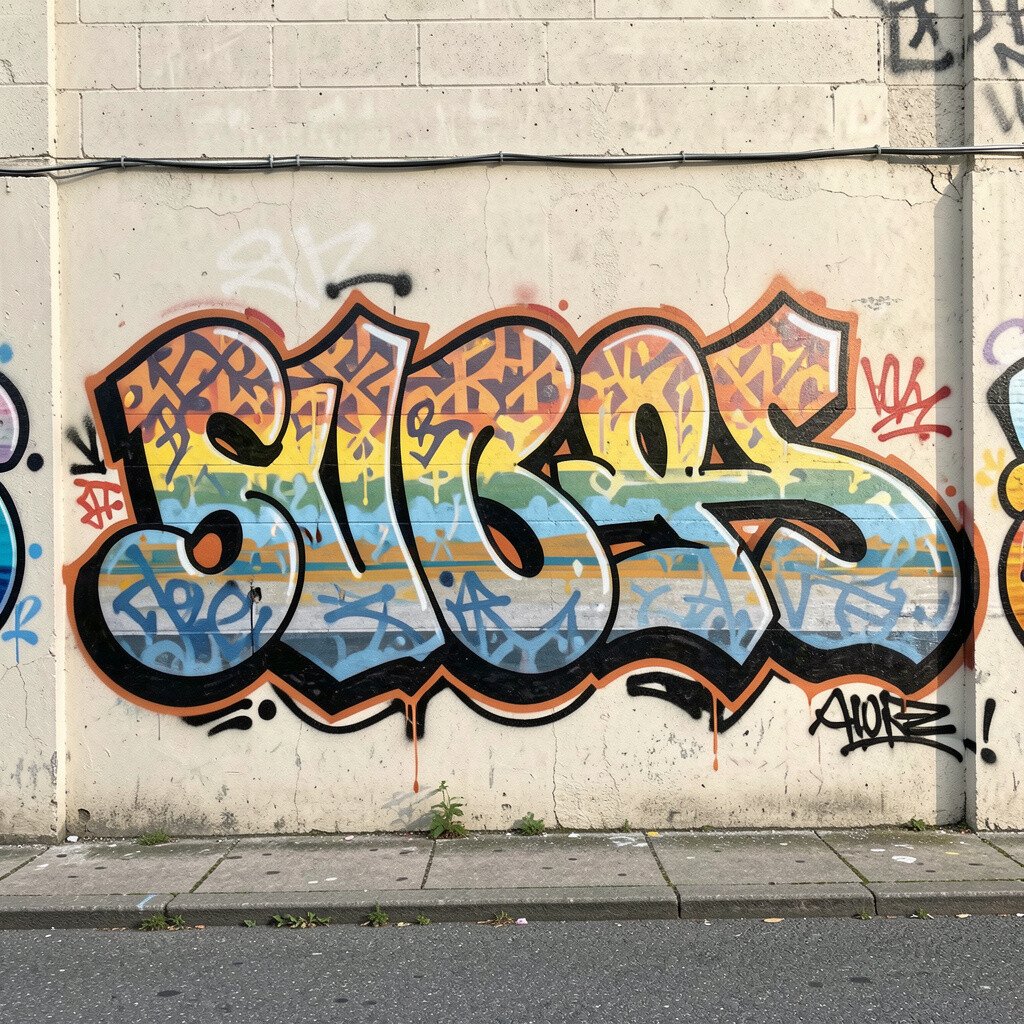
Picture a long, sweeping line of tags that turns into repeating patterns, like a fast highway made of letters. Start with a simple route, then add small shapes that repeat as you move across the wall.
This idea keeps your eyes traveling, so the wall feels active instead of crowded. Use a limited set of colors, like black, white, and one bright accent, to keep it clean and readable. If you want it to last, choose quality paint and seal the finished sections when everything dries.
2. Color-Blocked Letter Sculptures
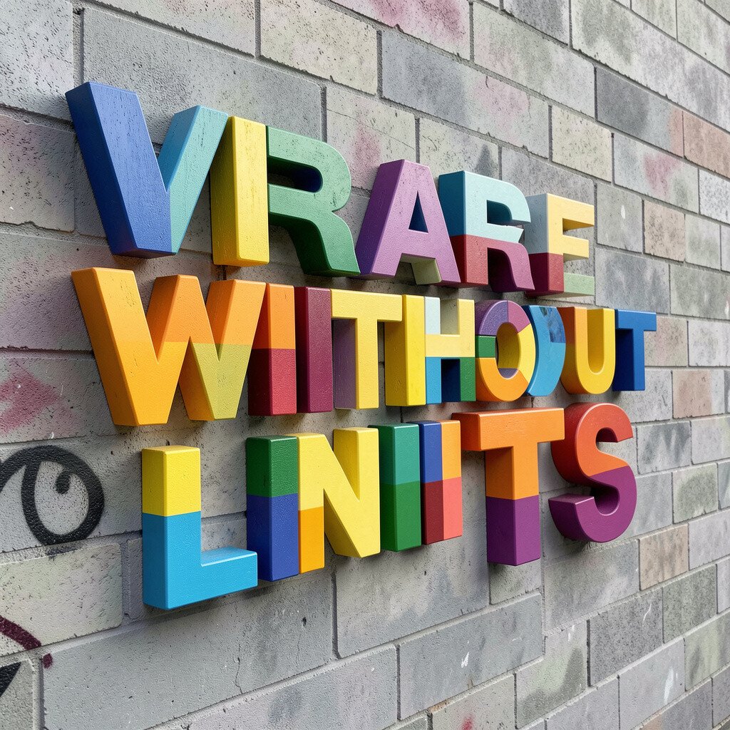
Make your lettering look chunky by filling each letter with bold blocks. Stand back and choose a few strong color pairs so the wall pops from far away.
Block colors give clear structure, especially when you’re learning letter styles. Keep edges crisp by using painter’s tape for a few key lines, then remove it while the paint is still fresh. You can personalize this by using your initials, a nickname, or a word that means something.
For cost control, plan with cheap test paper first, then buy only the most important cans and markers. A clean background makes the colored letters feel louder, which matches today’s trend of high-contrast typography.
3. City Map Lines and Missing Streets
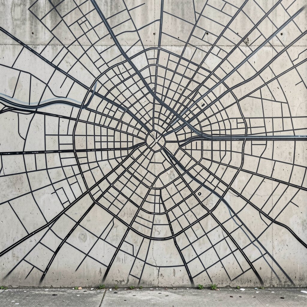
Draw the outline of a city map, but leave some streets “missing” and replace them with graffiti symbols. Your wall can look like a sketchbook of a place that only exists in your imagination.
Map-style lines help your art feel organized while still staying wild. Use thin pens for the street lines, then go thicker with spray or paint for the graffiti areas. Personalize it by using streets from where you grew up, then bend them until they become your own design language.
If you want a budget-friendly approach, reuse stencils or create one homemade stencil from cardboard for repeated icons. This style also fits current mural trends that mix urban art with graphic design.
4. Drip Rain Gradient Halo
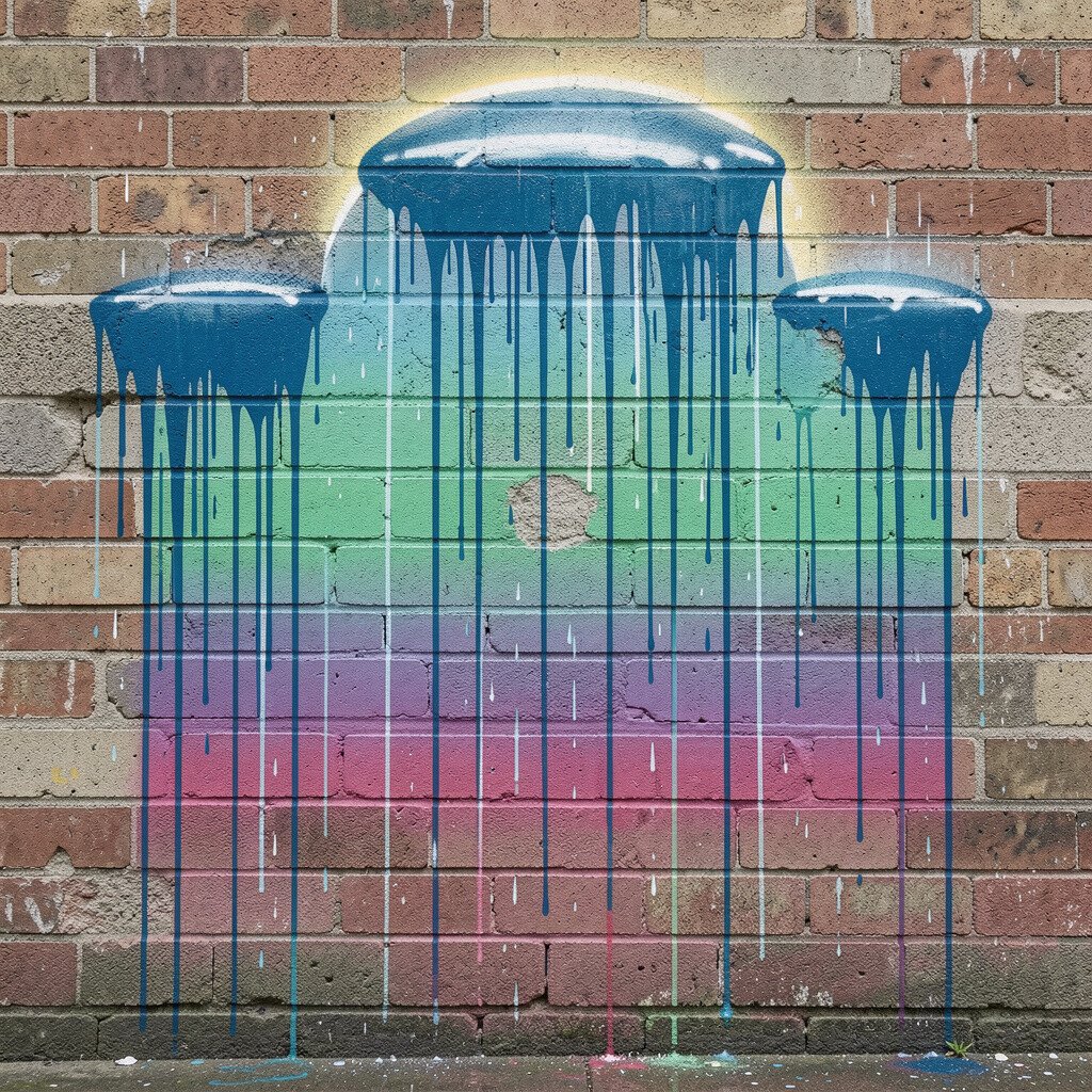
Let your colors fall like a controlled rain, but build them into a soft halo around a central name or symbol. Choose one main color and one supporting shade, then layer the gradient so it looks smooth.
Drip gradients look dramatic even with simple shapes, so you don’t need a complex sketch to make it striking. Use light coats first, then add the “drip” effect by tipping the can or letting paint run slightly. Keep it practical by protecting the floor with drop cloths and planning where each drip lands.
5. Stencil Parade of Repeated Characters
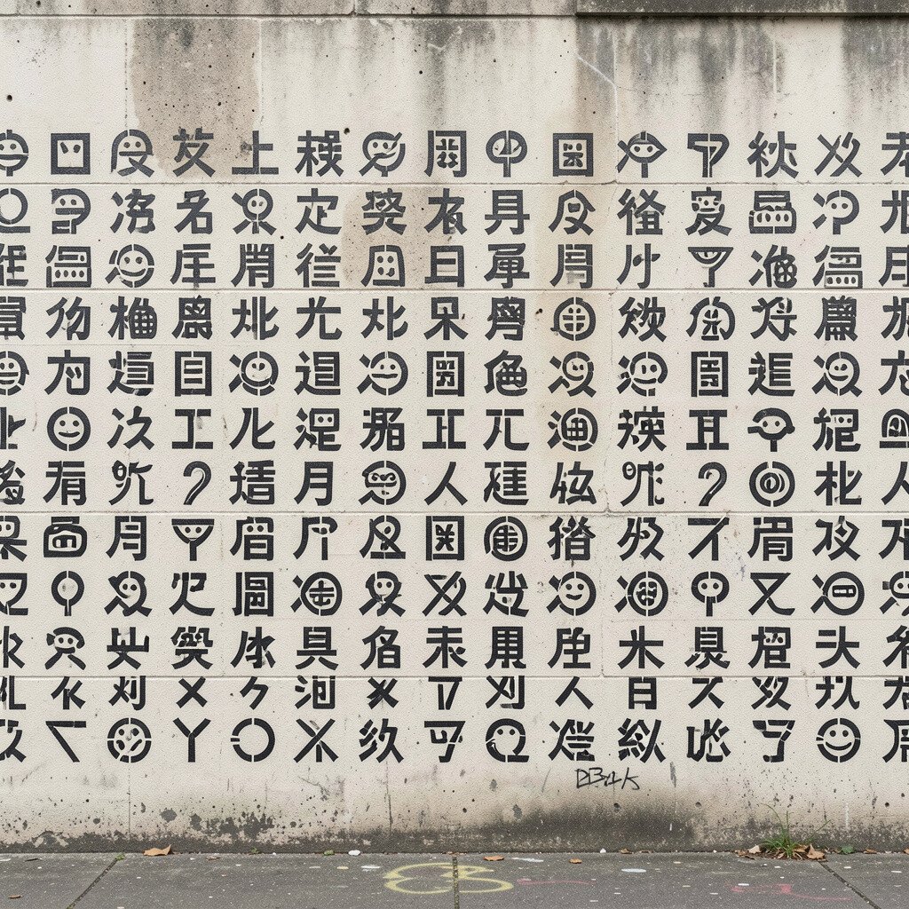
Use a stencil to repeat the same character across the wall, but vary the colors and sizes slightly. When the parade grows, the wall starts to feel like a cast of friends showing up again and again.
Stencils are great for consistency, and they speed up your progress without making the result boring. Line up each repeat like a rhythm, and leave small gaps so negative space breathes. Personalize by picking characters that match your mood, like a tiny animal, a face, or a star with a smile.
To keep costs down, make one stencil carefully and reuse it for many sessions. This also matches a popular trend where street art meets design grids and repeat patterns.
6. Metallic Tape Inlay and Mirror Lines
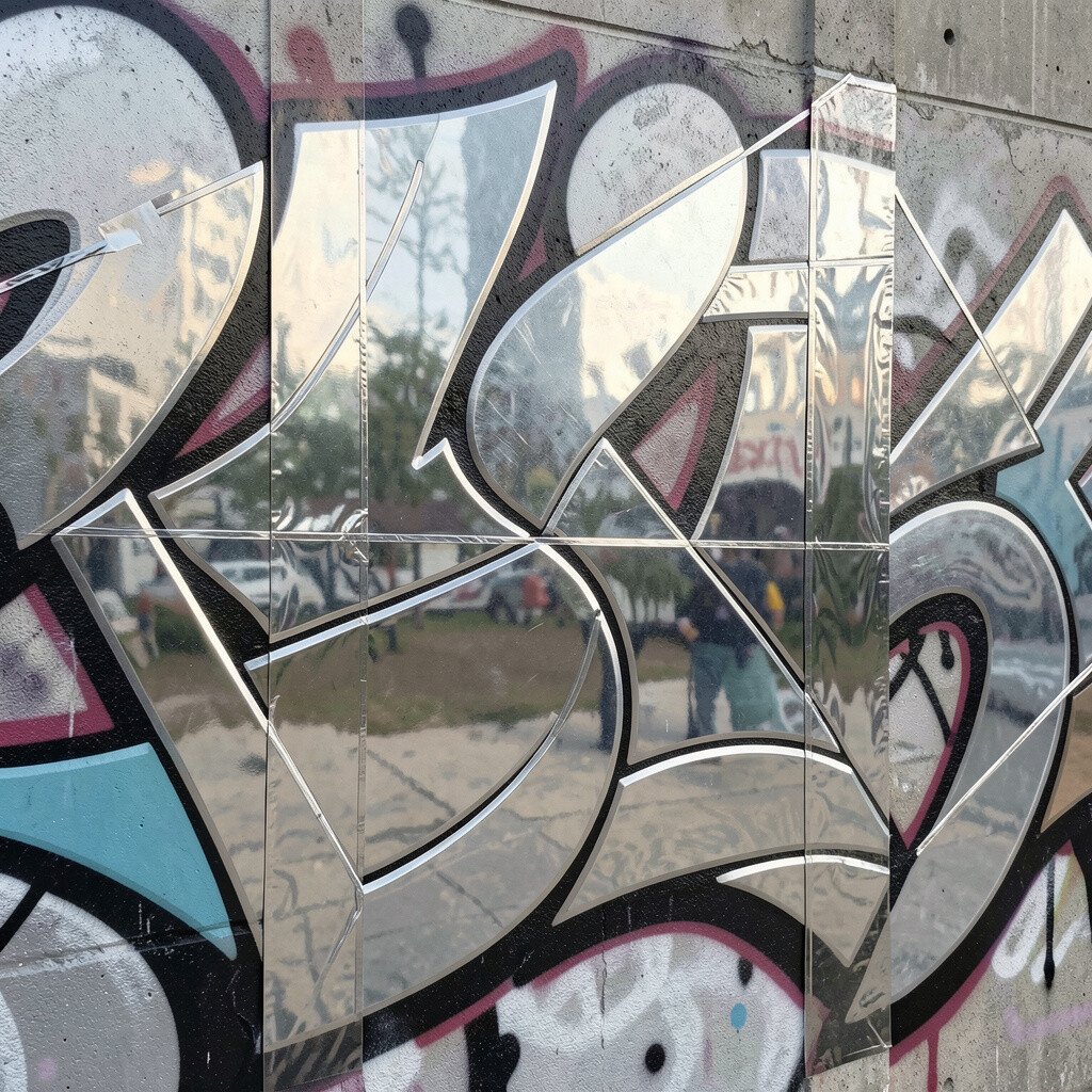
Frame sections of your wall with metallic tape, then draw over and around it to create a “mirrored” look. Think of it as bright borders that make your paint look more expensive than it is.
Tape inlay gives you clean lines and instant structure, which can help your confidence grow. Use a low-tack tape so you can remove it without ripping paint, and press edges firmly for sharp results. Personalize by choosing tape colors that match your room or favorite shoes.
If you’re watching your budget, metallic tape can be a cheaper shortcut than buying extra paint shades. This effect also fits the current love for shiny accents and mixed media street art.
7. Transparent Bubble Overlay World
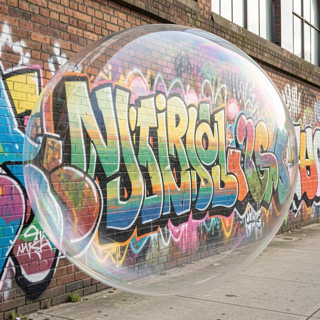
Paint bubbles across the wall like a floating layer, then add graffiti names inside some bubbles. Make the bubbles overlap so it feels like a playful underwater universe with words trapped inside.
Bubbles soften tough lettering and make the whole wall feel friendly. Use diluted paint or acrylic markers to create highlights on the bubble edges so they look glassy. Personalize the bubbles by assigning each one a different emotion word, like “calm,” “hype,” or “bold.”
8. Breakout Border with Torn Paper Edges
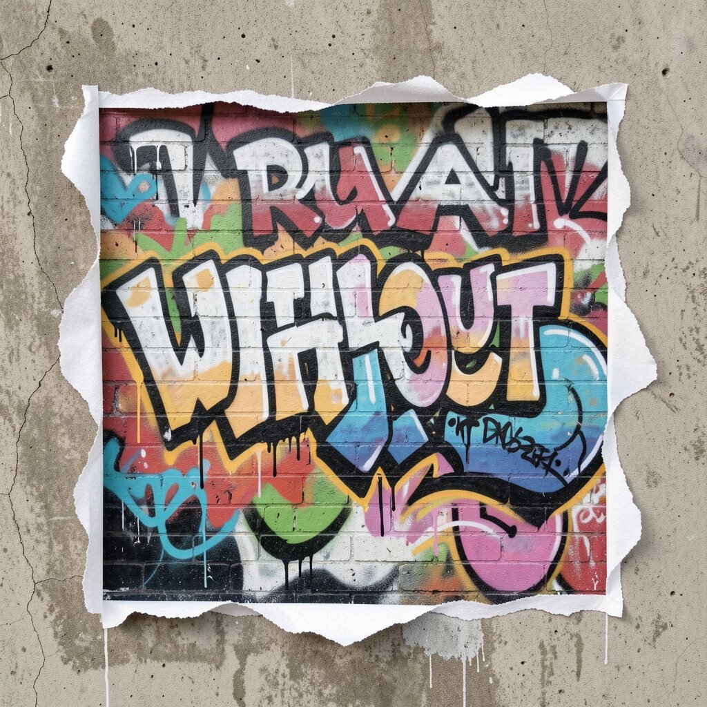
Create a thick border that looks torn and rough, then let your graffiti “break out” from behind it. This gives the wall a story, like your art is escaping a frame.
The torn-paper style adds texture without needing fancy tools. Use sponge marks for rough edges, and then paint over them with a steady hand for the main colors. Keep it practical by testing your border thickness on a small scrap first.
9. Night Sky Constellation Signatures
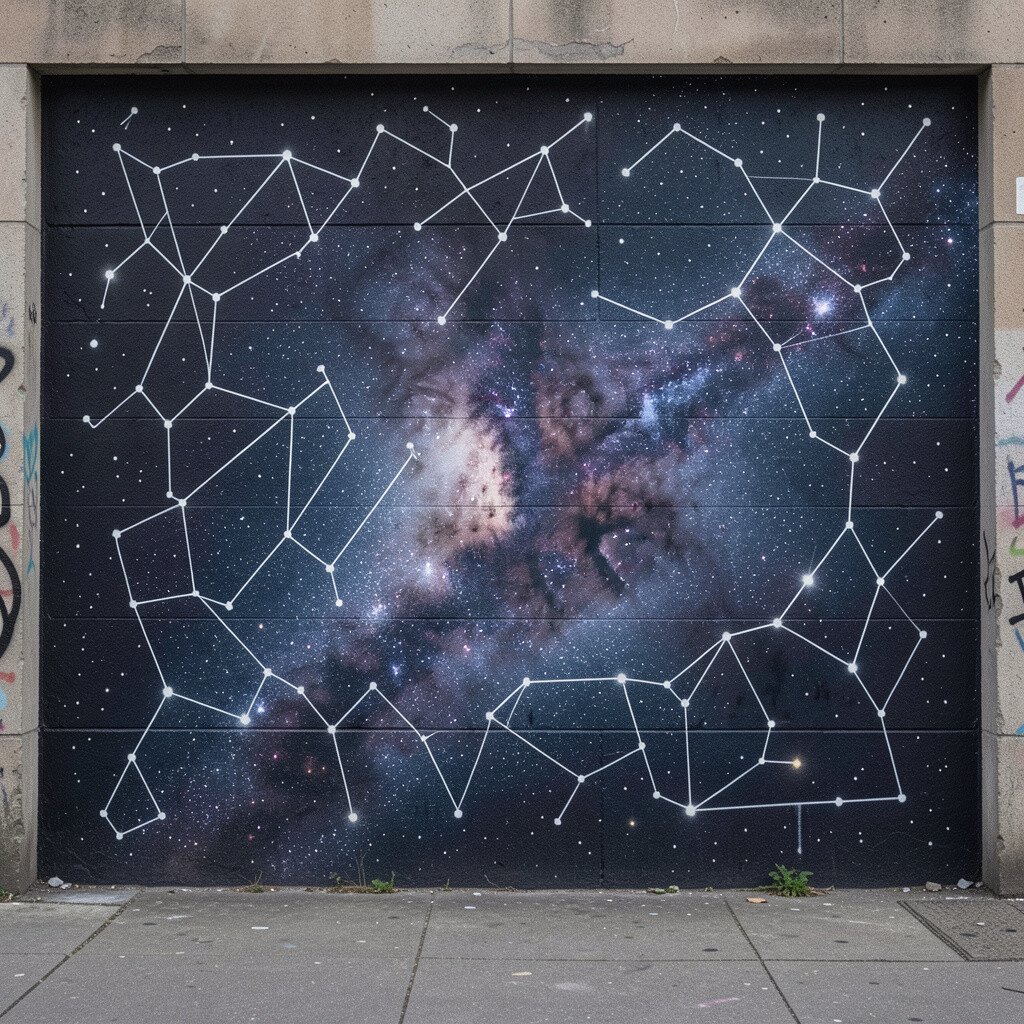
Turn your signature or tag into stars and connect them with thin lines like constellations. Add a dark background, then sprinkle dots with a marker or brush so it feels like night air.
This idea looks magical and gives your letters a calmer vibe. Use light colors for star points so they pop, and keep your connecting lines simple for readability. Personalize by using initials as the center star, then map your own “story” routes between points.
If you want to save money, use one paint color for stars plus one for lines, then rely on dot placement for variety. Current mural trends often lean into cosmic themes, so your wall will feel timely.
10. Giant Character Silhouette Cutouts
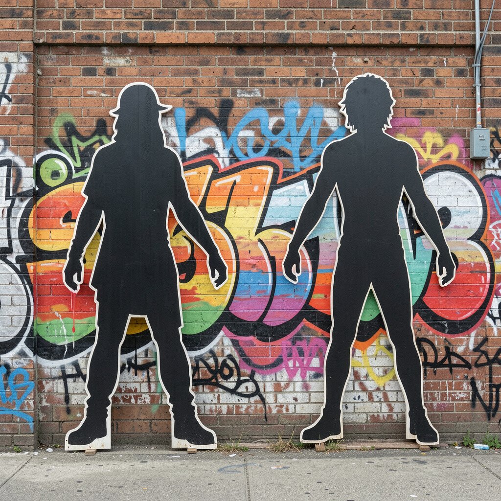
Paint one large silhouette, like a character or mascot shape, and let smaller graffiti elements fill the inside. When the silhouette dominates the wall, your art feels bold even if details are simple.
Silhouette work is great for beginners because it focuses attention on one big shape. Use painter’s tape to block the outer shape, then remove it to keep edges clean. Personalize by choosing a character that represents you, like a dragon, robot, or hoodie figure.
11. Subway Window Scene with Word Reflections
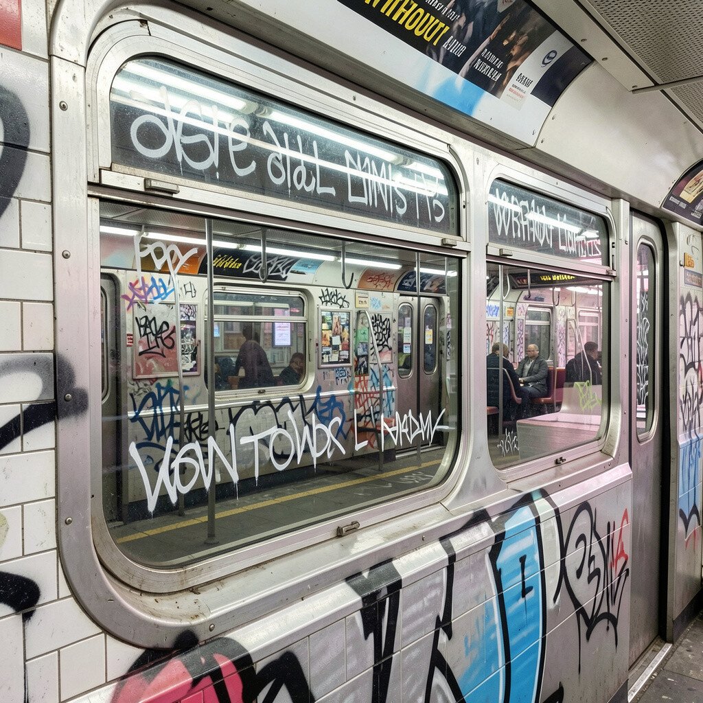
Draw a subway window view, with tracks and city blocks in the background. Then add word reflections on the “glass,” like your tag is floating on the surface.
This scene gives your wall depth, so it looks more like a place than a flat design. Use lighter colors for the window reflections, and darker colors for the outside city so everything separates clearly. Personalize it by adding a station name that matters to you.
To keep costs reasonable, use a limited palette and focus detail only where it frames your main word. This style fits current trends that mix street art with cinematic scenes and graphic illustration.
12. Wet Paint Optical Illusion Letters
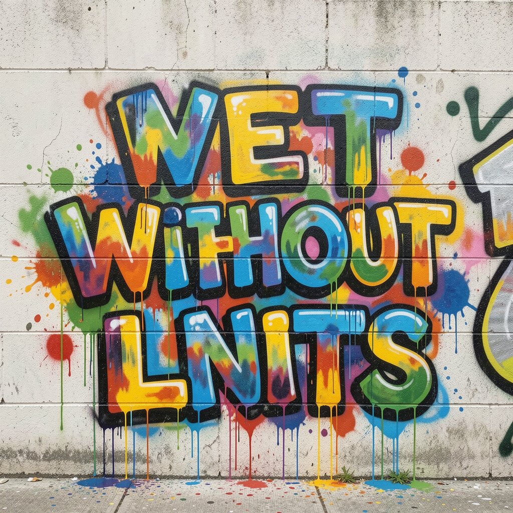
Make letters look like wet paint by adding ripples, smears, and shiny highlights. Start with clean block letters, then soften their edges so they look freshly poured.
Optical illusion letters feel high-tech and fun, and they get attention fast. Use a glossy medium or paint highlight sparingly so it looks like light, not messy blobs. Personalize by shaping the ripples to match your favorite music style, like smooth curves for mellow vibes.
13. Graffiti Botanicals and Leaf Vein Calligraphy
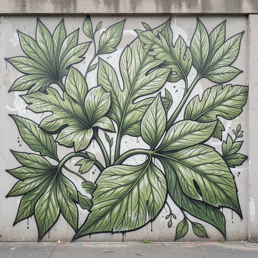
Combine graffiti lettering with plant details by drawing leaves around your words. Add “veins” inside the leaves using thin lines that echo the rhythm of your letters.
This blend looks unique because it merges street energy with soft nature shapes. Keep your layout balanced by placing leaves in corners and framing the main tag in the center. Personalize by using flowers from your area or a plant you love.
To manage cost, use markers for leaf veins and reserve spray paint for the main lettering. Current trends favor nature-meets-city art, so this idea feels fresh and popular.
14. Mirror Shadow Typing Behind Glass
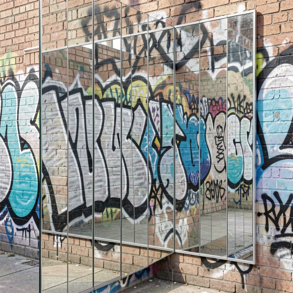
Paint a “glass panel” on the wall, then place your graffiti behind it like you’re writing on the far side. Add a faint shadow effect so the letters look trapped in the panel.
This method looks clean and stylish while still feeling street-level. Use light gray or diluted paint for the shadow layer, and darker colors for the letters behind. Personalize by writing a phrase that feels private, like a reminder you want to see every day.
15. Mosaic Tile Wall with Mini Tags
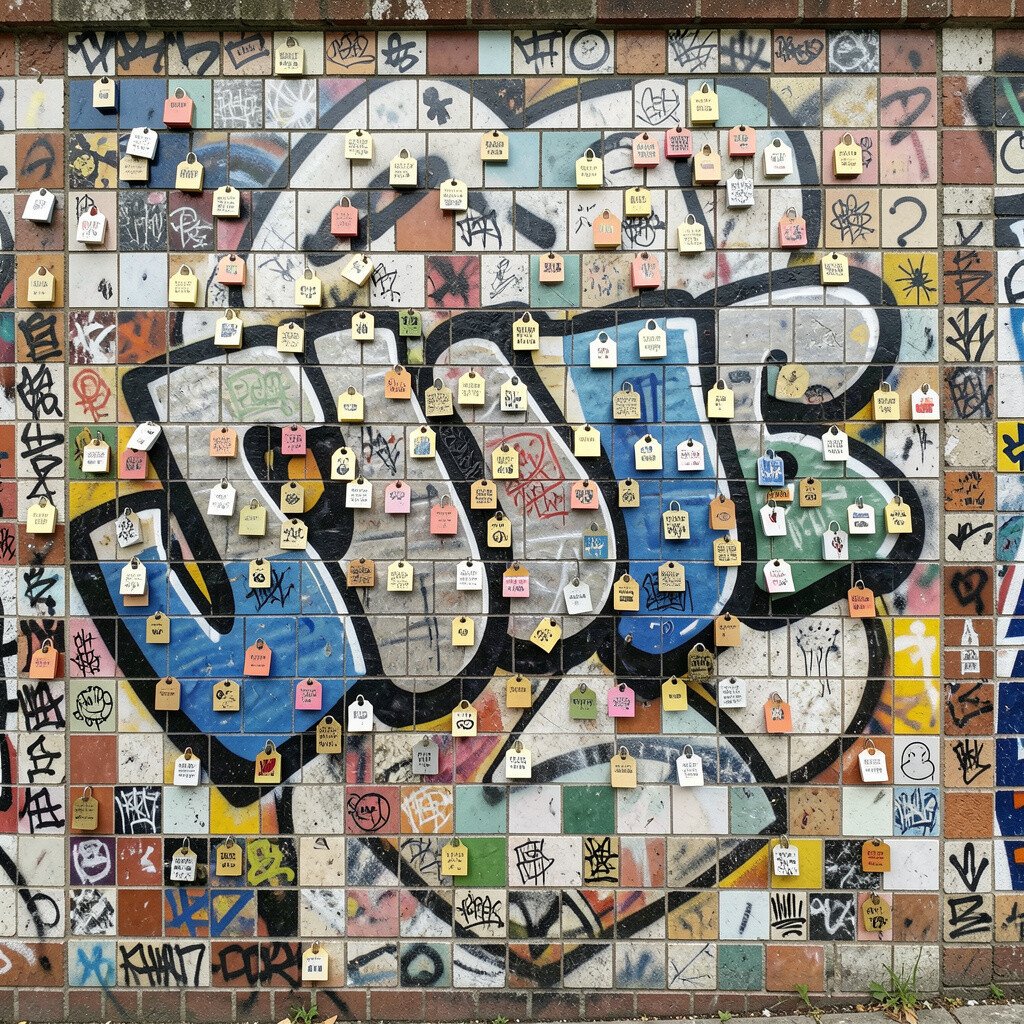
Draw a mosaic grid, then fill each tile with a tiny version of your tag or symbol. When you step back, it reads like one big image; up close, it becomes a whole world of details.
Mosaic walls are satisfying because every tile feels like a small win. Keep the pattern consistent by planning the grid size on paper first. Personalize it by using different color meanings in different tiles, like one color for words and another for symbols.
16. Balloon Drift Slogans and Soft Curves
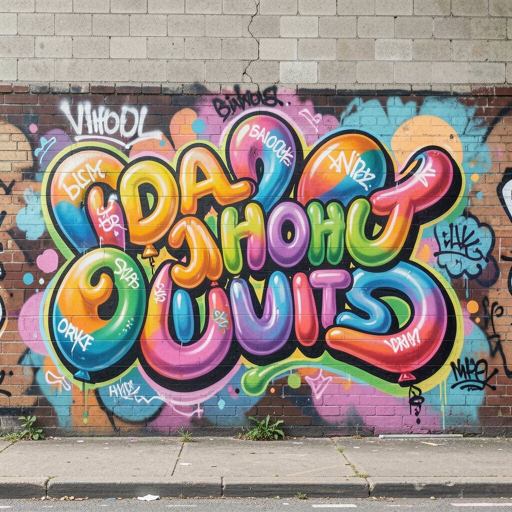
Make balloon-shaped bubbles and write slogans inside them, like floating messages drifting through air. Use soft curves and gentle shading so the whole wall feels light and warm.
Balloon typography is approachable, and it can help you practice smoother lettering. Shade one side of each balloon so it feels dimensional, and keep the outlines steady. Personalize the slogans with small affirmations or fun phrases you’d want to read on a rainy day.
For cost, use a few colors and repeat them often, letting shape variation do the heavy lifting. This also matches a growing trend toward playful, street-style posters that feel like everyday joy.
17. Typography Graffiti Blueprint and Notes
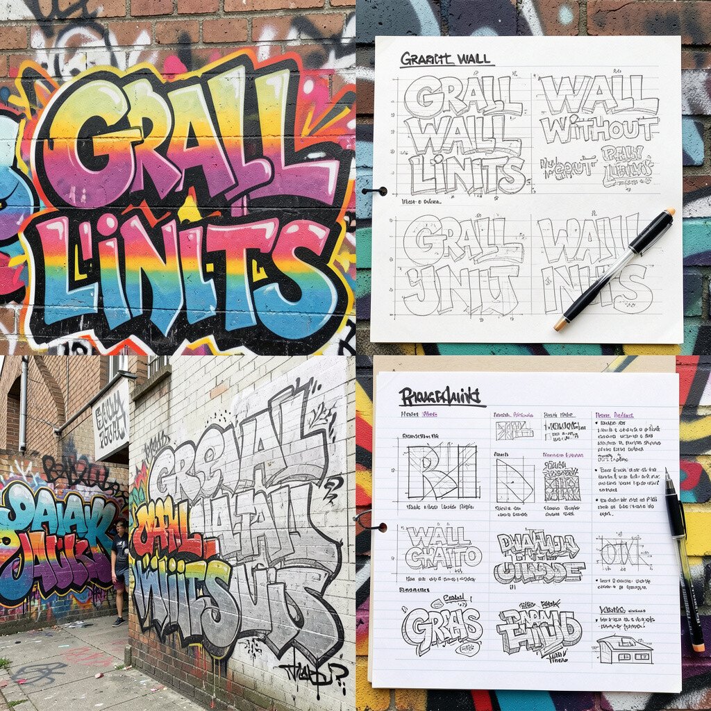
Draw “blueprint” lines around your art, including arrows, measurements, and scribbled notes that look like part of a plan. Then integrate your tag as the central “design” inside the blueprint.
Blueprint styling makes your wall feel smart and intentional, even when the lettering is wild. Use thin pen lines for the grid and thicker paint for the main tag so everything stays readable. Personalize by making the blueprint relate to something you love, like skate tricks or game levels.
Keep costs low by using markers for most blueprint lines and saving spray paint for the central letters. This style matches current interest in graphic design textures and technical sketch aesthetics.
18. Bold Character Speech Bubbles That Point
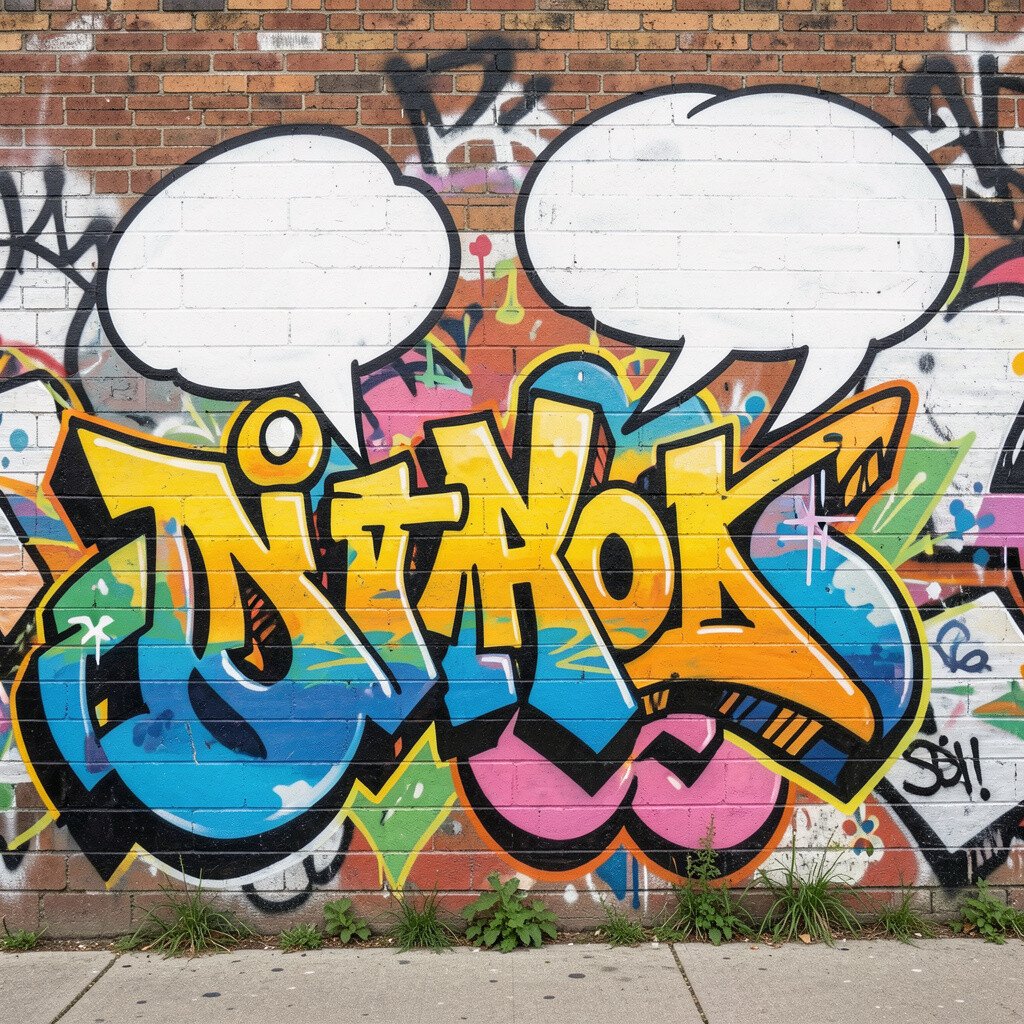
Place cartoon-style speech bubbles around your main graffiti word, and have the bubble tails point at details. Add tiny icons inside bubbles to create a mini story you can read with your eyes.
Speech bubbles add humor and make your wall feel social, like it’s talking back. Use clean outlines so bubbles don’t blend into the background, and keep the text short enough to stay clear. Personalize by writing messages that fit your personality, like “make it loud” or “stay curious.”
19. Texture Wash Background and Sharp Marker Edges
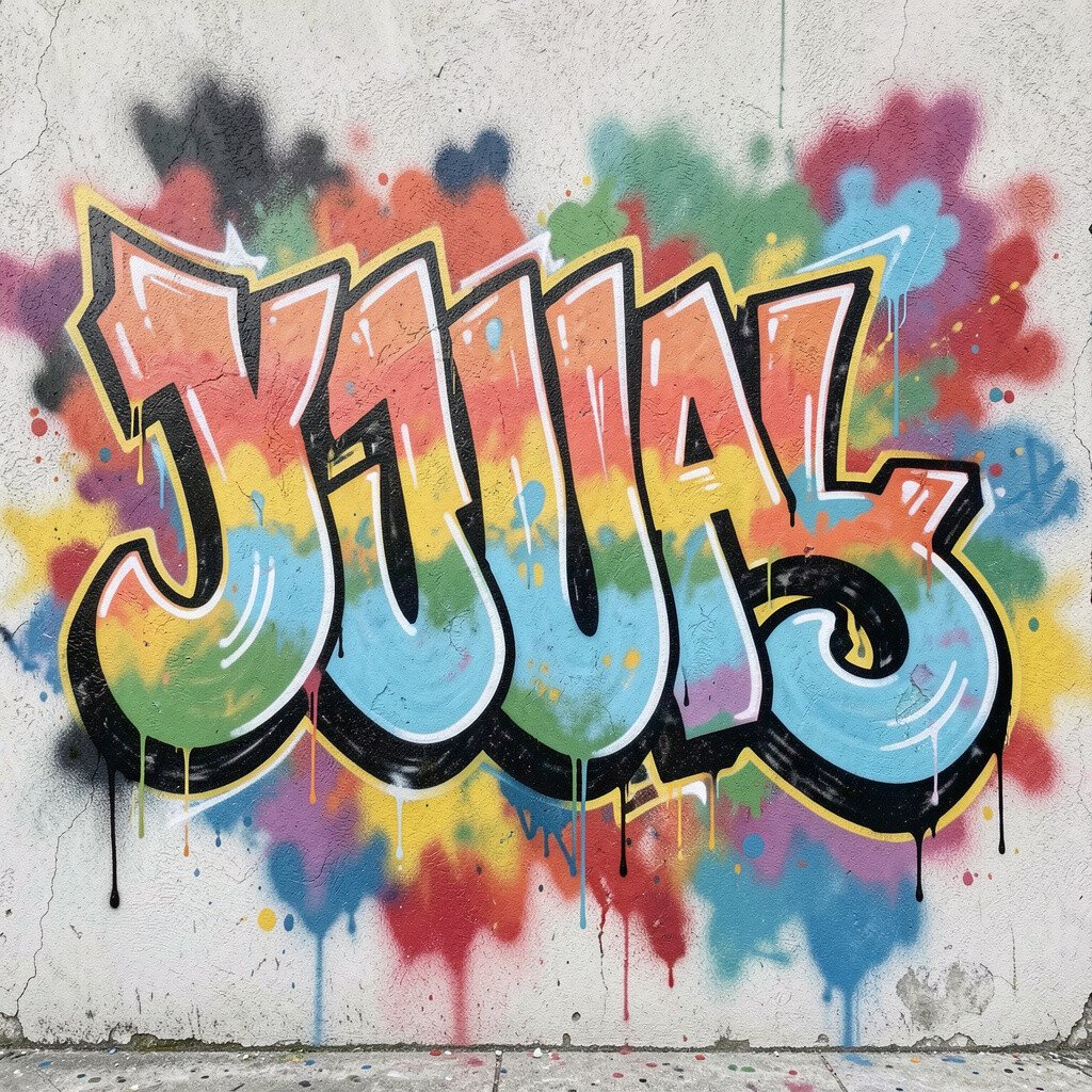
Start with a textured wash background, like watercolor-like swirls, then draw sharp graffiti edges on top using markers or paint pens. The contrast between soft background and crisp lettering makes everything feel layered.
This approach helps your art look professional without needing advanced techniques. Let the wash dry fully before outlining, or the lines will blur. Personalize it by choosing a wash palette that matches your room colors, like warm peach tones or cool blue grays.
For cost, use affordable acrylic washes and focus your expensive markers on outlines and highlights. Texture backgrounds are popular right now because they add depth without overcrowding.
20. Interactive Letter Arrows and Direction Paths
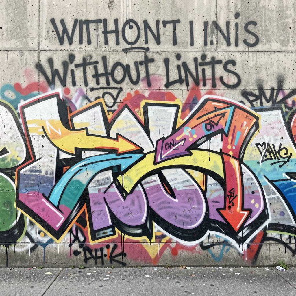
Turn your wall into a “map” for the eye by adding arrows that guide viewers from one part to another. Write your tag as checkpoints, and connect them with routes like a mini adventure trail.
Direction paths make your graffiti feel intentional and help people notice details in the right order. Use consistent arrow styles so the movement feels smooth, not chaotic. Personalize by mapping your own daily routine, like start at a morning word and end at a nighttime symbol.
21. Torn Banner Header with Handwritten Chaos

Create a banner at the top that looks torn and wavy, then fill the rest of the space with handwritten chaos that still lines up. Use bold headlines for the banner and looser scribbles underneath for energy.
This style works well because the top anchor keeps the composition from feeling messy. Try thick marker strokes for handwriting, then add small accents like dots or tiny stars. Personalize it by using a date, a team name, or a word that sets the mood for the whole space.
For cost, keep the banner simple and focus on one main tag plus a few accent colors. Banner-style street art remains popular because it feels like a festival poster pasted onto a wall.
22. Endless Color Loop with Repeat Borders
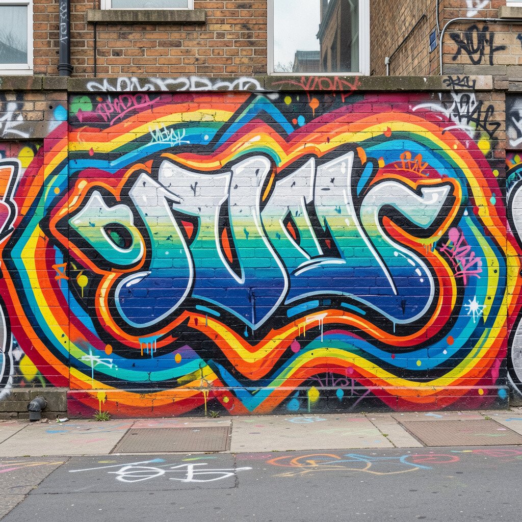
Design a big looping border that keeps returning, like a never-ending ribbon. Inside the loop, place your tag in the center, then repeat small symbols along the path.
This creates rhythm and unity, so your wall feels finished even when you add more later. Use one core color for the loop and rotate accent colors as you revisit sections. Personalize the loop by using symbols that mean something to you, like skate icons, music notes, or little clouds.
To manage cost, plan a repeat kit with a few essentials and reuse stencils for the symbols. Endless loop designs are trending because they look clean from a distance and packed with details up close.