Imagine stepping into a room or donning an outfit that just feels right, with colors that sing in harmony. It’s like a secret language only your eyes can hear, and today, we’re going to learn how to speak it fluently.
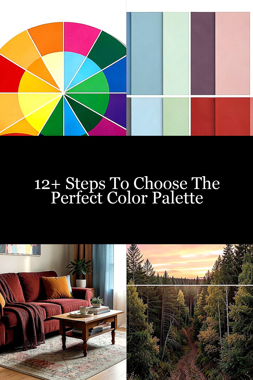
1. Understand the Basics of Color Theory
Color theory is like the alphabet of colors. It’s where you start to learn how colors mix, which ones contrast, and how they make you feel. By understanding the basics, you can create combinations that are pleasing to the eye.
Think of the color wheel as your map. Primary colors like red, blue, and yellow are your main stops, while secondary colors like orange, green, and purple are the exciting detours. It’s a fun way to see how colors relate to each other.
The benefit? A foundation that helps you pick colors with confidence, making your space or outfit pop in all the right ways!
2. Start with Your Favorite Colors
Your favorite colors are like old friends. They’re comfortable, familiar, and they make you smile. Using them as a starting point is a personal way to ensure you’ll love the final palette.
Personalization is key here. Maybe you love the calmness of blue or the energy of red. Use those as the stars of your palette, then build around them with complementary or neutral tones.
Plus, using colors you love doesn’t cost a thing! It’s all about expressing who you are.
3. Consider the Mood You Want to Create
Colors can change the way we feel. Imagine a room that feels warm and cozy with deep reds and oranges, or one that’s fresh and airy with soft blues and greens.
Decide on the mood you want: energetic, calm, happy, or sophisticated? Each mood has a color family that matches it. Energetic might mean bold yellows, while calm could be gentle pastels.
This step is unique because it’s all about emotions. Use color to tell a story and make your space or outfit truly special.
4. Take Inspiration from Nature

Nature’s color combinations are effortlessly beautiful. Think of a sunset with its pinks and oranges or a forest with its greens and browns. These natural palettes are tried and true.
Look outside your window, take a walk, or browse nature photography. The colors you see can be the perfect guide for your palette. They’re already proven to work together.
Plus, it’s a cost-effective way to find inspiration. Mother Nature offers it for free!
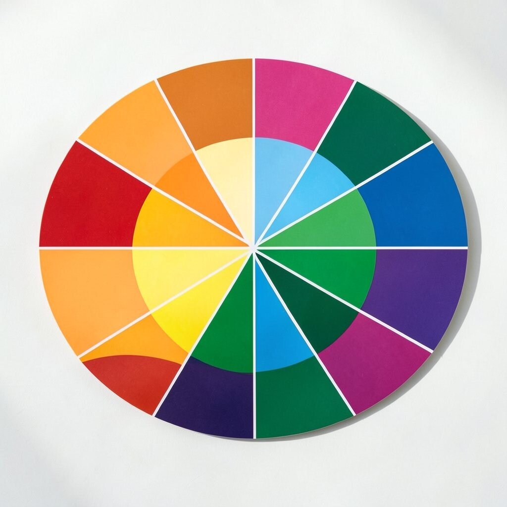
5. Use the 60-30-10 Rule
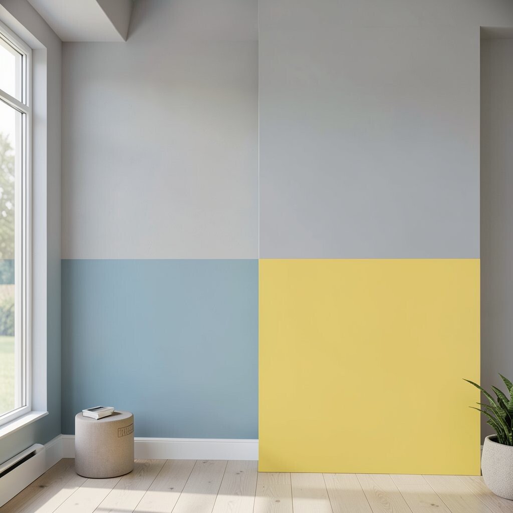
The 60-30-10 rule is a designer’s secret weapon. It’s a simple formula to balance colors: 60% for the main color, 30% for a secondary color, and 10% for an accent.
This method helps create a cohesive look. Imagine a room where 60% is a soft grey, 30% is a calming blue, and 10% is a vibrant yellow. Everything just feels right.
It’s an easy-to-follow rule that ensures your palette isn’t overwhelming or chaotic, without any extra cost.
6. Pay Attention to Trends
Trends are like the whispers of the fashion and design world. They tell you what’s hot and what’s not. While you shouldn’t follow them blindly, they can spark ideas.
Check out magazines, Pinterest, or home decor blogs to see what’s trending. Is it earthy tones this year or perhaps neon pops? Use trends as a guide, but always add your twist.
Trends can be a fun way to keep your palette fresh and modern, without losing your unique style.
7. Explore Different Textures and Finishes

Color isn’t just about hue; it’s also about texture and finish. A matte navy wall can feel very different from a glossy one. Consider how these elements affect your palette.
Mixing textures like a plush velvet in a rich green or a shiny copper accessory can add depth to your palette. It’s like adding spices to a dish—each one enhances the flavor.
This approach adds sophistication and interest, making your palette more dynamic and engaging.
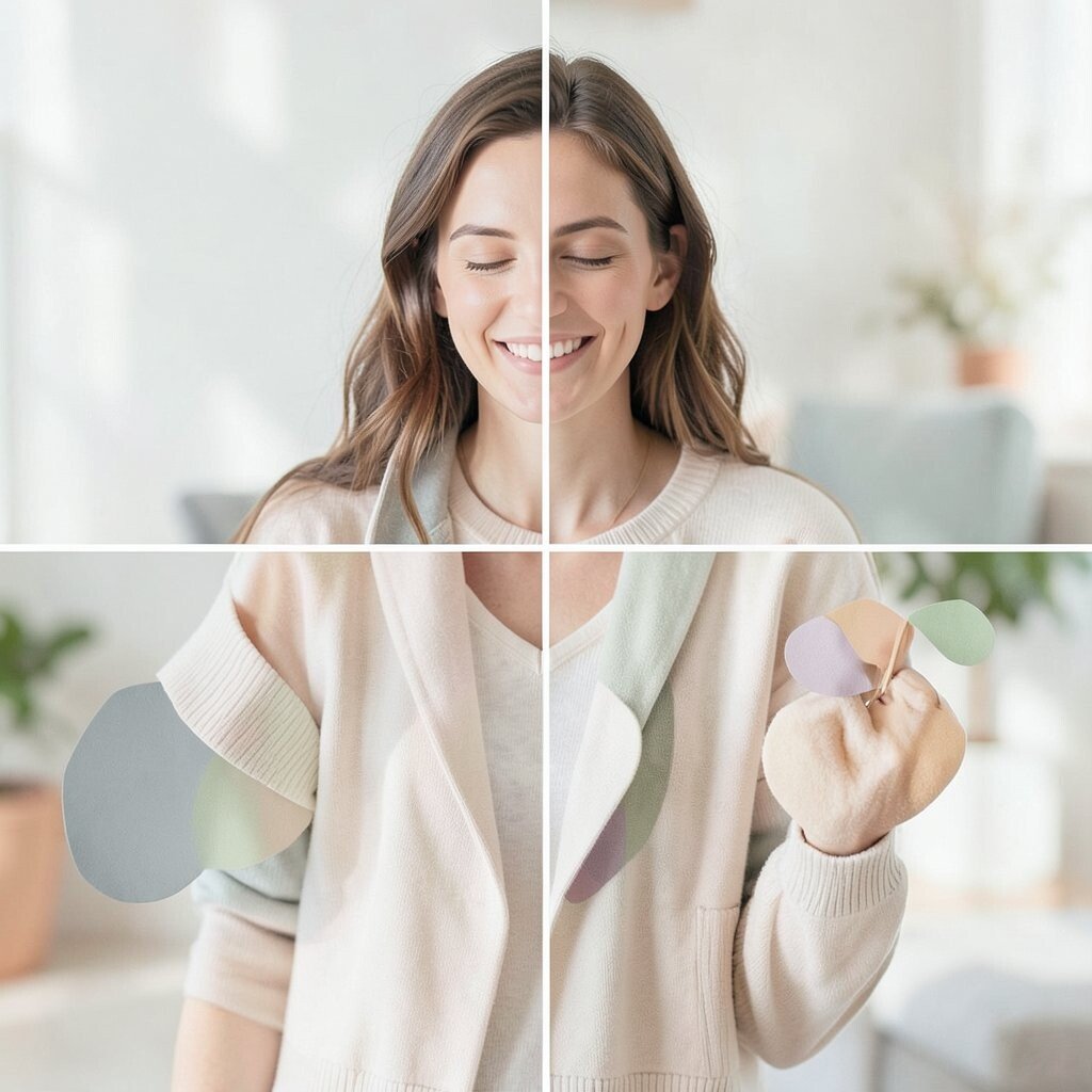
8. Test with Paint Samples or Fabric Swatches
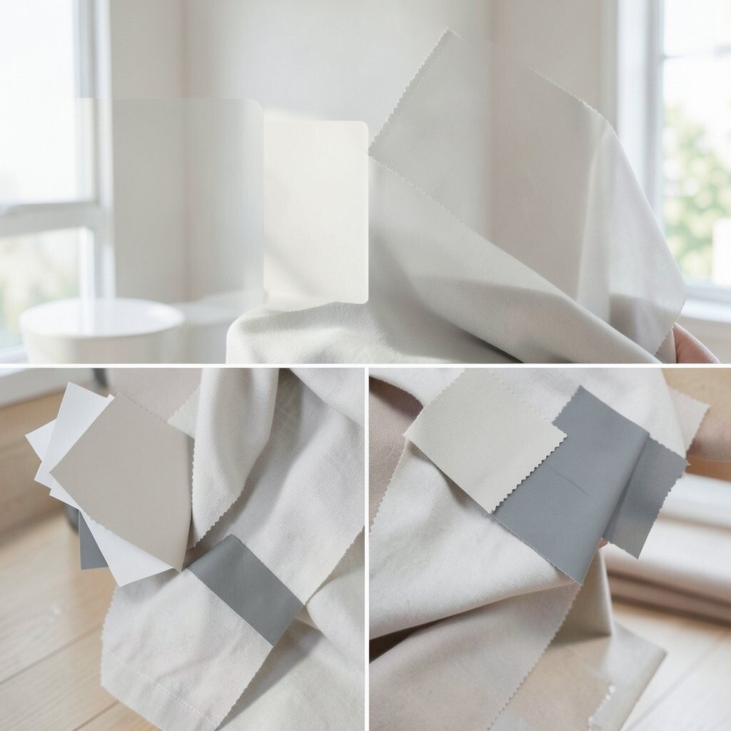
Testing is like trying on clothes before you buy them. It helps you see the colors in your space or against your skin, under different lighting.
Get paint samples or fabric swatches and see how they look at different times of the day. Light can change colors dramatically, turning a warm beige into a dull grey.
It’s a small investment that can save you from costly mistakes, ensuring your palette looks perfect in all settings.
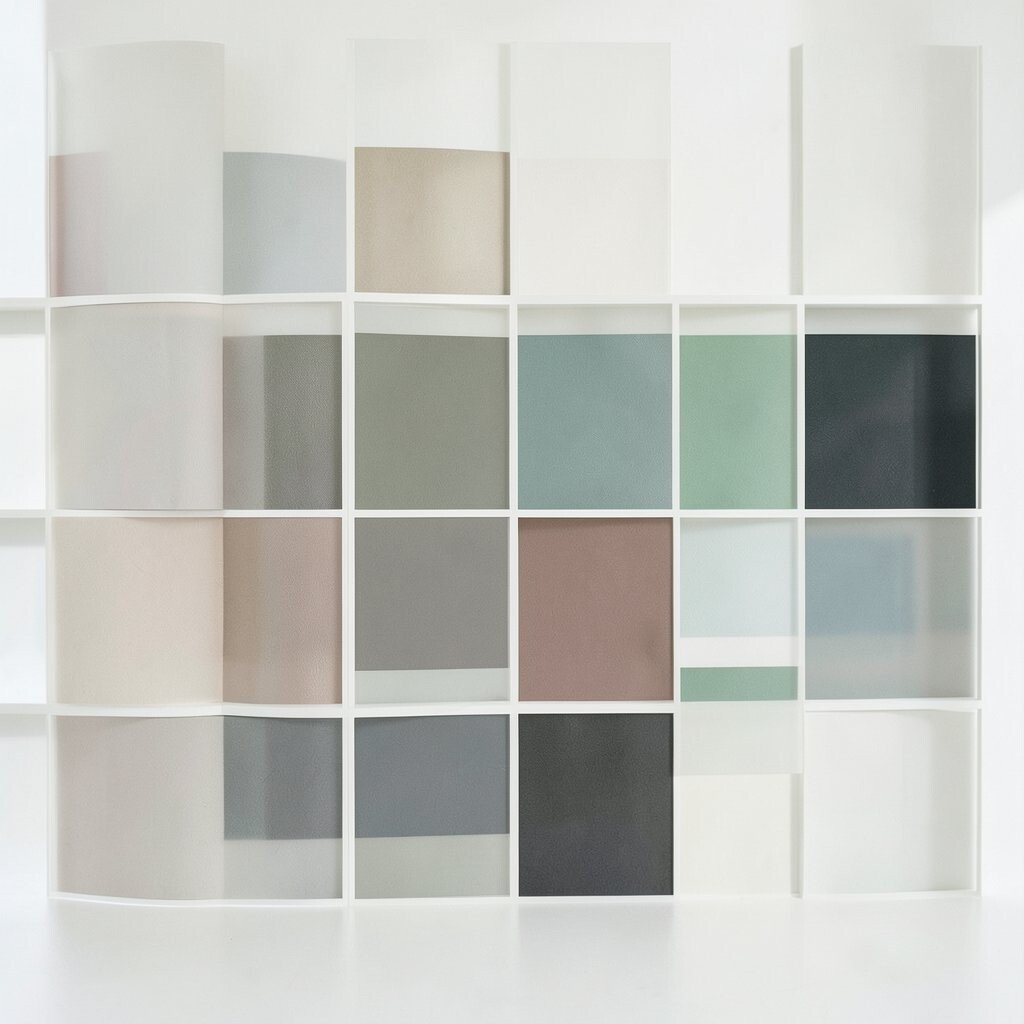
9. Use Technology and Apps
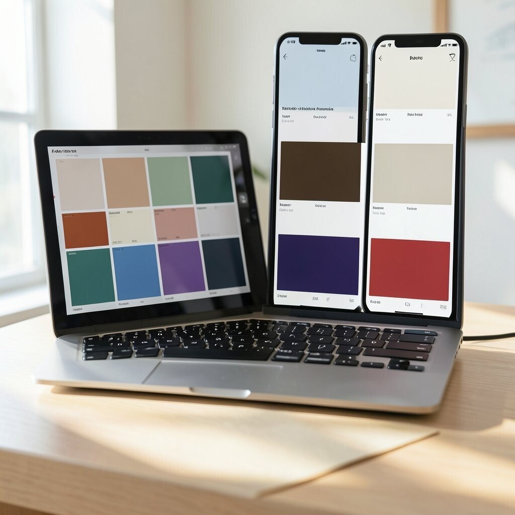
In today’s digital age, technology can be your best friend. There are apps and tools designed to help you pick colors, like Adobe Color or Pantone Studio.
These apps allow you to experiment with combinations, see how they look together, and even generate palettes from photos you love.
Having technology at your fingertips makes the process fun, interactive, and often free.
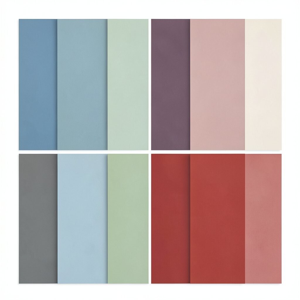
10. Balance Warm and Cool Colors
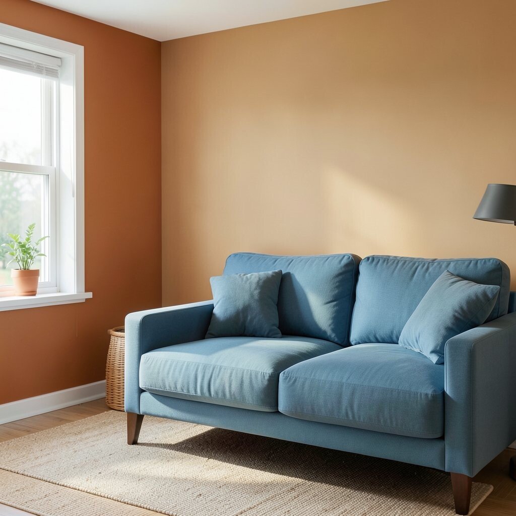
Balance is essential in any palette. Warm colors like reds and yellows can energize a space, while cool colors like blues and greens can calm it down.
Mixing both can create harmony. Think of a room where a warm orange wall is paired with a cool blue sofa. It’s the perfect blend of energy and relaxation.
Balancing warm and cool tones ensures your palette feels complete and well-rounded.
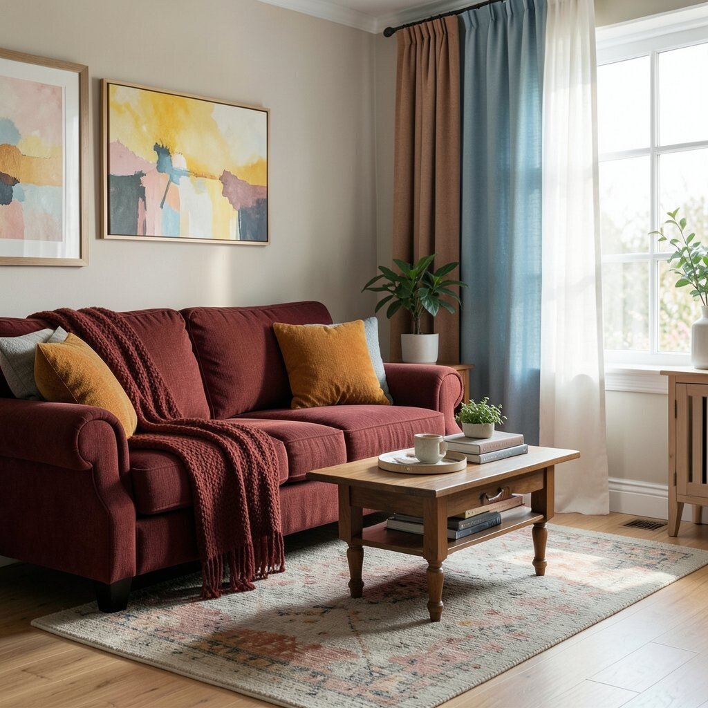
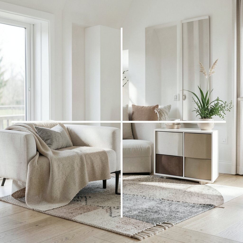
11. Look at Your Existing Decor or Wardrobe
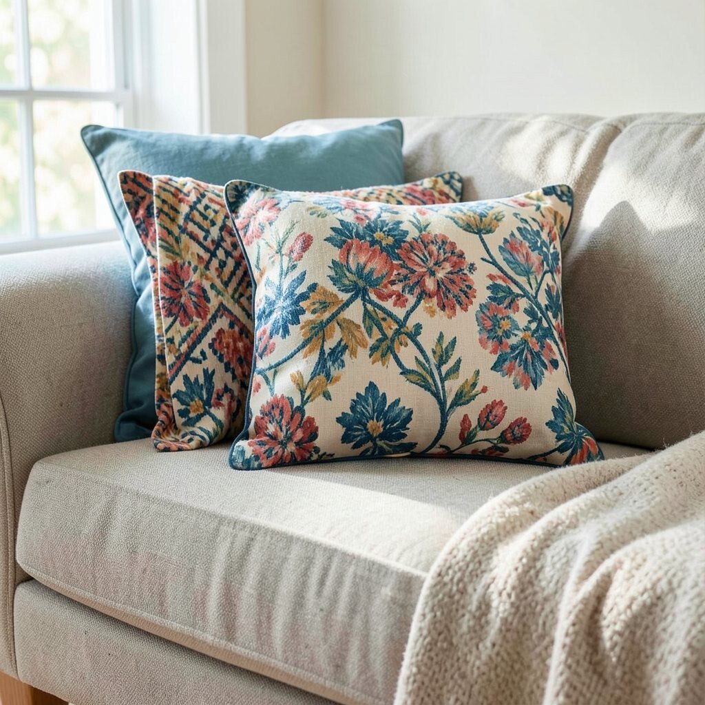
Sometimes the best inspiration is right in front of you. Look at the colors you already love in your home or closet. They can guide your palette choices.
If you have a favorite patterned cushion or a beloved scarf, pull colors from these items. It ensures everything you own works together beautifully.
This approach is cost-effective, as you’re building on what you already have and love.
12. Trust Your Instincts and Have Fun
At the end of the day, choosing colors should be enjoyable. Trust your gut instincts and don’t be afraid to take risks with your palette.
Remember, there are no strict rules in creativity. If a combination makes you happy, it’s the right choice for you.
Embrace the process and have fun with it. Your personality will shine through in your color choices.
13. Review and Adjust as Needed
Once you’ve settled on a palette, give it time to sink in. Live with it for a while and see how it feels. It’s okay to make adjustments if something doesn’t feel right.
Colors are like living things; sometimes they need a little tweaking to fit just right. Don’t be afraid to swap out a color or tweak a shade.
This flexibility ensures your palette remains perfect for you, evolving as you do.