
Old kitchen colors still know how to steal the show. They bring warmth, charm, and a little bit of story into everyday life.
These shades can make a room feel cozy, bold, or sweet in a way modern neutrals often miss. They also give you plenty of room to mix old memories with fresh style.
-
1. Butter Yellow
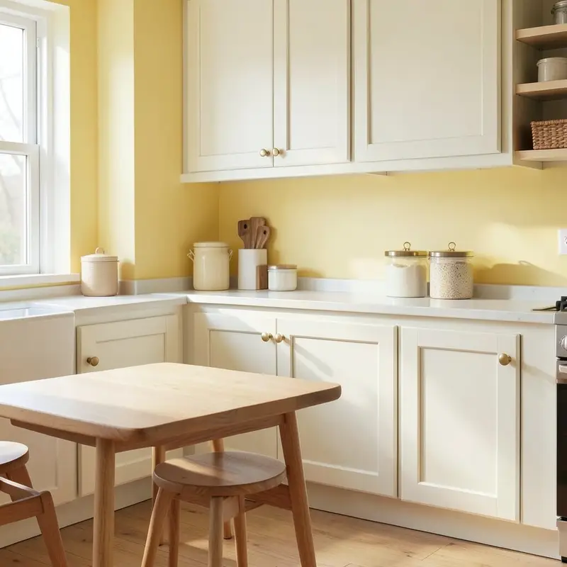
Butter Yellow Butter yellow feels soft, sunny, and friendly, like morning light on a clean table. It can make a kitchen look happy without feeling too bright.
This shade works well on walls, cabinets, or small accents like stools and canisters. It pairs nicely with white trim, warm wood, and simple brass pulls, which keeps the look calm and cheerful.
-
2. Mint Green
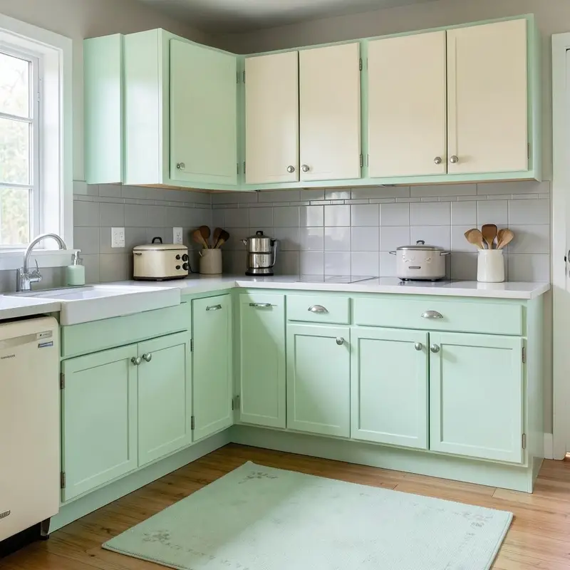
Mint Green Mint green brings a fresh, cool look that reminds many people of old diners and classic enamelware. It gives a kitchen a playful feel while still looking neat and tidy.
You can use mint on lower cabinets, a pantry door, or even a tile backsplash. It looks lovely with cream, pale gray, and chrome, and it can help a small kitchen feel open.
If you want a soft retro touch, mint is a smart pick because it feels light on the eye. It is also easy to live with, since it hides some everyday wear better than pure white. For a lower-cost update, try painted chair legs or a mint rug before doing the whole room.
-
3. Avocado Green
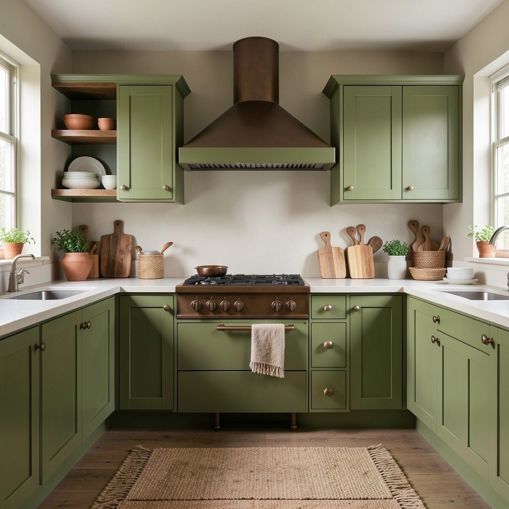
Avocado Green Avocado green has a strong vintage feel and brings back the look of old family kitchens. It can feel rich and earthy, especially when paired with wood and warm metal.
This color works best in spaces that need character and a grounded mood. Try it on cabinets, a range hood, or open shelves, and balance it with light counters so the room does not feel too dark.
One reason people still love avocado green is that it feels unique without shouting. It can make a kitchen seem collected over time, which is great if you want a homey style. If you are watching your budget, use it on one main piece and keep the rest simple.
Today, this shade fits well with natural textures and handmade details. A woven runner, clay bowls, and soft white dishes can make it feel fresh again.
-
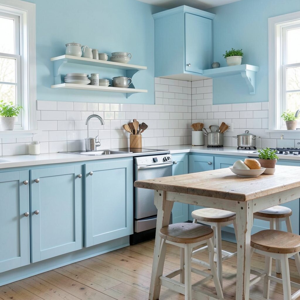
4. Powder Blue
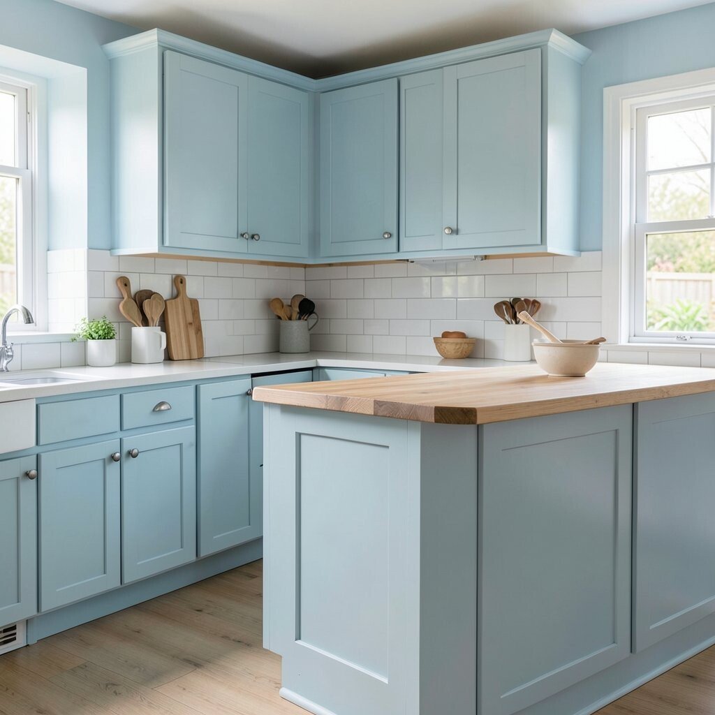
Powder Blue Powder blue gives a kitchen a gentle, airy look that feels calm from the first glance. It can make even a busy room seem lighter and more peaceful.
Use it on cabinets, wall paint, or a painted island for a sweet vintage touch. It looks lovely with white tile, pale wood, and silver hardware, and it can make a small kitchen feel bigger.
-
5. Cherry Red
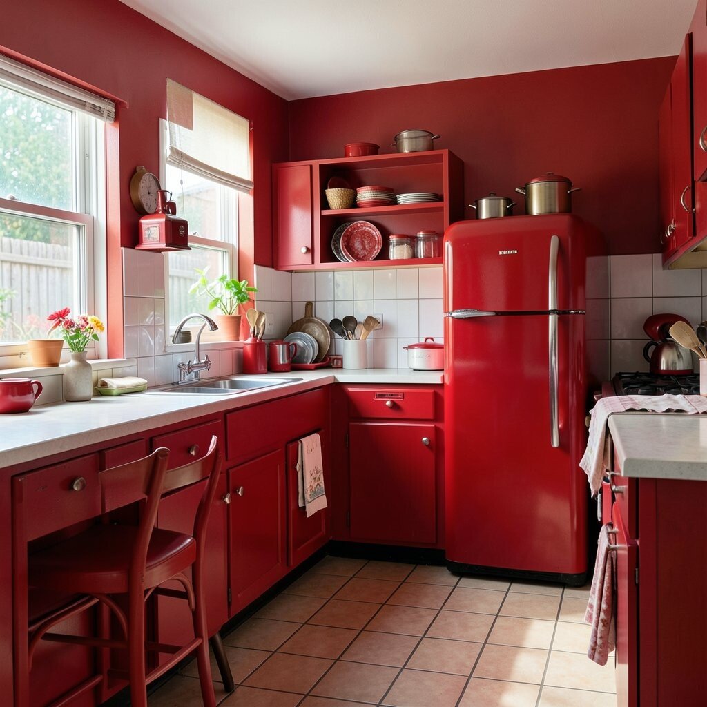
Cherry Red Cherry red brings energy, warmth, and a bold old-school diner mood. It can turn a plain kitchen into a lively place where people want to gather.
This shade works well in small bursts if you want impact without too much color. Think chairs, a retro fridge, dish towels, or a single accent wall, then soften it with white or black.
Cherry red is a strong choice for anyone who wants a kitchen with personality. It feels cheerful, but it also needs balance so the room does not become too busy. If you want a lower-cost way to try it, start with accessories and see how the color feels in your light.
-
6. Warm Cream
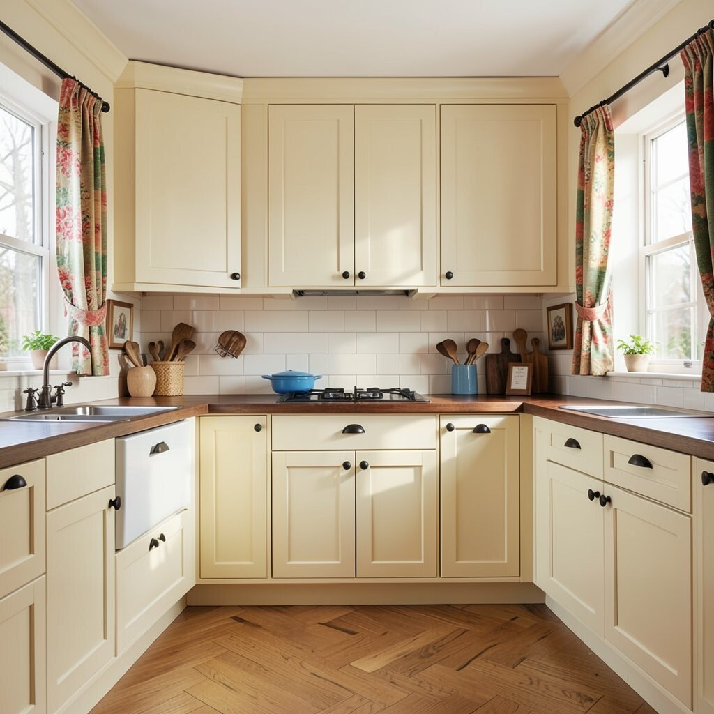
Warm Cream Warm cream is a classic color that has stayed loved for a long time because it feels soft and welcoming. It gives a kitchen a gentle glow and makes other colors stand out in a nice way.
This shade is perfect for cabinets, walls, and trim when you want a clean look with more warmth than bright white. It pairs well with nearly everything, from dark wood to blue dishes to black hardware.
Many people choose warm cream because it is timeless and easy to decorate around. It also helps resale value, since buyers often like a kitchen that feels bright and simple. If you want a custom touch, add colorful curtains or vintage art so the room does not feel plain.
-
7. Salmon Pink
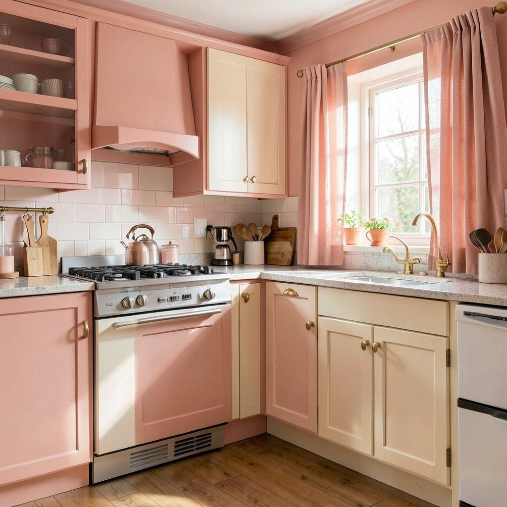
Salmon Pink Salmon pink brings a soft glow that feels both sweet and grown-up. It has a lovely old-fashioned charm that can make a kitchen feel warm and a little romantic.
You can use it on walls, a breakfast nook, or cabinet fronts if you want something gentle but not boring. It looks pretty with brass, cream, and natural wood, and it can help a kitchen feel more personal.
This color stands out because it is less common than beige or gray, yet still easy to live with. It can make your kitchen feel special without needing a full makeover. For a budget-friendly tryout, use salmon pink in textiles first, like seat cushions or cafe curtains.
Right now, soft pink tones are showing up in homes that want a cozy, layered look. Salmon pink fits that trend well while still keeping its vintage heart.
-
8. Teal
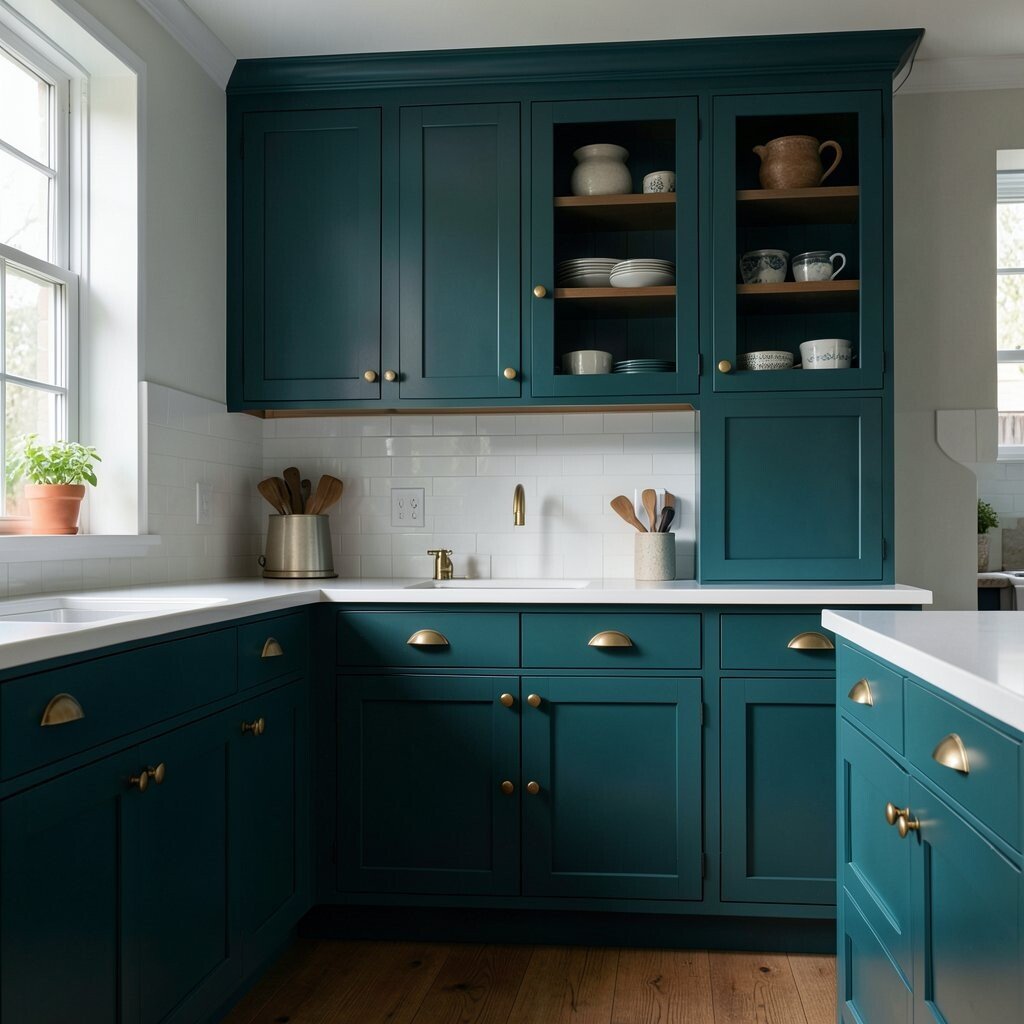
Teal Teal has a deep, rich look that feels both vintage and fresh at the same time. It can make a kitchen feel stylish, moody, and full of life.
Try teal on lower cabinets, a pantry wall, or a built-in hutch for a bold but balanced effect. It looks great with white counters, gold pulls, and warm wood, which helps the color feel inviting.
-
9. Peach
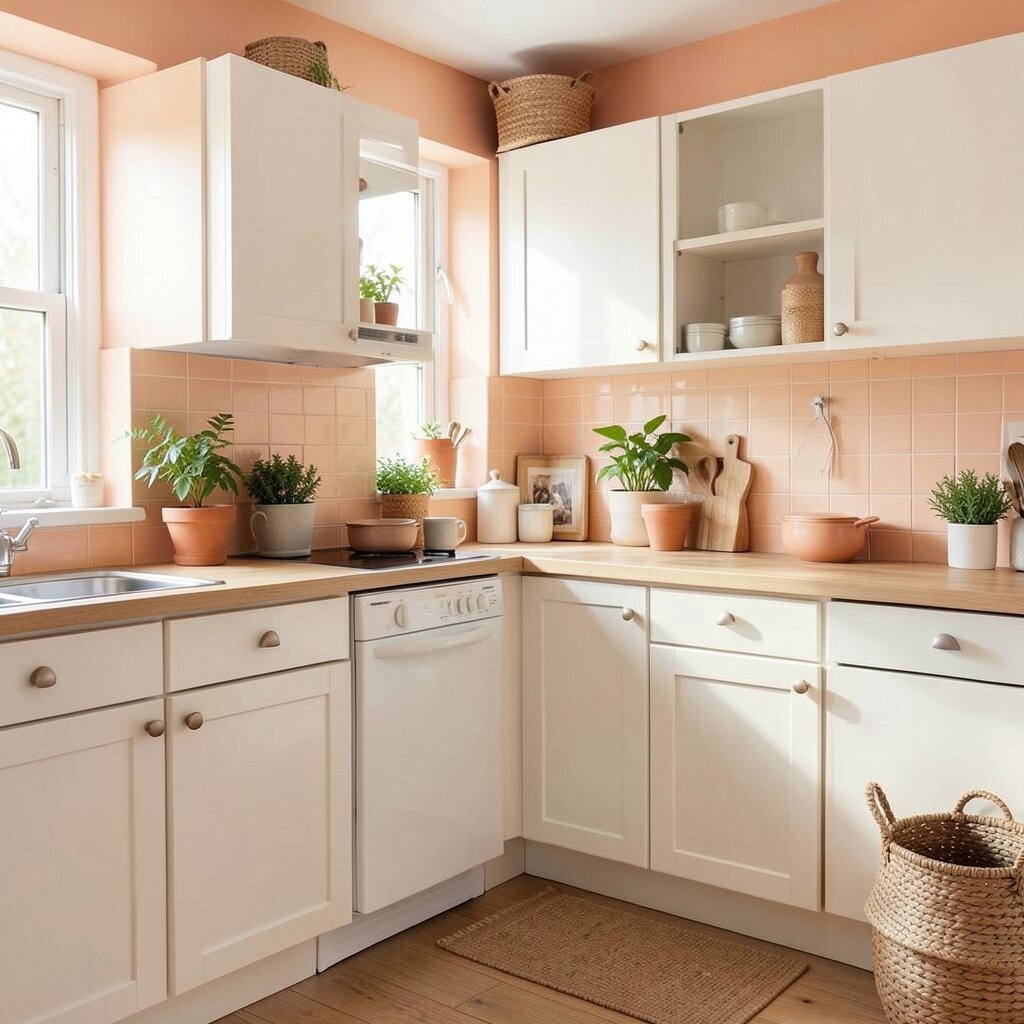
Peach Peach gives a kitchen a soft, sunny glow that feels kind and friendly. It can make the room seem brighter, even on cloudy days.
This color works nicely on walls, backsplashes, or small furniture pieces like a kitchen bench. It pairs well with white, tan, and light oak, and it can make vintage dishes look even prettier.
Peach is a lovely choice if you want a color that feels playful but still calm. It can also help a room feel more lived-in and warm, which many people want today. For a simple update, mix peach with plants and woven baskets for a natural, easy look.
Because peach is soft, it often costs less to style around than stronger colors. You can use it in small ways and still get a big change in mood.
-
10. Chocolate Brown
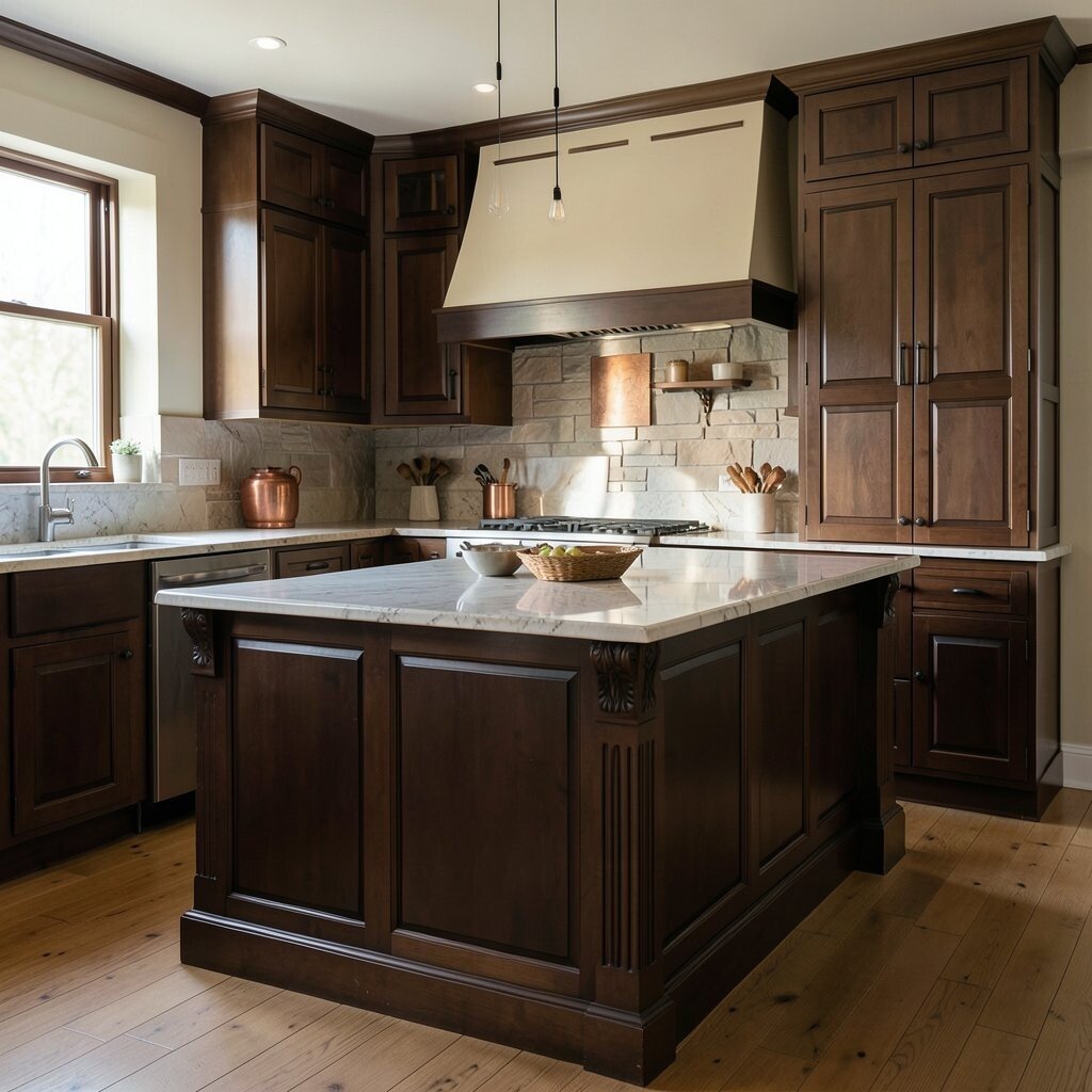
Chocolate Brown Chocolate brown gives a kitchen a deep, rich look that feels steady and classic. It can bring back the feel of older wood-heavy kitchens while still looking elegant.
This shade works well on cabinets, island bases, or tall pantry doors. It pairs beautifully with cream, copper, and stone, and it can hide scuffs better than lighter colors.
-
11. Sky Blue
Sky Blue Sky blue has a light and breezy feeling that can make a kitchen seem open and cheerful. It brings a gentle vintage look that feels easy to love.
You can use it on walls, stools, or a farmhouse table to keep the room bright and relaxed. It works well with white tile, pale wood, and shiny nickel, and it gives a nice clean backdrop for everyday cooking.
Sky blue is popular in homes that want a soft, coastal feel without going full beach theme. It also makes a smart choice for smaller kitchens because it helps the space feel less crowded. If you want a low-cost change, paint just the trim or a single shelf unit.
-
12. Mustard Gold
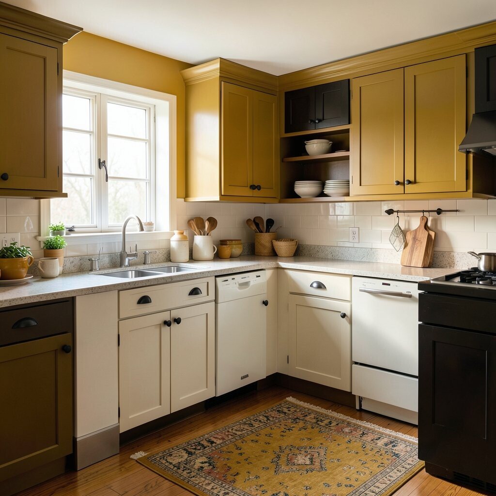
Mustard Gold Mustard gold has a bold retro spirit that can make a kitchen feel lively and memorable. It brings warmth and a little drama, which is great if you want something with character.
This color looks strong on accent walls, chairs, or cabinet doors, especially when paired with dark wood or black details. It can also work with white and cream to keep the room from feeling too heavy.
People like mustard gold because it feels old and new at the same time. It can fit a modern home that still wants a touch of history. If you are unsure, start small with a lamp, rug, or ceramic pieces before painting a big surface.
As trends move toward warmer rooms, mustard gold is getting more attention again. It gives a kitchen a cozy glow that feels bold but still welcoming.
-
13. Soft Gray-Green
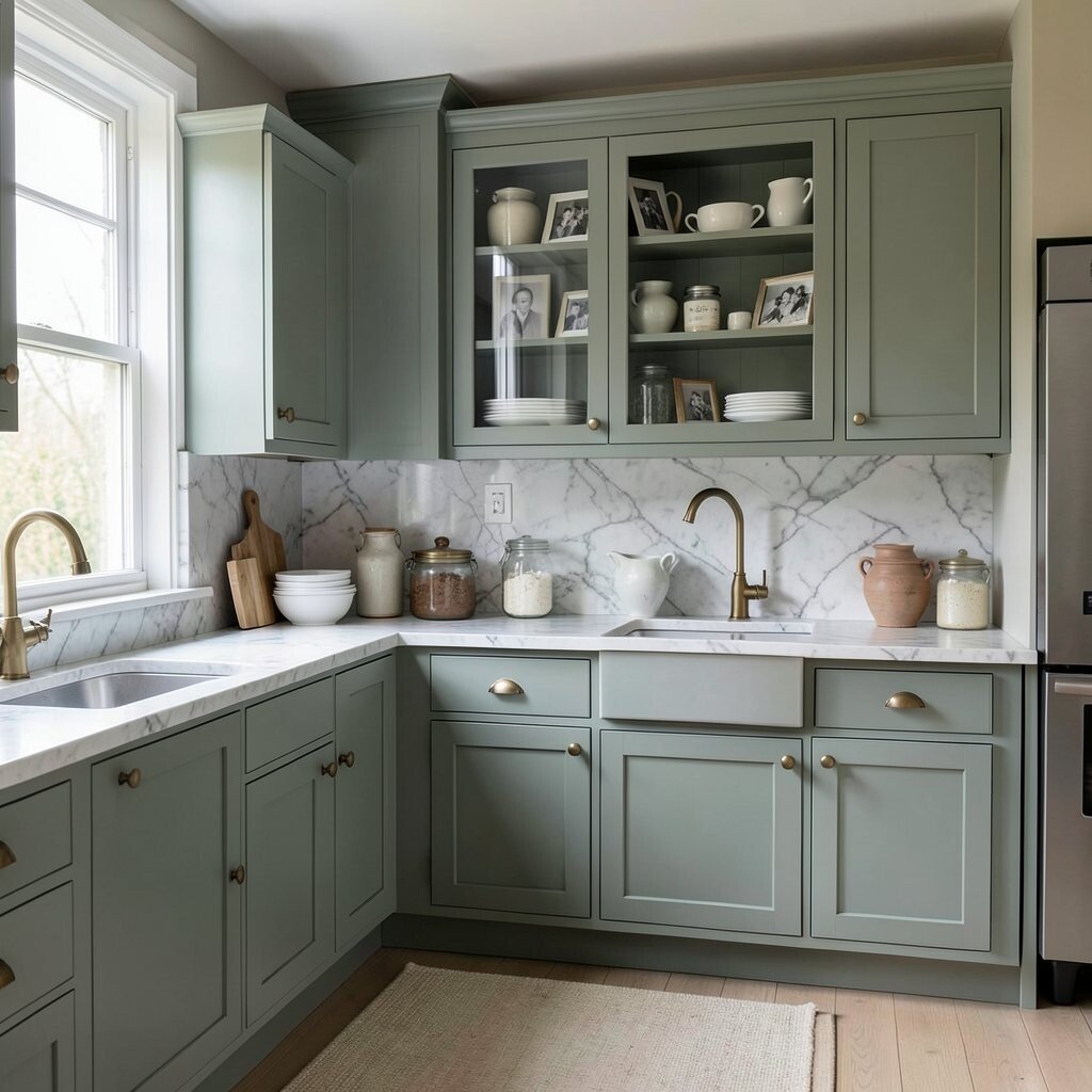
Soft Gray-Green Soft gray-green is quiet, lovely, and full of old-home charm. It can make a kitchen feel calm, refined, and easy to spend time in.
This shade works well on cabinets, walls, or a built-in hutch when you want something subtle but not plain. It looks beautiful with marble, white dishes, and aged brass, and it gives the room a soft layered look.
One big benefit of gray-green is that it fits many styles, from cottage to farmhouse to simple modern spaces. It feels unique without being hard to match, which makes decorating easier. For a personal touch, add family photos, vintage jars, or handmade pottery to bring out its gentle mood.