
The right color makes a lounge feel like a warm hug. It also helps you unwind the moment you step inside.
1. Creamy Off-White
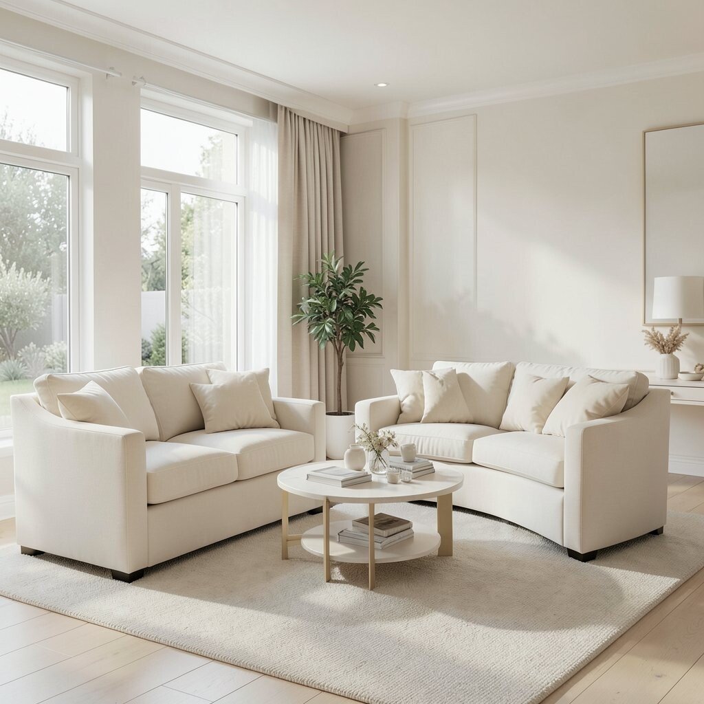
Think of creamy off-white walls that glow softly in the evening, like a candlelit bakery window. Pair it with warm wood tones and you get an instant calm you can feel in your shoulders.
Off-white works beautifully when you want flexibility for rugs, pillows, and artwork. Choose a paint with a slightly warm undertone so the room never feels icy. To keep it from looking plain, layer in textured fabrics like boucle, chunky knit throws, and linen curtains.
2. Warm Beige With a Soft Glow
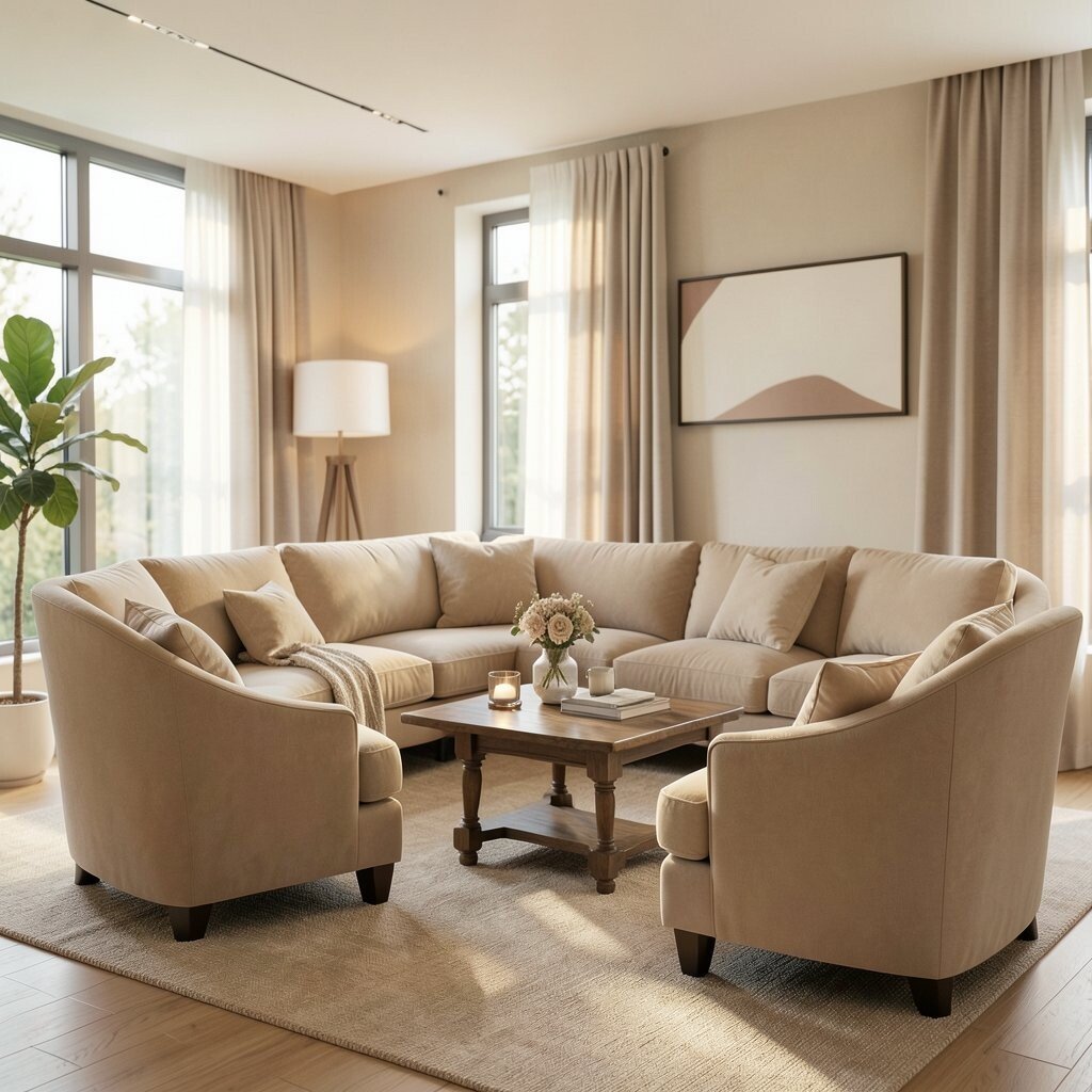
Warm beige creates a cozy baseline, like sand and sunshine settling into the space. It looks especially welcoming with earthy accents and low lighting.
This color is great for lounges where you want comfort without a lot of visual stress. It hides minor scuffs better than crisp whites, which can save time on touch-ups. Try adding a darker mocha throw or a caramel leather chair to create gentle contrast.
For personalization, mix beige with muted greens or terracotta in small decor pieces. If you’re on a budget, paint the walls and swap pillow covers first, since textiles make the biggest difference. Current trends lean toward natural tones, and warm beige fits right in.
3. Sage Green for Slow Evenings
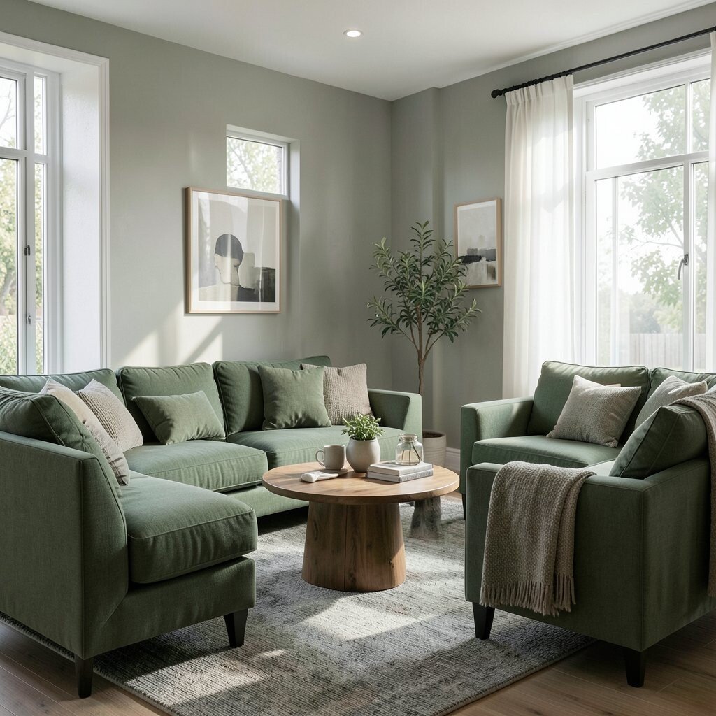
Sage green brings a fresh, muted vibe that feels relaxing rather than bold. Picture it with light oak furniture and airy curtains that flutter when the window opens.
It’s a smart choice because it pairs well with both modern and traditional styles. Sage also works nicely for lounges that get bright daylight since it softens the glare. For a practical approach, use sage on one wall and keep the rest in a warm neutral.
To tailor it to your taste, add touches of black in slim frames or lamp bases for a clean, grounded look. Consider medium-priced paints for full coverage, but start with an accent wall if you want to control costs. This color is popular in current wellness-inspired interiors, so you’ll still feel stylish years from now.
4. Dusty Rose for Gentle Comfort
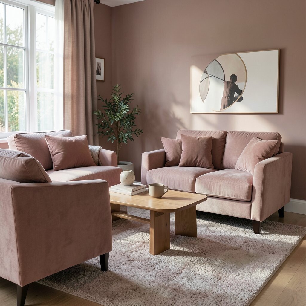
Dusty rose looks romantic and inviting without feeling overly sweet. Imagine it on walls with soft gray accents and plush seating that begs for long conversations.
This shade can make a lounge feel warmer, especially if your lighting is cool. It also complements brass and rose-gold details for a subtle glow at night. For an actionable setup, paint the walls and then choose neutral cushions so the rose stays calm.
5. Terracotta for Earthy Energy

Terracotta adds warmth that feels grounded, like clay pots on a sunny patio. You can almost picture the scent of herbs when you see it paired with natural textures.
This color is unique because it’s both cozy and lively, giving your lounge a personality that stands out. It looks amazing with creamy whites, dark wood, and woven baskets. Try using terracotta as an accent wall or on the underside of shelves for a hidden pop.
To keep it practical, balance terracotta with plenty of light neutrals so the room doesn’t feel heavy. You can refresh the look cheaply by changing throw pillows, adding a new rug, or swapping a lampshade. In many homes, terracotta remains a current trend because it brings a natural, handmade feel that never goes out of style.
6. Charcoal Gray for Cozy Depth

Charcoal gray makes a lounge feel grounded and intimate, like a book nook with soft lighting. It also creates depth that makes lighter fabrics and art pop.
This color is a great choice if you want your furniture to look more premium. It hides stains better than many lighter shades, which helps in busy homes. Start by painting just the walls behind your main sofa or use it on built-ins.
7. Deep Navy for Lounge Drama

Deep navy looks elegant and soothing at the same time, like twilight settling in. Pair it with brass lamps and you’ll get a refined glow that feels cozy instead of formal.
Navy is unique because it turns an ordinary lounge into a stylish retreat without needing bold patterns. It works well with warm whites, camel leather, and even soft pink accents. For practical tips, balance the darkness with a lighter rug and keep window treatments airy.
To personalize, choose navy in a matte finish for a softer look, then add a few framed photos or a gallery wall. Cost considerations are manageable since you can paint one feature wall first. Current trends favor rich jewel tones, and deep navy fits that trend while still feeling timeless.
8. Light Sky Blue for Airy Calm

Light sky blue can make a lounge feel brighter and more relaxed, like a gentle horizon. It pairs beautifully with white trim and soft, comfy textiles that invite you to stay awhile.
This color helps spaces feel open, especially when you use it with warm wood or beige accents. It’s also great if your lounge gets lots of daylight and you want the room to feel soothing rather than harsh. Choose a pale tone and avoid going too saturated so it keeps its calm personality.
9. Mustard Yellow for Sunny Cheer

Mustard yellow brings a burst of warmth that feels cheerful yet grounded. Picture it in pillows, a chair, or a single accent wall that catches the light.
This shade is unique because it adds joy without needing loud colors. It also pairs well with olive green, dark brown, and cream textiles for a warm, layered look. For practical styling, use it in smaller areas first, like curtains or a throw blanket, so you can adjust the vibe.
If you want to keep costs lower, swap accessories before committing to paint. Mustard remains a current trend because it adds character to neutral rooms and works with modern shapes. Personalize it by choosing a vintage-style lamp or patterned cushion covers that feel collected over time.
10. Olive Green for Nature-Inspired Cozy
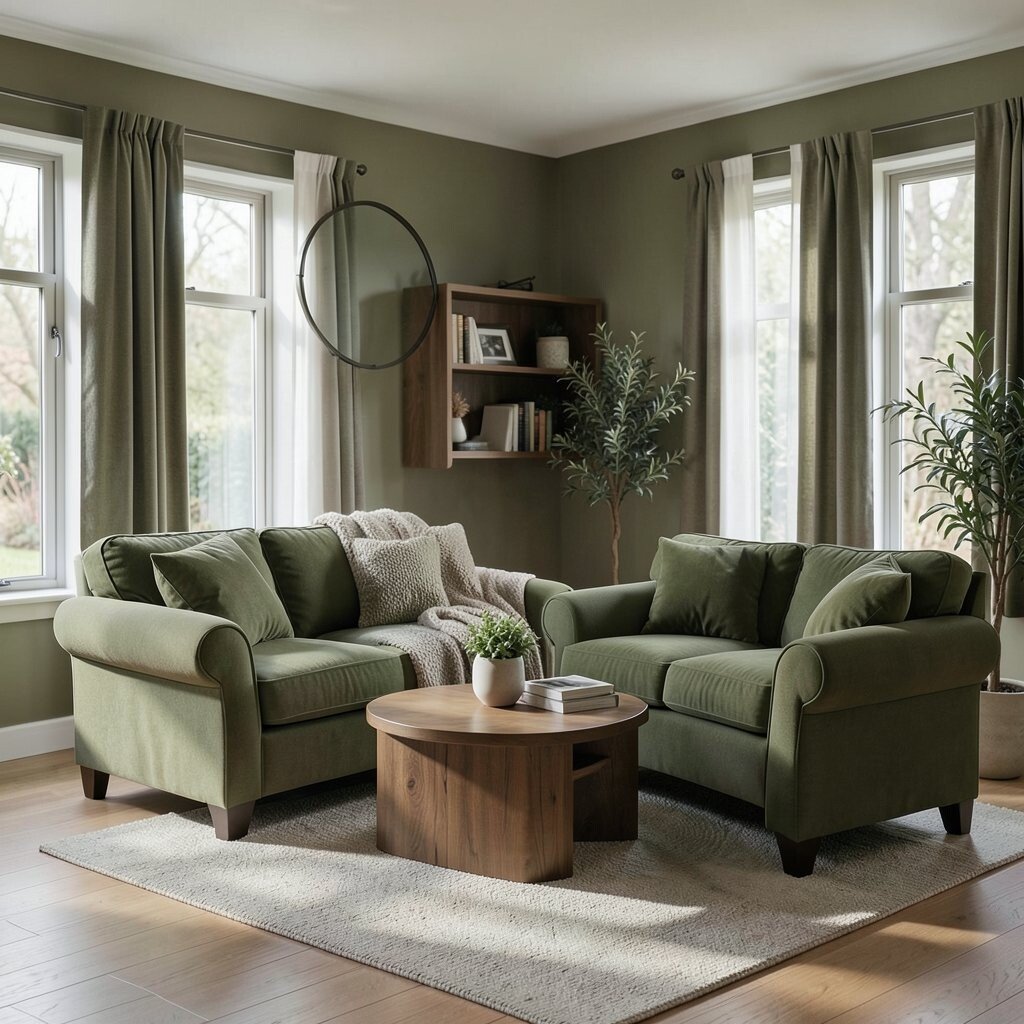
Olive green feels natural and cozy, like leaves in warm afternoon light. It gives lounges a grounded mood that works great with rustic wood and soft textiles.
This color is a practical win because it hides the “too bright” problem that some rooms face. It also looks amazing with cream, tan, and black accents that sharpen the overall design. Try painting the walls olive, then add off-white curtains to keep the room from feeling too dark.
11. Chocolate Brown for Snug Warmth

Chocolate brown makes a lounge feel snug and comforting, like wrapping up in a thick blanket. Think of it on cabinetry, accent walls, or even a rich leather sofa.
Brown is great for creating warmth, especially in homes that feel a little cool. It also pairs beautifully with cozy lighting, such as warm-toned bulbs and soft lamps. If full walls feel like too much, start with brown in the furniture and add paint in a lighter caramel or cream around it.
For personalization, mix different browns, from tan to mocha, so the room feels layered and not flat. Consider the cost of materials since darker finishes can highlight the texture of floors and walls, so prepping surfaces matters. Current trends often lean toward rich, layered earth tones, and chocolate brown fits that vibe perfectly.
12. Muted Lavender for Dreamy Ease
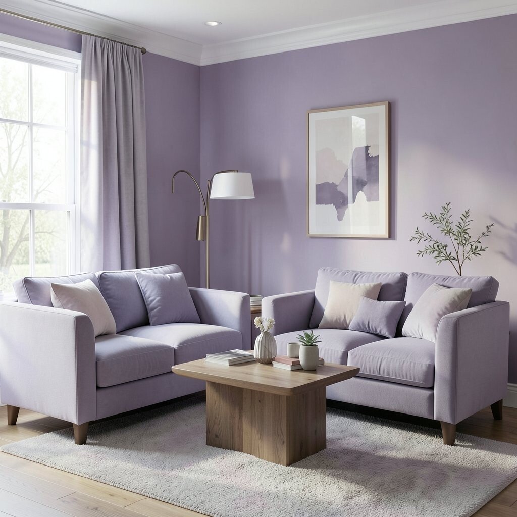
Muted lavender brings a gentle, dreamy feeling that still reads as practical. It’s the kind of color that makes a lounge feel quiet, like soft music in the background.
This shade can look stunning with gray, cream, and light wood, creating a soothing mix. It also works well when you want a calm space for reading and relaxing. Choose a muted tone rather than a bright purple so your lounge stays cozy instead of dramatic.
To personalize, add a few small floral textures in neutral tones so the color feels intentional. For cost considerations, try a washable wall paint or keep lavender to curtains and pillow covers first. This color trend shows up often in calm, self-care style rooms, and it’s easy to match with modern furniture.
13. Soft Coral for Playful Warmth
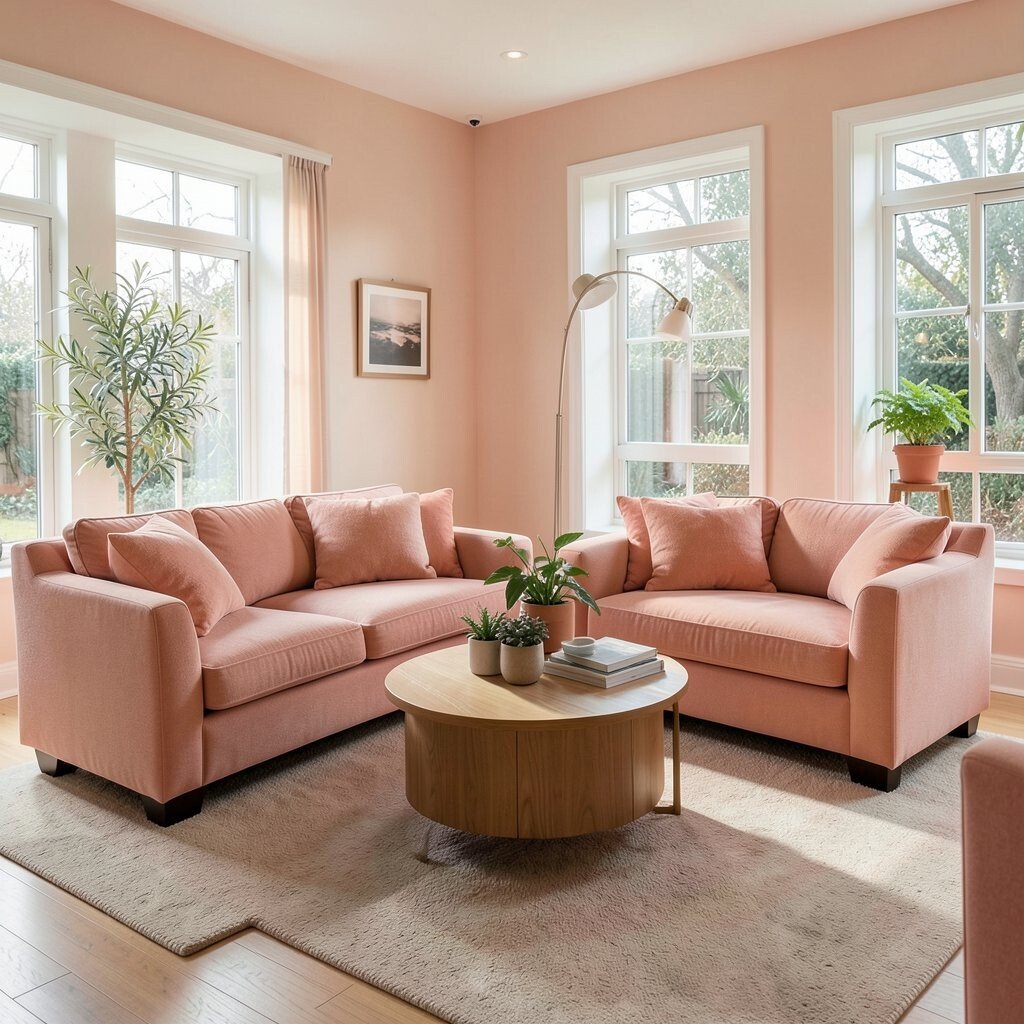
Soft coral feels friendly and inviting, like a warm sunset reflected on your couch. It can make a lounge feel energetic while still staying cozy.
This color is unique because it brings warmth without going full orange. It pairs well with cream, light gray, and natural rattan accessories for a fresh look. For a practical tip, use coral in upholstery, cushions, or a single accent wall, then keep the rest neutral.
14. Cool White With Textured Layers

Cool white can still feel cozy when you pair it with texture and warm lighting. Imagine white walls, thick knit throws, and a plush rug that softens every sound.
This approach works well if you love clean lines but still want comfort. Cool white also makes it easy to rotate seasonal decor like spring greens or autumn browns. To personalize, choose one statement piece, such as a bold rug pattern or a large piece of wall art, so the room doesn’t feel blank.
For cost, paint is usually one of the most affordable upgrades, and it sets the stage for everything else. Current trends often celebrate “quiet” backgrounds so colorful accents can shine. Keep it cozy by choosing warm bulbs and adding layered textiles that feel welcoming.
15. Brick Red for Vintage Charm

Brick red feels classic and cozy, like an old fireplace that anchors the room. It can instantly add warmth, especially when your lounge has dark wood or metal accents.
This color is unique because it connects with traditional styles while still feeling bold in a modern home. It also pairs well with cream, warm gray, and deep green accessories for a rich, vintage palette. Use it thoughtfully by painting one wall or adding it through art, curtains, or a statement chair.
To keep the look balanced, add softer neutrals so the brick tone doesn’t overwhelm the room. If you’re mindful of cost, try a larger rug in brick red first, since rugs can be swapped without major wall changes. This shade often appears in current “heritage” style designs, and it’s a great match for collected, meaningful decor.
16. Teal for Deep, Relaxing Contrast

Teal brings a calming richness, like ocean water under warm lighting. It looks especially cozy with beige, tan, and warm wood furniture.
This color is a strong choice when you want something distinctive but not too bright. It also works well for lounges because it feels relaxing and pairs nicely with many metals, from brass to bronze. For a practical start, try teal on built-ins or a feature wall, then keep the sofa and rug in neutral tones.
Personalize it with patterned cushions that echo sea textures, like subtle waves or botanical motifs. Cost considerations matter here because teal paint can show texture, so smooth walls or good preparation help. Teal continues to be a current favorite since it adds depth while still reading as fresh.
17. Creamy Gray for Soft Modern Balance
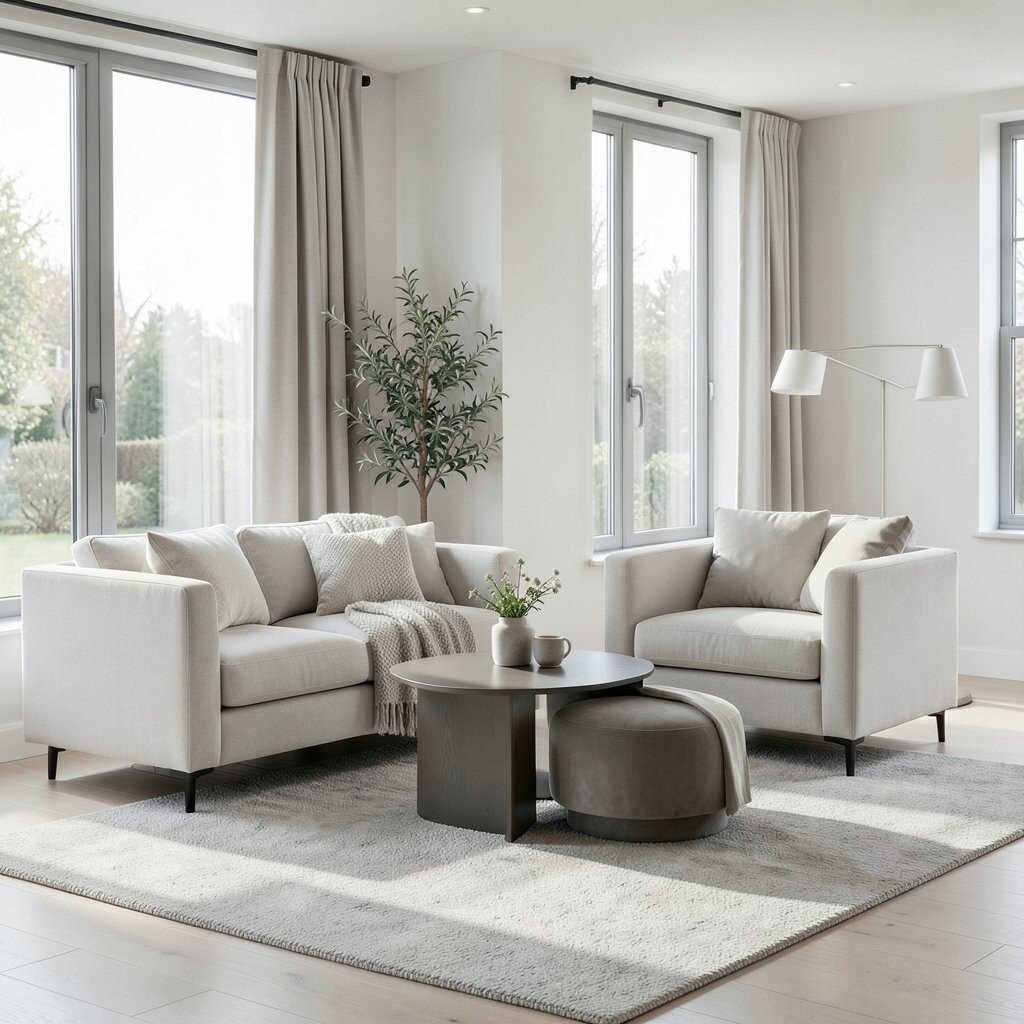
Creamy gray gives you a modern feel without turning chilly. Picture a gentle blend of gray and beige that makes couches look extra inviting.
This shade is practical because it works with almost any accent color, making shopping easier for pillows and artwork. It also hides everyday wear better than pure white, which is handy for busy households. Choose a warm creamy gray undertone so the room feels cozy rather than sterile.
18. Blackened Olive for Moody Calm
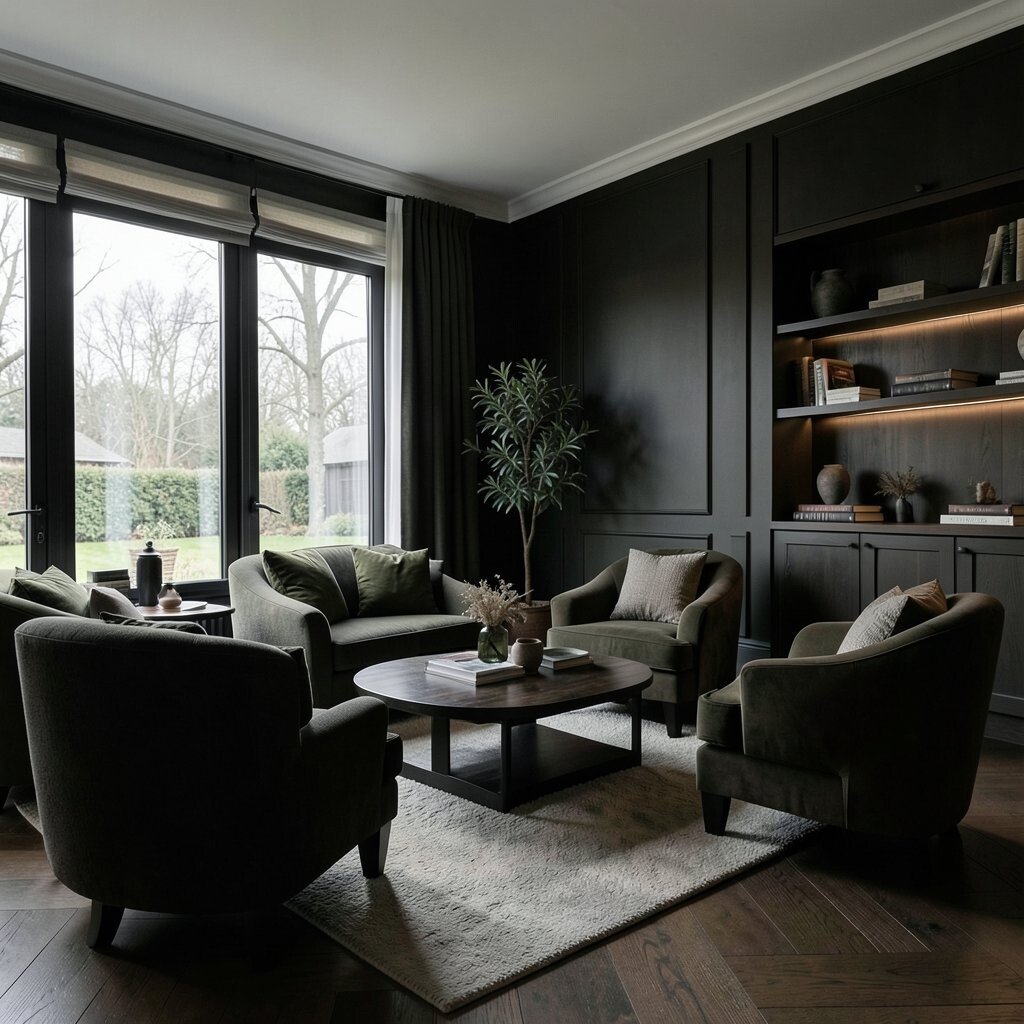
Blackened olive creates a moody, calm atmosphere that feels intimate and stylish. It looks like deep forest tones under lamplight.
This color is unique because it blends nature with drama, giving your lounge a strong personality. It pairs beautifully with cream textiles, warm brass, and light wood for a balanced look. For practical tips, use blackened olive in smaller spaces like a built-in, a media wall, or even the lower half of a wall.
To personalize, add warm-toned lighting and a mix of textures like velvet, linen, and wood grain. Cost considerations are worth thinking about because darker paint can require extra coats for even coverage, so budget accordingly. This moody color trend is showing up in many contemporary homes since it feels both cozy and high-end.
19. Sand Gold for Soft Luxury

Sand gold feels warm and luxurious, like sunlight filtered through curtains. It makes a lounge look welcoming even before you add any decor.
This color is unique because it adds glow without looking flashy. It pairs well with caramel leather, cream fabrics, and natural stone surfaces for an earthy luxury vibe. For an actionable plan, use sand gold as an accent wall or in paint on trim and behind shelving.
Personalize it with gold-toned frames, mirrors, or lamp bases, but keep the gold brushed or matte for a softer look. If cost is a concern, try wallpaper or removable panels for the first taste of the color. Current trends favor warm metallics used gently, and sand gold fits perfectly with that style.
20. Charcoal Teal for a Relaxing Statement

Charcoal teal is the sweet spot between deep and soothing, like a twilight beach. It makes a lounge feel styled and cozy while still calming your senses.
This color is beneficial when you want a statement wall that doesn’t feel too dark. It also coordinates well with warm neutrals, light wood, and natural fibers like jute and wool. Start by using charcoal teal behind the sofa or in the dining-adjacent area for a smooth, connected look.
To personalize, bring in pillows with varied teal shades so the room looks collected, not random. Cost considerations can be managed by painting one wall and letting the rest stay neutral, which keeps the project realistic. This shade aligns with current trends toward rich, calming colors that look great with modern furnishings and layered textures.