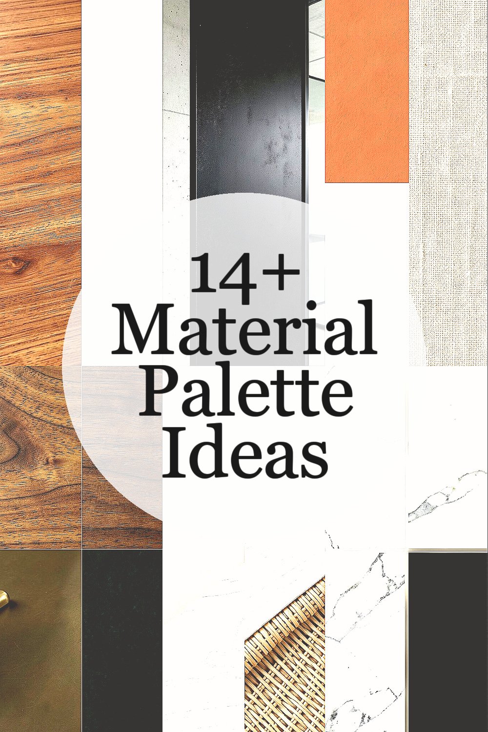
A strong material mix can change the whole mood of a room. The right palette can feel warm, calm, bold, or very fresh.
1. Warm Oak and Matte White

Warm oak and matte white make a space feel clean and gentle at the same time. The pale wood grain adds soft movement, while the white finish keeps the look bright and easy on the eyes.
This pair works well in kitchens, bedrooms, and small living rooms because it opens up the view and feels timeless. It is also a smart choice for budgets, since oak veneer and painted panels can look rich without the price of solid wood everywhere, and you can personalize it with black pulls or woven decor for a little contrast.
2. Concrete, Black Steel, and Clear Glass
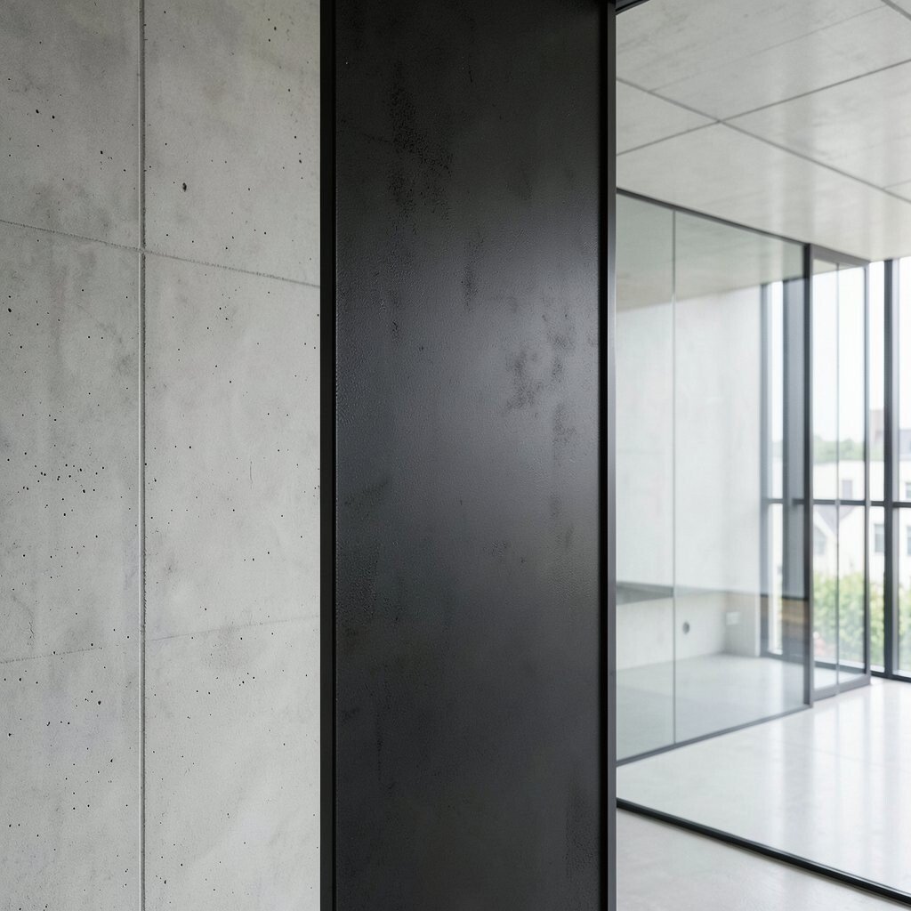
Concrete, black steel, and clear glass create a sharp, modern look with a cool gray tone. The rough surface next to smooth metal and shiny glass gives the room a strong sense of shape.
This palette feels bold yet simple, which makes it popular in lofts, studios, and modern homes. It can stay affordable if you use concrete-look finishes or powder-coated frames, and you can soften it with wood chairs, plants, or warm lights so it does not feel too hard.
The mix also works well for shelves, tables, and stair railings because each part has a clear job and a neat outline. If you want a more personal touch, try frosted glass, leather handles, or a few soft textiles to balance the strong industrial feel.
3. Terracotta, Cream, and Natural Linen
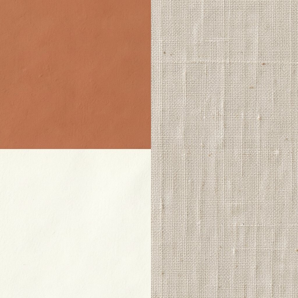
Terracotta, cream, and natural linen make a room feel sunny and relaxed. The clay color brings warmth, while cream and linen keep the space light and breathable.
This palette has a handmade look that feels friendly and current, especially in homes that want a softer, earthy style. It can be budget-friendly because linen-look fabrics, clay paint, and terracotta tiles come in many price ranges, and you can add your own style with pottery, arched lamps, or textured pillows.
It is a good choice for dining spaces, reading corners, and calm bedrooms because it feels welcoming without trying too hard. The unique charm comes from the small shifts in tone, so mixing matte and woven finishes helps the whole palette feel richer.
4. Walnut, Brass, and Deep Green
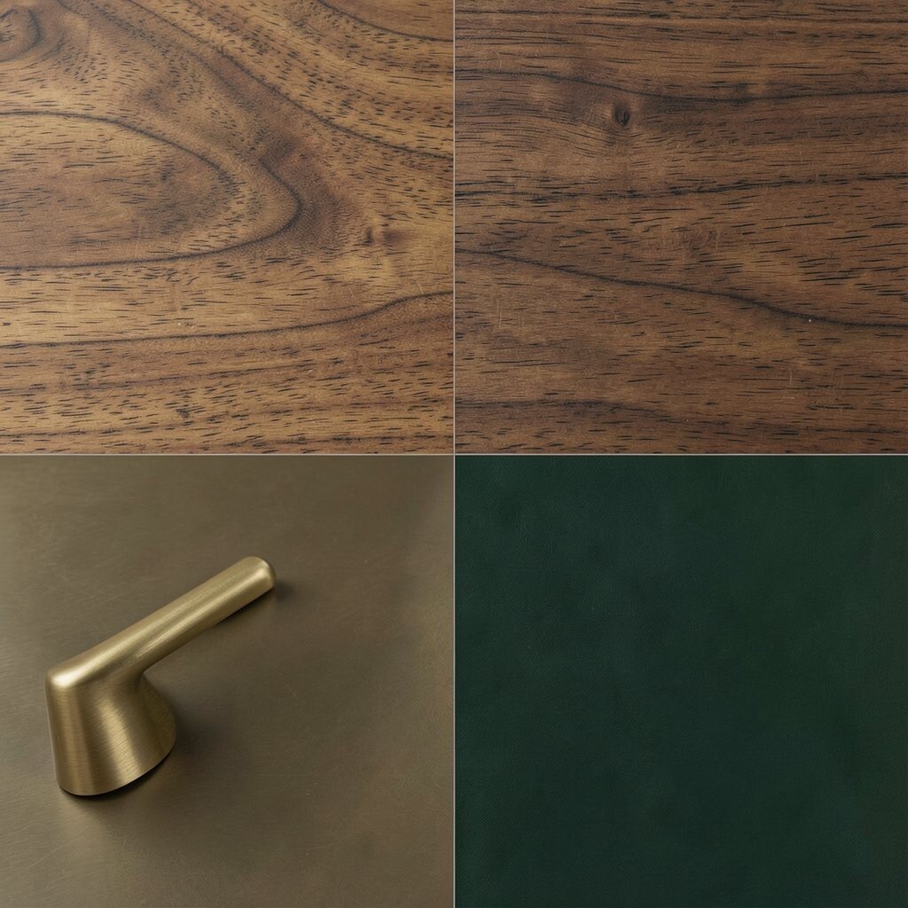
Walnut, brass, and deep green bring a rich, cozy feeling with a little drama. The dark wood looks smooth and deep, the brass shines softly, and the green adds a fresh note that still feels grounded.
This mix is great for home offices, libraries, and dining rooms where you want a polished look that still feels warm. It can cost more than basic finishes, but using brass on small details and choosing walnut stain instead of solid walnut can keep the project more manageable, and velvet cushions or framed art can make it feel personal.
5. Soft Beige, White Oak, and Rattan
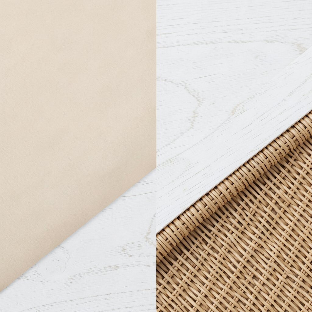
Soft beige, white oak, and rattan create a breezy palette that feels light and easy. The beige tone adds warmth, the pale wood keeps things natural, and the woven rattan brings a nice hand-made look.
This style is popular in relaxed homes because it feels simple, calm, and a little coastal without being too themed. It can be a smart budget pick since rattan chairs, cane-front cabinets, and beige paints are easy to find, and you can make it your own with striped fabric, ceramic lamps, or shell-toned decor.
The visual mix works well when you want a room to feel open but not plain. A few darker touches, such as bronze legs or walnut frames, can add depth and keep the palette from fading into the background.
6. White Marble, Charcoal, and Polished Nickel
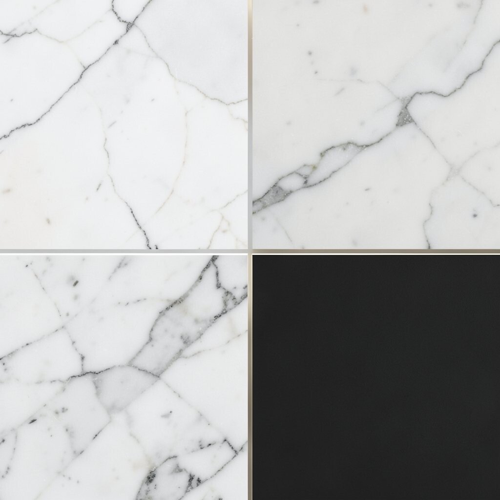
White marble, charcoal, and polished nickel give a room a crisp and elegant feel. The bright stone surface stands out against the darker gray and the cool shine of nickel.
This palette is a favorite for bathrooms and kitchens because it looks fresh, clean, and easy to match with many styles. Real marble can raise the cost fast, so quartz or marble-look tile is often a better choice, and you can make the look more personal with simple art, fluted glass, or a slim mirror frame.
The contrast is what makes this mix special, since the light and dark surfaces keep each other in balance. It also fits well with current trends that favor quiet luxury, where the room feels polished without showing off too much.
7. Sage Green, Light Ash, and Soft Gray
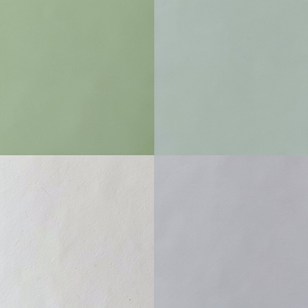
Sage green, light ash, and soft gray create a gentle palette that feels restful and fresh. The green brings a bit of nature inside, while ash wood and gray fabrics keep the room soft and calm.
This combination is great for bedrooms, nurseries, and even small entryways because it does not feel busy. It is often affordable since sage paint, gray upholstery, and ash-style laminates are widely available, and you can add your own touch with curved mirrors, linen curtains, or a few brass accents.
The look feels unique because it is quiet rather than loud, yet it still has a clear style. For the best result, keep the tones close in value so the space feels smooth and peaceful instead of crowded.
8. Blackened Wood, Linen White, and Soft Taupe
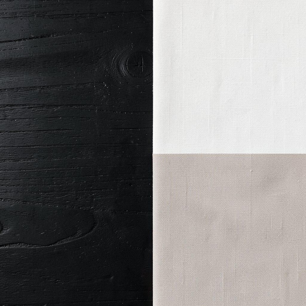
Blackened wood, linen white, and soft taupe make a room feel grounded and calm with a bit of edge. The dark wood adds strong shape, while the light fabrics and taupe soften the mood and keep it inviting.
This palette works well in living rooms and guest rooms where you want contrast without a harsh look. It can be cost-friendly if you use stained pine or laminate for the dark wood pieces, and you can personalize it with hand-thrown pottery, chunky knit throws, or simple framed prints.
The visual balance is what makes it feel so useful in real homes. It also suits current design tastes that mix dark and light materials for a more layered, lived-in feel.
9. Pale Blue, Brushed Aluminum, and White Oak
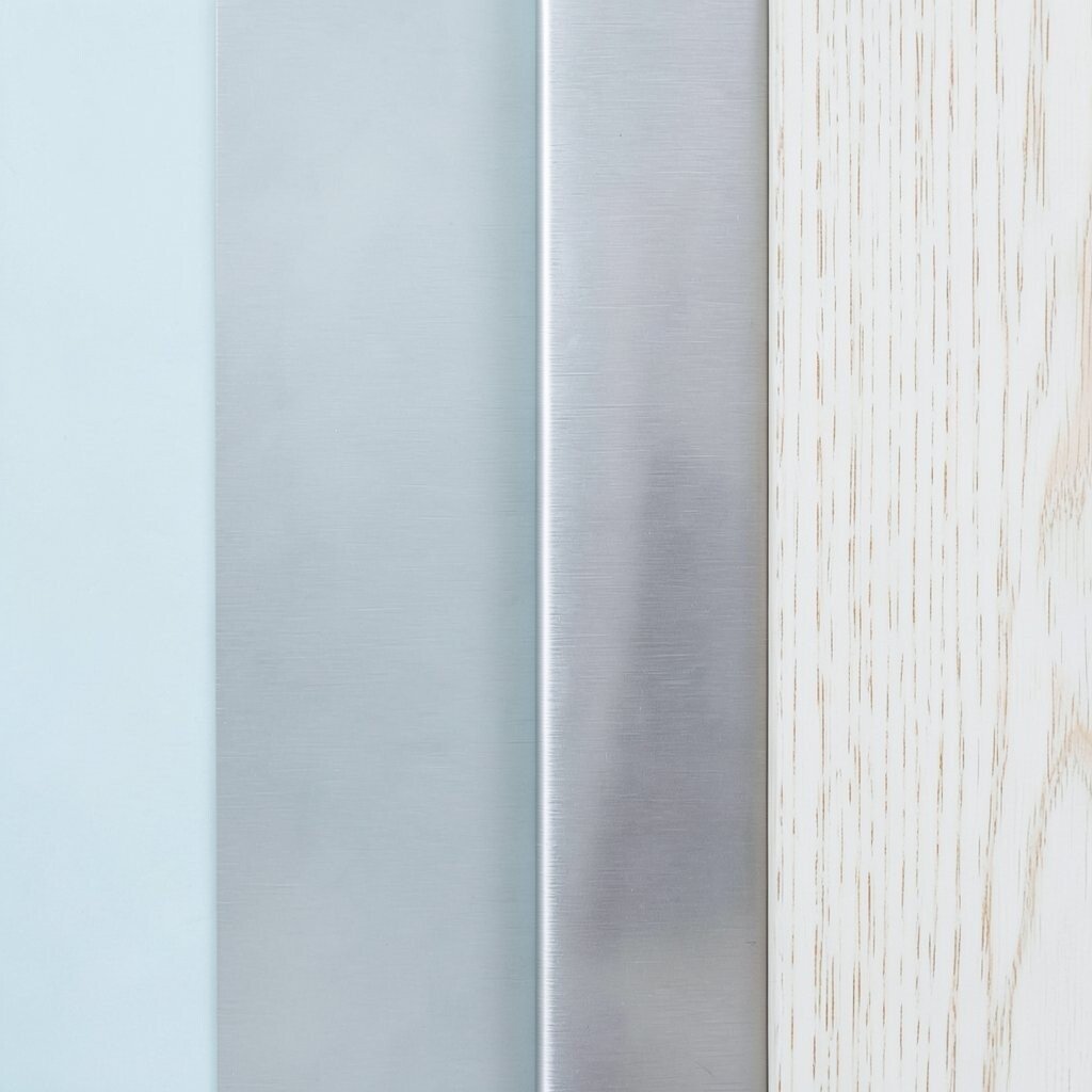
Pale blue, brushed aluminum, and white oak make a room feel fresh and airy like a clear morning. The cool blue softens the metal, and the pale wood keeps the whole palette from feeling cold.
This mix is a smart choice for workspaces, bathrooms, and modern kitchens because it feels neat and uplifting. It can stay within budget if you use painted cabinets and simple metal hardware, and you can make the room more personal with soft abstract art, pale ceramics, or a striped rug.
The palette stands out because it feels calm but not sleepy. If you want more warmth, add a little cream or a woven stool so the room feels more balanced and welcoming.
10. Rust Red, Camel Leather, and Dark Walnut
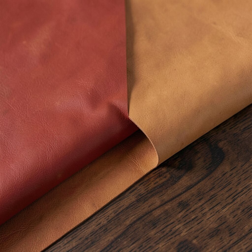
Rust red, camel leather, and dark walnut create a bold palette with a warm, old-world mood. The red feels rich and earthy, the leather adds a smooth surface, and the walnut brings depth and polish.
This look works especially well in dens, dining rooms, and reading areas where a cozy feeling matters. It may cost more if you use real leather and solid wood, but faux leather, wood stain, and a few deep-toned fabrics can give a similar effect for less, and you can make it more personal with vintage books or handmade ceramics.
What makes this palette unique is how strong it feels without needing bright colors. It fits well with current interest in heritage style, where people want spaces that feel collected over time instead of rushed.
11. Cream Stone, Olive Green, and Aged Bronze

Cream stone, olive green, and aged bronze give a room a grounded and classic feel. The stone looks soft and bright, the olive adds natural depth, and the bronze gives the palette a warm glow.
This combination is a good fit for kitchens, bathrooms, and patios because it feels sturdy and calm. It can be a practical choice for many budgets if you use stone-look surfaces and bronze-finish fixtures, and you can shape the mood with plant stands, woven baskets, or framed botanical prints.
The palette feels unique because it borrows from nature without looking rustic. When you keep the shapes simple and the textures varied, the room feels rich, useful, and easy to live with.
12. Dusty Rose, Light Oak, and Soft Gold
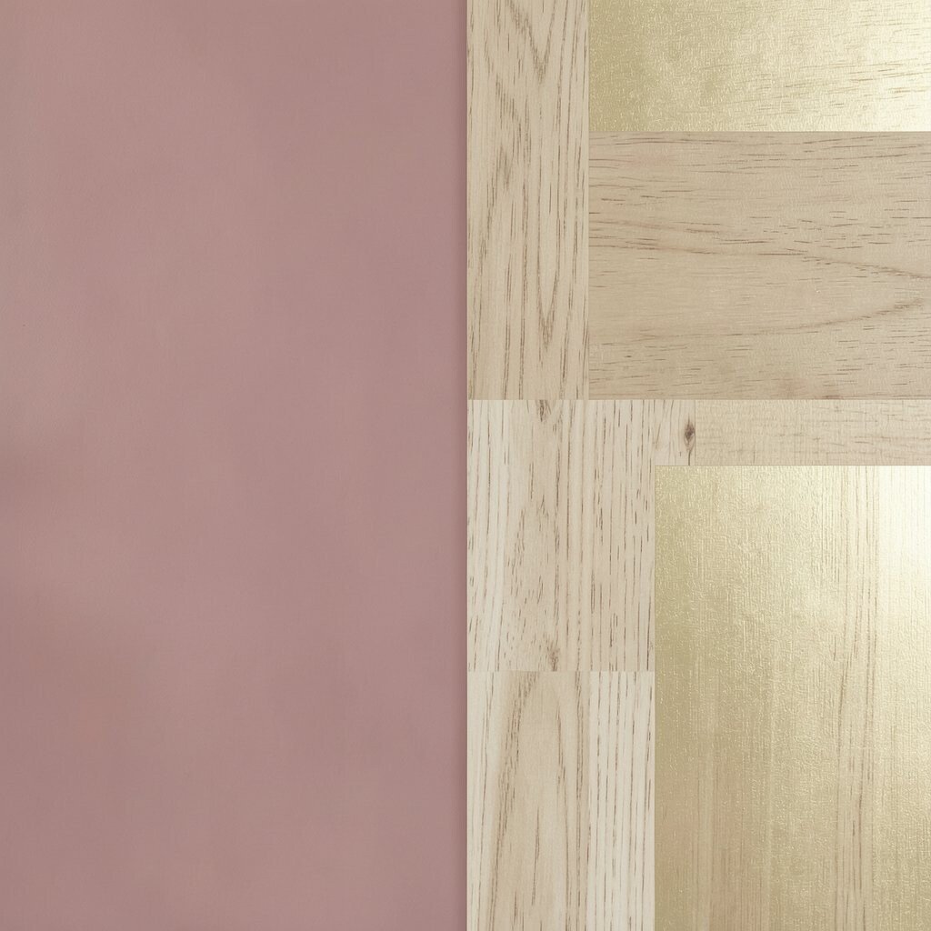
Dusty rose, light oak, and soft gold make a room feel warm, gentle, and just a little dreamy. The rose color adds a soft blush, the oak keeps the look natural, and the gold gives a light sparkle.
This palette works well in bedrooms, dressing spaces, and sitting rooms where comfort matters most. It can be affordable if you choose painted pieces and simple metallic accents, and you can personalize it with rounded furniture, floral art, or plush cushions that echo the rose tone.
The look feels current because soft color and warm wood are both very popular right now. It also has a nice benefit for small spaces, since the light tones help the room feel open while still giving it personality.
13. Slate Gray, Pine, and Burnt Orange
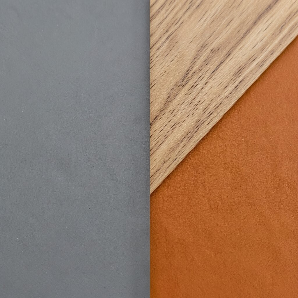
Slate gray, pine, and burnt orange create a lively palette with a strong outdoor feel. The gray gives a steady base, the pine adds a fresh green note, and the orange brings energy and warmth.
This mix works well for family rooms, cabins, and creative studios because it feels active and grounded at the same time. It can be kept in reach if you use painted walls, pine shelving, and orange accents in pillows or art, and you can make it feel more personal with patterned textiles or handmade wood objects.
The uniqueness comes from the color contrast, which feels a bit unexpected but still easy to enjoy. To keep it balanced, let the gray do most of the work and use the orange in smaller pieces so the room stays friendly rather than loud.
14. Soft Black, Sand, and Natural Cork
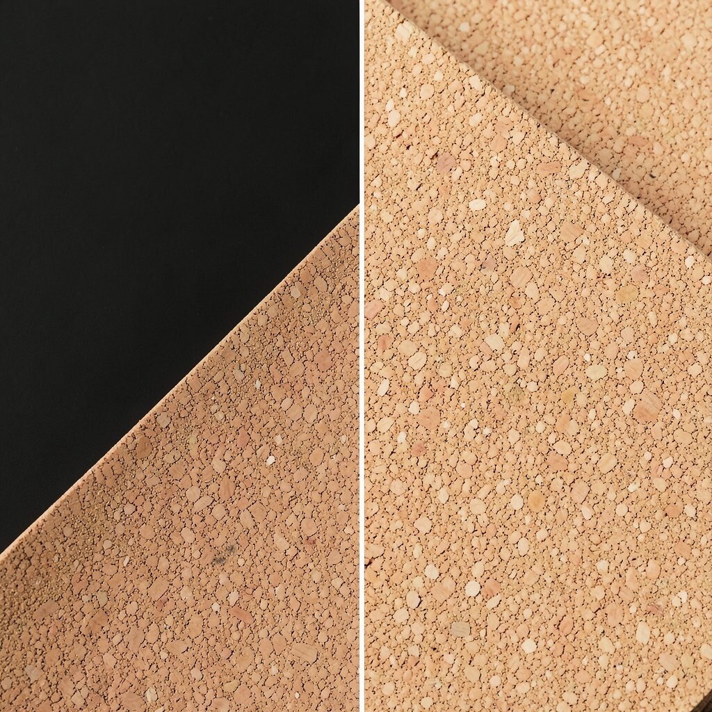
Soft black, sand, and natural cork create a modern palette that feels calm and tactile. The black gives a clean outline, the sand color keeps things light, and cork adds a warm, touchable surface.
This palette is useful for home offices, kitchens, and hallways because it looks neat and hides wear well. It can be a good budget option since cork wall panels, painted trim, and simple black fixtures often cost less than fancy stone, and you can personalize the look with clay vases, paper shades, or a textured runner.
The material mix feels fresh because cork is getting more attention in current design work. It also brings a nice benefit in comfort, since the natural surface makes a room feel softer and less rigid.
15. Ivory, Teak, and Midnight Blue
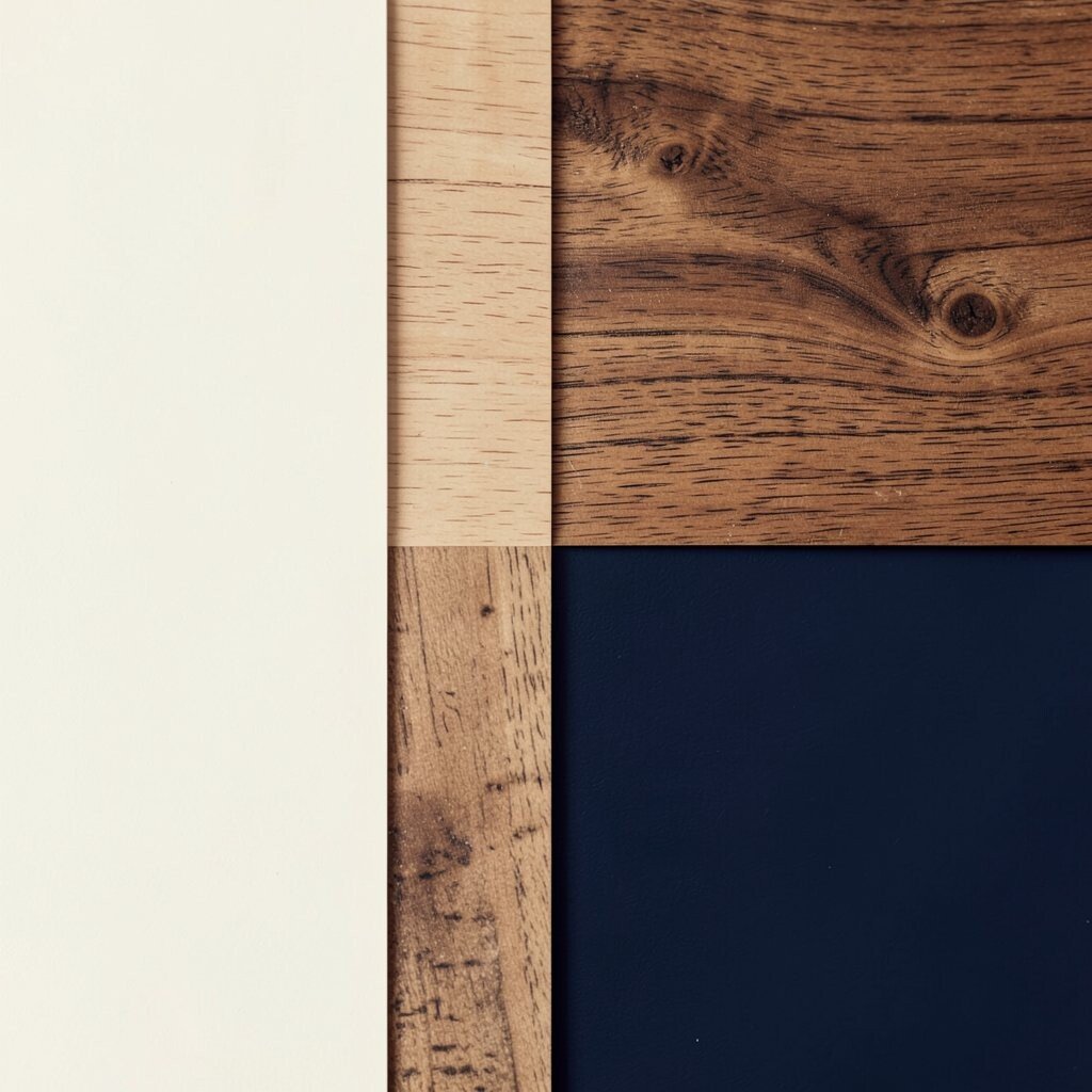
Ivory, teak, and midnight blue make a room feel elegant, deep, and peaceful. The ivory brightens the space, the teak brings a golden wood glow, and the midnight blue adds a rich and steady finish.
This palette is a strong choice for bedrooms, offices, and formal living spaces because it feels classic but not dull. It may cost more if you choose real teak, but teak-look finishes and deep blue paint can create the same mood for less, and you can make it feel personal with brass lamps, navy pillows, or framed travel photos.
The visual effect is memorable because the dark blue and warm wood set each other off so well. It is also easy to live with, since the palette feels polished in the day and cozy at night, which makes it useful for many kinds of homes.