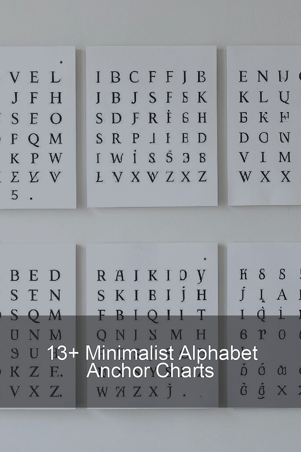
Alphabet walls do not have to feel busy. Clean charts can still feel bright and full of life.
1. Soft Neutral Letter Chart
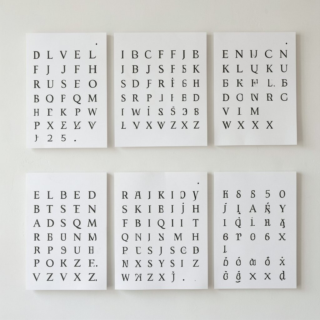
This chart uses cream, taupe, and soft gray letters on a simple white background, so the whole look feels calm and neat. It helps young learners focus on the shape of each letter without extra clutter getting in the way.
Because the design stays simple, it can fit almost any classroom theme and still look fresh next year. Teachers on a tight budget often like this style since plain paper, a printer, and a few markers can keep the cost low, and students can help add hand-drawn pictures for a personal touch.
2. Black-And-White Chalkboard Style
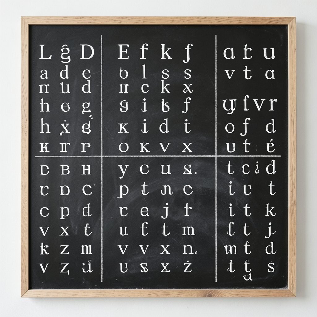
A chalkboard look gives the alphabet a classic feel with bold white letters on a dark background. The strong contrast makes each letter easy to see from across the room, which is helpful for quick reference during lessons.
This style works well because it looks tidy, modern, and simple at the same time. You can keep it affordable by using black poster paper or even a roll of dark bulletin board paper, then let children add tiny sketches in white crayon or pencil to make it feel more their own.
Many teachers enjoy this trend because it pairs nicely with farmhouse, rustic, or neutral classrooms. It also gives you room to change the look later by swapping in seasonal borders or student-made examples without starting over.
3. Pastel Block Letters
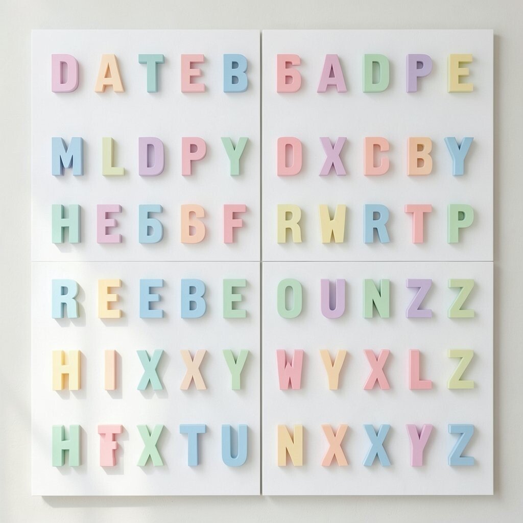
Pastel block letters bring a gentle pop of color while keeping the design clean and easy to read. The soft pinks, blues, mint greens, and yellows make the chart cheerful without making the wall feel crowded.
Kids often respond well to these calm colors because they feel friendly and safe. This chart is easy to personalize with tiny icons or student drawings, and you can save money by printing the letters in simple shades instead of using specialty materials.
The style feels current because pastel classroom decor stays popular in many learning spaces. If you want a fresh twist, mix matte paper with a few shiny letter accents so the chart catches the eye in a gentle way.
4. Nature-Inspired Alphabet Line
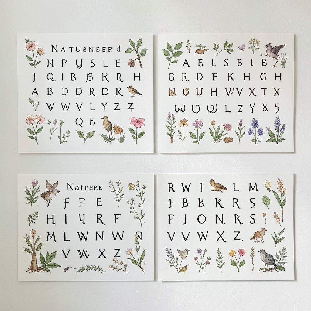
This chart uses leaves, twigs, mountains, or tiny flowers beside each letter, but keeps the layout wide open and simple. The natural look can make the classroom feel calm while giving children easy visual clues to remember each letter.
It is unique because every teacher can choose different nature pieces based on the season or the local area. You can keep costs down with hand-drawn art, recycled paper, or free printables, and students may enjoy adding their own small nature symbols during an art center activity.
5. Minimal Rainbow Strips
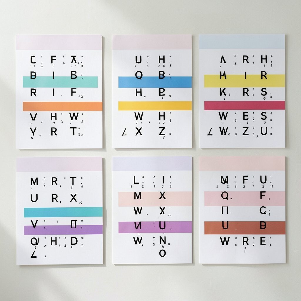
Thin rainbow strips can give the alphabet a happy feel without turning the wall into a busy color storm. Each letter stands out clearly when placed on a slim band of color, and that makes the chart useful for daily pointing and review.
This design is a smart choice for teachers who want color but still want a neat, modern look. It is easy to make on a small budget with colored cardstock or digital printouts, and you can personalize it by using each student’s favorite color for a small section.
Many classrooms now use rainbow accents in a softer way, and this chart fits that trend well. If you want extra charm, pair the strips with simple icons like dots, stars, or hearts so the whole set feels playful but not crowded.
6. Farmhouse Woodgrain Letters
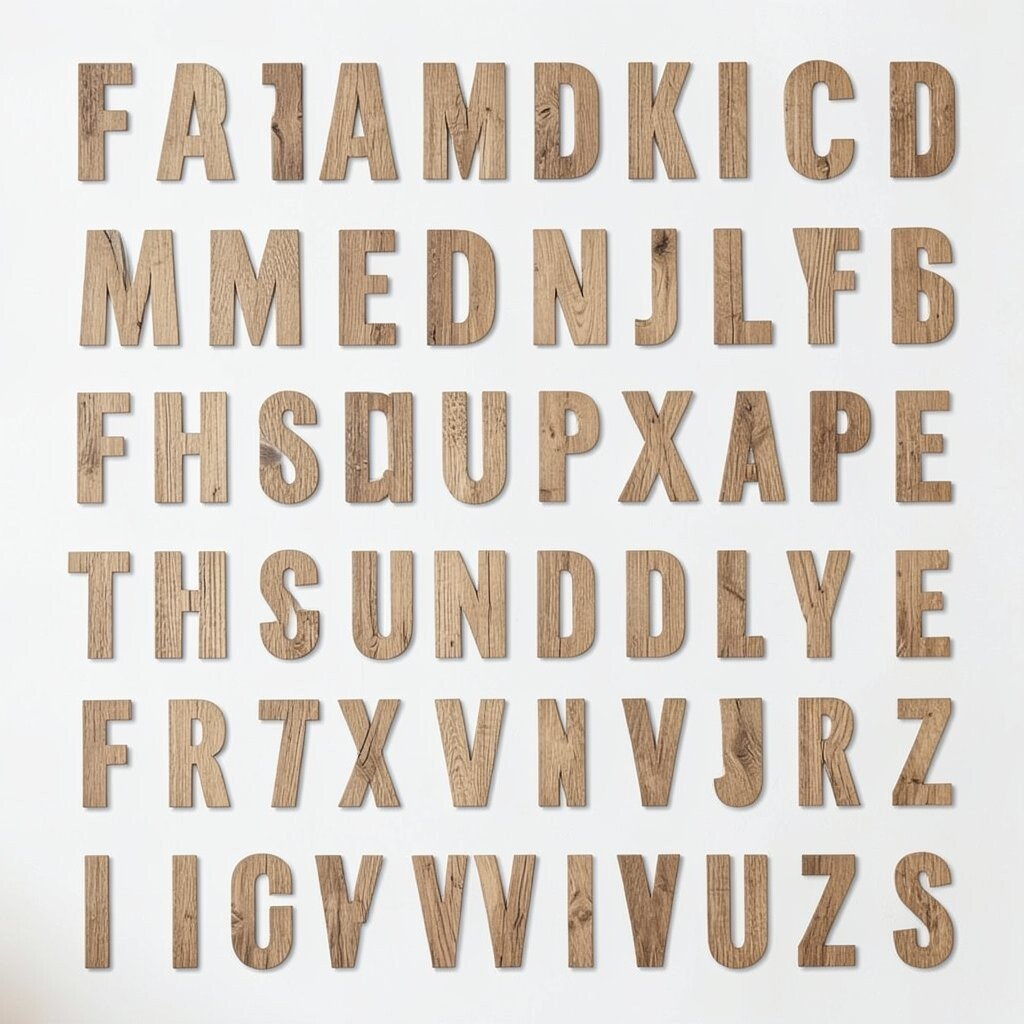
Woodgrain letters give the alphabet a warm, cozy feeling while still keeping the design clean. The look is simple enough for small learners to read quickly, and the texture adds just enough style to feel special.
This chart stands out because it feels homey and calm at the same time. You can make it on a budget by printing a woodgrain pattern on plain paper, then using black letters and a few soft accents like twine or kraft paper for a custom look.
Teachers who like natural decor often choose this style because it blends well with baskets, plants, and neutral shelves. Students can also help by adding small handprints or drawing matching objects, which makes the chart feel connected to the class community.
7. Simple Dot Marker Letters
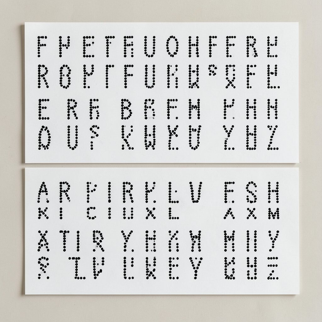
Dot marker letters use clean outlines filled with tiny dots of color, so the chart looks playful but still neat. The dotted texture helps each letter feel interesting without adding too much visual noise.
This kind of chart can support letter recognition because the pattern makes each letter easy to remember. It is also easy on the wallet if you use markers, crayons, or stickers you already have, and you can give it a personal feel by letting students place the dots themselves.
The style works well in modern classrooms where teachers want hands-on learning paired with calm visuals. If you want to keep the chart fresh, use one dot color for vowels and another for consonants so the design also carries a small learning pattern.
8. Muted Primary Alphabet Cards
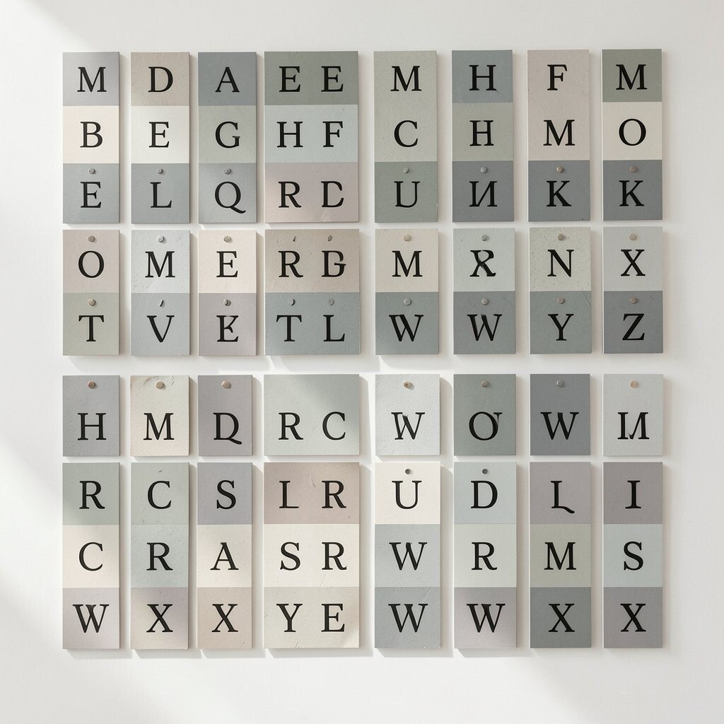
Muted primary colors give a classic school feel while staying softer than bright red, blue, and yellow. The result is a tidy alphabet chart that still feels cheerful and easy for children to notice.
This option is useful because it can support early literacy without making the wall feel too loud. You can keep the cost low by printing on regular paper and mounting the cards on kraft paper, and you can personalize the display with small student-made drawings that match each letter.
Many teachers like this balance because it feels familiar yet updated. The chart can also fit current classroom design trends that lean toward softer colors and cleaner layouts, which makes it easy to use in more than one space.
9. Monoline Script Alphabet
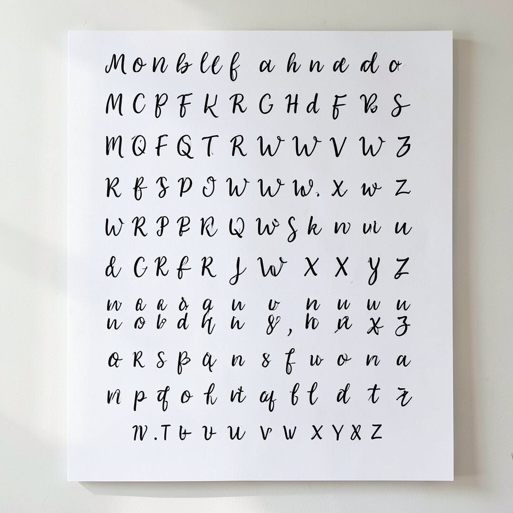
A monoline script chart uses one smooth line style for every letter, giving the alphabet a calm and polished look. The letters feel grown-up but still simple enough for young readers to follow with their eyes.
This style is special because it can make handwriting feel more inviting without looking too fancy. If you want to keep spending low, print the chart in black and white and add a single accent color for extra charm, then let students trace a few letters during practice time.
It works well in classrooms that want a neat and modern look. You can also personalize it by using the same letter style on desk tags, name cards, or word wall pieces so the room feels connected.
10. Soft Boho Alphabet Panels
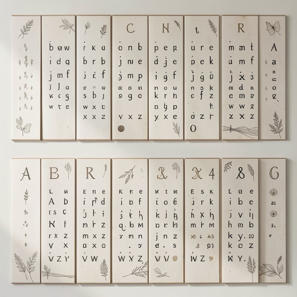
Boho panels often use warm clay, sand, sage, and dusty rose, which gives the alphabet a calm and cozy look. The soft shapes and simple layout help each letter stand out while still making the room feel stylish.
This design is popular because it fits many current classroom decor ideas without feeling too trendy or hard to match. It is budget friendly if you use printable panels and simple frames, and you can make it more personal by adding a class motto, student names, or tiny hand-drawn arrows around the letters.
Teachers like this style when they want the room to feel peaceful and welcoming. The chart can also work well with natural light, woven baskets, and other simple classroom pieces that are easy to use year after year.
11. Large Letter, Tiny Image Chart
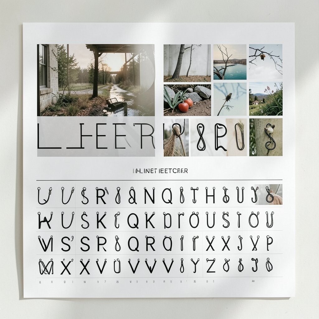
This chart keeps the letter huge and the picture small, which makes the alphabet the star of the wall. The simple layout is easy for children to read, and the tiny image gives just enough clue to help memory without taking over the design.
It is unique because it teaches with less clutter and more focus. You can save money by using a single printer page for each letter, then adding small classroom drawings or free clip art, and students can help choose the pictures so the chart feels shared.
That simple format fits well with current classroom ideas that value clear spaces and less visual overload. If you want to make it stand out, use one consistent frame shape for every card so the whole set looks polished and calm.
12. Transparent Look Alphabet Signs
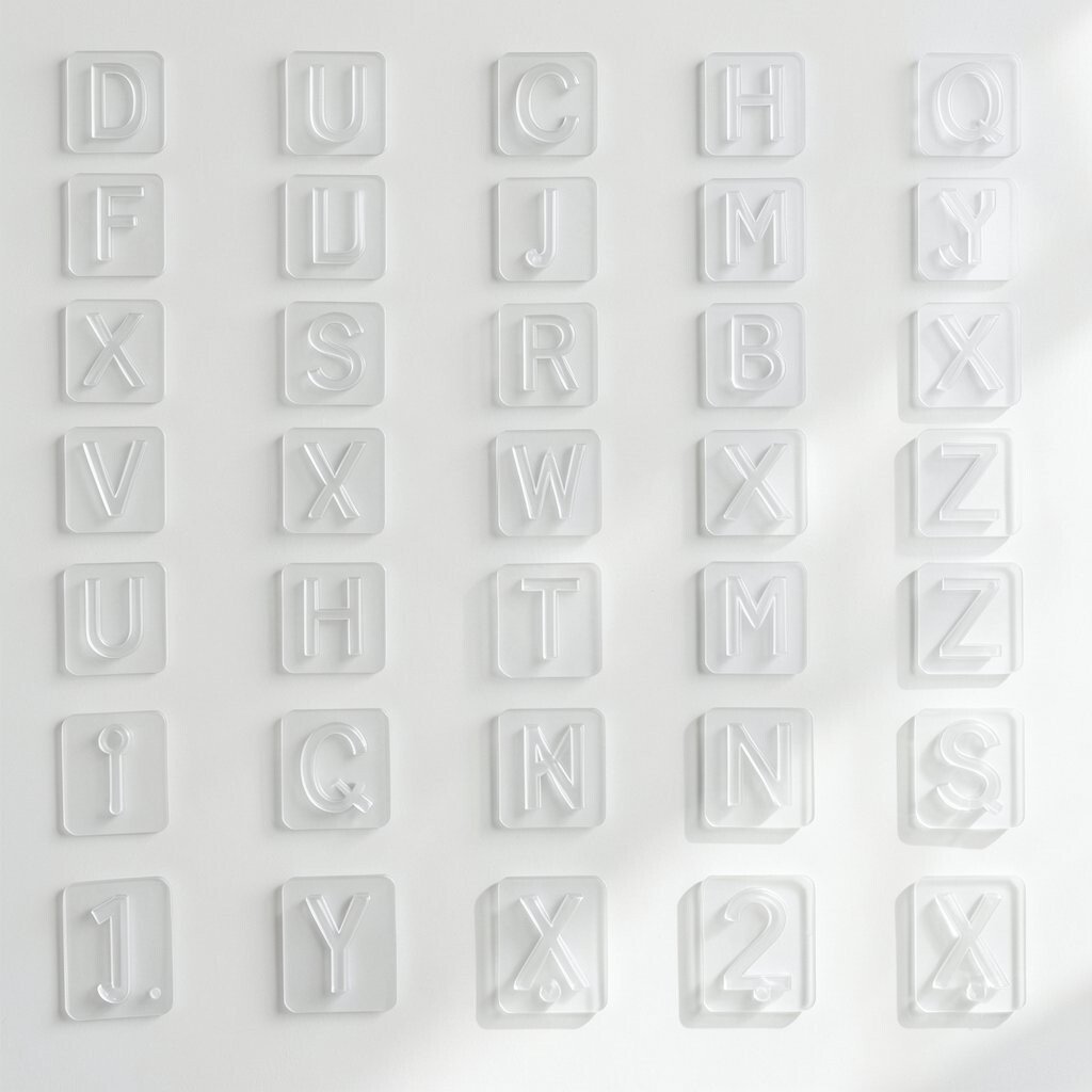
A transparent look can be created with light backgrounds, thin letter outlines, and soft shapes that seem almost see-through. The effect feels airy and modern, and it keeps the wall from looking too full.
This style is helpful for classrooms that already have a lot going on, since the chart stays easy on the eyes. It can be low cost if you use tracing paper effects on regular white paper, and you can personalize it with tiny student photos or initials in a corner of each card.
Many teachers enjoy this look because it feels fresh and current without asking for much effort. If you want extra personality, pair the letters with simple transparent-style objects like bubbles, windows, or jars drawn in pale outlines.
13. One-Color Pop Alphabet Wall
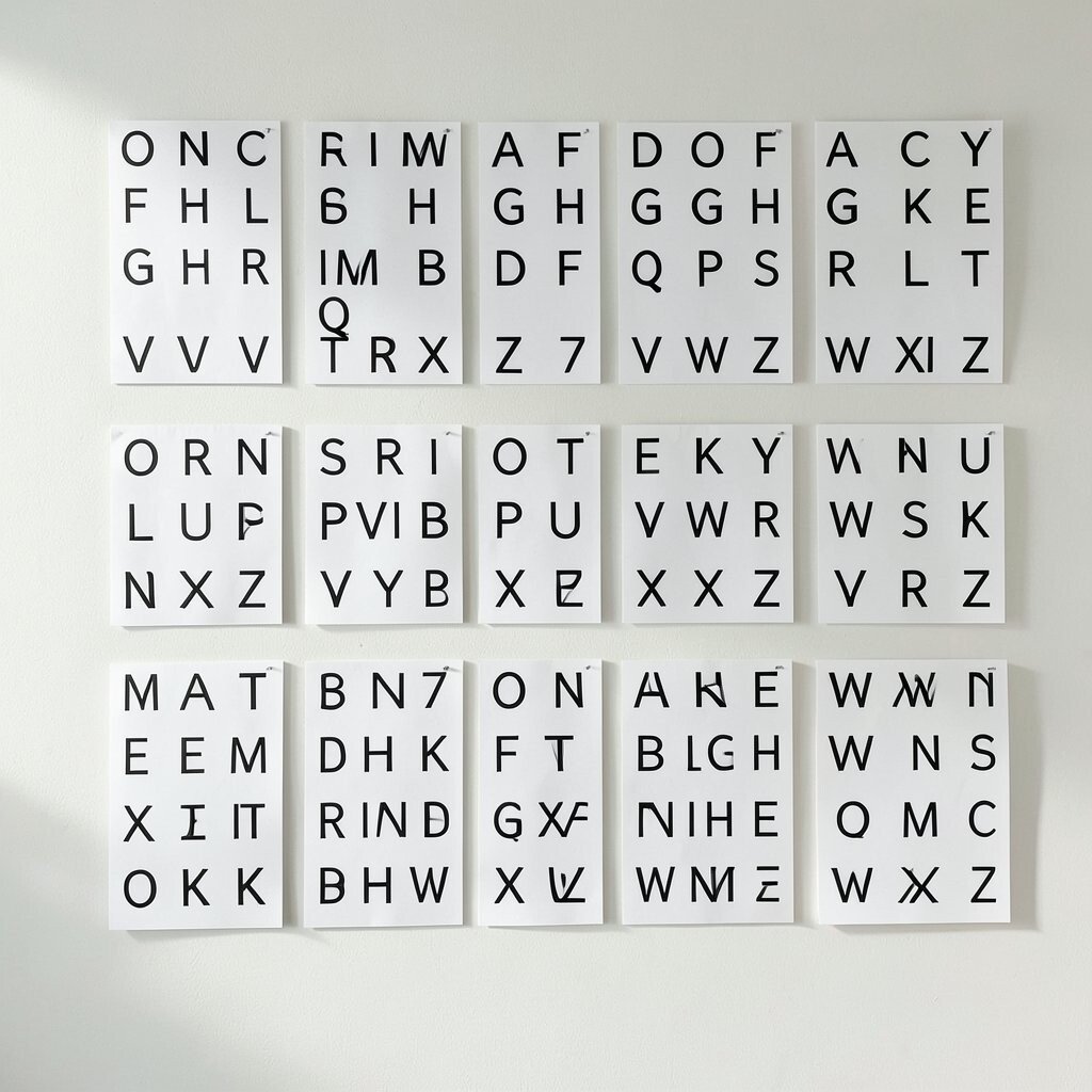
One-color pop walls use a single bold shade, such as navy, emerald, or coral, to make the letters stand out. The rest of the design stays plain, so the color feels strong without making the chart busy.
This approach is easy to use in almost any room because it gives a clear look with very little planning. The cost stays low if you print everything in one color and use white paper, and you can add a personal touch by letting students decorate one small border with matching crayons or markers.
The look feels modern and smart, which is why many teachers keep choosing it. It also works well with simple furniture and quiet classroom decor, helping the alphabet wall feel like part of the room instead of an extra decoration.
14. Student-Made Mixed Material Chart
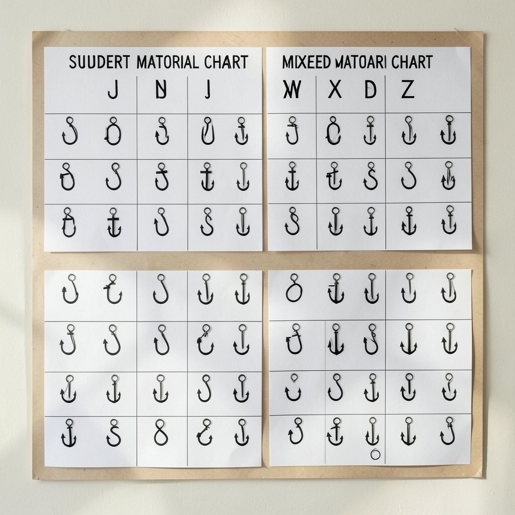
A mixed material chart can include paper, fabric scraps, stickers, yarn, or stamped shapes, but still stay neat and simple. Each letter becomes a little piece of class art, and that makes the display feel lively without losing its clean look.
This chart is the most personal of the group because students help shape it from the start. It can be very budget friendly when you use donated scraps or classroom leftovers, and it gives children a strong sense of pride when they see their work on the wall.
The style also fits a big trend toward student-centered classrooms where children help build the learning space. If you want it to stay minimalist, keep the base colors calm and let the materials bring the interest, so the alphabet remains easy to read and still feels special.