The right wood tone can make a room feel calm, warm, and lived-in. Small changes to color and grain can shift the whole mood in an instant.
1. Light Oak With Sunlit Warmth
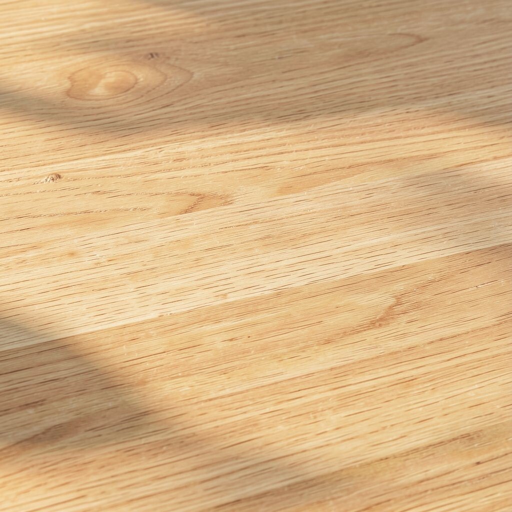
Light oak brings a soft glow that makes spaces feel airy even on cloudy days. You’ll notice the gentle grain lines that look tidy, not busy.
Pair light oak furniture with warm whites and creamy textiles for a balanced look. Add a light linen curtain and keep hardware in brushed metal to keep the whole area feeling fresh. This tone is also friendly for smaller rooms because it reflects more light and helps walls feel farther away.
2. Golden Honey Walnut for Cozy Depth
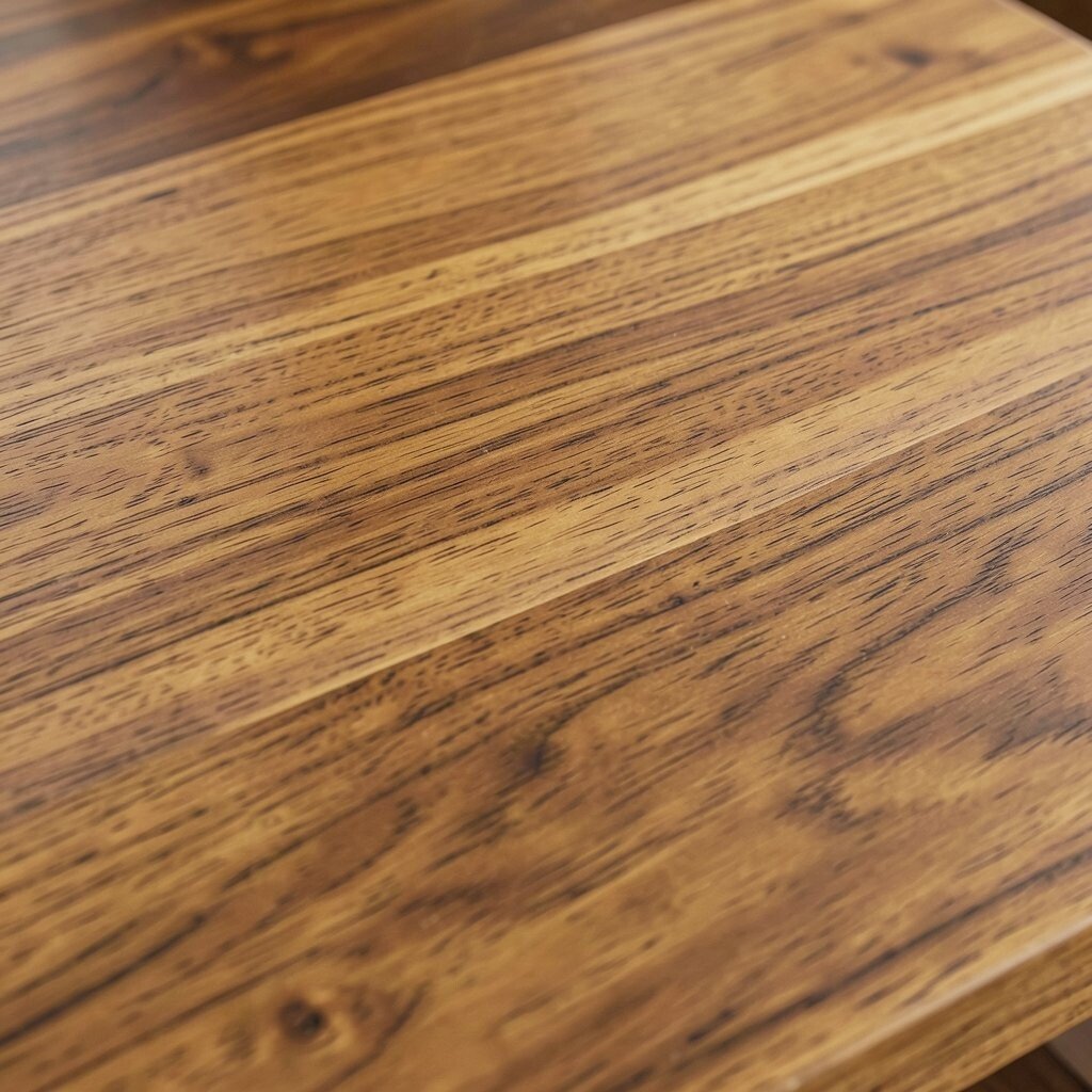
Honey walnut tones add rich warmth without going too dark right away. The color often sits between amber and toasted brown, which makes lighting look extra flattering.
Use this wood tone on a media console, dining table, or dresser to create a natural focal point. It pairs beautifully with soft greens, warm grays, and off-white walls. For everyday styling, choose woven baskets and textured throws so the room feels layered and comfortable.
If you want the look without spending much, consider a peel-and-stick wood veneer film for an accent piece. Look for grain patterns that match the direction of your room’s flow, like lining up the table grain lengthwise. Current trends lean toward warm neutrals, and honey walnut fits right in.
3. Whitewashed Pine With Beachy Ease
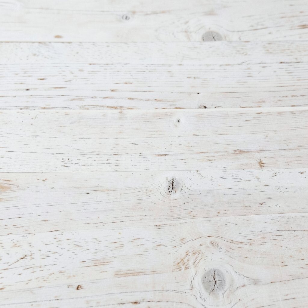
Whitewashed pine feels light, casual, and slightly weathered in a good way. The pale, open grain gives walls and furniture a relaxed, coastal vibe.
Try it on a bookshelf, floating shelves, or a hallway bench where you want calm color. Keep the rest of the palette airy with sand tones, soft blues, and natural fibers. This wood tone also works well if you love minimalist styling because it reduces visual heaviness.
For practicality, seal or topcoat whitewashed surfaces so they resist scuffs and moisture. If you’re painting near it, use a primer that helps prevent uneven coverage. A small budget can still deliver the look with an inexpensive pine piece refinished at home.
4. Medium Ash for Modern Calm
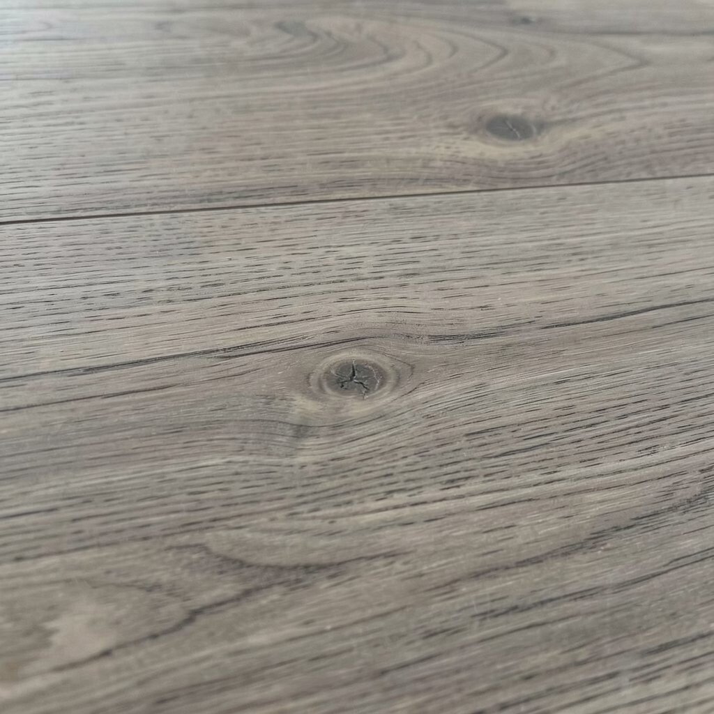
Medium ash has a clean look with a straight, subtle grain that reads modern and steady. Its color usually falls around natural beige-brown, which makes it easy to mix with many styles.
Use it for desks, armchairs with wood legs, or cabinets where you want a calm backbone. Combine with black accents for contrast or with warm metals for a softer feel. If you’re planning a refresh, medium ash is a great choice because it doesn’t fight with existing decor.
5. Rich Mahogany for Statement Character
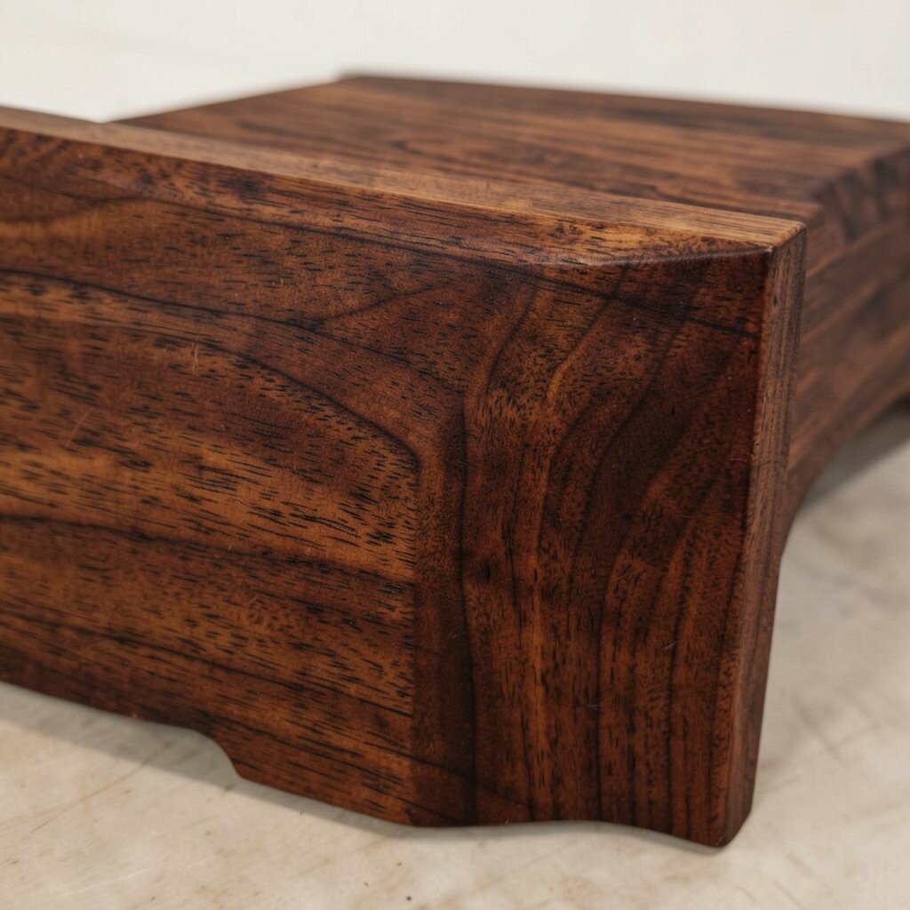
Mahogany delivers bold, reddish-brown character that feels like it belongs in a well-loved library. You’ll see deep tones and a dramatic grain that instantly adds personality.
This wood tone shines on entry doors, dining tables, and statement furniture. Match it with warm lighting, such as amber-toned bulbs, to bring out the depth. If you’re worried about making the room too heavy, balance it with light rugs and airy curtains.
It can be pricier, so consider buying fewer pieces but choosing high-impact ones. If you love the color, look for budget-friendly alternatives like stained oak that mimic mahogany warmth. This tone is still trending in classic-elegant interiors where people want comfort with richness.
6. Cool Birch for Fresh Minimalism
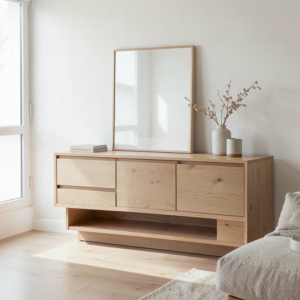
Birch has a lighter, cooler undertone that feels crisp and tidy. The grain often looks fine and even, which supports a modern, minimal look.
Choose birch for desks, shelving, or kitchen cabinets when you want a fresh start. Pair it with charcoal accents, crisp whites, and light gray fabrics for a balanced contrast. For a more inviting feel, add warm lighting and soft textiles that bring in cozy texture.
To keep it from looking too stark, include wood of another tone in small touches like frames or cutting boards. This makes the space feel curated rather than one-note. Birch is also a good pick if you’re sensitive to strong yellows because it stays cooler.
7. Teak-Inspired Golden Brown for Timeless Style
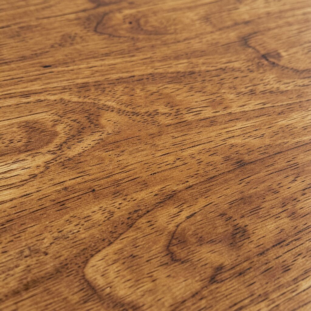
Teak-inspired tones feel warm and durable, with a golden brown that looks timeless. The grain can look slightly textured, which adds life without clutter.
Try teak tones in outdoor-style interiors, especially on patio-like seating, side tables, or cabinets. It pairs well with creamy walls, terracotta planters, and natural stone textures. For practicality, choose finishes that resist water spots since teak-style colors often invite sunshine.
If you want the look on a budget, search for furniture labeled as teak-look or teak stain. Make sure the undertone leans golden instead of red so it matches most warm palettes. Right now, people love sun-warmed neutrals, and teak tones fit that vibe perfectly.
8. Smoke-Toned Walnut for Moody Elegance
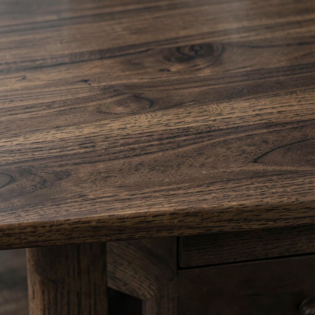
Smoke-toned walnut looks deep and sophisticated, almost like a soft shadow. It keeps the warmth of walnut but adds a muted, moody character that feels grown-up.
Use it for accent walls, media consoles, or cabinetry if you want a room to feel calm and cinematic. Pair with brushed brass or matte black hardware depending on whether you want warm glow or sharp contrast. A thick rug in cream or soft charcoal helps ground the darker wood.
9. Blonde Maple With a Light, Clean Feel
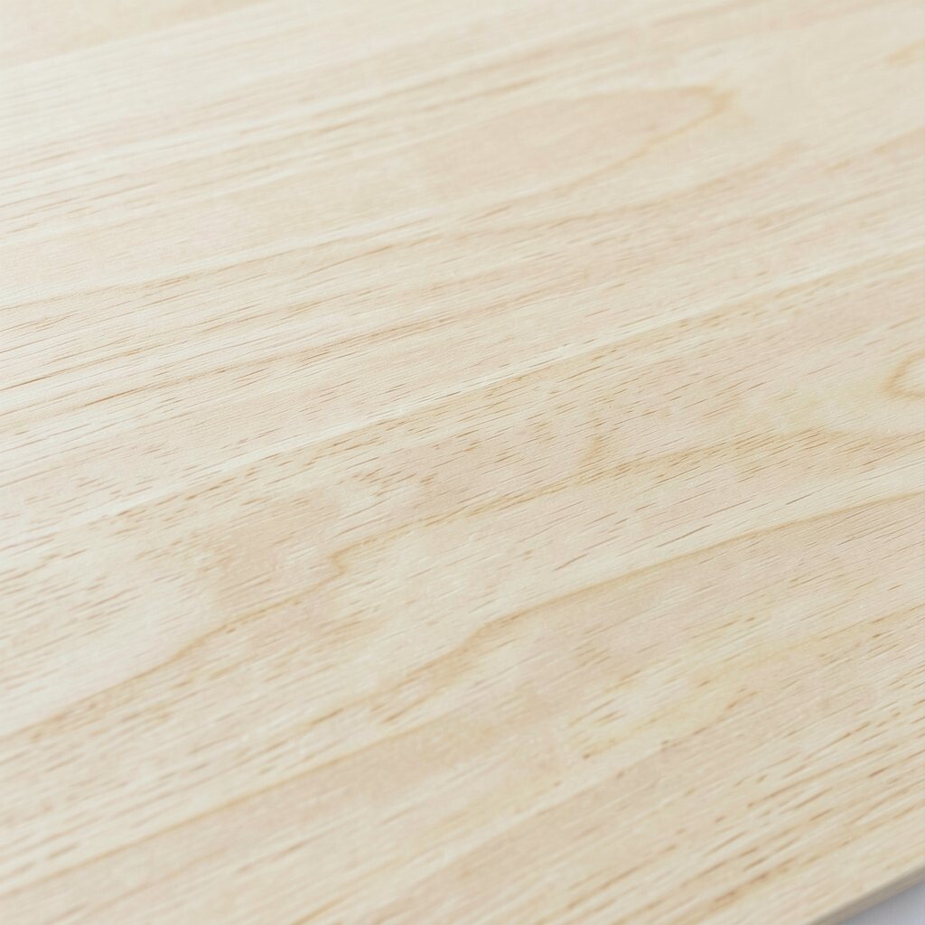
Blonde maple brings a bright, cheerful look that feels fresh and light. Its color can lean pale yellow or warm ivory, which makes rooms feel friendly.
This tone is ideal for kitchens, built-ins, and light furniture where you want an open, airy mood. Pair it with white countertops, pale stone, and simple metal fixtures for a tidy feel. If your space gets lots of daylight, blonde maple helps bounce that light around.
To keep the look from feeling too “new,” add warm textures like wool throws and linen curtains. Maple also looks great with muted colors like sage and dusty rose. For cost, you can start with a few pieces such as stools or a console and let the rest stay neutral.
10. Mid-Tone Cherry for Gentle Red Warmth
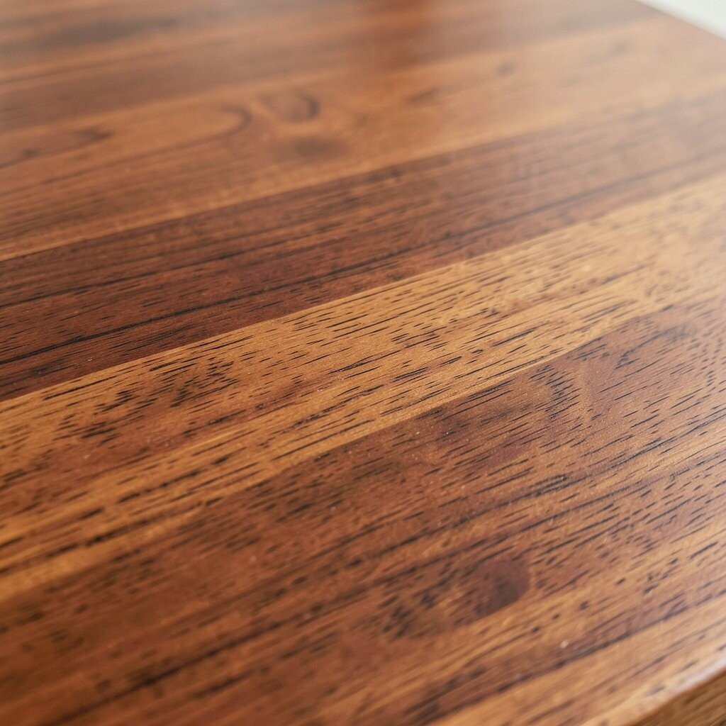
Cherry wood tones can show a gentle red warmth that feels inviting. The color often deepens over time, which makes it feel like it’s aging gracefully.
Try cherry in dining sets, bedroom dressers, and kitchen accents where you want a subtle glow. Pair with taupe walls, warm whites, and soft leather or fabric textures. To keep the undertone balanced, avoid overly cool grays and choose warm lighting.
11. Gray-Brown Driftwood for Relaxed Modern Spaces
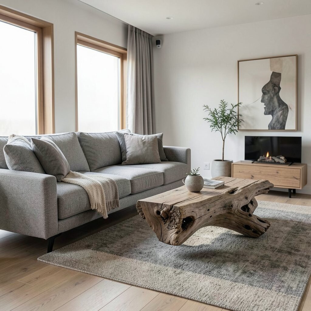
Driftwood tones look relaxed, with a gray-brown mix that feels beachy but not childish. The grain often looks weathered, which adds character even when the design is simple.
Use it in coastal modern rooms, especially for sideboards, cabinets, and headboards. Combine with crisp white walls, textured rugs, and touches of sea-glass color. This tone helps make modern shapes feel softer and more comfortable.
For practical upkeep, sealed driftwood finishes help resist fading and water spots. If you’re styling shelves, keep decor low and natural, like stacked books and simple ceramic vases. Many people love driftwood tones right now because they bring calm, natural color without going too light or too dark.
12. Cocoa Brown Wenge for Bold Contrast
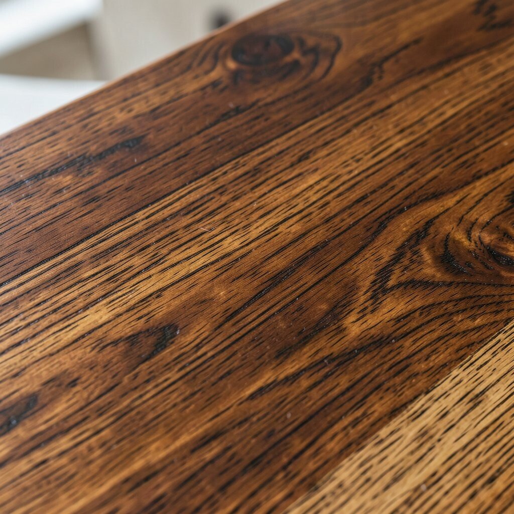
Wenge wood tones are dramatic and dark, often with deep brown and occasional hints of black. The look is bold and graphic, with strong grain that reads like a design pattern.
It’s perfect for small but impactful items like picture frames, bar carts, or cabinet doors. Pair with warm creamy walls and sleek black hardware for a striking modern feel. If you’re cautious, use wenge on just one area so the room stays balanced.
13. Caramel Walnut for Soft, Golden Balance
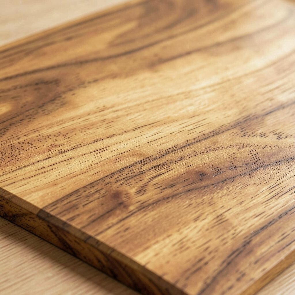
Caramel walnut has a warm golden-brown color that feels friendly and never too heavy. The grain can look smooth and elegant, which makes it great for a polished room.
Use caramel tones on kitchen cabinetry, shelving, or a dresser where you want warmth without darkness. Pair with warm whites, camel leather, and simple greenery for a fresh look. For an easy update, switch out old handles for brushed brass to make the wood feel more intentional.
Cost can vary, but you can often get the caramel look through stains on oak or birch. Try samples in different daylight conditions because caramel undertones can shift from golden to more neutral. Personalize by adding a patterned rug that brings in the same warm vibe without matching the wood exactly.
14. Cinnamon Stained Oak for Vintage Charm
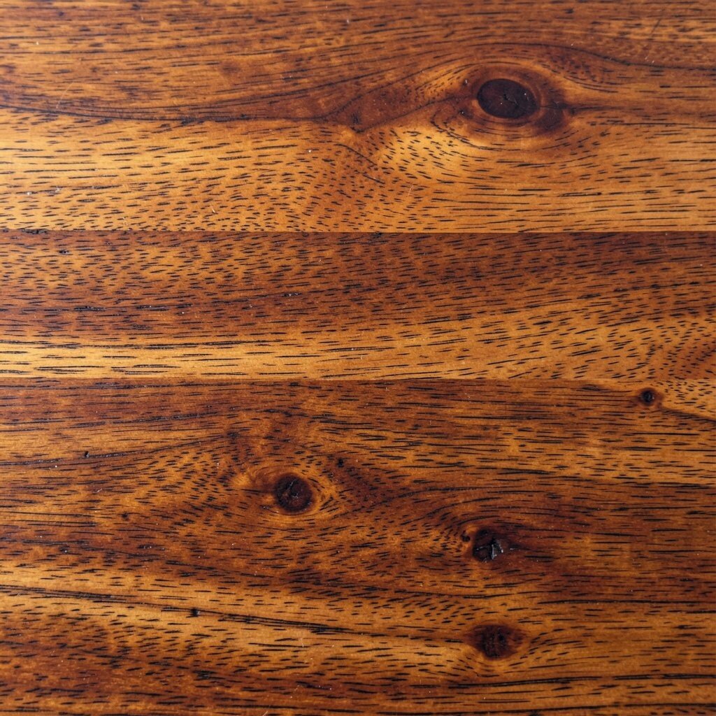
Cinnamon stained oak brings a vintage warmth that feels like it belongs in an older home. The tone lands between light brown and reddish spice, which makes it cozy and full of character.
This wood tone works well for kitchen islands, shelving, and dining chairs. Pair it with cream walls, subtle stripes, and antique-style decor for a charming feel. If your goal is an actionable update, refinish existing wood by sanding lightly and applying a cinnamon stain to match your new palette.
15. Light Teak for Bright, Easy Living Rooms
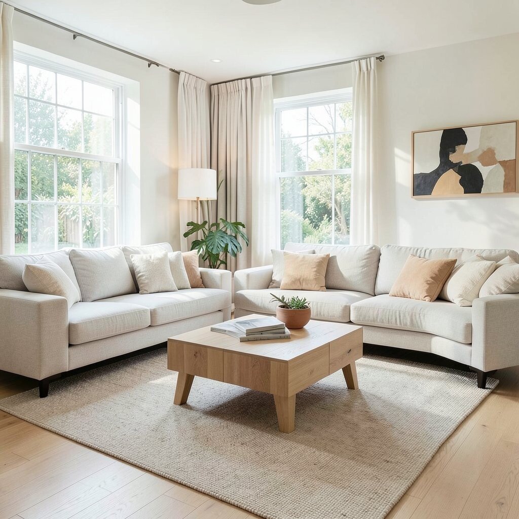
Light teak tones keep the golden warmth but stay more neutral and less deep. The color helps rooms feel welcoming, especially in living spaces that need everyday comfort.
Use light teak for coffee tables, media stands, and entryway benches. Combine it with white walls, natural textiles, and light gray stone or tile for a clean look. If you want extra softness, add layered rugs and warm lighting so the wood feels inviting rather than pale.
This tone can be a smart choice if you’re mixing multiple woods, because light teak tends to play well with both cool and warm accents. To keep costs down, consider buying only the key furniture pieces in this tone and letting smaller items be in other neutrals. Current styling favors natural textures, and light teak fits perfectly with that trend.
16. Chocolate Brown Stain for Grounded Style
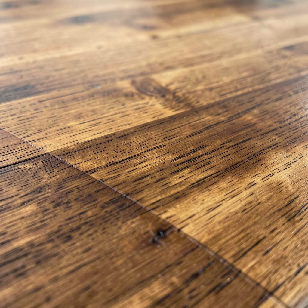
Chocolate brown wood tones create a grounded feeling that makes the room feel stable and cozy. The color reads rich but still flexible, especially when paired with warm accents.
Try chocolate tones in built-ins, desks, and dining tables where you want a strong visual anchor. Pair with tan, cream, or warm gray textiles to keep it from becoming too dark. For practical balance, choose a lighter rug or curtains so your room doesn’t feel closed in.
17. Natural Walnut With Classic Contrast
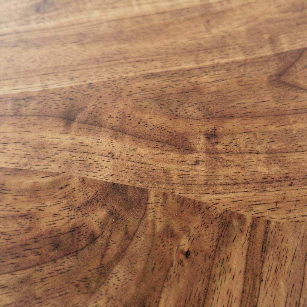
Natural walnut is a timeless choice, usually balancing brown warmth with a polished, elegant grain. It looks great in both traditional and modern rooms because it’s naturally expressive.
Place walnut on coffee tables, cabinets, or bed frames to create contrast against lighter walls. It pairs well with matte black, brushed nickel, and warm metals, so you can personalize hardware without worry. If you’re styling shelves, keep objects varied in height and texture to make the grain feel like part of the design.
Walnut can cost more, so consider using it on one or two anchor pieces. Budget-friendly updates include painting surrounding walls a warm off-white to amplify the walnut color. This tone remains popular because it feels like “forever,” not just a passing trend.
18. Pale European Oak for Soft, Modern Warmth

Pale European oak tones bring gentle warmth with a clean, contemporary look. The grain is often subtle, so it works well in calm, organized spaces.
Use it for flooring, cabinets, or lightweight furniture to keep everything feeling open. Pair with cool whites and simple shapes, then add soft textures like boucle or cotton to keep it human and cozy. If you have existing gray or black elements, pale oak can connect them smoothly.
19. Dark Espresso for Sleek, Contemporary Rooms
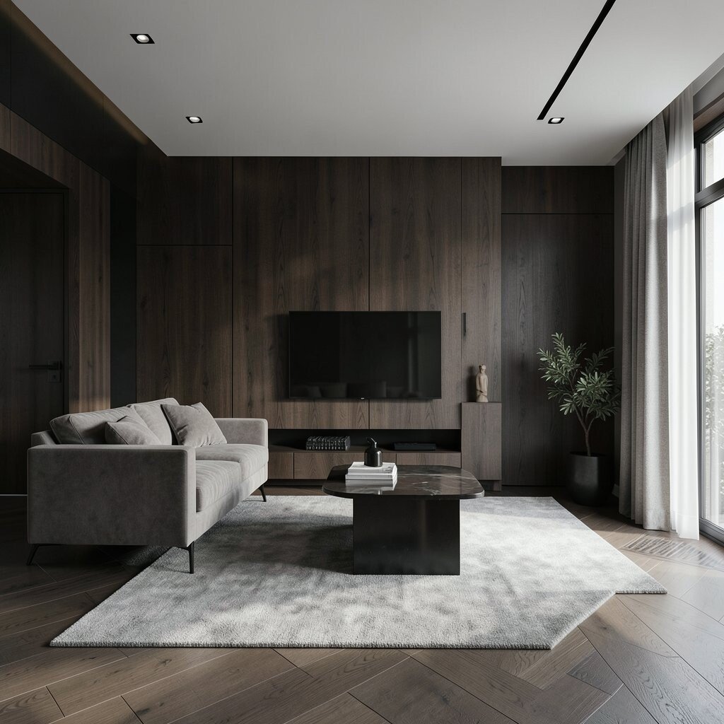
Espresso wood tones are deep, sleek, and dramatic, often with a near-black brown finish. The look feels modern and stylish, especially in rooms with clean lines.
Choose espresso for wardrobes, entertainment units, and desk surfaces where you want a strong contrast. Pair with bright whites, warm gold accents, and lighter fabrics so the room stays inviting. To keep the finish looking great, use gentle cleaners and avoid harsh chemicals that can dull the sheen.
If you want a similar vibe on a smaller budget, look for stain finishes labeled “espresso” on oak or beech. Personalize by adding light-colored wall art and a soft-toned rug that pulls the room together. This is a popular look right now in minimal interiors that want high contrast without clutter.
20. Olive-Toned Wood for Earthy Style
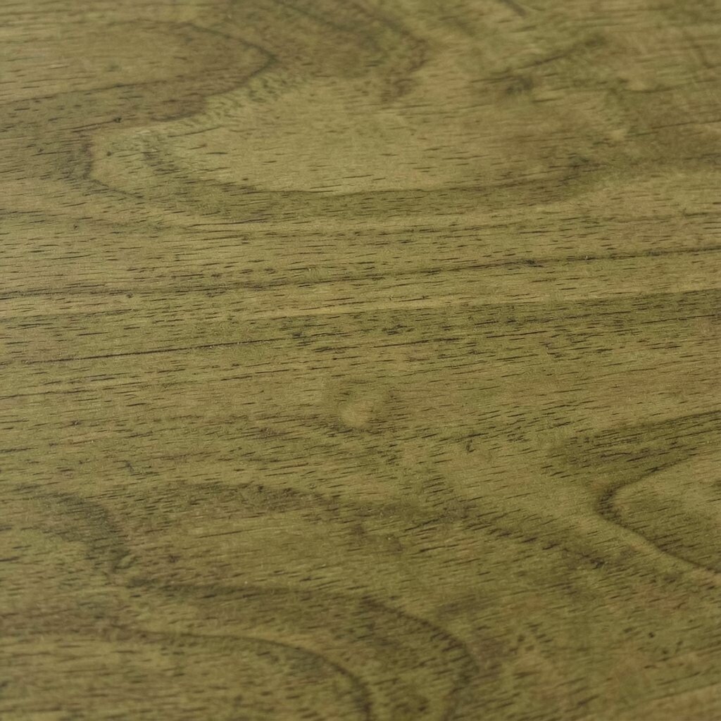
Olive-toned wood looks like it belongs in a naturally colored landscape. It usually shows a muted green-brown character that feels soothing and fresh.
Use olive-toned accents in shelves, side tables, or kitchen accessories to add earthy personality. Pair with warm beige walls, soft ivory linens, and natural ceramics. The benefit is that olive wood can act like a neutral while still bringing color depth.
For practical personalization, mix it with plants and textured baskets to create an effortless organic feel. When cost matters, choose smaller pieces in olive tones so you can invest without overspending. This tone fits current trends toward nature-inspired interiors and calm, grounded palettes.
21. Reddish Brown Sapele for Rich Warm Glow
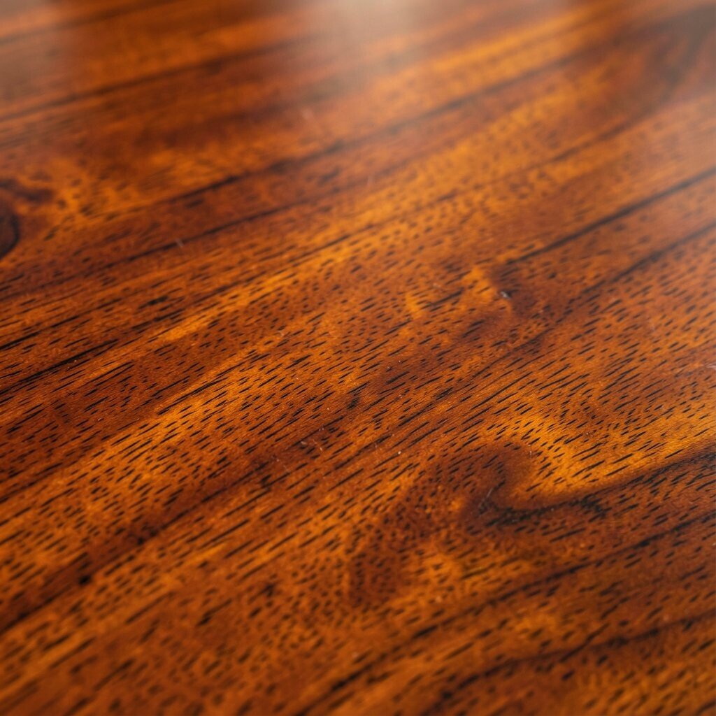
Sapele wood tones often show a reddish brown glow that feels luxurious but still comfortable. The grain can look striking, with swirls that catch light in a gentle way.
This tone is great for feature items like accent cabinets, chair frames, or bar tops. Pair with warm whites, caramel leather, and natural stone so everything feels cohesive. If you want a practical way to make it look polished, keep surrounding decor simple and let the wood be the star.
Sapele can be moderately priced depending on sourcing, so it’s smart to compare options and check finish quality. Look for even color and a protective topcoat if the item will see daily use. Personalize by choosing textiles in warm neutrals that echo the wood’s reddish warmth without matching exactly.
22. Soft Ash Tan for Light, Everyday Flexibility

Soft ash tan tones offer a light, neutral warmth that works with almost any style. It’s not too yellow, not too gray, and that balance makes it easy to live with.
Use it for furniture legs, shelving, and open storage so your room stays bright and functional. Pair with almost any color, from muted greens to crisp blues, because the wood tone stays calm. For personalization, change out cushions, rugs, and wall art seasonally while keeping the wood tone steady.
If you’re thinking about cost, ash is often a more budget-friendly option compared to rarer woods. You can also choose stain finishes to fine-tune the undertone, aiming for a tan that feels warm in your specific lighting. This flexible look fits the current trend toward adaptable interiors where decor can evolve without expensive swaps.